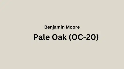
Are you looking for the perfect neutral paint color that feels warm but not boring? Pale Oak Benjamin Moore (OC-20) (Also known as 858) might be just what you need.
This lovely paint color sits between gray and beige, giving you the best of both worlds. With its 68.64 LRV, it’s not too dark or too light, making rooms feel cozy yet bright.
Pale Oak works great in all kinds of rooms and lighting. It plays nicely with many wood tones, metals, and decor styles without fighting for attention.
This blog will show you how to use Pale Oak in different rooms, what colors go well with it, and why it might be the perfect choice for your home.
Understanding Paint Color Basics
Color Terminology
| Property | Value |
|---|---|
| LRV | 68.64 |
| RGB | 222 / 216 / 205 |
| Hex Code | #DED8CD |
Undertones
- Pale Oak has soft greige (gray-beige) undertones
- It’s a warm neutral with very light taupe hints
- Not a stark white, but a gentle, cozy neutral
Psychology of Off-White/Neutral Colors
- Soft neutrals like Pale Oak Create a feeling of warmth and calm
- Greige tones: Give rooms a friendly, welcoming feel
- Warm neutrals: Make spaces feel cozy, relaxed, and timeless
- Benefits: Easier on the eyes than bright white, hides dirt better and makes a perfect backdrop for your furniture and art
Why Choose Benjamin Moore Pale Oak (OC-20)?
Benjamin Moore Pale Oak’s adaptability excels in diverse lighting situations. It preserves its gentle warmth in darker rooms while maintaining its soft character in bright, sunny spaces.
Its timeless greige quality creates a welcoming neutral foundation that works with both modern and traditional design elements without dominating the room.
1. Key features
Benjamin Moore Pale Oak delivers remarkable flexibility with permanent features like kitchen counters and wood floors, allowing smooth visual flow between rooms.
It offers just enough warmth to feel cozy while keeping a subtle, enduring quality that won’t make your home look dated as trends change.
2. Durability
Benjamin Moore Pale Oak, especially in quality finishes like Aura or Regal Select, provides excellent durability with good resistance to scuffs in busy areas.
Its soft depth and warm gray undertones help hide small marks and wall imperfections better than bright whites while keeping its refined look.
When applied correctly, this paint resists fading and keeps its color even with frequent cleaning.
3. Texture patterns
Benjamin Moore Pale Oak creates a gentle, soft texture that brings subtle dimension to walls without being too noticeable.
Its greige undertones create pleasant shadows that soften harsh light and add visual depth to textured walls.
When used on different surfaces, it can highlight constructive details while maintaining a consistent, refined appearance throughout connected spaces.
4. Why it works
Benjamin Moore’s Pale Oak works because it perfectly balances warmth and neutrality, providing just enough color to feel inviting without overpowering a room.
Its soft gray-beige undertones complement both wood elements and stone features, while its LRV of 68.64 ensures rooms feel bright yet comfortable.
This versatile neutral adjusts beautifully to changing daylight, maintaining its gentle character from morning to evening.
Room-by-Room Color Recommendations with Pale Oak
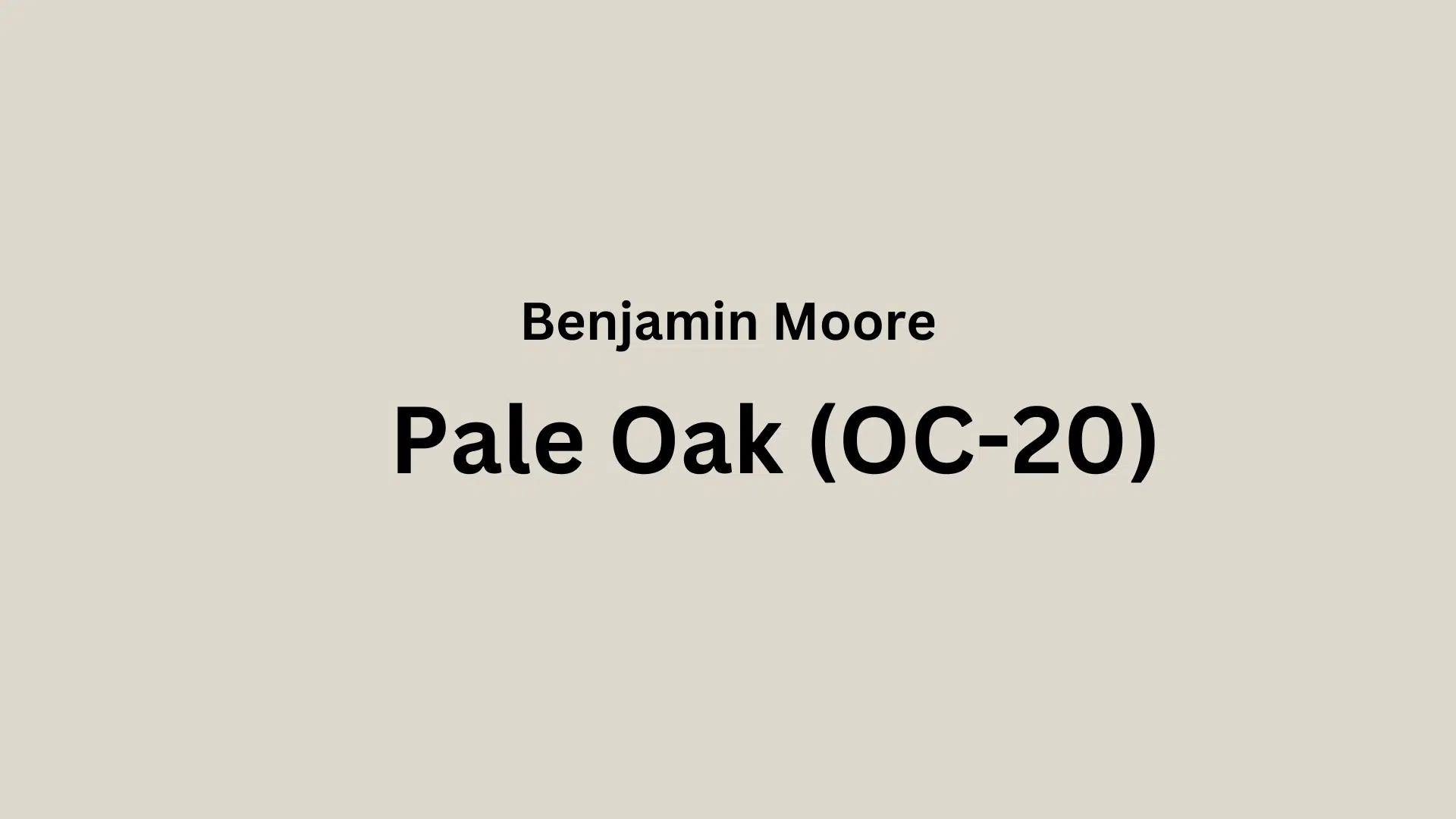
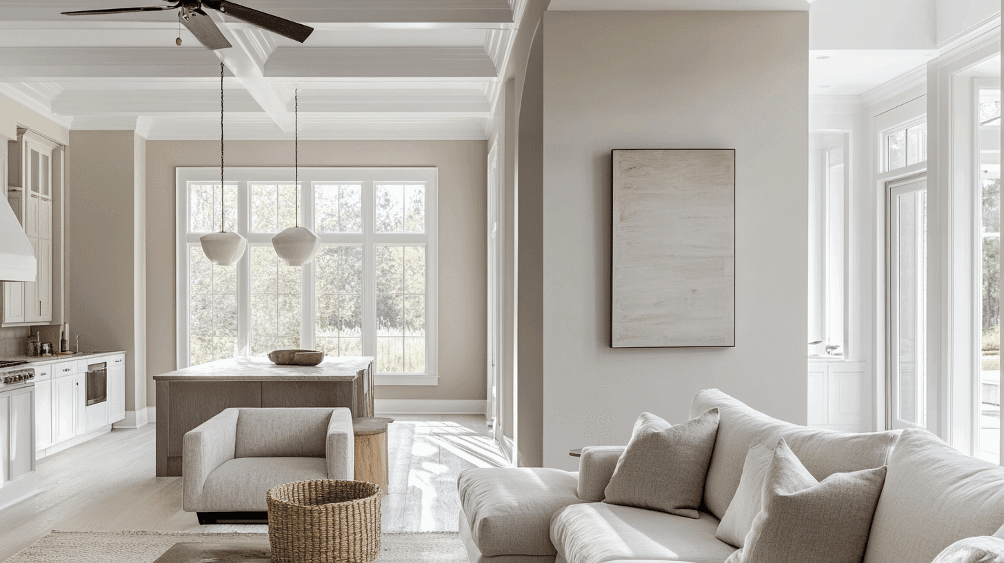
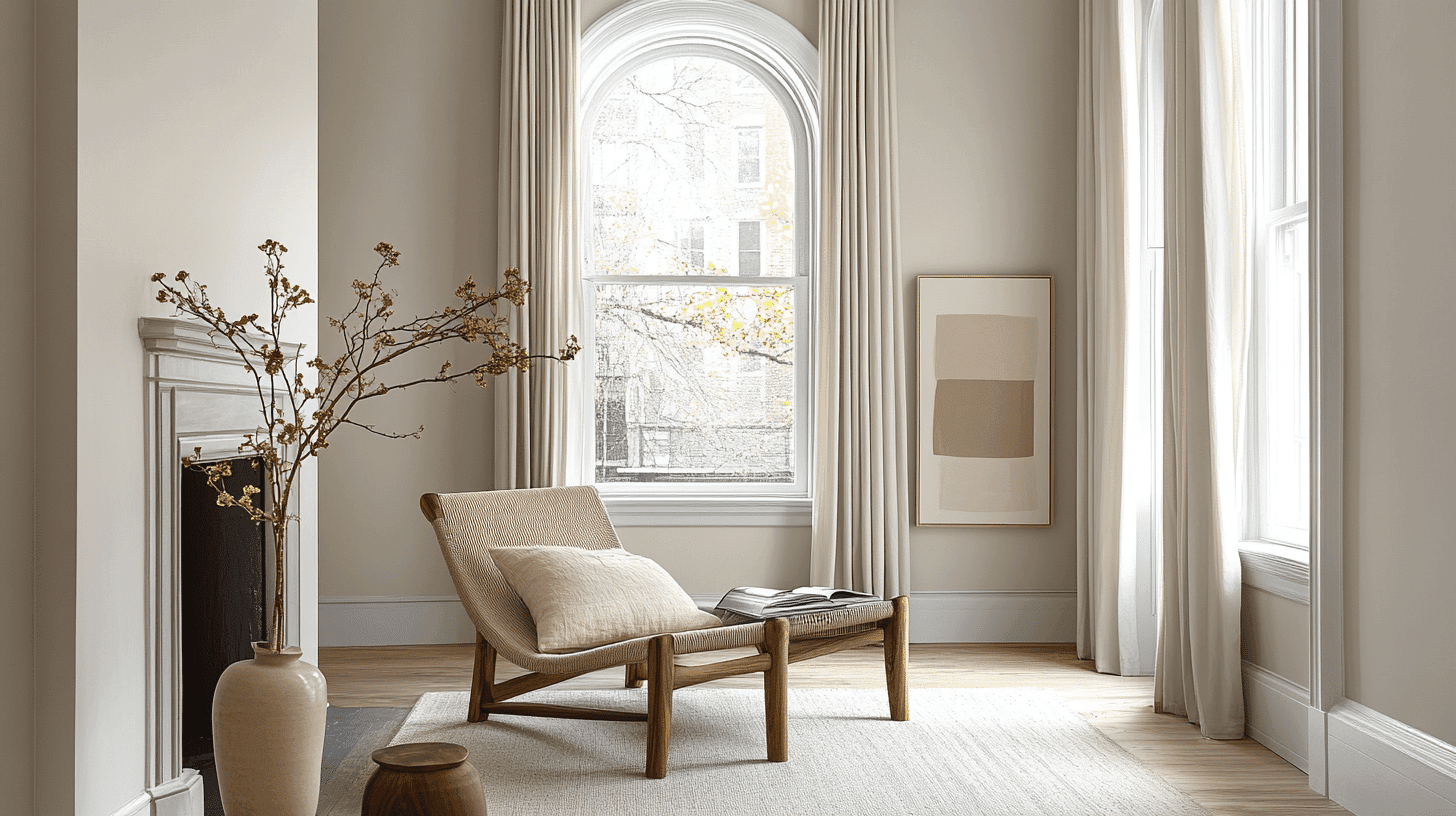
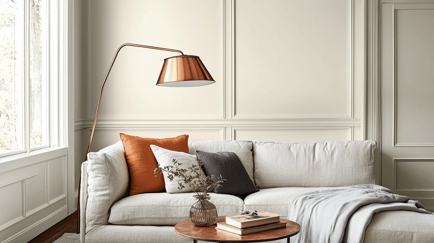
1. Living Spaces and Open Floor Plans
- Pale Oak (OC-20) shines in open floor plans thanks to its versatile greige undertones, which create a smooth visual flow between connected rooms.
- The 68.64 LRV of Pale Oak reflects enough light to keep spaces feeling airy while providing more depth and coziness than stark whites.
- For added interest, pair Pale Oak walls with lighter trim in White Dove (OC-17) or slightly darker accents in Revere Pewter (HC-172).
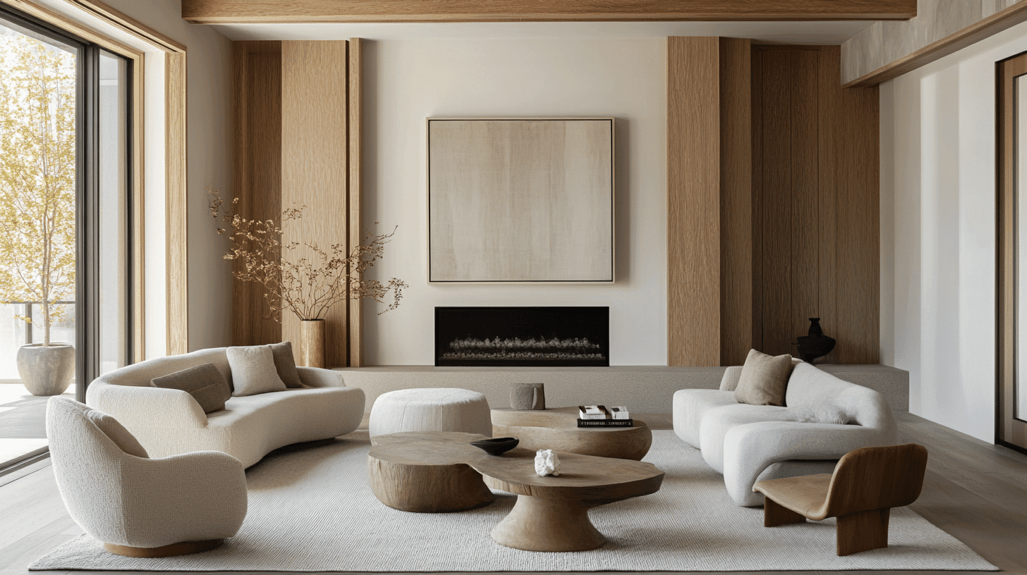
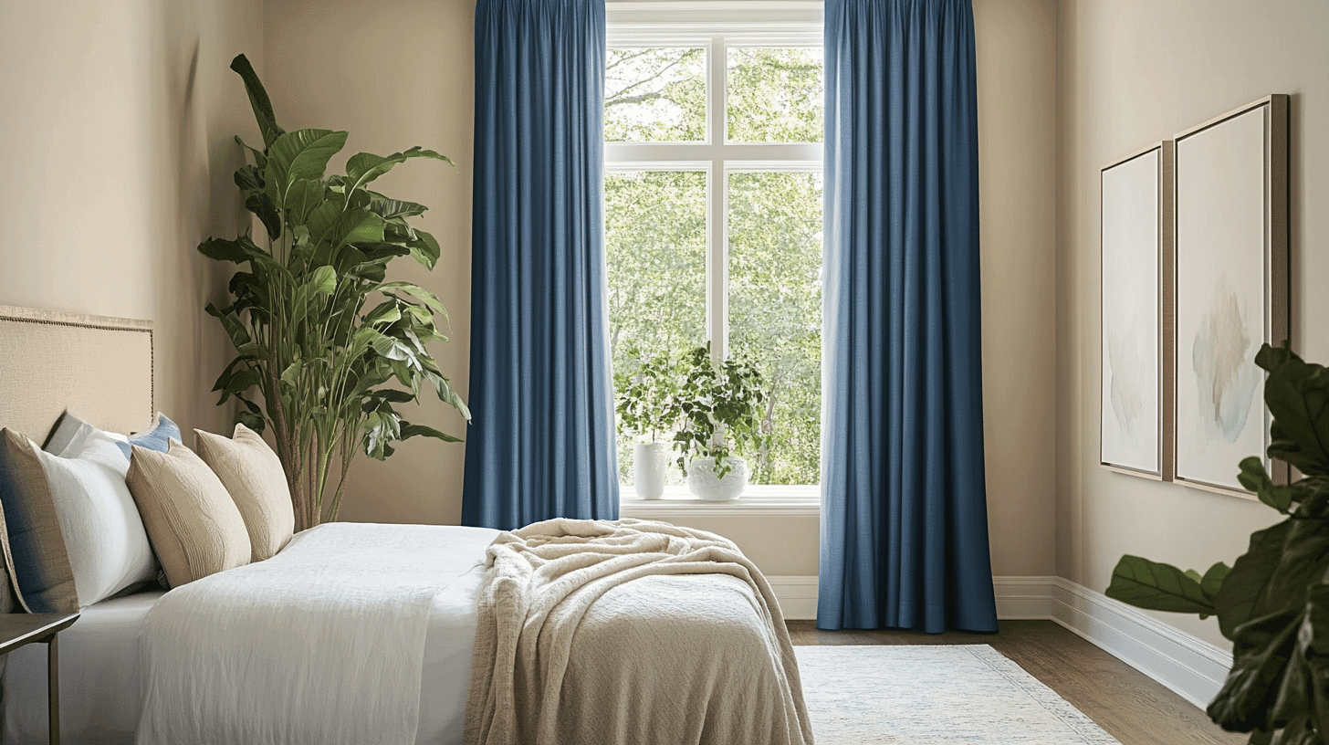
2. Bedrooms and Relaxation Areas
- Pale Oak creates a gentle, calming atmosphere in bedrooms without feeling cold or impersonal.
- The warm, greige undertones in Pale Oak help promote rest and relaxation while keeping the space bright enough to feel spacious.
- Consider Pale Oak for bedroom ceilings. It can soften harsh lighting and create a more peaceful environment than bright white overhead.
3. Kitchens and High-Traffic Zones
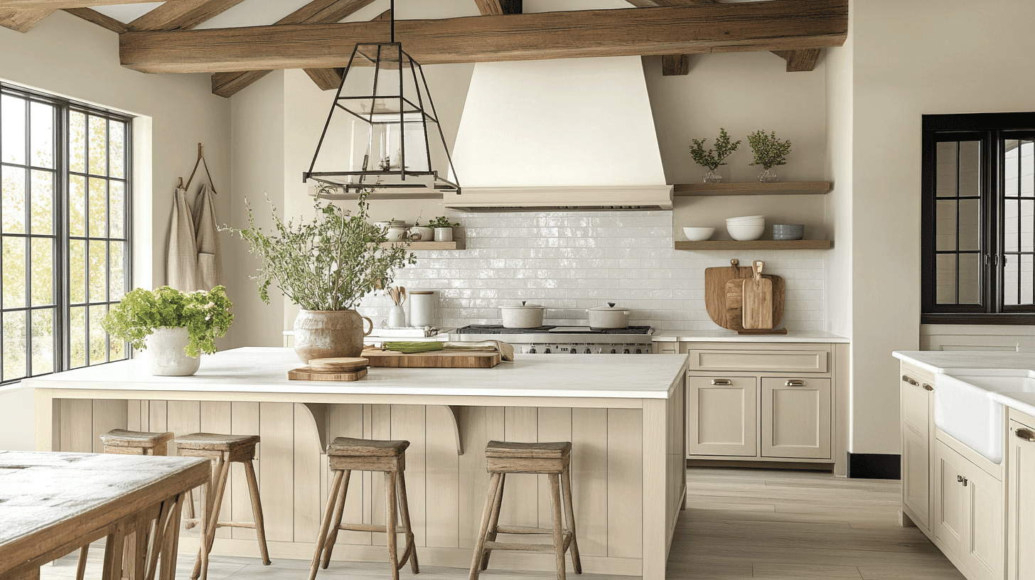
- Pale Oak in eggshell or satin finish performs well in busy areas, while its depth helps hide fingerprints and minor marks better than lighter whites.
- The balanced warmth of Pale Oak works with both cool quartz countertops and warm wood cabinets without clashing with either.
- Pale Oak creates a timeless backdrop for stainless steel appliances and various cabinet colors, making it flexible for kitchen updates over time.
4. Bathrooms and Spa-like Retreats
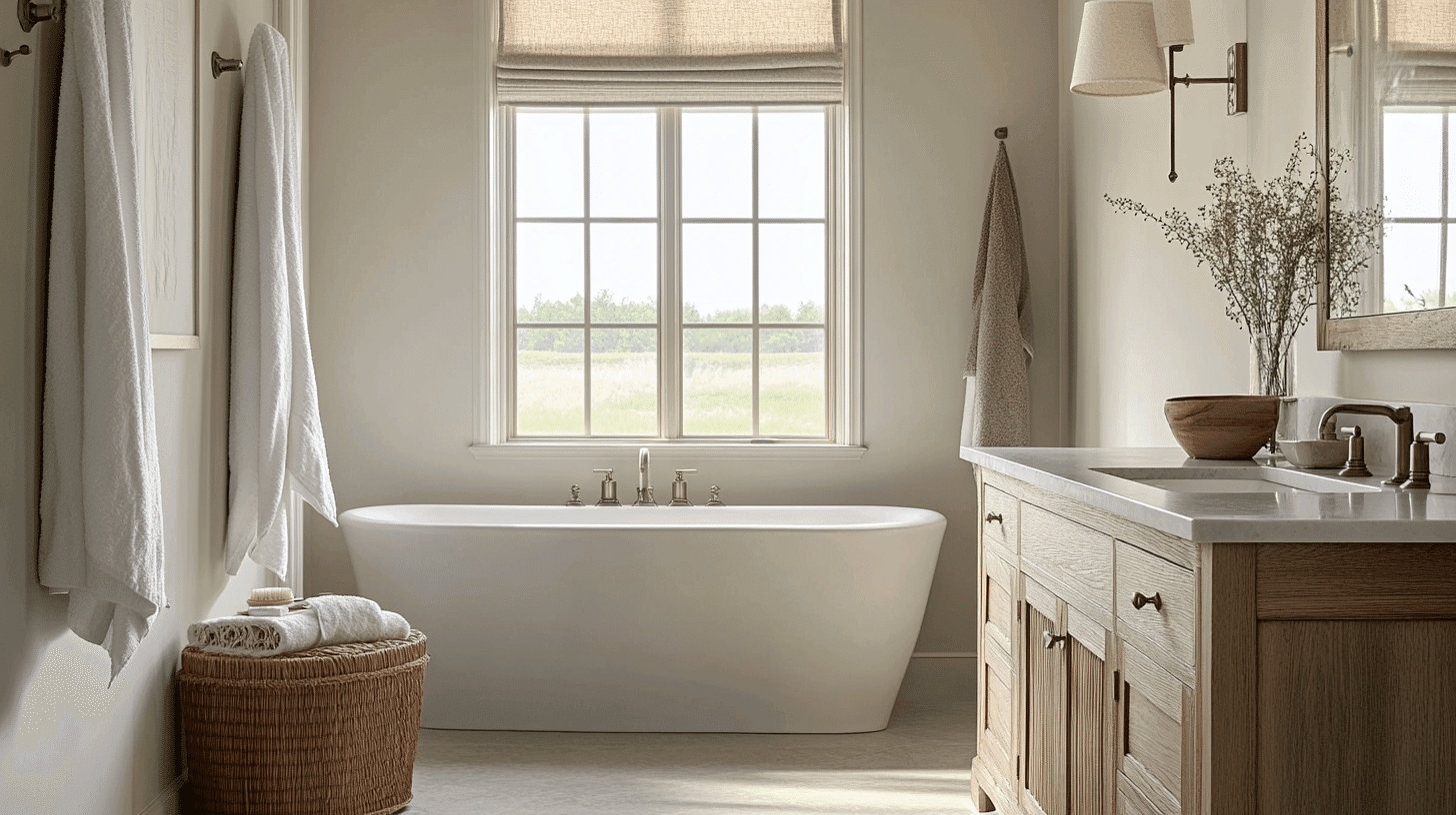
- Pale Oak brings a peaceful, spa-like feeling to bathrooms, with its soft, greige undertones warming up the clinical look of white fixtures.
- This versatile neutral works beautifully with marble, chrome, and brass elements, creating a coordinated look with various bathroom materials.
- In smaller bathrooms, Pale Oak helps make the space feel larger while providing a foundation that feels fresh rather than sterile.
Color Pairings and Combinations for Benjamin Moore Pale Oak (OC-20)
Pale Oak is a refined greige (gray-beige) with soft, warm undertones. Its moderate Light Reflectance Value (LRV) of 68.64 makes it a versatile neutral that adds subtle warmth to spaces while maintaining an airy feel.
This graceful neutral works beautifully as both a main wall color and a complementary shade.
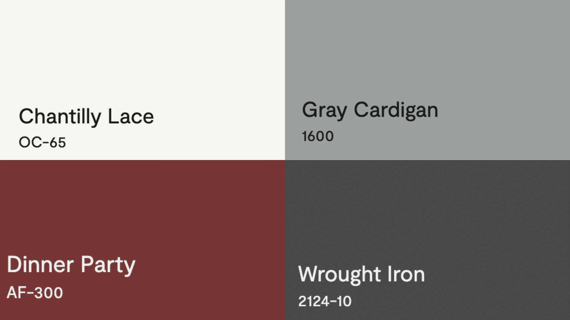
Complementary Trim Colors and Combinations
- Chantilly Lace (OC-65) – A crisp, clean white that creates a refined contrast against Pale Oak’s warmth, perfect for trim, moldings, and ceilings
- Gray Cardigan (1600) – A deeper greige that creates a cultured monochromatic palette when paired with Pale Oak, excellent for accent walls or adjacent rooms
- Dinner Party (AF-300) – A rich, muted plum that offers a subtle pop of color while maintaining the cultured feel of Pale Oak, ideal for accent furniture or a dining room adjacent to Pale Oak walls
- Wrought Iron (2124-10) – A soft black with blue undertones that provides dramatic contrast, perfect for statement elements like interior doors, window frames, or exterior accents alongside Pale Oak
Creating Cohesive Color Schemes
1. Monochromatic Scheme
- Pale Oak (OC-20) for main walls
- Chantilly Lace (OC-65) for trim and moldings
- White Dove (OC-17) for ceilings
- Kingsport Gray (HC-86) for accent pieces or adjoining rooms
2. Warm Color Scheme
- Pale Oak (OC-20) for main living areas
- Muslin (OC-12) for dining room
- Shaker Beige (HC-45) for hallways
- Manchester Tan (HC-81) for bedrooms
3. Cool Color Scheme
- Pale Oak (OC-20) for main walls
- Stonington Gray (HC-170) for bathrooms
- Silver Chain (1472) for bedrooms
- Chelsea Gray (HC-168) for home office
Coordinating with Furniture and Decor
1. Wood Tones
Rich walnut and mahogany create a striking contrast against Pale Oak’s soft, greige base. Medium-toned woods like cherry and oak complement its versatile undertones, creating a harmonious connection.
Bleached or whitewashed woods pair beautifully for a modern, Scandinavian-inspired aesthetic.
2. Metals
Warm metals like brushed brass and copper improve Pale Oak’s subtle warmth, adding dimension and classiness.
Matte black hardware provides a contemporary contrast without fantastic light neutral. This versatile color supports mixed metal finishes, allowing for more design flexibility.
3. Decor
Textiles in soft blues, greens, and lavenders pull out the subtle complexity of Pale Oak while creating a serene atmosphere.
Natural materials in varying textures add depth without competing with the subtle wall color. Live plants and botanical elements bring organic texture and life to spaces painted in this classic neutral.
Similar Paint Colors: Perfect Alternative to Benjamin Moore Pale Oak (OC-20)
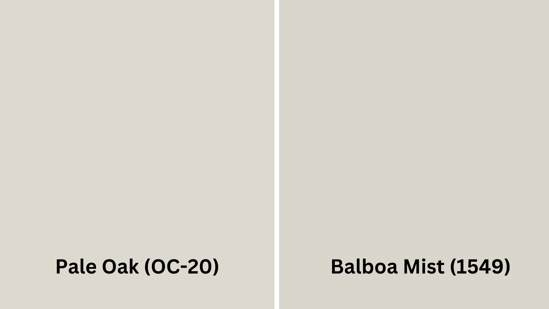
Pale Oak (OC-20) vs. Balboa Mist (1549)
- Refined greige with soft, warm undertones that lean slightly pink-beige
- A moderate LRV of 68.64 provides warmth while maintaining an airy feel
- Creates a versatile neutral backdrop that adapts beautifully to various lighting conditions
- Lighter greige with cooler gray undertones and less warmth than Pale Oak
- A higher LRV of 65.53 offers more light reflection for a brighter overall appearance
- It provides a more contemporary feeling that works especially well in south-facing rooms with abundant natural light
Final Thoughts
Pale Oak Benjamin Moore (OC-20) is a versatile paint color that can be used in almost any home. Its soft, greige tone creates spaces that feel warm and calm without being too plain.
If you’re painting living rooms, bedrooms, kitchens, or bathrooms, Pale Oak adapts beautifully. It pairs wonderfully with whites like Chantilly Lace for trim, deeper grays for drama, or even pops of color like muted plum.
This versatile neutral looks great with all kinds of wood, metals, and decor. If you want a home that feels both current and timeless, Pale Oak delivers without going out of style quickly.
Ready to change your space with the perfect neutral? Grab a sample of Pale Oak today and see how this chameleon color can bring your walls to life!

Alex Guerrero, a graduate with a Fine Arts degree from the Rhode Island School of Design, has been a visionary in the world of color and design for over 15 years. His professional journey began in the heart of the fashion industry in Milan, where he developed an acute sense for color harmonies and trends. Alex joined our team in 2018, offering fresh and innovative perspectives on color utilization in various spaces. Renowned for his ability to blend contemporary trends with timeless elegance. Outside of work, Alex is an accomplished painter and a volunteer art therapist, his artistic talents further enriching his professional insights.