In the vast palette of home design possibilities, neutral paints are the unsung heroes of interior transformation.
More than just “safe” choices, the perfect neutral can breathe life into a room, creating atmospheres that range from warm and inviting to dramatically refined.
Guiding the seemingly endless sea of swatches labeled “neutral” can feel like searching for five identical grains of sand on a beach.
Yet within this spectrum lie distinct personalities—whites that whisper rather than shout, greiges that bridge design worlds, and deeper tones that embrace rather than overwhelm.
This guide unveils five exceptional neutral paints that transcend the ordinary, each with its character and voice in the conversation of your home’s design story.
Timeless Neutrals: Finding Your Perfect Shade
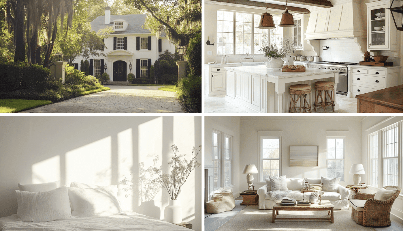
Choosing the right neutral paint color transforms a house into a home, creating a canvas that complements every design choice.
Neutrals aren’t just safe options—they’re refined foundations that stand the test of time while allowing your personality to shine through other elements.
The perfect neutral creates balance, expands space visually, and adapts to changing light throughout the day.
From warm beiges that create cozy sanctuaries to cool grays that deliver modern elegance, the best neutral colors work harmoniously with various textures and accent pieces.
When selecting your neutral, consider your home’s natural light exposure—north-facing rooms benefit from warmer neutrals to counterbalance cool light.
At the same time, south-facing spaces can handle cooler tones without feeling sterile. Test samples on different walls and observe them throughout the day before committing.
Remember that undertones make all the difference in neutrals. What appears as a simple beige might reveal pink, yellow, or green undertones that dramatically affect how the color feels in your space. The most versatile neutrals tend to have balanced undertones that don’t lean too heavily in any direction.
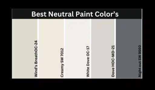
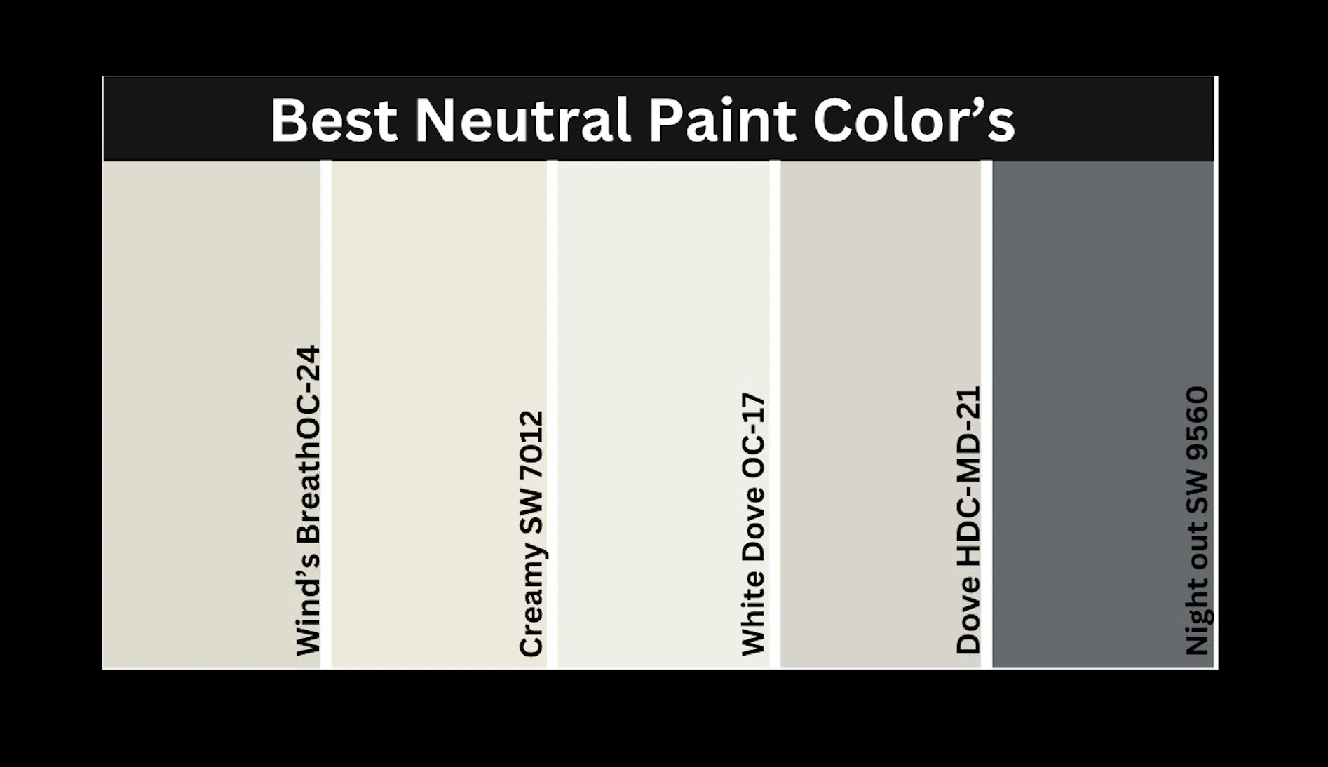
A List of Best Neutral Paints that I Recommend
- Benjamin Moore White Dove – A soft, warm white with subtle gray undertones
- Sherwin Williams Creamy – A warm, inviting neutral with subtle yellow undertones
- Benjamin Moore Winds Breath OC-24 – An advanced greige that bridges warm and cool
- Sherwin Williams Night Out SW 9560 – A rich, deep neutral for dramatic spaces
- Behr’s Dove HDC-MD-21 – A perfectly balanced neutral with versatile applications
In this section, I’ll explain why I recommend each of these shades for different spaces in my home, what makes them unique, and how they bring out the best in my interior design.
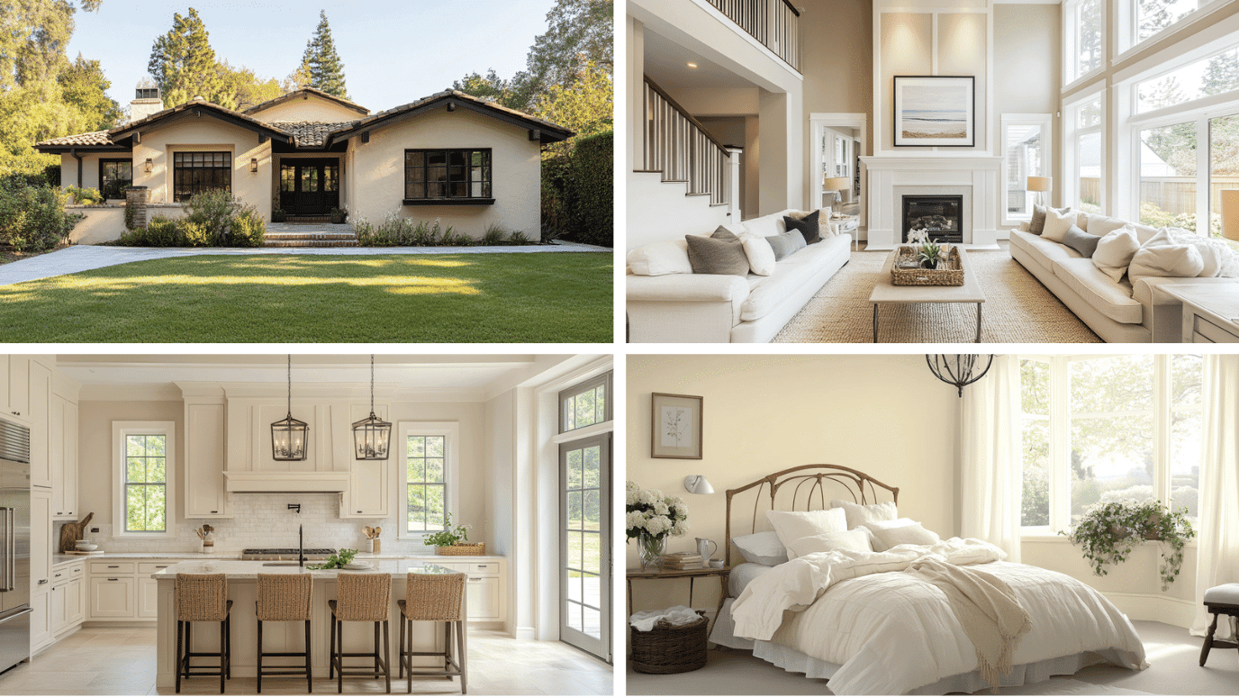
1. Benjamin Moore White Dove
Benjamin Moore White Dove is my go-to for creating a soft and inviting atmosphere in any room.
It’s perfect for spaces that need a warm and refined look without feeling too stark. I love how it adds subtle depth while brightening spaces with natural light.
| COLOR ATTRIBUTE | VALUE |
|---|---|
| RGB Value | (239, 238, 229) |
| HEX Code | #EFEEE5 |
| LRV (Light Reflectance Value) | 83.16 |
Classic Beauty
- White Dove is a soft, warm white with subtle gray undertones that create a welcoming and refined atmosphere.
- This versatile neutral provides the perfect canvas for expressing your unique style while maintaining a classic style.
Ideal for Any Space
- Kitchens appear bright and inviting with a soft, refined finish.
- Bedrooms transform into peaceful retreats that promote relaxation.
- Living areas feel more open and welcoming for family and guests.
Versatile Companion
- Bold accent colors appear more balanced and harmonious against this neutral backdrop.
- Natural materials like wood and stone create beautiful organic contrast.
- All metallic finishes, from brass to chrome, complement its adaptable palette.
Emotional Benefits
- Promotes a sense of calm and clarity in busy environments.
- Creates a feeling of expanded space while maintaining warmth.
- Inspires creativity by providing a warm yet neutral canvas for personal expression.
2. Sherwin Williams Creamy
Sherwin Williams Creamy is my favorite for creating a warm and welcoming atmosphere in any room.
It’s perfect for spaces that need a cozy and inviting look without feeling too yellow. I love how it brings a subtle luminosity to spaces while maintaining a comfortable ambiance.
| COLOR ATTRIBUTE | VALUE |
|---|---|
| RGB Value | (239,232,219) |
| HEX Code | #EFE8DB |
| LRV (Light Reflectance Value) | 81 |
Cozy Refinement
- Creamy is a warm off-white with gentle yellow undertones that create a nurturing and inviting atmosphere.
- This versatile neutral provides a welcoming canvas for expressing your unique style while maintaining refined comfort.
Ideal for Any Space
- Kitchens appear warm and inviting with a soft, lived-in style.
- Bedrooms transform into nurturing retreats that promote comfort and relaxation.
- Living areas feel more intimate and embracing for family and guests.
Versatile Companion
- Rich, saturated colors appear more grounded and harmonious against this warm backdrop.
- Natural materials like wood and stone blend perfectly for an organic, cohesive look.
- Antique and vintage pieces feel at home against its heritage-inspired palette.
Emotional Benefits
- Promotes a sense of comfort and tradition in modern environments.
- Creates a feeling of gentle warmth in larger, open spaces.
- Inspires a balance of creativity and calmness for everyday living.
3. Benjamin Moore Winds Breath OC-24
Benjamin Moore Winds Breath OC-24 is my go-to for creating a balanced and advanced atmosphere in any room.
It’s perfect for spaces that need a versatile and refined look that bridges warm and cool. I love how it brings a subtle depth to spaces while maintaining a contemporary feel.
| COLOR ATTRIBUTE | VALUE |
|---|---|
| RGB Value | (223, 219, 205) |
| HEX Code | #DFDBCD |
| LRV (Light Reflectance Value) | 69.59 |
Advance Balance
- Winds Breath is a refined greige with balanced undertones that create a serene and contemporary atmosphere.
- This versatile neutral provides an adaptable canvas for expressing your unique style while maintaining subtle complexity.
Ideal for Any Space
- Kitchens appear fresh and advanced with a subtle, refined character.
- Bedrooms transform into peaceful sanctuaries that promote true relaxation.
- Living areas feel more balanced and harmonious for family and guests.
Versatile Companion
- Both cool and warm accent colors appear true and balanced against this neutral backdrop.
- Natural materials like wood and stone create a beautiful, seamless integration.
- All metallic finishes, from silver to gold, complement its adaptable palette.
Emotional Benefits
- Promotes a sense of balance and serenity in busy environments.
- Creates a feeling of thoughtful refinement in any space.
- Inspires nuanced creativity by providing a subtle canvas for personal expression.
4. Sherwin Williams Night Out SW 9560
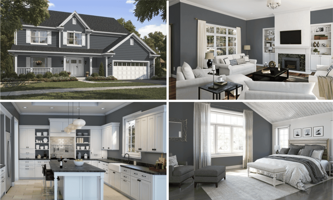
Sherwin Williams Night Out SW 9560 is my go-to for creating a dramatic and cozy atmosphere in any room.
It’s perfect for spaces that need depth and character without feeling too dark or heavy. I love how it brings richness to spaces while maintaining a contemporary style.
| COLOR ATTRIBUTE | VALUE |
|---|---|
| RGB Value | (101,106,110) |
| HEX Code | #656A6E |
| LRV (Light Reflectance Value) | 14 |
Dramatic Depth
- Night Out is a rich, deep neutral with complex undertones that create a stylish and advanced atmosphere.
- This bold neutral provides a statement canvas for expressing your unique style while maintaining modern refinement.
Ideal for Any Space
- Dining rooms appear stylish and intimate with a dramatic, atmospheric finish.
- Accent walls transform into focal points that add depth and character.
- Home offices feel more focused and professional for productivity and inspiration.
Versatile Companion
- Light accent colors appear more vibrant and defined against this deep backdrop.
- Natural materials like light wood and marble create a striking contrast.
- Metallic accents, especially gold and brass, shine brilliantly against its rich palette.
Emotional Benefits
- Promotes a sense of focus and sophistication in any environment.
- Creates a feeling of intimacy and comfort in larger spaces.
- Inspires bold creativity by providing a dramatic canvas for personal expression.
5. Behr’s Dove HDC-MD-21
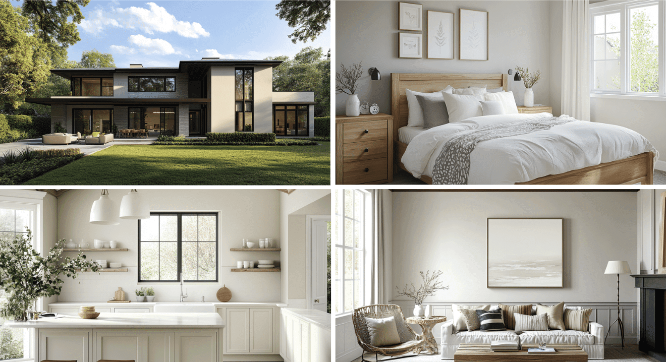
Behr’s Dove HDC-MD-21 is my go-to for creating a balanced and versatile atmosphere in any room.
It’s perfect for spaces that need a neutral and adaptable look without feeling too warm or cool. I love how it brings a subtle sophistication to spaces while maintaining a timeless quality.
| COLOR ATTRIBUTE | VALUE |
|---|---|
| RGB Value | (217, 212, 203) |
| HEX Code | #D9D4CB |
| LRV (Light Reflectance Value) | 66 |
Perfect Balance
- Dove is a versatile neutral with balanced undertones that create a calm and timeless atmosphere.
- This adaptable neutral provides a flexible canvas for expressing your unique style while maintaining subtle sophistication.
Ideal for Any Space
- Kitchens appear clean and inviting with a balanced, timeless finish.
- Bedrooms transform into peaceful retreats that promote relaxation.
- Living areas feel more open and adaptable for family and guests.
Versatile Companion
- All accent colors appear true and harmonious against this balanced backdrop.
- Natural materials like wood and stone integrate beautifully for a cohesive look.
- All metallic finishes complement its adaptable palette.
Emotional Benefits
- Promotes a sense of calm and balance in busy environments.
- Creates a feeling of timeless style in any space.
- Inspires versatile creativity by providing a truly neutral canvas for personal expression.
Best Dark Colors to Pair with Neutrals
| DARK COLOR | BEST NEUTRAL PAIRING |
|---|---|
| Black | Benjamin Moore White Dove, Behr’s Dove |
| Navy Blue | Sherwin Williams Creamy, Benjamin Moore Winds Breath |
| Forest Green | Benjamin Moore Winds Breath, Sherwin Williams Creamy |
| Charcoal | Benjamin Moore White Dove, Behr’s Dove |
| Dark Purple | Sherwin Williams Creamy, Benjamin Moore White Dove |
| Dark Brown | Benjamin Moore Winds Breath, Sherwin Williams Creamy |
| Dark Gray | Behr’s Dove, Benjamin Moore White Dove |
| Teal | Sherwin Williams Night Out, Behr’s Dove |
| Burgundy | Sherwin Williams Creamy, Benjamin Moore White Dove |
| Dark Green-Gray | Benjamin Moore Winds Breath, Behr’s Dove |
| Dark Blue-Gray | Behr’s Dove, Benjamin Moore White Dove |
| Chocolate Brown | Sherwin Williams Creamy, Benjamin Moore Winds Breath |
Summing It Up
Choosing the perfect neutral paint depends on your specific space and desired atmosphere. Benjamin Moore White Dove offers a soft, warm white with subtle gray undertones, ideal for stylish, refined spaces.
Sherwin Williams Creamy is a warm, inviting neutral with subtle yellow undertones, perfect for cozy, welcoming designs.
Benjamin Moore Winds Breath OC-24 is an advanced greige that bridges warm and cool tones, excellent for versatile, contemporary environments.
Sherwin Williams Night Out SW 9560 brings rich depth with complex undertones, ideal for dramatic, intimate spaces. Behr’s Dove HDC-MD-21 offers a perfectly balanced neutral that adapts to any style.
Each neutral brings unique qualities to enhance your home. Consider your room’s lighting, existing décor, and the feeling you want to evoke.
Pair these neutrals with complementary dark colors to create striking contrasts that raise your interior design. Whatever your style preference, this neutral paint collection offers the perfect shade to transform your space.

Alex Guerrero, a graduate with a Fine Arts degree from the Rhode Island School of Design, has been a visionary in the world of color and design for over 15 years. His professional journey began in the heart of the fashion industry in Milan, where he developed an acute sense for color harmonies and trends. Alex joined our team in 2018, offering fresh and innovative perspectives on color utilization in various spaces. Renowned for his ability to blend contemporary trends with timeless elegance. Outside of work, Alex is an accomplished painter and a volunteer art therapist, his artistic talents further enriching his professional insights.