Sherwin Williams Alabaster (SW 7008) has earned its reputation as a designer favorite for its exceptional versatility and timeless appeal.
This warm white shade, with its subtle beige undertones and an LRV of 82, creates the perfect canvas for countless design possibilities.
Understanding Alabaster’s unique properties allows you to select coordinating colors and create balanced, refined spaces that flow from room to room.
If you’re refreshing your living space, updating kitchen cabinets, or transforming your home’s exterior, Alabaster provides a soft, inviting foundation that pairs beautifully with both bold statements and subtle accents.
In this guide, we’ll explore the most complementary color pairings that enhance Alabaster’s warm refinement, helping you create balanced, cohesive spaces that showcase this versatile shade at its very best.
What is Sherwin Williams’ Alabaster?
Alabaster (SW 7008) is like the first light of dawn captured in a paint can a warm white that whispers rather than shouts. Neither stark nor yellow, it exists in that perfect balance where serenity meets substance.
This chameleon color changes with the changing light: morning brings out its creamy softness, while evening light reveals subtle depth and dimension. In modern spaces, Alabaster creates crisp, clean backdrops; in traditional rooms, it wraps spaces in timeless elegance.
Designers treasure it for its versatility across walls, trim, cabinets, and ceilings a unifying element that feels intentional yet effortless. Alabaster isn’t just white; it’s white perfected.
LRV (Light Reflectance Value)
Alabaster (SW 7008) has an LRV of 82, striking the perfect balance between brightness and warmth. This higher LRV means it reflects 82% of light, making it ideal for darker spaces without appearing stark or clinical.
In dimly lit rooms, it maximizes available light, while in sun-drenched areas, it softens to prevent glare. This versatile reflectance creates a welcoming glow in any lighting condition.
Undertone
Alabaster (SW 7008) carries subtle, warm undertones that balance perfectly between creamy and neutral. Unlike cooler whites, it has faint hints of yellow and beige that prevent it from appearing stark or sterile.
These gentle undertones remain soft enough to read as “true white” in most lighting while providing just enough warmth to create inviting, comfortable spaces without veering to yellow.
Lighting
- North-facing rooms: Alabaster appears softer, with warm undertones more visible
- Southern exposure: Brightens significantly for a cleaner, crisper appearance
- East-facing spaces: Morning light brings out warmth; afternoon light neutralizes
- West-facing rooms: Cooler inthe mornings, warmer golden glow in the evenings
- Artificial lighting: Incandescent enhances warmth; LEDs maintain true color
- Always test in your specific lighting conditions before full application
Colors you can pair with Alabaster (SW 7008)
Alabaster (SW 7008) is a soft, warm off-white with subtle beige undertones that creates a versatile foundation for many color palettes. This Sherwin-Williams shade offers a smart neutral base that works beautifully with numerous complementary colors.
Here are excellent color pairings that enhance Alabaster’s warm sophistication:
1. Sophisticated Grays
Gray hues like Repose Gray (SW 7015) or Dorian Gray (SW 7017) pair elegantly with Alabaster for a subtle, layered neutral scheme. These combinations work exceptionally well in transitional or contemporary spaces.
2. Warm Terracottas and Rust Tones
Colors like Cavern Clay (SW 7701) or Terra Cotta (SW 6355) enhance the warmth in Alabaster for a grounded, southwest-inspired palette that feels both current and timeless.
3. Black Accents
For a classic, high-contrast look, pair Alabaster with Tricorn Black (SW 6258) on trim, furniture, or fixtures. This combination creates a refined, timeless aesthetic that works in virtually any style home.
4. Soft Blush Tones
Soft pinks like Intimate White (SW 6322) complement Alabaster’s warmth for a subtle, feminine palette that feels fresh and inviting without becoming too sweet.
When using Alabaster as your primary wall color, these pairings can be incorporated through accent walls, furniture, textiles, and decorative elements to create cohesive and visually appealing spaces.
Comparing Alabaster With Other Whites
Sherwin Williams Alabaster or White Dove
Alabaster (SW 7008) features warm beige undertones with an LRV of 82, creating a soft, cozy atmosphere. White Dove (OC-17) has subtle gray-green undertones and a higher LRV of 83.16, appearing slightly brighter and crisper.
Alabaster excels in traditional spaces with warm lighting, while White Dove suits transitional styles and north-facing rooms needing more light reflection..
Sherwin Williams Alabaster or Greek Villa
Alabaster (SW 7008) offers warm beige undertones with an LRV of 82, creating a soft, versatile neutral. Greek Villa (SW 7551) is brighter with yellow undertones and a higher LRV of 84, giving spaces more luminosity.
Alabaster creates cozy, refined environments ideal for traditional settings, while Greek Villa brightens rooms and works well in Mediterranean or contemporary designs where a cleaner, more reflective white is desired.
Alabaster for your Space
Whole Home Color
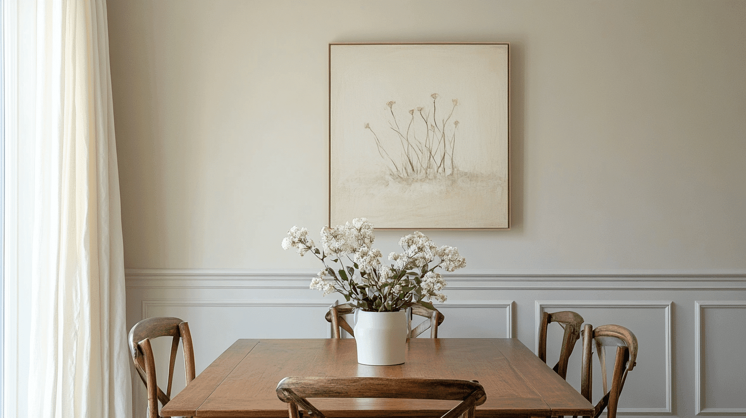
Using Alabaster as your whole-home color creates an effortless, refined flow from room to room while providing a neutral backdrop that adapts beautifully to changing light conditions. This warm white works exceptionally well as a whole-home solution because:
- It provides a consistent neutral foundation that allows details to shine
- The subtle warmth prevents spaces from feeling cold or sterile
- It complements both cool and warm accent colors, allowing for design flexibility in each room
- The moderate LRV (82) offers brightness without harsh glare in sunny rooms
- It transitions smoothly between spaces with different lighting conditions
Cabinets
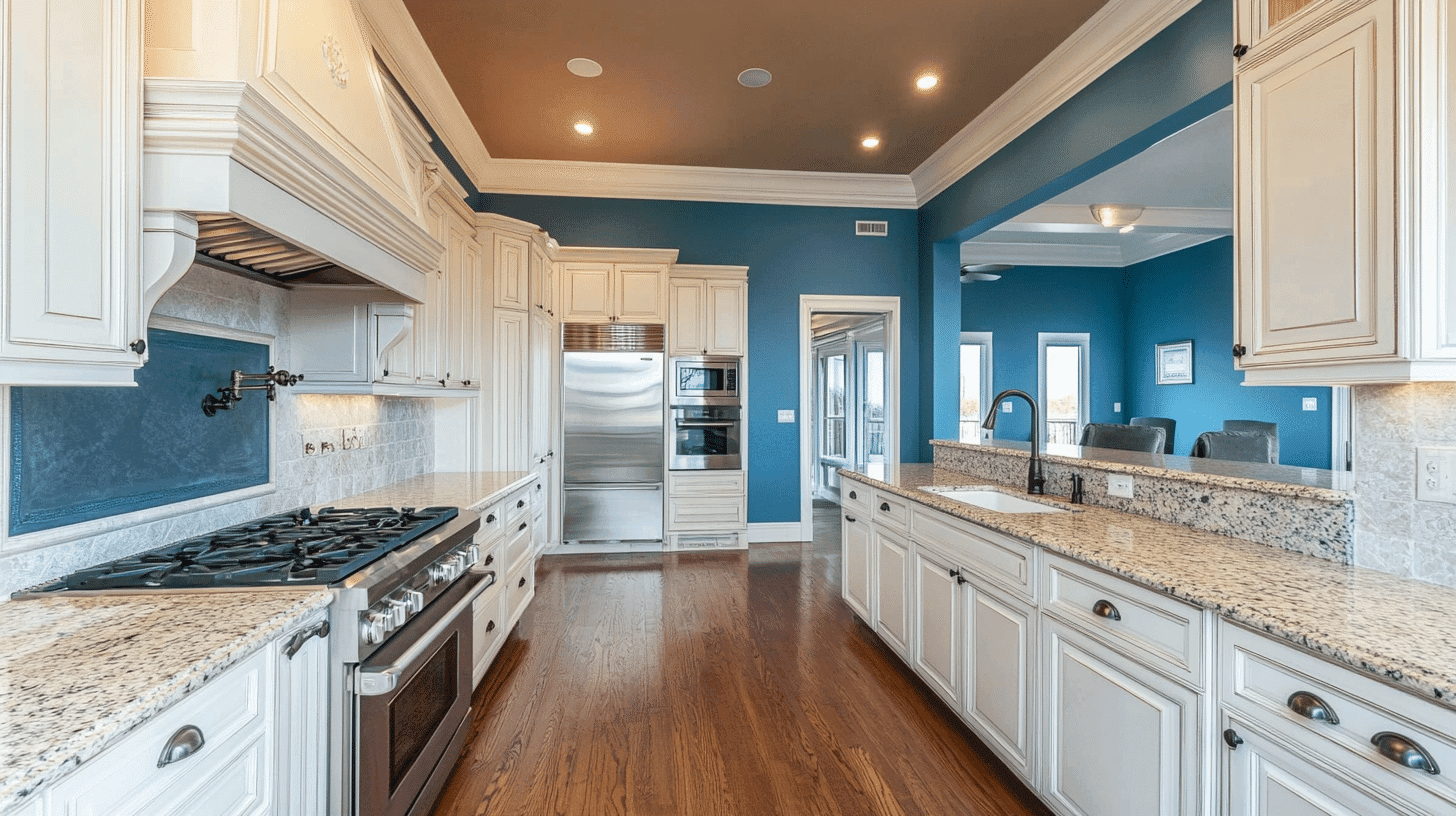
Alabaster (SW 7008) makes an exceptional choice for kitchen and bathroom cabinets, offering a timeless alternative to stark white or bold colored cabinetry. Its warm undertones create a soft, inviting look that complements a wide range of countertop materials and backsplash options.
On cabinets, Alabaster provides:
- A clean, fresh appearance without the harsh brightness of pure white
- Subtle warmth that pairs beautifully with natural stone, wood elements, and metallics
- Versatility to work in traditional, transitional, or modern kitchen designs
Trim and Doors

Alabaster (SW 7008) creates a refined, versatile option for trim and doors throughout your home. Its warm undertones offer a softer alternative to stark white trim while maintaining a clean, classic look that frames your spaces beautifully.
On trim and doors, Alabaster delivers:
- A subtle warmth that softens transitions between walls and architectural elements
- Enough contrast against most wall colors without the harshness of bright white
- A timeless look that complements both traditional and contemporary door styles
The exterior of your home
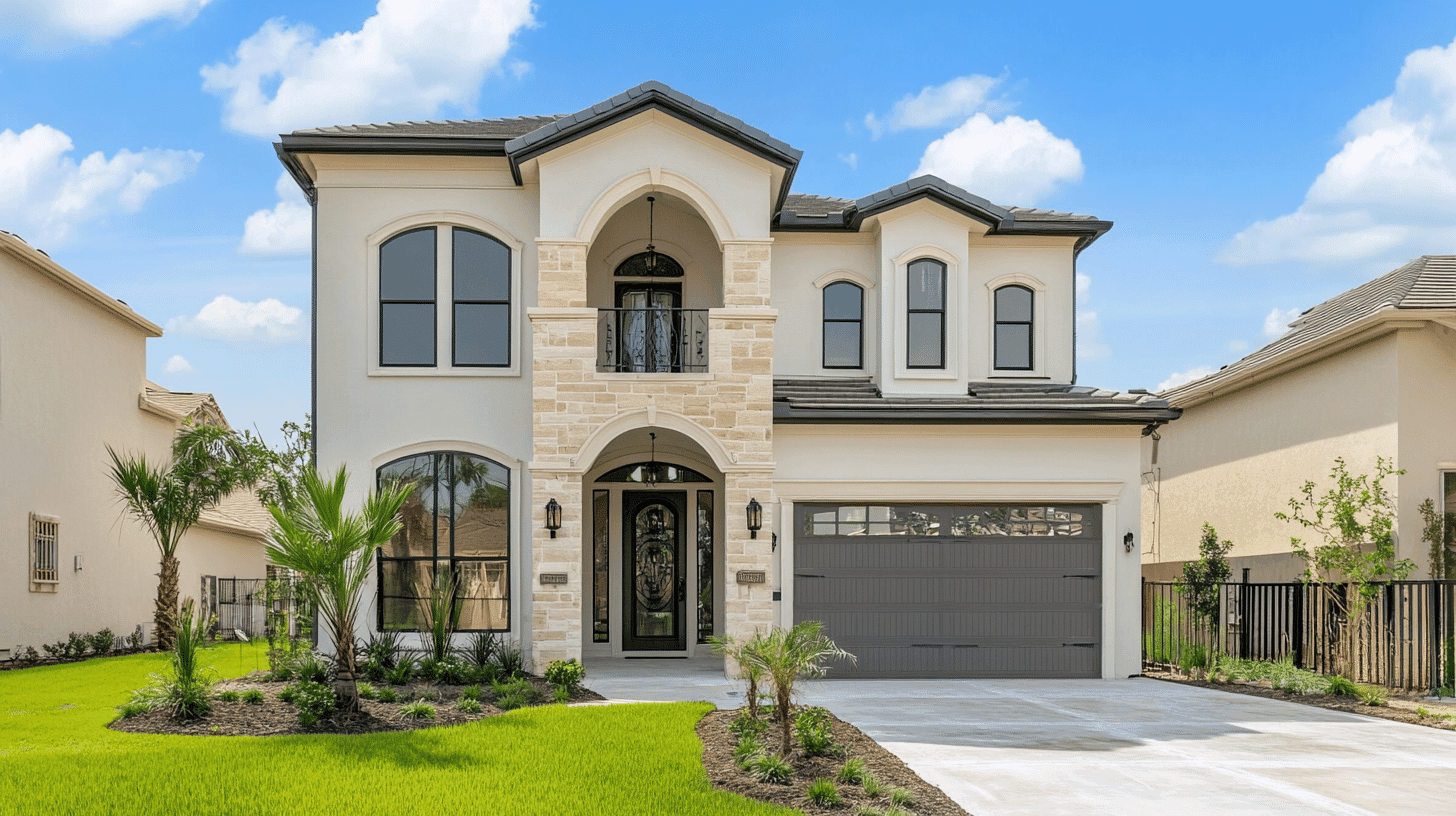
Alabaster (SW 7008) creates a timeless, sophisticated exterior that balances warmth and brightness perfectly. This versatile off-white brings elegance to any architectural style while providing practical benefits for your home’s exterior surfaces.
On home exteriors, Alabaster offers:
- A soft, warm white that doesn’t appear stark or clinical in natural light
- Enough brightness to keep your home looking fresh without a harsh glare
- Versatility to complement various roofing materials, stone accents, and landscaping
Conclusion
Sherwin Williams Alabaster (SW 7008) is not just another white paint—it’s a versatile design element that adapts beautifully to any space and provides infinite coordination possibilities.
From refined grays and dramatic black accents to warm terracottas and light blush tones, the colors you pair with Alabaster can transform your space while maintaining its timeless elegance.
Remember that lighting significantly impacts how this chameleon-like shade appears, making it essential to test your color combinations under your specific conditions.
Whether used on walls, trim, cabinets, or as a whole-home solution, Alabaster creates a cohesive foundation that allows your coordinating colors to shine.
By thoughtfully selecting companions for this refined neutral, you’ll create spaces that feel intentionally designed, invitingly warm, and effortlessly cultivated – the hallmark of truly exceptional interior design.

