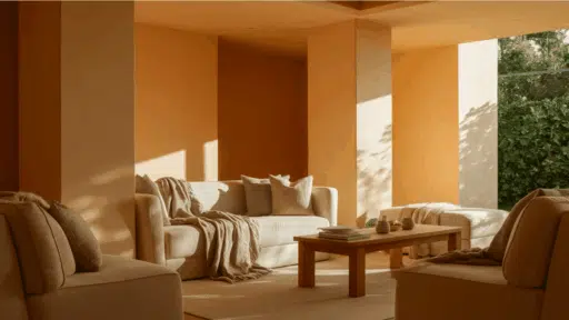
Ever wondered what paint color can make your ordinary rooms feel instantly more sophisticated?
Behr’s Cracked Pepper might be just what you’re looking for!
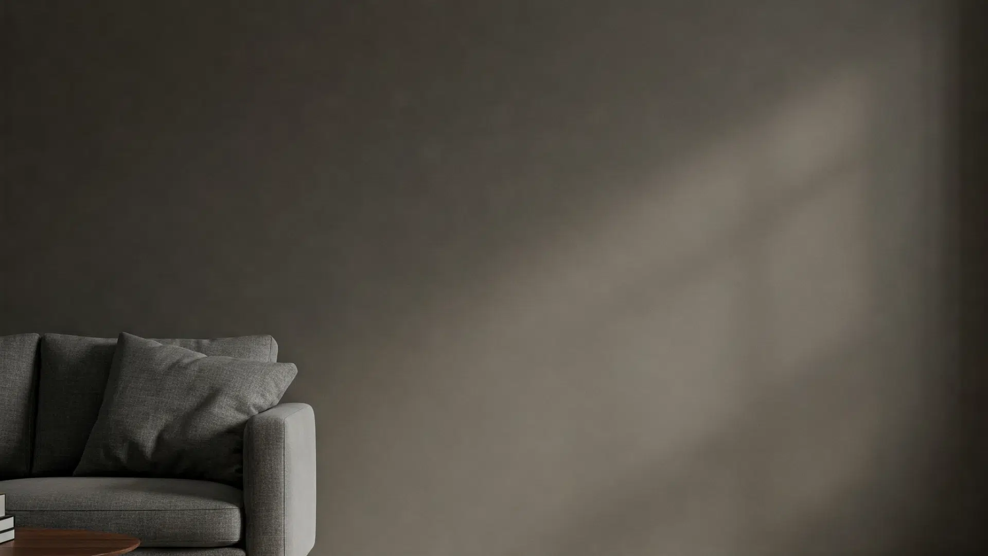
This rich, deep near-black is one of the most dramatic neutral options Behr offers.
It absorbs light, making rooms feel more intimate and luxurious.
Unlike other dark colors that can look flat or harsh, Cracked Pepper maintains subtle warm undertones that add depth regardless of lighting.
It creates a bold, designer-inspired feel that makes your furniture and décor pop with striking contrast.
This versatile dark neutral creates a refined canvas for modern and traditional styles, whether for an accent wall or the whole space.
Understanding Behr Cracked Pepper’s Basics
Behr Cracked Pepper (PPU18-01) is a versatile soft black with blue-gray undertones that shifts appearance with lighting. It is cool in daylight and warmer in dim settings.
Color Terminology
Let’s look at the technical details of Cracked Pepper
These numbers help designers and painters understand exactly what this color looks like.
| Property | Value |
|---|---|
| LRV | 8 |
| RGB | 79 / 81 / 82 |
| Hex Value | #4F5152 |
The low LRV of 8 indicates that it absorbs most of the light, making the room more intimate and cozy.
You can use the RGB and HEX VALUE when testing room designs for paintings or custom furnishings.
Undertones
- Primary blue-gray undertone that appears most prominent in bright natural light
- Occasional hint of violet undertone, particularly in south/west-facing spaces
- Reads as a neutral soft black in average lighting with minimal color bias
- Undertones are subtle and well-balanced, giving the color versatility across different design styles
Psychology of Dark Colors
Color evokes how we feel in a room, especially deep tones like Behr’s Cracked Pepper. The right dark color can make a big difference in your home.
- Rich near-blacks like Cracked Pepper: Create a feeling of sophistication and drama
- Maximum depth darks: Bring a luxurious, theater-like feeling to any room
- Neutral darks: Make spaces feel more intimate, focused, and more intentional
- Benefits: Enhances architectural details, showcases light-colored artwork beautifully, and thrives in well-lit rooms
Cracked Pepper is actually a complex neutral that Behr offers among their designer colors, but it has become popular as a bold choice in its own right.
It works as a perfect backdrop when you want your furniture, art, and decorations to stand out with striking contrast against the walls’ rich depth.
Why Choose Behr’s Cracked Pepper?
Behr’s Cracked Pepper (PPU18-01) is a sophisticated soft black with subtle blue-gray undertones that offers the perfect balance between dramatic impact and everyday livability.
As Behr’s 2024 Color of the Year, this versatile shade brings timeless elegance to any space while remaining remarkably adaptable.
1. Versatility
It complements modern, traditional, farmhouse, and industrial styles.
Performs beautifully on walls, trim, cabinets, doors, and exteriors.
Works exceptionally well with whites for contrast, earth tones for warmth, or bold accents for drama
Creates depth and interest in areas where lighter colors feel flat.
2. Key Features
LRV of 8 provides richness without the harshness of pure black.
Available in all Behr paint lines for different performance needs.
Subtle blue-gray undertones add sophistication without overwhelming.
The color of the Year 2024 ensures trend relevance.
3. Durability
Weather Resistant allows exterior formulations to withstand UV exposure and moisture.
Premium formulations resist water stains and everyday marks.
Premium formulations include scuff defense technology, which resists everyday wear in busy homes.
Has a Long-Term Appearance, maintaining color depth and finish integrity over time.
4. Texture Patterns
The Touch and Feel Quality creates a rich, velvety appearance in matte finishes.
Compatible with brush, roller, or spray application.
Sheen Selection available in flat (for depth), eggshell/satin (for balance), and semi-gloss/gloss (for impact).
Room Color Advice: Behr’s Cracked Pepper
Behr’s Cracked Pepper is a versatile soft black with subtle blue-gray undertones, creating sophisticated spaces with depth and character.
As Behr’s 2024 Color of the Year, this stylish color adapts beautifully to different lighting conditions, appearing more blue in bright spaces and deeper charcoal in dimmer settings.
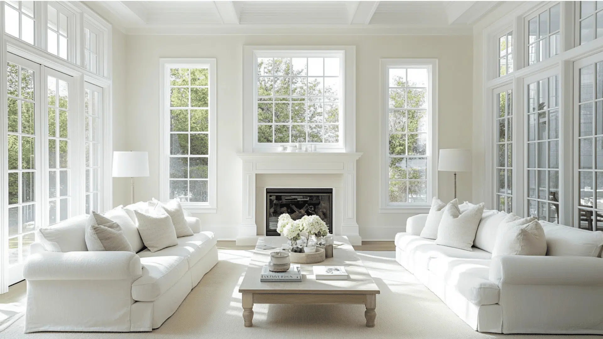
1. Living Spaces and Open Floor Plans
- The depth of Cracked Pepper creates an intimate, cozy atmosphere in living spaces while highlighting architectural features.
- Perfect for walls that create a stylish contrast against white walls and soft-toned furniture.
- Complements architectural features like fireplaces, creating a cohesive design when coordinated with door hardware.
2. Bedrooms and Relaxation Areas
- Creates an intimate atmosphere that naturally promotes relaxation, making it perfect for quality sleep and unwinding.
- Use on the wall behind your bed, especially effective when paired with lighter bedding and reflective elements to maintain balance.
- Despite its darkness, it works as a “timeless color for a kids bedroom” when paired with white or bright accent colors.
3. Kitchens and High-Traffic Zones
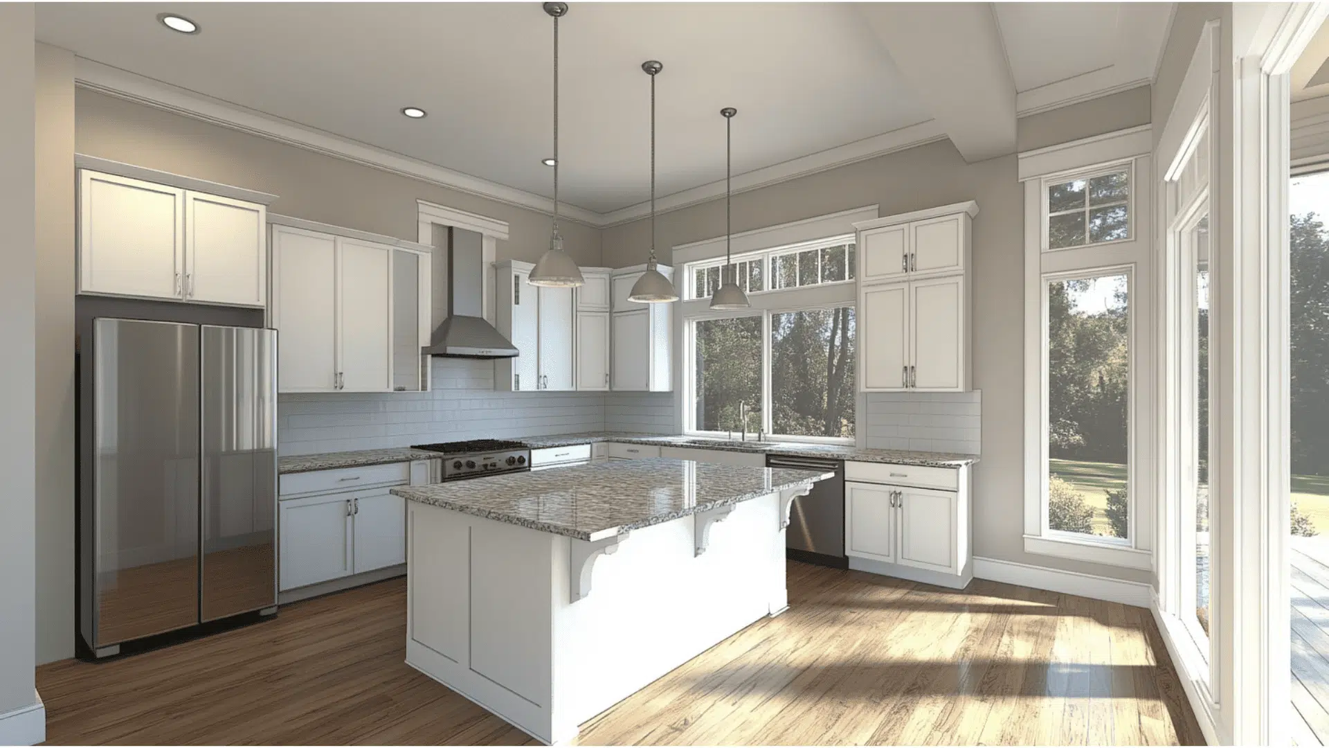
- In the kitchen, choose Behr ULTRA with SCUFF DEFENSE for superior durability against marks and moisture in busy areas.
- Select semi-gloss or satin finish in high-touch areas for optimal cleanability and stain resistance.
- Apply to kitchen islands or door frames rather than full cabinetry for impact without overwhelming.
Color Pairings for Behr’s Cracked Pepper
A versatile soft black with subtle blue-gray undertones and an LRV of 8.
Creates sophisticated, dramatic spaces while remaining approachable and livable.
Here are color pairings and combinations for Behr’s Cracked Pepper.
Complementary Trim Colors
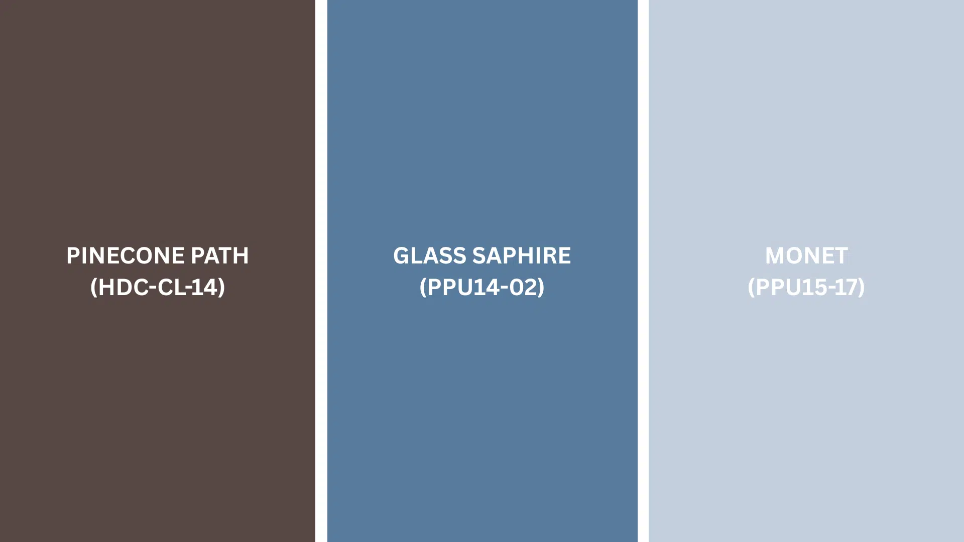
Choosing the right accent colors can make a difference when using Cracked Pepper.
Pinecone Path (HDC-CL-14) creates a rich earth-tone contrast that grounds spaces with natural warmth. It can be used for wooden elements, leather furniture, or textiles for an organic luxury feel.
Glass Sapphire (PPU14-02) offers a vibrant blue contrast that energises the soft black with contemporary appeal. It is perfect for accent pieces, artwork frames, or textiles in predominantly Cracked Pepper spaces.
Monet (PPU15-17) light blue-gray tones provide a soft balance against Cracked Pepper’s depth. It is ideal for adjacent walls, ceilings, or larger furnishings to create breathing room.
Each of these colors brings out different qualities in Cracked Pepper.
Try a few sample pairings to see which one looks best in your specific lighting and space.
Creating Cohesive Color Schemes
These professionally curated color palettes feature Behr’s Cracked Pepper (PPU18-01) and are designed to create cohesive and visually appealing interior spaces. Choose a scheme that matches your preferred aesthetic and lighting conditions.
| SCHEME | MAIN WALLS / AREAS | TRIM / ACCENT / CEILINGS | OTHER ROOMS / ACCENTS |
|---|---|---|---|
| Monochromatic | Cracked Pepper (PPU18-01) | Black Boudoir (PPU18-20), Broadway (PPU18-20) | Graphic Charcoal (N500-6), |
| Warm | Cracked Pepper (PPU18-01) | Ultra Pure White (1850), Swiss Coffee (12) | Toasty Gray (N320-4), Mocha Foam (N150-3), Ancient Pottery (PPU7-20) |
| Cool | Cracked Pepper (PPU18-01) | Frost (PPU12-17), White Metal (770E-2) | North Wind (N470- 2), Blueprint (S470-5), Dark Navy (S530-7) |
NOTE: Paint colors from the Behr collection may vary under different lighting, so testing samples in your actual space is recommended before finalizing your selection.
Coordinating with Furniture and Decor
Behr’s Cracked Pepper is a sophisticated near-black with subtle warm undertones, making it excellent for creating dramatic, cozy spaces.
This versatile deep neutral works beautifully as an accent wall or throughout a room, providing the perfect backdrop for furniture and décor to shine against its rich depth.
1. Wood Tones
Beh’s Cracked Pepper looks stunning with Light maple or ash, providing a striking contrast that brightens the space.
Gray-washed oak complements the cool undertones while maintaining sophistication.
White oak or bleached wood creates a modern Scandinavian aesthetic against the dark walls.
2. Metals
Cracked Pepper pairs beautifully with matte black fixtures, creating a sleek, cohesive look that blends with the walls.
Brushed brass or gold hardware adds warmth and luxury against the dark backdrop.
Bronze fixtures offer a traditional feel with subtle warmth.
Copper elements bring warmth and visual interest.
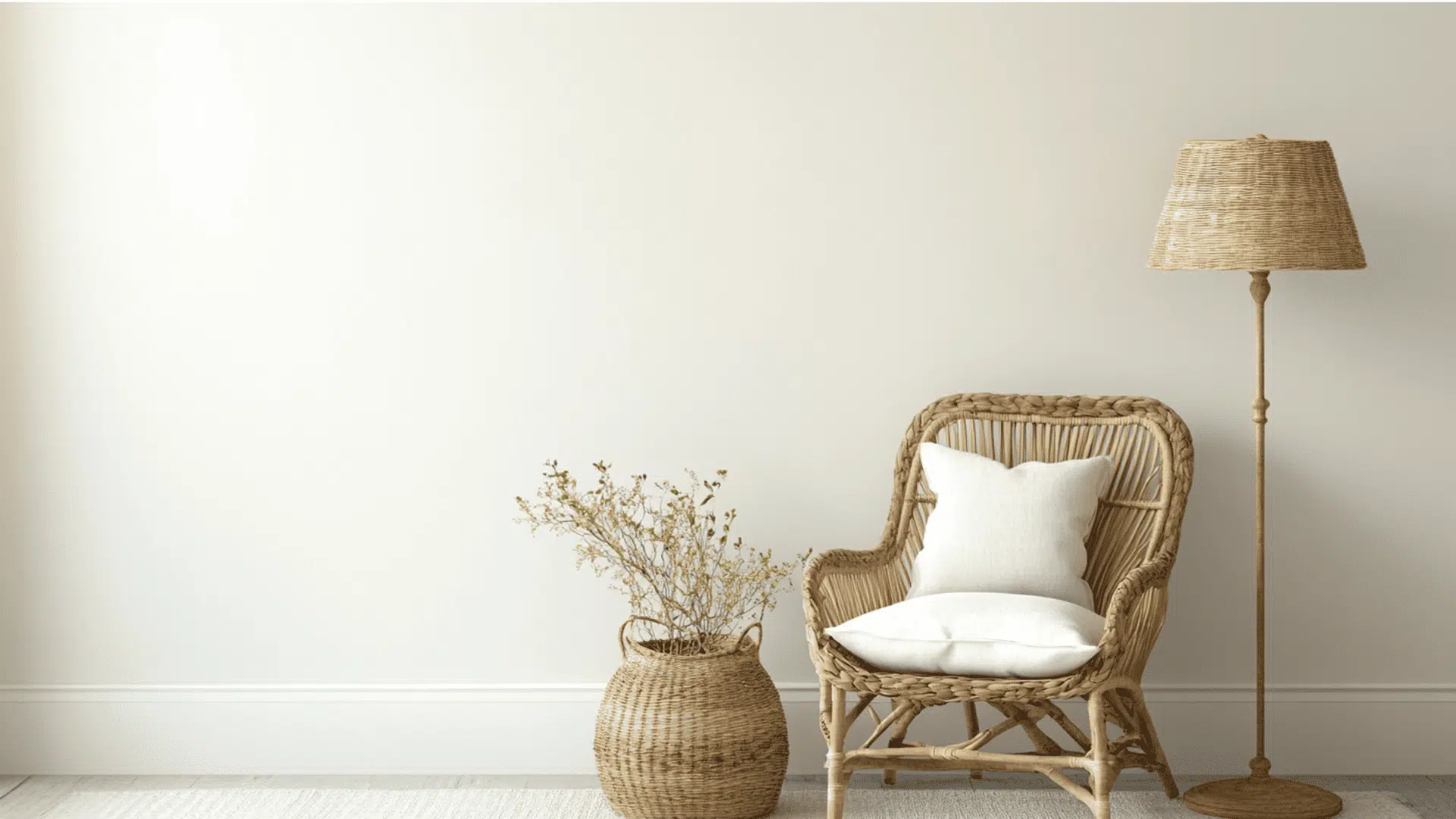
3. Decor
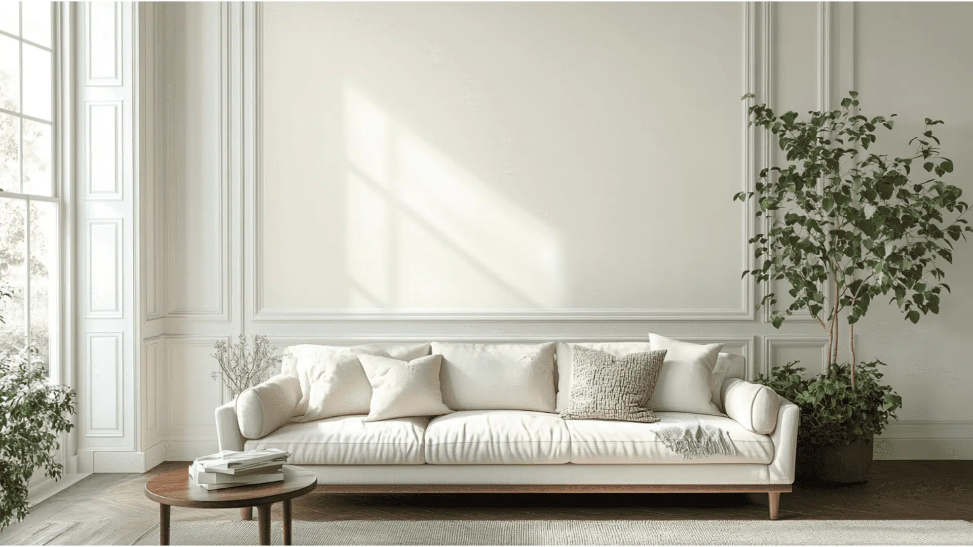
Choose artwork with white mattes or frames to create visual punctuation against the dark walls.
Include plants to bring life and natural contrast.
Add light-colored textiles to brighten and balance the space.
Incorporate textural elements like woven baskets oe fabrics to soften the bold wall color.
Similar Paint Colors: Perfect Alternatives to High Reflective White
These colors have subtle differences that, depending on your lighting and desired look, might make one work better in your home.
1. PENCIL POINT (PPU18-02)
- Rich dark gray with subtle indigo undertones for sophisticated depth.
- Versatile neutral with an LRV of 11, ideal for accent walls or whole rooms.
- Provides a stylish backdrop that changes subtly with different lighting conditions.
- Pairs beautifully with whites, woods, and metallic accents for balanced contrast.
2. TIDAL (M510-6)
- Deep, engaging blue with oceanic qualities and an LRV of approximately 11.
- Creates a sophisticated, calming atmosphere reminiscent of rolling waves at sea.
- Pairs beautifully with warm neutrals and metallic accents for balanced contrast.
- Versatile for accent walls, cabinetry, or full rooms where depth and character are desired.
3. ENGLISH CHANNEL (PPU14-19)
- Deep, naval blue inspired by the Atlantic waters with an LRV of approximately 11.
- Creates a sophisticated atmosphere with subtle depth that changes beautifully with lighting.
- Pairs excellently with crisp whites, warm woods, and metallic accents like brass or gold.
- Versatile for accent walls, cabinetry, or statement rooms where timeless refinement is desired.
Final Words
Behr’s Cracked Pepper adds instant drama and elegance to any room.
This rich near-black brings boutique-hotel vibes to bedrooms, makes kitchens pop with contrast, and turns dining rooms into stylish retreats.
It pairs beautifully with light neutrals, metals, and textures, working across styles from modern to classic.
Bonus: its depth helps hide wall flaws! For the best effect, balance it with good lighting in darker spaces.
Thinking of trying it? Grab a sample, test it in your lighting, and see the difference!
What room would you paint with Cracked Pepper first?
Share your thoughts in the comments below!
If you’re interested in more informational color review blogs, feel free to click here and explore other blogs that you might enjoy.

Alex Guerrero, a graduate with a Fine Arts degree from the Rhode Island School of Design, has been a visionary in the world of color and design for over 15 years. His professional journey began in the heart of the fashion industry in Milan, where he developed an acute sense for color harmonies and trends. Alex joined our team in 2018, offering fresh and innovative perspectives on color utilization in various spaces. Renowned for his ability to blend contemporary trends with timeless elegance. Outside of work, Alex is an accomplished painter and a volunteer art therapist, his artistic talents further enriching his professional insights.