
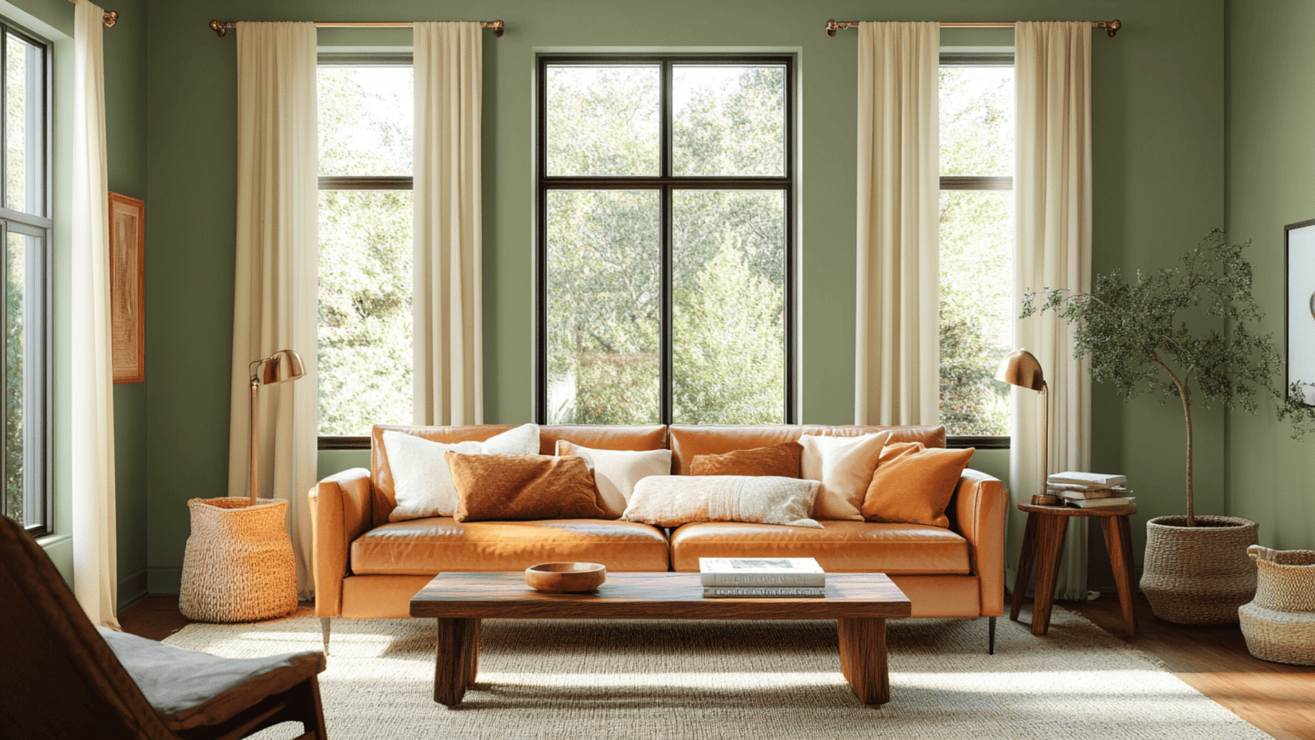
Ever walked into a room and felt your shoulders instantly drop an inch?
That’s the magic of the perfect wall color.
This deep, earthy shade doesn’t just sit on your walls, and it creates an atmosphere that wraps around you like a forest hug.
Beyond technical specs and impressive stats, the right green tells a story.
It whispers of moss-covered stones and weathered copper, of libraries where time stands still and dining rooms where conversations linger past midnight.
Not all greens are created equal; most shout for attention or fade into the background.
But this one?
Sherwin-Williams’ Green Onyx commands presence without demanding it.
Understanding Sherwin-Williams’ Green Onyx
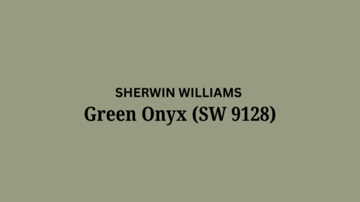
This is a popular mid-tone green paint color by Sherwin-Williams.
It creates rich and grand spaces that feel connected to nature and peaceful.
Color Terminology
Let’s look at the technical details of this color.
These numbers help designers and painters understand exactly what this color looks like.
| PROPERTY | VALUE |
|---|---|
| LRV | 31 |
| RGB | 152 / 154 / 130 |
| Hex Value | #989A82 |
You can use the RGB and Hex values when trying to match this color for online designs or when ordering things for your home.
Undertones:
Green Onyx has distinctive undertones that give it its unique character:
- It has soft yellow-green undertones
- It’s a mid-tone, earthy green that feels organic
- Not a bright green, but a subtle, sophisticated earth tone
These understated undertones give the shade its versatility and allow it to work with many decorating styles from traditional to contemporary.
Psychology of Green Colors
When you paint your walls with this color, you’ll notice it has a balancing effect.
This color can actually change your mood when you enter a room.
- Earth-Tone Greens: Create a feeling of balance and stability
- Nature-based Colors: Bring a peaceful, grounded feeling to any room
- Mid-tone Greens: Add depth while still feeling open and connected
- Benefits: Versatile in various lighting, hides marks, complements natural decor styles
Green reduces stress and promotes relaxation, making it an excellent choice for spaces to unwind and feel connected to nature.
This versatile green is a good choice that won’t quickly go out of style. It works as a perfect background for your favorite things in your home.
Why Choose Sherwin-Williams Green Onyx?
Sherwin-Williams Green Onyx is a balancing mid-tone green that adds depth to spaces while keeping them grounded in nature.
It’s a go-to color when you want something with character that still feels timeless.
1. Versatility
It adapts beautifully to changing lighting throughout the day.
In morning light, it shows its more vibrant green side, while evening lamps bring out its softer, more muted tones.
This color works in dining rooms, home offices, or even as an accent in bedrooms.
If your style is traditional, nature-inspired, or modern organic, it provides the perfect backdrop.
2. Key Features
Its earthy green tone makes it a team player with most natural furniture colors.
Its LRV of 28 helps create depth and interest in the room, making large spaces feel more intimate and cozy.
Unlike trendy colors that quickly date your home, this timeless green will look stylish for years to come.
3. Durability
When applied in Sherwin-Williams’ Cashmere or Emerald finishes, the color resists scuffs and marks, perfect for busy homes with kids or pets.
The mid-tone green color hides minor imperfections while maintaining its sophisticated appearance.
A simple wipedown keeps walls looking freshly painted even after years of daily life.
4. Texture Patterns
This paint color creates a rich, velvety appearance that adds substantial depth to your walls.
Its yellow-green undertones respond beautifully to changing light, creating gentle shadows and highlights throughout the day.
This color provides a consistent flow when used in connected spaces while allowing your natural wood furniture and organic decor to stand out as focal points.
Room Color Recommendations: Sherwin-Williams Green Onyx
This is a rich, earthy green that works wonderfully in specific rooms of your home.
It changes subtly throughout the day, staying balanced and sophisticated in any lighting.
1. Dining Rooms and Kitchens
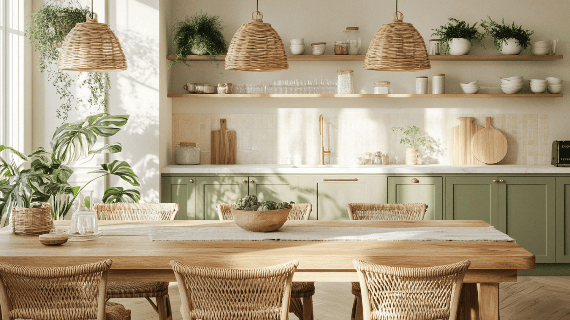
Turn your dining spaces into welcoming areas perfect for gatherings:
- Creates a warm, inviting feeling in dining spaces, enhancing mealtime experiences while adding a touch of finesse.
- The earthy green tone brings a natural vibe to your room, especially when paired with wooden dining tables and warm lighting.
- For kitchens, use the color on lower cabinets or as an accent wall to ground the space while keeping upper areas light and open.
This color choice can even enhance the dining experience, as green tones are known to create a harmonious atmosphere conducive to conversation and connection.
2. Home Offices and Libraries
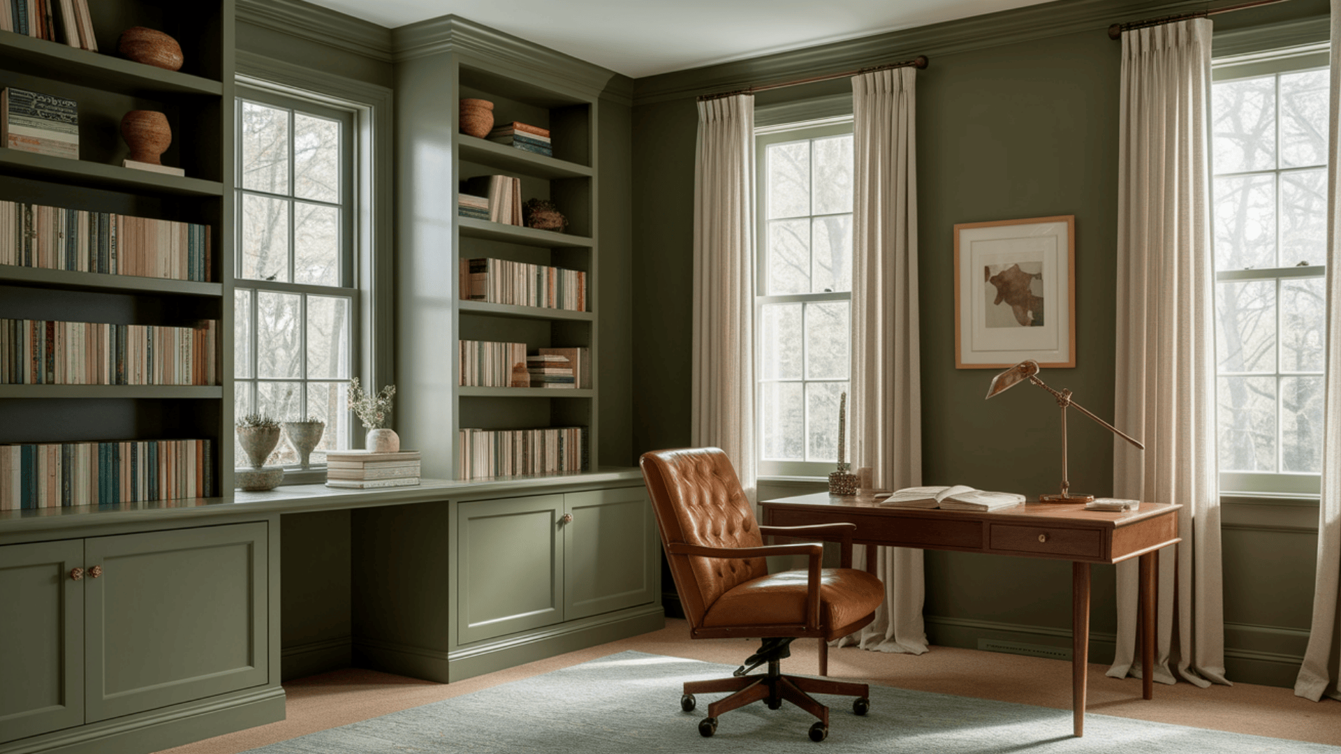
When creating a productive workspace, the shade offers several advantages:
- Helps make your workspace feel like a focused retreat where you can concentrate and be productive.
- The moderate LRV (28) creates just enough depth to feel cozy without being too dark or distracting.
- Try this on all walls for a wrapped, den-like feeling, or pair it with cream trim for a more traditional look.
Studies suggest that green tones can reduce eye strain during long work sessions.
This makes the Sherwin-Williams’ colour an ideal color for spaces where you spend significant time reading or working on a computer.
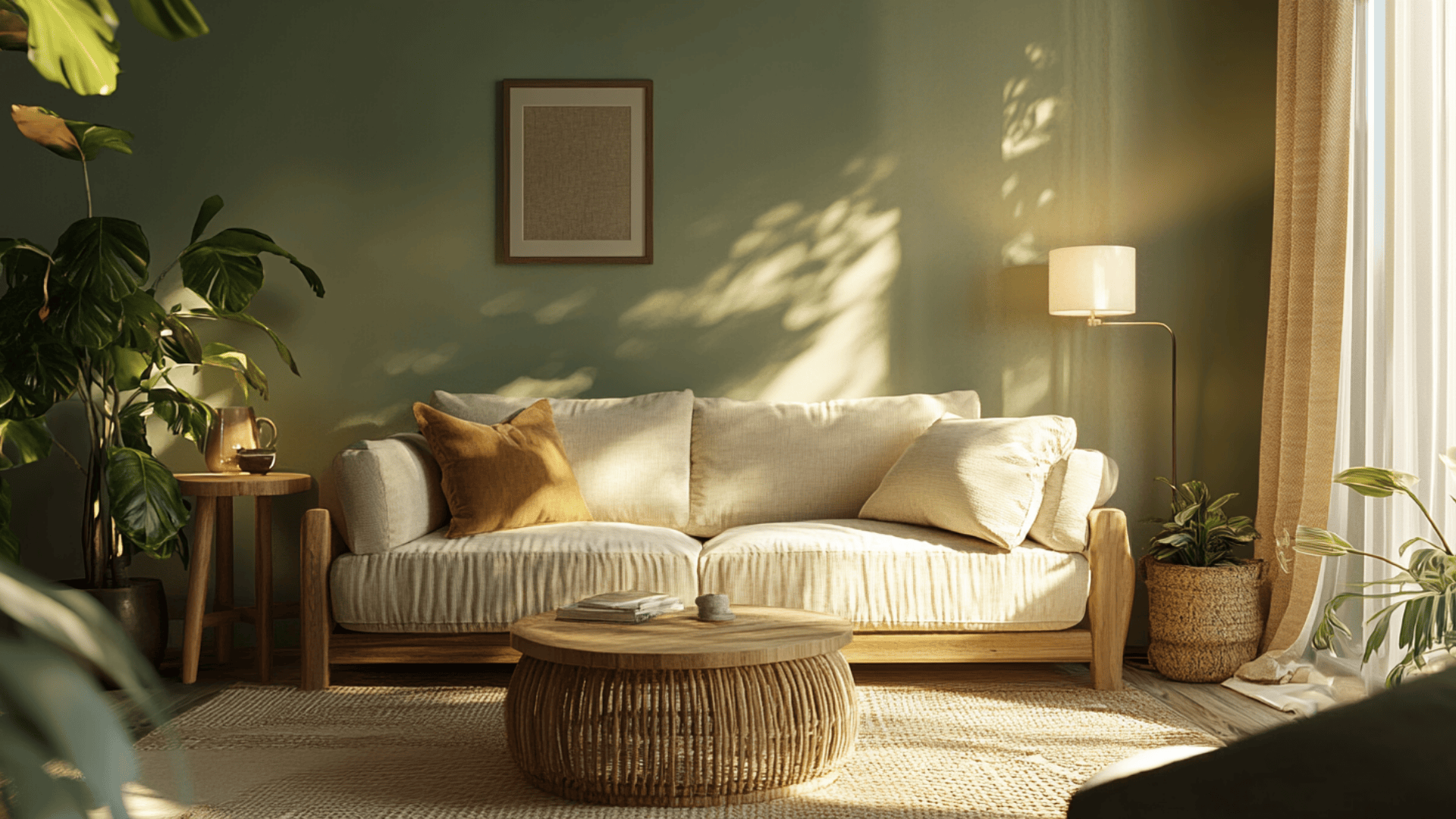
3. Living Spaces and Accent Walls
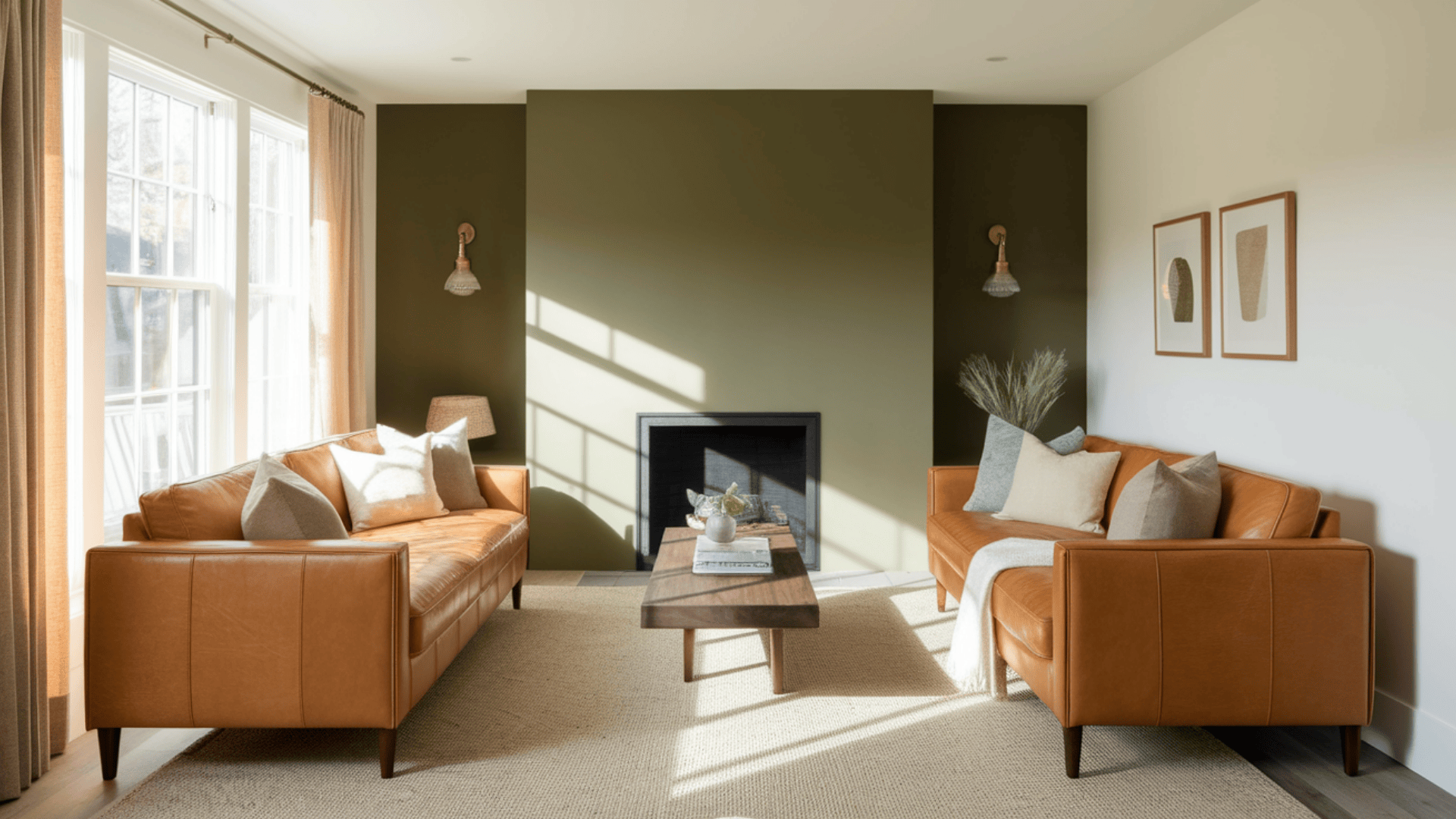
For common areas where you entertain and relax, the color offers urbane charm:
- This beautiful color transforms living spaces into rich, sophisticated areas that feel connected to nature.
- The mid-tone green provides a perfect background for artwork, leather furniture, and brass or gold accents.
- Use as an accent wall behind a fireplace or bookshelf to create a natural focal point that adds depth without overwhelming the space.
If you’re hesitant to commit to a full room, start with one accent wall to test how this versatile green enhances your existing furniture and decor.
Color Pairings and Combinations for Sherwin-Williams Green Onyx
This is a versatile mid-tone green with gentle yellow-green undertones.
Its Light Reflectance Value (LRV) of 28 makes it a balanced neutral that adds sophistication while maintaining a connection to nature.
Here are color pairings that work great with it.
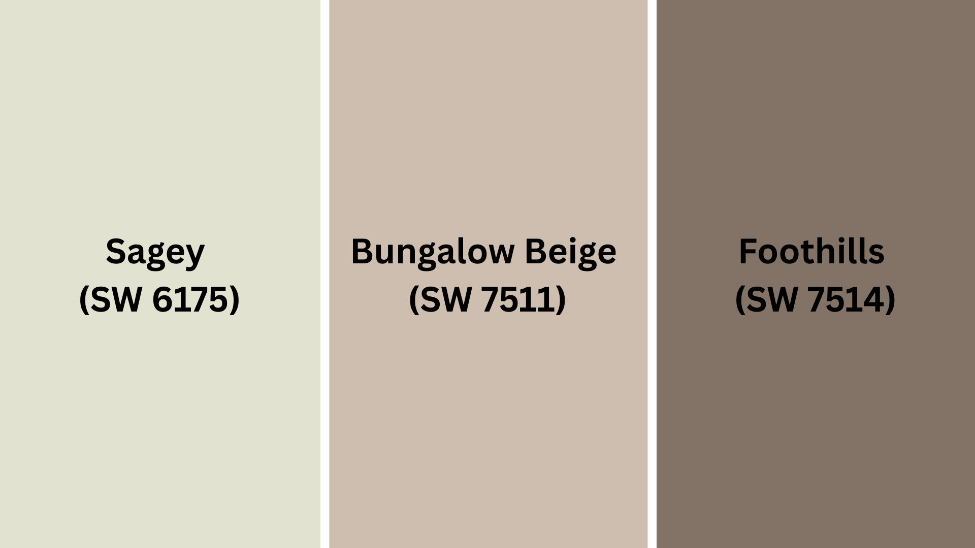
Complementary Trim Colors
Picking the right trim color can really change how a color looks on your walls.
These colors work especially well with Green Onyx and can highlight its earthy undertones:
- Sagey (SW 6175): This softer, lighter green creates a subtle, layered look that enhances the colour’s natural feeling.
- Bungalow Beige (SW 7511): A warm, neutral beige that balances the colour perfectly, creating a classic, timeless combination.
- Foothills (SW 7514): A rich, earthy taupe that complements the colour, adding warmth and depth to a space.
The right trim color serves as a framework for your Green Onyx walls, either creating subtle harmony or striking contrast depending on your design preferences.
Pro Tip: Before finalizing, test small areas with each color pairing to see which best showcases the colour in your home’s lighting.
Creating Cohesive Color Schemes
This perfect earth tone works beautifully with many other colors to create a pulled-together look throughout your home.
Here are three different color schemes:
| SCHEME | MAIN WALLS / AREAS | TRIM / ACCENT / CEILINGS | OTHER ROOMS / ACCENTS |
|---|---|---|---|
| Natural | Green Onyx (SW) | Alabaster (SW 7008), Creamy (SW 7012) | Rookwood Terra Cotta (SW 2803) |
| Earthy | Green Onyx (SW) | Foothills (SW 7514), Kilim Beige (SW 6106) | Hopsack (SW 6109) |
| Sophisticated | Green Onyx (SW) | Urbane Bronze (SW 7048), Tricorn Black (SW 6258) | Messenger Bag (SW 7740) |
NOTE: All colors shown are Sherwin-Williams paints. Colors will look different depending on your lighting, so always test samples on your walls before buying full gallons.
Coordinating with Furniture and Decor
Green Onyx is a versatile color that complements many furniture styles and decorative elements.
Its earthy, rich green tone creates a perfect backdrop for showcasing your favorite things.
1. Wood Tones
This Sherwin-Williams color looks exceptional with all kinds of wood, especially medium to dark tones.
Dark woods like walnut create a luxurious, refined pairing with the colour.
Medium woods like oak and cherry add warmth while creating a balanced, natural look.
Light woods like maple create an interesting contrast that feels modern and fresh when paired with this earthy green.
The organic quality of both green and wood creates a connection to nature that enhances the overall feeling of your space.
2. Metals
Brass and gold fixtures look rich and elegant, enhancing the warmth in the colour’s undertones.
Matte black hardware creates a contemporary, striking contrast that stands out beautifully on these green walls.
Bronze and copper add complementary warmth, playing up the yellow undertones in the colour, creating a cohesive mix that feels both natural and refined.
Mixing metal finishes adds dimension and interest, but try to limit to 2-3 different metals in the same space for a cohesive look.
3. Decor
Natural fabrics like linen, wool, and cotton in cream, ivory, and tan look perfectly at home with the colour, improving their organic quality.
Terracotta, rust, and burnt orange accents create beautiful color harmony with the green background, adding energy to any room.
Natural elements like stone, leather, and woven textures bring depth and authenticity to spaces painted in this versatile earth-tone green.
When accessorizing, remember that less is often more—let your beautiful Green Onyx walls be the star, with decor elements enhancing rather than competing with the rich color.
Similar Paint Colors: Perfect Alternatives to Green Onyx
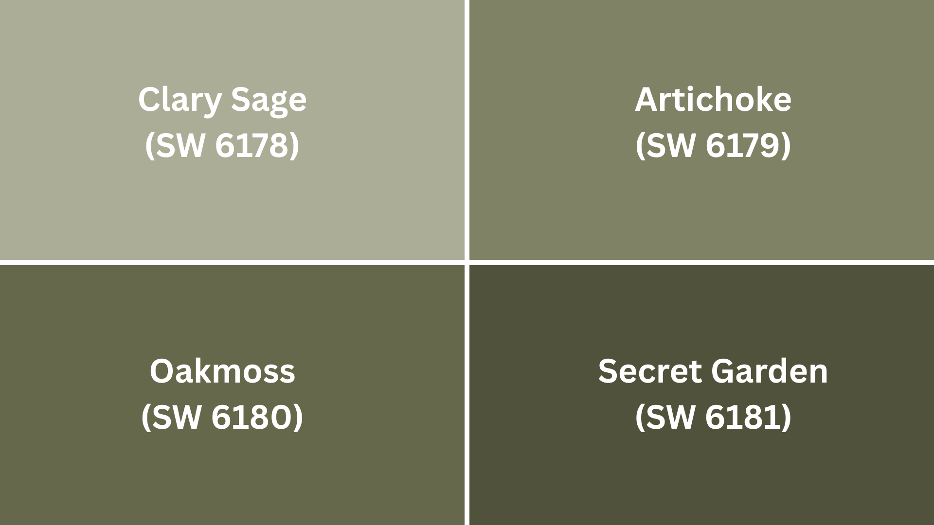
All these colors work well in similar spaces but offer slightly different undertones and intensities.
They create rich, nature-inspired spaces that feel sophisticated and timeless.
1. Clary Sage (SW 6178)
Looking for something slightly lighter but with the same natural feel? Consider Clary Sage:
- Slightly lighter green with more prominent sage undertones
- Higher LRV (37) gives a bit more brightness while still providing depth
- Creates a softer, more muted look that works great in bedrooms and living spaces
This color is particularly good for connecting spaces or rooms that receive less natural light while maintaining a cohesive green palette.
2. Artichoke (SW 6179)
If you want a touch more energy while staying in the same color family:
- Similar depth but with stronger yellow-green undertones
- Close in LRV (30) but feels more vibrant and lively
- Creates a slightly more energetic feeling that’s perfect for dining rooms and kitchens
Consider this shade if you want the organic feel of the colour but need something that won’t absorb quite as much light.
3. Oakmoss (SW 6180)
Need something with a bit more drama and richness?
- Deeper, richer green with more olive undertones
- Lower LRV (24) creates more drama and sophistication
- Looks especially good in formal dining rooms or as an accent color
This shade is perfect when you want to make a statement while maintaining an organic feel.
4. Secret Garden (SW 6181)
For those wanting a truly bold statement, green:
- Darker, more saturated green with balanced undertones
- Lower LRV (19) creates a bold, enveloping feeling
- Perfect for creating dramatic accent walls or cozy, intimate spaces
This color works beautifully in spaces where you want to emphasize natural elements and create a warm, enveloping atmosphere.
Before selecting any of these alternatives, paint samples on your wall to see how they interact with your specific lighting and furniture.
Final Thoughts
The perfect paint isn’t just another pretty color on a swatch; it’s an investment in your daily mood.
The walls we live between silently shape our experiences, and a rich, earthy green creates moments.
Morning coffee tastes richer, evening conversations feel more intimate, and quiet afternoons refresh rather than merely pass by.
The true magic happens months after painting day, when you realize you’ve stopped noticing the color and instead feel perpetually at ease in your space.
That’s when you know it has done its job, creating a backdrop that enhances everything in front of it while asking nothing in return.
We’d love to hear about your experience – drop a comment below and share your thoughts!
If you’re interested in more informational color review content, feel free to click here and explore other blogs that you might enjoy.

Alex Guerrero, a graduate with a Fine Arts degree from the Rhode Island School of Design, has been a visionary in the world of color and design for over 15 years. His professional journey began in the heart of the fashion industry in Milan, where he developed an acute sense for color harmonies and trends. Alex joined our team in 2018, offering fresh and innovative perspectives on color utilization in various spaces. Renowned for his ability to blend contemporary trends with timeless elegance. Outside of work, Alex is an accomplished painter and a volunteer art therapist, his artistic talents further enriching his professional insights.