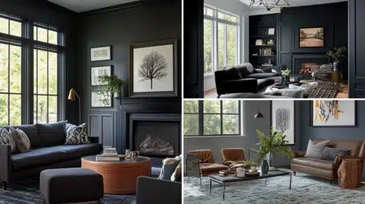

Can a single paint color really shift from calm and industrial to warm and inviting just with lighting?
Benjamin Moore Wrought Iron proves this change is possible.
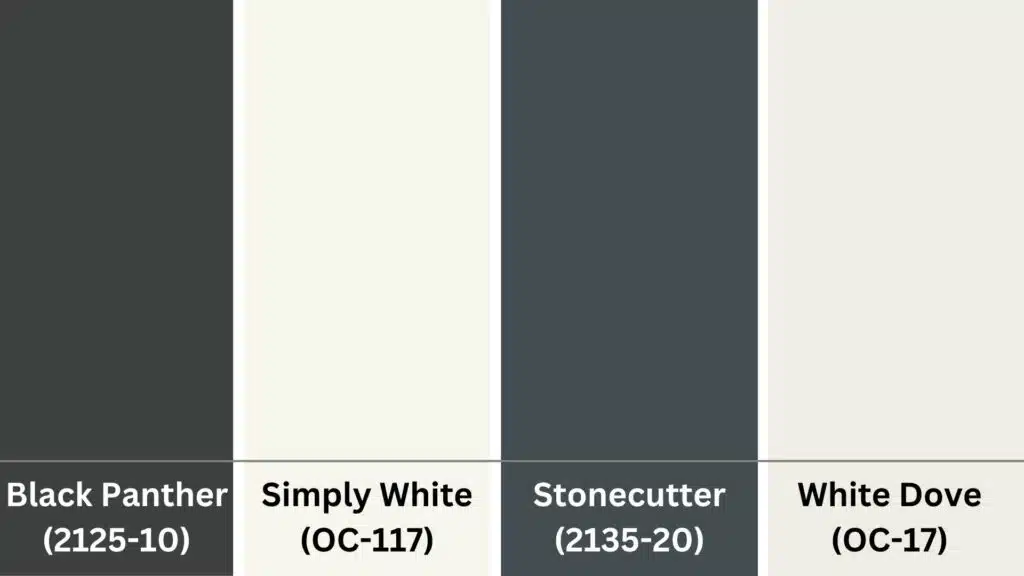
This rich, deep charcoal shade borders on black but offers more softness and versatility than pure black alternatives.
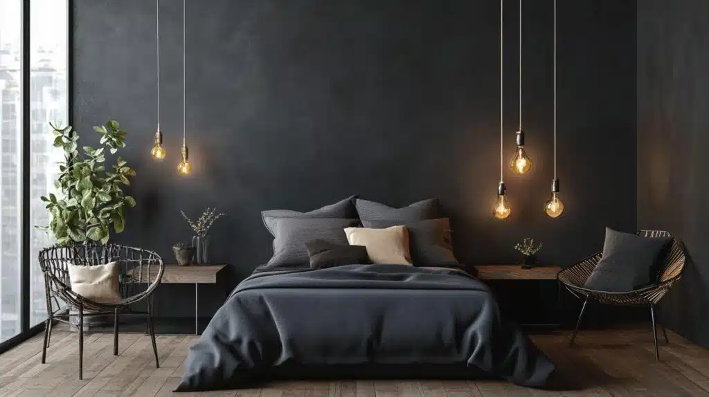
It works perfectly for moody bedrooms, refined kitchens, modern exteriors, and cozy reading nooks.
The color adapts beautifully across various lighting conditions, whether under warm lamplight or cool natural daylight.
This versatile shade appeals to a wide range of design styles, including modern, farmhouse, and industrial themes.
It sets the tone for bold yet refined spaces without overwhelming other design elements.
The color works as both a dramatic accent and a complete neutral base.
Learn about Wrought Iron palettes, buying tips, designer advice, and care suggestions to guide your decorating choices.
Why Wrought Iron Works with So Many Colors?
Benjamin Moore Wrought Iron stands out among dark paint colors due to its unique composition and visual properties.
This shade combines multiple color elements to create a unique alternative to standard black paint options.
1. Undertones and Complementary Tones in Wrought Iron
Understanding undertones helps you choose colors that work harmoniously with Wrought Iron in your design schemes.
| Property | Value |
|---|---|
| Company Code | 2124-10 |
| LRV (Light Reflectance Value) | 8.17 |
| HEX Code | #494a4b |
| RGB Code | 73, 74, 75 |
Check out our full review on Wrought Iron by Benjamin Moore here.
2. Core Color Profile: Soft Black with Charcoal Gray Depth
Wrought Iron isn’t a harsh black but rather a soft, deep tone rooted in charcoal gray.
This charcoal foundation adds approachability and flexibility in design applications.
The gray base makes it less intense than true black, allowing it to work in spaces where pure black might feel too dramatic or overwhelming.
3. Subtle Blue Undertones: Cool Styling in Varying Light
The understated blue undertones emerge in certain lighting conditions, giving the color a calm and refined feel.
These blue hints never become obvious or overwhelming.
Instead, they add depth and complexity that prevents the color from appearing flat or one-dimensional in different room settings.
Wrought Iron Color Palette Ideas for Every Style
Wrought Iron pairs beautifully with various color schemes to create different moods and design styles.
Each palette combination brings out different aspects of this versatile charcoal shade.
1. Cool Neutrals for a Modern Look
This palette pairs Wrought Iron with soft dove gray, crisp white, and pale slate blue for a calming, contemporary feel.
The combination creates clean lines and peaceful spaces, perfect for modern homes.
Cool neutrals enhance the blue undertones while maintaining a fresh, uncluttered appearance.
Colors Used:
2. Warm Neutrals for a Cozy Feel
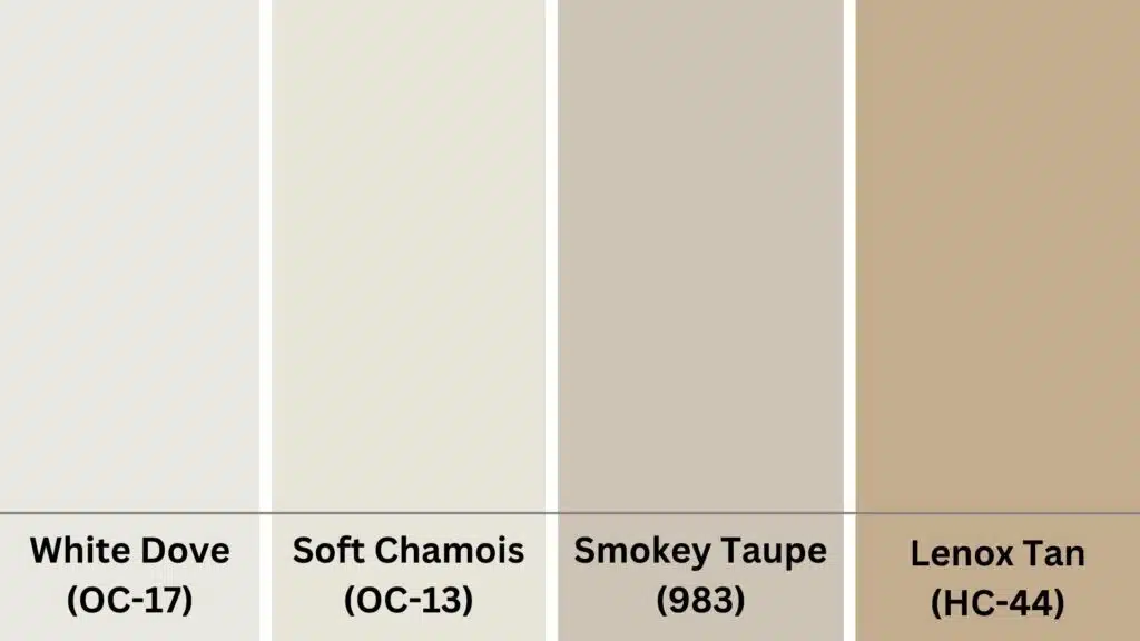
Pair Benjamin Moore Wrought Iron with warm neutrals to create inviting, comfortable spaces.
Soft creams and gentle taupes balance the cool undertones, adding warmth without overpowering the deep charcoal base.
Colors Used:
This combination works beautifully in living rooms and bedrooms, offering a cozy yet complete atmosphere.
3. Rich Jewel Tones for High Contrast
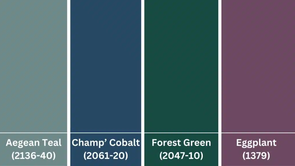
Teal, sapphire, emerald, and aubergine enhance the subtle blue depth while maintaining refined style.
These bold colors create a dramatic contrast against Wrought Iron’s deep base.
The jewel tone palette works well in dining rooms, libraries, or accent walls where you want visual impact.
Colors Used:
4. Monochrome Layers for Drama and Depth
Stack Wrought Iron with charcoal, true black, and white to create layered visual texture.
This approach uses different shades of the same color family for complete depth.
Monochrome schemes work especially well in modern and minimalist design styles where subtle variations create interest.
Colors Used:
5. Muted Earth Tones with a Cool Lean
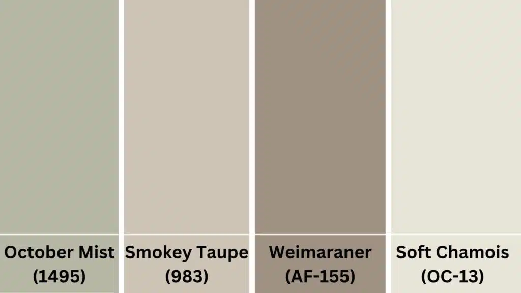
Sage, taupe, ash brown, and foggy beige work well without clashing with the blue-gray undertones.
These earth tones create warm, natural combinations while respecting Wrought Iron’s cool character.
This palette suits farmhouse and transitional design styles perfectly.
Colors Used:
6. Soft Pastels for a Balanced Contrast
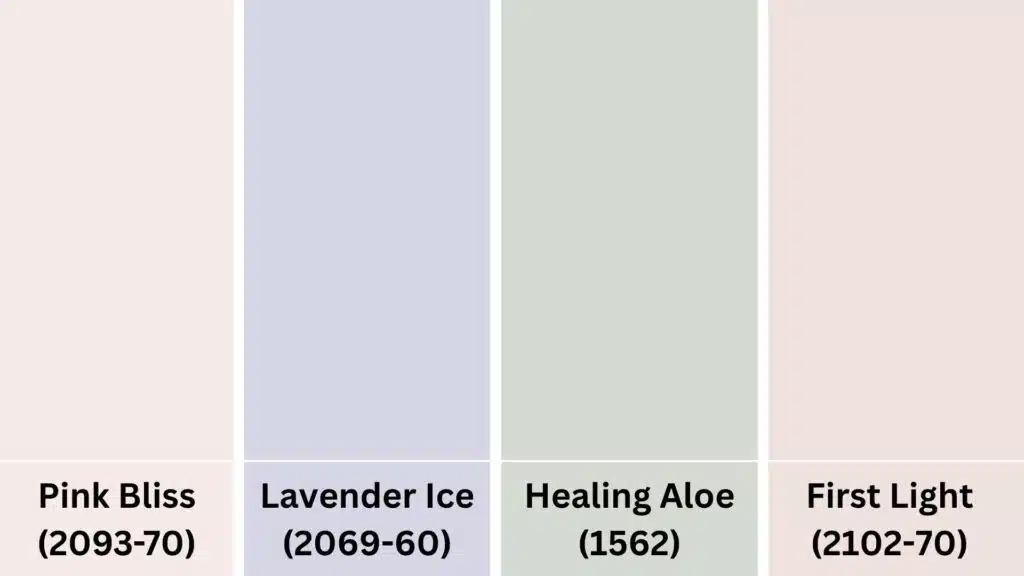
Powder pink, misty lavender, pale mint, and cool blush offer a gentle visual lift without overwhelming the moodiness.
These soft colors create unexpected but harmonious combinations with the deep charcoal base.
Pastels work well in bedrooms, nurseries, or spaces needing a softer touch.
Colors Used:
Sheen Guide for Benjamin Moore Wrought Iron
Choosing the right sheen can totally change how Benjamin Moore’s Wrought Iron looks in your space.
Here’s a quick guide to help you decide:
- Matte: Velvety and rich. Hides wall flaws and gives a soft chalkboard-like look. Ideal for creating a cozy and moody atmosphere.
- Eggshell: Slightly more sheen than matte. Still subtle and easier to clean. Adds gentle depth without overpowering the color.
- Satin: Soft pearl-like glow. Works well on trim or doors for a bit of contrast but highlights surface imperfections more easily.
- Semi-Gloss: Sleek and modern. Creates a bold look on furniture or trim but shows fingerprints and dust more clearly.
- High-Gloss: Extremely reflective and dramatic. Excellent for statement pieces like front doors but requires flawless surface prep.
The higher the sheen, the darker and more intense Wrought Iron will look.
So think about the vibe you’re going for when you pick your sheen.
And hey, don’t be afraid to mix it up in one room!
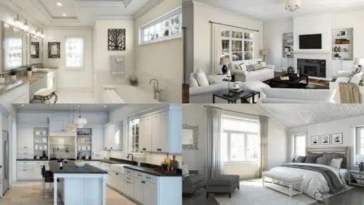
What to Pair Wrought Iron With (Based on Room Types)
Wrought Iron adapts beautifully in different rooms, depending on the shades, materials, and lighting around it.
These room-specific palettes enhance their charm while maintaining balance and visual interest.
1. Living Room
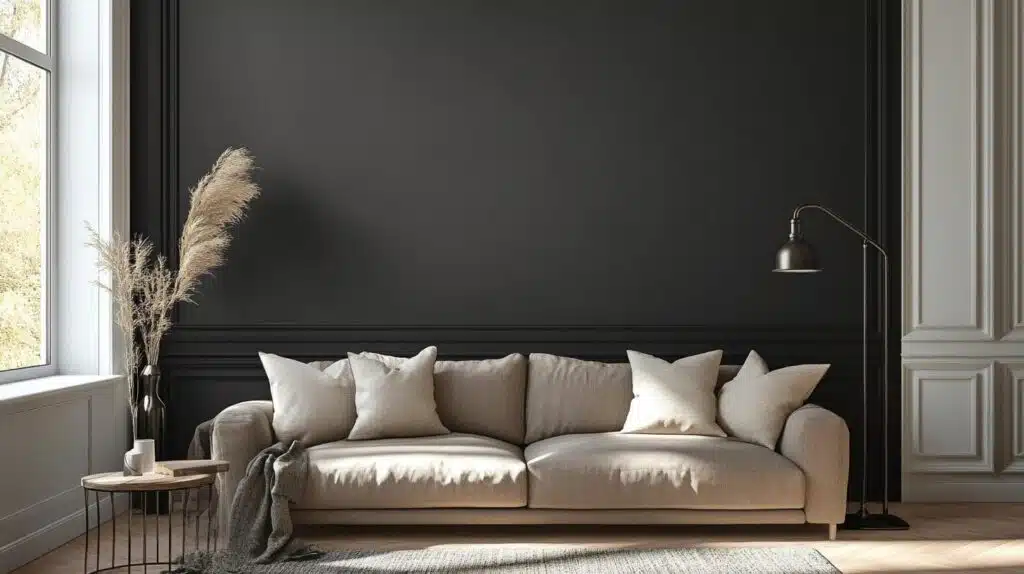
Wrought Iron creates a dramatic yet grounded feel in living rooms.
Pair it with Cloud White (OC-130) for trim and Smokey Taupe (983) for balance.
Add natural linen or leather textures to soften its intensity.
This combination suits modern, farmhouse, and transitional spaces, making the room feel structured but still warm and welcoming.
2. Kitchen
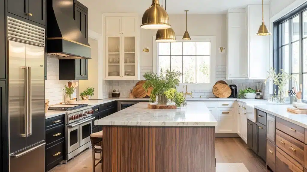
Use Wrought Iron on lower cabinets or islands to introduce bold contrast in a stylish kitchen.
Pair with Simply White (OC-117) for upper cabinetry and walnut countertops to add warmth.
Brass or matte black hardware enhances the design.
The result feels sleek, modern, and highly functional without being too cold or dark.
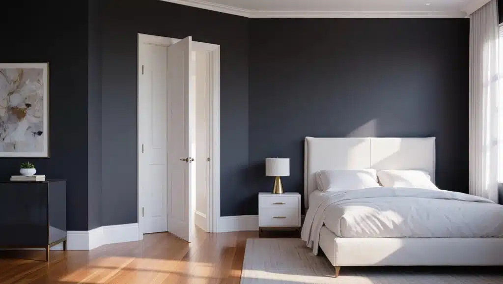
3. Bedroom
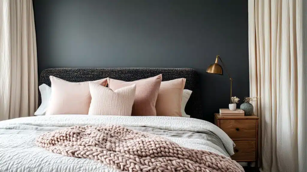
Wrought Iron sets a restful tone in bedrooms when paired with soft tones.
First Light (2102-70) adds warmth through linens, and Soft Chamois (OC-13) works well on walls or ceilings.
Use layered bedding and curtains for texture.
This pairing delivers a cozy retreat that feels serene and visually appealing day or night.
4. Bathroom
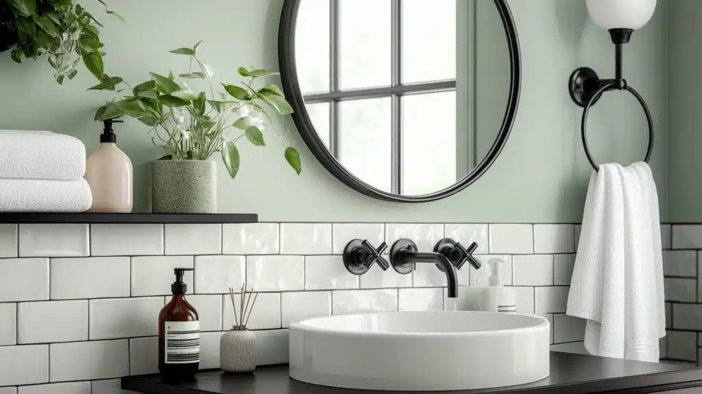
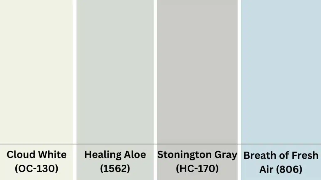
For spa-like calm, combine Wrought Iron with cool green tones like Healing Aloe (1562).
Eggshell trim keeps edges defined, and matte black fixtures complete the palette.
This look feels airy but grounded.
It’s ideal for modern bathrooms with limited space where contrast and texture add depth without overwhelming the room.
5. Home Exterior
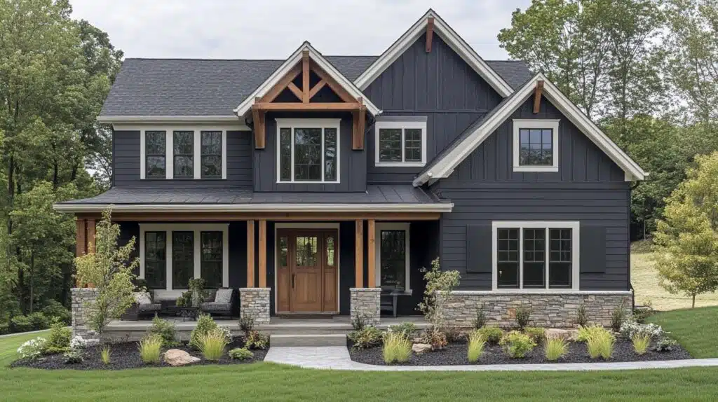
Wrought Iron provides bold definition to exterior trim, doors, or siding.
Use Stonecutter (2135-20) for depth, off-white trim for balance, and natural oak doors for warmth.
This palette fits modern or craftsman homes.
The result is timeless, striking, and clean, giving your house curb appeal without feeling too stark or severe.
Designer Tips for Using Wrought Iron Effectively
Professional designers recommend specific strategies for maximizing Wrought Iron’s impact in your home design projects.
- Use as accent walls in bedrooms or dining rooms, rather than painting entire rooms, for better balance.
- Choose a matte finish for walls to enhance the moody effect, satin or semi-gloss for trim and cabinetry.
- Pair with warm artificial lighting to soften the cool undertones in evening hours.
- Combine with natural wood tones like oak or walnut for rich, grounded color schemes.
- Add brass or copper metallics to warm up the overall palette and create visual interest.
- Layer different textures like linen, wool, and leather to prevent the space from feeling flat.
- Use white or cream trim to create crisp contrast and prevent overwhelming darkness.
These professional techniques help you achieve polished, well-balanced interiors that showcase Wrought Iron’s versatility.
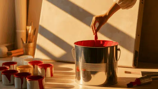
Where to Buy Benjamin Moore Wrought Iron?
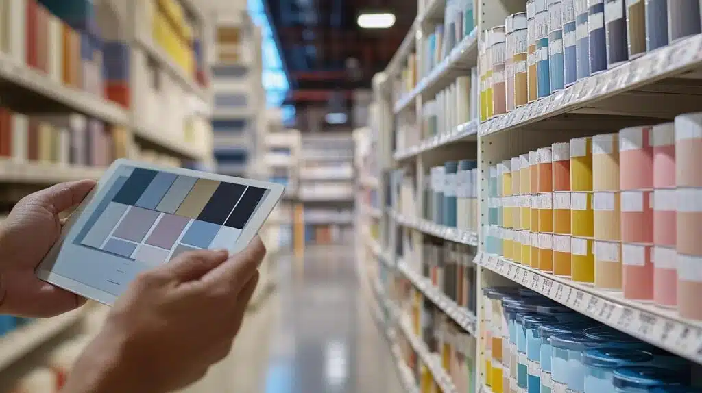
You can purchase Benjamin Moore Wrought Iron from several reliable sources.
The official Benjamin Moore website offers a complete color selection, along with detailed product information.
Local paint dealers offer personalized service and expert color-matching assistance.
Large home improvement stores, such as Home Depot and Lowe’s, carry Benjamin Moore products, offering convenient locations.
Before finalizing your color choice, always order samples first.
Benjamin Moore offers peel-and-stick samples and test pints for in-home testing.
Apply samples to different walls and observe them throughout the day.
Natural light changes how colors appear, so testing prevents costly mistakes.
Live with your samples for several days before making final decisions.
Check how the color looks in morning sunlight, afternoon shadows, and evening artificial light.
This testing process ensures Wrought Iron works perfectly with your home’s unique lighting conditions.
Note: Price variation occurs across different finishes and geographic regions, so compare options at multiple retailers.
Maintenance Tips for Paint Longevity
Proper maintenance ensures your Wrought Iron paint maintains its beautiful appearance for years to come.
- Choose eggshell or satin finishes for high-traffic areas to resist scuffs and allow easier cleaning
- Use matte finish for low-traffic areas like bedrooms to maximize the color’s moody character
- Clean walls with mild soap and water, avoiding harsh chemicals that can damage the finish
- Touch up scuffs immediately to prevent them from becoming more noticeable over time
- Prime all surfaces properly before painting to ensure even coverage and better adhesion
- Schedule seasonal inspections for exterior applications to catch weather damage early
- Store leftover paint properly for future touch-ups and maintenance needs
Following these maintenance guidelines protects your investment and keeps Wrought Iron looking fresh and professionally applied throughout its lifespan.
Final Notes
Benjamin Moore Wrought Iron offers remarkable depth and design adaptability that makes it a standout choice among dark paint colors.
Its unique combination of charcoal gray base with subtle blue undertones creates a near-black neutral.
This versatility makes it perfect for accent walls, kitchen cabinetry, exterior trim, and interior doors.
The color pairs beautifully with both warm and cool palettes, adapting to various design styles and lighting conditions.
Whether you prefer modern minimalism, cozy farmhouse charm, or dramatic jewel tones, Wrought Iron provides the perfect foundation.
Its light-absorbing quality creates intimate, moody spaces without harsh industrial feelings.
Take time to explore different palette combinations and test samples in your specific lighting conditions.
If you want more color reviews, click here to explore other blogs you might enjoy.

Alex Guerrero, a graduate with a Fine Arts degree from the Rhode Island School of Design, has been a visionary in the world of color and design for over 15 years. His professional journey began in the heart of the fashion industry in Milan, where he developed an acute sense for color harmonies and trends. Alex joined our team in 2018, offering fresh and innovative perspectives on color utilization in various spaces. Renowned for his ability to blend contemporary trends with timeless elegance. Outside of work, Alex is an accomplished painter and a volunteer art therapist, his artistic talents further enriching his professional insights.