Choosing the perfect gray paint can feel like a never-ending search, often resulting in too cold, too stark, or just flat. That’s why Dorian Gray SW 7017 continues to stand out in the crowd.
This warm, medium-depth gray by Sherwin-Williams offers something rare: balance. It brings subtle brown undertones that soften its look, creating comfort in every room.
If you’re updating your kitchen cabinets or refreshing a home’s exterior, Dorian Gray adapts beautifully without ever feeling trendy or tired.
With its smooth tone and time-tested popularity, it’s become a go-to for designers and homeowners alike.
In this, we’ll learn what makes Dorian Gray special, how it behaves in different lights, where to use it best, and what colors pair perfectly with it. Let’s find out why it’s more than just another gray.
What Makes Sherwin-Williams Dorian Gray Special?
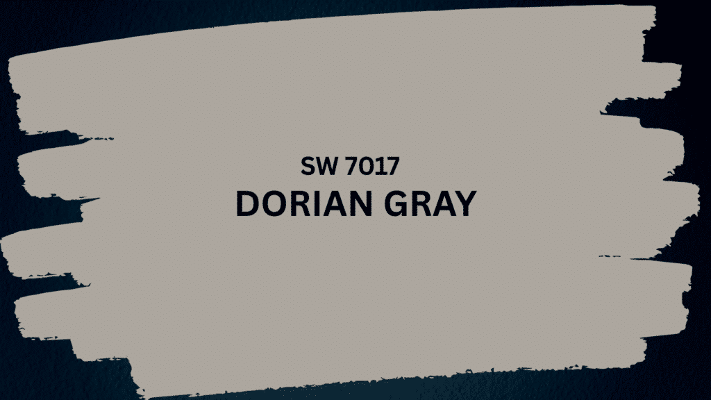
Dorian Gray SW 7017 stands out because it solves the common gray paint problem. Most grays feel cold and sterile, but this one brings warmth through its brown undertones.
The color sits perfectly in the medium range with an LRV of 39, making it neither too light nor too dark. It comes across as soft rather than heavy, creating comfortable spaces that feel lived-in.
The smoothness makes it work in any room style, from modern to traditional. Unlike trendy colors that quickly feel outdated, Dorian Gray offers ageless appeal that grows with your home.
This balance of warmth, depth, and neutrality explains why it made Sherwin-Williams’ top exterior colors list and remains a designer favorite for both interior and exterior projects.
Key Color Details
| SPECIFICATION | DETAILS |
|---|---|
| Paint Code | SW 7017 |
| Color Family | Neutral Gray |
| LRV (Light Value) | 39 |
| RGB Values | 172, 167, 158 |
| HEX Code | #ACA79E |
| Color Type | Warm Gray |
| Finish Options | All sheens available |
| Application | Interior & Exterior |
Dorian Gray Paint Undertones: Warm or Cool?
Dorian Gray displays complex undertones that shift with lighting conditions. The primary brown undertones create warmth, while subtle purple hints add depth and richness.
Green notes may appear, especially on exteriors with natural surroundings.
In south-facing rooms with abundant natural light, the color leans warmer and can appear greige or taupe-like. North-facing spaces bring out the gray base while maintaining gentle warmth.
Morning light emphasizes the gray tones, while afternoon sun reveals the brown warmth. Evening artificial light makes purple undertones more visible.
This chameleon quality means the color feels fresh throughout the day, adapting to changing light conditions without losing its core character or becoming flat.
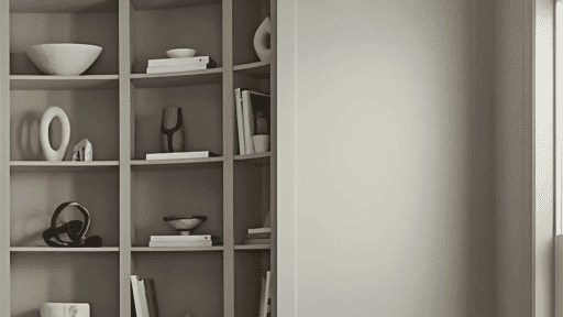
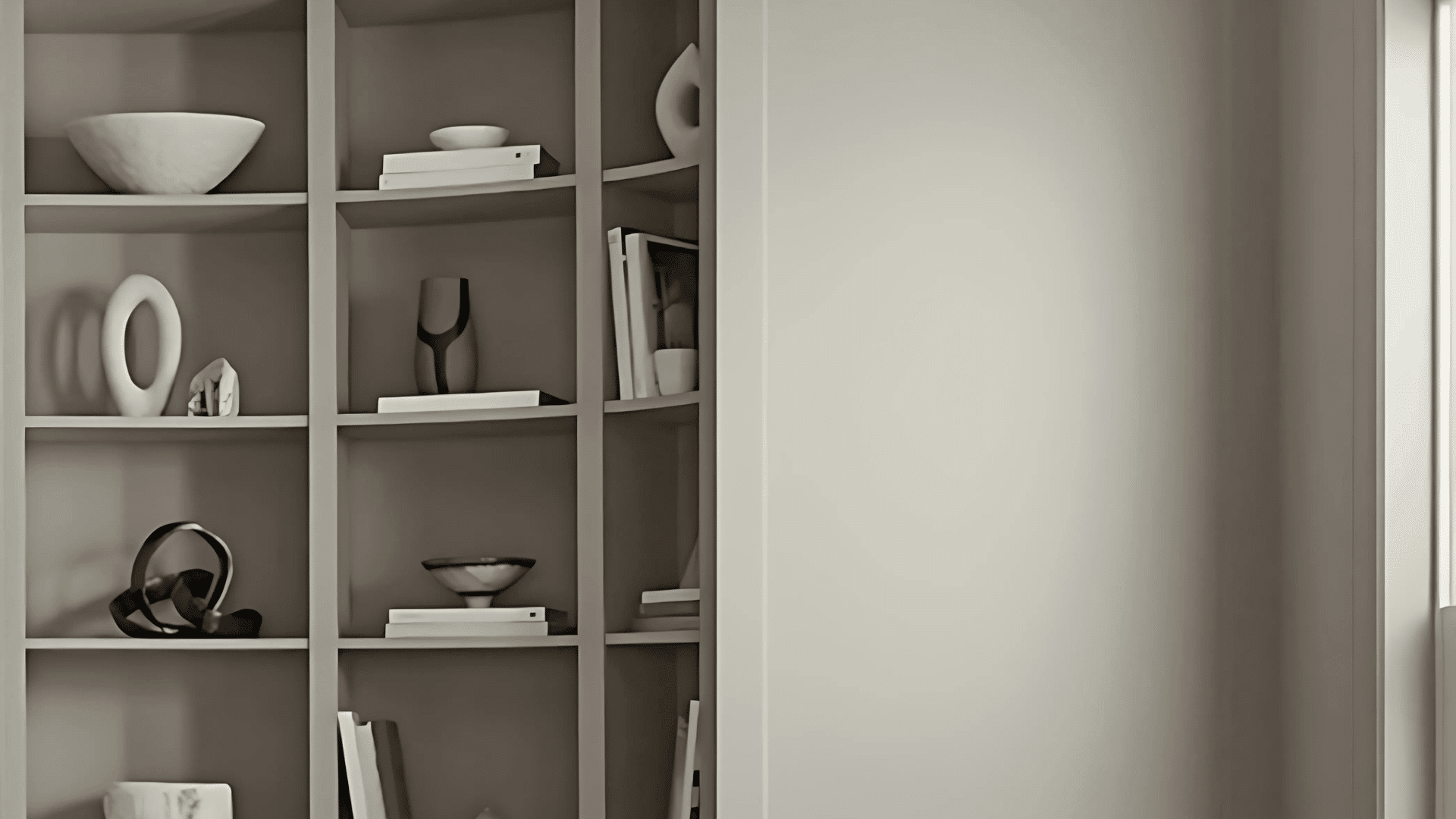
Where to Use Dorian Gray Paint in Your Home
Dorian Gray works beautifully across various spaces, both indoors and outdoors. Its medium tone and warm undertones make it adaptable to different lighting conditions and room functions.
The color creates a cohesive look when used throughout a home while maintaining enough character to stand alone in single rooms.
1. Living Room
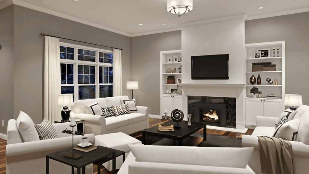
Living rooms benefit from Dorian Gray’s cozy yet refined presence. The warm undertones create an inviting atmosphere for family gatherings and entertaining guests.
The color pairs well with both leather and fabric furniture, making it easy to change decor styles. Natural light brings out the depth of color, while evening lighting maintains its warmth and comfort.
2. Bedroom
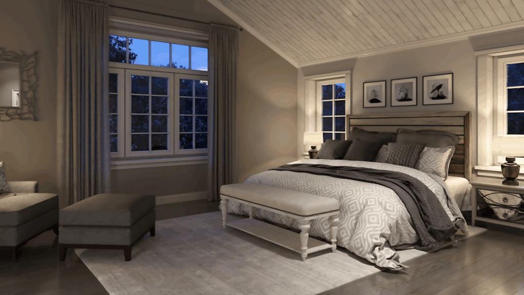
Bedrooms painted in Dorian Gray feel calm and restful without being cold or sterile. The color creates a perfect backdrop for white bedding while complementing wood furniture beautifully.
Its medium tone won’t overwhelm small bedrooms but adds enough richness to make large bedrooms feel cozy. The subtle undertones add visual interest without being distracting during rest.
3. Kitchen
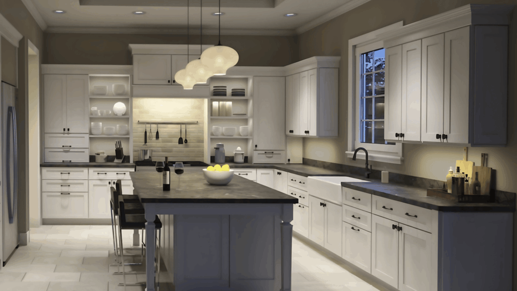
Kitchen cabinets or islands in Dorian Gray add character without overwhelming the space. The color works with both warm and cool countertop materials, from marble to granite.
It provides a rich alternative to white cabinets while staying neutral enough for changing decor. The warm undertones complement wood accents and brass or black hardware equally well.
4. Exterior
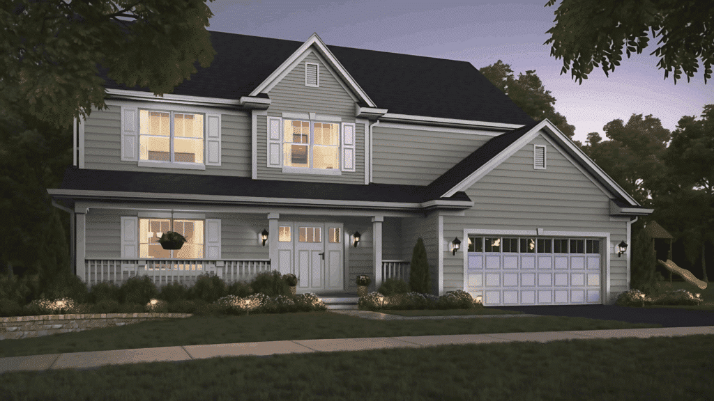
Dorian Gray made the top exterior colors list for good reason – it updates home facades beautifully. The color works on various materials, including vinyl siding, brick, stucco, and wood shingles.
It provides enough depth to hide minor imperfections while staying light enough to reflect heat. The warm undertones complement natural landscapes and architectural features.
5. Bathroom
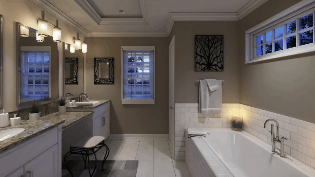
Bathrooms in Dorian Gray feel spa-like and serene while maintaining warmth and comfort. The color works with white fixtures and vanities, creating a clean but not clinical environment.
It pairs beautifully with natural materials like wood vanities or stone counters. The medium tone provides a rich backdrop for colorful towels and accessories.
Best Trim and Accent Colors for Sherwin-Williams Dorian Gray
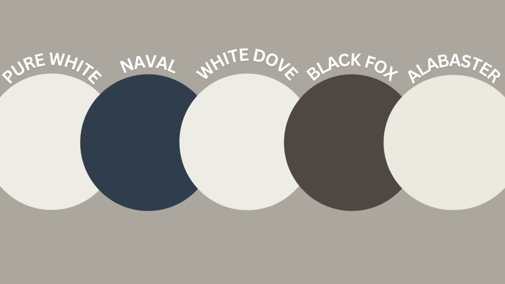
The beauty of Dorian Gray shines through its ability to pair with various colors across the spectrum.
Its warm gray base and brown undertones create a perfect foundation for both bold and subtle color combinations, making it a favorite among designers.
Pure White (SW 7005): This crisp white adds bold contrast to Dorian Gray, making both shades pop. It’s a perfect choice for trim, offering clean, classic lines.
Naval (SW 6244): Deep navy blues pair perfectly with Dorian Gray’s warmth, creating a classic, grounded look. Ideal for shutters, doors, or accents with a rich, traditional feel.
Benjamin Moore White Dove (OC-17): This soft, warm white boosts Dorian Gray’s natural warmth with a gentle touch. It’s ideal for cozy, bright spaces with a soft contrast.
Black Fox (SW 7020): This deep charcoal adds bold contrast to Dorian Gray while keeping a refined look. It’s perfect for trim, shutters, or striking interior accents.
Sherwin-Williams Alabaster (SW 7008): This creamy off-white highlights Dorian Gray’s brown undertones while keeping the look soft. Together, they create a warm and refined atmosphere.
Dorian Gray Paint vs Other Sherwin-Williams Grays
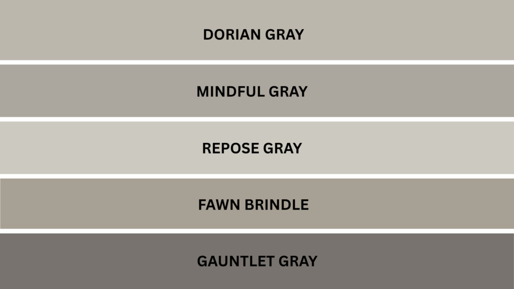
Understanding how Dorian Gray compares to similar gray paint colors helps you make the right choice for your space.
| PAINT COLOR | LRV | UNDERTONES | BEST FOR | KEY DIFFERENCE |
|---|---|---|---|---|
| Mindful Gray (SW 7016) | 48 | Green, blue | Light-filled rooms | Cooler and lighter |
| Repose Gray (SW 7015) | 58 | Purple, green | Bright spaces | Much lighter and reflective |
| Fawn Brindle (SW 7640) | 36 | Strong brown | Greige lovers | Darker with more brown |
| Gauntlet Gray (SW 7019) | 17 | Purple, brown | Dramatic spaces | Much darker and richer |
Each gray has distinct characteristics that affect its appearance and texture in different rooms and lighting conditions.
How to Sample and Buy Sherwin-Williams Dorian Gray SW 7017
You can buy Dorian Gray at:
- Sherwin-Williams stores nationwide
- Authorized paint retailers
- Online through the Sherwin-Williams website
Smart Shopping Tips
Start with samples costing $5-8 to test the color in your space before buying gallons. Time your purchase with store sales to get 30-40% discounts during special events.
For large projects, consider 5-gallon containers, which cost less per gallon and ensure color consistency.
Paint Sample Options
- Peel-and-stick samples from companies like Samplize
- Traditional brush-on samples from Sherwin-Williams stores
- Large sample boards for better color testing
Dorian Gray Paint Finish Options and Durability Tips
Match paint quality to each room’s specific needs. High-traffic areas like kitchens benefit from premium grades that resist wear. Guest rooms work well with standard grades.
Choose the right finish for each space:
- Flat or matte for low-traffic areas
- Eggshell for most living spaces
- Satin for kitchens and bathrooms
- Semi-gloss for trim and doors
Real Homes Using Dorian Gray Paint Successfully
Homeowners consistently report positive experiences with Dorian Gray across various settings and home styles.
One family found the color during a beach house vacation, where they observed how beautifully it performed throughout different lighting conditions.
They described it as “relaxing, neutral and light considering an LRV of 39,” noting how the color remained appealing from morning through evening hours.
Professional designers have used this popular gray in diverse projects, successfully incorporating it into modern farmhouse renovations, traditional colonial exteriors, and contemporary urban homes.
These success stories demonstrate why Dorian Gray remains a popular choice among both homeowners and design professionals seeking reliable, timeless color solutions.
Final Thoughts on Dorian Gray Paint: Is It Right for You?
Dorian Gray isn’t just a popular paint color; it’s a trusted choice that brings warmth, depth, and reliability to any project.
From cozy living rooms to bold exteriors, it adjusts gracefully to light and complements a wide range of styles and palettes.
If you prefer classic, coastal, or contemporary spaces, this shade stays relevant without feeling overused or dated.
Its mid-range LRV makes it flexible for both small and large spaces, while the undertones add just enough complexity to keep things interesting.
Have you used Dorian Gray in your home or project? Thinking about it for your next paint job?
Comment below and share your experience or ask questions; we’d love to hear from you!

Alex Guerrero, a graduate with a Fine Arts degree from the Rhode Island School of Design, has been a visionary in the world of color and design for over 15 years. His professional journey began in the heart of the fashion industry in Milan, where he developed an acute sense for color harmonies and trends. Alex joined our team in 2018, offering fresh and innovative perspectives on color utilization in various spaces. Renowned for his ability to blend contemporary trends with timeless elegance. Outside of work, Alex is an accomplished painter and a volunteer art therapist, his artistic talents further enriching his professional insights.