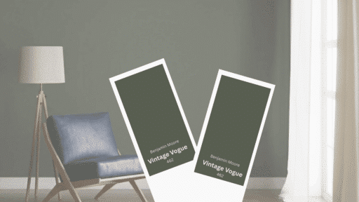
Some colors announce themselves. Others wait to be understood.
Vintage Vogue Benjamin Moore falls into the second category: a shade that doesn’t perform the same way twice.
It shifts with the light. It reacts to its surroundings.
Call it green, and you’re only half right.
The gray undertones complicate things. So does the blue that surfaces when the sun moves.
It’s not a color you choose quickly or use carelessly. There’s depth here, but also risk.
Put it in the wrong room, and it collapses into muddiness. Put it in the right one, and it holds everything together without trying.
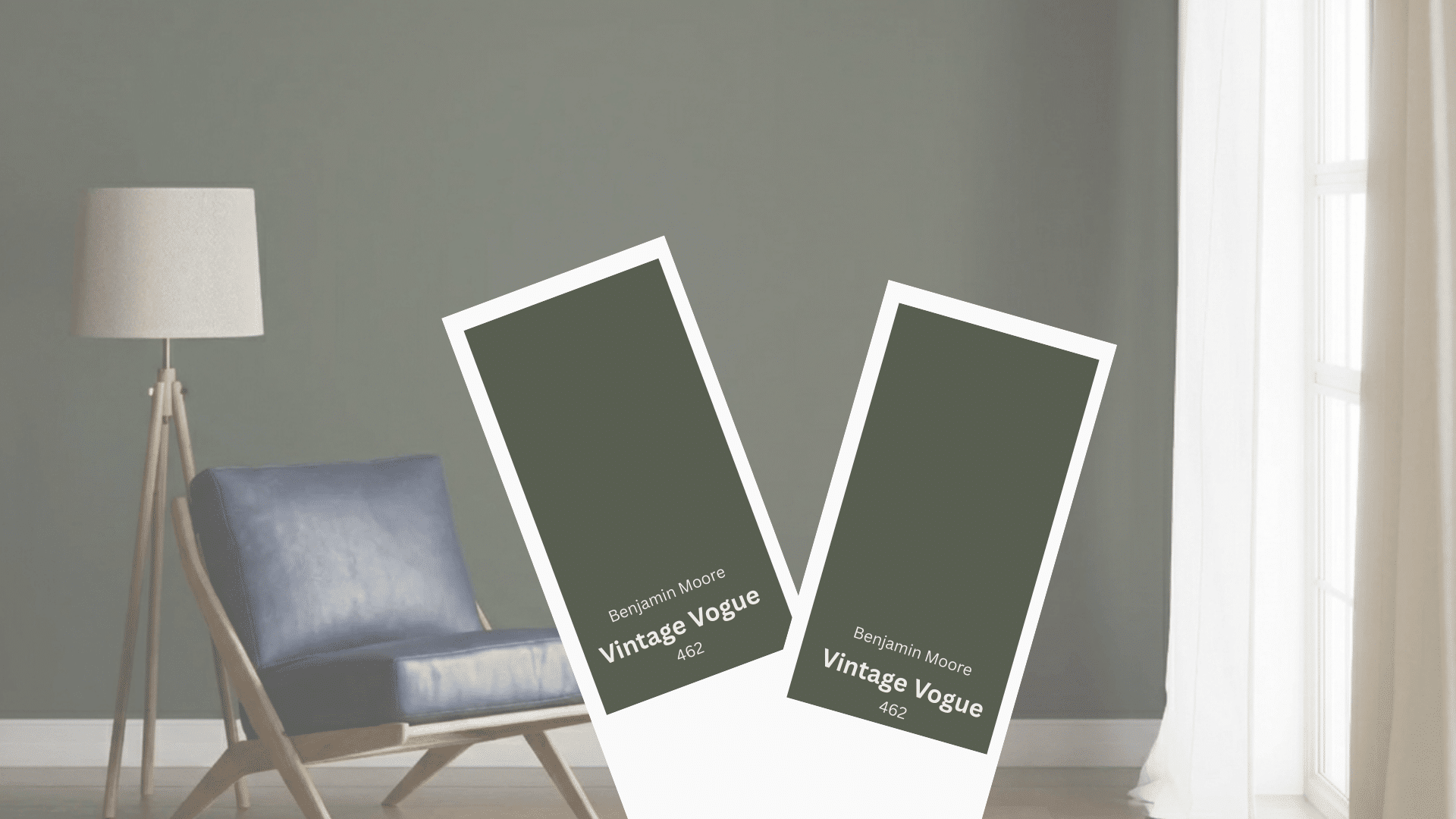
Vintage Vogue Benjamin Moore 462 Overview
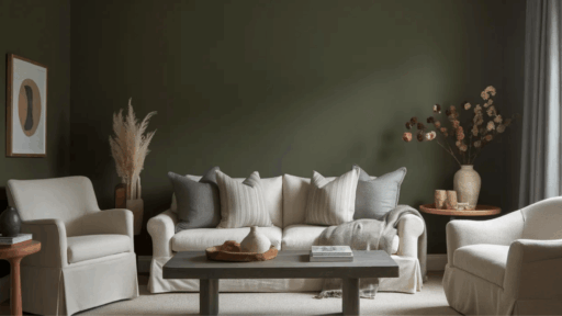
Vintage Vogue by Benjamin Moore is a deep, muted green with noticeable gray undertones.
The color reads rich without feeling overly bold, making it suitable for both accent use and full-room applications where a grounded, classic look is preferred.
| Attribute | Details |
|---|---|
| Color name | Vintage Vogue |
| Brand | Benjamin Moore |
| Color code | 462 |
| Color family | Green |
| Light Reflectance Value (LRV) | 11.85 |
| Finish options | Available in all Benjamin Moore interior finishes |
| Visual depth | Dark and muted |
| Best lighting | Medium to bright light |
| Common use | Walls, cabinets, accent areas |
| Overall appearance | Moody, balanced, and subdued |
LRV of Benjamin Vintage Vogue
Vintage Vogue has an LRV of 11.86, which means it reflects very little light and appears as a deep, dark color.
This low reflectance gives the shade strong visual depth and weight.
It absorbs light rather than bouncing it around, creating a grounded look that feels richer in well-lit spaces and noticeably darker in low-light rooms.
Benjamin Vintage Vogue Undertones
Vintage Vogue undertones play a key role in how the color appears on walls and cabinetry.
While it is classified as green, its layered undertones influence depth, mood, and overall balance in different lighting conditions.
- Gray undertone: A strong gray base softens the green, reducing saturation and preventing the color from feeling loud or overpowering.
- Subtle blue influence: In cooler or lower light, faint blue notes may surface, adding a cooler edge without shifting the color fully into blue-green territory.
- Muted green base: The primary green remains grounded and restrained, giving the shade a calm, composed appearance rather than a vivid one.
Overall, these undertones allow Vintage Vogue to maintain a rich presence while staying adaptable across rooms, lighting types, and surrounding finishes.
How Vintage Vogue Looks in Different Lighting
Lighting conditions directly affect how Vintage Vogue reads on surfaces. Changes in light temperature and intensity can subtly shift its depth, tone, and overall presence within a space.
| Lighting type | Visual appearance |
|---|---|
| North-facing natural light | Appears deeper with cooler, more reserved tones |
| South-facing natural light | Looks slightly warmer and more balanced |
| Warm artificial light | Feels richer with softened edges |
| Cool artificial light | Reads crisper with stronger green definition |
Tip: Always test a sample on multiple walls and observe it at different times of day to understand how lighting changes its appearance in the space.
Best Rooms for Vintage Vogue Benjamin Moore
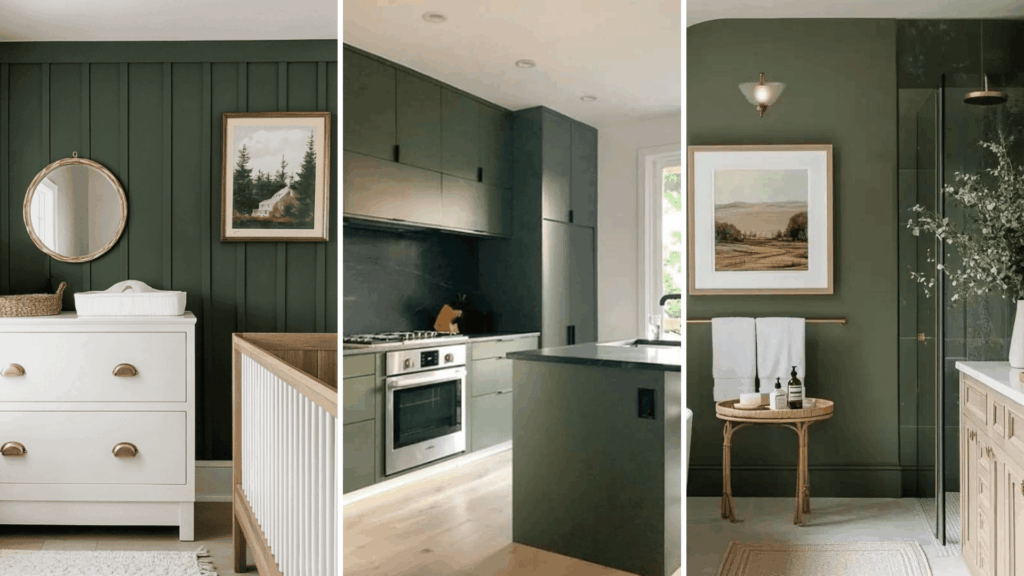
Vintage Vogue suits spaces where a darker shade can add definition and visual interest.
Its muted green tone adapts well across rooms when paired with appropriate lighting, finishes, and scale.
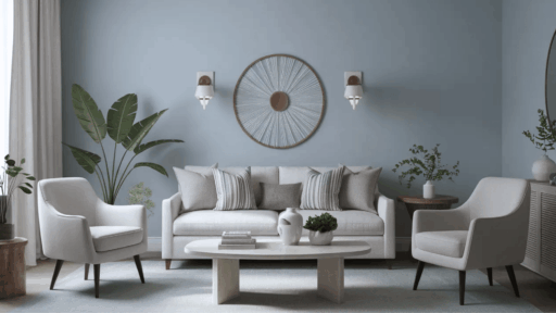
Living rooms
In living rooms, Vintage Vogue adds depth without dominating the space.
It works especially well on larger walls or built-ins, creating contrast against lighter seating and flooring.
The color helps anchor open layouts and supports layered decor, making the room feel intentional rather than flat or overly minimal.
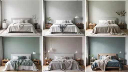
Bedrooms
Used in bedrooms, Vintage Vogue contributes to a settled and composed atmosphere.
It performs well as a full-wall color or behind the headboard, where it adds visual weight without distraction.
When balanced with light textiles and simple furnishings, the shade supports a comfortable, low-contrast setting.
Kitchens and Cabinets
Vintage Vogue brings a grounded look to kitchens, particularly on lower cabinets or islands.
The muted green pairs well with stone surfaces and warm metal hardware, helping cabinetry feel substantial rather than stark.
It also works in spaces where contrast is needed without relying on black or deep gray tones.
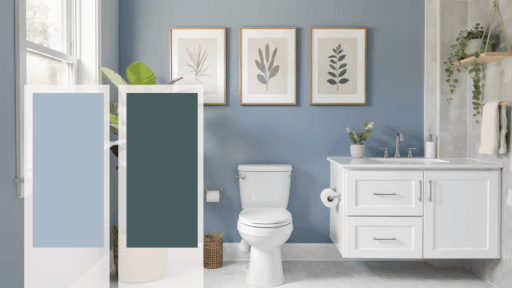
Bathrooms and Powder Rooms
In bathrooms, Vintage Vogue creates a defined, enclosed feel that suits smaller footprints.
It performs well alongside light tile, mirrors, and reflective finishes, helping the space feel less closed in.
The color adds character while maintaining a clean, controlled appearance.
Overall, Vintage Vogue works best in rooms where contrast, balance, and thoughtful lighting are prioritized, allowing the color to add presence without overwhelming the space.
Benjamin Vintage Vogue Coordinating Colors
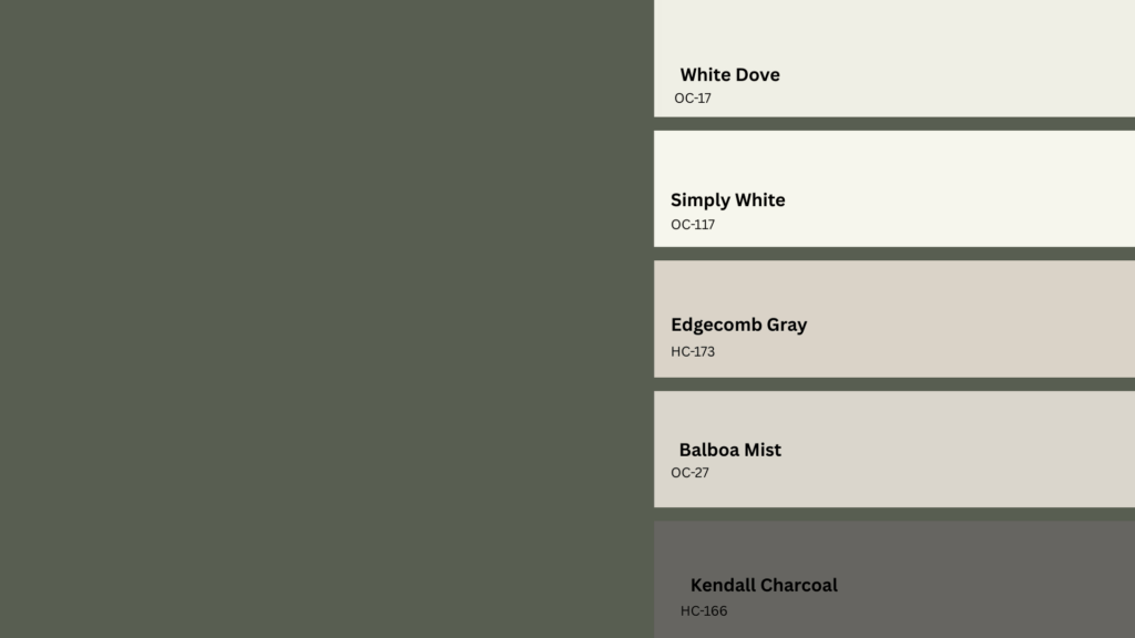
Choosing the right supporting colors helps Vintage Vogue feel intentional rather than heavy.
When considering what colors go well with Vintage Vogue, the goal is to balance its depth while maintaining visual clarity across different spaces.
Below are coordinated shades and finishes that support the color without competing with it, helping create a cohesive and well-proportioned look:
- White Dove OC-17 works well for trim and ceilings, offering clean contrast without appearing stark.
- Simply White OC-117 adds gentle warmth, helping darker spaces feel brighter.
- Edgecomb Gray HC-173 provides a soft greige backdrop that balances the muted green.
- Balboa Mist OC-27 keeps the palette light and neutral while maintaining consistency.
- Kendall Charcoal HC-166 complements Vintage Vogue with controlled depth for accents or adjacent rooms.
Natural oak finishes introduce warmth and texture, while brushed brass hardware adds subtle contrast that pairs well with the color’s muted character.
Together, these coordinating choices allow Vintage Vogue to remain the focal point while maintaining a cohesive and balanced overall look.
Similar Colors to Vintage Vogue Benjamin Moore
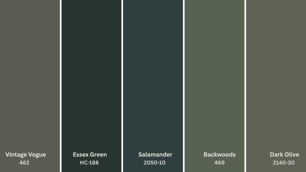
Several Benjamin Moore shades share characteristics with Vintage Vogue but differ slightly in depth, undertone, or intensity.
Comparing these options can help narrow down the best match for a specific space or lighting condition:
- Essex Green HC-188 appears darker and more saturated, with fewer gray notes and a stronger traditional presence.
- Salamander 2050-10 leans deeper and moodier, offering a bolder look with richer green intensity.
- Backwoods 469 feels slightly warmer, with brown undertones that create a more organic appearance.
- Dark Olive 2140-30 shows a softer profile, combining green with yellow undertones for a lighter feel.
Reviewing these similar colors side by side makes it easier to see how Vintage Vogue stands apart through its muted balance and controlled depth.
Is Vintage Vogue Benjamin Moore Right for the Space?
Vintage Vogue works when the space can handle depth without feeling closed in.
The low LRV demands good lighting, natural or layered; otherwise, the room just gets heavy.
It needs contrast. Lighter trim, clean finishes, minimal clutter. Without those, the color overwhelms instead of anchors. Test it on different walls first.
Morning light versus afternoon light will shift how it reads. The surrounding materials matter too.
What looks moody in one room might look muddy in another. If the space is small, dim, or already packed with dark furniture, skip it.
But in the right setting, with the right support, it holds.
The Bottom Line
Vintage Vogue Benjamin Moore isn’t a safe choice; it’s a calculated one. The low LRV means lighting dictates everything.
North-facing rooms pull it cooler. South-facing spaces warm it up. Artificial light changes the game entirely. Gray undertones keep it from screaming.
Blue notes emerge when conditions shift. And that muted green base? It provides a subtle anchor without being overpowering, especially when there’s contrast.
When paired with White Dove trim or Edgecomb Gray walls, it creates a harmonious and soothing look.
Put it in a dim, cluttered space, and it fails. Test samples. Watch how morning versus evening light transforms it.
Check how surrounding materials interact. This color rewards preparation, punishes guesswork.
Have you used Vintage Vogue in your space? Share your experience or favorite pairing below.

Alex Guerrero, a graduate with a Fine Arts degree from the Rhode Island School of Design, has been a visionary in the world of color and design for over 15 years. His professional journey began in the heart of the fashion industry in Milan, where he developed an acute sense for color harmonies and trends. Alex joined our team in 2018, offering fresh and innovative perspectives on color utilization in various spaces. Renowned for his ability to blend contemporary trends with timeless elegance. Outside of work, Alex is an accomplished painter and a volunteer art therapist, his artistic talents further enriching his professional insights.