
Color can make or break how something looks, but picking the right combination isn’t always easy. That’s where understanding what split complementary colors can really help.
This color scheme gives you contrast without making things feel too loud or hard to look at. It’s a simple way to create a more comfortable and visually pleasing design while still keeping things interesting.
In this blog, you’ll get a clear idea of how split complementary colors work and why they are so useful.
From basic theory to real-life examples, everything is explained in an easy and practical way so that the approaches work for you.
What are Split Complementary Colors?
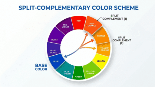
A split complementary color scheme is a color combination that uses one main color and the two colors placed next to its direct opposite on the color wheel.
This setup keeps the contrast strong but less intense than regular complementary colors. In basic terms, split complementary colors give a more balanced and easy-to-use palette.
For example, if red is the base color, instead of pairing it with green, the scheme uses yellow-green and blue-green.
This makes the combination look more flexible and visually pleasing for beginners.
Split Complementary Colorson the Color Wheel

Understanding the color wheel helps explain how this color combination stays balanced yet visually interesting. This is how you create a Split-Complementary Color Scheme:
- Choose your base color: Start by selecting one main color that defines your design’s mood, message, and overall visual direction for better consistency.
- Find its direct complement: Use a color wheel to locate the color directly opposite your base color, which naturally creates strong visual contrast.
- Pick the split complements: Instead of using the exact opposite color, choose the two colors placed next to it for a more balanced combination.
- Build your color palette: Combine your base color with the two selected split complements to create a flexible and visually appealing color palette.
- Maintain smooth contrast:This color setup keeps contrast noticeable while avoiding overly harsh combinations, resulting in a more pleasing and harmonious overall look.
Best Split Complementary Color Combinations
These combinations help make the concept easier to understand. Each set follows the same rule: one base color and two colors next to its opposite on the color wheel.
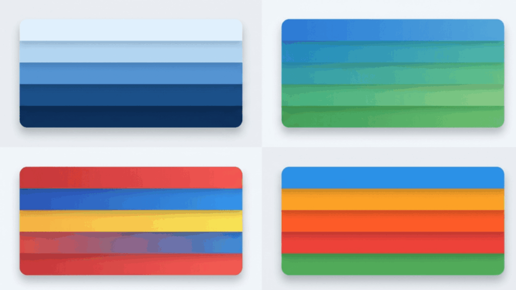
1. Blue with Warm Orange Tones

This color combination blends cool and warm tones in a way that feels balanced and easy on the eyes. It creates a palette that is calm yet engaging, without strong or harsh contrast.
| Element | Role In Palette | Effect |
|---|---|---|
| Blue | Base color | Adds stability and a calm foundation |
| Yellow-Orange | Bright accent | Brings lightness and energy |
| Red-Orange | Warm accent | Adds depth and richness |
| Overall Combination | Balanced mix of tones | Feels calm yet lively without harsh contrast |
2. Red Balanced with Cool Greens

This color combination centers around red, which naturally draws attention and becomes the main focus. When paired with cooler green tones, the palette feels more controlled and comfortable to look at.
| Element | Role In Palette | Effect |
|---|---|---|
| Red | Base color | Creates a strong focal point and adds energy |
| Blue-Green | Cool accent | Brings a calming contrast that tones down intensity |
| Yellow-Green | Fresh accent | Adds brightness and a natural feel |
| Overall Combination | Balanced contrast of warm and cool | Feels bold yet controlled without being overwhelming |
3. Yellow Paired with Rich Violet Shades

This color combination feels bright and playful while still staying balanced. Yellow brings light and energy, while the violet tones add depth and control. Together, they create a layered look that feels lively without being too intense.
| Element | Role In Palette | Effect |
|---|---|---|
| Yellow | Base color | Adds brightness and a sense of energy |
| Red-Violet | Deep accent | Brings richness and soft contrast |
| Blue-Violet | Cool accent | Adds depth and balances the brightness |
| Overall Combination | Layered mix of light and dark tones | Feels lively and creative without looking too sharp |
Practical Ways to Use Split Complementary Colors
These simple examples show how split complementary colors can be applied in everyday design to create contrast without making things feel too strong.
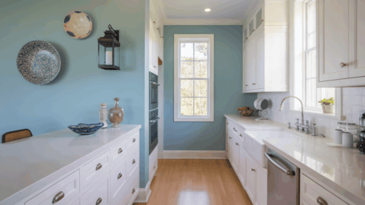
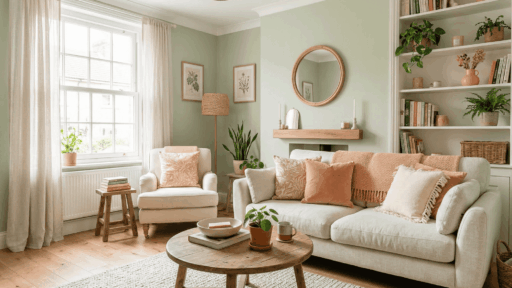
- Interior Design: Use one main color for walls or large furniture pieces, then bring in the other two colors through cushions, rugs, or decor accents to keep the space balanced.
- Graphic Design: Choose a dominant color for the main visuals, then use the other two colors for highlights, buttons, or small details to create contrast.
- Art and Painting: Start with a base color for the main subject, then add the split complementary shades to create depth, shadows, and contrast while keeping the artwork smooth and cohesive.
- Fashion and Styling: Pick one primary color for your outfit, then add the other two colors through accessories, layers, or small details to create a balanced and eye-catching look.
- Content Design: Use one color as the background or base theme, and apply the other two colors to text, icons, or highlights to make content stand out while still looking clean and consistent.
Alternatives to Split-Complementary Color Schemes
If split complementary colors feel a bit strong, there are other color schemes that offer different moods and visual styles while still keeping your design easy to work with.
1. Analogous Color Scheme
This scheme uses three or more colors placed next to each other on the color wheel, such as blue, blue-green, and green. Since no direct complementary colors are used, the look stays soft.
It works well for backgrounds, interiors, and calm visual designs. It is a good choice when a smooth and connected color flow is more important than strong contrast.
It also helps create a natural look since the colors feel closely related to each other. Designers often use this scheme to keep visuals easy on the eyes and visually connected.
2. Monochromatic Color Scheme
This approach focuses on a single base color and builds around it using lighter and darker variations.
Complementary colors are not part of this setup, which keeps the look clean and consistent. It is commonly used in minimal designs, branding, and modern layouts.
This scheme is easy to manage and helps maintain a clear and organized visual style. It also allows you to highlight details through subtle shifts in tone and depth.
3. Triadic Color Scheme
This scheme uses three colors spaced evenly on the color wheel, like red, blue, and yellow. These are not direct complementary pairs, but still create contrast.
It is often used in playful designs, illustrations, and creative projects that need strong visual interest. Careful color proportion helps prevent the palette from feeling too busy or distracting.
Using one color as the main focus and the others as accents keeps the design more controlled.
This scheme works well when you want a lively look without making the design feel intense.
4. Tetradic Color Scheme
This method combines two complementary color pairs, such as blue with orange and red with green. It includes both contrast and variety, so it needs careful use.
It works well in complex designs, branding, and layouts with multiple focal points. Using one dominant color while keeping others as accents helps maintain visual clarity.
It also gives more room to experiment with color combinations without repeating the same tones too often.
Significance of Split Complementary Colors in Color Theory
Understanding the role of split complementary colors helps explain how designers create balance without losing strong visual contrast in projects.
A split complementary color scheme plays an important role in color theory by offering both contrast and balance in design work.
Unlike direct complementary pairs, split complementary colors reduce harsh visual tension while still keeping colors lively and engaging.
Designers often rely on this method to guide attention, create depth, and maintain visual comfort in compositions.
Because of this balance, split complementary colors remain a practical choice for both beginners and experienced creatives working with color.
Conclusion
Understanding what split complementary colors are makes it easier to work with color in a more balanced way.
A split complementary color scheme offers the right mix of contrast and harmony, which is why it is widely used in design, art, and everyday styling.
By using one main color and two nearby complements, split complementary colors help create a look that feels bold but not overwhelming.
This approach is simple enough for beginners and still useful for more advanced projects.
With a little practice, it becomes easier to build color combinations that look organized and presentable.

Alex Guerrero, a graduate with a Fine Arts degree from the Rhode Island School of Design, has been a visionary in the world of color and design for over 15 years. His professional journey began in the heart of the fashion industry in Milan, where he developed an acute sense for color harmonies and trends. Alex joined our team in 2018, offering fresh and innovative perspectives on color utilization in various spaces. Renowned for his ability to blend contemporary trends with timeless elegance. Outside of work, Alex is an accomplished painter and a volunteer art therapist, his artistic talents further enriching his professional insights.