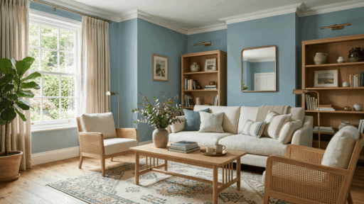
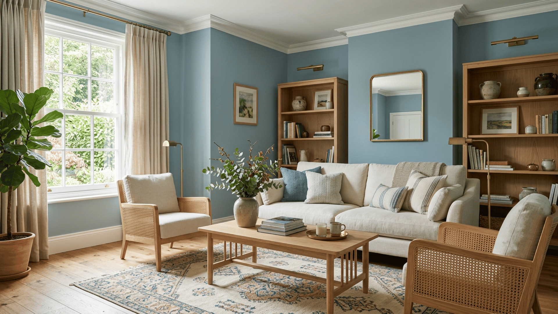

If Woodlawn Blue Benjamin Moore HC-147 has made it onto your paint shortlist, the first thing to know is that it is not a straightforward blue.
Benjamin Moore places it in the Historical Colors collection and describes it as a delicate blue, but the shade can look softer, greener, or grayer once it is on a wall.
That shifting quality is what makes the color interesting, but it also makes choosing from a small swatch difficult. I would pay particular attention to the room’s natural light, flooring, trim, and other fixed finishes before committing.
Below, I will first confirm the official Woodlawn Blue HC-147 details, then tell you about its undertones, lighting changes, best uses, coordinating colors, and how it compares with Palladian Blue.
What is Benjamin Moore Woodlawn Blue HC-147?
Woodlawn Blue Benjamin Moore HC-147 comes from Benjamin Moore’s Historical Colors collection. The official Woodlawn Blue HC-147 listing gives it an LRV of 60.65, placing it in a lighter range while still allowing the color to show clearly on the wall.
Here are the key details directly from Benjamin Moore:
Detail | Woodlawn Blue |
|---|---|
Color name | Woodlawn Blue |
Color code | HC-147 |
Brand | Benjamin Moore |
Collection | Historical Colors |
LRV | 60.65 |
Color family | Blue |
Benjamin Moore also offers a digital swatch, color chips, samples, and paint from the official Woodlawn Blue listing.
What Does Woodlawn Blue Actually Look Like?
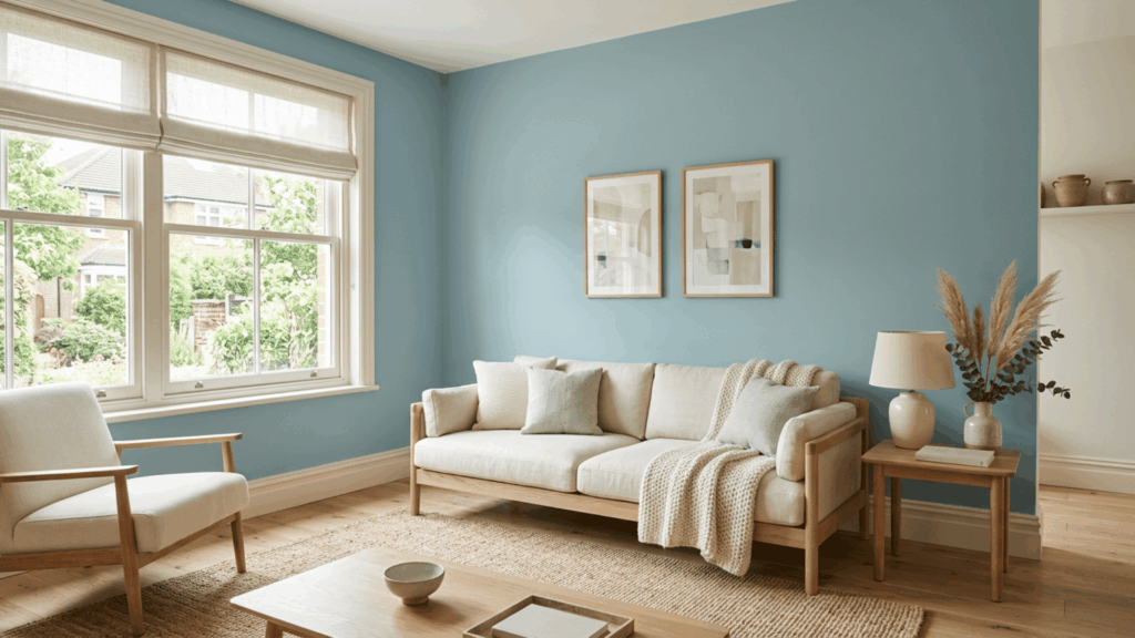
On the wall, Woodlawn Blue feels soft and muted rather than bright or sharply blue. Its LRV of 60.65 keeps it fairly light while still allowing the color to register clearly.
At a glance, expect:
- Overall look: soft and subdued
- Main color: blue
- Secondary influence: green
- Depth: medium-light
- Finish: calmer than aqua or a saturated blue
To my eye, its appeal is that it brings color into a room without taking over. It can feel airy and relaxed, but it still has enough depth to avoid looking washed out.
What Undertones Does Woodlawn Blue Have?
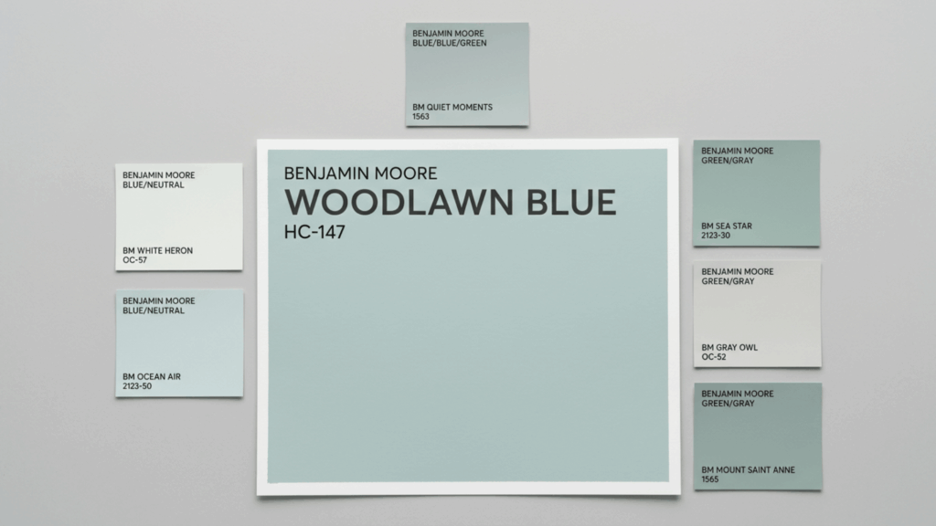
Woodlawn Blue Benjamin Moore is primarily blue, but its appearance can move between blue, green, and muted gray depending on the surroundings.
The green becomes easier to notice when the shade sits beside warm finishes or receives warmer light. Cooler or weaker light can make its blue-gray character more apparent.
The important point is that Woodlawn Blue is not a pure sky blue. If your goal is a clean blue without noticeable green movement, this is one of those colors I would sample carefully before buying several gallons.
Nearby flooring, countertops, upholstery, wood tones, and even the view outside the windows can change which part of the color stands out most.
How Does Woodlawn Blue Change With Lighting?
Woodlawn Blue can look noticeably different as natural light changes throughout the day. Room direction is therefore worth checking before deciding whether the shade works.
Room Direction | How Woodlawn Blue May Read |
|---|---|
North facing | Cooler, quieter, and more blue-gray |
South facing | Brighter, with the blue-green balance easier to see |
East facing | Fresher in morning light and softer later |
West facing | More muted earlier and warmer later in the day |
These are useful starting points rather than guarantees. Window size, landscaping, flooring, and artificial bulbs can all change the result.
I would check the sample at the times you actually use the room. A bedroom color that looks great at noon may feel very different under lamps at night.
What are the Best Uses for Benjamin Moore Woodlawn Blue?
Because Woodlawn Blue Benjamin Moore HC-147 is relatively light and muted, it can work across several rooms without feeling overly dominant.
1. Bedroom
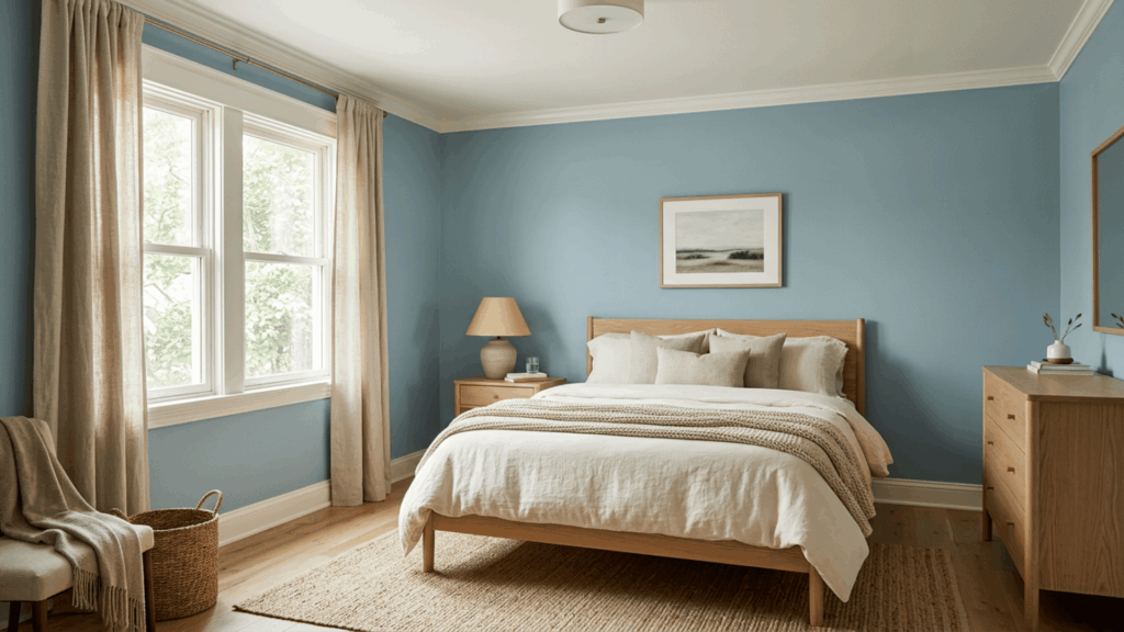
Woodlawn Blue can create a soft backdrop for bedrooms, especially with white or cream bedding, natural linen, and warm wood furniture. It also sits naturally alongside other calm bedroom paint colors that favor muted tones over stronger saturation.
In bedrooms with limited daylight, test it carefully because the color can shift cooler or grayer than expected.
2. Bathroom
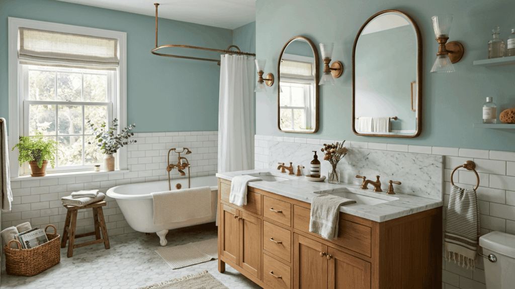
Bathrooms are a natural fit for this blue-green family. Woodlawn Blue works well with white tile, marble, natural wood, and warm metallic finishes.
I would be more careful if the bathroom already contains several cool gray surfaces. Too many cool finishes can make the overall palette feel flatter than the paint chip suggests.
3. Living Room
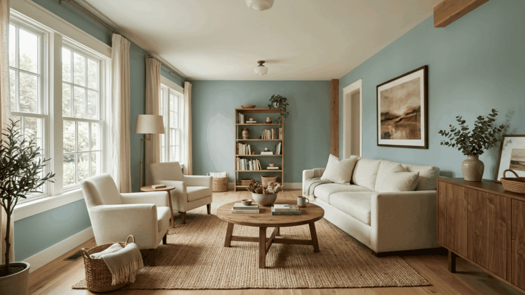
In a living room, Woodlawn Blue adds visible color without becoming the main attraction.
Neutral upholstery, woven materials, medium or warm wood, and simple white trim can help balance its cooler side. It is particularly useful when you want something more interesting than a neutral but still want furniture and artwork to lead the room.
4. Kitchen and Cabinets
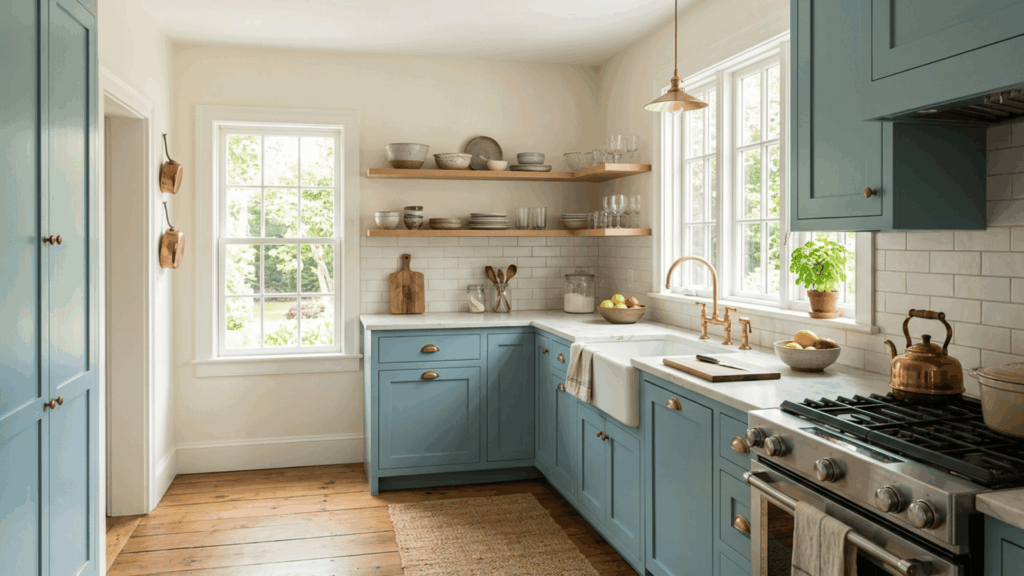
Woodlawn Blue can also move beyond walls. Benjamin Moore includes HC-147 among its blue kitchen cabinet colors, making cabinetry a manufacturer-supported use for the shade.
It can work on a full run of cabinets, an island, built-ins, or a pantry. Warm wood and brass or aged-metal hardware can keep the finished kitchen from feeling overly cool.
What Colors Go With Woodlawn Blue?
Benjamin Moore’s official Woodlawn Blue page suggests White OC-151, Chelsea Gray HC-168, Tawny Port 1281, and Cloud White OC-130 as coordinating colors.
Each creates a different effect:
Pairing | How It Works With Woodlawn Blue |
|---|---|
White OC-151 | Creates a clean, lighter contrast |
Cloud White OC-130 | Gives the blue a softer warm-white partner |
Chelsea Gray HC-168 | Adds a deeper grounded neutral |
Tawny Port 1281 | Introduces warmer color contrast |
Natural wood | Balances the cooler blue-green character |
Brass or aged metal | Adds warmth through small accents |
For trim, I would choose the white only after checking it beside the Woodlawn Blue sample. A warm white and a crisp white can make the exact same wall color read differently.
Woodlawn Blue vs Palladian Blue: What is the Difference?
Woodlawn Blue HC-147 and Palladian Blue HC-144 are close enough that they deserve a side-by-side comparison. Benjamin Moore itself lists Palladian Blue as a similar color to Woodlawn Blue.
Their LRVs are also almost identical:
Woodlawn Blue | Palladian Blue | |
|---|---|---|
Code | HC-147 | HC-144 |
LRV | 60.65 | 60.4 |
Overall read | Muted blue with green and gray movement | Soft airy blue-green |
Best reason to compare | Similar depth but different color balance | Similar depth but greener feel |
Benjamin Moore officially lists Palladian Blue at an LRV of 60.4.
If both colors are on your shortlist, Palladian Blue is worth comparing beside Woodlawn Blue because their LRVs are almost identical, while their blue-green balance differs.
I would still place physical samples side by side. With two colors this close in depth, undertone matters more than brightness.
How Should You Sample Woodlawn Blue Before Painting?
Sampling is especially important with a color that shifts between blue, green, and gray.
Benjamin Moore sells an 8 oz Woodlawn Blue HC-147 color sample designed specifically for testing color. The company says it covers approximately a 2-by-2-foot area with two coats and recommends applying two coats when evaluating the shade.
For a useful test:
- Sample more than one wall: Different walls receive different amounts of light.
- Apply two coats: A thin single coat may not represent the finished color accurately.
- Check it throughout the day: Look in morning, afternoon, and evening light.
- Compare fixed finishes: Hold it beside flooring, counters, tile, and trim.
- Check it under your lamps: Artificial lighting can change the blue-green balance.
I would make the final decision in the actual room rather than from a phone screen or a small online swatch.
Final Verdict: Is Woodlawn Blue a Good Choice?
Woodlawn Blue Benjamin Moore HC-147 is a strong option when you want a soft blue that feels muted rather than bright. Its blue-green movement gives it more personality than a straightforward blue, while the gray influence keeps the color relatively calm.
It is especially worth considering for bedrooms, bathrooms, living rooms, kitchens, and cabinetry where you want noticeable color without heavy saturation.
The tradeoff is that Woodlawn Blue responds strongly to lighting and surrounding finishes. I would shortlist it for rooms with natural light, warm wood, or soft white finishes, but I would not skip the sampling stage.
If Woodlawn Blue feels too green or muted in your space, comparing it with other popular interior paint colors can help you find a similar depth with a different undertone.
Where are you thinking of using Woodlawn Blue? Comment below and share the room and its lighting.
Frequently Asked Questions
Is Benjamin Moore Woodlawn Blue Blue or Green?
Woodlawn Blue reads primarily as a soft blue, but green and gray influences can become more noticeable depending on lighting and nearby finishes.
What is the LRV of Woodlawn Blue HC-147?
Benjamin Moore lists Woodlawn Blue HC-147 with an LRV of 60.65, so it reflects a good amount of light while still showing clear color.
Is Woodlawn Blue Lighter Than Palladian Blue?
Only slightly by LRV. Woodlawn Blue is 60.65 and Palladian Blue is 60.4, so their undertones matter more than their small brightness difference.
Is Woodlawn Blue Good for Kitchen Cabinets?
Yes. Benjamin Moore includes Woodlawn Blue HC-147 in its selection of blue kitchen cabinet colors. Test it beside countertops, backsplash, and hardware first.
When Might Woodlawn Blue Not Work?
It may feel too gray, green, or muted in certain dark rooms or beside cool gray finishes. It is also less suitable if you want a pure, consistent blue.

With a Master in Architectural Studies from University of Pennysylvania, Marwa Haydar has pioneered living spaces since 2005. Her expertise, initially honed in a prestigious architectural firm, is evident in her approach to creating environments. Marwa became part of our team in 2019 and has since been a driving force in our home improvement section, known for her practical yet stylish solutions. She’s been spearheading our design workshops since then, infusing her passion for teaching into her work. In her leisure time, Marwa enjoys exploring historic architecture and is an enthusiastic pottery hobbyist, further enriching her understanding of form and texture.