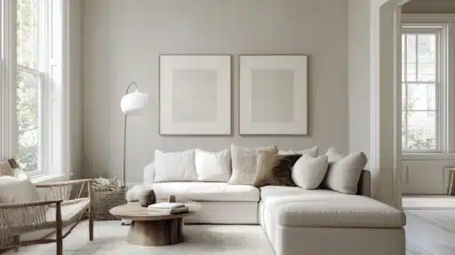
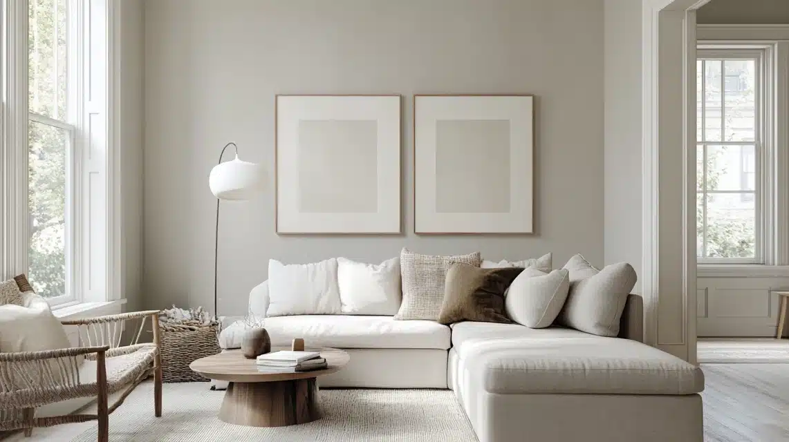
I want to tell you about Agreeable Gray (SW 7029) from Sherwin-Williams and its coordinating colors.
This paint shade sits perfectly between gray and beige, making it a top choice for many homes.
When you’re picking paint colors, getting the right combinations matters—they help your rooms feel put-together and well-planned.
This paint’s mix of warm and cool tints helps it work well with many other colors.
Understanding Agreeable Gray
This paint’s mix of gray and beige (often called greige) makes it very flexible.
Agreeable Gray has a Light Reflectance Value (LRV) of 60, reflecting a good amount of light while providing enough color depth.
In my experience, Agreeable Gray shows different sides of itself based on your room’s lighting.
Natural sunlight might reveal more of its warm beige notes, while artificial lighting can bring out the gray.
When I help people choose colors, I always point out how lighting changes everything.
North-facing rooms might make Agreeable Gray look cooler, while south-facing spaces bring out its warmth.
The colors around it – like your furniture, floors, and decor – also affect its appearance.
Best trim colors for Agreeable Gray
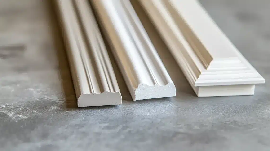
| Trim Color | SW Code | Key Features |
|---|---|---|
| High Reflective White | SW 7757 | Clean, bright white creates a sharp contrast |
| Pure White | SW 7005 | Slight warmth, a good middle-ground option |
| Alabaster | SW 7008 | Warm undertones add softness to the trim |
Tips: Skip cream-colored trim with strong yellow undertones, as they can clash with Agreeable Gray’s subtle tones.
Coordinating wall colors for Agreeable Gray
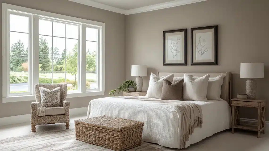
| Wall Color | SW Code | Description | Best Use |
|---|---|---|---|
| Big Chill | SW 7648 | Light gray, low contrast | Flow between spaces |
| Egret White | SW 7570 | Soft off-white | Bright areas, halls |
| Silver Strand | SW 7057 | Gray with blue-green hints | Bathrooms, bedrooms |
| Mindful Gray | SW 7016 | Deep, cool gray | Feature walls |
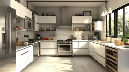
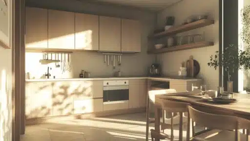
Cabinet and island colors in the kitchen for Agreeable Gray
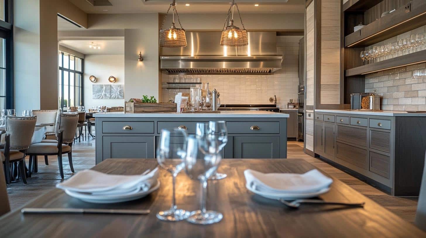
| Cabinet/Island Color | SW Code | Style Notes |
|---|---|---|
| Gauntlet Gray | SW 7019 | Deep charcoal works on full cabinets |
| Dovetail | SW 7018 | Mid-tone gray suits both uppers and lowers |
| Urbane Bronze | SW 7048 | Dark gray-green makes islands stand out |
Accent colors and feature wall ideas for Agreeable Gray
| Accent Color | SW Code | Best Applications |
|---|---|---|
| Cyberspace | SW 7076 | Interior doors, feature walls in offices |
| Grizzle Gray | SW 7068 | Living room accent wall, built-ins |
| Magnetic Gray | SW 7058 | Dining room feature wall, powder rooms |
Create cohesive color palettes featuring Agreeable Gray!
When I combine whole-house color schemes with Agreeable Gray, I focus on colors that share its gentle nature. Here’s how I build a balanced palette.
Main Living Areas
- Primary Walls: Agreeable Gray (SW 7029)
- Supporting Walls: Repose Gray (SW 7015)
- Trim: Pure White (SW 7005)
- Accents: Urbane Bronze (SW 7048)
Connected Spaces
- Kitchen Cabinets: Dovetail (SW 7018)
- Hallways: Egret White (SW 7570)
- Bedrooms: Silver Strand (SW 7057)
Key considerations when pairing colors!
Understanding undertones makes all the difference in creating a successful color scheme.
Agreeable Gray has gentle, warm undertones work best with other muted, earthy colors.
I always tell my clients to look at colors in three ways:
- Natural daylight
- Artificial lighting
- Different times of day
When testing colors together, paint large squares (at least 2 feet by 2 feet) on different walls.
Watch how they change from morning to evening. This helps you see how the colors interact in your specific space.
I find it helpful to limit stronger colors to smaller areas or accents. This keeps the overall feel balanced and lets Agreeable Gray maintain its subtle presence.
The existing elements in your room—flooring, furniture, and natural light—will affect how each color looks. Therefore, take time with samples before making your final choice.
Summing Up
Agreeable Gray (SW 7029) is a versatile greige paint that balances gray and beige tones.
Its Light Reflectance Value of 60 provides good light reflection while maintaining color depth.
The paint changes with lighting – warmer in natural light, cooler in artificial light.
It pairs well with trim colors like Pure White and Alabaster, wall colors like Big Chill and Silver Strand, and deeper accents like Urbane Bronze.
Test samples in different lighting conditions and consider room direction when planning color schemes for best results.
Frequently Asked Questions
How does Agreeable Gray compare to Revere Pewter?
Agreeable Gray is slightly lighter and cooler than Revere Pewter. While both are greige colors, Revere Pewter shows more beige undertones in most lighting conditions.
Can Agreeable Gray be used on exteriors?
Yes, Agreeable Gray works well on house exteriors. It pairs nicely with white trim and stone accents and holds its color well in outdoor lighting conditions.

