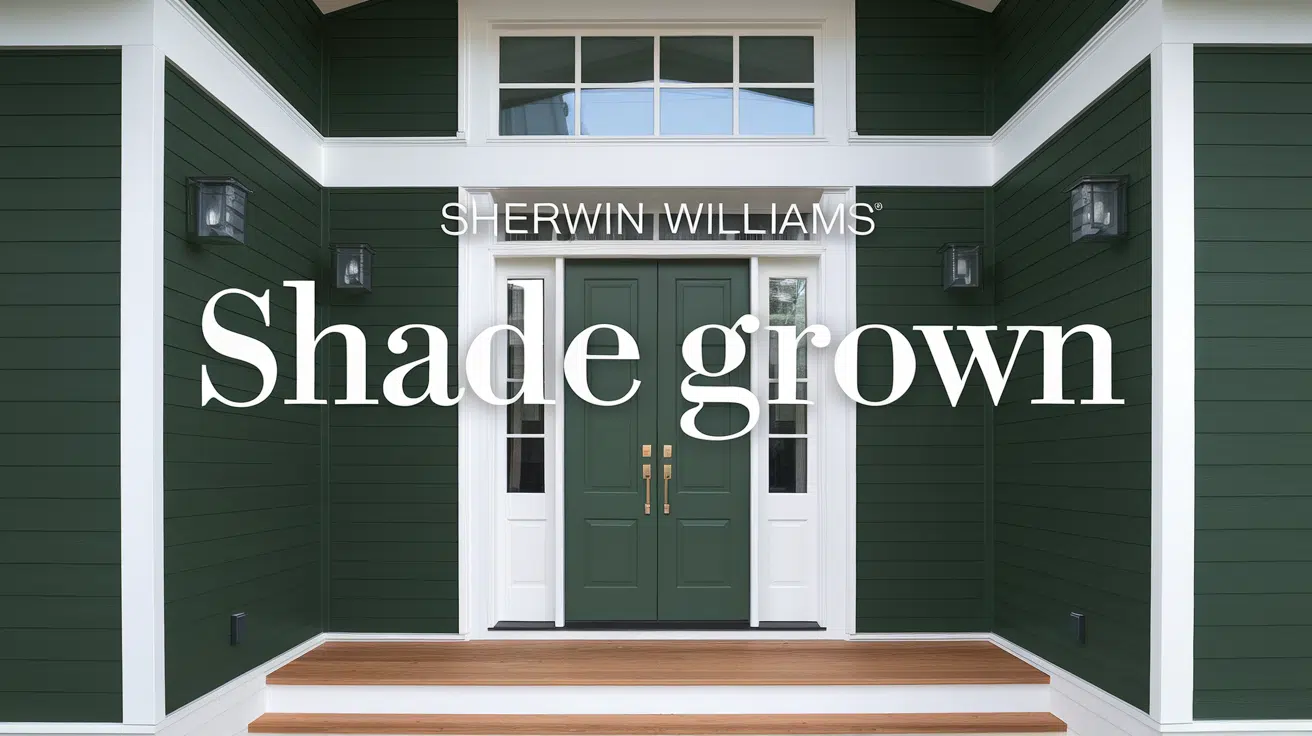
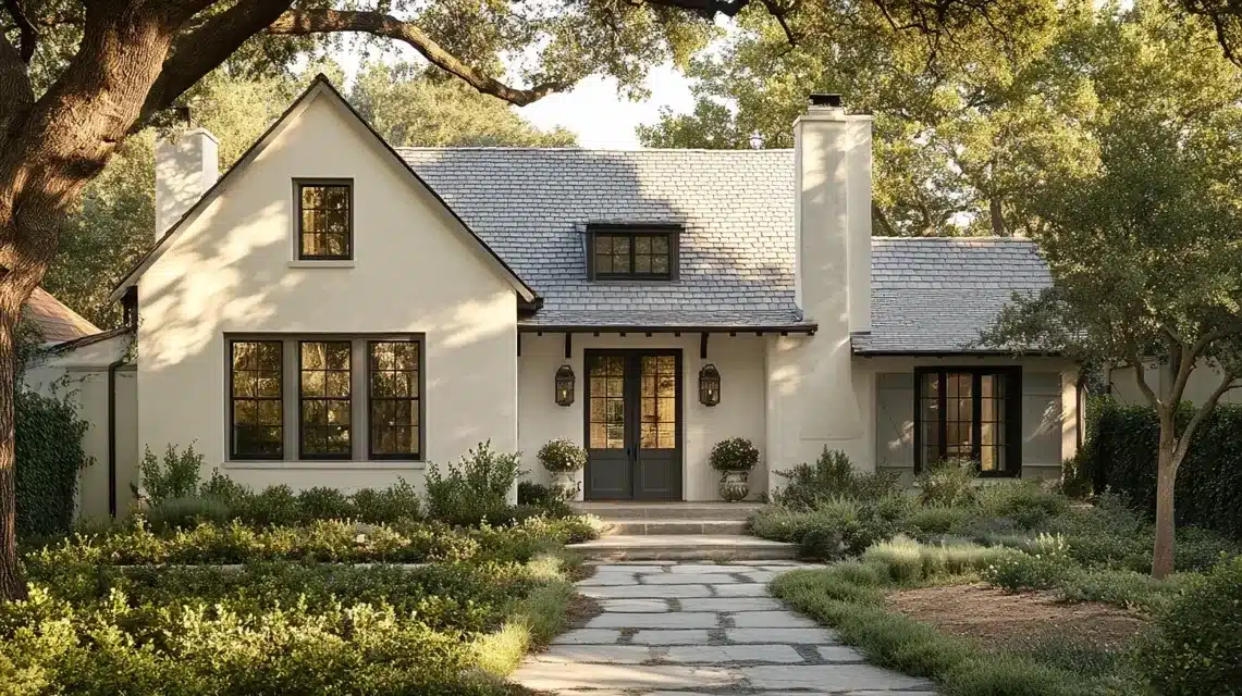
I received an interesting question from a reader about Sherwin-Williams Alabaster paint.
They wanted to know which darker gray would best complement the Alabaster on their home’s exterior.
It’s a smart question because matching colors isn’t as simple as picking any gray you like.
You need to understand how colors work together to create harmony.
Let me share what I learned about finding the perfect gray companion and others for Alabaster on your home’s exterior.
Understanding Alabaster from SW
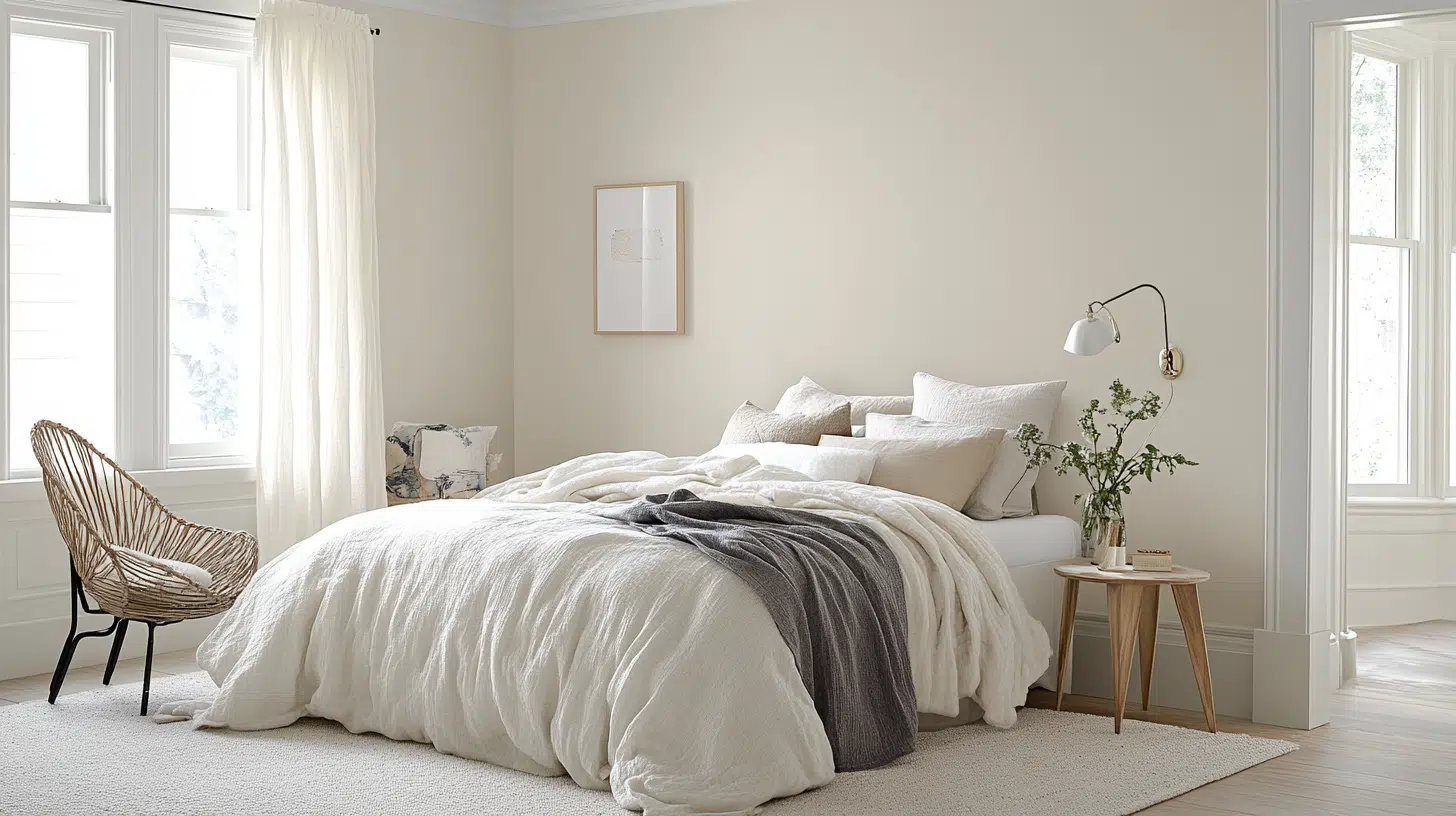
I want you to know something important about Sherwin-Williams Alabaster—it’s not just white paint.
It belongs to the yellow hue family, with a hue angle of 100 degrees.
This matters because when we pick colors to go with it, we need to consider shades that share this color relationship for the best results.
How to Choose Complementary Color
Let me tell you how I find grays that work well with Alabaster. I use the Color DNA Table, which shows me Alabaster’s exact color details – a hue angle of 100 degrees.
When picking a gray, I look for options within the same range to strengthen that color connection.
I start by filtering for Sherwin-Williams colors in the yellow family. Then, I check the hue angles close to 100 degrees.
The less the colors differ in hue angle, the better they’ll work together. I also look at how light or dark the gray is, ensuring it gives enough contrast while keeping that color link.
Using the color DNA table
Let me walk you through my process using the Color DNA Table, a tool that helps you find colors that work well together.
- First, I type “Alabaster” into the search bar. I see options from different brands but want Sherwin-Williams, so I use the brand filter to show only their colors.
- Next, I filter for the yellow hue family since that’s where Alabaster belongs. The table then shows me all Sherwin-Williams colors in this family.
- Since I know, Alabaster sits at 100 degrees. I sort by hue angle. This gives me a list of colors that share Alabaster’s basic color traits. I can scroll up or down to find darker grays that match well.
- I look through these options like I’m shopping – checking each color’s details to find the perfect match. The closer a gray stays to that 100-degree mark, the better it will work with Alabaster.
Recommended darker gray colors that complement Alabaster
1. French gray
This shade leans more neutral, with a very low chroma of 0.33. It gives you a solid contrast with Alabaster while keeping things subtle.
Most people see the color as a true gray, making it a safe choice for exteriors. It sits well within the yellow family but doesn’t show its yellow undertones too strongly.
2. Dorian gray
I put this one high on my list for exteriors. From my experience, it creates just the right amount of contrast with Alabaster without looking too stark.
It stays true to the yellow family connection while giving that perfect gray appearance that many homeowners want.
3. Chat room
Here’s something a bit different – this color shows a slight green tint. While it might sound odd, it works because it keeps that yellow family connection.
The green hint adds interest without breaking the color harmony. You’ll want to test this one carefully in your lighting.
4. Bedrock
This color moves a bit further from Alabaster’s exact hue angle but still maintains enough connection to work.
It gives you a solid gray appearance with low chroma, meaning it won’t compete with Alabaster for attention.
5. Herbal wash
If you’re open to something beyond pure gray, this gray-green option might surprise you. It keeps the yellow family connection but adds more character.
It works especially well in natural settings or with homes surrounded by greenery.
6. Canal street
This color gives you that darker gray look while staying firmly in the yellow family.
It provides a good contrast with Alabaster but keeps the color harmony intact. The connection between these two colors feels natural rather than forced.
7. Adaptive shade
While this sits at the edge of our ideal hue angle range, it’s worth considering.
It gives you that darker tone you might want while still maintaining enough color connection to Alabaster to create a cohesive look.
Coordinating Colors with SW Alabaster

Choosing the right color to pair with Sherwin-Williams Alabaster can set the tone for any space. Here’s a quick guide to top companion shades by style.
| Category | Color | Description | Best Uses |
|---|---|---|---|
| A. Neutral Companions | Accessible Beige (SW 7036) | Warm, inviting nature | Ideal for living spaces |
| Repose Gray (SW 7015) | A versatile greige that complements Alabaster | Great for walls and open spaces | |
| Mindful Gray (SW 7016) | Slightly deeper adds depth without overpowering | Works well in living rooms and kitchens | |
| B. Bold Accent Colors | Urbane Bronze (SW 7048) | 2021 Color of the Year, rich and sophisticated | Perfect for accent walls or cabinetry |
| Peppercorn (SW 7674) | A deep gray adds drama and contrast | Best for accent walls and trim | |
| Iron Ore (SW 7069) | Almost black, it provides striking elegance | Ideal for dramatic features and cabinetry | |
| C. Cool and Calming Hues | Evergreen Fog (SW 9130) | A subdued green-gray creates a peaceful atmosphere | Ideal for bedrooms or calming spaces |
| Sea Salt (SW 6204) | Light blue-green enhances spa-like spaces | Best for bathrooms and relaxation areas | |
| Rainwashed (SW 6211) | Soft aqua gives off serene vibes | Great for bedrooms, bathrooms, and nurseries | |
| D. Warm and Cozy Tones | Taupe Tone (SW 7633) | Earthy and grounding | Perfect for living rooms and dens |
| Townhall Tan (SW 7690) | Adds warmth and comfort | Great for cozy spaces and family rooms | |
| E. Soft Blushes and Pastels | Intimate White (SW 6322) | A delicate pink-beige, perfect for bedrooms | Ideal for bedrooms or feminine spaces |
| Quaint Peche (SW 6330) | Soft peach brings subtle color | Perfect for bathrooms or accent walls |
Tips for choosing the right shade
I always tell people that picking colors isn’t just about what looks good on paper. Follow these steps to ensure that you get it right.
- Test samples: First, get actual paint chips of your top choices. Your home’s lighting colors may differ from those in the store.
- Context matters: Look at how these grays work with everything else on your house—your roof, brick, stone, or other materials that won’t change—the gray needs to work with all of these elements, not just alabaster.
- Avoiding too much contrast: stay close to the Alabaster’s 100-degree hue angle when possible. The further you move away, the less natural the pairing might look.
Comparing Alabaster to other whites from SW
| White Paint | Features | Undertones | Best Uses | Brightness | Styling Tips |
|---|---|---|---|---|---|
| Alabaster (SW 7008) | It belongs to the yellow hue family | Warm with soft yellow undertones | Perfect for south-facing rooms and warm color schemes | LRV: 82 | Works well with earthy tones and natural materials |
| Pure White (SW 7005) | True white base | Neutral with minimal undertones | Best for modern spaces and clean color schemes | LRV: 84 | Pairs well with both cool and warm colors |
| Extra White (SW 7006) | Brightest white option | Cool with slight blue undertones | Ideal for contemporary spaces and north-facing rooms | LRV: 86 | Best with cool colors and modern finishes |
| Snowbound (SW 7004) | Soft white base | Slightly warm with gray undertones | Great for transitional spaces and balanced lighting | LRV: 83 | Versatile with most color schemes |
Summing Up
I’ve shown you how to find the perfect gray match for Alabaster by understanding its yellow hue family and 100-degree angle.
We explored grays like French and Dorian Gray. Other great companions included Accessible Beige for warmth, Urbane Bronze for a bold contrast, and Sea Salt for a calming touch.
Remember to test your samples at home and consider all your exterior elements.
The key is staying within the same color family and checking how the colors look in your specific setting.
Frequently Asked Questions
Can Alabaster be used for trim and ceilings?
Alabaster works well for trim and ceilings due to its balanced warmth. Its LRV of 82 provides enough brightness without being too stark.
Is Alabaster suitable for exterior use?
Absolutely. Alabaster performs well on exteriors, particularly when paired with coordinating colors from the yellow hue family for a balanced look.
Is Alabaster a warm or cool white?
Alabaster is a warm white. It is in the yellow hue family and has a 100-degree hue angle, which gives it subtle warmth without being too yellow.

Alex Guerrero, a graduate with a Fine Arts degree from the Rhode Island School of Design, has been a visionary in the world of color and design for over 15 years. His professional journey began in the heart of the fashion industry in Milan, where he developed an acute sense for color harmonies and trends. Alex joined our team in 2018, offering fresh and innovative perspectives on color utilization in various spaces. Renowned for his ability to blend contemporary trends with timeless elegance. Outside of work, Alex is an accomplished painter and a volunteer art therapist, his artistic talents further enriching his professional insights.