Welcome to my personal favorite, Gray Cashmere—a color that changed my living space from ordinary to extraordinary.
I’ve fallen in love with this refined light gray, with its whispered blue-green undertones that shift magically throughout the day.
When I first painted my living room, I was amazed at how it appeared soft and airy in morning light and rich and complex by evening.
Have you been searching for the perfect neutral that isn’t boring? Gray Cashmere delivers that unattainable balance—cool enough to feel fresh, warm enough to feel inviting. I’ve paired it with everything from crisp whites to natural woods, and it never disappoints.
Ready to create a space that feels both timeless and current? Let me show you why Gray Cashmere might be your perfect color solution.
Understanding Paint Color Basics
Color Terminology
| PROPERTY | VALUE |
|---|---|
| LRV (Light Reflectance Value) | 64.53 |
| Color Category | Considered a light-medium color (LRV between 50-70) |
| Comparison | Pure white: ~90 LRV, Black: ~0 LRV |
| RGB Value | Red: 207, Green: 213, Blue: 205 |
| Hex Code | #CFD5CD |
Undertones:
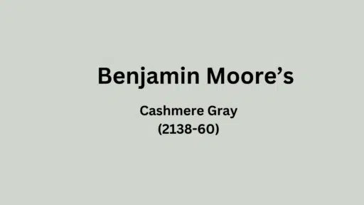
- Gray Cashmere is a soft, light gray with subtle blue-green undertones.
- Gray Cashmere leans slightly cooler with its blue-green influence.
- It’s still considered neutral and works well as a refined alternative to stark white.
- Gray Cashmere creates a serene, airy feeling in spaces while providing more depth than pure white.
- It’s versatile and pairs well with both warm and cool color schemes.
Psychology of Neutral Colors
- It creates mental clarity and calm by reducing visual stimulation, allowing the mind to rest.
- Conveys subtle refinement through understated classiness rather than bold statements.
- Enhances perception of space and light, fostering feelings of openness and freedom.
- It provides emotional adaptability, serving as a versatile backdrop for changing moods and activities.
Why Choose this color?
Versatility
Gray Cashmere alters beautifully across lighting conditions, appearing more blue in natural light while maintaining its soft gray grace in artificial lighting.
Its balanced blue-green undertones create a versatile neutral that pairs effortlessly with both warm and cool color palettes.
Key Features
Gray Cashmere coordinates exceptionally with permanent fixtures, creating urbane transitions between spaces without competing with structural elements.
It provides a tranquil backdrop that feels current yet timeless, avoiding the dated quality of more trendy colors.
Durability
Benjamin Moore Gray Cashmere in premium finishes like Aura or Regal Select delivers excellent wear resistance with superior washability in busy areas.
Its subtle depth effectively masks minor imperfections and maintains color integrity even with frequent cleaning when properly applied.
Texture Patterns
Gray Cashmere creates a gentle, luminous quality that adds dimension to walls while maintaining visual cohesion.
Its blue-green undertones produce nuanced shadow play that softens harsh lighting and improves textured surfaces without overwhelming the space.
Why It Works
Gray Cashmere succeeds by perfectly balancing coolness with neutrality, providing an urbane color that feels both fresh and grounded.
This adaptable neutral shifts gracefully throughout the day, maintaining its refined character across changing light conditions.
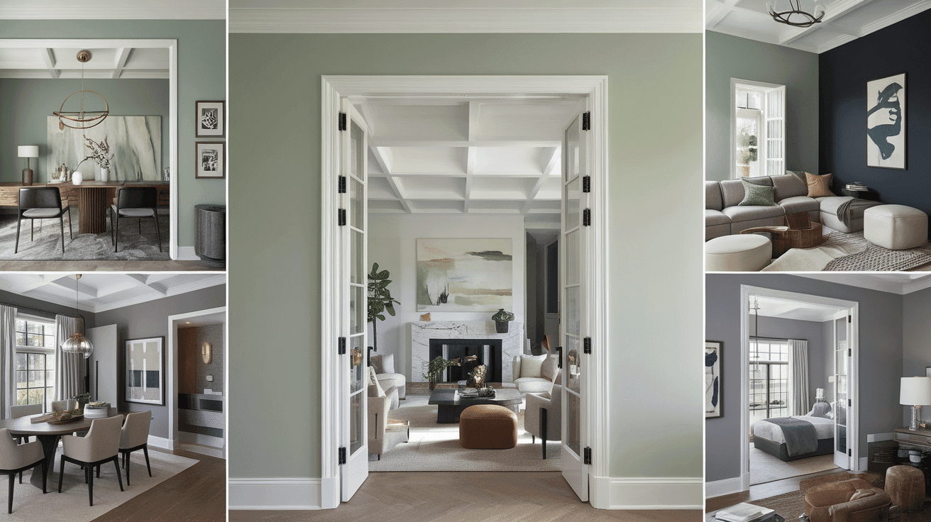
Room-by-Room Color Recommendations for Gray
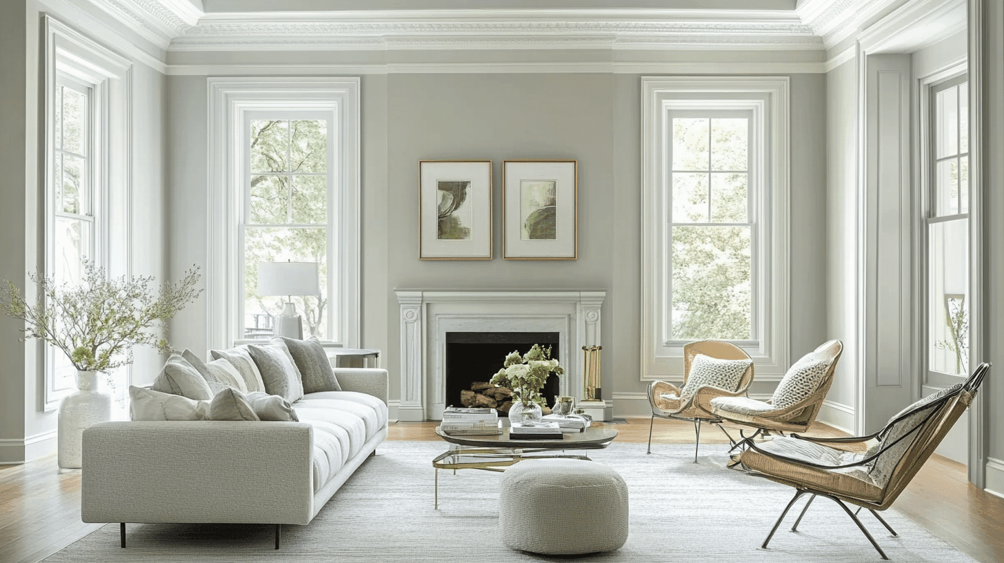
In Living Spaces and Open Floor Plans

- Gray Cashmere creates cultured continuity in open floor plans with its balanced blue-green undertones that maintain consistency across varying light conditions.
- The moderate LRV of Gray Cashmere provides enough brightness to improve spaciousness while offering more depth than standard whites.
- For structural interest, pair Gray Cashmere walls with crisp white trim in White OC-117 or create a subtle contrast with Wickham Gray HC-171 for moldings.
Practical Application Example: In a 1,200 square foot open concept home, use Gray Cashmere on all main walls. Paint the kitchen island in White OC-117 for contrast. Add Wickham Gray HC-171 on the fireplace accent wall to create visual interest without breaking the flow.
In Bedrooms and Relaxation Areas
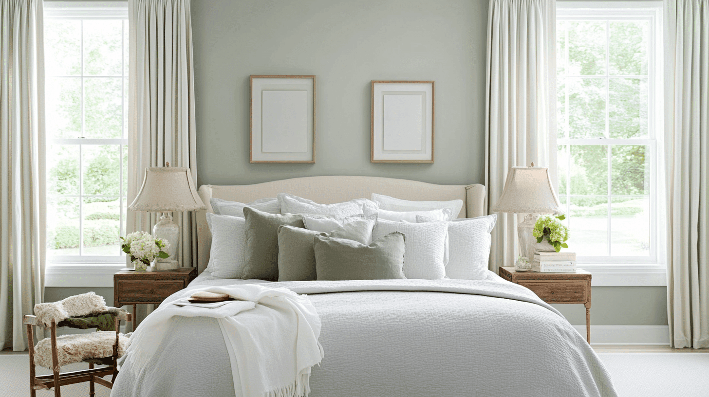
- Gray Cashmere establishes a peaceful sanctuary in bedrooms with its soft, cool undertones that promote restfulness and calm.
- The blue-green influence creates a soothing environment while maintaining an airy quality that prevents the space from feeling confined.
- Consider Gray Cashmere for an accent wall behind the bed to enhance the room’s restful focal point without overwhelming the space.
Practical Application Example: Paint three walls in Gray Cashmere using eggshell finish for easy cleaning. Create an accent wall behind the headboard using Night Mist (1569) for subtle depth. Pair with white bedding and natural wood nightstands for a spa-like retreat.
In Kitchen
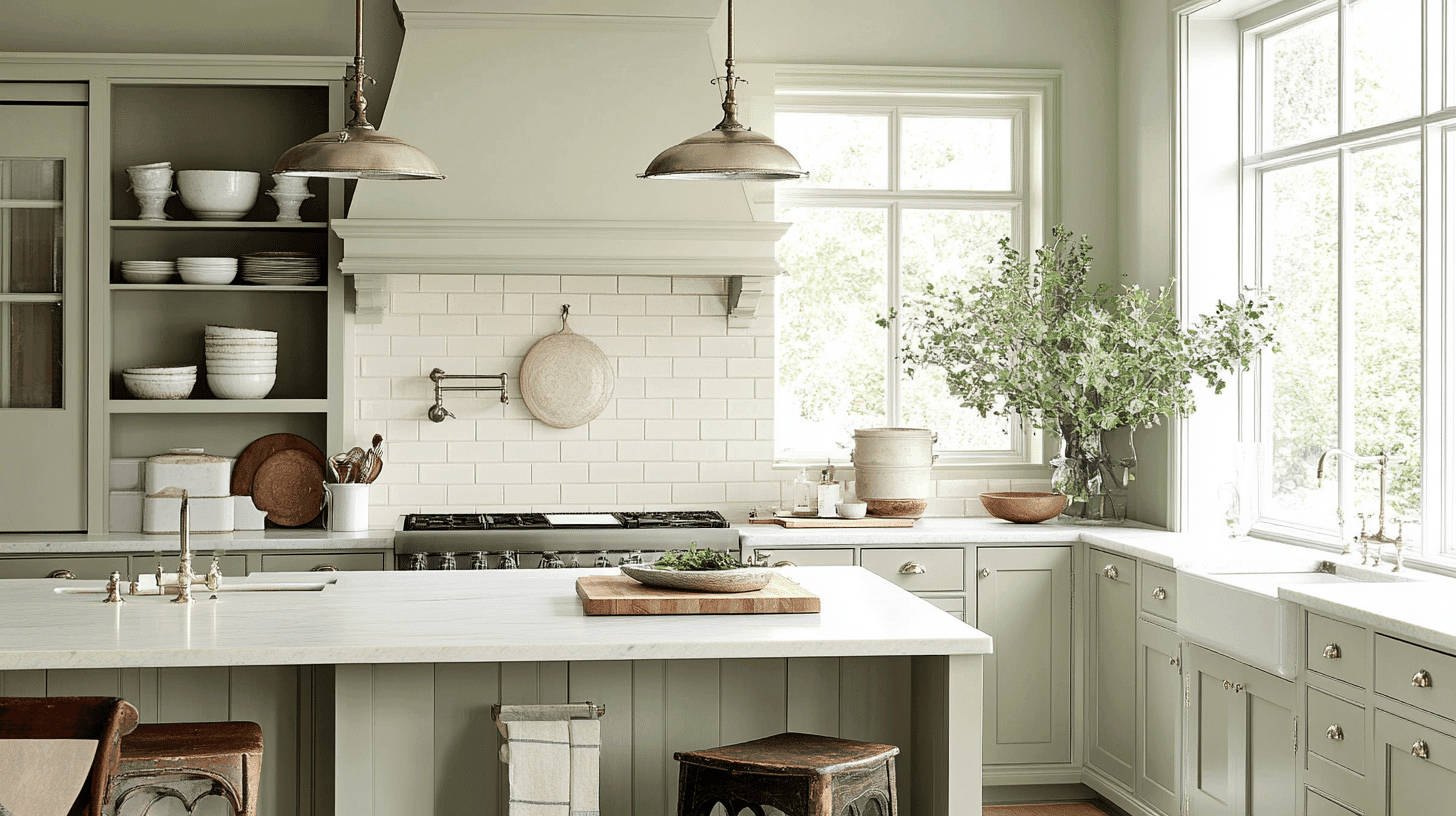
- Gray Cashmere in pearl or satin finish offers excellent practicality in kitchens, while its subtle depth conceals inevitable marks better than pure whites.
- The cool undertones complement stainless steel appliances and provide a smart contrast with warm wood elements or brass hardware.
- Gray Cashmere creates a refined backdrop for both white and colored cabinetry, adapting beautifully to kitchen renovations and style updates.
Practical Application Example: Use Gray Cashmere on upper and lower cabinets in a small galley kitchen. Paint the walls in Ice Cap (1576) to reflect more light. Add a subway tile backsplash in soft white with gray grout for cohesion. Install brass cabinet pulls and pendant lights for warmth.
In Bathrooms and Spa-Like Retreats
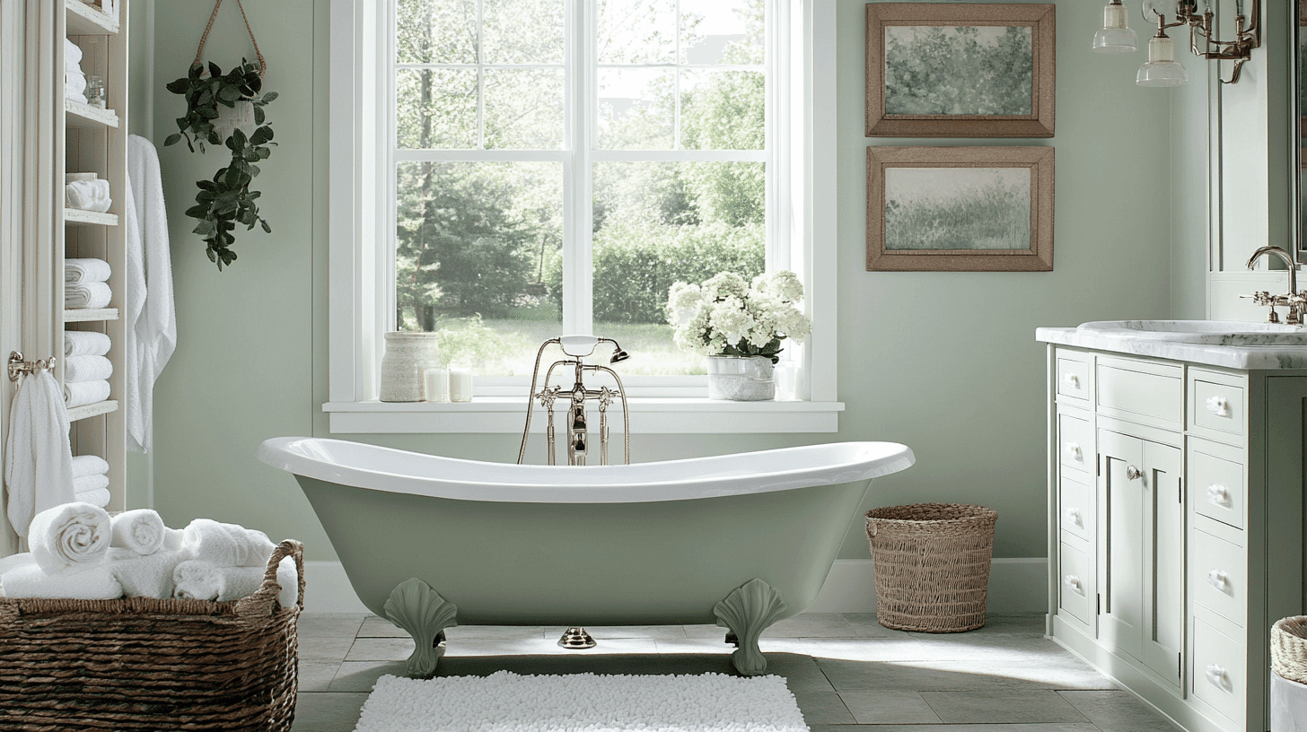
- Gray Cashmere establishes a contemporary, spa-like atmosphere in bathrooms. Its blue-green undertones enhance the space’s fresh feeling while softening harsh lighting.
- This versatile neutral pairs exceptionally well with white porcelain, marble veining, and chrome fixtures, creating a timeless yet current aesthetic.
Practical Application Example: Paint bathroom walls in Gray Cashmere using satin finish for moisture resistance. Install white subway tiles from floor to ceiling on the shower wall. Add a white vanity with marble countertop and chrome faucets. Include natural elements like bamboo storage baskets and eucalyptus plants.
Color Pairings and Combinations for Gray Cashmere
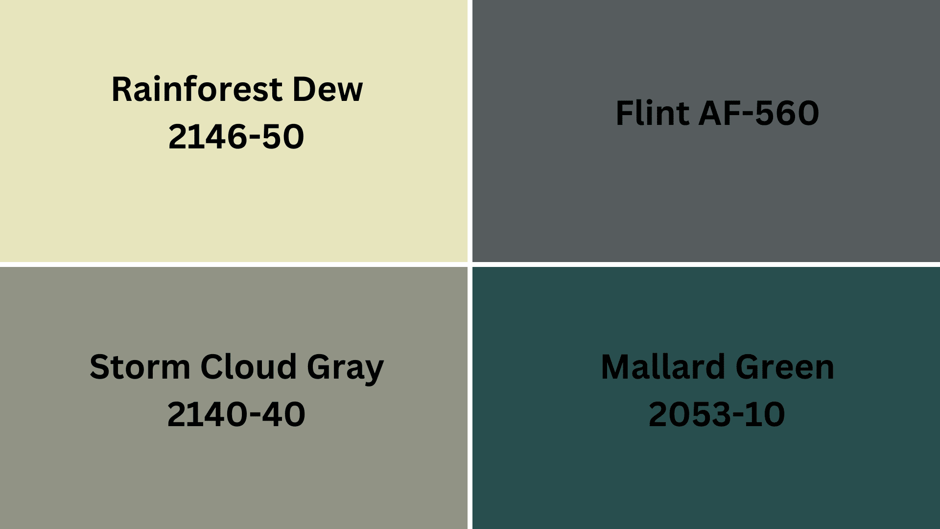
If you’re considering Gray Cashmere (2138-60) but want to dig through similar options, these alternatives offer comparable qualities with subtle variations:
Complementary Trim Colors
Storm Cloud Gray (2140-40) – A deeper, more saturated version with similar blue-green undertones but greater drama and depth.
Rainforest Dew (2146-50) – A slightly greener alternative that maintains Gray Cashmere’s softness while introducing more natural, organic undertones.
Flint (AF-560) – A more neutral alternative with less blue-green influence, creating a more grounded, urbane feel while maintaining Gray Cashmere’s lightness.
Mallard Green (2053-10) – A bolder, more saturated option that amplifies the green undertones present in Gray Cashmere for spaces that benefit from a stronger color statement.
Each of these options maintains compatibility with Gray Cashmere’s recommended trim colors and complementary palettes while offering a distinctive character.
Creating Cohesive Color Schemes with Gray Cashmere (2138-60)
1. Monochromatic Scheme
- Gray Cashmere for main walls
- Ice Cap (1576) for trim
- White Diamond (2121-60) for ceilings
- Night Mist (1569) for accent pieces or adjoining rooms
2. Cool Color Scheme
- Gray Cashmere for main living areas
- Healing Aloe (1562) for dining room
- Quiet Moments (1563) for hallways
- Silver Mist (1619) for bedrooms
3. Warm-Cool Balance Scheme
- Gray Cashmere for main walls
- Oystershell (864) for bathrooms
- Beach Glass (1564) for bedrooms
- November Rain (2142-60) for home office
Coordinating with Furniture and Decor
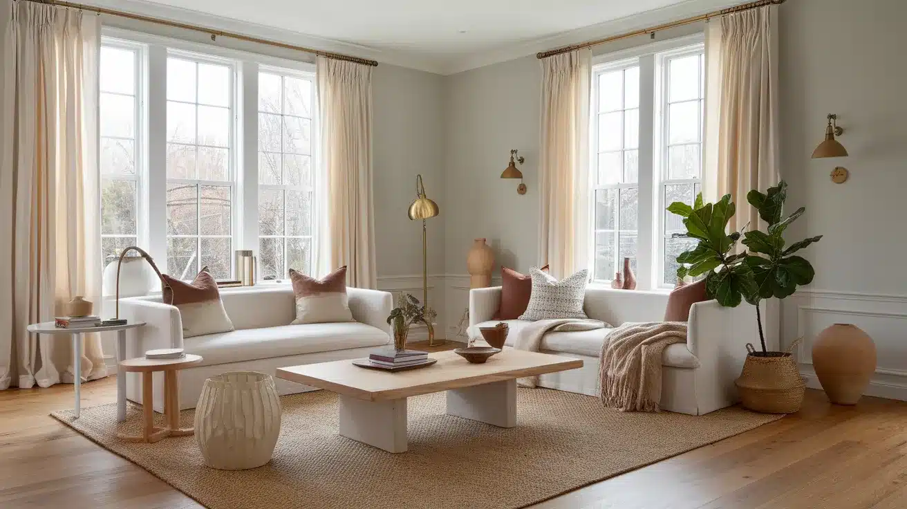
Wood Tones
Gray Cashmere works beautifully with medium to light wood tones like oak, maple, and birch. White-washed or pickled woods paired with this versatile cream create a serene, coastal feel.
For a more dramatic look, walnut provides rich contrast while maintaining a warm atmosphere.
Metals
Brushed nickel, chrome, and brass hardware complement Gray Cashmere’s warm undertones.
Antique bronze fixtures add depth and character against the soft cream backdrop. The neutral base allows for successfully mixing metallic finishes throughout a space.
Decor
Natural elements like jute, rattan, and houseplants enhance Gray Cashmere’s warmth and create an inviting atmosphere.
Ceramic pieces in earth tones complement the cream backdrop while adding subtle dimension. Woven baskets, organic shapes, and light-filtering linen window treatments complete the refined yet comfortable aesthetic.
Similar Paint Colors: Perfect Alternative to Gray Cashmere
Gray Cashmere is a refined light gray with subtle blue-green undertones. Its balanced Light Reflectance Value makes it a versatile neutral that can create serene, refined spaces while providing more dimension than basic whites.
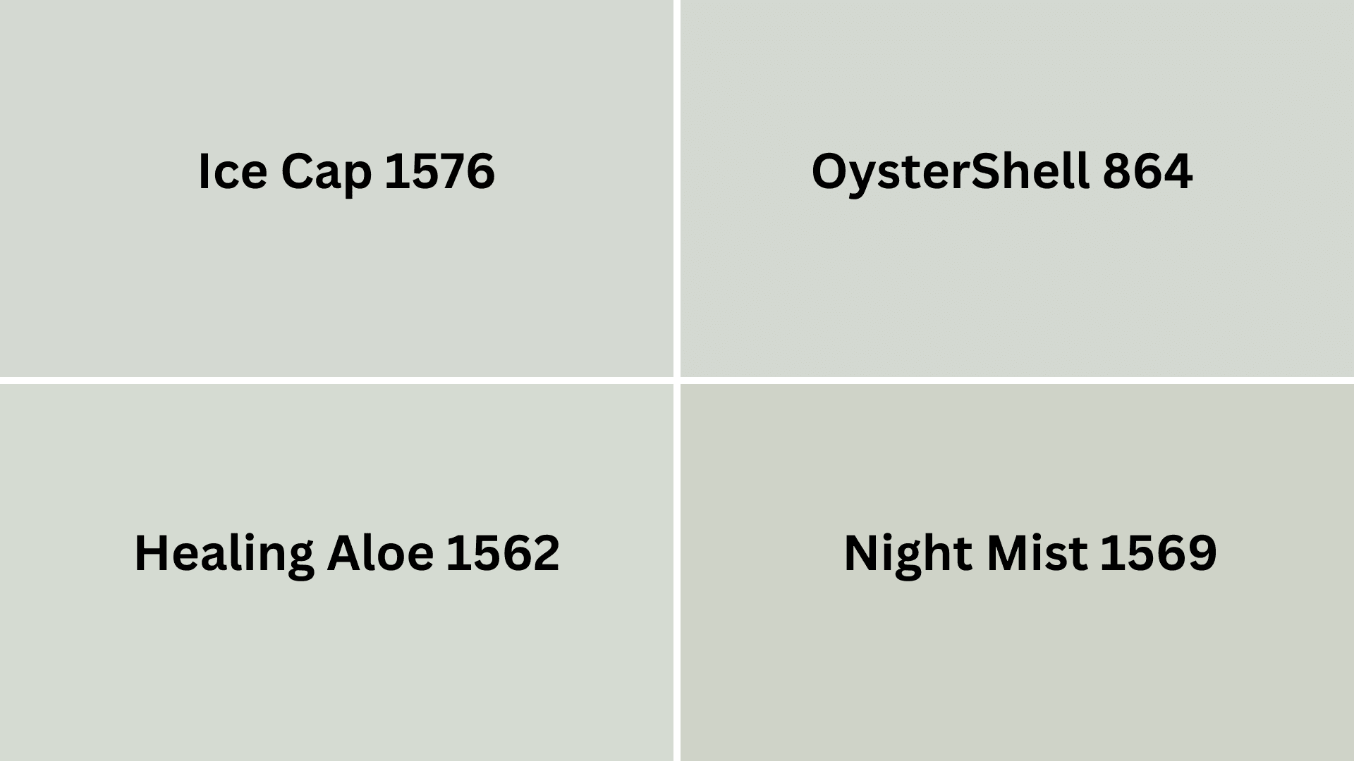
- Ice Cap (1576) – A crisp, clean white that creates smart contrast against Gray Cashmere’s soft depth.
- Healing Aloe (1562) – A gentle green-gray that enhances Gray Cashmere’s subtle undertones for a balanced flow.
- Night Mist (1569) – A deeper blue-gray that provides refined definition while maintaining color family continuity.
- Oystershell (864) – A warm-toned neutral that balances Gray Cashmere’s coolness for a refined, nuanced pairing.
Wrapping It Up
After living with Gray Cashmere in my home for three years now, I can confidently say this versatile color continues to impress me daily.
Its subtle blue-green undertones have provided the perfect backdrop for both my traditional furniture and newer contemporary pieces.
I’ve noticed that my guests always comment on the “peaceful feeling” of my space without immediately identifying the wall color as the source. That’s the magic of Gray Cashmere—it creates an atmosphere without demanding attention.
Ready to change your space with this refined neutral? I encourage you to sample Gray Cashmere on different walls in your home.
Watch how it shifts throughout the day before making your final decision. Trust me—this smart chameleon might be exactly what your home has been missing.
Take that first step toward your quiet space today.

Alex Guerrero, a graduate with a Fine Arts degree from the Rhode Island School of Design, has been a visionary in the world of color and design for over 15 years. His professional journey began in the heart of the fashion industry in Milan, where he developed an acute sense for color harmonies and trends. Alex joined our team in 2018, offering fresh and innovative perspectives on color utilization in various spaces. Renowned for his ability to blend contemporary trends with timeless elegance. Outside of work, Alex is an accomplished painter and a volunteer art therapist, his artistic talents further enriching his professional insights.