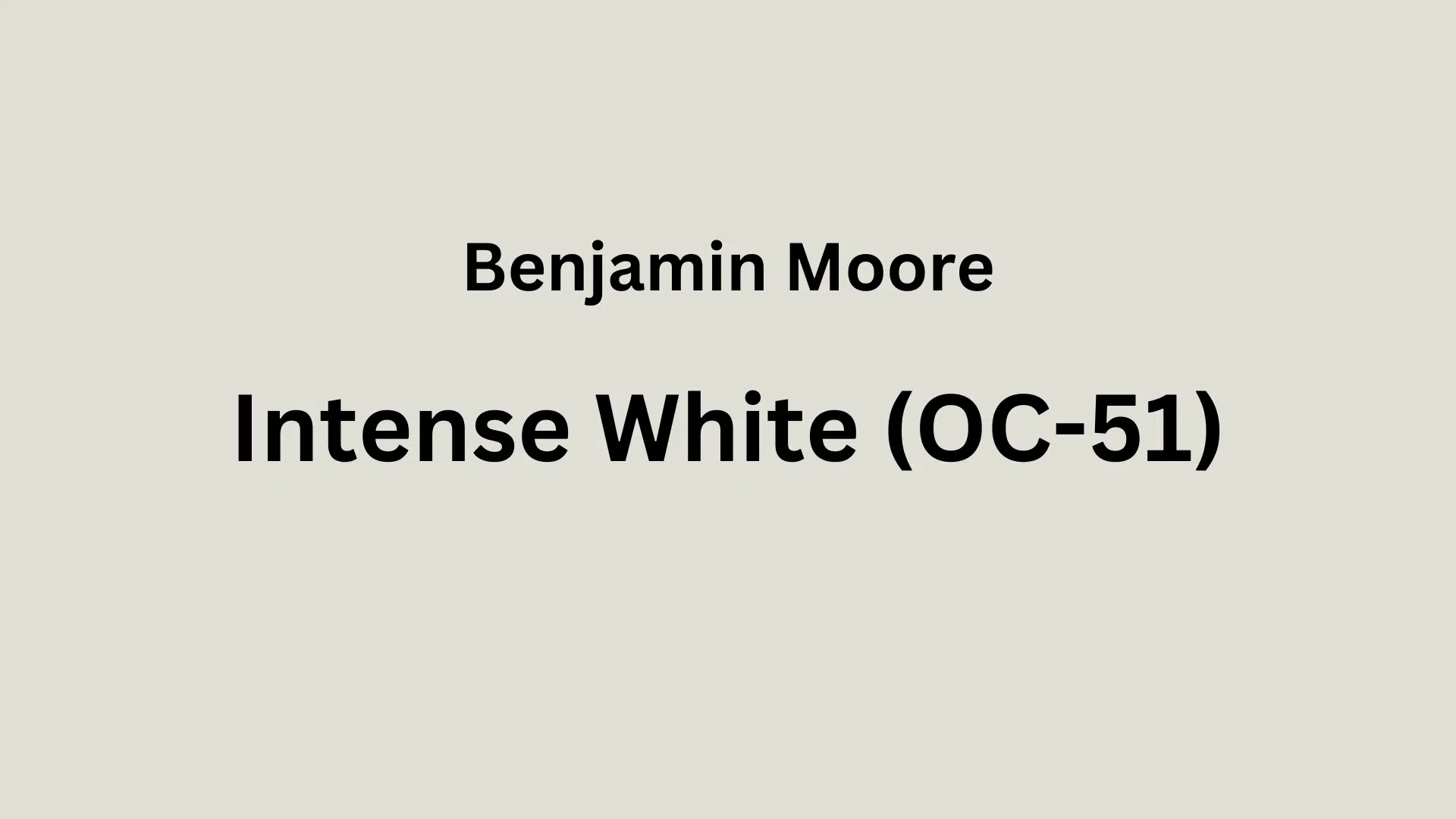
Are you tired of stark white walls but still want a bright, airy space? Intense White Benjamin Moore (OC-51) might be your perfect solution.
This refined off-white has subtle gray-blue undertones that create a fresh, clean look without feeling cold or sterile. With a high LRV of 73.36, it reflects plenty of light while adding just enough depth to make your space interesting.
Intense White balances beautifully between warm and cool, making it incredibly versatile for any room in your home.
In this blog, we’ll find why Intense White is so popular, how it works in different rooms, what colors pair well with it, and why it might be the perfect choice for your next painting project.
Understanding Paint Color Basics
Color Terminology
| PROPERTY | VALUE |
|---|---|
| LRV | 73.36 |
| RGB | (224, 223, 215) or (225, 222, 213) |
| Hex Code | #E0DFD7 or #E1DED5 |
Undertones
- Intense White has subtle gray-blue undertones
- It’s a soft off-white with very light, cool undertones
- Not a stark or pure white but a refined neutral
Psychology of Off-White/Neutral Colors
- Off-whites like Intense White: Create a sense of openness and calm
- Cool undertones: Offer freshness and clarity
- Bright neutrals: Evoke cleanliness, subtle refinement, and timelessness
- Benefits: Less harsh than pure white, easy on the eyes, and creates a clean backdrop for other design elements
Why Choose Benjamin Moore’s Intense White (OC-51)?
1. Key Features
Benjamin Moore Intense White (OC-51) offers refined versatility. Its soft gray undertones create a contemporary feel while maintaining warmth.
It performs exceptionally well in various lighting conditions, appearing crisp in direct sunlight while providing gentle luminosity in north-facing rooms.
This chameleon-like quality makes it an ideal transitional color for open floor plans. It creates an ideal flow between spaces while adapting beautifully to each room’s unique lighting conditions.
2. Durability
Benjamin Moore Intense White, particularly in premium formulations like Aura or Regal Select, delivers outstanding durability with excellent resistance to daily wear.
Its subtle gray undertones create depth that helps camouflage minor imperfections and fingerprints better than brighter whites.
The paint maintains its integrity with regular cleaning and resists yellowing over time, ensuring your walls maintain their refined appearance for years to come.
3. Texture Patterns
Intense White creates a luminous, barely-there texture that enhances architectural details without competing with them. Its soft gray undertones produce subtle shadow play that adds dimension to walls and moldings.
When applied across different surfaces and finishes, it unifies spaces while allowing textural elements like wood, stone, or textiles to shine, creating a refined backdrop that feels both contemporary and timeless.
Room-by-Room Color Recommendations with Intense White
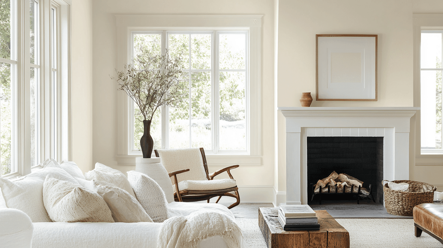
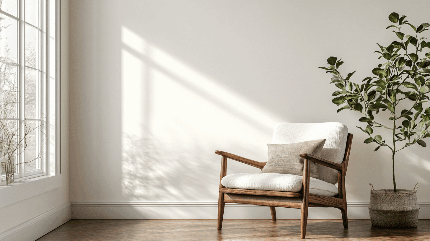
1. Living Spaces and Open Floor Plans
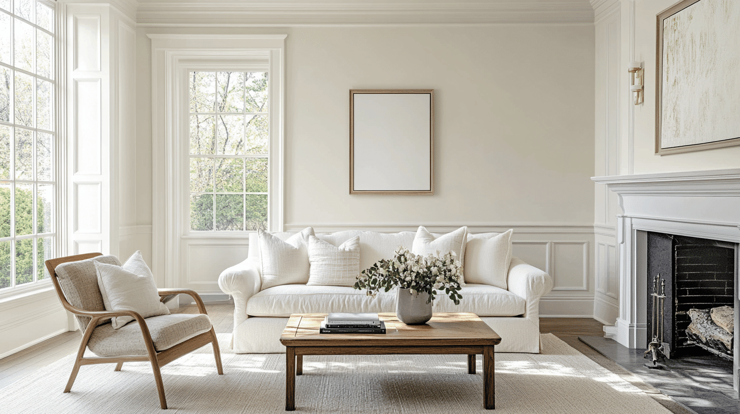
- Intense White’s subtle gray undertones create a graceful, contemporary feel while maintaining enough warmth to keep living spaces inviting rather than stark.
- With a high LRV of 73.36, Intense White reflects ample light throughout open floor plans while providing just enough depth to define constructive features.
- For added dimension, pair Intense White walls with crisp White Dove (OC-17) trim or ground the space with darker accents in Metropolitan (AF-690).
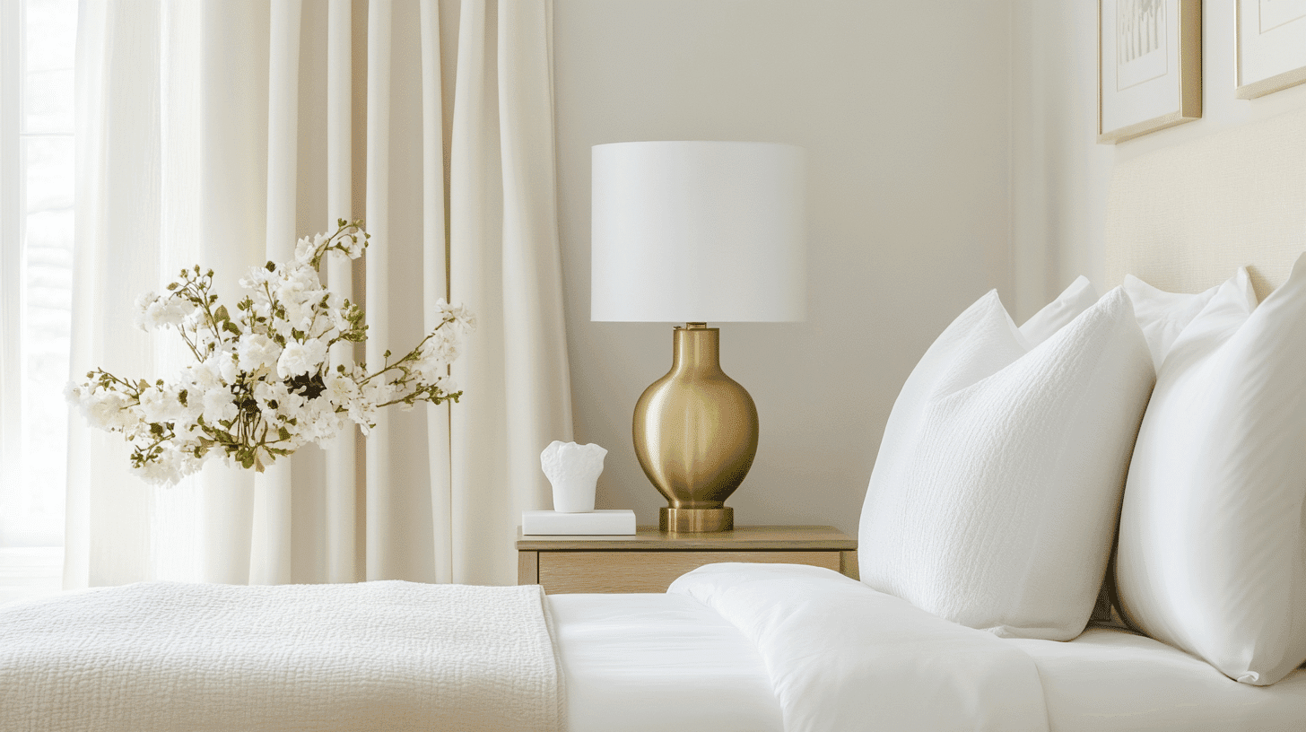
2. Bedrooms and Relaxation Areas
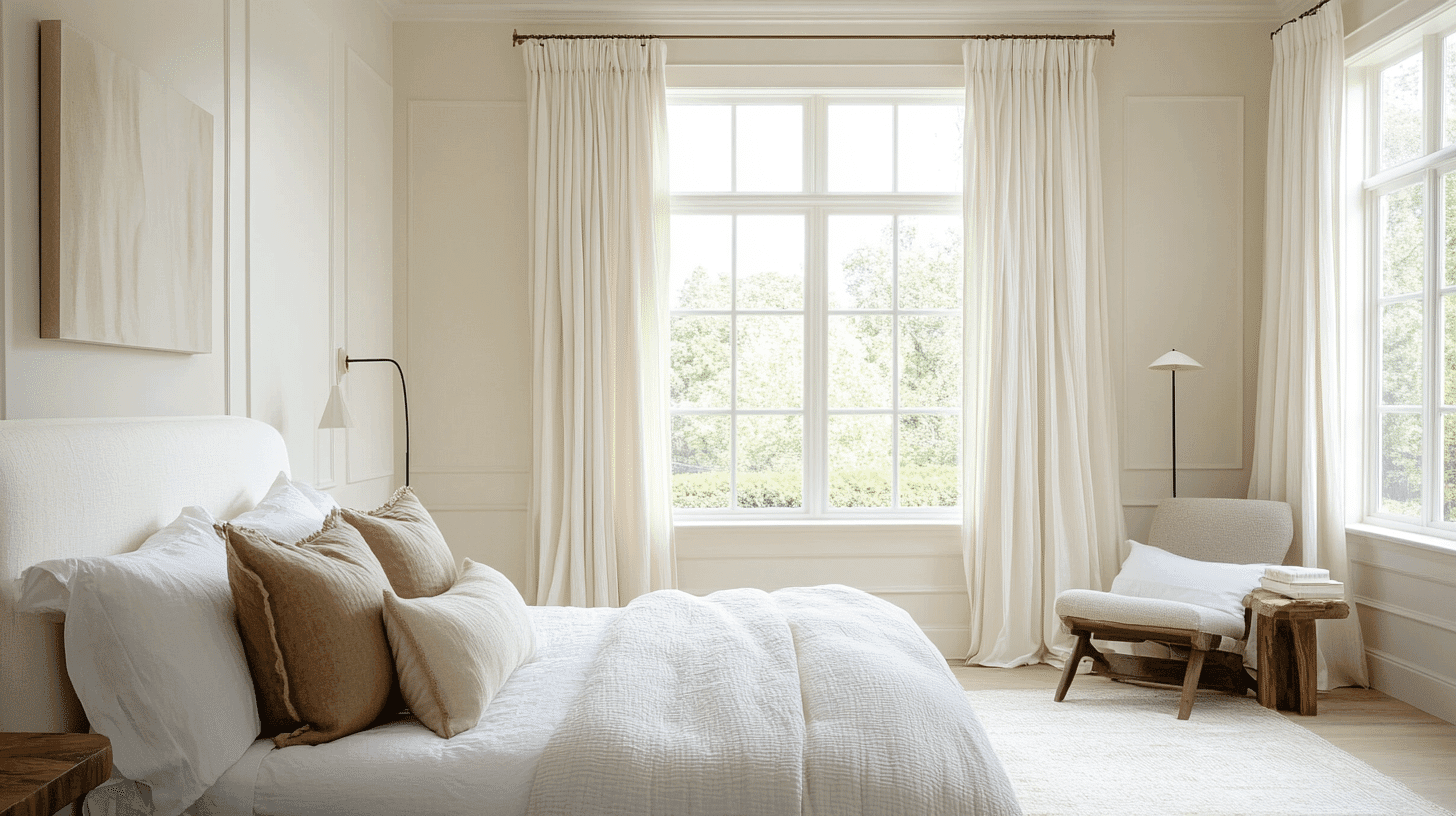
- Intense White creates a serene, restful atmosphere in bedrooms with its soft luminosity that feels cultured without being cold.
- The balanced undertones in Intense White adapt beautifully to both morning and evening light, maintaining a consistent, calming presence throughout the day.
- Consider Intense White for all surfaces in smaller bedrooms to create an expansive feel, or pair with deeper accent colors like Hale Navy (HC-154) for a more dramatic retreat.
3. Kitchens and High-Traffic Zones
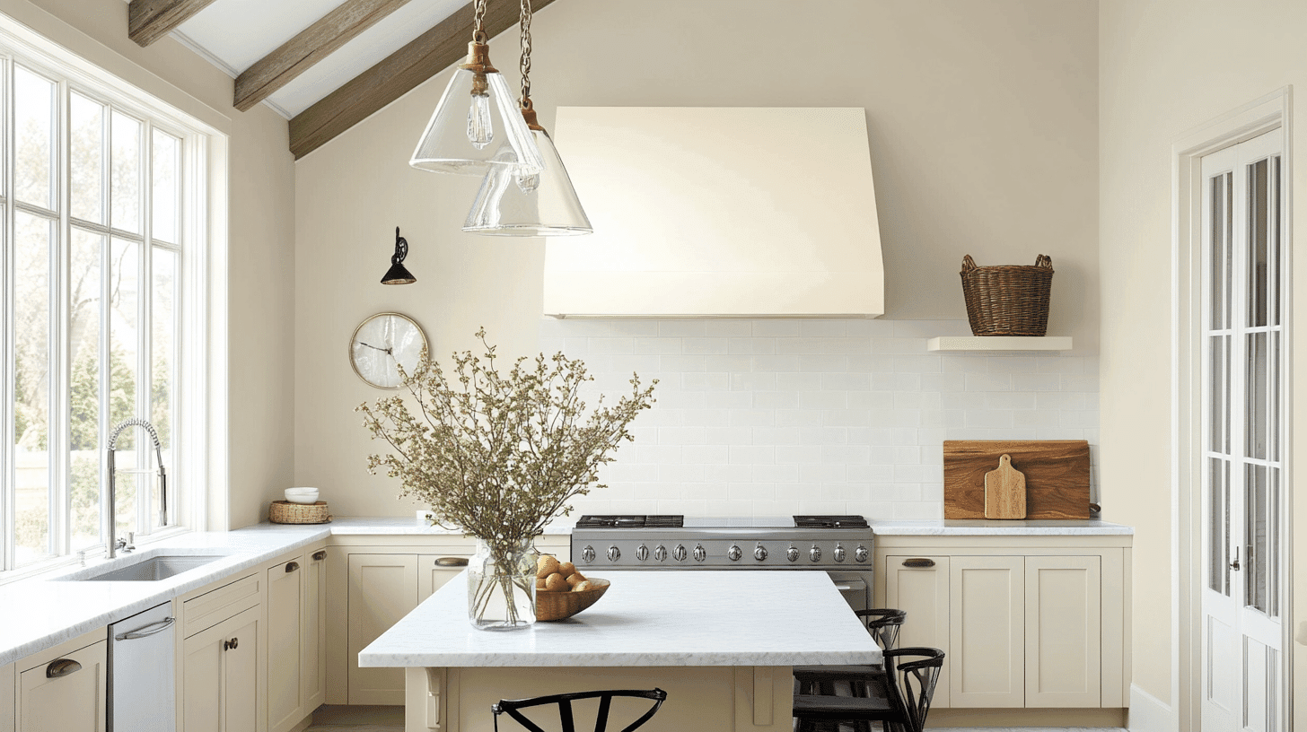
- Intense White in a pearl or satin finish offers excellent durability in busy kitchens, while its subtle gray undertones help disguise fingerprints and minor marks.
- This versatile near-white complements both cool quartz countertops and warm wood elements, making it adaptable as kitchen finishes evolve.
- Intense White creates a clean, timeless backdrop for colorful accessories and appliances, allowing design elements to stand out without competing with them.
4. Bathrooms and Spa-like Retreats
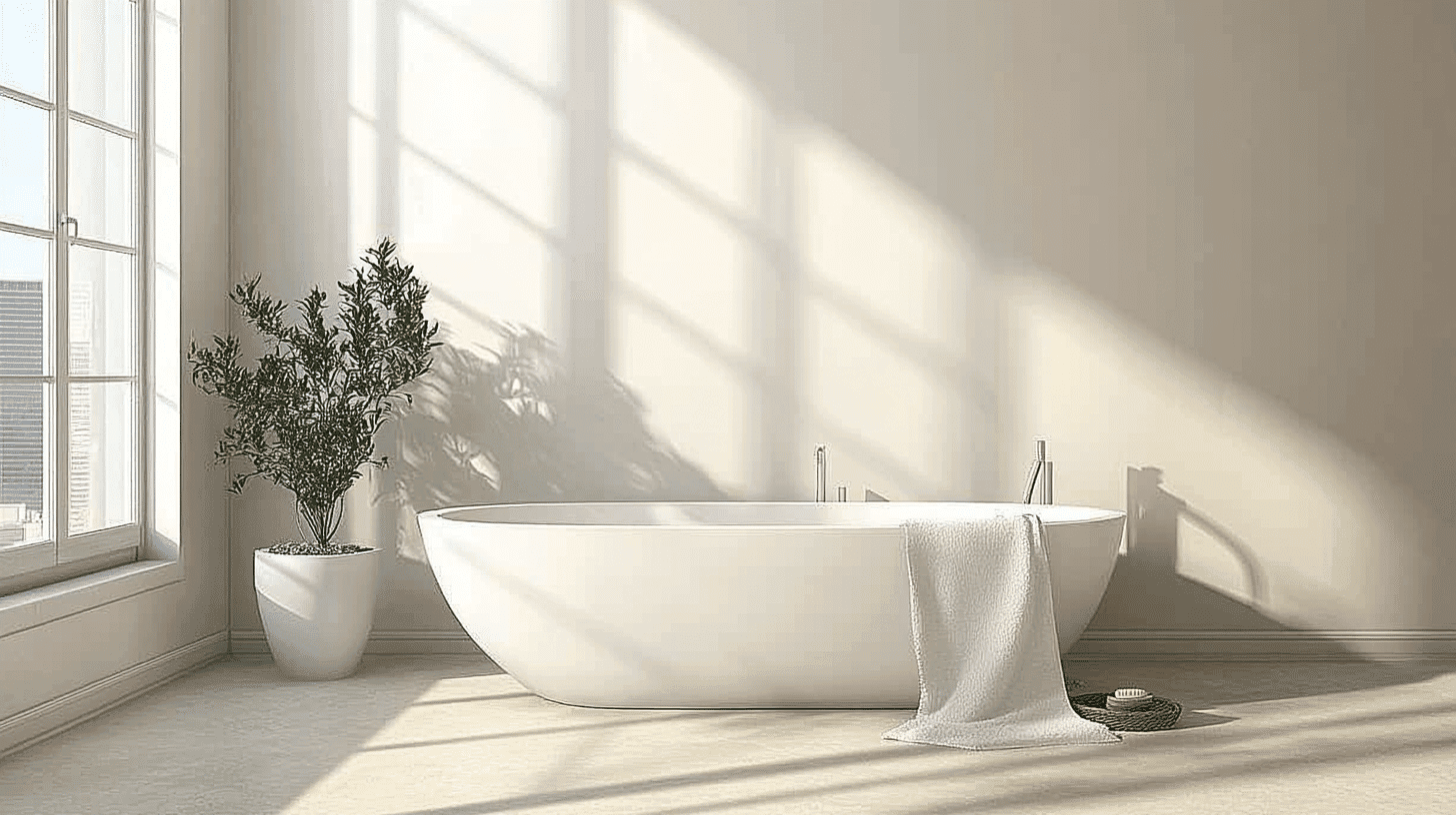
- Intense White delivers a fresh, airy quality in bathrooms that feels clean and bright without the harshness of pure whites.
- Its subtle gray undertones pair beautifully with marble, chrome, and brass fixtures, creating a cohesive look across various bathroom materials.
- In smaller bathrooms or powder rooms, Intense White expands the visual space while providing a cultivated foundation that won’t feel clinical or institutional.
Color Pairings and Combinations for Intense White (OC-51)
Intense White is a sophisticated off-white with subtle gray undertones. Its high Light Reflectance Value (LRV) of 73.36 makes it a versatile neutral that creates brightness while offering more depth than stark whites. Here are excellent color pairings for this refined shade.
Complementary Trim Colors
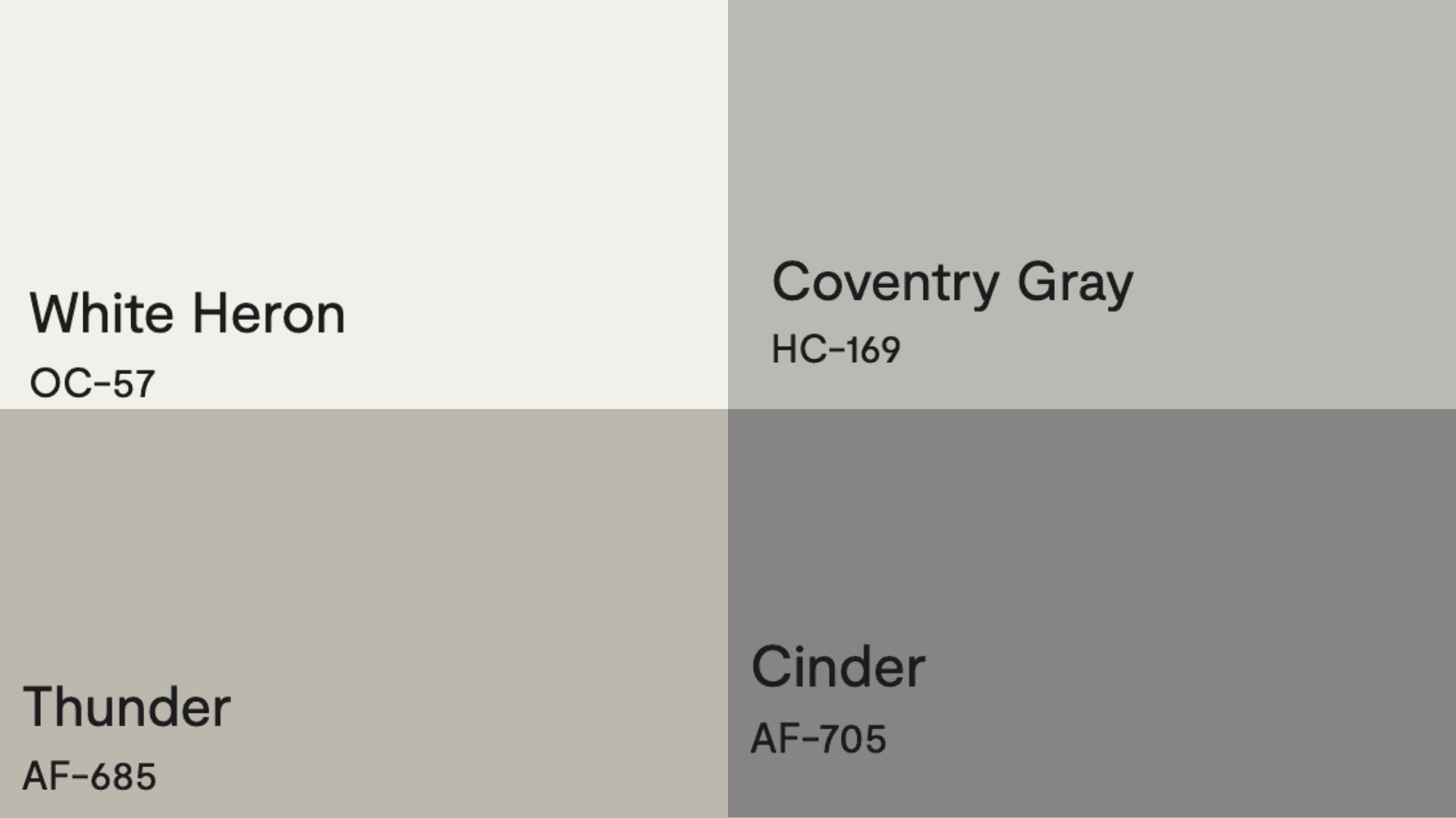
- White Heron (OC-57) – A clean, bright white that creates crisp definition against Intense White’s subtle gray tones
- Coventry Gray (HC-169) – A medium-toned classic gray that provides elegant contrast while coordinating with Intense White’s undertones
- Thunder (AF-685) – A refined deeper gray that grounds Intense White while maintaining a cohesive palette
- Cinder (AF-705) – A rich charcoal gray that creates dramatic contrast while complementing Intense White’s cool undertones
Creating Cohesive Color Schemes
1. Monochromatic Scheme
- Intense White (OC-51) for main walls
- White Heron (OC-57) for trim
- Decorator’s White (OC-149) for ceilings
- Thunder (AF-685) for accent pieces or adjoining rooms
2. Warm Color Scheme
- Intense White (OC-51) for main living areas
- Collingwood (OC-28) for dining room
- Edgecomb Gray (HC-173) for hallways
- Pale Oak (OC-20) for bedrooms
3. Cool Color Scheme
- Intense White (OC-51) for main walls
- Metropolitan (AF-690) for bathrooms
- Silver Chain (1472) for bedrooms
- Coventry Gray (HC-169) for home office
Coordinating with Furniture and Decor
Wood Tones
Intense White creates a cultivated backdrop for both light oak and rich walnut furniture, highlighting wood grain while maintaining a contemporary feel.
The subtle gray undertones in Intense White complement the natural warmth in maple and cherry without competing with their inherent character. This versatile neutral allows wood elements to shine as focal points in the space.
Metals
Polished chrome and stainless steel hardware pop cleanly against Intense White’s refined surface, creating a modern, precise aesthetic.
Matte black fixtures provide a dramatic contrast, while brushed gold adds unexpected warmth that balances Intense White’s cooler undertones.
The neutral base allows for a cohesive look when mixing metallic finishes throughout connected spaces.
Decor
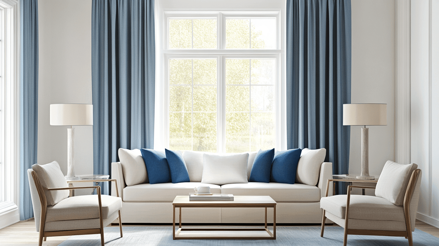
Intense White provides a refined canvas for textural elements like linen, wool, and velvet in neutral and saturated hues.
Blue and green accents particularly complement Intense White’s subtle gray undertones, creating a fresh, cultured palette.
Black-and-white photography, abstract art with minimal color, and carefully curated accessories stand out beautifully against this refined, neutral background.
Similar Paint Colors: Perfect Alternative to Intense White (OC-51)
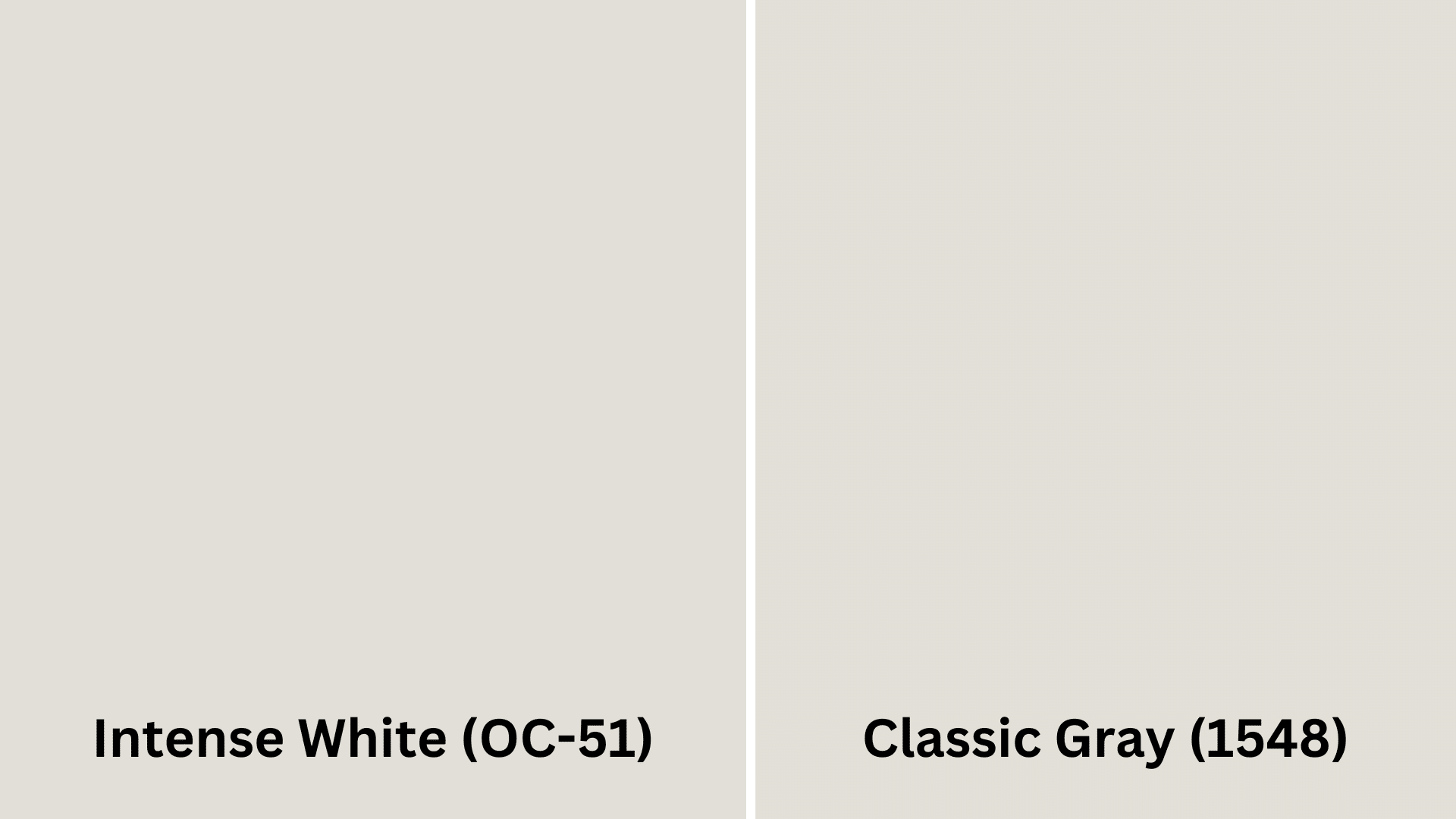
Intense white(OC-51) vs. Classy Gray(1548)
Intense White (OC-51)
- Refined off-white with subtle gray undertones
- A high LRV of 73.36 provides excellent light reflection and brightness
- Creates a refined, contemporary atmosphere that feels airy yet grounded
Classy Gray (1548)
- Slightly deeper than Intense White with more pronounced taupe undertones
- Lower LRV creates noticeable depth while still maintaining a light, neutral appearance
- Warmer feeling that adds dimension to spaces while complementing similar design elements
Wrapping It Up
Intense White Benjamin Moore (OC-51) stands out as a truly versatile paint color that works in virtually any space. Its subtle gray undertones create a cultured backdrop that’s neither too warm nor too cool.
This chameleon-like quality makes it perfect for open floor plans, where it creates an ideal flow while adapting to different lighting conditions.
If you’re refreshing your living room, creating a calm bedroom, or updating your kitchen, Intense White delivers a timeless grace that won’t feel dated next year.
It plays well with various wood tones, metals, and decor styles, making it an excellent foundation for any design vision.
Ready to change your space with this refined neutral? Pick up a sample of Intense White today and see how this cultured shade can upgrade your home!

Alex Guerrero, a graduate with a Fine Arts degree from the Rhode Island School of Design, has been a visionary in the world of color and design for over 15 years. His professional journey began in the heart of the fashion industry in Milan, where he developed an acute sense for color harmonies and trends. Alex joined our team in 2018, offering fresh and innovative perspectives on color utilization in various spaces. Renowned for his ability to blend contemporary trends with timeless elegance. Outside of work, Alex is an accomplished painter and a volunteer art therapist, his artistic talents further enriching his professional insights.