Are you struggling to find the perfect gray paint that won’t look too blue, too green, or too dull? Benjamin Moore Stonington Gray (HC-170) might be the answer to your color dilemma.
It brightens rooms without being too stark or reflective, making spaces feel open and airy. Stonington Gray has subtle blue-green undertones that add just enough interest without overwhelming your space.
When you’re painting a living room, bedroom, kitchen, or bathroom, this versatile shade adapts beautifully to different lighting conditions and complements almost any design style.
Designers love Stonington Gray because it provides the perfect neutral canvas for showcasing your style while maintaining visual interest.
Understanding Paint Color Basics
Looking for a versatile gray that works in virtually any room? Benjamin Moore Stonington Gray (HC-170) is a beloved medium-toned gray that creates balanced, refined spaces that feel both modern and timeless.
Color Terminology
Understanding the technical details helps you anticipate how Stonington Gray will look in your space:
| PROPERTY | VALUE |
|---|---|
| LRV | 59.36 |
| RGB | 202 / 203 / 197 |
| Hex Value | #CACBC5 |
With a moderate LRV of 59.36, Stonington Gray provides excellent brightness without being too light or reflective. These color codes help when creating digital designs or matching accessories.
Undertones
- Stonington Gray has subtle blue-green undertones
- It’s a true medium gray with cool leanings
- Not too dark or light, offering perfect balance for walls
The Psychology of Gray Paint
Gray paint colors can create a calm, balanced atmosphere in your home. The right shade of gray helps balance a room while providing a neutral backdrop for your furniture and decor.
- Balanced grays like Stonington Gray create an atmosphere of refinement and calm.
- Cool-leaning grays: Add a contemporary, crisp feeling that feels clean and fresh
- Versatile neutrals: Make spaces feel cohesive, organized, and gracefully composed
- Benefits: Reduces visual noise, creates an excellent backdrop for artwork, and pairs beautifully with both bold colors and subtle neutrals
Stonington Gray is a designer favorite because it provides lasting appeal that won’t quickly date your space. It creates the perfect neutral canvas for showcasing your style.
Why Choose Benjamin Moore Stonington Gray (HC-170)?
Benjamin Moore Stonington Gray is a versatile medium gray that creates balanced spaces. It provides a neutral backdrop that works with almost any design style while maintaining visual interest.
1. Versatility
Benjamin Moore Stonington Gray (HC-170) adapts beautifully to changing light conditions. Morning sun highlights its crispness, while evening light brings out subtle depth and warmth.
This adaptable gray works equally well in living spaces, bedrooms, and home offices, flawlessly complementing traditional and contemporary design elements.
2. Key Features
Benjamin Moore Stonington Gray creates a balanced neutral background with its perfect balance of warm and cool undertones. Its moderate LRV of 59.36 brightens spaces without being too stark or reflective.
This timeless shade provides lasting appeal that won’t quickly date your space, saving you from frequent repainting.
3. Durability
Benjamin Moore Stonington Gray in premium finishes resists daily wear and marks, making it ideal for hallways and family rooms.
Its medium tone conceals minor imperfections while maintaining a clean appearance. Regular maintenance keeps this paint looking fresh and vibrant for years.
4. Texture Effects
Benjamin Moore Stonington Gray creates a refined, cohesive look on walls. Its subtle blue-green undertones add depth and interest without overwhelming the space.
When used consistently throughout connected areas, it creates excellent flow while allowing architectural details and decorative elements to become focal points.
Room-by-Room Color Recommendations with Benjamin Moore Stonington Gray (HC-170)
Stonington Gray is a versatile medium gray that adapts beautifully throughout your home. It shifts subtly from morning to evening, maintaining its balanced, classy appearance in various lighting conditions.
1. Living Spaces and Open Floor Plans

- Stonington Gray (HC-170) creates a refined neutral backdrop in living areas that feels classy yet comfortable, allowing colorful furniture and artwork to stand out beautifully.
- Its blue-green undertones add subtle depth to your walls without overwhelming the space, creating a graceful atmosphere that feels both contemporary and timeless.
- For open concept homes, Stonington Gray provides excellent continuity, or pair it with lighter White Dove (OC-17) for trim to create architectural definition and visual interest.
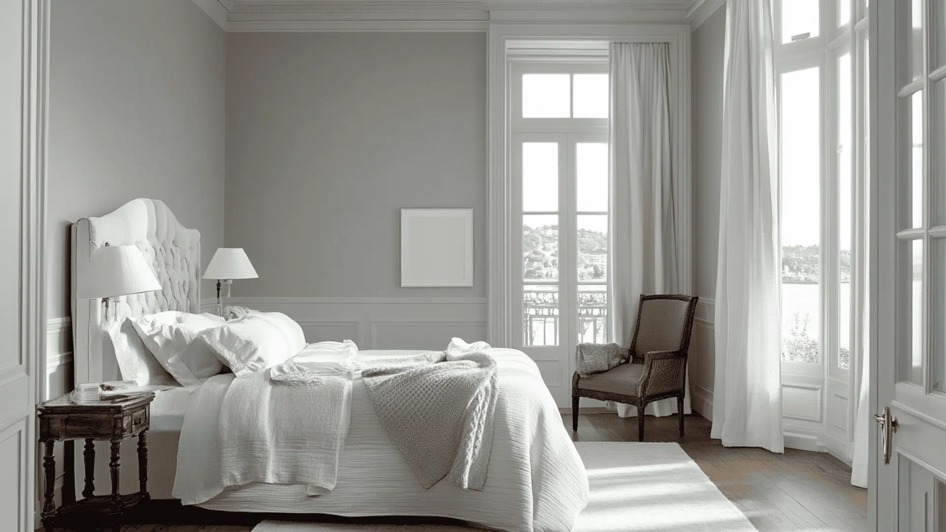
2. Bedrooms and Relaxation Areas

- Stonington Gray offers a serene, balanced environment in bedrooms, promoting restful sleep with its not-too-dark, not-too-light medium tone that feels calming and grounded.
- The moderate light reflection value keeps bedrooms feeling bright during daytime hours while creating a cozy, intimate atmosphere when evening comes.
- Try Stonington Gray with crisp white bedding for a hotel-inspired look, or pair it with soft blues and greens for a nature-inspired palette that enhances relaxation.
3. Kitchens and High-Traffic Zones

- Stonington Gray in a satin or semi-gloss finish resists stains and cleans easily, maintaining its cultured appearance even in busy kitchen and hallway areas.
- This versatile neutral complements both white and wood-toned cabinets, stainless steel appliances, and most countertop materials for a cohesive, designer-approved kitchen look.
- The balanced undertones work beautifully with marble, subway tile, and natural stone elements, creating a timeless kitchen aesthetic that won’t quickly feel dated.
4. Bathrooms and Spa-like Retreats
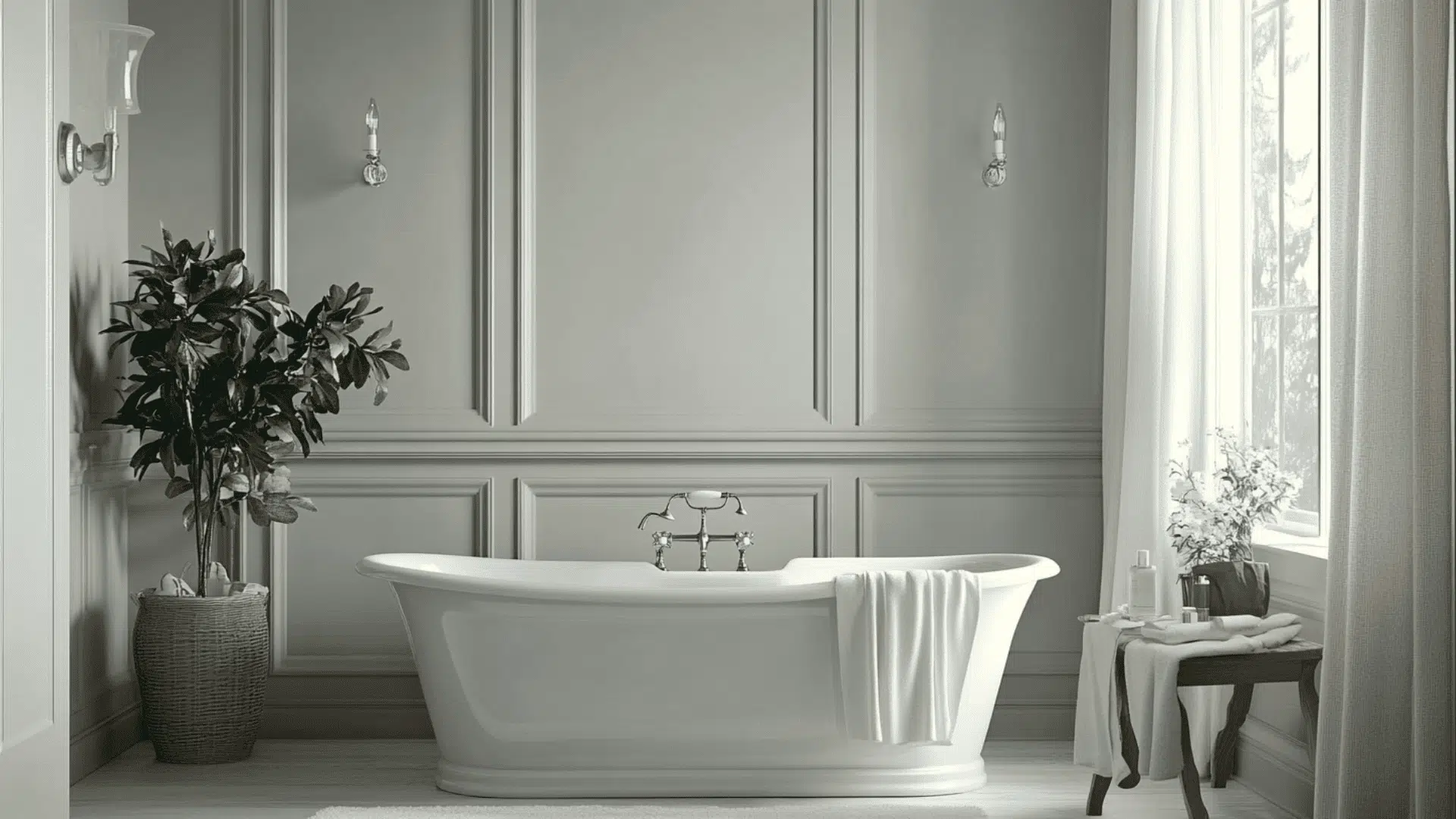
- Stonington Gray converts bathrooms into polished, refined spaces that feel both clean and relaxing, creating a perfect backdrop for fixtures and accessories.
- The cool undertones pair beautifully with white tile, marble, and chrome fixtures, creating a cohesive, spa-inspired atmosphere that feels fresh and balanced.
- In smaller bathrooms, this medium-toned gray adds character without overwhelming the space, while complementing natural elements like wood accents and greenery.
Color Pairings and Combinations for Benjamin Moore Stonington Gray (HC-170)
Stonington Gray is a versatile medium gray with subtle blue-green undertones. Its moderate Light Reflectance Value (LRV) of 59.36 creates a balanced neutral that adds refinement without darkening spaces.
Here are complementary colors that pair beautifully with this popular shade.
Complementary Trim Colors
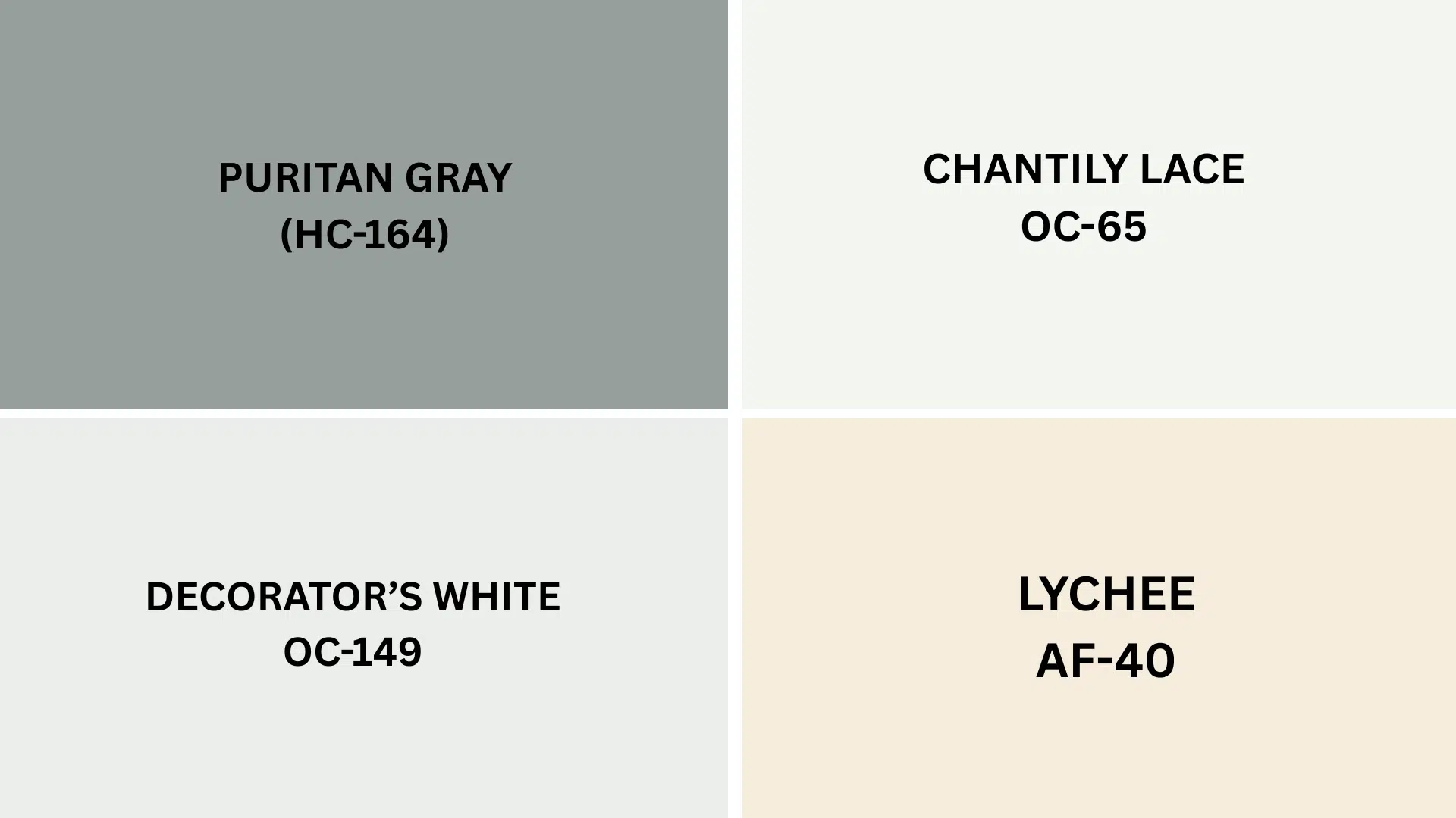
The right trim color can enhance Stonington Gray’s classy appearance and highlight its subtle undertones. These specific colors create striking combinations with Stonington Gray:
- Puritan Gray (HC-164) – A slightly darker gray-blue that creates a subtle layering effect when paired with Stonington Gray, ideal for adjacent walls or cabinetry
- Chantilly Lace (OC-65) – A crisp, clean white that provides bright contrast against Stonington Gray, making architectural details pop while maintaining a fresh, contemporary look
- Lychee (AF-40) – A warm pink-beige that softens Stonington Gray’s cooler undertones, creating unexpected warmth and interest when used on accent walls or adjoining spaces
- Decorator’s White (OC-149) – A soft white with subtle gray undertones that complements Stonington Gray perfectly, offering gentle contrast for trim and moldings in refined spaces
Each of these colors brings out different aspects of Stonington Gray. Consider testing several combinations to see which creates your desired effect in your specific lighting conditions.
Creating Cohesive Color Schemes
Stonington Gray works with many other colors to create a coordinated look throughout your home. Here are three different color schemes that use Stonington Gray as the main color.
1. Monochromatic Scheme
- Stonington Gray (HC-170) for main walls
- Chantilly Lace (OC-65) for trim
- Decorator’s White (OC-149) for ceilings
- Coventry Gray (HC-169) for accent pieces or adjoining rooms
2. Warm Color Scheme
- Stonington Gray (HC-170) for main living areas
- Puritan Gray (HC-164) for the dining room
- Lychee (AF-40) for hallways
- Richmond Gold (HC-41) for bedrooms
3. Cool Color Scheme
- Stonington Gray (HC-170) for main walls
- Jamestown Blue (HC-148) for bathrooms
- Thunder (AF-685) for bedrooms
- Wickham Gray (HC-171) for home office
Coordinating with Furniture and Decor

Stonington Gray is a versatile neutral that enhances nearly any furniture and decorative style. Its a balanced medium tone with subtle blue-green undertones that creates an excellent foundation for showcasing your items.
1. Wood Tones
Stonington Gray pairs beautifully with various wood finishes, offering flexibility with your existing furniture pieces regardless of their tone.
Rich mahogany and ebony woods create a dramatic contrast against Stonington Gray, highlighting their depth and character while adding refinement to living and dining areas.
Lighter woods, including ash and birch, maintain a contemporary, fresh aesthetic when combined with this versatile gray, perfect for modern and Scandinavian-inspired spaces.
2. Metals
Brushed brass and antiqued gold hardware add warmth that softens Stonington Gray’s cooler undertones, creating classy interest in kitchens, bathrooms, and living spaces.
Matte black fixtures offer crisp definition against Stonington Gray walls, creating a modern industrial aesthetic that feels both contemporary and timeless.
Polished chrome and nickel maintain Stonington Gray’s cool complexness while adding brightness to spaces where clean, reflective surfaces are desired.
3. Decor
Textured accessories like jute rugs, chunky knit throws, and velvet pillows create dimension against Stonington Gray’s smooth surface, adding visual interest and comfort.
Navy, burgundy, and emerald green accents create rich focal points against this neutral backdrop, adding depth and personality to an otherwise subtle color scheme.
Natural elements, including terra cotta, leather, and indoor plants, introduce organic warmth and life that beautifully balance Stonington Gray’s cooler undertones.
Similar Paint Colors: Perfect Alternative to Stonington Gray (HC-170)
These colors all work well in various rooms throughout your home. They create balanced, refines spaces that feel both modern and timeless.
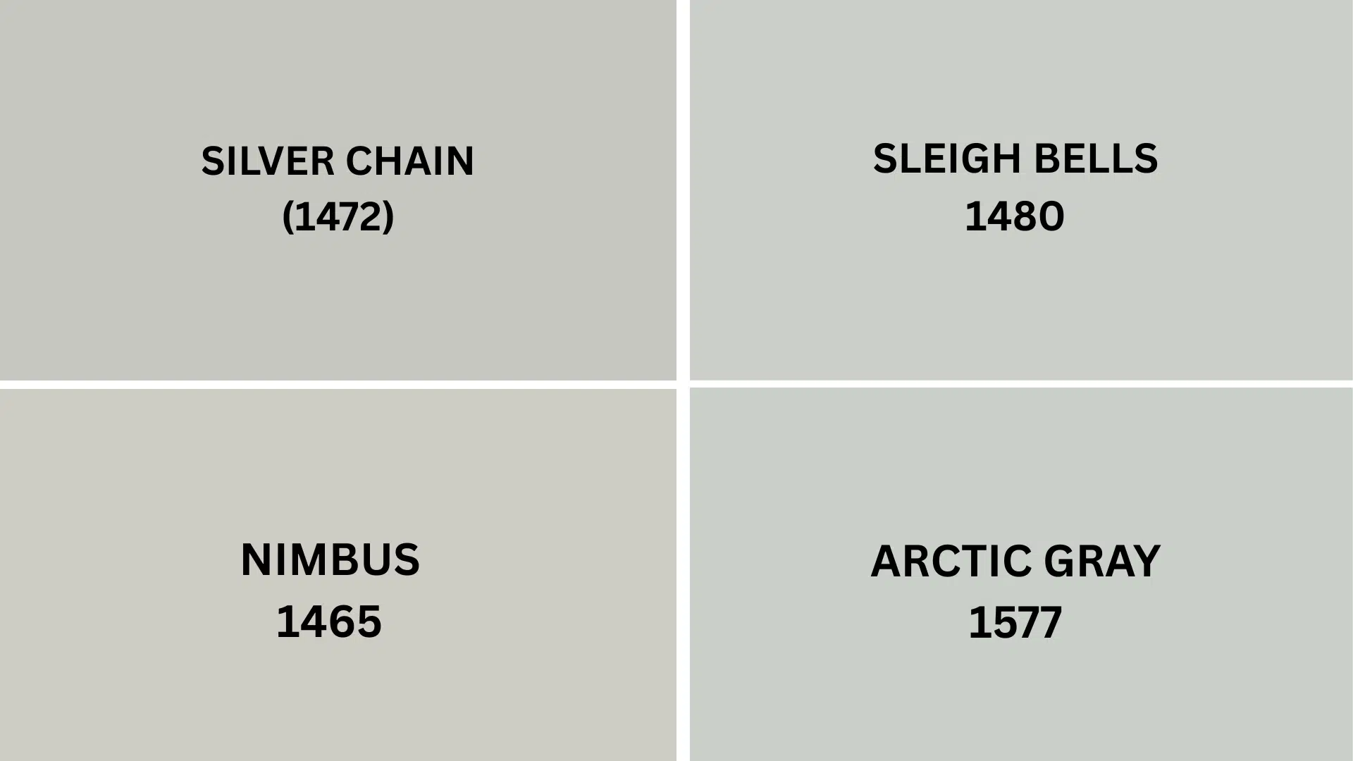
1. Silver Chain (1472)
- A classy gray with noticeable blue undertones that creates a cool, contemporary feeling in modern spaces.
- Its lower light reflectance value adds more depth to walls while still maintaining excellent balance in various lighting conditions.
- Ideal for north-facing rooms where you want a slightly more dramatic neutral without overwhelming the space.
2. Sleigh Bells (1480)
- A lighter, softer gray with warm undertones that brightens spaces effectively while maintaining a cohesive neutral palette.
- Creates an airy, welcoming atmosphere perfect for living rooms and entryways where you want a bright but defined wall color.
- Pairs beautifully with white trim and natural wood tones for a balanced, relaxed aesthetic.
3. Nimbus (1465)
- A deeper, more saturated gray with pronounced blue undertones that adds significant presence and refinement to walls.
- Creates dramatic, refined spaces that still function as versatile neutrals for a wide range of decorating styles.
- Works beautifully in dining rooms, home offices, and accent walls where you want more color depth and visual interest.
4. Arctic Gray (1577)
- A luminous light gray with subtle blue-lavender undertones that creates bright, ethereal spaces with a contemporary feel.
- Reflects light wonderfully, making it perfect for smaller rooms, hallways, or areas with limited natural light.
- Creates a soft, dreamy quality ideal for bedrooms and bathrooms where a calming atmosphere is desired.
Final Thoughts
Benjamin Moore Stonington Gray (HC-170) proves that finding the right gray doesn’t have to be complicated.
Its balanced undertones work with both warm and cool color schemes, making it incredibly versatile for any room in your home.
Pair it with crisp whites like Chantilly Lace for trim, or create depth with complementary colors like Puritan Gray or Richmond Gold.
This timeless shade looks beautiful with various wood tones, metals, and decor styles, from traditional to contemporary.
Stonington Gray’s medium tone conceals minor wall imperfections while offering enough color to define your space.
If you’re interested in more informational color review content, feel free to click here and explore other blogs that you might enjoy.

Alex Guerrero, a graduate with a Fine Arts degree from the Rhode Island School of Design, has been a visionary in the world of color and design for over 15 years. His professional journey began in the heart of the fashion industry in Milan, where he developed an acute sense for color harmonies and trends. Alex joined our team in 2018, offering fresh and innovative perspectives on color utilization in various spaces. Renowned for his ability to blend contemporary trends with timeless elegance. Outside of work, Alex is an accomplished painter and a volunteer art therapist, his artistic talents further enriching his professional insights.