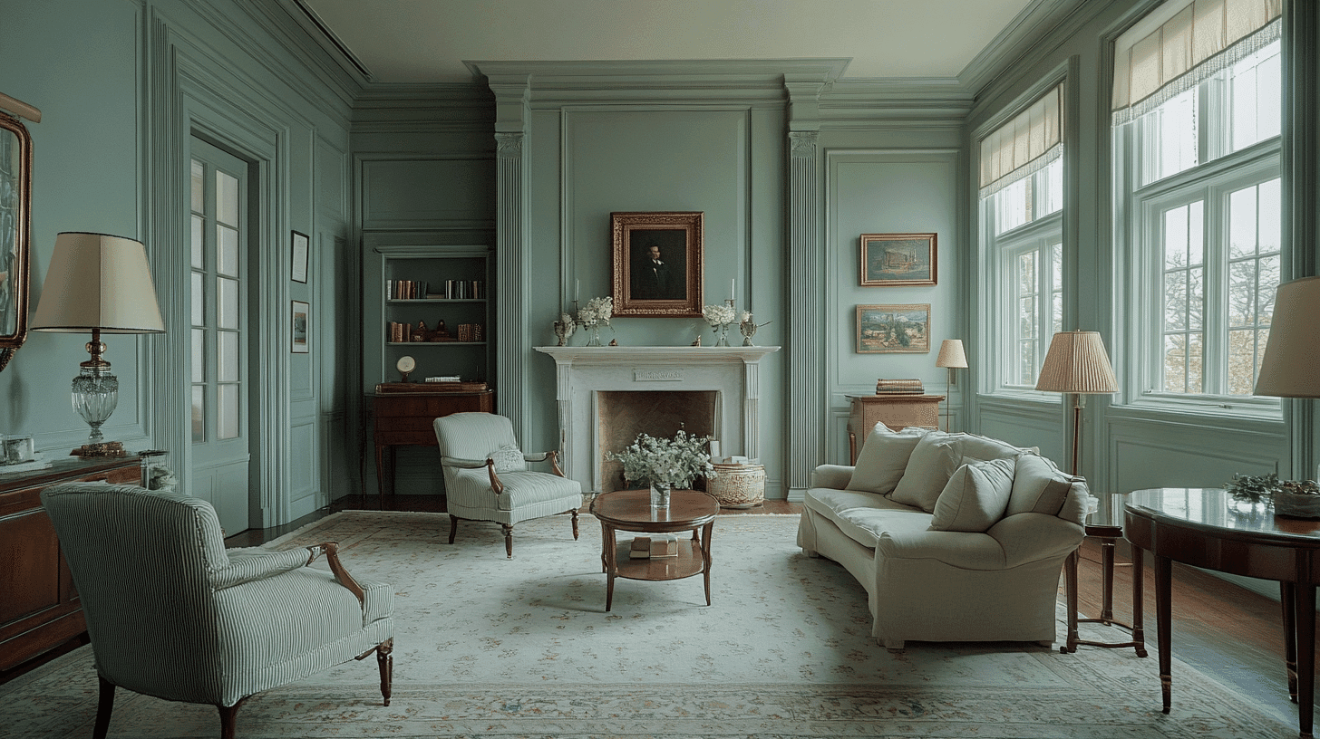
Quiet Moments 1563 is a special color that mixes blue and gray together. This soft color feels calm and peaceful, like early morning fog over a lake.
When you look at Quiet Moments 1563, you might think of rainy days spent reading by a window or the gentle color of the sky just before evening.
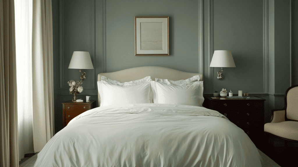
This color can make a room feel more relaxing. It’s perfect for bedrooms, reading corners, or any space where you want to slow down and breathe deeply. The blue parts bring a feeling of openness, while the gray adds a touch of softness.
Quiet Moments 1563 works well with natural woods, cream fabrics, and silver or white accessories.
Whether on walls or furniture, this color creates spaces that invite you to pause, reflect, and enjoy the simple beauty of stillness.
Why Choose Benjamin Moore’s Quiet Moments?
This soft, serene color creates spaces that feel calm and balanced. It works anywhere you want shades, from bedrooms to living areas.
Quiet Moments pairs beautifully with contemporary and classic décor, making it a versatile choice for your home.
1. Soothing Atmosphere
- Quiet Moments 1563 is a gentle blend of blue and gray with subtle green undertones.
- It creates a peaceful backdrop that feels like a breath of fresh air.
- The color perfectly balances coolness and warmth, making spaces feel welcoming and relaxed.
2. Ideal for Any Space
- Bedrooms transform into restful retreats
- Living areas become more harmonious and inviting
- Bathrooms gain a spa-like, refreshing quality
- Home offices make productive yet calming work environments
3. Versatile Companion
- Light furniture creates gentle harmony against it
- Metallic accents look sleek and refined
- Wood tones appear more natural and warm
- Colors like white, cream, and soft blue complement beautifully
4. Emotional Benefits
- Creates visual serenity in busy spaces
- It helps rooms feel thoughtful and intentional
- Promotes a sense of calm and relaxation
- It makes large spaces feel more welcoming and balanced
5. Lighting Effects
- Morning light brings out its soft blue undertones
- The afternoon sun enhances its subtle gray qualities
- Evening lamps create a peaceful, unwinding atmosphere
- This adaptability makes it perfect for creating shades of moods throughout the day
Benjamin Moore’s Quiet Moments (1563) in Interior Design
Benjamin Moore’s Quiet Moments (1563) is a gentle blend of blue and gray with subtle green undertones.
It captures the calm feeling of early morning mist or a calm shoreline at dusk.
The color shifts beautifully with changing light, revealing different aspects throughout the day.
Both soothing and refined, it creates spaces that invite peaceful reflection and relaxation.
Texture Partners that go well with Quiet Moments
The serene nature of Quiet Moments 1563 is beautifully amplified when paired with complementary textures that improve its peaceful character.
- Soft linen and cotton fabrics
- Natural wood grains (especially light oak and walnut)
- Matte ceramic and stone surfaces
- Hazy glass and frosted finishes
- Plush wool or cashmere textiles
- Brushed nickel or satin brass accents
- Smooth leather in neutral tones
- Woven natural fibers like jute or seagrass
Perfect Places To Use Quiet Moments
- Bedrooms
- Living rooms
- Home offices
- Bathrooms
- Kitchens
- Dining rooms
- Hallways and transitional spaces
- Nurseries
- Meditation or yoga spaces
Today’s Home Design with Quiet Moments
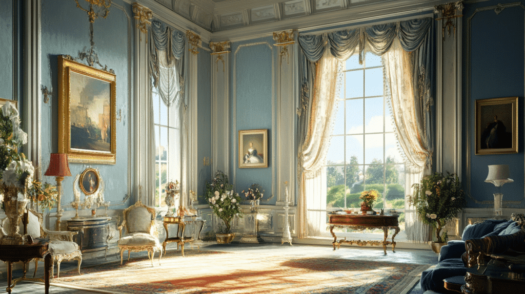
Quiet Moments by Benjamin Moore is a soft, serene blue-gray that adds shade and balance to any interior. Its gentle, muted shade serves as a calming foundation, creating a peaceful backdrop for both contemporary and traditional spaces.
Quiet Moments pairs beautifully with natural materials, subtle textiles, and warm wood tones, offering a versatile foundation for a variety of design schemes.
This soothing color transforms under different lighting, creating a dynamic atmosphere that evolves from day to night. Quiet Moments makes a graceful statement in any room, whether used for bedroom walls or as an all-over hue.
Quiet Moments (1653) Profile By Benjamin Moore
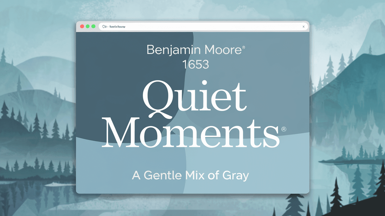
1. Color Values
RGB Value: 199, 207, 200
Red: 199
Green: 207
Blue: 200
HEX code: #C7CFC8
Quite Moments by Benjamin Moore is a soft, serene light gray with a touch of warmth. This calming hue brings a peaceful and refined atmosphere to any room, making it perfect for bedrooms, living spaces, or any area that needs a relaxing ambiance.
Its subtle undertones provide a neutral base, allowing it to pair well with various accent colors and decor styles. Quite Moments is a great choice for creating a shade, inviting environment.
2. What Do These Numbers Mean
The RGB values show how Benjamin Moore’s Quiet Moments 1653 achieves its serene, muted look:
- The balanced red, green, and blue values (approximately 181, 194, 183) create this color’s soft, gentle appearance
- The slightly higher green value compared to red and blue gives it a fresh, natural vibe
- The harmonious RGB components evoke calm and relaxation, creating a peaceful atmosphere
- The higher light reflection (around 60% LRV) enhances its light, airy quality
3. Digital Uses
Benjamin Moore’s Quiet Moments 1653 serves as a shaded background for websites and online platforms that prioritize calm and clarity.
This versatile, soft color enhances digital branding for wellness brands, spas, and interior design websites, evoking a sense of shades and renewal.
Graphic designers choose Quiet Moments for content that requires a serene, understated contrast, such as lifestyle blogs or mindful brands.
E-commerce sites use this subtle hue to highlight natural products or classy services, offering a calming environment for the viewer.
Color Description
1. Light Reflectance Value (LRV)
- LRV: 60.98
- Quiet Moments 1653 is a soft, muted color with an elevated level of light reflectance.
- It has a moderate Light Reflectance Value (LRV) of approximately 60-70%.
- The color helps brighten spaces without being too overpowering, creating an airy feel.
- Works well in rooms with limited natural light, adding brightness without overwhelming the space.
- It creates serene, open spaces, offering a calming environment.
2. Undertones
Quiet Moments 1563 presents a complex depth beyond simple blue-gray, revealing subtle undertones that emerge under various lighting conditions.
This refined hue carries faint green-gray undertones that provide a serene, slightly coastal quality rather than a flat, conventional pastel.
When bathed in natural daylight, these understated sage notes become more perceptible, giving the color a shade richness reminiscent of morning mist over calm waters.
Under artificial lighting, particularly cool-toned bulbs, the color may appear softer and more ethereal than expected. These undertones prevent Quiet Moments from feeling clinical or overly bland, allowing it to create contemplative spaces that maintain warmth and serenity.
The color’s undertones complement natural linens, weathered woods, and silver accents, helping to reveal its multidimensional character.
Using Benjamin Moore’s Quiet Moments (1653) for Your Home
The Living Room
- Light-reflective qualities enhance natural light
- Worldly neutral pairs with most furniture styles
- Creates a calm, welcoming atmosphere for gathering spaces
The Dining Area
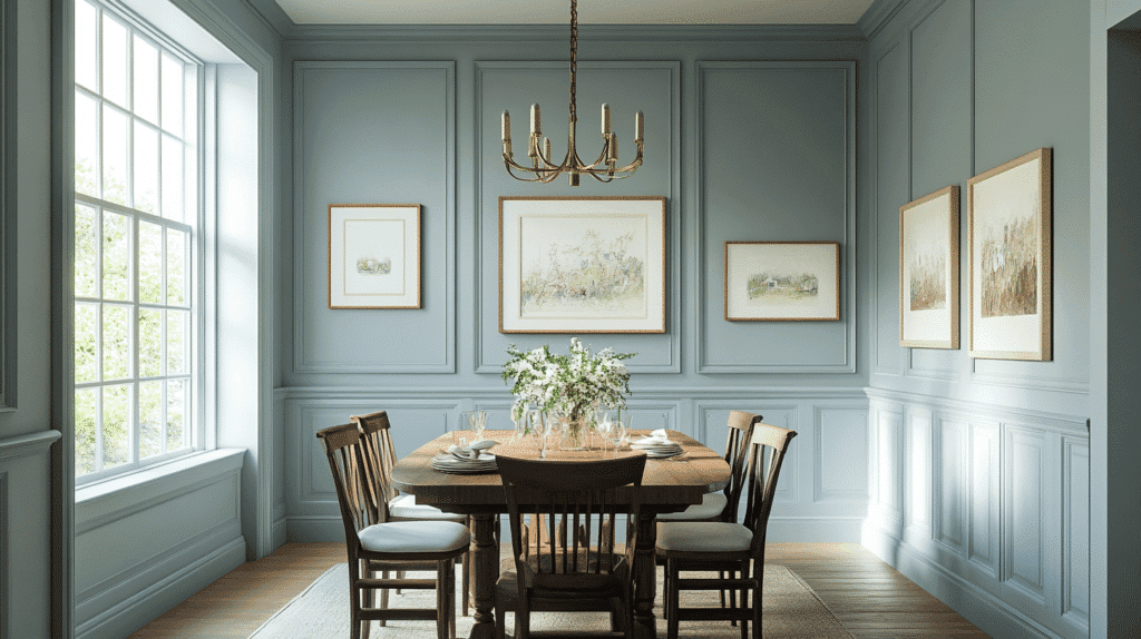
- Subtle blue-green undertones complement the food presentation.
- Provides classy backdrop for dinner parties
- Transitions beautifully from day to evening lighting
The Bedroom
- Promotes restful sleep with its serene color psychology
- Low-VOC formula improves air quality for overnight hours
- Soft tone creates a shade retreat from daily stress
Color Pairings for Benjamin Moore’s Quiet Moments (1563)
| Dark Colors | Light Colors |
|---|---|
| Hale Navy | Cloud White |
| Chelsea Gray | White Dove |
| Black Panther | Decorators White |
| Dark Pewter | Gray Owl |
| Kendall Charcoal | Sea Salt |
Decor Tips for Benjamin Moore Quiet Moments 1563-10
| Room | Decor Tips |
|---|---|
| Living Room | Layer with cozy textiles in cream and gray tones. Incorporate natural wood elements to warm up the serene blue-green. |
| Kitchen | Pair with white cabinetry for a fresh look. Add brass hardware and fixtures to bring warmth to the cool undertones. |
| Bedroom | Create a sanctuary with crisp white bedding and soft blue accents. Use minimal décor to maintain a classy atmosphere. |
| Bathroom | Install chrome or nickel fixtures for a spa-like feel. Combine with white tile and natural stone for a refreshing space. |
| Home Office | Select light wood or white furniture to keep the space airy. Plants and ceramic accessories enhance the calming effect. |
| Entryway | With Quiet Moments walls, make a welcoming statement. Add a metallic frame mirror to brighten the space. |
Practical Tips for Painting with Quiet Moments 1563
Preparing Your Space
• Proper preparation is essential for achieving the best results when painting with Benjamin Moore’s Quiet Moments 1563. Begin by thoroughly cleaning all surfaces with a mild detergent or wall cleaner to remove any dirt, oils, or residue that could affect adhesion.
• Address any wall imperfections by filling holes with a packing compound and repairing cracks with caulk. Sand all repairs until smooth to ensure a flawless finish that enhances Quiet Moments’ subtle blue-green tones.
• A quality primer is recommended before applying Quiet Moments 1563, especially for surfaces that are darker in color. A white or light gray primer helps achieve better coverage and preserves the true soft blue-green hue of Quiet Moments.
• Before committing to the entire space, test Quiet Moments by painting 2′ x 2′ samples on different walls throughout the room. This soft spa blue shade can appear more gray in certain lights or more blue in others, making sample testing important to understand how it will look in your specific lighting conditions.
Application Tips
• Use premium synthetic brushes for trim and a ¾” nap roller for walls, applying in “W” patterns to ensure even coverage of this delicate, serene shade.
• Apply two complete coats for consistent coverage, as Quiet Moments’ subtle tones require proper buildup for true color representation.
• Depending on humidity levels, allow 2-4 hours of drying time between coats to prevent streaking and ensure proper adhesion.
• Paint in natural daylight whenever possible to accurately assess Quiet Moments’ shades of blue-green tone and ensure a flawless finish throughout your space.
Finishing Touches
• Inspect walls with a bright light held at an angle to catch any missed spots.
• Touch up as needed after the paint has fully dried.
• Wait at least 2 weeks before washing newly painted surfaces.
• Store leftover paint in a sealed container for future touch-ups.
• Label the can with the room name for easy reference later.
Similar Benjamin Moore’s Colors
Beach Glass 1564
- Beach Glass is a serene, light aqua blue-green shade that evokes the weathered sea glass found along coastal shores, creating a fresh, airy atmosphere perfect for bathrooms, bedrooms, and living spaces that benefit from a peaceful vibe.
- This versatile color shifts subtly between blue and green depending on lighting conditions, appearing more aqua in natural daylight and taking on a softer, more muted quality in artificial light, making it an excellent chameleon color.
Wales Gray 1585
- Wales Gray is a refined, mid-tone gray with subtle blue-green undertones that create a balanced, calming atmosphere while offering more depth than lighter grays.
- This versatile neutral acts as a chameleon color that shifts slightly throughout the day – appearing more blue in morning light, more green in afternoon sun, and settling into a true gray in evening hours.
Summing It Up
Benjamin Moore’s Quiet Moments (1563) is a testament to the power of subtle color. This soft blue-green hue creates fresh shades of space, perfectly balancing blue’s quiet and green’s natural harmony.
Its versatility allows it to adapt beautifully across various rooms and lighting conditions, shifting gently between cool and warm undertones throughout the day. Whether paired with crisp whites for a clean coastal feel or grounded with deeper neutrals for culture.
Quiet Moments never overwhelm. Instead, it provides a breathable backdrop that supports both everyday living and mindful moments of peace.
For those seeking a color that surpasses trends while maintaining a distinct personality, Quiet Moments delivers—creating environments that truly live up to its thoughtfully chosen name.

With a Master’s in Architecture from the University of California, Berkeley, Mitchell Green has spent over two decades dedicated to the study and practical application of home fixture design. His career started in an architectural firm, providing him a strong foundation in the structural and aesthetic aspects of home interiors. Mitchell brought his comprehensive knowledge to our platform, where he has been an influential voice in our home fixtures and fittings section. Since 2018, he has been guiding our readers through the intricacies of selecting and installing fixtures, combining technical know-how with design flair. In his spare time, Mitchell is a keen photographer, capturing architectural details and design elements, an interest that complements his professional focus.