The Color of the Year is an annual spectacle far beyond a simple choice.
Organizations like Pantone, a global color authority, carefully analyze global trends, cultural movements, technological innovations, and societal moods to select a color that encapsulates the zeitgeist.
This color has become a powerful cultural symbol, influencing design, fashion, product development, and marketing strategies across multiple industries.
2025’s Bold and Beautiful Color Trends
The chosen color typically reflects broader societal emotions and aspirations.
It’s a visual preference and a nuanced communication of collective human experience.
Design professionals, brands, and creative industries eagerly anticipate this annual revelation, using it as a strategic touchstone for their innovative and commercial endeavors.
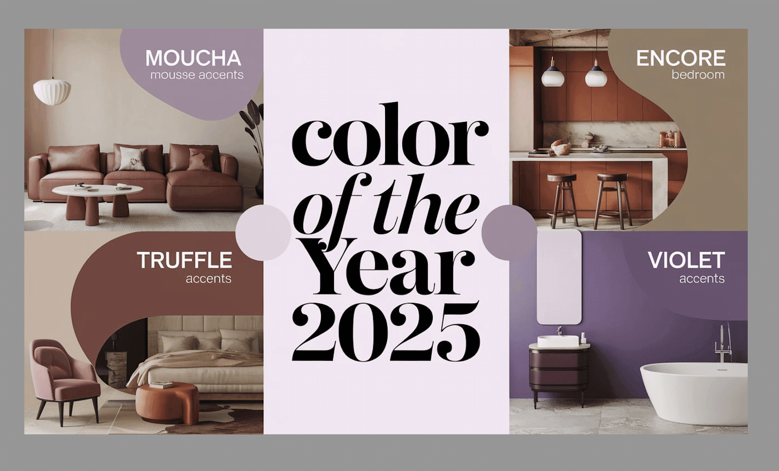
1. Pantone’s Mocha Mousse

Pantone’s Mocha Mousse (LVR-17-1230) is a rich, warm brown with a cozy, comforting appeal.
It evokes indulgence and connection to the earth, making it perfect for creating a calm and welcoming space.
Top tips for this idea
- Pair with neutral tones for a cozy, inviting space.
- Use in living rooms or cozy corners to enhance comfort.
2. Dunn-Edwards’ Caramelized

Dunn-Edwards’ Caramelized (LVR-DET687) is a warm terracotta brown with a vintage twist.
It brings a sense of nostalgia while fitting modern designs, perfect for both rustic and contemporary interiors.
Top tips for this idea
- Works well in kitchens and bathrooms for a cozy vibe.
- Pair with soft off-white or bold darker tones.
3. Benjamin Moore’s Cinnamon Slate

Benjamin Moore’s Cinnamon Slate (LVR-2113-40) blends plum and brown to create a refined, timeless hue that brings warmth and refinement to any space.
Top tips for this idea
- Use it in living rooms for a deep, inviting atmosphere.
- Pair with soft neutrals like Glacier White for contrast.
4. Behr’s Rumors

Behr’s Rumors(LVR- MQ1-15) is a bold ruby red with brown undertones. It brings energy and luxury and is immaculate for making bold statements in any room.
Top tips for this idea
- Great for accent walls or a front door statement.
- Pair with subtle beige or cream to balance its intensity.
5. Glidden’s Purple Basil
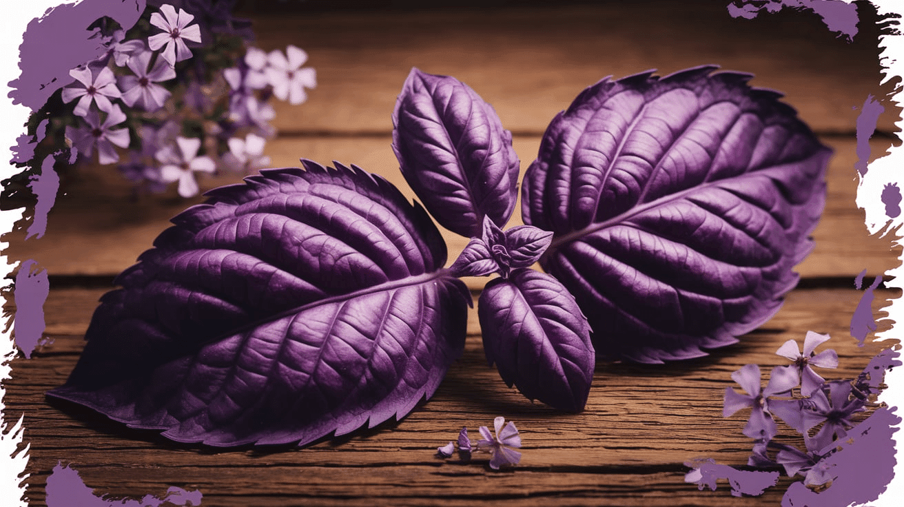
Glidden’s Purple Basil(LVR- PPG1046-7) is a deep, warm purple that fosters creativity and self-expression. It’s perfect for adding richness and drama to any space.
Top tips for this idea
- Use in offices, kitchens, or bathrooms for an artistic flair.
- Pair with earthy tones for an lavish look.
6. Valspar’s Encore

Valspar’s Encore (LRV – 8002-45G) is a rich, jewel-toned blue that evokes both luxury and modernity. It’s perfect for creating a calming yet cultured backdrop.
Top tips for this idea
- Use it in bedrooms for a peaceful, serene ambiance.
- Combine with metallics like gold or silver for a touch of grace.
7. Krylon’s Hammered Black

Krylon’s Hammered Black (LVR-K02782007) is a dark, textured shade that adds depth and a gothic flair to any project, perfect for creating unique accents.
Top tips for this idea
- Great for furniture like tables and chairs.
- Pair with metallic finishes for a bold contrast.
8. STAINMASTER’s Truffle

STAINMASTER’s Truffle is a deep brown that exudes both boldness and timeless enlightenment. It complements various interior styles, from modern minimalism to rustic chic.
Top tips for this idea
- Perfect for living rooms or home offices for a grounded look.
- Pair with light neutrals for balance.
9. Minwax’s Violet

Minwax’s Violet (HEX CODE- #7F00FF) is a cool, bold purple that adds a whimsical yet modern touch to wood pieces, making it perfect for unique furniture or decor.
Top tips for this idea
- Use in eclectic or modern spaces for a pop of color.
- Pair with natural wood tones for a striking contrast.
10. Glidden’s Brick Red

Glidden’s Brick Red (HEX code- #8A565E) is a rich, warm red that adds a luxurious feel to spaces. It’s great for making bold statements and creating a urbane atmosphere.
Top tips for this idea
- Use on furniture or as an accent color in living areas.
- Pair with gold or muted greens for added warmth.
11. Graham & Brown’s Elderton

Graham & Brown’s Elderton is a versatile medium brown that fits rustic and modern themes. Its adaptability makes it a perfect backdrop for various design styles.
Top tips for this idea
- Ideal for living rooms or bedrooms for a cozy and grounded feel.
- Pair with natural wood tones or bold accent colors.
12. Little Greene’s Mochi

Little Greene’s Mochi (LVR- 344) is a soft brown with peachy-pink undertones, ideal for creating restful spaces in both traditional and contemporary settings.
Top tips for this idea
- Perfect for bedrooms or bathrooms for a relaxing atmosphere.
- Pair with darker greens or soft whites for a balanced look.
13. Sherwin-Williams’ Quietude

HGTV Home by Sherwin-Williams’ Quietude (SW 6212) is a calming sage green that promotes relaxation, making it perfect for creating serene spaces.
Top tips for this idea
- Use in bedrooms or bathrooms for a peaceful retreat.
- Combine with white or soft wood tones for a fresh look.
14. Dutch Boy’s Mapped Blue

Dutch Boy’s Mapped Blue (LVR- 429-5DB) is a medium blue-gray with subtle yellow undertones, ideal for pairing with both warm and cool tones in various interior designs.
Top tips for this idea
- Great for accent walls or as a backdrop in living rooms.
- Pair with natural stone exteriors for a timeless appeal.
15. C2 Paint’s Raku

C2 Paint’s Raku ( C2-549) is an earthy, brownish-red that brings grounding, comfort, and timeless refinement to any space. It’s perfect for creating intimate settings.
Top tips for this idea
- Use in libraries or living rooms for a dramatic effect.
- Pair with gold accents or dark wood for added richness.
16. Sherwin-Williams’ Grounded

Sherwin-Williams’ Grounded (SW6089)is a deep, earthy brown that brings a sense of stability and nature to any space. Perfect for creating warm, comforting environments.
Top tips for this idea
- Use in home offices or living rooms for a grounded feel.
- Pair with lighter greens or creams for contrast.
17. Sherwin-Williams’ Sunbleached

Sherwin-Williams’ Sunbleached (SW9585) is a soft, muted beige with warm undertones. It adds a subtle touch of lightness to any room, making it feel airy and relaxed.
Top tips for this idea
- Ideal for creating airy, open spaces in living rooms.
- Pair with pastels for a soft, calming palette.
18. Sherwin-Williams’ Chartreuse

Sherwin-Williams’ Chartreuse (SW0073) is a vibrant yellow-green that adds energy and modern flair to any space. It’s perfect for those looking to add bold accents.
Top tips for this idea
- Use for accent walls or in small spaces for a vibrant pop.
- Pair with muted tones to prevent it from overwhelming the room.
19. Sherwin-Williams’ Bosc Pear

Sherwin-Williams’ Bosc Pear (SW-6390) is a muted green with earthy undertones, bringing nature’s stability into your home, perfect for living rooms and kitchens.
Top tips for this idea
- Pair with soft wood tones for a nature-inspired feel.
- Use on walls for a relaxing and grounded space.
20. Sherwin-Williams’ White Snow

Sherwin-Williams’ White Snow (SW9541) is a soft, cool white, creating a refreshing, crisp atmosphere in any space. It’s ideal for enhancing natural light.
Top tips for this idea
- Use in small rooms to make them feel larger and brighter.
- Pair with natural wood or muted accents to balance its coolness.
21. Sherwin-Williams’ Rain Cloud

Sherwin-Williams’ Rain Cloud (SW9541) is a gentle gray-blue that evokes calm and quiet, perfect for bedrooms or relaxing spaces.
Top tips for this idea
- Use in bedrooms or bathrooms for a serene and peaceful vibe.
- Pair with soft white accents for an agreeable look.
22.Sherwin-Williams’ Clove

Sherwin-Williams’ Clove (SW9605) is a warm brown with a spicy undertone, perfect for cozy interiors. It pairs well with both modern and vintage decor styles.
Top tips for this idea
- Use in living rooms or dining rooms for warmth and comfort.
- Pair with gold accents for a luxurious touch.
23. Sherwin-Williams’ Malabar

Sherwin-Williams’ Malabar (SW9110) is a deep, rich color that combines culture and boldness, perfect for creating dramatic and intimate spaces.
Top tips for this idea
- Use in accent pieces or large furniture.
- Pair with soft neutrals to balance its passion.
24. Sherwin-Williams’ Mauve Finery

Sherwin-Williams’ Mauve Finery (SW6282) is a soft mauve that brings a subtle grace to any room. It adds depth without overpowering the space.
Top tips for this idea
- Use in bedrooms for a touch of refined calm.
- Pair with soft grays or light woods for a balanced beauty.
25. Sherwin-Williams Desert Oasis
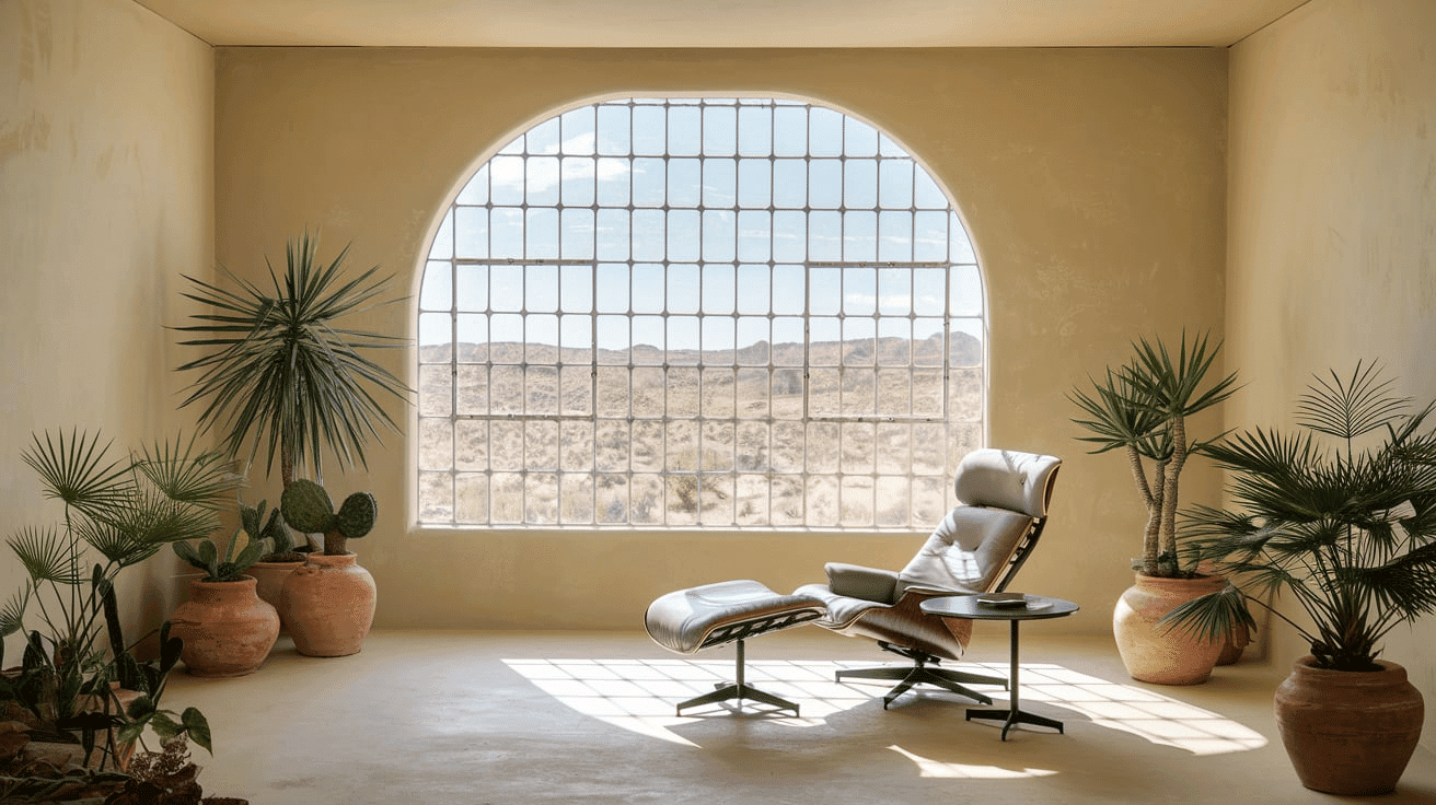
A soft, warm beige with subtle yellow undertones, Desert Oasis (SW 6107) by Sherwin-Williams brings a serene and relaxing vibe to any space, evoking the calmness of a desert landscape.
Top tips for this idea
- Ideal for creating a soft, welcoming atmosphere in living rooms or bedrooms.
- Pair with natural textures like wood and linen for a grounded feel.
26. Benjamin Moore’s Midnight Plum

Midnight Plum (LVR-2131-20) by Benjamin Moore is a deep, rich purple with a slight bluish undertone. It adds drama and refinement, making it ideal for creating bold accents in spaces.
Top tips for this idea
- Great for feature walls or accent pieces like cushions and curtains.
- Pair with gold or silver accents to enhance its luxurious feel.
27. Sherwin-Williams Olivine

Olivine (SW4023) by Sherwin-Williams is a muted, earthy green with yellow undertones, evoking the natural hues of olive groves. It creates a peaceful, organic atmosphere perfect for living areas.
Top tips for this idea
- Use in kitchens or dining rooms for a fresh, nature-inspired vibe.
- Pair with whites or soft woods for a balanced and refreshing space.
Conclusion
As we stand on the cusp of a transformative year, the Color of the Year 2025 emerges as more than just a visual trend—a powerful narrative of our collective consciousness.
This carefully selected shade exceeds mere aesthetic appeal, serving as a mirror to our global experiences, technological innovations, and cultural aspirations.
It invites us to see the world through a new lens, challenging our perceptions and motivating creativity across design, fashion, and creative industries.
Whether embraced boldly or subtly integrated, this color represents a shared language of hope, innovation, and connection.
As we move forward, it reminds us that color is not just something we see but a profound expression of how we interpret and interact with the world around us.

Alex Guerrero, a graduate with a Fine Arts degree from the Rhode Island School of Design, has been a visionary in the world of color and design for over 15 years. His professional journey began in the heart of the fashion industry in Milan, where he developed an acute sense for color harmonies and trends. Alex joined our team in 2018, offering fresh and innovative perspectives on color utilization in various spaces. Renowned for his ability to blend contemporary trends with timeless elegance. Outside of work, Alex is an accomplished painter and a volunteer art therapist, his artistic talents further enriching his professional insights.