Liveable Green (SW 6176) by Sherwin-Williams is a soft, earthy green with yellow-gray undertones. It feels warm, calm, and balanced, never too bright or too dull.
With a Light Reflectance Value (LRV) of 61, it reflects just the right amount of light to make rooms feel open and inviting.
I’ll walk you through how and where to use this color at home. From cozy bedrooms to simple kitchens, Liveable Green fits right in.
It works well with both modern and classic styles, and it’s easy to pair with other paint colors.
In this guide, I’ll keep things clear and practical. You’ll find tips on color matching, placement ideas, and why this shade works in so many spaces.
By the end, you’ll know if Liveable Green is a smart pick for your next project, inside or out.
What Makes Liveable Green a Smart Choice for Paint?

Liveable Green is an ideal paint color because it brings balance and calm to a space.
Its soft green tone, mixed with hints of yellow and gray, makes it gentle on the eyes. It doesn’t feel too cold or too warm, which makes it suitable for many rooms and styles.
This color works well with natural light. It reflects enough brightness to keep rooms feeling open, while also adding a cozy feel.
You can pair it with both light and dark shades, which makes decorating easier.
Because it’s so versatile, Liveable Green can be used in bedrooms, kitchens, living rooms, and even exteriors.
It helps create a space that feels clean, quiet, and put together without trying too hard.
The Subtle Undertones of Liveable Green
Liveable Green has more than just green in it. Beneath the surface, you’ll find hints of yellow and gray.
These soft undertones make the color feel warm and calm. The yellow brings in a light, sunny touch.
The gray tones it down, keeping it from feeling too bright or bold. Together, they help the color look steady and easy to live with.
These undertones also change slightly depending on the lighting. In natural light, the color may look fresher and more open.
In darker rooms, it can feel warmer and cozier. This is what makes Liveable Green so flexible; it reacts well in different spaces without looking too sharp or too dull.
Where to Use Sherwin-Williams Liveable Green?
Liveable Green is easy to work with. It fits in many parts of the home, both inside and out. Below are areas where Liveable Green stands out.
Living Room
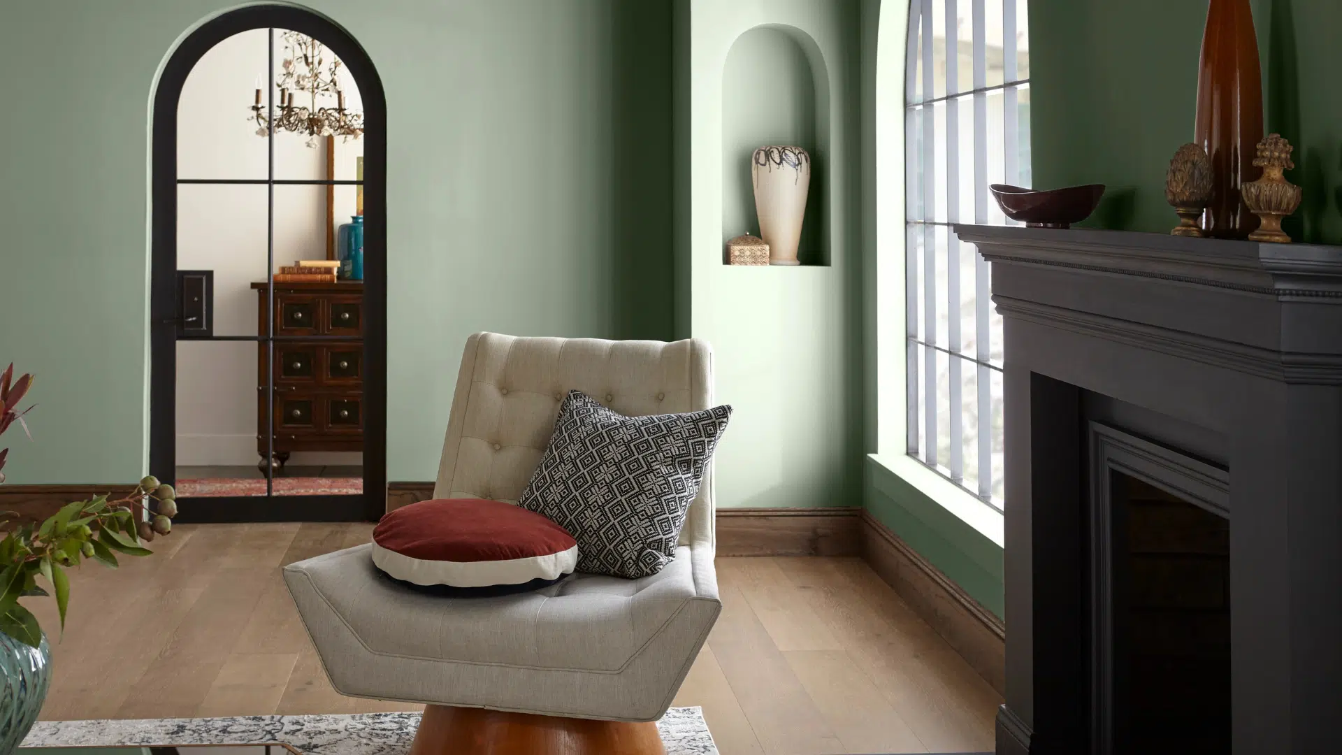
In the living room, Liveable Green helps you slow down. It makes the room feel quiet and comfortable.
The green brings a bit of nature indoors. The gray tones keep things simple and calm. You can match it with warm wood floors, white trim, or beige rugs.
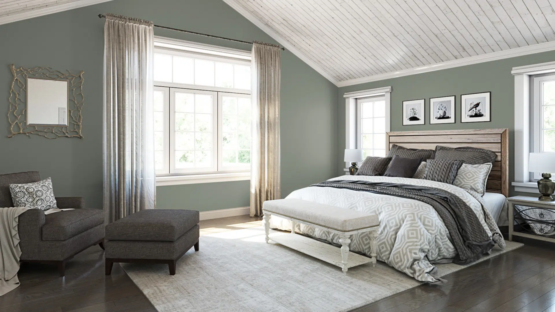
Bedroom
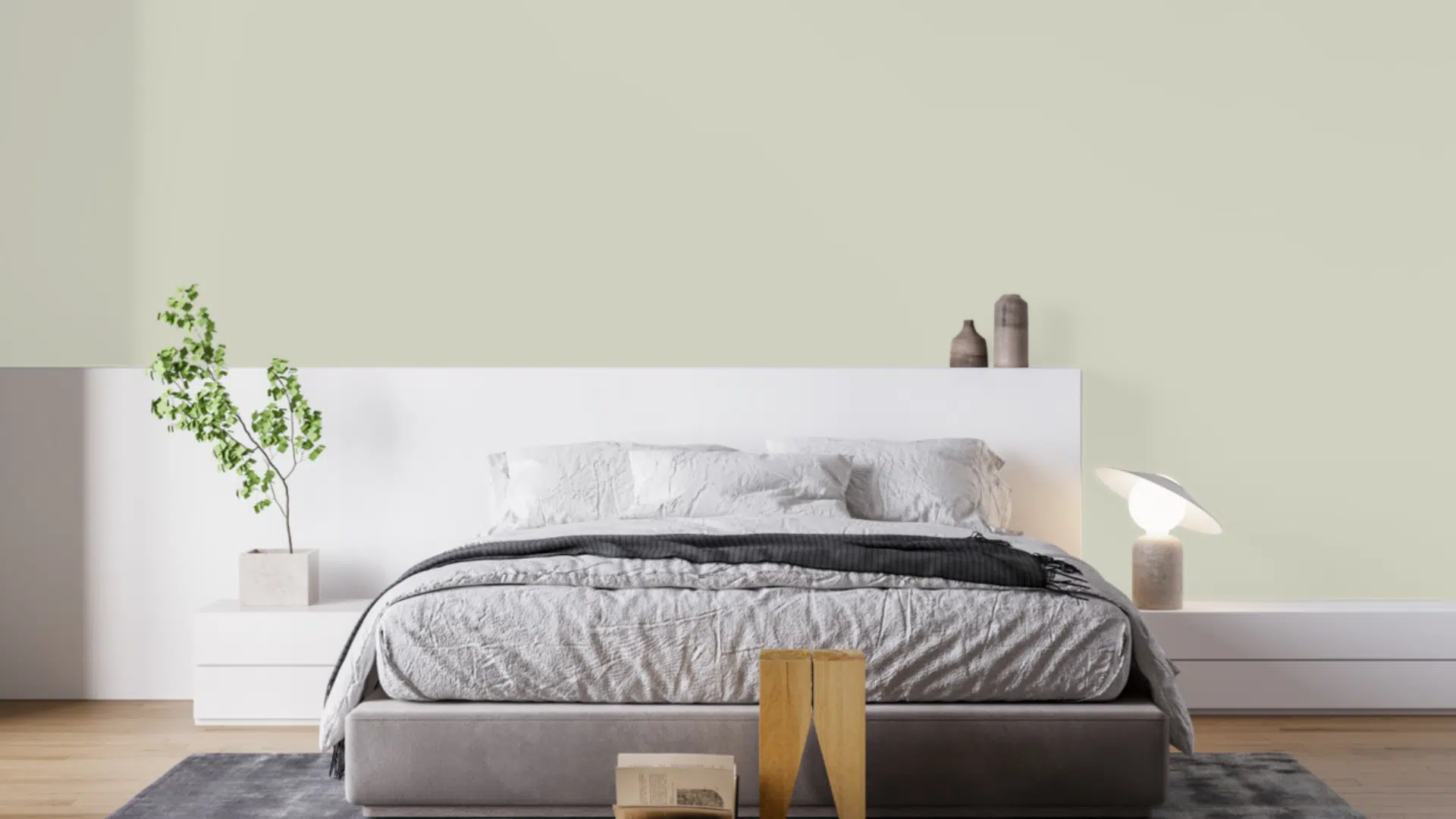
Bedrooms should feel restful, and Liveable Green helps with that. Its soft tone doesn’t shout; instead, it gives off a steady, peaceful feeling.
It looks great behind a bed or on all four walls. Use white or cream bedding to keep things light, or bring in darker wood for contrast.
Kitchen
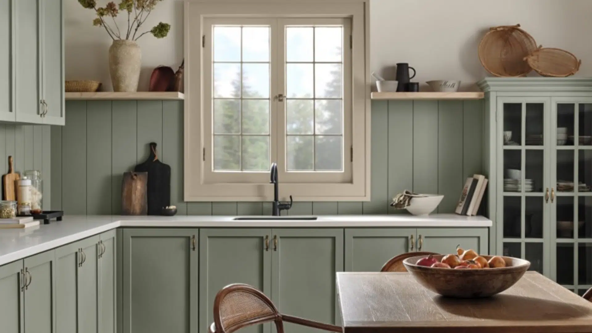
Kitchens need to feel fresh and clean, and this green helps do that. It pairs well with white cabinets, wooden shelves, or black hardware.
You can use it on walls for a soft backdrop or on the cabinets for a gentle pop of color. It also works with light tile or stone.
Bathroom
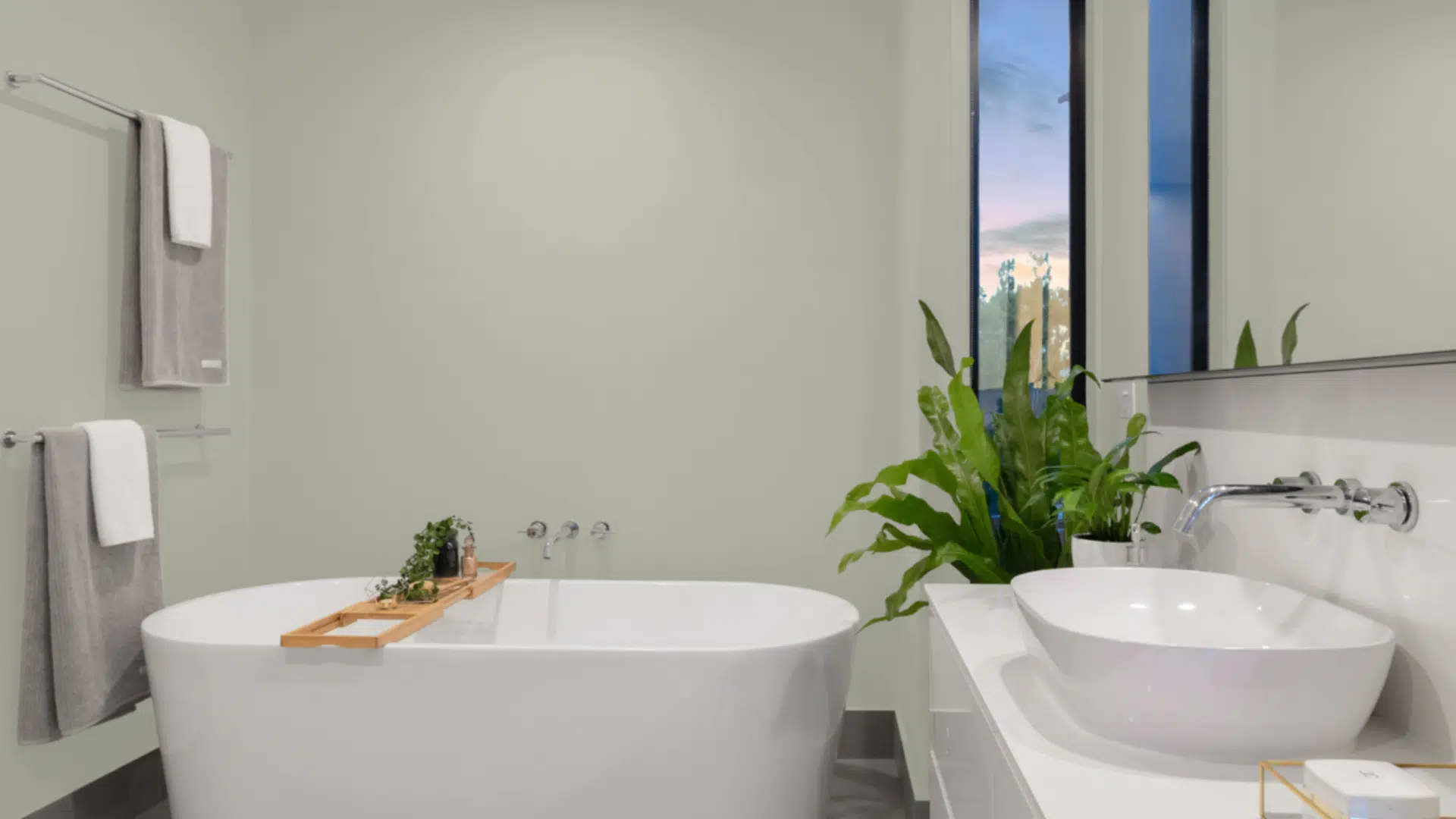
Liveable Green is a smart choice for bathrooms. It’s clean without feeling cold. It works nicely with white tile, silver fixtures, or light wood vanities.
Even in small bathrooms, this color won’t feel too dark or heavy. Instead, it makes the space feel calm and put together.
House Siding
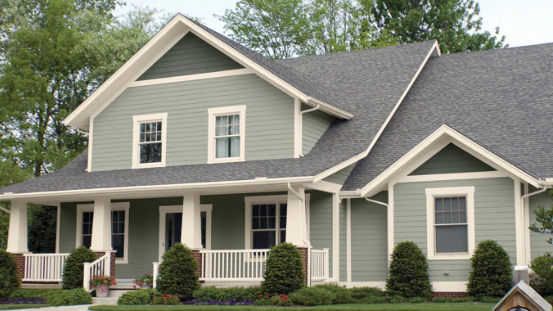
This color also works well outside. On the siding, Liveable Green blends with nature. It looks soft against trees, plants, and lawns.
It works well with many house styles, including cottages, farmhouses, and modern homes. You can pair it with white or charcoal trim for a balanced look.
Front Door
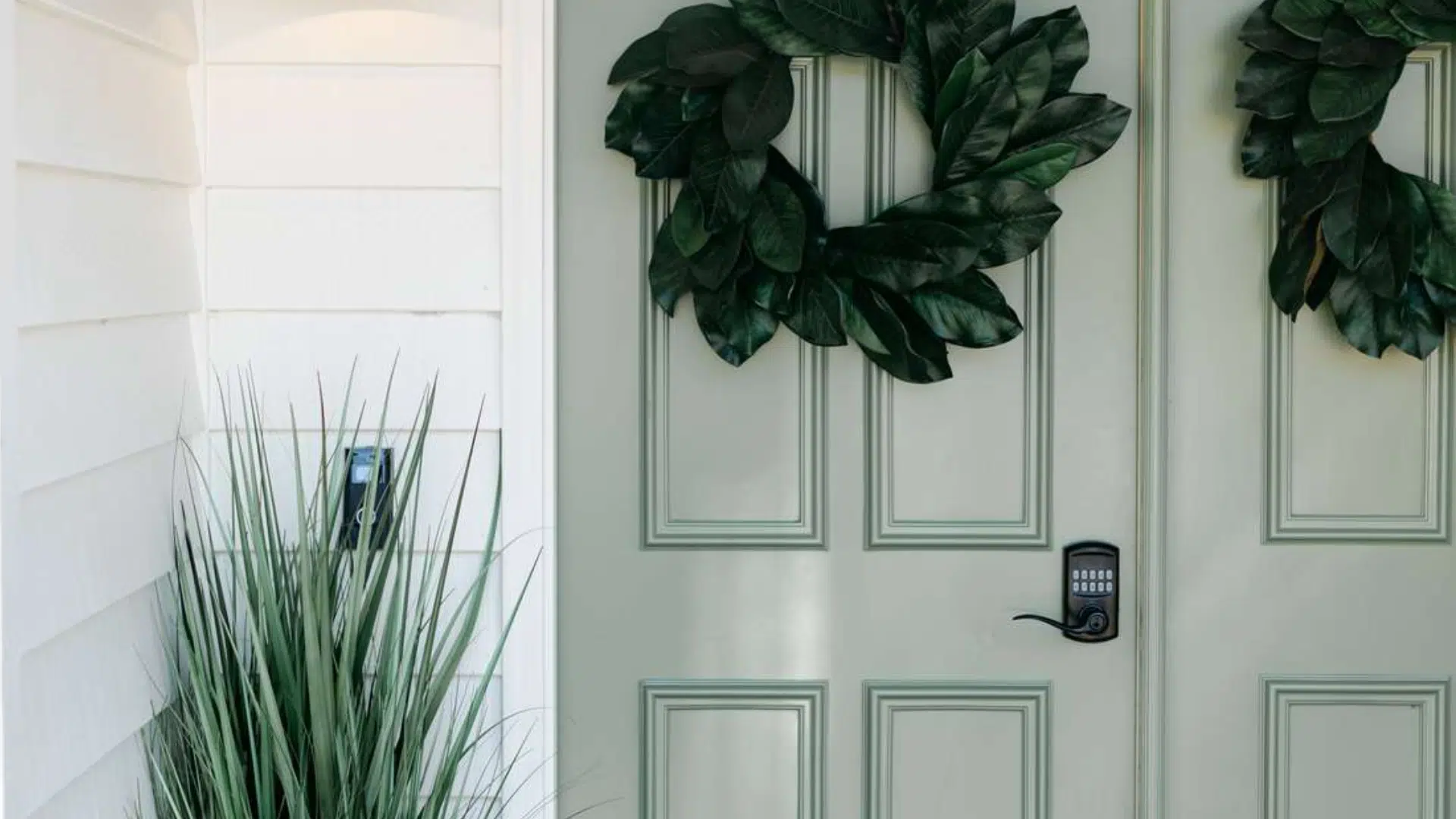
A front door in Liveable Green gives a calm welcome. It’s a nice way to add interest without going bold.
This color pairs well with brick, stone, or white walls. It’s soft, but still adds personality. Try matte black handles or brushed metal hardware for a neat contrast.
Flooring Options that Pair with Liveable Green
Liveable Green is soft, warm, and natural, so the right flooring can make it feel even better. If you want a light, bright space or something more grounded, there’s a floor that works. Below are some great flooring choices:
- Light Oak or Whitewashed Wood: These tones keep the space airy and open. They highlight the freshness of Liveable Green without making it feel too cool.
- Medium Warm Woods: (like maple or honey oak) Creates a cozy and inviting look. The warmth in the wood brings out the softer tones in the paint.
- Soft Gray Hardwood or Vinyl: Gray floors match the paint’s undertones. This combo works well in modern or minimal rooms.
- Natural Stone: (like limestone or travertine) It adds texture and depth. It is good for kitchens, entryways, or outdoor areas.
- Neutral Carpet: (beige, tan, or oatmeal) This type of carpet is great for bedrooms or living rooms. Its soft shades keep the mood calm and comfortable.
Coordinating Colors for Liveable Green
Choosing the right colors to complement Liveable Green can make a space feel more complete. Below are some solid color matches to help you build a balanced palette.
- Westhighland White (SW 7566): This is a warm, creamy white. It’s soft but still bright enough to make Liveable Green stand out. Use it for trim, ceilings, or even cabinets. It brings light into the room without clashing.
- Nonchalant White (SW 6161): This is a relaxed, gray-leaning white. It feels calm and subtle, just like Liveable Green. Together, they create a smooth, even look. Try it on walls, built-ins, or tiles for a blended and straightforward style.
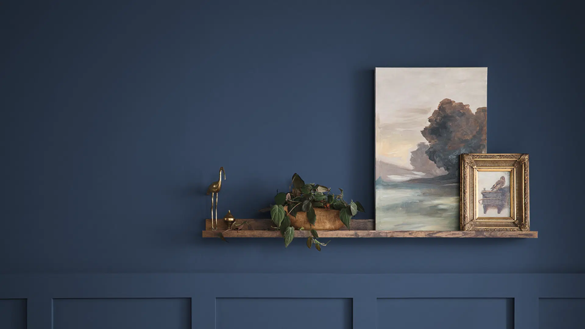
- Moody Blue (SW 6221): This rich blue brings contrast. It has depth and works great in accents like pillows, rugs, or even a single wall. Pairing it with Liveable Green adds energy while keeping the space grounded.
- Adaptive Shade (SW 7053): This is a deep, muted gray with warmth. It blends nicely with the soft tones in Liveable Green. Use it on furniture, trim, or nearby walls to create a layered, quiet space.
Liveable Green Compared to Other Neutral Paints
Liveable Green is part of a soft green family, but not all greens are the same. Some feel cooler, some lighter, and some more earthy. Comparing them can help you choose the right one.
| Paint Color | Undertone | Vibe | Best For |
|---|---|---|---|
| Liveable Green | Soft yellow-gray | Calm, warm, grounded | Bedrooms, living rooms, kitchens, exteriors |
| Softened Green | Cool gray-green | Fresh, slightly cooler | Dining areas, modern rooms |
| Sea Salt | Blue-green with gray | Breezy, airy, light | Bathrooms, coastal spaces |
| Evergreen Fog | Deep green with gray | Moody, cozy, modern | Accent walls, dens, exteriors |
Tips for Using Liveable Green
Using Liveable Green well is all about knowing your space. This shade can look slightly different depending on light, nearby colors, and materials. Below are some tips to help you get the best results:
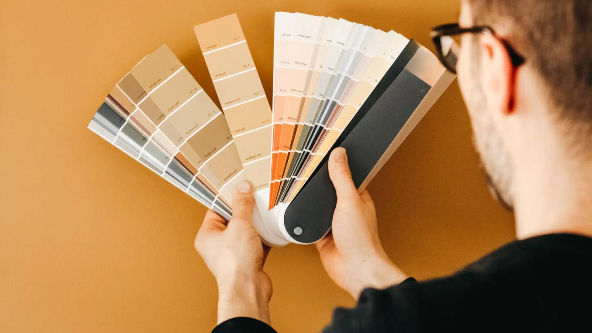
- Try a sample first: Paint a small area on each wall. Look at it in the morning, afternoon, and evening. Natural and artificial light can change how it looks.
- Use natural materials: This color looks great with wood, stone, and rattan. These textures make the space feel calm and grounded.
- Keep the mood soft: his color works best in rooms where you want peace, like bedrooms, bathrooms, or quiet sitting areas. Use light or neutral decor to let the color shine.
- Balance with trim: For contrast, try soft whites like Westhighland White. This helps the green feel brighter and fresher.
- Add simple accents: Think natural fabrics, plants, or soft metals. These details can pull the room together without being too bold.
Conclusion
Liveable Green is a calm, soft green with yellow and gray undertones. I like how it feels warm and balanced without being too bold.
It works well in peaceful spaces, such as bedrooms, kitchens, and living rooms, as well as outside on doors or siding.
I’ve found it pairs beautifully with soft whites, light woods, and muted blues or grays. Its light reflectance helps rooms stay open and airy.
If you want a color that adds calm without standing out too much, Liveable Green is a great pick.

Alex Guerrero, a graduate with a Fine Arts degree from the Rhode Island School of Design, has been a visionary in the world of color and design for over 15 years. His professional journey began in the heart of the fashion industry in Milan, where he developed an acute sense for color harmonies and trends. Alex joined our team in 2018, offering fresh and innovative perspectives on color utilization in various spaces. Renowned for his ability to blend contemporary trends with timeless elegance. Outside of work, Alex is an accomplished painter and a volunteer art therapist, his artistic talents further enriching his professional insights.