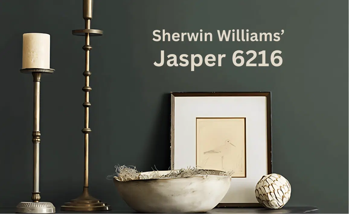
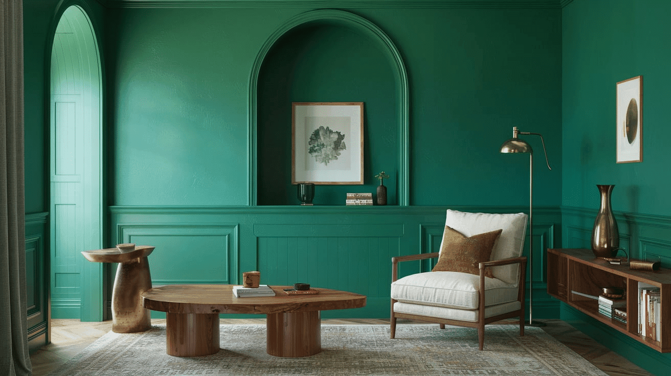
Change your space with the grounded richness of Sherwin-Williams’ Jasper (SW 6216). This sophisticated green goes beyond ordinary neutrals, delivering deep earth-tone undertones that command attention on your walls.
Jasper builds a sanctuary of warmth—a welcoming atmosphere that connects both mind and space to nature.
Watch as natural light reveals subtle variations throughout the day, shifting with the hours while maintaining its earthy, composed character.
Choose Jasper for more than just another green experience, a color that brings the timeless elegance of natural stone into your everyday environment.
Create the perfect backdrop for rustic, organic designs and contemporary spaces that demand refined depth.
Understanding Sherwin Williams’ Jasper (SW 6216)
Color Terminology
| PROPERTY | VALUE |
|---|---|
| LRV (Light Reflectance Value) | 4 |
| Color Category | Considered a dark green-neutral color (LRV between 15-20) |
| Comparison | Pure white: ~90 LRV, Black: ~0 LRV |
| RGB Value | 52 / 59 / 54 |
| Hex Code | #343B36 |
Undertones
- Jasper has noticeable earthy undertones
- It’s a deep green with a slight olive influence
- Not a flat or one-dimensional color but a refined, complex neutral with a substantial presence
Psychology of Deep Green-Neutral Colors
Deep greens like Jasper create a sense of security and natural sophistication.
- Grounding tones: Offer intimacy and visual depth to spaces
- Earth-tinted greens: Evoke nature, tranquility, and timeless elegance
- Benefits: More nuanced than stark greens, adds substantial presence to spaces, creates a rich backdrop for both light furniture and metallic elements
Jasper provides the perfect balance for those seeking a considerable green that isn’t too vibrant or overwhelming.
Its subtle earth undertones make it particularly versatile in spaces with western or southern exposure, where it helps maintain richness while contributing a sense of refined warmth.
Why Choose this Color?
The balanced depth of Jasper evokes a sense of grounding and refinement that promotes tranquility in any environment.
This enduring color carries complex undertones that shift subtly with changing light, ensuring your space feels both current and timelessly peaceful.
Key Features
Sherwin Williams Jasper offers exceptional depth and versatility across different lighting conditions. It maintains its subtle olive undertones in bright spaces while creating a rich, cozy atmosphere in rooms with varied natural light.
Its timeless neutral quality provides a refined backdrop that complements both light-colored elements and natural textures without appearing overly dark or flat.
Adaptability
Sherwin Williams Jasper demonstrates remarkable adaptability with existing elements like light-colored furniture and natural wood fixtures, creating striking contrasts between spaces.
It provides enough depth to feel substantial and grounding while maintaining a refined, enduring quality that won’t quickly date your interior design choices.
This versatile green works equally well as an accent wall for creating focused, atmospheric environments or as a complementary element to lighter, neutral walls.
Durability
Sherwin Williams Jasper, particularly in premium finishes like Duration or Emerald, delivers outstanding durability with excellent coverage in both new and repainted areas.
Its deep tone and subtle earth undertones maintain a refined appearance throughout your home while providing a forgiving surface for everyday living.
This paint maintains color consistency even with regular cleaning when properly applied.
Texture Patterns
Sherwin Williams Jasper creates a rich, velvety texture that adds subtle dimension to walls and architectural features.
Its complex undertones produce a beautiful light play that enhances moldings and adds visual interest to even simple walls.
When applied to different finishes, it can elegantly highlight architectural details while maintaining a consistent, refined appearance throughout connected spaces.
Room-by-Room Color Recommendations with Jasper
Living Spaces and Dining Rooms
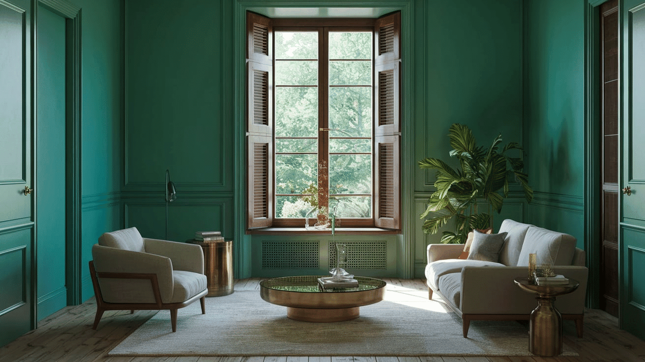
- Jasper works exceptionally well as an accent wall in living areas. It creates a rich focal point while maintaining a refined, earthy palette.
- The 17.43 LRV of Jasper provides a substantial, anchoring feel that makes spaces appear more intimate and refined without feeling gloomy.
- Use Jasper to define different areas in larger spaces while allowing lighter furnishings and artwork to stand out against its tranquil backdrop.
Home Offices and Libraries
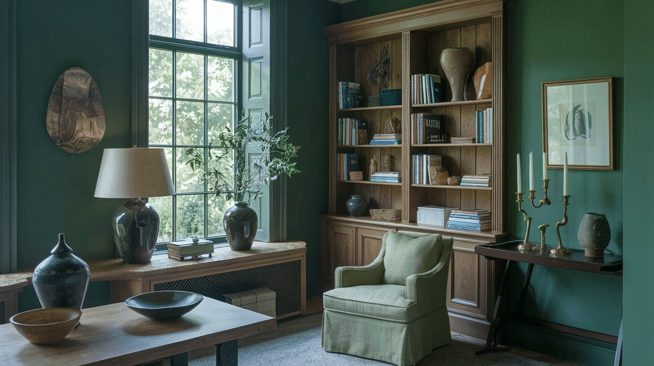
- Jasper creates a focused, grounding atmosphere in workspaces that promotes concentration and productivity.
- The subtle earth undertones in Jasper evoke a sense of stability while creating a refined backdrop for natural wood furniture and brass accents.
- Consider Jasper for all walls to create a cozy sanctuary that feels both enveloping and refined without sacrificing warmth.
Kitchens
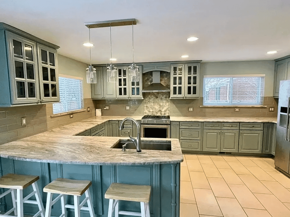
- Jasper in satin or semi-gloss finish on lower cabinets creates a rich, timeless element that contrasts beautifully with light-colored upper cabinets or open shelving.
- The deep richness of Jasper enhances both light countertop materials and brass fixtures, making it adaptable to various kitchen styles, from rustic to contemporary.
- Jasper as an accent wall paired with light neutral cabinets creates an appealing contrast that grounds the kitchen while maintaining a refined, cohesive feel.
Bedrooms and Relaxation Areas
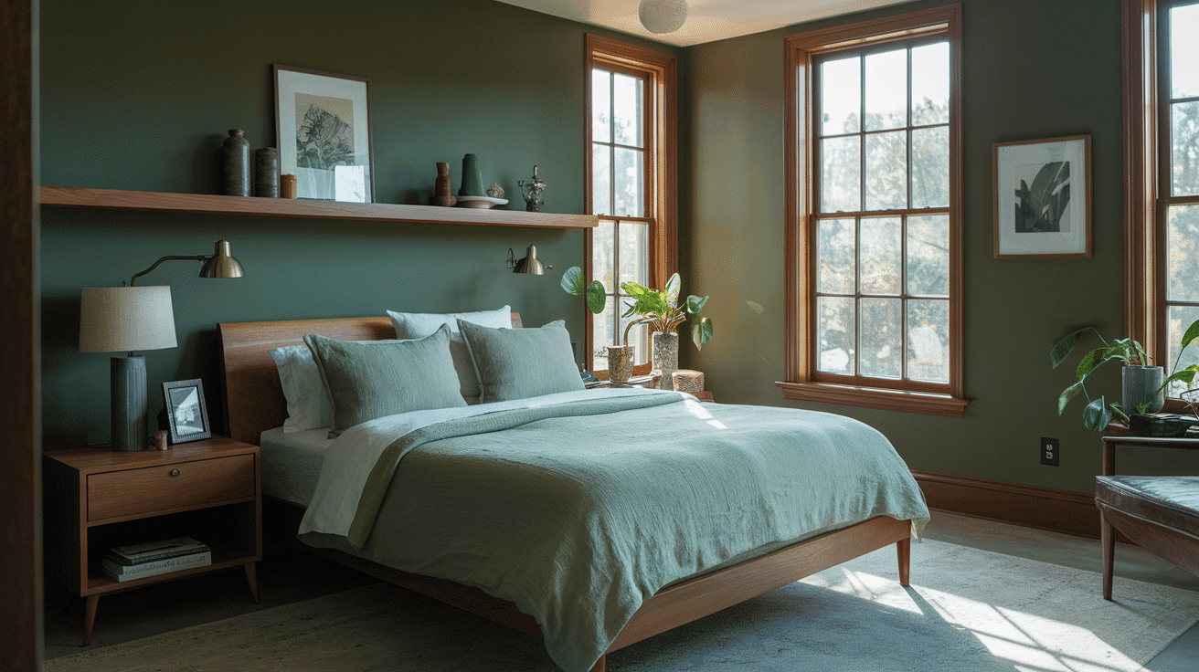
- Sherwin Williams Jasper creates a cozy, refined atmosphere in bedrooms. Its subtle earth undertones establish a sense of security while complementing natural textiles.
- This versatile shade pairs beautifully with both crisp white bedding and natural linen, creating a timeless, refined retreat that feels both elegant and inviting.
- Use Jasper on an accent wall behind the bed to create a focal point without sacrificing spaciousness.
Jasper Color Combinations
Jasper is a deep, refined green with subtle earth undertones. Its lower Light Reflectance Value (LRV) of 17.43 makes it a substantial, grounding foundation that adds intimacy and versatility to spaces while maintaining a refined natural quality.
Complementary Trim Colors
- Extra White (SW 7006) – A bright, clean white that creates a dramatic distinction with Jasper
- Alabaster (SW 7008) – A versatile off-white that softens Jasper’s deep quality
- Creamy (SW 7012) – A warm white that harmonizes with Jasper’s earth undertones
- Greek Villa (SW 7551) – A warm white that brightens spaces while complementing Jasper’s depth
Coordinating Wall Colors
- Accessible Beige (SW 7036) – A light, warm beige that adds brightness while complementing Jasper
- Agreeable Gray (SW 7029) – A versatile greige that creates a balanced, cohesive palette
- Sea Salt (SW 6204) – A light blue-green that brightens while echoing Jasper’s green qualities
- Colonnade Gray (SW 7641) – A medium warm gray that creates sophisticated contrast with Jasper
Accent Colors
- Naval (SW 6244) – A deep navy that creates a rich, refined pairing with Jasper
- Rookwood Red (SW 2802) – A muted terracotta that provides a natural complement to Jasper’s earthiness
- Urbane Bronze (SW 7048) – A deep brown-gray that extends Jasper’s grounding qualities
- Dried Thyme (SW 6186) – A lighter olive green that creates a harmonious color story with Jasper
Coordinating with Furniture and Decor

Wood Tones and Finishes
Light Woods: Scandinavian-style blonde oak, whitewashed ash, or honey maple create striking contrast against Jasper’s deep backdrop—think modern farmhouse or minimalist aesthetics.
Medium Woods: Rich cherry with traditional stain, walnut with satin finish, or hickory with natural grain provide complementary warmth. These work beautifully in craftsman or transitional interiors.
Dark Woods: Espresso-stained oak, mahogany with high-gloss finish, or ebony create sophisticated drama—perfect for traditional or contemporary luxury spaces.
Specialty Finishes: Weathered barn wood, lime-washed pine, or olive-tinted eucalyptus extend Jasper’s refined quality for organic, coastal, or bohemian styles.
Metal Finishes and Hardware
Warm Metals: Brass, aged bronze, and copper enhance Jasper’s earth undertones. Brushed finishes feel contemporary while antique patinas suit traditional spaces.
Cool Metals: Chrome and nickel create dynamic contrast—choose brushed or satin finishes over high-polish for a more refined pairing with Jasper’s matte quality.
Mixed Metals: Combine warm brass cabinet pulls with matte black lighting fixtures for sophisticated layering that complements Jasper’s complex undertones.
Texture and Paint Finish Impact
Matte Finishes: Absorb light and intensify Jasper’s earthy depth—ideal for creating intimate, cozy atmospheres.
Satin/Eggshell: Provide subtle sheen that reveals Jasper’s olive undertones while maintaining sophistication.
Semi-Gloss: Best for trim work—creates crisp definition against Jasper walls while enhancing durability in high-traffic areas.
Quick Do’s and Don’ts
| DO | DON’T |
|---|---|
| Mix wood tones for added depth and interest | Pair Jasper with overly bright or neon accent colors |
| Use warm metals to enhance Jasper’s earthy quality | Use high-gloss finishes on large Jasper wall surfaces |
| Layer textures in light, neutral tones | Forget to add lighter elements to prevent the space from feeling too dark |
| Choose brushed over high-polish metal finishes | Mix too many cool-toned metals without warm balance |
| Consider the room’s natural light when selecting complementary elements | Overlook the impact of texture on color perception |
Similar Paint Colors: Perfect Alternatives to Jasper

Jasper vs. Retreat
Jasper (Sherwin Williams SW 6216)
- A deep green with subtle earth undertones
- Low LRV (Light Reflectance Value) that creates intimate, grounded spaces
- Works well in traditional, rustic, or contemporary interiors
- Best for spaces where you want substantial, refined depth
Retreat (Sherwin Williams SW 6207)
- A versatile sage green with slight gray undertones
- Medium-low LRV (around 29) that creates a balanced, adaptable backdrop
- It contains cool undertones that create a more refreshing atmosphere
- Popular for creating neutral, calming environments that work with many design styles
Key Differences
| Feature | Jasper (SW 6216) | Retreat (SW 6207) |
|---|---|---|
| Undertones | Noticeable earth undertones | Gray undertones |
| Lighting Appearance | Notably darker in most conditions | Lighter and more balanced |
| Atmosphere Created | Intimacy and groundedness | Versatile and refreshing |
| Design Role | Substantial, refined depth | Adaptable neutral backdrop |
| Best For | Traditional, rustic, contemporary spaces seeking weight | Neutral, calming environments with broad appeal |
Final Thoughts
Jasper (SW 6216) stands out as an exceptional paint choice for three key reasons: its rich, earthy depth creates instant sophistication, its versatility works across multiple design styles, and its timeless appeal ensures your investment won’t look dated.
This sophisticated green transforms any room into a grounded sanctuary while providing the perfect backdrop for both bold accents and subtle neutral palettes. Its complex undertones shift beautifully with natural light, giving you a dynamic color that feels fresh throughout the day.
Ready to bring natural elegance to your space?
Jasper offers the rare combination of dramatic impact and lasting appeal. Visit your local Sherwin-Williams store to see how this distinguished green can anchor your design vision with refined, earthy sophistication.

Alex Guerrero, a graduate with a Fine Arts degree from the Rhode Island School of Design, has been a visionary in the world of color and design for over 15 years. His professional journey began in the heart of the fashion industry in Milan, where he developed an acute sense for color harmonies and trends. Alex joined our team in 2018, offering fresh and innovative perspectives on color utilization in various spaces. Renowned for his ability to blend contemporary trends with timeless elegance. Outside of work, Alex is an accomplished painter and a volunteer art therapist, his artistic talents further enriching his professional insights.