Colors affect our homes in ways we don’t always notice.
They can make rooms feel bigger or smaller. They can make people feel calm or excited.
Picking the right paint color is one of the most important parts of making a home feel good.
The right color can change how a space feels and looks.
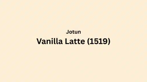
Vanilla Latte is a soft beige color from Jotun with an LRV of 65-70.
This color brings warmth and calm to any room.
The high LRV means it reflects more light, making spaces feel open and bright.
It works well in many styles, from modern to traditional.
Its warm undertones make rooms feel cozy without being too dark or heavy.
This post will look at what makes Vanilla Latte special and how to use it in your home.
Let’s find out if this color might be the perfect choice for your walls.
Understanding Jotun’s Vanilla Latte Color (1519)
Vanilla Latte is a light, soft beige with warm, creamy undertones.
It has a gentle yellowish tint that makes it feel cozy.
This color looks like ivory, eggshell, or sand.
It also reminds many people of oatmeal or untreated wood.
In the morning, Vanilla Latte catches the sunrise and glows with a soft golden hue.
By midday, it settles into a clean, neutral beige that brightens rooms.
In the evening, it warms up again, creating a cozy feeling as the sun sets.
Under lamp light at night, it takes on a richer, more yellow tone that feels homey and relaxed.
Vanilla Latte changes with the light but always stays warm and welcoming.
This makes it perfect for rooms used all day long.
Color Terminology
Before picking a paint color, it helps to understand the digital and technical aspects.
Here we’ll break down the numbers and terms that define Vanilla Latte.
| ATTRIBUTE | VALUE |
|---|---|
| Jotun Company Color Code | 1519 |
| LRV (Light Reflectance Value) | 65–70 |
| RGB Code | 227, 216, 198 |
| Hex Code | #E3D8C6 |
These values show how the color appears on screens and in print materials.
They also help when trying to match this color with other products.
What Do These Numbers Mean?
Here’s what each number in the table below represents:
- Company Code: A unique identifier used by Jotun for cataloging the paint.
- LRV (Light Reflectance Value): Measures the percentage of light the color reflects. Higher values mean more reflectivity and a brighter appearance.
- RGB Code: Indicates the mix of Red (227), Green (216), and Blue (198) used to create the color.
- Hex Code: A six-digit HTML color code used in digital design and web development.
This color information helps you understand how Vanilla Latte will work in your space.
Why Choose Jotun’s Vanilla Latte Color?
Vanilla Latte is a smart choice for many homes. It works well in both small and large spaces.
The neutral tone goes with many styles and colors.
This beige shade can make a room feel bigger and brighter.
It’s also easy to match with furniture and decor items.
Many people pick this color because it doesn’t go out of style.
It can stay on walls for years without looking old or dated.
The warm tones also help rooms feel cozy in cold months while still looking fresh in summer.
1. Key Features
Vanilla Latte has a high LRV (65-70). This makes rooms look bigger and brighter.
The color has warm undertones that create a cozy feeling in any space.
It works as a perfect backdrop for both bold and soft accent colors.
This paint color doesn’t change much with different light sources.
Morning light or evening lamps will show the same warm beige tone.
It also hides small wall flaws better than darker or brighter colors would.
2. Durability & Maintenance
Jotun’s Vanilla Latte paint is made to last for many years when cared for properly.
- Clean walls with a soft, damp cloth and mild soap every few months
- Touch up small marks right away to prevent bigger damage
- Use a feather duster to remove dust from walls regularly
- Keep walls dry in high-moisture areas like bathrooms
- Avoid scrubbing with rough sponges or harsh cleaners
3. Texture & Finish Recommendations
The right finish can make Vanilla Latte look even better in different rooms of your home.
- Matte finish: perfect for bedrooms and living rooms where a soft look is wanted
- Eggshell finish: great for hallways and children’s rooms that need easy cleaning
- Semi-gloss: works well in bathrooms and kitchens where moisture is common
- Satin finish: best for trim and doors that get touched often
The finish you pick can change how the color looks and how easy it is to keep clean.
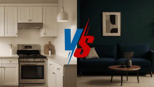
Room-by-Room Recommendations
The photos below show how Vanilla Latte looks in different spaces.
These real-life examples help visualize how this versatile color adapts to various rooms and lighting conditions.
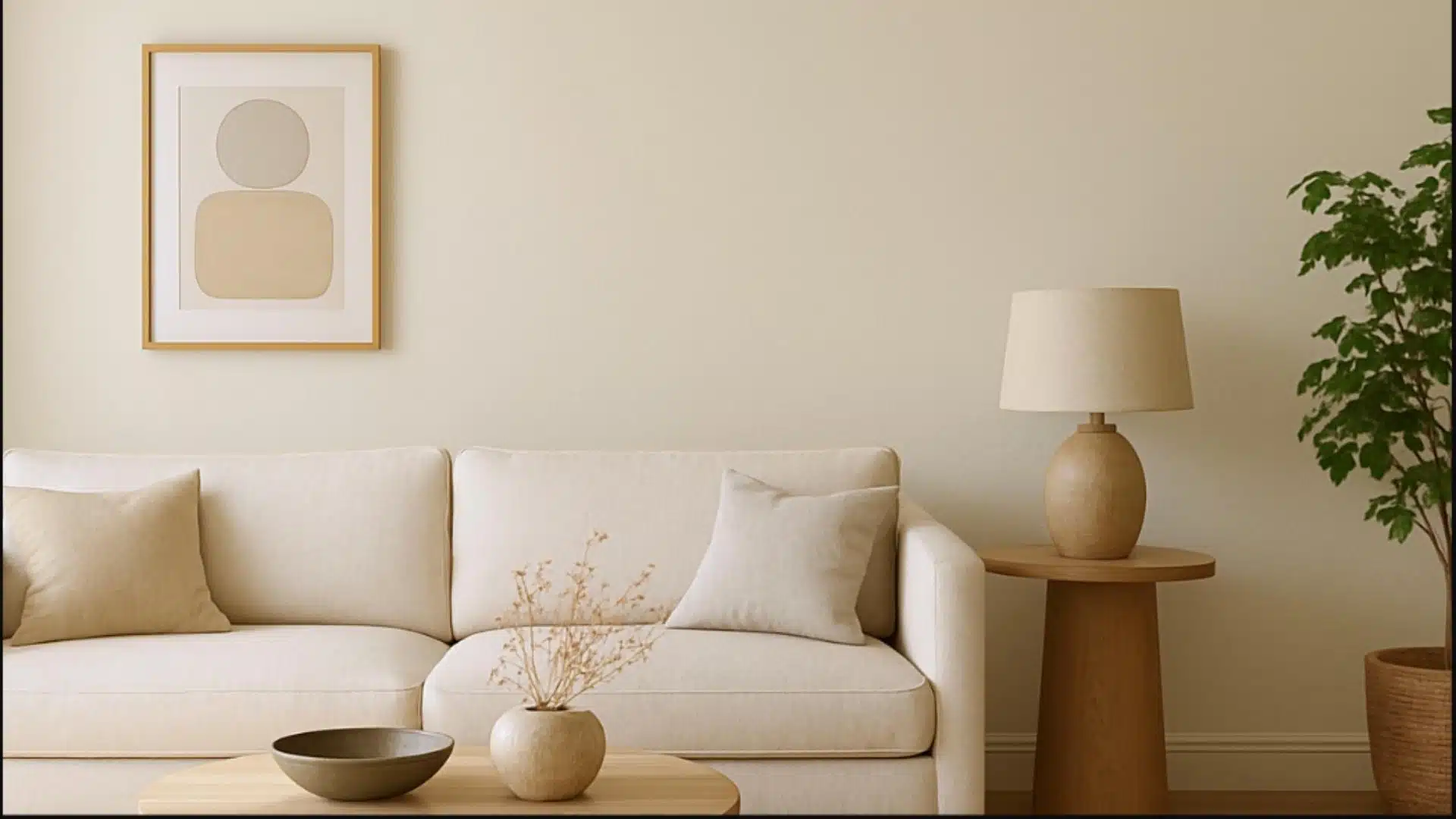
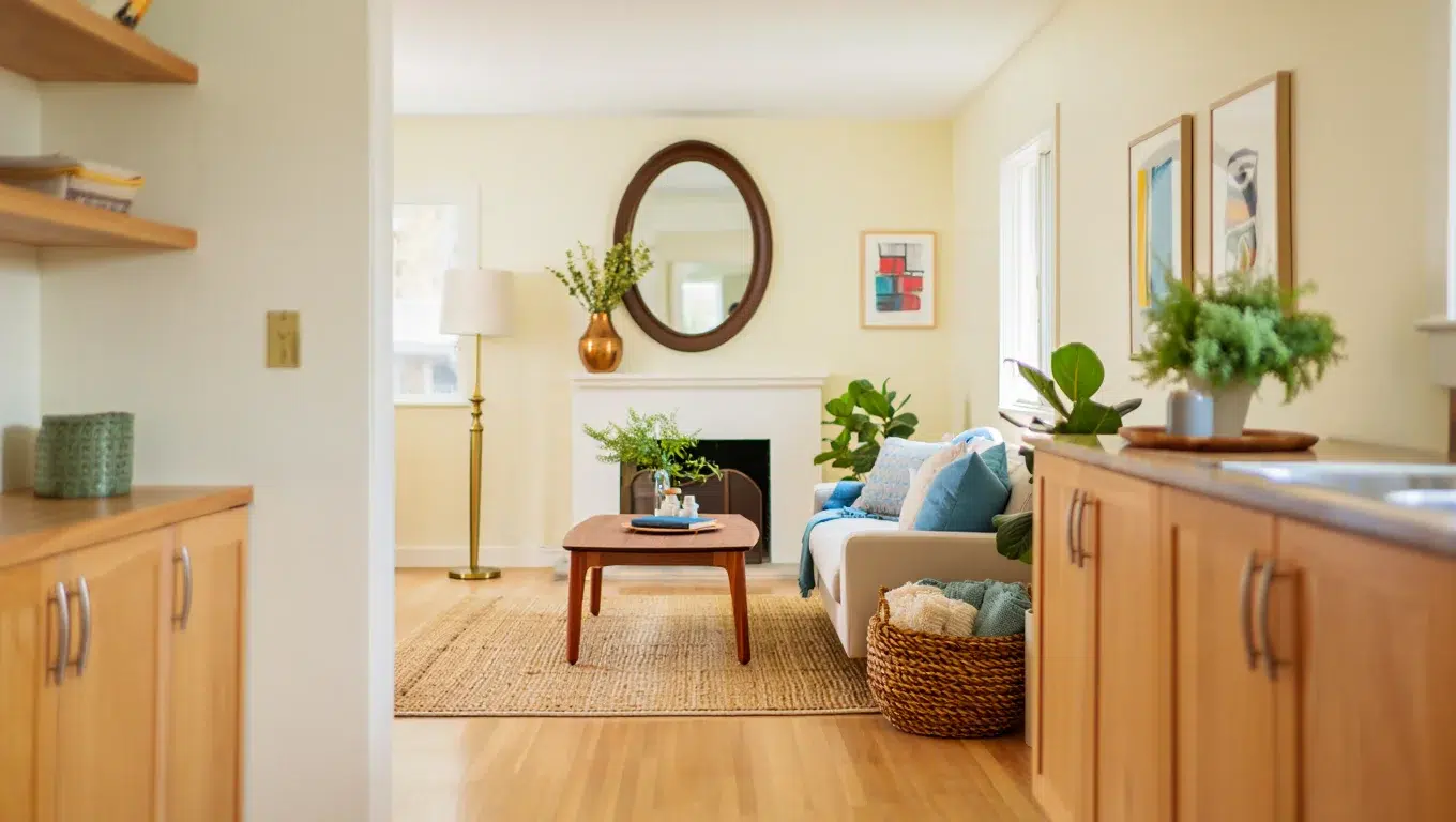
Living Spaces & Open Floor Plans
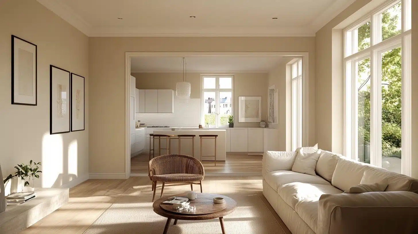
Vanilla Latte makes living rooms feel airy and open, enhancing natural light throughout the day.
It creates a calm, neutral background that pairs beautifully with colorful furniture, art, or bold rugs.
This shade adds softness without dullness, giving the space a fresh yet lived-in look.
Use it in open-concept areas to maintain flow and cohesion from one zone to the next.
Additional Tips:
- Use this color on all walls for a clean, unified look
- Pair with white trim to make the walls stand out more
Bedrooms & Relaxation Areas
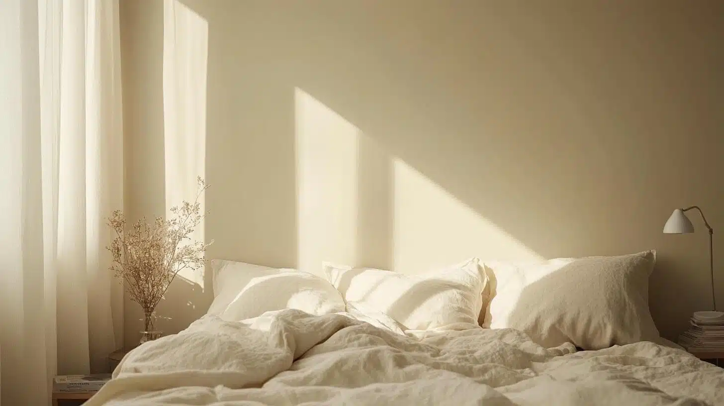
This soft beige helps turn bedrooms into peaceful retreats ideal for relaxation and sleep.
It balances warmth and neutrality, avoiding harsh contrasts that disturb the senses.
Vanilla Latte works with bedding in earthy tones, pastels, or deeper neutrals to set a cozy mood.
Use layered lighting to highlight its creamy undertones during both daytime and nighttime.
Additional Tips:
- Add soft lighting to enhance the warm undertones
- Use darker beige or brown bedding to create depth
Kitchens & High-Traffic Areas
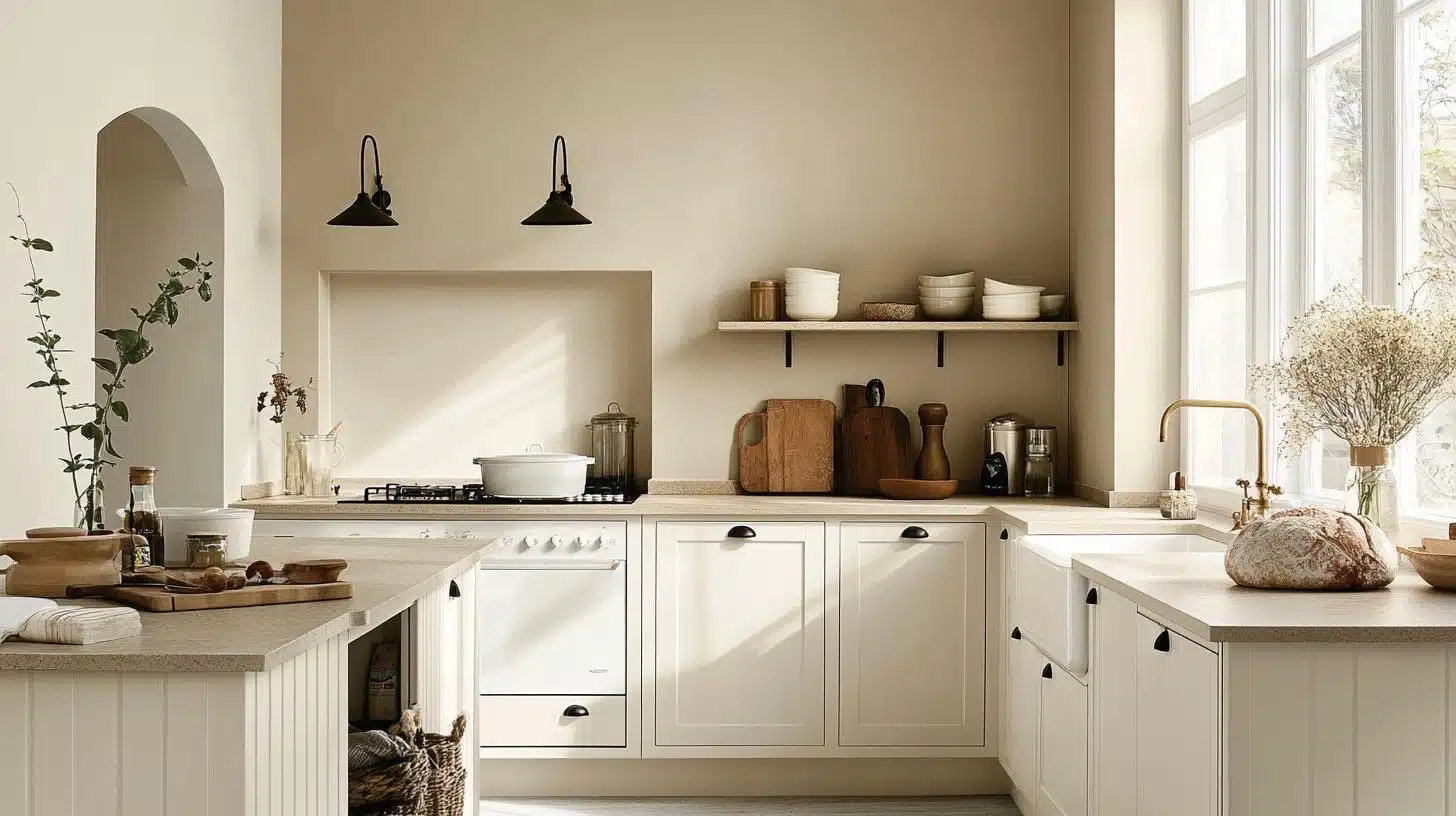
Vanilla Latte keeps kitchens bright while hiding everyday scuffs and smudges common in busy areas.
It works well with modern, farmhouse, or classic cabinetry finishes and countertop materials.
Choose semi-gloss or satin finish to make cleanup easier while preserving the color’s warmth.
Its timeless look blends effortlessly with white, wood, or stainless-steel appliances and fixtures.
Additional Tips:
- Choose a washable finish for easy cleaning
- Pair with white cabinets for a clean, fresh look
Bathrooms & Spa-like Retreats
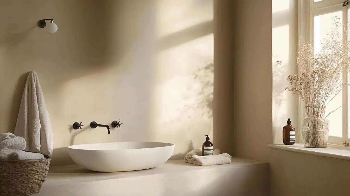
This shade turns bathrooms into warm, peaceful retreats that still feel fresh and clean.
Vanilla Latte complements tile, marble, or wooden vanities with its soft neutral tone.
It’s ideal for small bathrooms because it reflects light and makes them feel larger.
Use plants, brass fixtures, or soft towels to build a spa-like, welcoming atmosphere.
Additional Tips:
- Use good ventilation to keep the paint looking fresh
- Add plants to bring life to the neutral background
Color Pairings & Combinations
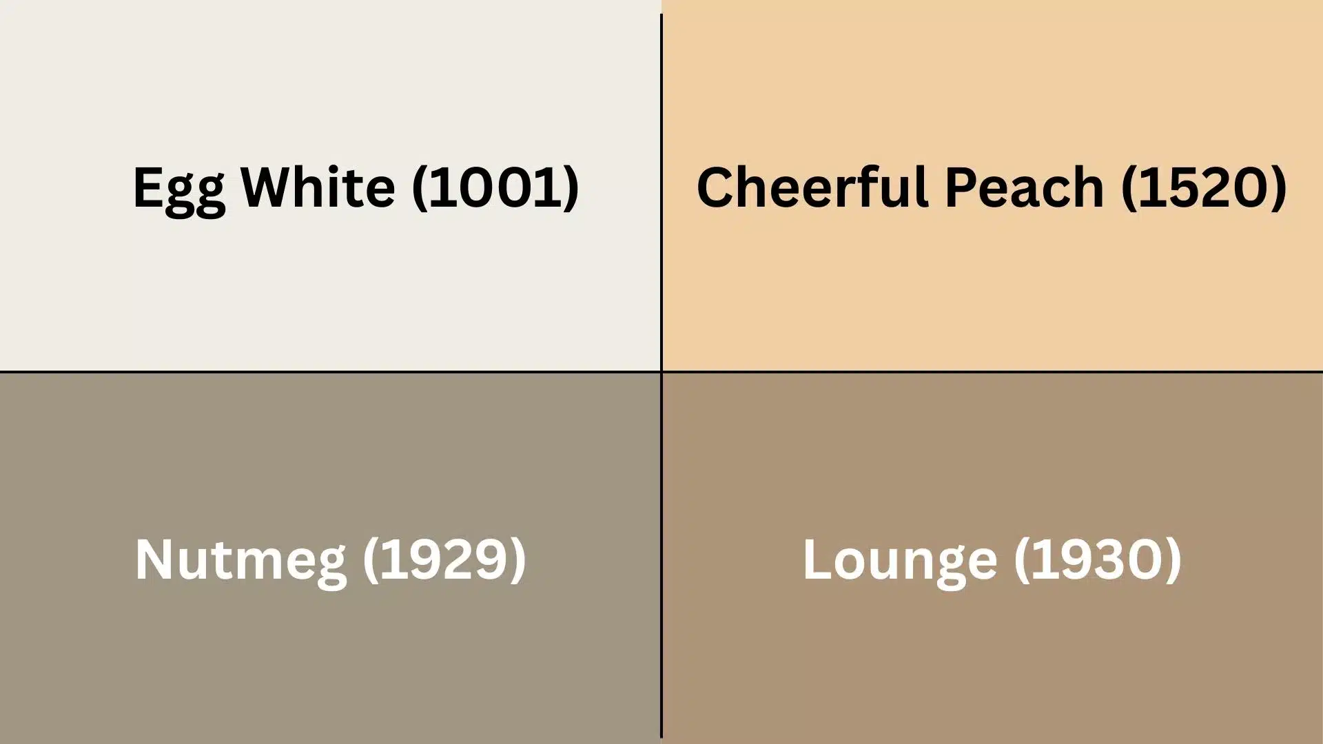
Not sure what colors go with Vanilla Latte?
Here are four perfect matches from Jotun’s collection that create beautiful combinations.
These pairings have been tested in real homes to ensure they work well together.
- Egg White (1001): This lighter cream color works well with Vanilla Latte for trim and ceilings. It creates a soft, layered look without harsh contrasts.
- Cheerful Peach (1520): This warm peach tone adds a pop of color that complements the yellow undertones in Vanilla Latte. It works well for accent walls or nearby rooms.
- Nutmeg (1929): This deeper brown creates a nice contrast with Vanilla Latte. Use it for furniture or accent pieces to ground the lighter beige.
- Lounge (1930): This cool gray-beige balances the warmth of Vanilla Latte. It makes a good companion in open floor plans or adjoining rooms.
These color matches can help create a flowing, put-together look throughout your home.
Creating Different Color Schemes
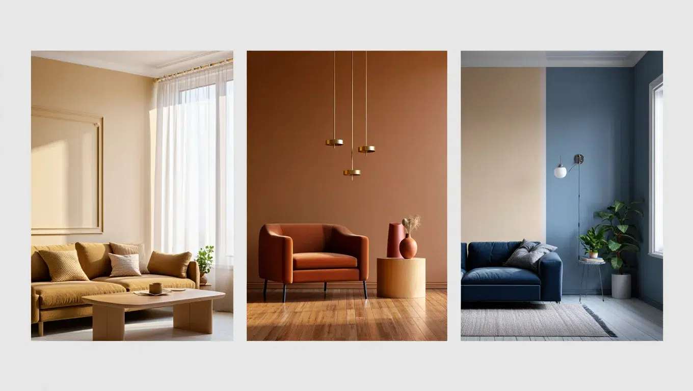
Below are three color schemes that show different ways to use Vanilla Latte in your home.
Each scheme creates a unique mood while keeping Vanilla Latte as the base color.
1. Monochromatic Scheme
A monochromatic scheme uses different shades of the same color family as Vanilla Latte.
- Use darker beiges for furniture pieces
- Add creamy white for trim and ceilings
- Include tan throw pillows and blankets
- Finish with light brown wood accents
This creates a calm, unified look that feels put together without being boring.
2. Warm Color Scheme
Vanilla Latte works well with other warm colors that share yellow or red undertones.
- Add rust-colored accent pieces
- Include warm wood tones in furniture
- Use gold or brass metal fixtures
- Try terracotta planters or vases
This scheme feels cozy and makes spaces seem more welcoming and friendly.
3. Cool Color Scheme
Balance Vanilla Latte’s warmth with cool colors for an interesting mix.
- Pair with soft blue-gray walls in nearby rooms
- Add navy blue furniture pieces
- Include silver or chrome fixtures
- Try green plants for natural cool tones
This mix creates a nice contrast while still feeling calm and balanced.
Coordinating with Furniture & Decor
Vanilla Latte looks different when paired with various materials.
Here’s how to match this color with different furniture and decor elements to create a cohesive look.
1. Wood Tones
Vanilla Latte works with many wood tones to create different looks in your home.
- Light oak creates a bright, Scandinavian feel
- Cherry adds warmth and richness
- Walnut provides a nice contrast with darker accents
- White-washed woods keep the space feeling light and airy
- Maple blends well for a seamless look
The right wood tone can make Vanilla Latte feel more modern or more traditional.
2. Metals
The right metal finishes can enhance the warm undertones of this paint color.
- Brass brings out the yellow undertones
- Copper adds warmth and a bit of color
- Brushed nickel offers a more modern look
- Bronze creates depth and richness
Metal accents in light fixtures, handles, and decor items pull the room together.
3. Decor
The right decor items make Vanilla Latte walls come to life.
- Natural fibers like jute rugs and woven baskets look great
- Green plants create a nice contrast against the beige background
- Blue or gray textiles balance the warmth of the walls
- Colorful art pops against the neutral backdrop
- White picture frames create a clean gallery look
Decor choices can make this versatile color feel more formal or casual.
Similar Colors & Alternatives
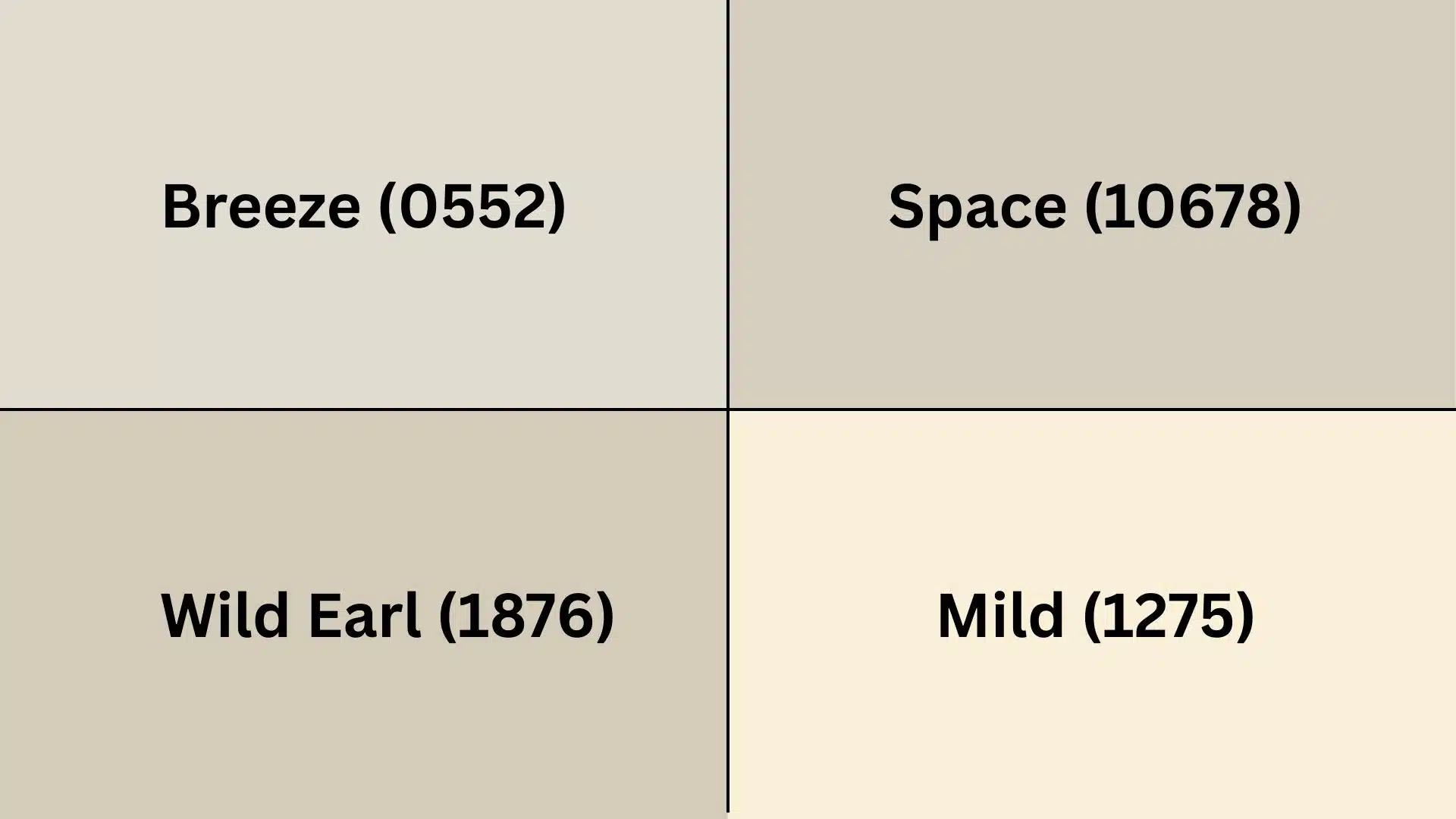
If you like Vanilla Latte but want to explore other options, here are four similar colors from Jotun.
These alternatives offer slight variations that might better suit your specific lighting or style needs.
- Breeze (0552): This color is a bit cooler than Vanilla Latte. It has more gray undertones, but it still maintains a light, airy feeling in rooms.
- Space (10678): A slightly darker beige with more brown in it. This gives a cozier feel while still being light enough for small rooms.
- Wild Earl (1876): This has more yellow than Vanilla Latte. It feels sunnier and more cheerful while still being neutral enough for whole rooms.
- Mild (1275): A softer, lighter version with more yellow, even more than Wild Earl. This creates a more modern look than Vanilla Latte’s warmth.
These alternatives offer subtle changes if Vanilla Latte is almost but not quite right for your space.
Final Thoughts
Paint colors can change how people feel in a space.
Vanilla Latte is a warm, light beige that works in many homes.
It has a good light reflection value that brightens rooms.
This color pairs well with many other colors and styles.
The soft beige tone creates a calm background for life to happen.
It works in busy kitchens and peaceful bedrooms alike.
The color stays looking good over time and doesn’t go out of style.
With the right finish, it can last for many years.
The warm undertones make it feel cozy without being too yellow or brown.
When used with the right colors and materials, Vanilla Latte creates spaces that feel both fresh and timeless.
If you’re interested in more color review content, feel free to click here and explore other blogs you might enjoy.

Alex Guerrero, a graduate with a Fine Arts degree from the Rhode Island School of Design, has been a visionary in the world of color and design for over 15 years. His professional journey began in the heart of the fashion industry in Milan, where he developed an acute sense for color harmonies and trends. Alex joined our team in 2018, offering fresh and innovative perspectives on color utilization in various spaces. Renowned for his ability to blend contemporary trends with timeless elegance. Outside of work, Alex is an accomplished painter and a volunteer art therapist, his artistic talents further enriching his professional insights.