Looking for that perfect white paint that feels just right? Origami White Sherwin Williams might be exactly what you need. This thoughtful shade delivers brightness without feeling cold or clinical.
What makes Origami White special is how it brings a touch of warmth to your walls while maintaining that clean, fresh look most homeowners want. This versatile white turns ordinary rooms into polished spaces that feel both modern and welcoming.
It works beautifully across entire homes or in single rooms, pairing well with practically any furniture, decor style, or accent color.
Origami White creates bright, open spaces with walls that feel fresh without being stark – making it an excellent choice for anyone seeking the perfect white paint.
Understanding Paint Color Basics
Color Terminology
| PROPERTY | VALUE |
|---|---|
| LRV | 76 (High reflectance, light tone) |
| RGB Values | 229, 226, 218 (A soft, warm neutral) |
| HEX Code | #E5E2DA (A warm off-white) |
The Psychology of Origami White SW 7636
- Pure Precision – Delivers crisp definition with subtle warmth to any space.
- Contemplative – Soft undertones create a canvas for thoughtful design expressions.
- Versatile – Pairs effortlessly with both warm and cool design elements.
- Dimensional – Reveals hidden depth and character in changing light.
- Timeless – Merges traditional simplicity with contemporary minimalist sensibilities.
Why Choose Origami White SW 7636
Sherwin Williams Origami White delivers a crisp yet welcoming tone that creates subtle depth without feeling stark. This thoughtful shade establishes a clean foundation that enhances furnishings while creating a sense of openness.
Its artistic inspiration ensures your space remains refined for years, turning ordinary rooms into polished personal style statements. It is perfect for those seeking a versatile white that adapts to changing design trends.
1. Key Features of Origami White SW 7636
Origami White offers a balanced white with gentle, warm undertones and excellent coverage. Unlike cooler whites that feel institutional, this pure white creates a fresh canvas.
Its matte finish distributes light effectively, adding subtle dimension to walls while maintaining consistency across varying lighting conditions. The color’s understated warmth makes it more inviting than stark whites without straying into cream territory.
2. Durability
Sherwin-Williams’ premium formulation ensures Origami White resists yellowing even in bright areas. This practical shade conceals minor wall flaws and withstands regular use, making it perfect for busy spaces.
Easy to maintain without sacrificing quality, its enduring performance preserves timeless appeal for years. The paint’s resistance to scuffs makes it valuable in high-traffic areas.
3. Texture Patterns
Origami White develops impressively across various application methods. In conventional use, it produces a clean appearance, while brushed techniques create interesting depth.
The color enhances structural details on textured surfaces with precise subtlety. Its neutral base makes it effective on textured walls, capturing shadows and highlights without competing with the surface texture.
4. Why It Works
Origami White establishes immediate clarity without overwhelming spaces. This adaptable neutral complements diverse design approaches while allowing statement pieces to command attention.
Its purity effectively guides the eye, defining spaces with tasteful restraint. The color’s balanced undertones prevent it from appearing too cold in north-facing rooms, yet it doesn’t turn yellow in warm southern exposures.
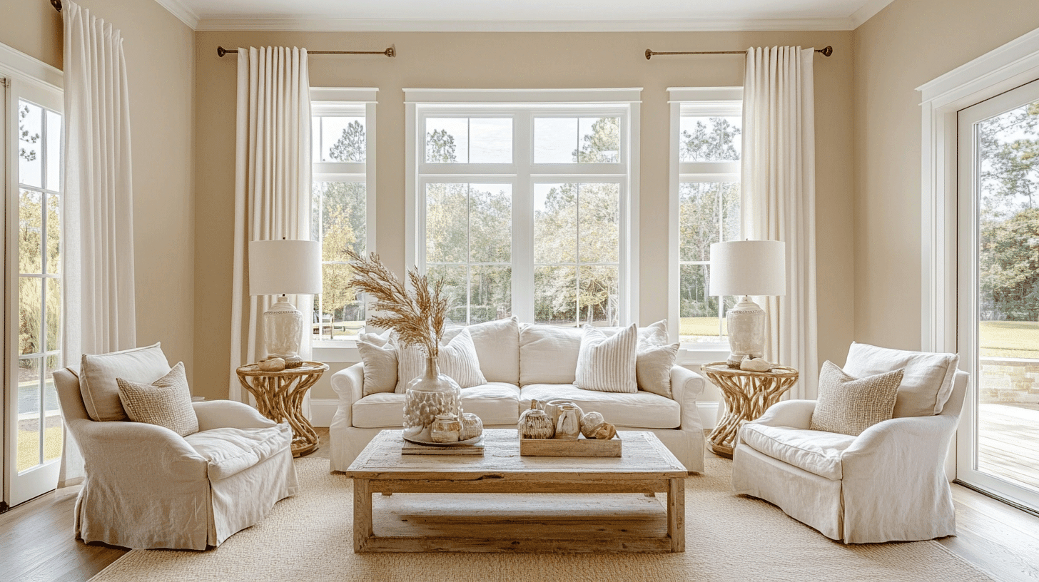
Room-by-Room Color Recommendations with Origami White
Origami White adapts beautifully across different spaces in your home, creating a cohesive design flow while addressing each room’s unique needs.
Its versatility makes it ideal for open floor plans, allowing each area to maintain its distinct character and purpose.
Bathrooms and Spa-Like Retreats
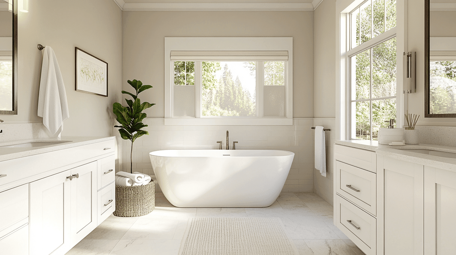
In bathrooms, Origami White creates a fresh, clean atmosphere without the clinical feel of pure whites. Its subtle warmth pairs perfectly with natural stone, wood accents, and metallics.
The color enhances light reflection, making even small bathrooms feel more spacious and serene.
Dining Spaces
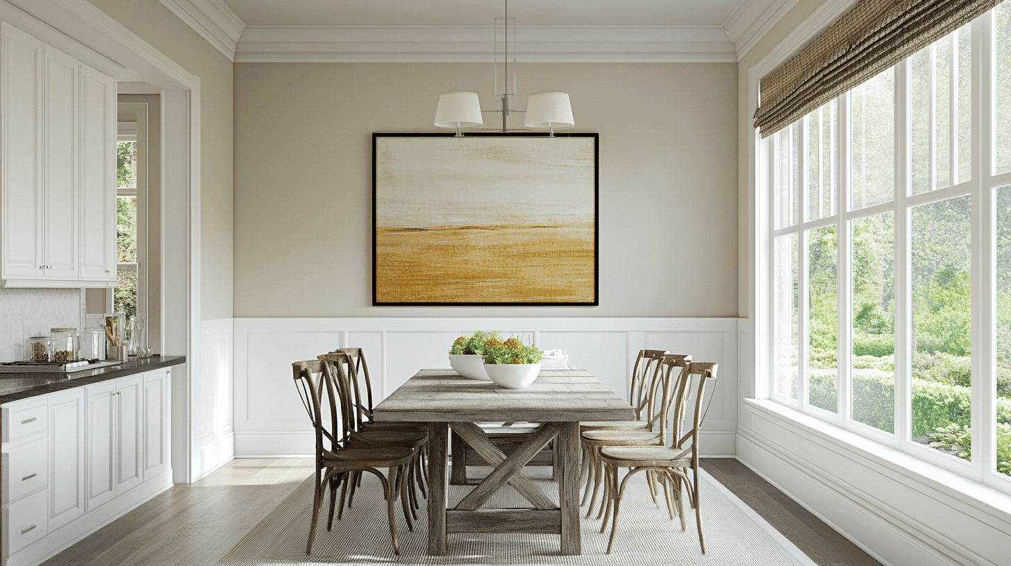
Origami White provides an ideal backdrop for dining areas, allowing your table settings and food to shine. The color creates a bright, inviting atmosphere that feels clean yet warm.
It works particularly well with wood furniture, adding contrast while maintaining a cohesive feel.
Home Offices and Focus Spaces
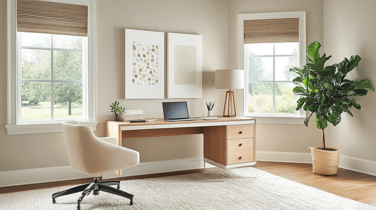
For workspaces, Origami White reduces visual distractions while creating an alert, productive environment.
The color minimizes eye strain during long work sessions and serves as a perfect background for inspiration boards and organizational systems without competing for attention.
Color Pairings and Combinations for Origami White SW 7636
Origami White creates a versatile foundation that pairs exceptionally well with both bold and subtle accent colors. Its balanced undertones allow it to complement cool blues, warm earth tones, and deeper neutrals without clashing.
Consider these strategic pairings to enhance Origami White’s crisp presence while creating distinctive design statements that reflect your style.
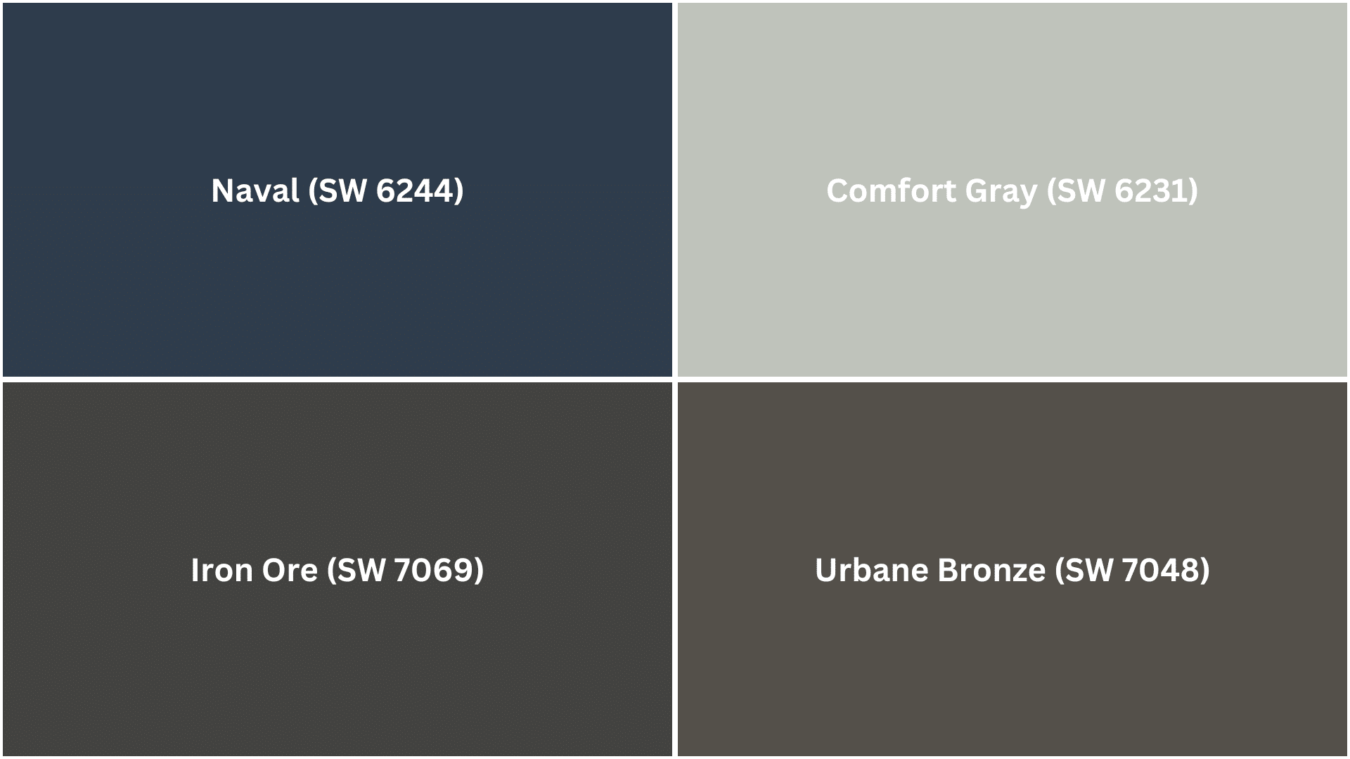
Complementary Trim Colors
- Naval (SW 6244) – Creates dramatic contrast for a timeless navy-and-white color scheme.
- Comfort Gray (SW 6231) – Offers a soft, calming combination for serene, nature-inspired spaces.
- Iron Ore (SW 7069) – Delivers striking modern contrast for a clean black-and-white look.
- Urbane Bronze (SW 7048) – Provides rich, grounding warmth that balances Origami White’s crispness.
Creating Cohesive Color Schemes
Origami White is a versatile foundation for numerous color schemes, creating spaces with clarity and depth.
This balanced white acts as a perfect canvas, allowing you to build varied looks ranging from crisp and modern to warm and inviting. Its adaptable tone provides the ideal starting point for any design vision.
Monochromatic Scheme
A monochromatic scheme uses various white shades alongside Origami White to create depth without complexity. This versatile white makes spaces feel cohesive yet interesting.
The subtle variations between similar tones create refined layers while maintaining a clean, timeless look that feels intentional rather than flat.
My recommendations are:
- Origami White on walls with Pure White SW 7005 trim creates a subtle, no-fuss contrast.
- Try Origami White in a satin finish on woodwork with matte walls – it really makes a difference.
- Add Snowbound SW 7004 on a bookshelf or accent piece for a touch more dimension.
- Layer in textured whites like linen throws and matte ceramics to bring the whole look to life.
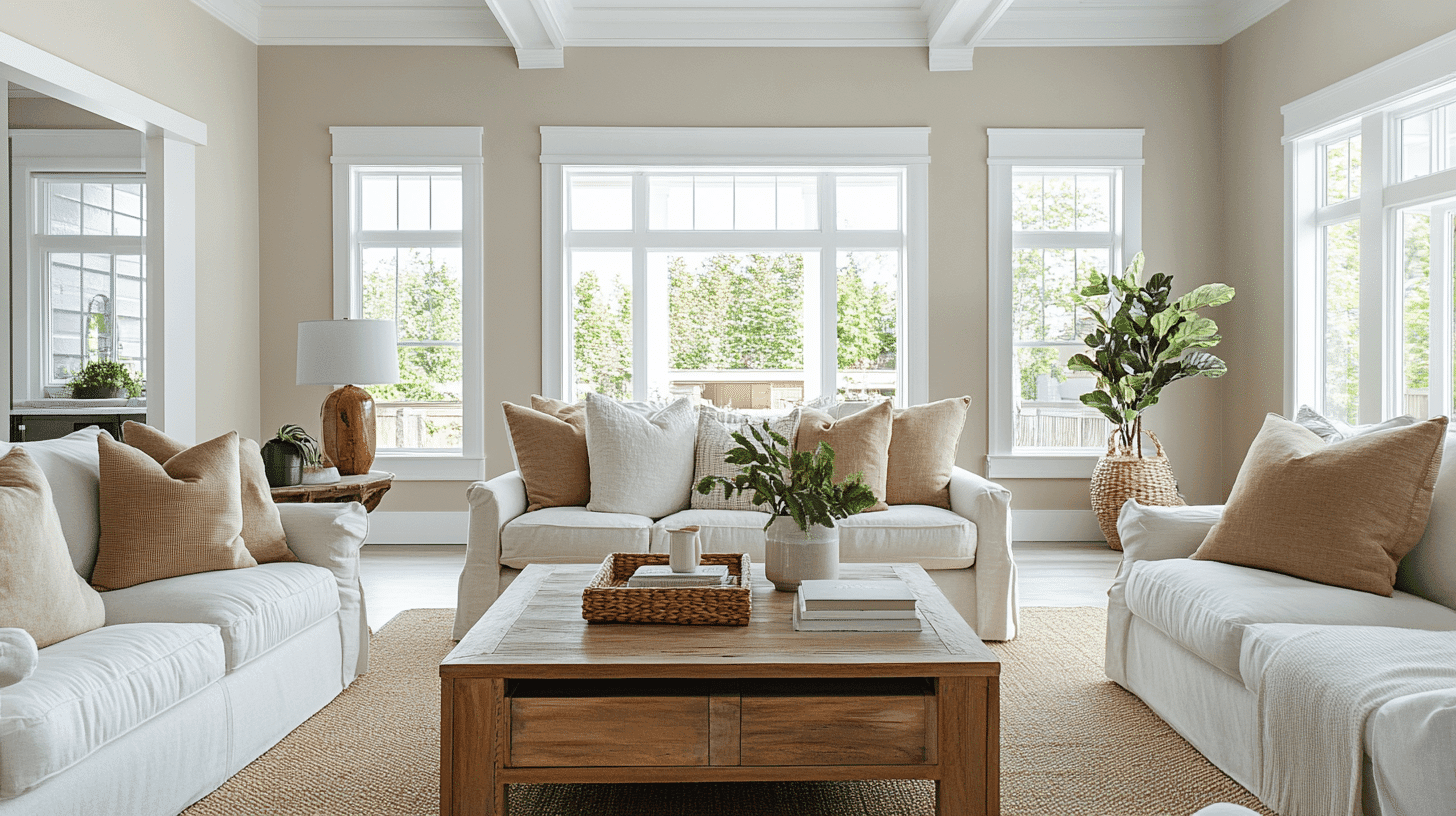
Warm Color Scheme
Origami White’s subtle warm undertones complement warmer colors beautifully. This combination feels welcoming yet clean when natural light flows through the space.
The connection between the balanced white and warm hues creates visual interest without overwhelming it. Terracotta, clay, and amber tones shine against this versatile white backdrop.
My recommendations are:
- Use Alabaster SW 7008 in dining spaces – it feels incredibly inviting for gatherings.
- Accessible Beige SW 7036 works wonders in hallways and ties everything together.
- Kilim Beige SW 6106 makes bedrooms feel rich without trying too hard.
- Try Nomadic Desert SW 6107 for a subtle accent wall that doesn’t steal all the attention.
Cool Color Scheme
Though slightly warm, Origami White pairs wonderfully with cooler colors, too. This balanced mix creates spaces that feel fresh yet grounded.
The interplay between the white’s clarity and cool tones like blue, teal, or sage produces a balanced, contemporary look that avoids feeling cold or stark while maintaining visual interest.
My recommendations are:
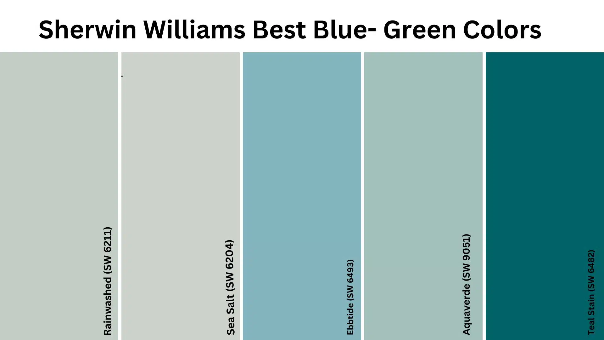
- Rainwashed SW 6211 in bathrooms creates a fresh, spa-like atmosphere against Origami White’s crispness.
- Tradewind SW 6218 in bedrooms delivers a tranquil coastal feeling while maintaining brightness.
- Window Pane SW 6210 brings focus and calm to home offices without feeling cold or clinical.
- Smoky Blue SW 7604 as an accent wall provides just enough depth to balance Origami White’s lightness.
Coordinating with Furniture and Decor
Origami White creates an ideal backdrop for virtually any furniture and decor style. Its balanced undertones enhance both warm and cool elements without competing, allowing your carefully selected pieces to stand out while maintaining a unified design flow throughout your space.
Wood Tones
Origami White pairs beautifully with all wood tones. It brightens dark walnut and mahogany while adding crispness to lighter oak and maple.
Medium-toned woods like cherry gain definition against this white. The contrast creates visual interest while allowing natural wood grain patterns to become focal points.
Metals
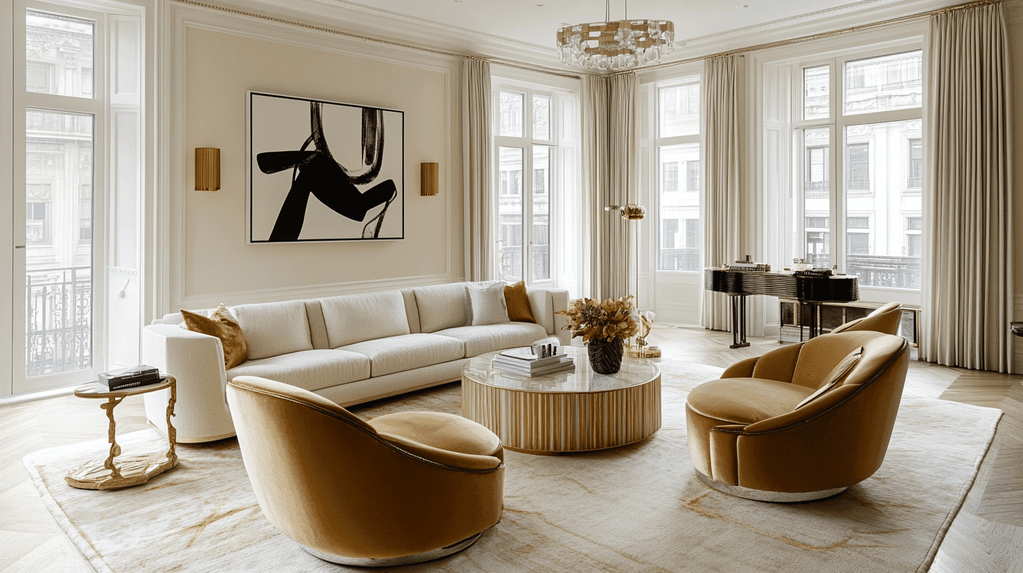
This versatile white enhances all metal finishes. Brass and gold hardware pop dramatically while maintaining warmth. Silver and chrome fixtures reflect light for a clean, modern look.
Matte black hardware creates a striking contrast. Oil-rubbed bronze adds depth without overwhelming the space’s brightness.
Fabrics
Origami White allows fabrics to take center stage. Bold patterns gain clarity against this neutral backdrop, and textured neutrals like linen and cotton create subtle layering.
Vibrant colors maintain their true hues without being altered by wall undertones. Performance fabrics in any shade complement this adaptable white.
Decor
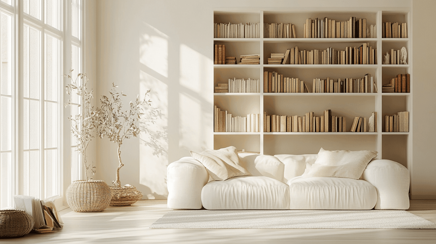
The artwork displays beautifully against Origami White, which acts as a gallery-like canvas. Plants appear more vivid and lush against the crisp background.
Ceramics and glass pieces effectively catch the light. Books and collections become focal points rather than competing with wall color, allowing personal items to shine truly.
Similar Paint Colors: Alternative to Origami White SW 7636
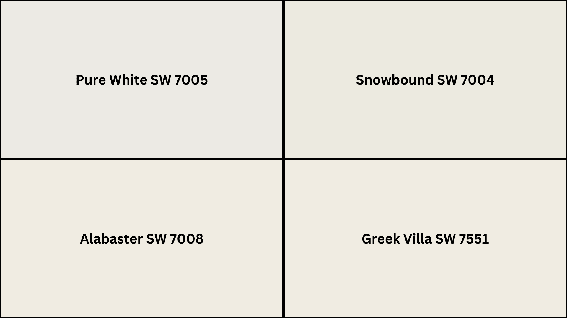
If you’re considering options similar to Origami White, these alternatives offer subtle variations while maintaining their balanced appeal.
Each provides a slightly different undertone or depth, giving you the flexibility to find the perfect white for your specific lighting conditions and design preferences.
- Pure White (SW 7005) – Brighter with less warmth for a cleaner look.
- Snowbound (SW 7004) – Slightly cooler with subtle gray undertones.
- Alabaster (SW 7008) – Warmer with soft cream influences for added coziness.
- Greek Villa (SW 7551) – Creamier with yellow undertones for traditional spaces.
Wrapping It Up
Origami White Sherwin Williams stands out as a truly exceptional choice for those seeking versatile white paint. Its balanced warmth, impressive durability, and adaptability across various lighting conditions make it a reliable option for any room in your home.
From serene bedroom retreats to productive home offices and welcoming dining spaces, this thoughtful shade provides the perfect canvas for your design vision.
As you consider your next painting project, remember that Origami White offers that rare combination of brightness without starkness, warmth without yellowing, and versatility without compromise.
It’s a white that works with you rather than against you, allowing your furniture, art, and personal style to shine through. For a white that feels just right in virtually any space, Origami White delivers beautifully.

Alex Guerrero, a graduate with a Fine Arts degree from the Rhode Island School of Design, has been a visionary in the world of color and design for over 15 years. His professional journey began in the heart of the fashion industry in Milan, where he developed an acute sense for color harmonies and trends. Alex joined our team in 2018, offering fresh and innovative perspectives on color utilization in various spaces. Renowned for his ability to blend contemporary trends with timeless elegance. Outside of work, Alex is an accomplished painter and a volunteer art therapist, his artistic talents further enriching his professional insights.