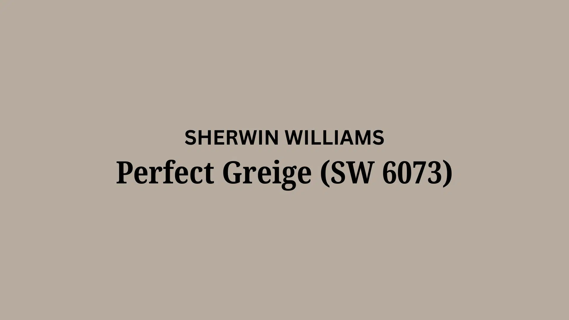
Tired of choosing between cold grays and dated beiges? Perfect Greige Sherwin Williams offers the best of both worlds.
This balanced neutral has become a favorite for homeowners who want a color that’s versatile enough for any room yet stylish enough to enhance your space.
With its balanced undertones, Perfect Greige Sherwin Williams creates rooms that feel fresh and grounded—never too cool or too warm.
It’s a color that works beautifully with everything from crisp whites to bold accents, adapting to changing light throughout the day.
For single-room updates or whole-home refreshes, this thoughtful shade provides a foundation that makes decorating decisions simpler and more successful. Perfect Greige might be the versatile neutral your home needs.
Understanding Paint Color Basics
Color Terminology
| Property | Value |
|---|---|
| LRV | 42 (Moderate reflectance, neutral tone) |
| RGB Values | 183, 171, 159 (A balanced, warm neutral) |
| HEX Code | #B7AB9F (A soft taupe-like shade) |
The Psychology of Perfect Greige SW 6073
- Perfect Balance – Delivers ideal equilibrium between warm and cool tones in any space.
- Grounding – Rich undertones create a canvas for thoughtful design expressions.
- Versatile – Pairs effortlessly with both traditional and contemporary design elements.
- Adaptable – Reveals different characters in changing light throughout the day.
- Enduring – Merges practical neutrality with refined design sensibilities.
Why Choose Perfect Greige SW 6073
Sherwin Williams Perfect Greige delivers a balanced yet welcoming tone that creates subtle depth without feeling flat. This thoughtful shade establishes a refined foundation that enhances furnishings while creating a sense of unity.
Its practical inspiration ensures your space remains tasteful for years, turning ordinary rooms into polished personal style statements. It is perfect for those seeking a versatile neutral that adapts to changing design trends.
1. Key Features of Perfect Greige SW 6073
Perfect Greige offers a balanced neutral with gentle, warm undertones and excellent coverage. Unlike cooler grays that feel sterile or warmer beiges that can appear dated, this true greige creates a fresh yet grounded canvas.
Its matte finish effectively distributes light, adding subtle dimension to walls while maintaining consistency across varying lighting conditions.
The color’s understated warmth makes it more inviting than stark grays without straying into overly beige territory.
2. Durability
Sherwin-Williams’ premium formulation ensures Perfect Greige maintains its true color even in areas with changing light. This practical shade conceals minor wall flaws and withstands regular use, making it perfect for busy spaces.
Easy to maintain without sacrificing quality, its enduring performance preserves timeless appeal for years. The paint’s resistance to scuffs makes it valuable in high-traffic areas like hallways and family rooms.
3. Texture Patterns
Perfect Greige develops impressively across various application methods. In conventional use, it produces a refined appearance, while brushed techniques create interesting depth.
The color enhances structural details on textured surfaces with precise subtlety. Its neutral base makes it effective on textured walls, capturing shadows and highlights without competing with the surface texture.
4. Why It Works
Perfect Greige establishes immediate balance without overwhelming spaces. This adaptable neutral complements diverse design approaches while allowing statement pieces to command attention.
Its versatility effectively guides the eye, defining spaces with tasteful restraint. The color’s balanced undertones prevent it from appearing too cool in north-facing rooms, yet it doesn’t turn overly warm in southern exposures.
Room-by-Room Color Recommendations with Perfect Greige
Perfect Greige adapts beautifully across different spaces in your home, creating a unified design flow while addressing each room’s unique needs.
Its versatility makes it ideal for open floor plans, allowing each area to maintain its distinct character and purpose.
Living Rooms and Gathering Spaces

In living rooms, Perfect Greige creates a refined, welcoming atmosphere without the coldness of pure grays. Its balanced undertones pair perfectly with natural stone, wood accents, and various metallics.
The color improves both artificial and natural light, making even modestly sized living spaces feel more polished and inviting.
Kitchens and Dining Areas

Perfect Greige provides an ideal backdrop for kitchens and dining areas, allowing your cabinetry and table settings to shine. The color creates a warm, grounded atmosphere that feels clean yet cozy.
It works particularly well with wood cabinetry, adding contrast while maintaining a unified feel. White cabinets add depth and richness that bright whites alone cannot achieve.
Bedrooms and Restful Retreats

For bedrooms, Perfect Greige reduces visual stimulation while creating a serene, restful environment.
The color minimizes distraction during rest and serves as a perfect background for textured bedding and soft furnishings without competing for attention.
Its neutral appeal makes it suitable for primary suites, guest rooms, and children’s spaces alike.
Color Pairings and Combinations for Perfect Greige SW 6073
Perfect Greige creates a versatile foundation that pairs exceptionally well with both bold and subtle accent colors. Its balanced undertones allow it to complement cool blues, warm earth tones, and deeper neutrals without clashing.
Consider these strategic pairings to highlight Perfect Greige’s refined presence while creating unique design statements that reflect your style.
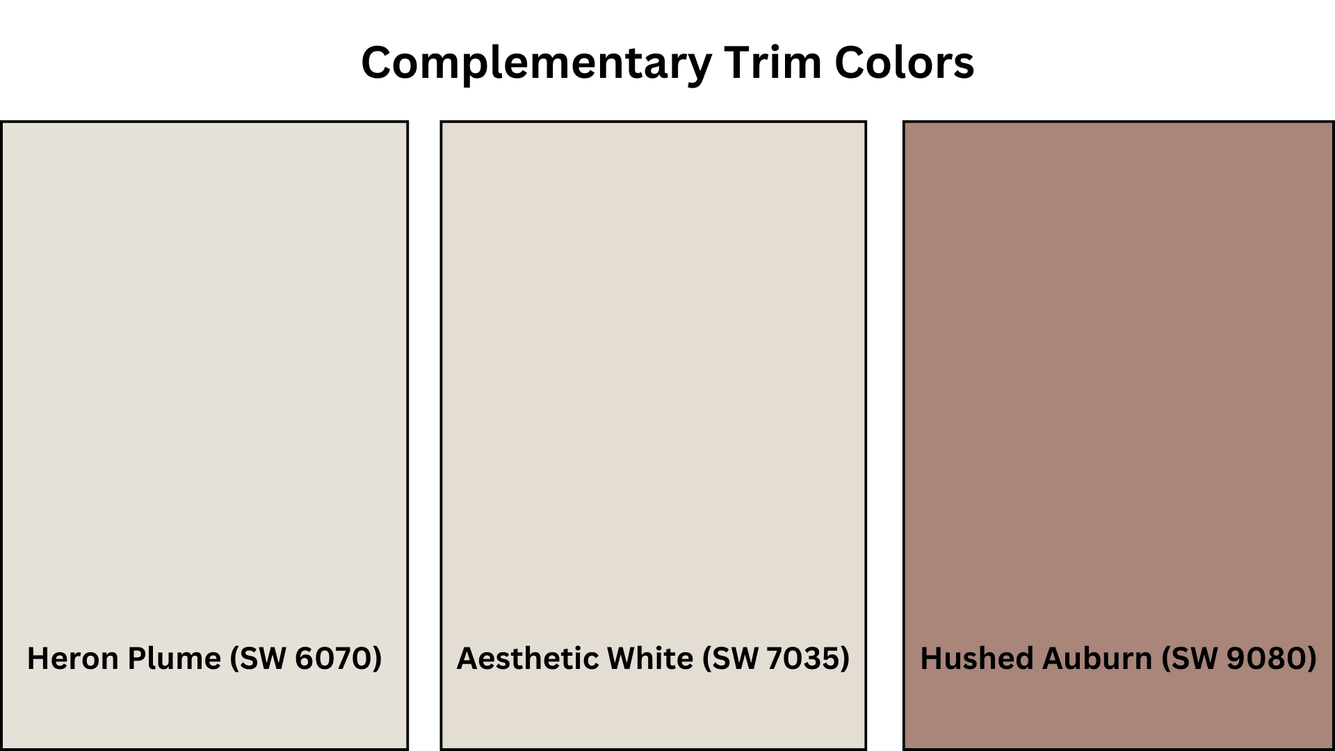
Complementary Trim Colors
- Heron Plume (SW 6070) – Creates a subtle, gentle contrast for a seamless, flowing look.
- Aesthetic White (SW 7035) – Offers a clean, bright pairing for fresh, airy spaces.
- Hushed Auburn (SW 9080) – Provides rich, warm accents that balance Perfect Greige’s neutrality.
Creating Cohesive Color Schemes
Perfect Greige is a versatile foundation for numerous color schemes, creating spaces with depth and character. This balanced greige acts as an ideal canvas, allowing you to build varied looks ranging from sleek and modern to warm and traditional. Its adaptable tone provides the perfect starting point for any design vision.
Monochromatic Scheme
A monochromatic scheme uses various greige shades alongside Perfect Greige to create depth without complexity. This versatile neutral makes spaces feel unified yet interesting.
The subtle variations between similar tones create refined layers while maintaining a polished, timeless look that feels intentional rather than flat.
My recommendations are:
- Perfect Greige on walls with Pure White SW 7005 trim creates a subtle, tailored contrast.
- Try Perfect Greige in a satin finish on woodwork with matte walls – it creates refined definition.
- Add Mega Greige SW 7031 on a bookshelf or accent piece for a touch more depth.
- Layer in textured neutrals like linen throws and matte ceramics to bring the whole look to life.
Warm Color Scheme
Perfect Greige’s subtle warm undertones complement warmer colors beautifully. When natural light flows through the space, this combination feels welcoming and rich.
The connection between the balanced neutral and warm hues creates visual interest without overwhelming it. Terracotta, rust, and amber tones shine against this versatile greige backdrop.
My recommendations are:
- Use Kilim Beige SW 6106 in dining spaces – it feels incredibly inviting for gatherings.
- Accessible Beige SW 7036 works wonders in hallways and ties everything together.
- Baked Clay SW 6340 makes accents feel rich without trying too hard.
- Try Rookwood Terra Cotta SW 2803 for a subtle accent wall that adds warmth without overwhelming.
Cool Color Scheme
Though slightly warm, Perfect Greige pairs wonderfully with cooler colors, too. This balanced mix creates spaces that feel fresh yet grounded.
The interplay between the greige’s versatility and cool tones like blue, teal, or sage produces a balanced, contemporary look that avoids feeling cold or stark while maintaining visual interest.
My recommendations are:
- Sea Salt SW 6204 in bathrooms creates a fresh, spa-like atmosphere against Perfect Greige’s balance.
- Tradewind SW 6218 in bedrooms delivers a tranquil coastal feeling while maintaining refinement.
- Silver Strand SW 7057 brings focus and calm to home offices without feeling cold or clinical.
- Retreat SW 6207 as an accent wall provides just enough depth to balance Perfect Greige’s neutrality.
Coordinating with Furniture and Decor
Perfect Greige creates an ideal backdrop for virtually any furniture and decor style. Its balanced undertones complement both warm and cool elements without competing, allowing your carefully selected pieces to stand out while maintaining a unified design flow throughout your space.
Wood Tones

Perfect Greige pairs beautifully with all wood tones. It softens dark walnut and mahogany while adding depth to lighter oak and maple.
Medium-toned woods like cherry gain definition against this greige. The contrast creates visual interest while allowing natural wood grain patterns to become focal points.
Metals

This versatile neutral improves all metal finishes. Brass and gold hardware pop dramatically while maintaining warmth, while silver and chrome fixtures add crispness for a clean, modern look.
Matte black hardware creates a striking contrast. Oil-rubbed bronze adds rich depth that complements the greige’s refined character.
Fabrics

Perfect Greige allows fabrics to take center stage. Bold patterns gain clarity against this neutral backdrop, and textured neutrals like linen and cotton create subtle layering.
Vibrant colors maintain their true shades without being altered by wall undertones. Performance fabrics in any shade complement this adaptable neutral.
Decor

The artwork displays beautifully against Perfect Greige, which acts as a tasteful gallery-like canvas. Plants appear more vivid and organic against the balanced background.
Ceramics and glass pieces effectively catch the light. Books and collections become focal points rather than competing with wall color, allowing personal items to shine truly.
Similar Paint Colors: Alternative to Perfect Greige SW 6073
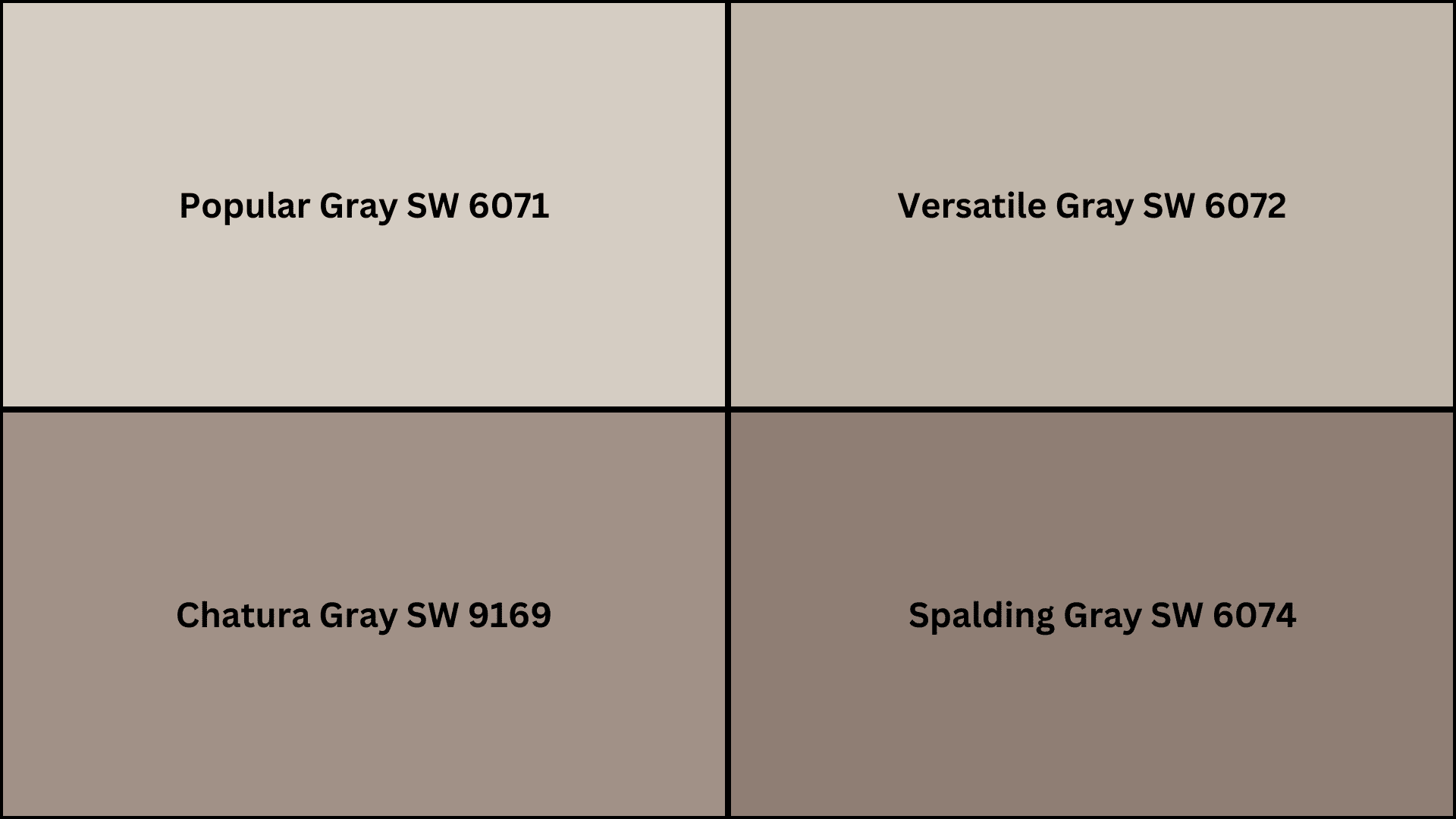
If you’re considering options similar to Perfect Greige, these alternatives offer subtle variations while maintaining their balanced appeal.
Each provides a slightly different undertone or depth, giving you the flexibility to find the perfect greige for your specific lighting conditions and design preferences.
- Popular Gray (SW 6071) – Lighter with a cooler base, creating a more neutral gray appearance.
- Versatile Gray (SW 6072) – Similar in tone but with slightly more green undertones for a balanced look.
- Chatura Gray (SW 9169) – Deeper with rich earth undertones for a more dramatic effect.
- Spalding Gray (SW 6074) – Warmer with stronger taupe influences for a cozier, more traditional feel.
Wrapping It Up
Perfect Greige Sherwin Williams offers the rare balance so many homeowners seek—a neutral that’s neither too warm nor too cool, neither too light nor too dark.
This thoughtfully crafted color creates spaces that feel both grounded and fresh, giving you remarkable design flexibility without sacrificing character.
From small room updates to complete home renovations, Perfect Greige establishes a foundation that welcomes your style.
Its ability to adapt to changing light throughout the day while maintaining its balanced essence makes it truly special.
For those seeking a versatile neutral that bridges the gap between gray and beige worlds, Perfect Greige Sherwin Williams delivers consistently beautiful results.
It’s not just a paint color – it’s a design partner that makes decorating decisions effortlessly successful.

Alex Guerrero, a graduate with a Fine Arts degree from the Rhode Island School of Design, has been a visionary in the world of color and design for over 15 years. His professional journey began in the heart of the fashion industry in Milan, where he developed an acute sense for color harmonies and trends. Alex joined our team in 2018, offering fresh and innovative perspectives on color utilization in various spaces. Renowned for his ability to blend contemporary trends with timeless elegance. Outside of work, Alex is an accomplished painter and a volunteer art therapist, his artistic talents further enriching his professional insights.