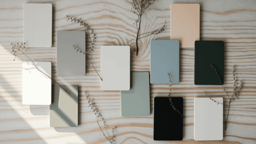
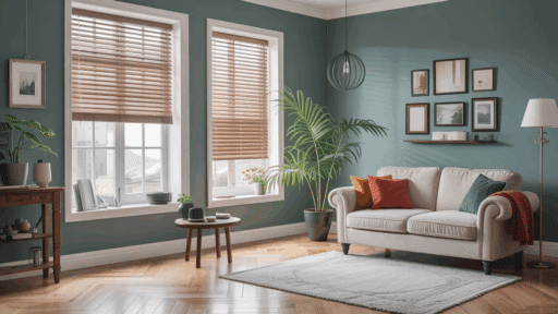
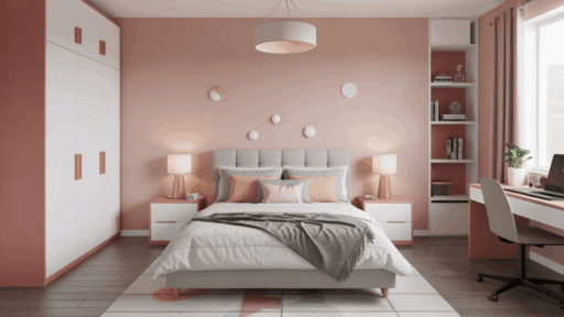
Are you looking to bring calm, serenity, and natural beauty into your home?
The Scandinavian color palette offers exactly that, drawing inspiration from Nordic landscapes and long winters.
This approach features soft, muted tones that create bright, peaceful spaces even during dark months.
With white as its foundation, the palette incorporates gentle grays, blues, and greens that mirror fjords and forests.
Warm woods add natural elements to this clean aesthetic.
Scandinavian design adopts two key ideas: “lagom” (perfect balance) and “hygge” (coziness).
These colors create environments where people can relax while making spaces feel bigger and more peaceful.
The Scandinavian color palette changes ordinary rooms into serene retreats where natural light becomes a key design element.
Scandinavian Color: Arctic Light and Cozy Warmth
Nordic landscapes inspire Scandinavia’s muted color palette, designed to warm spaces during long winters.
White forms the foundation, reflecting scarce light while reducing stress.
Soft grays, blues, and greens echo fjords and forests, promoting a calm and natural connection.
Warm woods complement traditional “Falu red” homes, colored with copper byproducts that preserve timber for centuries.
The palette embodies “lagom” (perfect balance) and “hygge” (coziness), creating serene environments through thoughtful color choices.
These natural, restrained hues transform homes into peaceful retreats during dark northern months.
Core Colors in Scandinavian Design
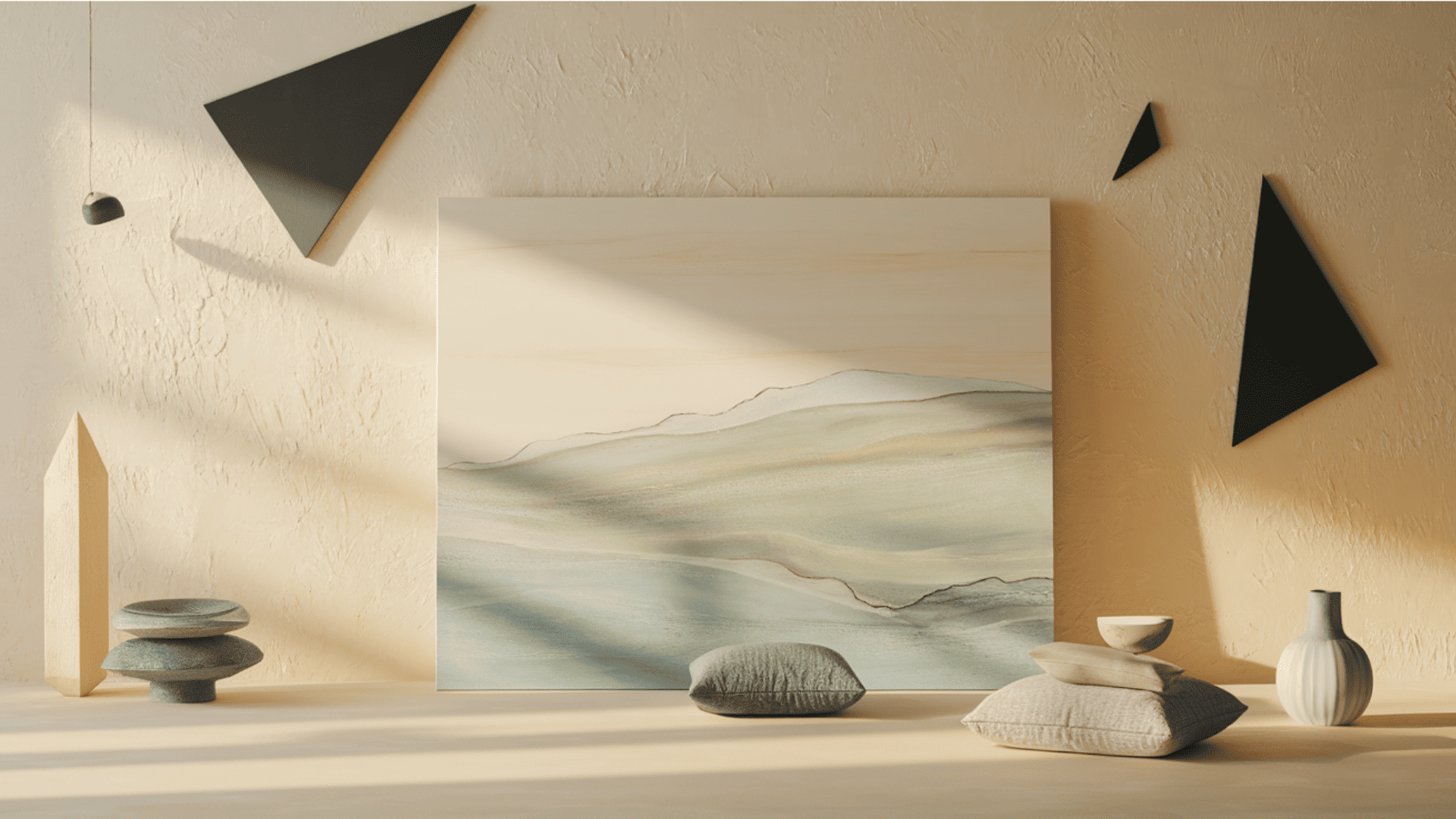
The Scandinavian palette centers around light neutrals with nature-inspired accents.
These colors work together to create bright, peaceful spaces.
They reflect both the region’s climate and design philosophy.
1. Soft Whites & Creams
White walls create the perfect backdrop in Nordic homes.
These shades reflect precious sunlight during short winter days, making rooms feel bigger.
Creamy tones add warmth to spaces that might otherwise feel cold.
Designers use these colors as a foundation for the entire home.
These light colors help showcase wooden furniture and colorful textiles.
They create a clean canvas where other elements can shine.
2. Muted Grays
Gray balances white spaces without feeling heavy.
These soft shades remind us of cloudy Nordic skies and smooth stones.
Gray is found in wool blankets, painted walls, and comfy sofas.
It pairs perfectly with light woods and darker accents.
Gray helps rooms feel modern yet timeless.
It creates depth without darkness, making spaces feel calm and peaceful.
3. Pale Blues and Dusty Greens
These gentle colors bring the outdoors inside.
They mirror the clear fjord waters and misty pine forests of Scandinavia.
Blue works well in bedrooms, creating a restful feeling.
Green adds life to living spaces, connecting them to nature.
Use these colors for a single wall or in pillows and artwork.
They add interest without overwhelming the calm atmosphere.
4. Black and Charcoal Accents
Dark touches create necessary contrast in light-filled rooms.
A black picture frame or lamp base can anchor a space.
Use these dark colors sparingly, like seasoning in cooking.
They work wonderfully on chair legs, window frames, and light fixtures.
These accents refine simple designs, create visual interest, and help define the clean lines of Nordic furniture.
Material and Surface Pairings
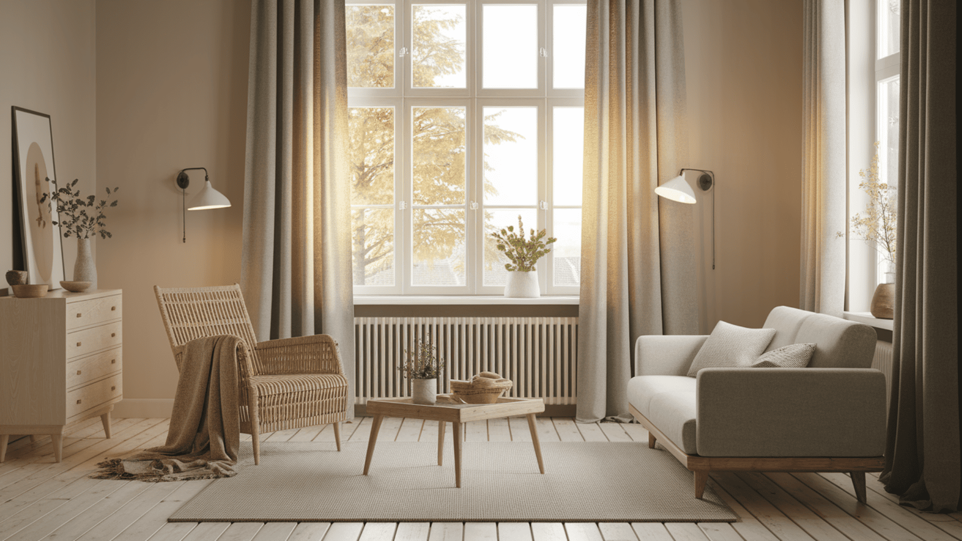
Scandinavian design weaves natural materials with its signature colors to create warm, inviting spaces.
Light woods, birch, ash, and pine, brighten rooms while adding organic texture to floors, furniture, and cabinetry.
Soft wool blankets, airy linen curtains, and leather furnishings that develop character with age introduce tactile comfort.
These natural fibers strengthen the connection to the outdoors, while matte finishes on most surfaces create a gentle, authentic atmosphere.
The thoughtful combination of materials and palette produces interiors that embody Nordic simplicity while delivering profound comfort, spaces that feel both minimal and deeply welcoming.
Room-by-Room Scandinavian Color Strategies
Scandinavian homes use color differently depending on each room’s purpose.
Each space follows the same design principles but with subtle variations.
The goal is always comfort, simplicity, and connection to natural light.
1. Living Room
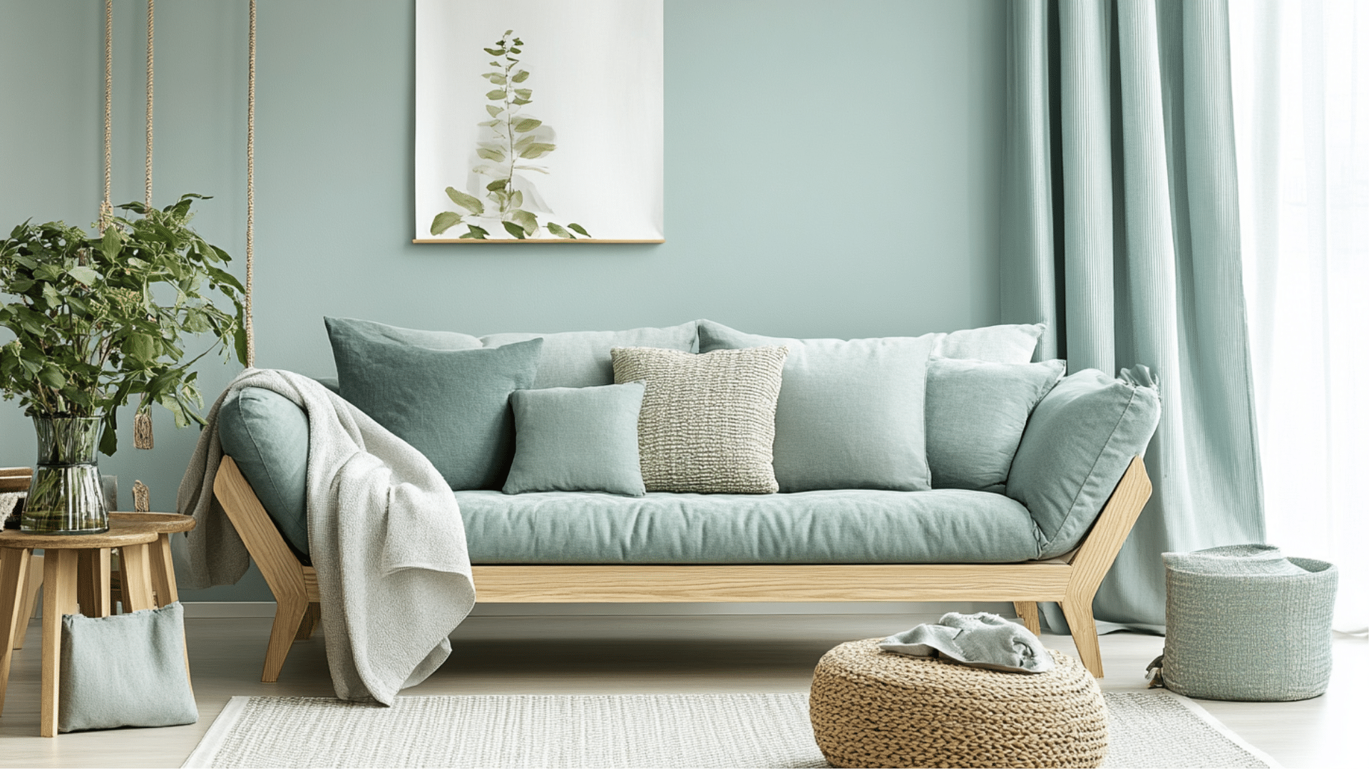
Each room in Scandinavian design serves a specific purpose and needs its own color approach.
The living room should feel welcoming while maintaining a light, airy quality.
- White walls create a bright canvas while gray sofas add depth without overwhelming the space.
- Natural wood coffee tables and shelving bring warmth and connect the room to nature.
- Add small touches of green through plants and layer wool throws for texture and comfort.
Focus on creating a space that feels both practical and comfortable.
Remember that furniture placement should maximize natural light flow.
2. Bedroom
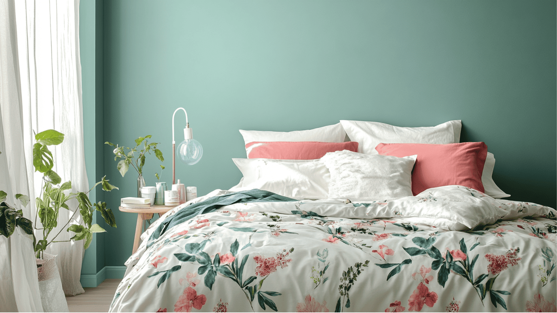
Bedrooms in Nordic homes prioritize rest above all else.
Colors should help you unwind and create a peaceful retreat from daily life.
- Choose white or soft gray for walls to create a peaceful space for rest.
- Layer in beige or muted blue through bedding and curtains for a calm feeling.
- Use multiple textile layers, like linen sheets and wool blankets, for warmth and comfort.
Keep bedroom decor simple and remove items that might disturb sleep.
A clutter-free space leads to a clutter-free mind.
3. Kitchen and Dining
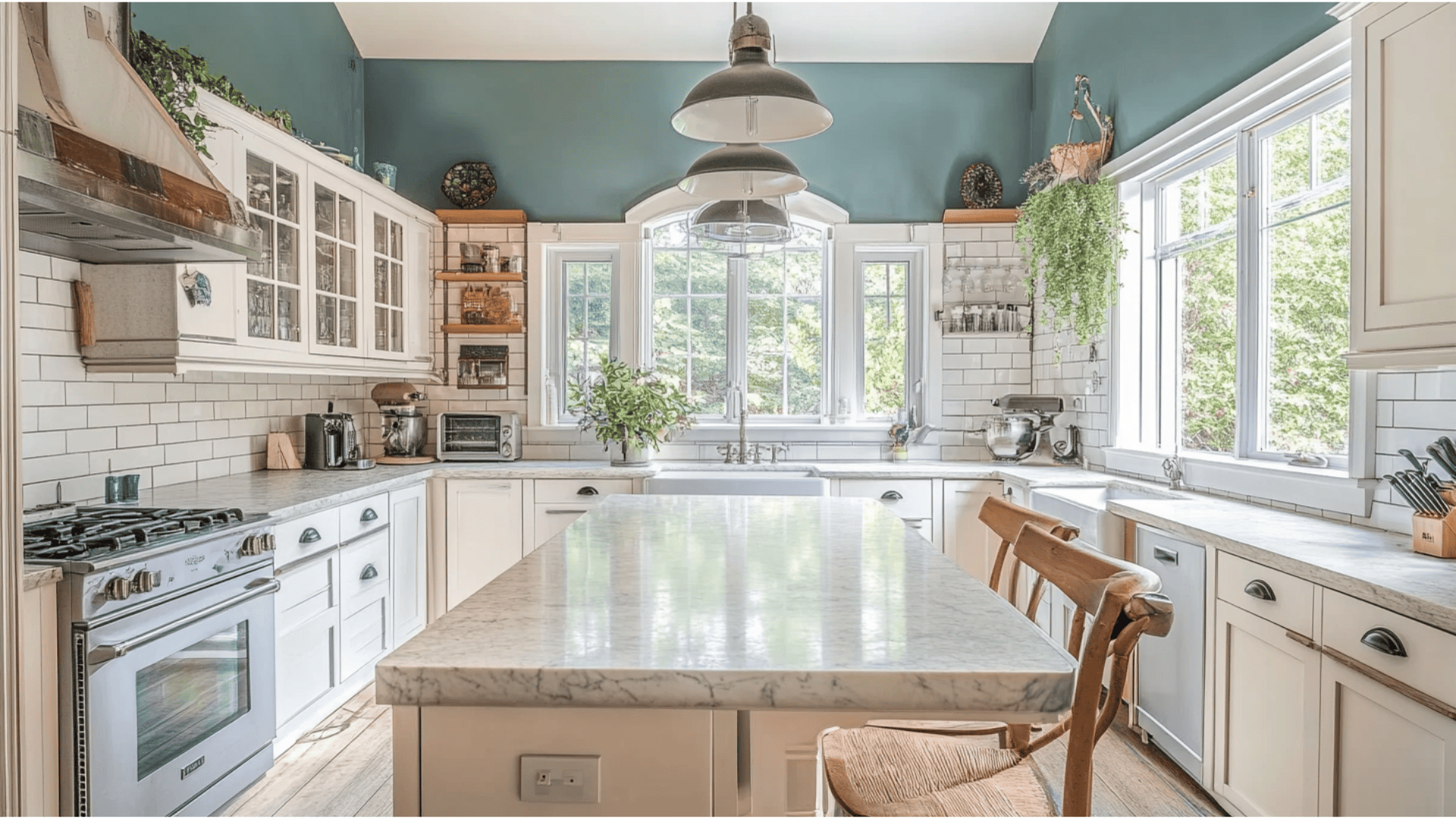
In Scandinavian homes, kitchens blend function with beauty.
These spaces should feel clean and organized while still being warm.
- White cabinets reflect light while black ones add drama, both paired with wooden countertops.
- Open shelving displays simple ceramics and keeps the space feeling airy and uncluttered.
- Choose dining chairs in light wood with simple forms that won’t block light.
The kitchen should inspire healthy cooking and gathering.
Good lighting is especially important in this hardworking space.
Tips for Using Scandinavian Colors in Your Home
Bringing Nordic colors into your home is easier than you might think.
These simple changes can convert your space into a Scandinavian-inspired retreat.
You don’t need to renovate your entire house to achieve this look.
- Paint walls in soft whites or grays with matte finishes that gently absorb light.
- Place mirrors across from windows to bounce natural light throughout your space.
- Add small pops of color through pillows, artwork, or a single piece of furniture.
- Choose items that serve a purpose rather than filling spaces with unnecessary decoration.
- Balance cool tones with warm woods and textiles to keep rooms feeling cozy and inviting.
Remember that Scandinavian design is about creating calm, functional spaces.
Start with one room and slowly expand your color palette throughout your home.
The goal is to create a space that feels both peaceful and practical.
Scandinavian-Inspired Paint Colors from Top Brands
Finding the right paint colors is key to creating an exact Nordic look in your home.
Both Benjamin Moore and Sherwin-Williams offer excellent options that capture the essence of Scandinavian design.
These carefully selected shades range from bright whites to soft neutrals and gentle nature-inspired tones.
Benjamin Moore Colors
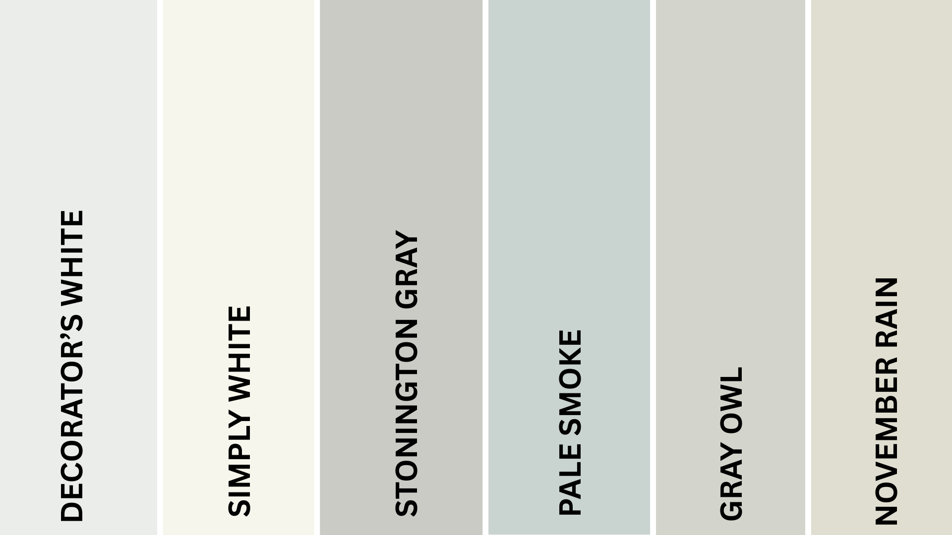
Benjamin Moore offers several shades that perfectly capture the Scandinavian aesthetic.
These colors balance brightness with subtle warmth, creating serene spaces that feel both clean and inviting.
Each shade works beautifully with the natural materials central to Nordic design.
1. Decorator’s White (OC-149)
A soft, clean white with subtle gray undertones, this shade perfectly captures Nordic simplicity.
This versatile shade brightens spaces without feeling harsh or clinical.
It creates the ideal backdrop for wooden elements and textiles while reflecting natural light beautifully throughout the day.
2. Simply White (OC-117)
A warm, creamy white with just enough softness to feel inviting.
This gentle shade has gained popularity in Scandinavian-inspired homes for its balance of brightness and comfort.
It pairs perfectly with pale woods like birch and ash without competing for attention.
3. Stonington Gray (HC-170)
A true light gray that reflects the cloudy skies of Nordic countries.
This balanced neutral has a calm presence that works in any room.
Designers love how it shifts subtly throughout the day, creating peaceful spaces that feel both modern and timeless.
4. Pale Smoke (1584)
A whisper-soft blue-gray that evokes misty fjords and northern skies.
This light color adds subtle interest without feeling like a statement.
It’s perfect for bedrooms and living spaces where a hint of color enhances the serene Scandinavian aesthetic.
5. Gray Owl (OC-52)
A light, versatile gray with subtle green undertones that connect to nature.
This popular shade works beautifully with both cool and warm elements.
It creates the perfect neutral background while adding just enough depth to feel intentional and warm.
6. November Rain (2142-60)
A barely there green with gray undertones brings the outdoors inside.
This subtle color shifts throughout the day, sometimes appearing almost neutral.
It creates a connection to nature while maintaining the light, airy quality essential to Scandinavian design.
Sherwin-Williams Colors
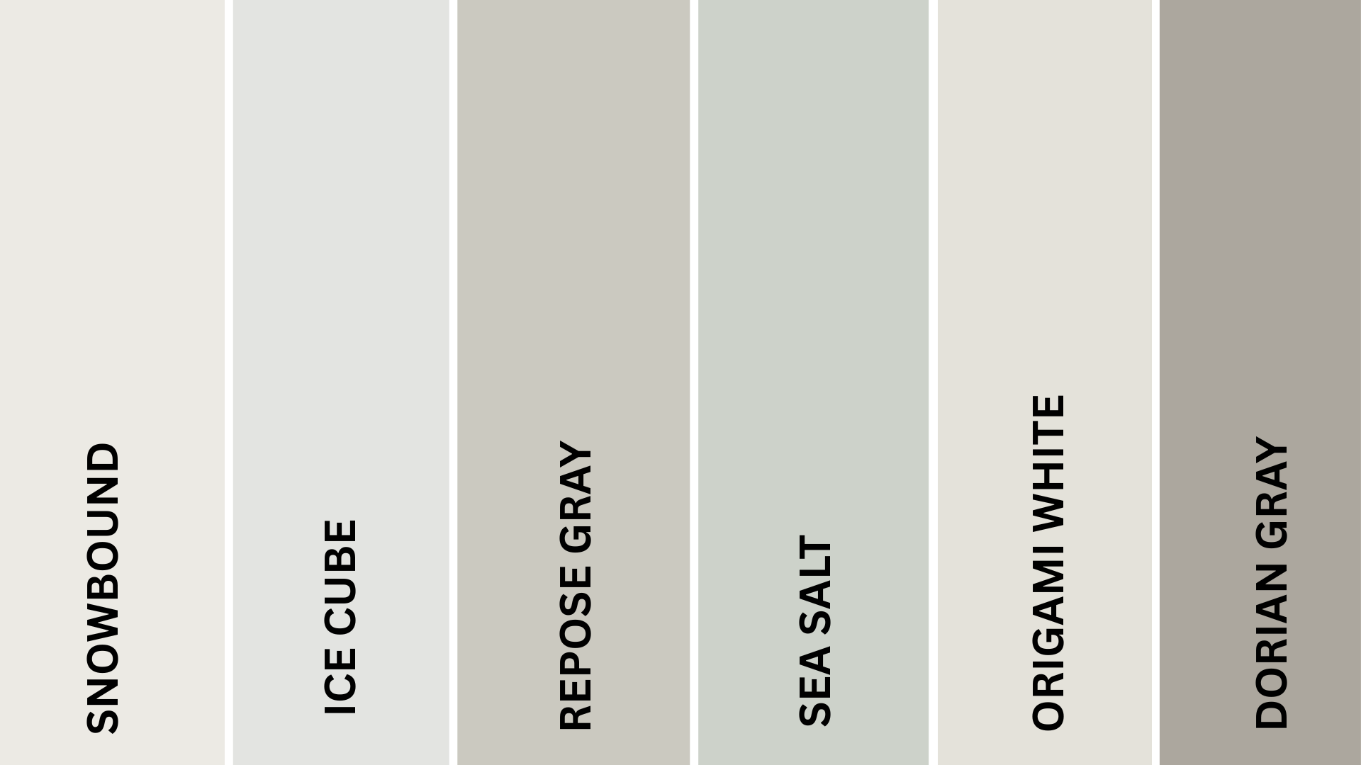
Sherwin-Williams provides an excellent range of Scandinavian-inspired colors that balance simplicity with character.
These shades create bright, peaceful environments that still feel warm and livable.
Each color works beautifully in the changing light that’s so important to Nordic design.
1. Snowbound (SW 7004)
A soft white that feels welcoming rather than stark.
This balanced shade creates bright interiors without coldness or glare.
It has become a staple in Scandinavian-inspired homes for its ability to showcase natural textures and simple furnishings.
2. Ice Cube (SW 6252)
A crisp, clean blue-white that captures the brightness of Nordic interiors.
This refreshing shade has subtle cool undertones that create a sense of openness and light.
It works wonderfully in spaces that need to feel airy and uncluttered.
3. Repose Gray (SW 7015)
A perfect light, warm gray that works in any lighting condition.
This versatile neutral has become a favorite for its ability to feel both modern and cozy.
It creates an ideal background for both contemporary and traditional Scandinavian furniture pieces.
4. Sea Salt (SW 6204)
A subtle blue-green with gray undertones that recalls misty fjords.
This gentle color brings nature indoors without overwhelming the senses.
It creates a fresh, tranquil atmosphere, perfect for Scandinavian-style bedrooms and bathrooms.
5. Origami White (SW 7636)
A soft off-white with subtle warm undertones that feels lived-in and comfortable.
This versatile shade avoids the starkness of pure white while maintaining brightness.
It captures the essence of hygge while maximizing the feeling of natural light.
6. Dorian Gray (SW 7017)
A medium warm gray that adds depth without heaviness.
This balanced neutral has become popular for accent walls and furniture pieces.
Use it to create subtle contrast in predominantly white spaces, following the Scandinavian principle of thoughtful minimalism.
Final Words
The Scandinavian color palette offers more than trendy interior design; it creates a lifestyle centered around simplicity, nature, and well-being.
By incorporating these thoughtful color choices, your home becomes a peaceful sanctuary that feels both spacious and cozy.
Start with light neutrals as your base, add measured touches of muted colors from nature, and finish with sparse dark accents for definition.
This approach extends beyond paint to materials and textures, creating spaces that feel genuine and timeless.
Whether painting a single room or renovating your entire home, these Nordic-inspired colors invite calm into your daily life.
The right colors can change how you feel in your space, affecting your mood and well-being.
Ready to alter your space with Scandinavian simplicity?
Share your Scandinavian Color experience with us in the comments!
If you’re interested in more informational color palette blogs, feel free to click here and explore other blogs you might enjoy.

