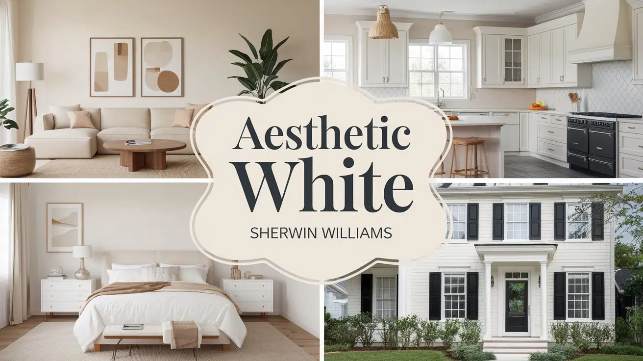
Are you searching for the perfect off-white paint that brightens your space without feeling stark or clinical? Sherwin Williams Aesthetic White (SW 7035) might be exactly what you want.
This soft, warm shade sits comfortably between white and beige, offering a gentle brightness that works in almost any room.
As a light neutral with an LRV of 73, Aesthetic White creates bright, open spaces while maintaining a welcoming feel that pure whites often lack.
It’s particularly suited for homeowners who want to modernize their space but feel hesitant about committing to stark white walls.
Whether updating your kitchen, refreshing your living room, or planning a whole-house color scheme, this versatile shade deserves your attention.
Let’s explore why Aesthetic White might solve your paint color dilemma.
The Sherwin Williams’ Aesthetic White (SW 7035)
Sherwin Williams Aesthetic White (SW 7035) is a light off-white paint color that combines the brightness of white with soft beige undertones.
It belongs to Sherwin Williams’ Timeless Whites Collection, making it an excellent choice for those seeking a paint color that stands the test of time.
Color Terminology
| Attribute | Value |
|---|---|
| Company Code | SW 7035 |
| Light Reflective Value (LRV) | 73 |
| RGB | 227 / 221 / 211 |
| Hex Value | #E3DDD3 |
Psychology of White Color Shades
White shades like Aesthetic White affect how we feel in a space without us even noticing because:
- White rooms often feel bigger and more open than rooms with darker colors.
- Light whites can boost your mood and energy levels during the day.
- Warmer whites like Aesthetic White create feelings of comfort and welcome.
- White with beige undertones helps create a calm, peaceful feeling.
- The right white can make a room feel clean without seeming cold or plain.
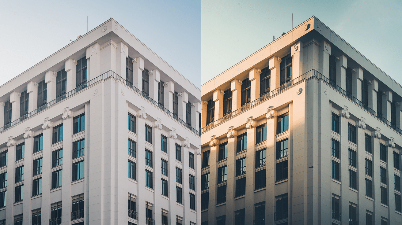
Is Aesthetic White Warm or Cool?
Aesthetic White treads a unique line between warm and cool.
While technically categorized as a warm neutral, its subtle gray undertones create a balanced temperature that makes it highly adaptable to various design styles and lighting conditions.
Understanding Its Balanced Temperature
Base Temperature
- Primarily leans warm with beige undertones.
- Gray undertones provide temperature balance.
- Never feels overly warm or starkly cool.
Light Interaction
- Morning light: Shows soft warmth.
- Afternoon light: Maintains neutral balance.
- Evening light: Displays gentle beige tones.
- Artificial light: Keeps a consistent appearance.
Room Orientation Effects
- North-facing rooms: They offer welcome warmth without looking dull.
- South-facing rooms: Stays balanced without washing out.
- East/West-facing rooms: Adapt throughout the day while maintaining character.
The Light Reflectance Value (LRV) of Aesthetic White
The Light Reflectance Value (LRV) helps predict how light or dark a paint color will appear in your space. On a scale where 0 represents pure black and 100 stands for pure white, Aesthetic White’s LRV of 73 places it comfortably in the light range, reflecting 73% of the light that hits it without reaching the intensity of true whites.
This moderate reflectance makes it bright enough to open up spaces but not so reflective that it creates glare.
In smaller rooms like bathrooms or hallways, this moderate reflectance helps create an airy feel without the stark brightness of pure white.
In larger spaces such as living rooms or kitchens, it provides enough depth to feel grounded while still maintaining brightness.
In dim basements or north-facing rooms, Aesthetic White’s LRV helps maximize available light without looking flat or dingy.
However, in very bright, sun-filled spaces, it can appear slightly washed out, revealing more of its off-white nature rather than appearing beige.
Aesthetic White’s Undertones
Aesthetic White is valued for its understated complexity of undertones that never overwhelm its base color.
While it might look like a simple off-white at first glance, this paint color carries subtle undertones that make it uniquely versatile.
The primary undertone in Aesthetic White is gray, which helps keep the color from feeling too warm or beige.
This gray undertone acts as a neutralizing force, preventing the color from leaning too heavily into yellow or pink territories that often plague other off-whites.
What makes it special is how these undertones respond to different lighting conditions:
- Morning light: Beige undertones become more noticeable.
- Midday sun: Gray undertones help balance the brightness.
- Evening light: Warm undertones surface gently.
- Artificial lighting: Maintains neutral balance with minimal color shift.
White Colors That Complement Aesthetic White Walls
The right white combinations create subtle depth and visual interest while maintaining a clean, cohesive look.
Complementary whites enhance architectural details and create a refined, layered effect while respecting Aesthetic White’s warm undertones.
Sherwin-Williams Pure White (SW 7005)
A versatile neutral white that balances Aesthetic White’s warmth without creating a stark contrast.
Its clean undertones help define trim work while maintaining a cohesive look that doesn’t compete with your wall color.
Benjamin Moore White Dove (OC-17)
This soft, warm white carries subtle yellow-grey undertones that harmonize beautifully with Aesthetic White’s warmth.
It’s especially effective for crown molding and baseboards, creating gentle definition without harsh transitions.
Sherwin-Williams Extra White (SW 7006)
Though slightly cooler, Extra White provides a crisp contrast for architectural details while its subtle blue undertones help moderate Aesthetic White’s warmth, creating a balanced visual relationship between walls and trim.
Benjamin Moore Chantilly Lace (OC-65)
A bright, clean white that reads true white in most lighting conditions. Its neutral undertones make it an excellent ceiling color when paired with Aesthetic White walls, as it brightens the space without introducing competing undertones.
Sherwin-Williams Alabaster (SW 7008)
This creamy white shares similar warm undertones with Aesthetic White but at a lighter intensity, making it perfect for creating subtle depth in layered white spaces.
It’s particularly effective for door frames and window casings.
Benjamin Moore Simply White (OC-117)
A warm white with yellow undertones that complement Aesthetic White’s warmth while providing just enough contrast to define architectural features.
It works especially well in spaces with abundant natural light.
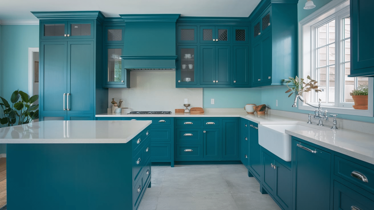
Why Choose Aesthetic White for Kitchen Cabinets?
This warm off-white brings sophistication to your kitchen without the stark feel of pure white.
The Perfect Balance for Modern Kitchens
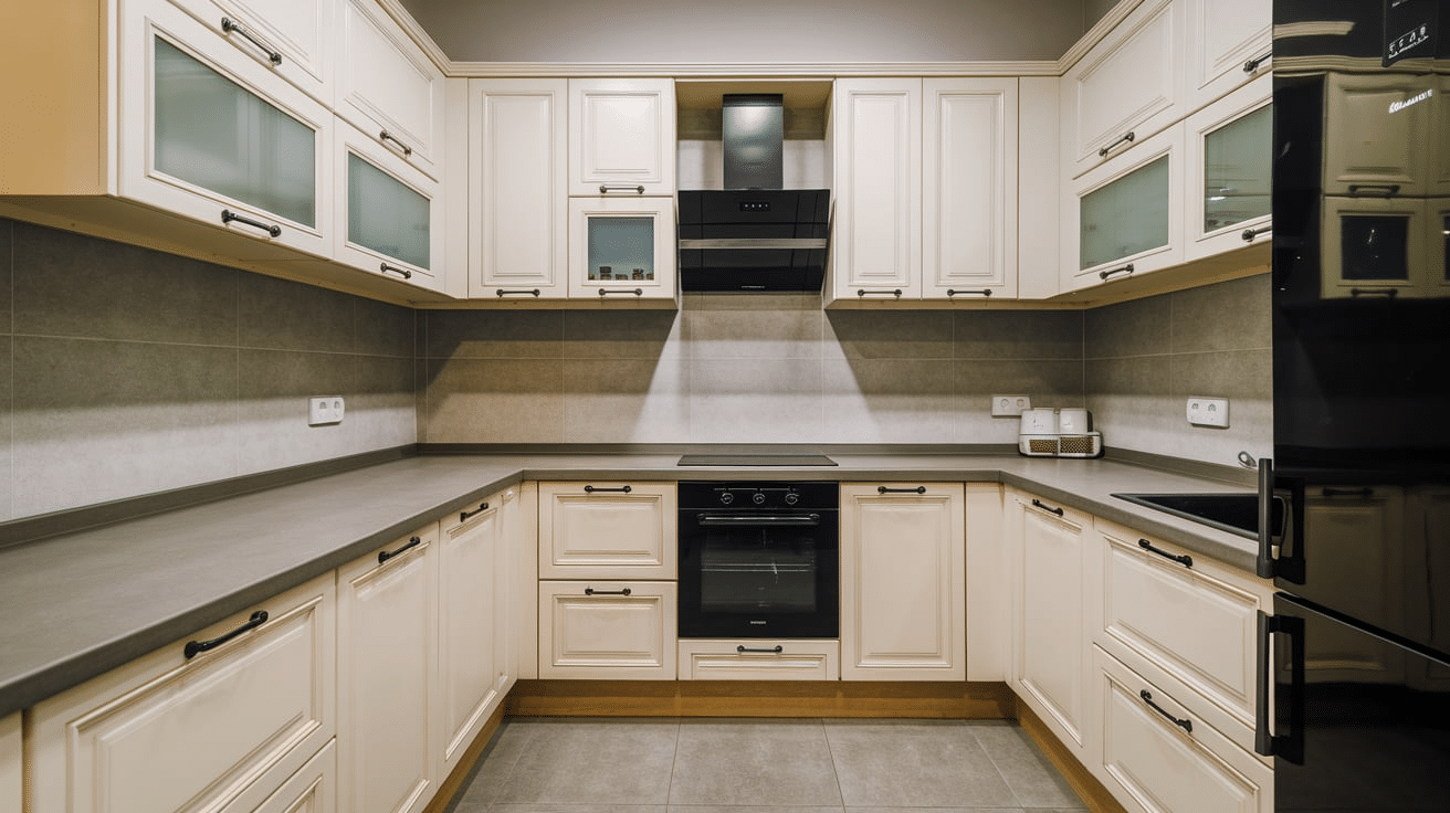
Aesthetic White (SW 7035) is an excellent choice for kitchen cabinets, striking the ideal balance between warm and cool tones.
Unlike stark whites that can feel clinical, this refined shade adds subtle depth while maintaining a clean, fresh appearance.
Its greige undertones create visual interest without overwhelming the space, making it a timeless option for any kitchen style.
Versatility with Kitchen Elements
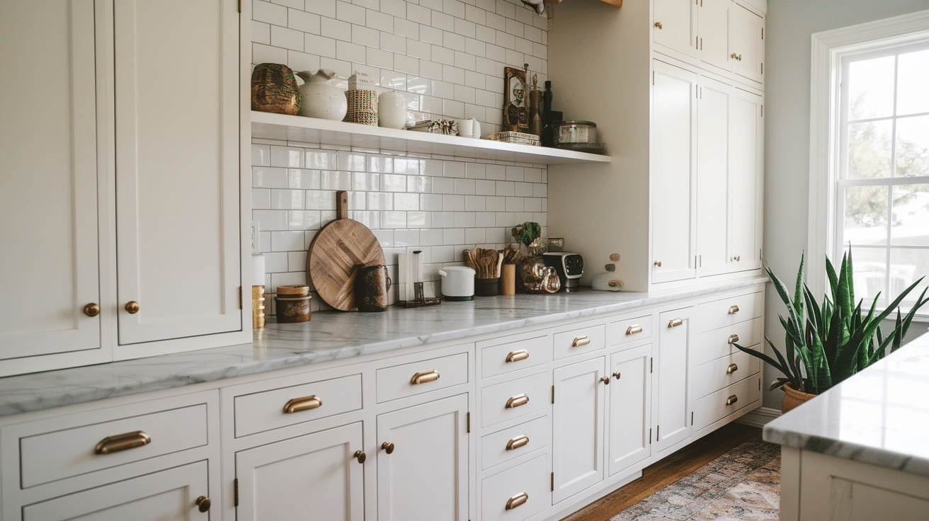
Aesthetic White’s adaptability makes it a standout choice for cabinets. It harmonizes beautifully with various countertop materials, from sleek quartz to natural marble.
The color also pairs exceptionally well with different hardware finishes, including brushed brass, matte black, and nickel.
When it comes to backsplashes, this versatile shade complements everything from classic subway tiles to modern geometric patterns.
Practical Benefits
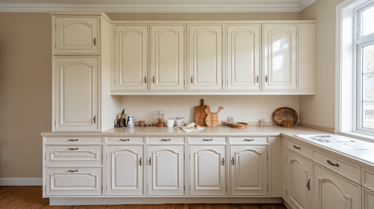
Beyond its aesthetic appeal, this color offers practical advantages for kitchen cabinets.
It helps mask minor imperfections better than pure white, shows less dirt and fingerprints, and maintains its fresh appearance over time without yellowing.
For optimal results, use a semi-gloss or satin finish in a professional-grade cabinet paint for maximum durability and a beautiful sheen.
Lighting Considerations
Remember that lighting plays a crucial role in how Aesthetic White appears.
In natural daylight, it reads as a soft, warm white, while under artificial lighting, it can take on subtle variations that add depth to your kitchen design.
Always test the color in your specific lighting conditions before committing to ensure it achieves your desired look.
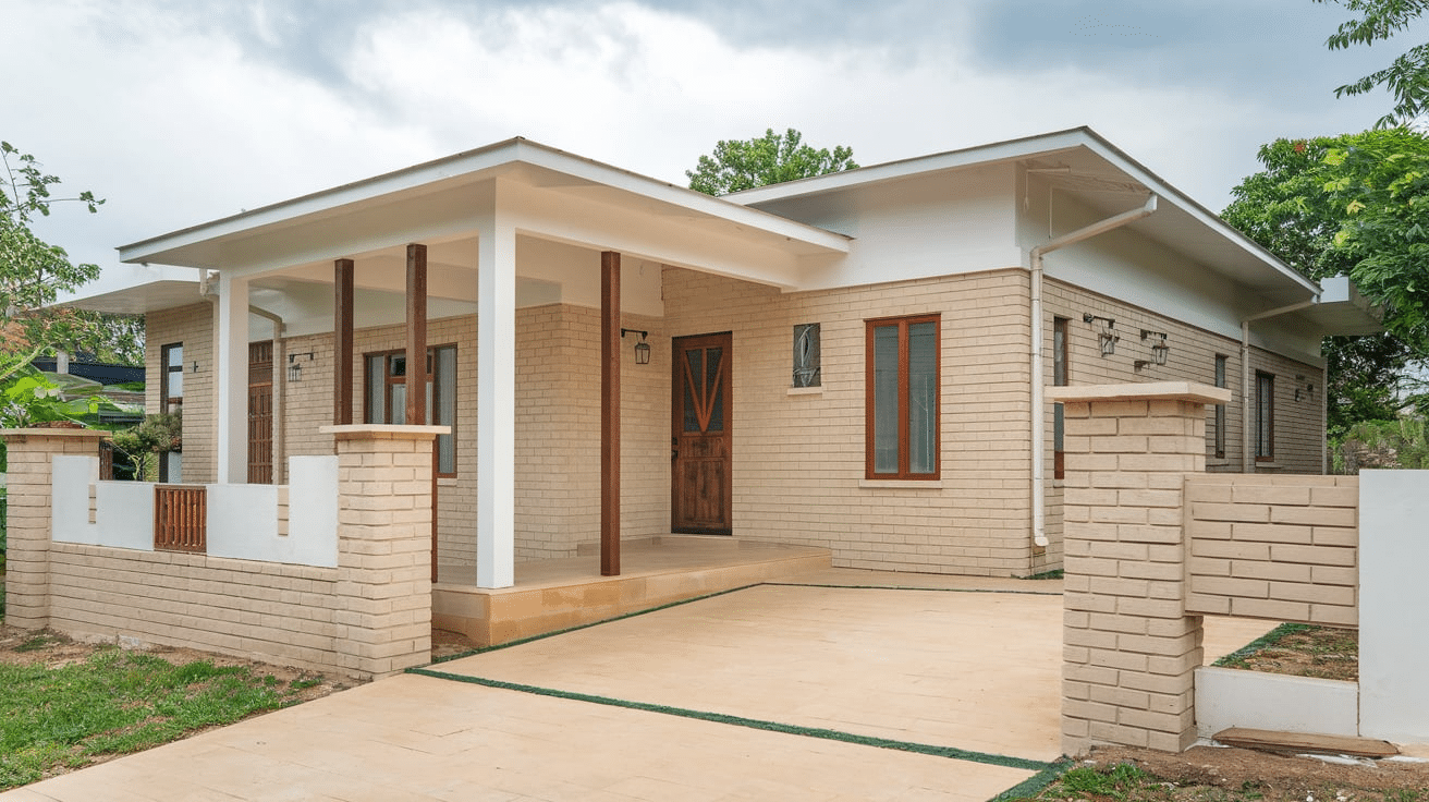
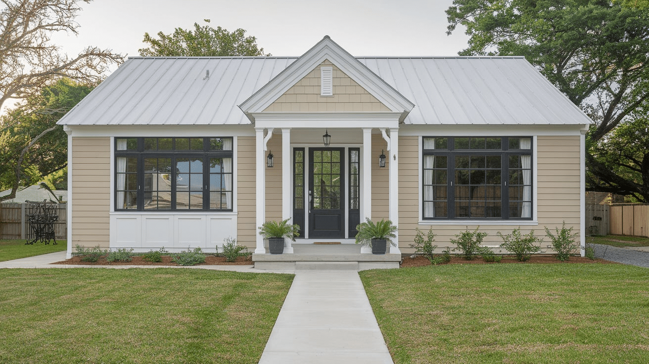
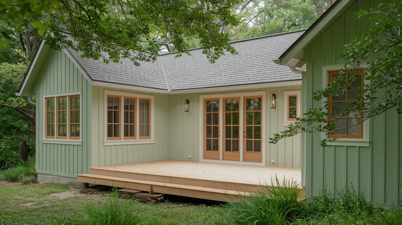
Is Aesthetic White Ideal for Exterior Use?
Aesthetic White offers a gentle alternative to bright white for home exteriors, creating welcoming curb appeal without harsh glare.
This warm off-white works beautifully on modern farmhouses and traditional homes, pairing harmoniously with natural stone, brick foundations, and wood elements.
However, homes with predominantly beige brick or stone may need careful sampling, as it might lack enough orange undertone to complement these materials effectively. For best results, pair with darker accents like deep-toned shutters, rich wood doors, or metal roof details to create depth and visual interest.
A Soft Alternative for Modern Exteriors
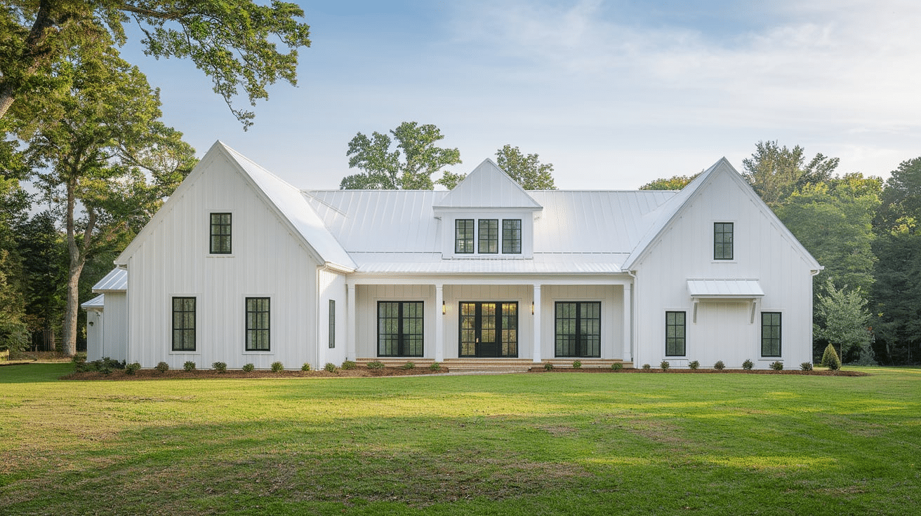
Aesthetic White offers a gentle alternative to bright white for home exteriors. This warm off-white creates a welcoming curb appeal without the harsh glare of pure white.
It’s particularly effective on modern farmhouses and traditional and transitional-style homes, providing a sophisticated appearance that feels fresh yet timeless.
Compatibility with Exterior Materials
Aesthetic White works harmoniously with various exterior materials and finishes. The color pairs beautifully with natural stone accents, brick foundations, and wood elements.
However, suppose your home features predominantly beige brick or stone.
In that case, you may need to carefully sample the color as it might not provide enough orange undertone to complement these materials effectively.
Performance in Natural Light
As an exterior color, Aesthetic White responds beautifully to natural daylight. The color maintains its soft warmth throughout the day while providing enough depth to highlight architectural details.
In bright sunlight, it appears crisp without becoming blindingly bright, and in shadowy areas, it retains its warmth without looking dingy.
Trim and Accent Considerations
Consider pairing Aesthetic White with darker accents for visual interest for exterior trim. The color works particularly well with:
- Dark window frames
- Deep-toned shutters
- Rich wood doors
- Metal roof accents These combinations help create depth and dimension while maintaining a cohesive exterior palette.
Similar Paint Colors to Aesthetic White
How Aesthetic White Compares to Other Popular Whites
| Paint Color | LRV | Undertones | Key Differences | Best Uses |
|---|---|---|---|---|
| Aesthetic White (SW 7035) | 73.45 | Warm beige, subtle gray | Balanced warm-cool mix | Versatile whole-house color, great for kitchens |
| White Duck (SW 7010) | 73.61–74.005 | Yellow, warm beige | Slightly warmer, more yellow | Better for cool climates, north-facing rooms |
| Eider White (SW 7014) | 72.36 | Gray, subtle pink | Cooler, more gray-leaning | Modern spaces, south-facing rooms |
| Shoji White (SW 7042) | 73.42 | Beige, subtle green | Stronger beige, green hints | Traditional spaces, east/west-facing rooms |
| Pure White (SW 7005) | 84 | Neutral | Much brighter, true white | Trim ceilings, modern spaces |
| Alabaster (SW 7008) | 82.28 | Warm, creamy | More creamy, higher LRV | Traditional spaces, warm-toned rooms |
| Maritime White (BM) | 71.6 | Orange, beige | More noticeable undertones | Spaces with warm wood tones |
| Greek Villa (SW 7551) | 84 | Warm, creamy | Much brighter, creamier | Southern traditional homes |
Key Comparison Notes:
- LRV (Light Reflectance Value) ranges from 71-84.
- All are off-whites but with distinct undertone variations.
- Each is suited for specific lighting conditions.
- Aesthetic White sits in the middle range for versatility.
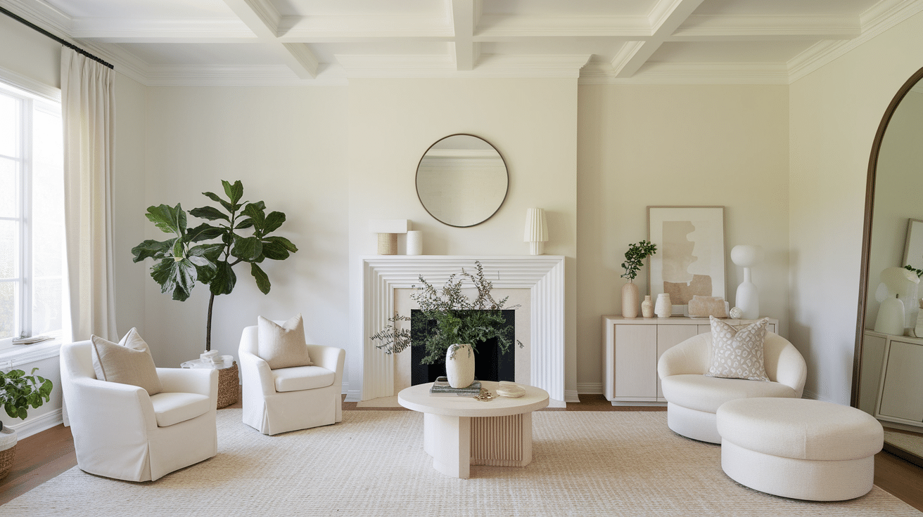
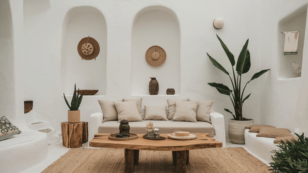
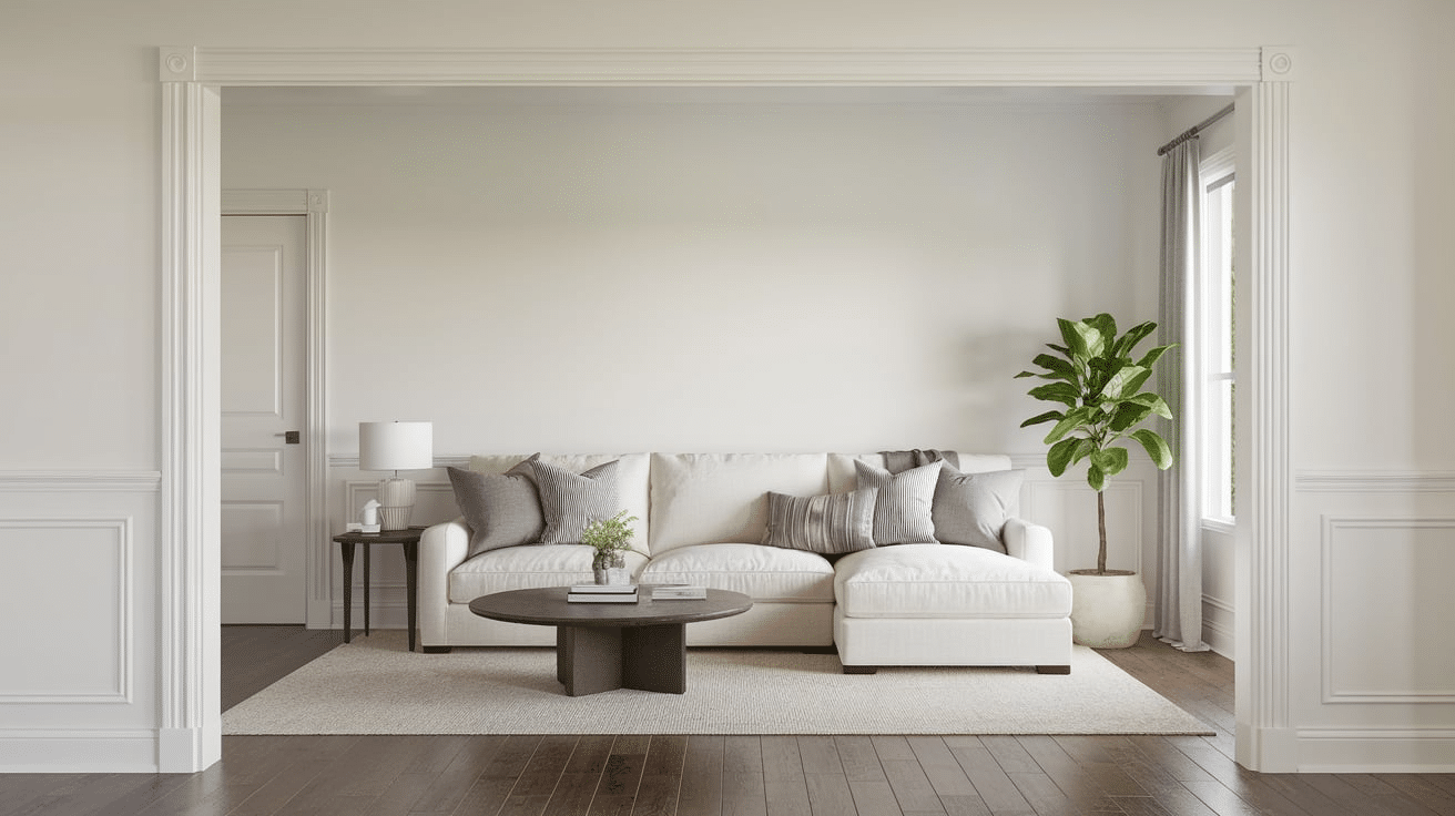
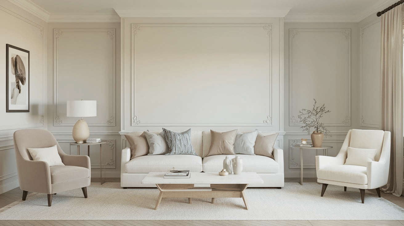
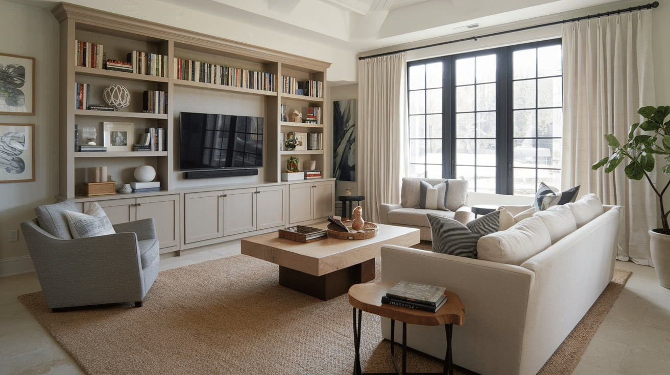
Best Places to Use Aesthetic White in Your Home
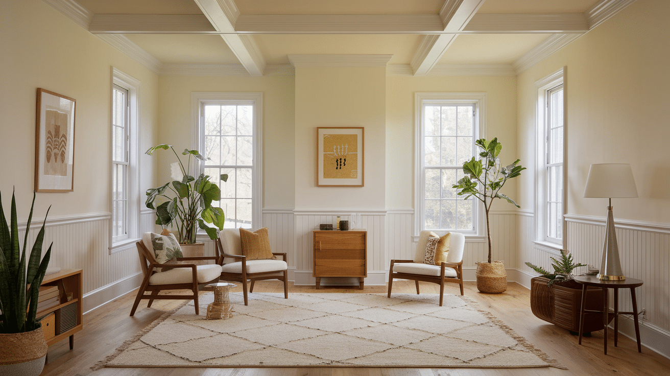
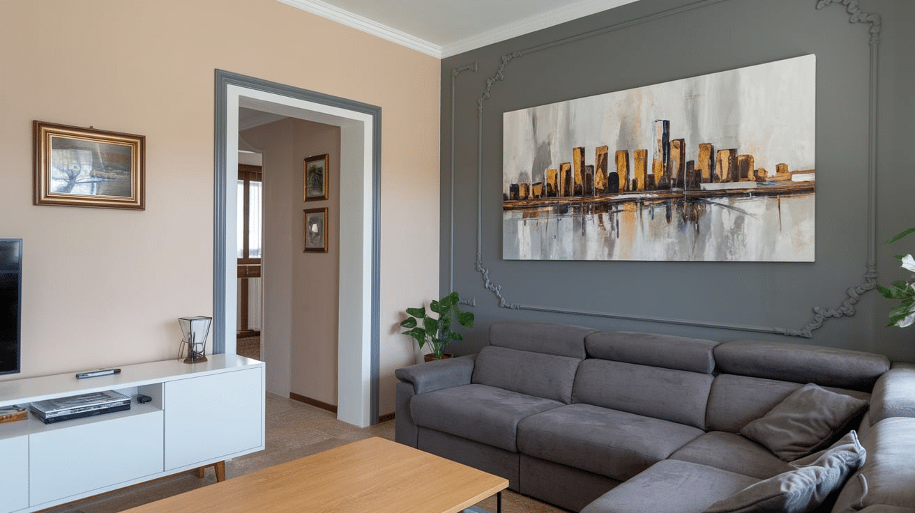
Living Rooms
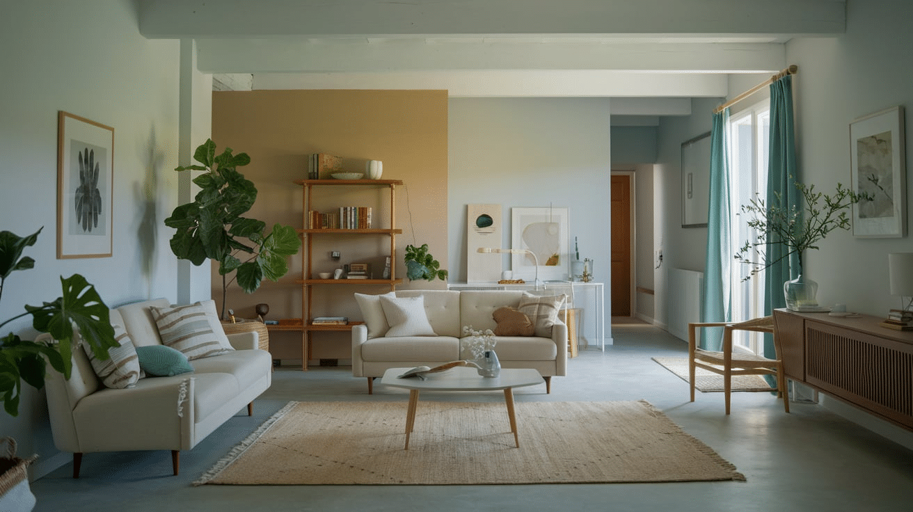
- Creates an airy, welcoming atmosphere.
- Balances warm and cool decor elements.
- Provides subtle depth without dominating the space.
- Perfect for open-concept layouts.
Family Rooms
- Offers a relaxed, comfortable backdrop.
- Stays fresh-looking in varying light conditions.
- Hides minor scuffs better than pure white.
- Complements media center and entertainment areas.
Main Kitchen Walls
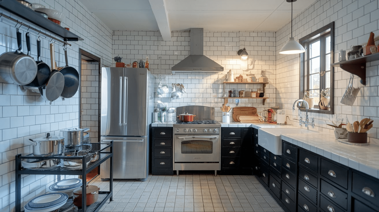
- Brightens dark kitchen spaces.
- Works well with various cabinet colors.
- Resists, showing cooking residue.
- Reflects light effectively.
Kitchen Cabinets
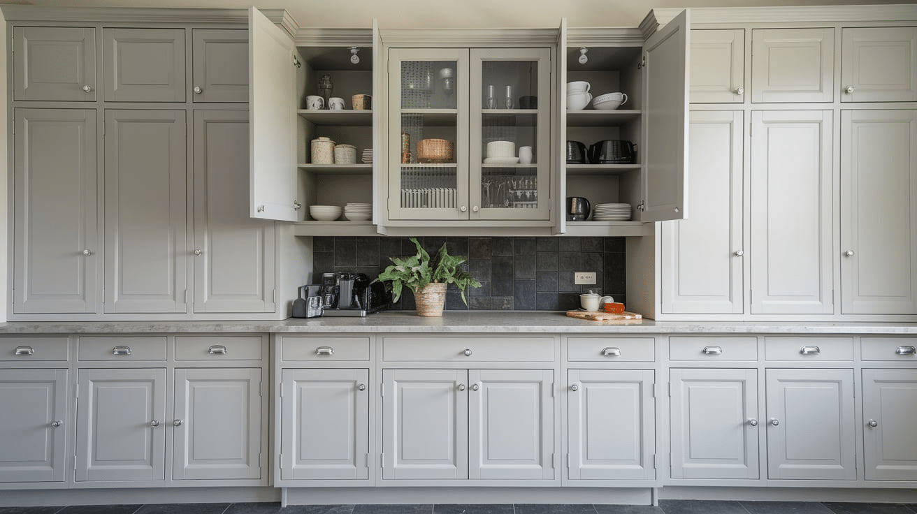
- Provides refined alternative to stark white.
- Pairs beautifully with various countertops.
- Shows less dirt and fingerprints.
- Creates depth without being too creamy.
- Private Spaces
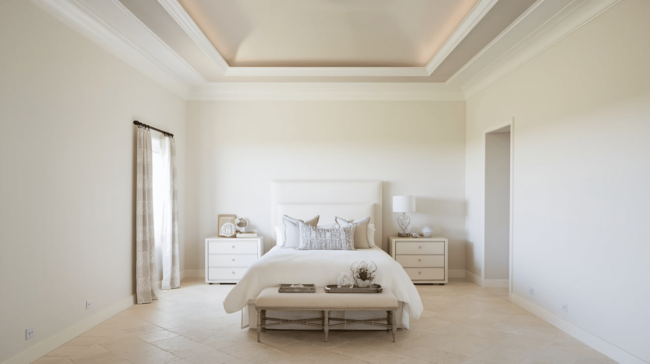
Bedrooms
- Creates a serene, restful environment.
- Offers enough warmth for cozy ambiance.
- Adapts well to changing light throughout day.
- Works with various bedding colors.
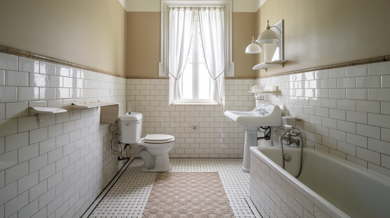
Bathrooms
- Maintains clean, fresh appearance.
- Resists showing moisture marks.
- Complements various tile choices.
- Makes small spaces feel larger.
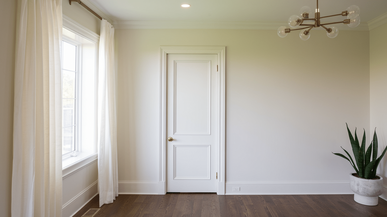
Hallways
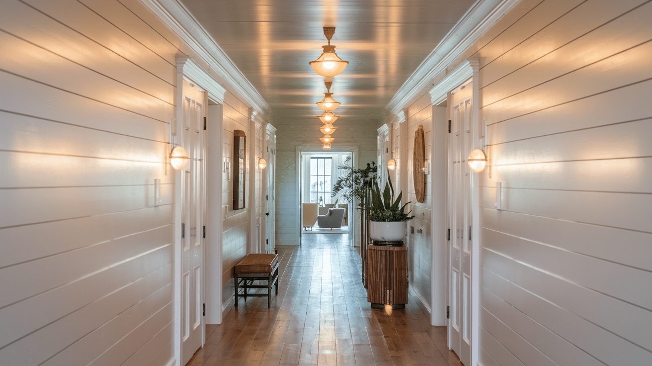
- Brightens typically dark corridors.
- Provides consistent flow between rooms.
- Reflects both natural and artificial light.
- Creates an inviting pathway through home.
Entryways
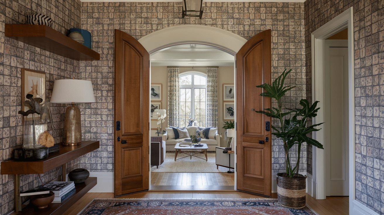
- It makes a welcoming first impression.
- Transitions well to other spaces.
- Hides scuffs and marks effectively.
- Provides versatile backdrop for decor.
Best Color Combinations with Aesthetic White
Greiges & Grays
- Chelsea Gray – Perfect for accent walls and cabinetry.
- Dorian Gray – Excellent for creating depth in open spaces.
- Westchester Gray – Ideal for trim and architectural details.
- Accessible Beige – Beautiful for adjacent walls or furniture.
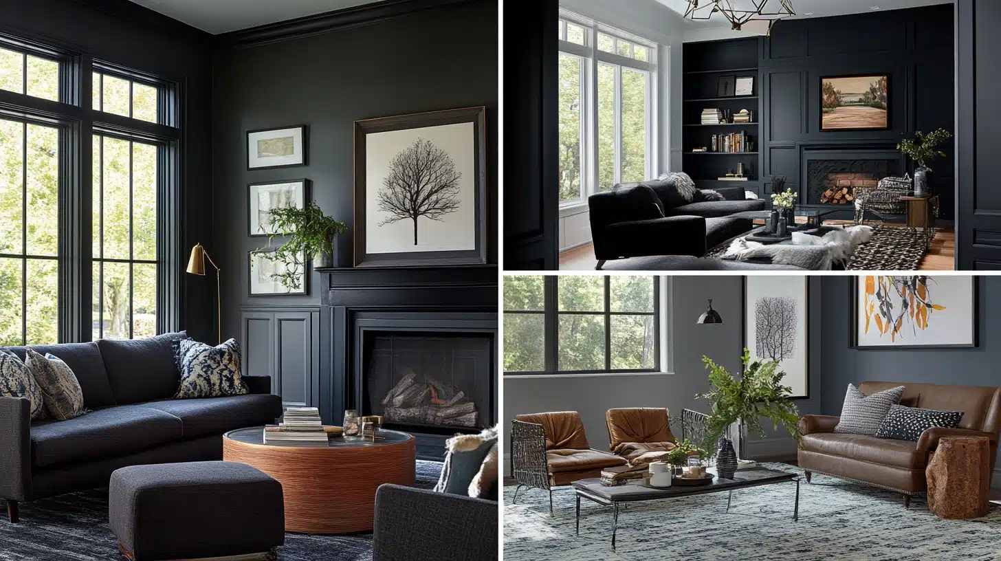
Charcoals & Blacks
- Iron Ore – Striking for doors and windows.
- Tricorn Black – Dramatic accent for hardware and fixtures.
- Gauntlet Gray – Refined choice for built-ins.
- Peppercorn – Polish for furniture pieces.
Blues & Teals
- Aquaverde – Refreshing bathroom or kitchen accent.
- Moody Blue – Perfect for bedrooms and living spaces.
- Sea Salt – Calming color for adjacent rooms.
- Krypton – Beautiful for furniture and decor pieces.
Greens
- Retreat – Excellent for exterior accents.
- Sage Green – Natural complement for living areas.
- Clary Sage – Soft option for bedrooms.
- Evergreen Fog – Rich accent for built-ins.
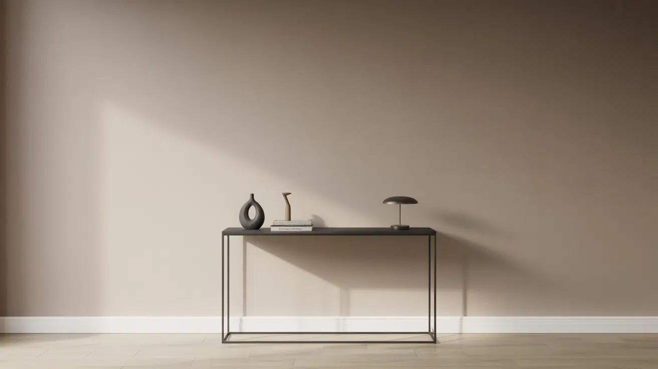
Metals & Earth Tones
- Brushed Brass – Perfect for hardware and lighting.
- Oil-rubbed bronze – Rich contrast for fixtures.
- Copper – Warm accent for decorative elements.
- Natural Wood – Beautiful complement in any room.
Design Tips
- Pair with darker shades for contrast in large spaces
- Use metallic accents to add warmth and sophistication
- Combine with natural textures for depth
- Layer different tones for visual interest
The Pros and Cons of Aesthetic White (SW 7035)
Like any paint color, Aesthetic White comes with both strengths and limitations that homeowners should consider. Understanding these factors helps you make an informed decision about whether this versatile off-white fits your specific needs and space requirements.
| Pros | Cons |
|---|---|
| Versatility | Lighting Challenges |
| • Works in most rooms and lighting conditions | • Can appear dingy in poorly lit spaces |
| • Pairs well with various design styles | • May wash out in intense southern exposure |
| • Excellent whole-house color option | • Needs good lighting to show true color |
| Color Properties | Color Coordination |
| • Perfect balance of warm and cool tones | • Difficult to pair with other off-whites |
| • LRV of 73 provides good light reflection | • Can clash with yellow-toned whites |
| • Hides imperfections better than pure white | • May not provide enough contrast with some trims |
| Practical Benefits | Application Considerations |
| • Shows less dirt than stark whites | • Requires multiple samples in different lighting |
| • Ages well without yellowing | • May need extra coats for full coverage |
| • Easy to touch up when needed | • Not ideal for spaces needing stark white |
While Aesthetic White offers excellent versatility for most homes, it’s important to test samples in your specific lighting conditions.
The color’s balanced nature makes it forgiving in many situations, but proper lighting and careful coordination with existing elements ensure the best results.
Conclusion
Aesthetic White is an enduring favorite among homeowners for its remarkable adaptability and subtle refinement.
This soft, warm white creates an inviting atmosphere while maintaining a clean, contemporary feel that complements any design scheme.
Its balanced undertones prevent it from appearing too stark or clinical, allowing it to transition between traditional, modern, and transitional spaces flawlessly.
Whether used in sun-drenched living rooms or dimly lit hallways, Aesthetic White maintains its gentle presence while providing an ideal backdrop for artwork, furniture, and decor.
For those seeking a dependable shade that will stand the test of time, Aesthetic White offers the perfect blend of warmth and brightness, making it an excellent choice for creating cohesive, welcoming spaces throughout the home.
Ready to change your space with Aesthetic White? and see how this timeless color can refresh your home’s interior design.
What’s your go-to warm white paint? Share your favorites in the comments below!

Alex Guerrero, a graduate with a Fine Arts degree from the Rhode Island School of Design, has been a visionary in the world of color and design for over 15 years. His professional journey began in the heart of the fashion industry in Milan, where he developed an acute sense for color harmonies and trends. Alex joined our team in 2018, offering fresh and innovative perspectives on color utilization in various spaces. Renowned for his ability to blend contemporary trends with timeless elegance. Outside of work, Alex is an accomplished painter and a volunteer art therapist, his artistic talents further enriching his professional insights.