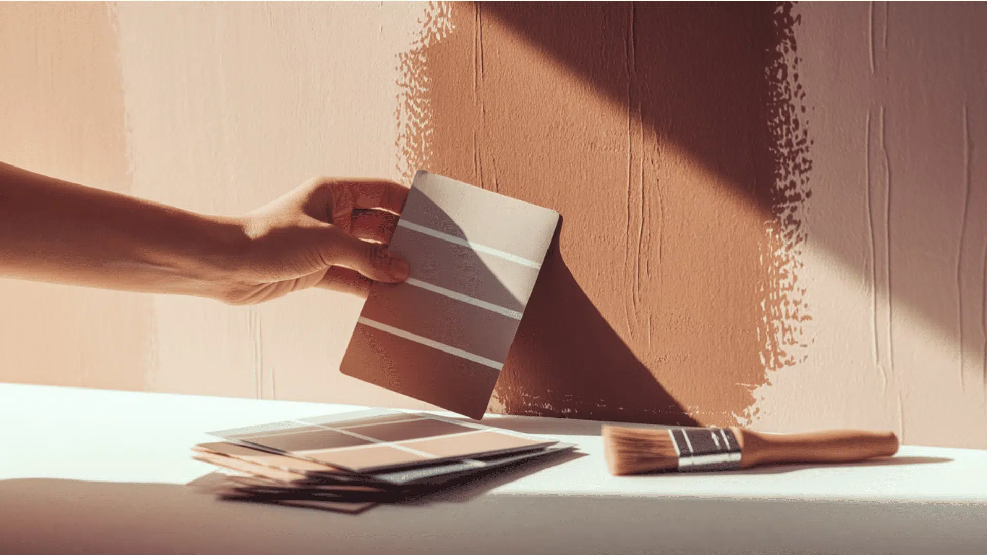

Are you looking for the perfect gray paint that feels warm, inviting, and never goes out of style? Sherwin Williams On The Rocks (SW 7671) is a versatile gray paint color that creates calm and refined spaces while feeling balanced and welcoming.
With an LRV of 62, it brightens rooms while still providing depth. This isn’t a cold gray – it’s a natural, soft gray with gentle green and beige undertones that feels fresh and clean.
Perfect for living rooms, bedrooms, kitchens, or even offices, this friendly color shifts beautifully with sunlight, looking fresh in the morning and cozy as evening falls.
On The Rocks creates a timeless feeling in your home where your favorite furniture and decorations can truly shine.
Understanding Paint Color Basics
On The Rocks (SW 7671) is a popular gray paint color by Sherwin-Williams. It creates calm and urbane spaces that feel balanced and welcoming.
Color Terminology
Let’s look at the technical details of On The Rocks by Sherwin-Williams. These numbers help designers and painters understand exactly what this color looks like.
| PROPERTY | VALUE |
|---|---|
| LRV | 62 |
| RGB | 208 / 206 / 200 |
| Hex Value | #D0CEC8 |
The good LRV of 62 shows why On The Rocks brightens up rooms while still providing some depth. You can use the RGB and Hex values to match this color for digital designs or order custom items.
Undertones:
- On The Rocks has soft green and beige undertones
- It’s a light, versatile gray that feels fresh and clean
- Not a cold gray, but a natural, soft, warm gray
Psychology of Gray Colors
Colors affect how we feel in a room, even neutral ones like On The Rocks. The right gray can make a big difference in your home.
- Warm grays like On The Rocks create a feeling of balance and timelessness
- Green-based grays: Bring a natural, calming feeling to any room
- Soft neutrals: Make spaces feel larger, brighter, and more put-together
- Benefits: Easy to coordinate with, works well in changing light, and pairs nicely with both bold and subtle furniture.
On The Rocks is a safe choice that won’t go out of style. It works as a perfect background for your favorite furniture and decorations.
Why Choose Sherwin-Williams On The Rocks (SW 7671)?

Sherwin-Williams On The Rocks is a peaceful gray that balances and freshens rooms. It’s easy to live with and makes decorating simple because it works with almost any color.
1. Versatility
On The Rocks shines in different lighting situations throughout the day. Morning light brings out its softer side, while afternoon sun shows its warmer undertones. Evening light makes it feel extra cozy.
This paint can be used in bedrooms, living rooms, offices, or even kitchens. It looks great in country homes or city apartments and does not feel wrong in either place.
2. Key Features
This gentle gray has a good brightness level that lights up spaces without being too harsh. Its green-beige undertones make it play well with wood tones, white trim, and colorful furniture.
On The Rocks creates a lasting background that won’t quickly go out of fashion, saving you from frequent repainting projects.
3. Durability
When you choose Sherwin-Williams’ better-quality paints for On The Rocks, you get walls that handle the bumps and scrapes of everyday life. This makes them perfect for busy homes with kids and pets.
The soft gray color hides small marks and fingerprints better than darker or lighter shades, keeping your home looking cleaner with less effort.
4. Texture Patterns
With its balanced tone, On The Rocks brings a sense of calm to your home. Thanks to those warm undertones, it’s not too cold like some grays can be.
This paint helps rooms feel bigger and more open while creating a unified look throughout your home. Your colorful rugs, artwork, and furniture will stand out beautifully against this thoughtful background color.
Room-by-Room Color Recommendations with Sherwin-Williams On The Rocks (SW 7671)
On The Rocks is a gentle gray that fits perfectly in any part of your home. This friendly color shifts with the sunlight, looking fresh in the morning and cozy as evening falls.
1. Living Spaces and Open Floor Plans

- On The Rocks (SW 7671) brings a peaceful feeling to living rooms and family spaces, helping create a backdrop that lets your furniture shine.
- This light gray color makes walls seem to step back, giving your room a more open feel without being too cold or boring.
- For connected spaces, try On The Rocks with a slightly darker shade like Mindful Gray (SW 7016) to gently separate dining areas from living areas while keeping the flow.
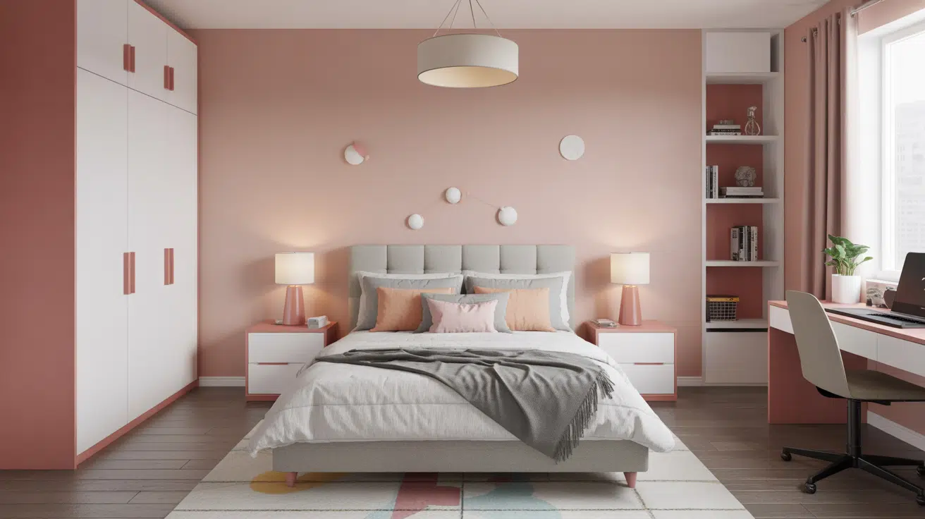
2. Bedrooms and Relaxation Areas

- On The Rocks helps create a restful bedroom space that feels clean but not too stark or hospital-like.
- The soft gray tone works beautifully with bedding in almost any color, from crisp whites to deep blues or even bold patterns.
- Try using On The Rocks for walls and Sea Salt (SW 6204) for the ceiling to create a dreamy, layered look that feels both grounded and airy.
3. Kitchens and High-Traffic Zones

- When used in a washable finish, On The Rocks holds up wonderfully in busy kitchens, better hiding minor splashes and fingerprints than pure white.
- This versatile gray creates a clean canvas that lets colorful dishes, copper pots, or green plants really pop against the walls.
- The neutral undertones make it work perfectly with stainless steel appliances, white subway tile, or natural stone backsplashes without clashing.
4. Bathrooms and Spa-like Retreats

- On The Rocks gives bathrooms a hotel-like quality that feels both clean and luxurious without being cold.
- In small powder rooms, this light gray creates an illusion of more space while adding more character than plain white.
- Pair with soft, fluffy white towels and a green plant or two to create a spa-like feeling that helps you relax and unwind at the end of a long day.
Color Pairings and Combinations for Sherwin-Williams On The Rocks (SW 7671)

On The Rocks is a soft gray with gentle green and beige undertones. Its good Light Reflectance Value (LRV) of 62 makes it a versatile neutral that brightens spaces while adding depth and subtle warmth. Here are color pairings and combinations for this shade.
Complementary Trim Colors
Choosing the right trim color can make a big difference when using On The Rocks. These colors work especially well with On The Rocks and can highlight its unique qualities.
- Extra White (SW 7006) – A clean, bright white that creates a crisp contrast with On The Rocks, perfect for trim in rooms where you want the walls and woodwork to stand out from each other
- Greek Villa (SW 7551) – A warm, creamy off-white that pairs beautifully with On The Rocks to create a soft, cozy feeling while adding just enough contrast to door frames and baseboards
- Almond Roca (SW 9105) – A rich, warm brown that offers bold definition against On The Rocks while creating a natural, earthy color scheme for accent walls or furniture pieces
Each of these colors brings out different sides of On The Rocks. Before painting whole rooms, try painting small areas with these combinations to see which one looks best in your home’s lighting.
Creating Cohesive Color Schemes
On The Rocks works beautifully with many other colors to create a pulled-together look throughout your home. Here are three different color schemes that use On The Rocks as the main color.
1. Monochromatic Scheme
- On The Rocks (SW 7671) for main walls
- Extra White (SW 7006) for trim
- Ceiling Bright White (SW 7007) for ceilings
- Mindful Gray (SW 7016) for accent pieces or adjoining rooms
2. Warm Color Scheme
- On The Rocks (SW 7671) for the main living areas
- Mega Greige (SW 7031) for dining room
- Greek Villa (SW 7551) for hallways
- Accessible Beige (SW 7036) for bedrooms
3. Cool Color Scheme
- On The Rocks (SW 7671) for main walls
- Sea Salt (SW 6204) for bathrooms
- Silverpointe (SW 7653) for bedrooms
- Repose Gray (SW 7015) for home office
Coordinating with Furniture and Decor

On The Rocks is a versatile color that works well with many types of furniture and decorations. Its soft gray tone with green undertones creates a perfect background for showing off your favorite items.
1. Wood Tones
On The Rocks pairs nicely with different wood colors, from dark to light. This makes it easy to use with furniture you already own.
Dark woods, like espresso and mahogany, stand out boldly against On The Rocks’ light gray walls. Medium woods, like oak and cherry, create a balanced, natural look with this paint color. Light woods, such as birch and ash, blend smoothly with On The Rocks for a clean, modern feel.
2. Metals
Bronze and copper fixtures add warmth, balancing the cool side of On The Rocks’ gray tone. Matte black hardware creates sharp, clear lines that look very current against these soft gray walls.
Brushed nickel and chrome keep spaces feeling fresh and modern while reflecting light beautifully in rooms painted with On The Rocks.
3. Decor
Textured fabrics, such as velvet, linen, and chunky knits, add depth and interest against On The Rocks’ smooth background.
Green plants look especially good with this paint color since they bring out its subtle green undertones.
Soft blues, sandy tans, and creamy whites create a peaceful color story with On The Rocks. Natural elements, such as stone coasters, wooden bowls, and woven throws, bring warmth and life to the calm foundation that On The Rocks provides.
Similar Paint Colors: Perfect Alternative to On The Rocks (SW 7671)

All these colors work well in many different rooms. They create calm, balanced spaces that feel cultured and welcoming.
1. Crushed Ice (SW 7647)
- Cool light gray that feels fresh and bright without looking too icy or sterile
- Perfect for bathrooms, kitchens, and modern spaces that get lots of natural light
- Pairs beautifully with navy blue, crisp white trim, and silver or chrome fixtures
2. Pediment (SW 7634)
- Warm light gray that feels cozy and comfortable in any lighting situation
- Works wonderfully in living rooms, bedrooms, and traditional-style homes
- Looks great with natural wood furniture, cream fabrics, and bronze hardware
3. Egret White (SW 7570)
- Soft greige with yellow undertones that warm up spaces that don’t get much sun
- Shines in entryways, north-facing rooms, and areas that need to feel more inviting
- Complements earthy tones like terracotta, olive green, and natural stone elements
Final Words
Sherwin-Williams On The Rocks (SW 7671) is a peaceful gray that freshens any room in your home.
Its versatility shines in different lighting situations, bringing out softer tones in morning light and warmer undertones in afternoon sun.
This gentle gray has the perfect brightness level to light up spaces without being harsh. Its green-beige undertones play well with wood tones, white trim, and colorful furniture, creating a lasting background that won’t go out of fashion.
When paired with quality Sherwin-Williams paint, it handles everyday bumps and scrapes, making it perfect for busy homes.
Ready to alter your space? Grab a sample of Sherwin-Williams On The Rocks today and watch your rooms come alive! If you’re interested in more color review content, feel free to click here and explore other blogs you might enjoy.

Alex Guerrero, a graduate with a Fine Arts degree from the Rhode Island School of Design, has been a visionary in the world of color and design for over 15 years. His professional journey began in the heart of the fashion industry in Milan, where he developed an acute sense for color harmonies and trends. Alex joined our team in 2018, offering fresh and innovative perspectives on color utilization in various spaces. Renowned for his ability to blend contemporary trends with timeless elegance. Outside of work, Alex is an accomplished painter and a volunteer art therapist, his artistic talents further enriching his professional insights.