Hey there! Ever wondered what makes a paint color truly special? Meet SW Repose Gray – the color that’s taking homes by storm! This isn’t just another gray on the shelf.
Think of it as the perfect middle ground, like finding that sweet spot between hot cocoa and iced coffee.
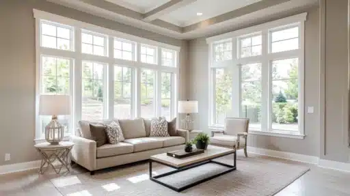
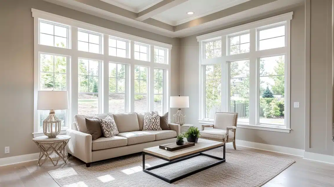
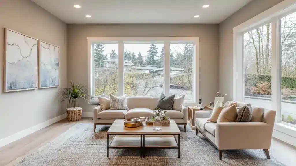
This color stands out by delivering more than expected. With an LRV of 58, it sits perfectly between too light and too dark, creating fresh and grounded spaces.
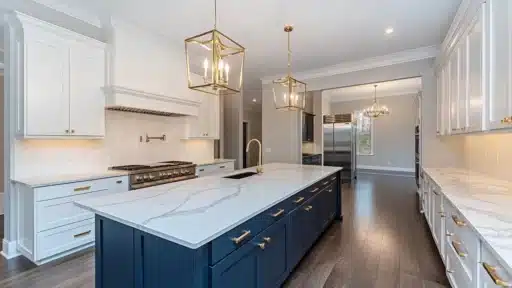
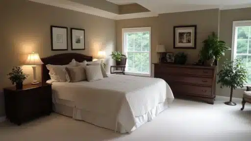
If you’re painting your bedroom, living room, or cozy reading nook, this versatile shade adapts like a chameleon to any lighting.
Ready to find why designers can’t stop raving about this game-changer? Repose Gray doesn’t just paint walls, it alters spaces into something extraordinary!
What is SW Repose Gray?
It sits right in the sweet spot, neither too light nor too dark. It reflects just enough light to keep your space open while maintaining enough depth to create interest.
While it firmly belongs to the warm gray family, it exhibits some interesting, subtle shifts.
You might catch hints of purple undertones under bright sunlight or cool LED lighting.
But don’t let that worry you – these subtle variations make it special.
I like to describe Repose Gray as a “smart neutral.” It’s warm enough to avoid looking cold like some grays can, but it doesn’t swing into the beige territory either.
It’s that perfect middle ground that works in both modern and traditional spaces.
How Does Lighting Affect Repose Gray?
Lighting can make or break any paint color, and Repose Gray is no exception! The magic happens when you understand how different light sources bring out its hidden personality.
Natural Light
- North-facing rooms: The color can look cooler here. I’ve noticed the gray tones become more prominent, and you might lose some warmth.
- South-facing rooms: This is where Repose Gray shines. The warm sunlight brings out its cozy undertones.
- Morning light: Early-day sunlight can pull out subtle purple hints.
- Afternoon sun: The color feels warmer and more balanced.
Artificial Light
- Warm LED bulbs: These work best, enhancing the color’s natural warmth.
- Cool LED lights: Be careful with these – they can make the color feel too cool and bring out those purple undertones.
Is Repose Gray Warm or Cool?
While it’s labeled as a warm gray, I wouldn’t call it a typical warm shade – it’s more nuanced than that.
Here’s what I’ve noticed:
- Not warm enough to show gold or creamy tints
- Not cool enough to look bluish like some grays
- Maintains a balanced neutral feel in most lights
- Shows warmth without leaning into beige territory
This balance makes it excellent for:
- Open floor plans where you need a consistent flow
- Modern spaces that need warmth without looking dated
- Traditional rooms that want an updated feel
- Spaces where you’re trying to avoid colors that look too warm or too cool
How Does Repose Gray Compare to Other Grays?
| Aspect | Repose Gray (SW 7015) | Agreeable Gray (SW 7029) | Mindful Gray (SW 7016) |
|---|---|---|---|
| Undertones | Warm gray with subtle purple and cool undertones in some lighting | Warm gray with a soft beige undertone, slightly more neutral | Greenish gray with soft blue undertones, cooler than Repose |
| Light Reflectance Value (LRV) | 58 (mid-tone gray) | 60 (slightly lighter than Repose Gray) | 48 (darker than both Repose and Agreeable Gray) |
| Warmth | Neutral with warm tones, ideal for modern spaces | Warmer, more neutral, very versatile | Cooler with greenish hues, slightly more subdued warmth |
| Best for | Modern, minimalist spaces; ideal for open floor plans or rooms with a lot of light | Versatile for any room; works well in kitchens, living rooms, and bedrooms | Smaller rooms or spaces need a deeper, more dramatic tone |
| Lighting Impact | It can show subtle purple hues in cool lighting or bright sunlight | Maintains a warm, neutral tone in all lighting conditions | It can look cooler or more muted in certain lighting |
| Use Case Recommendations | Great for larger spaces, open-concept living areas, and contemporary settings | Perfect for whole-home use; works well in spaces with varying lighting | Ideal for rooms with good natural light or larger rooms with darker accents |
Best Trim and Accent Colors to Pair with Repose Gray
Repose Gray’s versatile neutral foundation makes it an ideal canvas for both warm and cool color palettes. The following carefully selected trim and accent colors will enhance your space while maintaining the urbane balance that makes Repose Gray so popular.
Trim Colors
Choosing the right trim color is essential for creating clean lines and defining architectural details in your space. These carefully selected whites complement Repose Gray’s undertones while offering different levels of warmth and contrast.
Elder White is a soft, creamy off-white with subtle gray undertones. It creates a clean contrast with Repose Gray, making it ideal for modern and traditional settings. This versatile trim color offers a polished, timeless appearance that complements a wide range of design styles.
Pure White is a bright, crisp white with neutral undertones. It offers sharp, fresh contrast, making it perfect for a more contemporary look. This clean, modern trim color complements the coolness of Repose Gray, creating a sleek aesthetic.
Alabaster is a warm, soft white with beige undertones. It adds warmth and softens the contrast in more cozy, traditional rooms. This inviting trim color creates a comfortable, lived-in feeling that pairs beautifully with Repose Gray’s versatility.
Accent Colors
Accent colors bring personality and visual interest to spaces painted in Repose Gray. These thoughtfully curated options range from bold statement makers to subtle natural tones that enhance the color’s inherent versatility.
Pavestone is a rich, earthy gray with a hint of warmth, darker than Repose Gray. It adds depth and drama to accent walls or furniture, making it perfect for creating contrast. This urbane color creates visual interest while maintaining a cohesive, grounded palette.
Caviar is a deep, charcoal black with slightly warm undertones. It serves as a bold, refined accent color for statement pieces or feature walls. This dramatic shade offers a striking contrast that promotes any space with a modern style.
Dried Thyme is a muted green with brown undertones. It offers subtle, natural contrast for a more organic, earthy vibe. This calming color brings nature indoors while maintaining perfect harmony with Repose Gray’s neutral foundation.
Upward is a soft blue with gray undertones. It provides a cool-toned accent to complement the undertones in Repose Gray. This serene shade creates a tranquil atmosphere while enhancing the modern neutrality of the main color.
Basil is a dark, rich green with slight brown undertones. It serves as a deep, grounding accent for a urbane, natural look. This luxurious color adds depth and richness while maintaining an organic, timeless appeal.
Summing Up
Ready to revamp your space?
SW Repose Gray proves why it’s America’s favorite neutral! This versatile chameleon shifts from warm to cool depending on your lighting, making it perfect for any room in your home.
If you’re painting a cozy bedroom or an open living area, Repose Gray adapts beautifully. Its balanced undertones mean no surprising color shifts that leave you disappointed.
Think of it as the perfect pair of jeans for your walls; it goes with everything! From bold accent colors to natural wood tones, this shade creates the ideal backdrop for your style. Plus, with its popularity, you’ll never struggle to find matching decor.
Repose Gray: Where style meets simplicity, and your walls finally find their perfect match!
What room are you planning to paint first? Drop a comment below and share your Repose Gray dreams!

Alex Guerrero, a graduate with a Fine Arts degree from the Rhode Island School of Design, has been a visionary in the world of color and design for over 15 years. His professional journey began in the heart of the fashion industry in Milan, where he developed an acute sense for color harmonies and trends. Alex joined our team in 2018, offering fresh and innovative perspectives on color utilization in various spaces. Renowned for his ability to blend contemporary trends with timeless elegance. Outside of work, Alex is an accomplished painter and a volunteer art therapist, his artistic talents further enriching his professional insights.