Have you been looking for a perfect gray paint that’s not too light or dark but just right? Meet Benjamin Moore Iron Mountain (2134-30), a versatile medium-gray shade that brings depth and style to any room.
This popular color has become a favorite among homeowners and designers because it works in many spaces – from living rooms to bedrooms and kitchen cabinets!
Iron Mountain has a slight blue-green undertone that gives it character without being too colorful. It creates a calm, grounded feeling that makes rooms feel both modern and cozy at the same time.
In this guide, we’ll cover everything you need to know about Iron Mountain – from color matching and room ideas to painting tips and the best trim colors to pair with it.
Why Choose the Benjamin More Iron Mountain(2134-30)
Iron Mountain delivers a perfect balance of refined depth and versatile neutrality, making it an excellent choice for creating spaces with character and timeless appeal.
1. The Perfect Neutral Foundation
- Iron Mountain is a rich medium gray with subtle blue-green undertones.
- It captures the solid, enduring quality of natural stone formations.
- The color sits comfortably between light and dark, adding depth without overwhelming a space.
2. Versatile Room Applications
- Living rooms gain a cozy, grounded atmosphere
- Bedrooms convert into serene, restful sanctuaries
- Kitchens and bathrooms feel modern and clean
- Home offices benefit from its focus-enhancing properties
3. Design Compatibility
- Crisp white trim and natural wood elements
- Both light and dark furniture pieces
- Metal accents from brushed nickel to brass
- Stone and tile in complementary earth tones
4. Mood-Enhancing Qualities
- Creates spaces that feel calm and collected
- It brings a touch of natural stability indoors
- Sets an enlightened mood in any room
- It makes spaces feel cohesive and intentional
5. Lighting Adaptability
- In bright spaces, Iron Mountain reveals more of its blue-green undertones.
- When lighting is dimmer, it becomes a richer, more grounding shade.
- This adaptability helps the color transition beautifully throughout the day, responding to your home’s changing light.
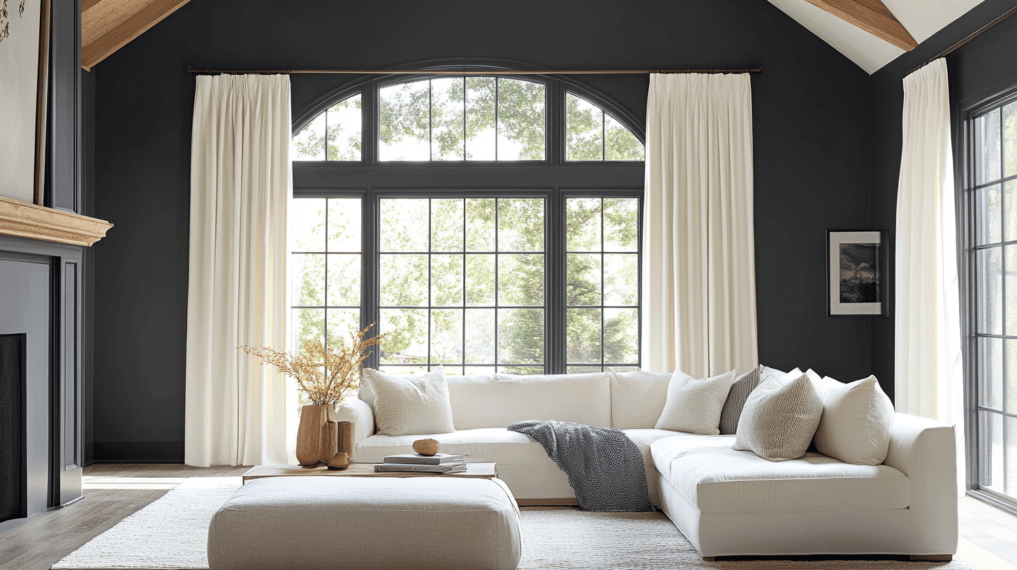
Iron Mountain in Interior Design
Iron Mountain, a refined deep charcoal with subtle blue undertones, brings dramatic grace and timeless appeal to interior spaces while creating a grounded, luxurious atmosphere.
1. Color Pairings
| Color Category | Color Name | Benjamin Moore Code |
|---|---|---|
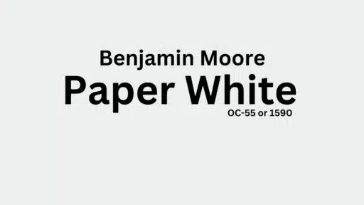
| Soft Whites | White Dove | OC-17 |
| Light Grays | Barren Plain | 2111-60 |
| Crisp Whites | Snowfall White | OC-118 |
| Warm Neutrals | Stardust | 2108-40 |
2. Material Companions
- Brushed brass fixtures
- Polished marble surfaces
- Velvet upholstery
- Reclaimed wood elements
- Natural linen textiles
- Handcrafted ceramic pieces
- Woven wool rugs
3. Ideal Application Areas
- Kitchen islands
- Feature walls in dining rooms
- Built-in bookshelves
- Home office cabinetry
- Powder room walls
- Exterior accents
- Interior doors
4. Today’s Home Design
Iron Mountain aligns with contemporary design trends by:
- Creating contrast in minimalist spaces
- Adding sophistication to neutral palettes
- Establishing visual anchors in open floor plans
- Complementing both cool and warm metal finishes
- Providing depth in light-filled rooms
5. Why Does It Work?
- Provides dramatic impact without overwhelming
- Creates intimate, cozy environments
- Serves as a neutral backdrop for artwork
- Hides imperfections in older homes
- Transitions beautifully from day to evening lighting
- Adaptable to various design styles, from industrial to traditional
- Addsconstructive interest to simple spaces
Iron Mountain’s Color Profile By Benjamin Moore
Iron Mountain is a rich, deep charcoal with refined blue undertones that creates dramatic impact while maintaining versatile grace in any space.
This timeless neutral adds depth and character to interiors while pairing beautifully with various textures and accent colors.
1. Color Values
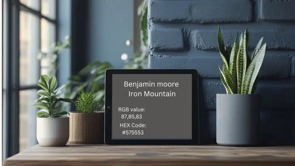
RGB Value: 87,85,83
- Red: 87
- Green: 85
- Blue: 83
HEX Code: #575553
- Used by web designers and digital artists
- It helps match colors exactly in digital formats
2. What These Numbers Mean
The RGB values show how Iron Mountain gets its unique look:
- A slightly higher blue value (87) creates a cool undertone
- Nearly equal red (85) and green (83) contribute to the neutral charcoal quality
- This balanced composition creates the color’s sophisticated, grounded appearance
3. Digital Uses
- Web design projects
- Digital mood boards
- Online room planners
- Paint color-matching apps
- Interior design software
- Digital paint visualizers
- Virtual home staging
4. Quick Tips
- Save these codes for exact color-matching
- Use in digital planning tools
- Share with designers for perfect matches
- Help coordinate other decor items
- Match fabric and furniture colors online
- Test in different lighting conditions via digital visualizers
- Create custom color palettes with complementary tones
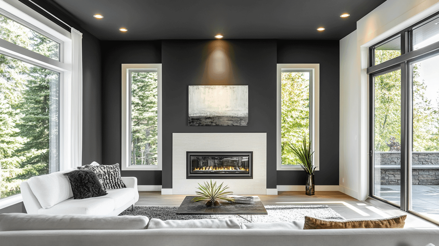
Characteristics and Color Profile
Iron Mountain is a dark charcoal color with hints of blue that adds drama and enlightenment to any room.
It absorbs most light instead of reflecting it, changing its appearance throughout the day from slightly blue in sunlight to rich and deep in the evening light.
1. Light Reflectance Value (LRV)
- LRV: 10.96
- Low brightness level
- Significantly dark value
- Creates depth and richness in spaces
- Absorbs rather than reflects most light
- Best balanced with lighter elements in the room
2. Undertones
- Deep charcoal base
- Subtle blue undertones
- Slight graphite notes
Similar Benjamin Moore Colors
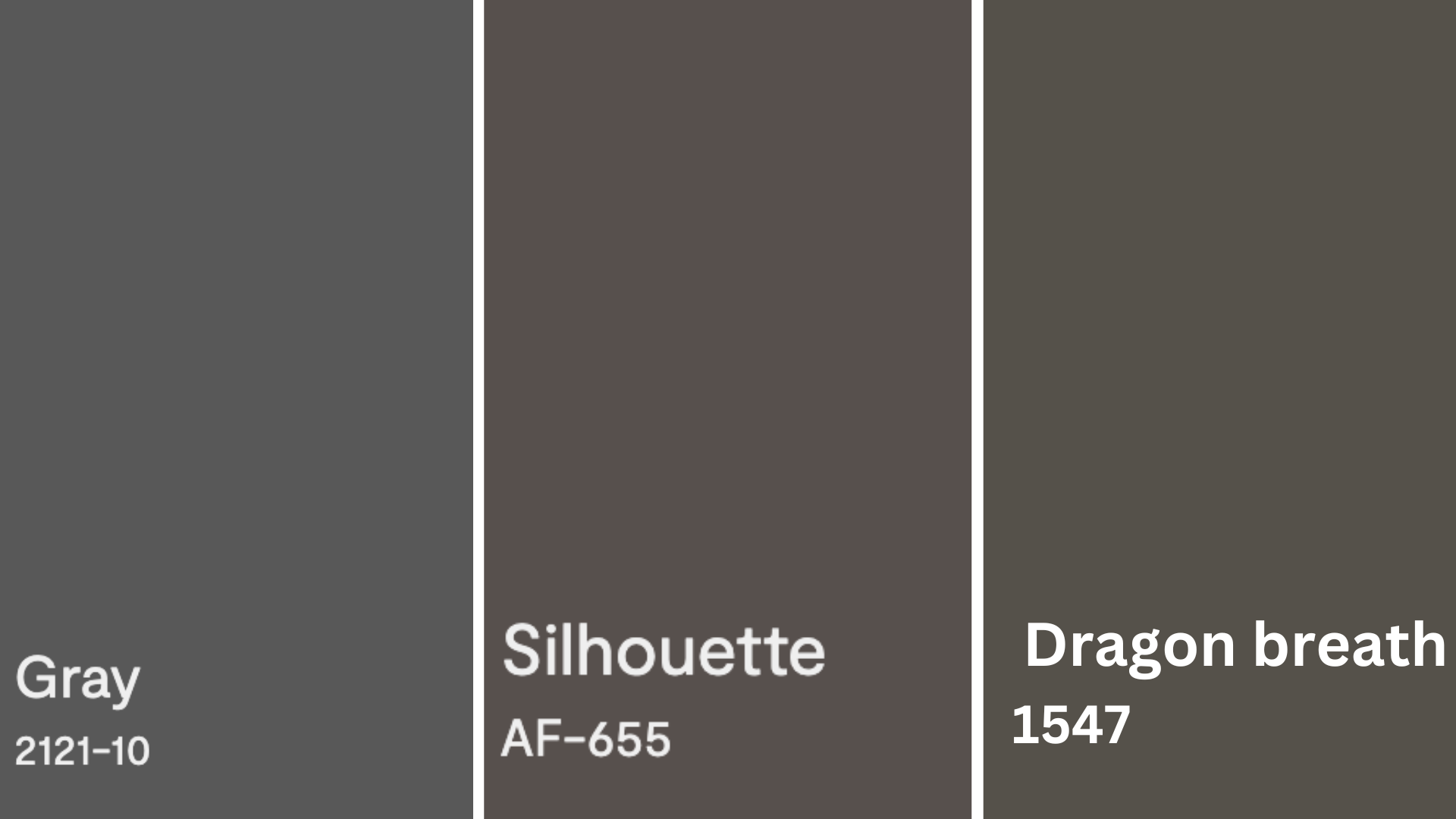
Gray (2121-10)
Benjamin Moore’s Gray is a deep, sophisticated charcoal with neutral undertones that creates dramatic contrast in any space. Despite its name, this color has remarkable depth and richness that makes it perfect for accent walls or creating focal points in a room.
Silhouette (AF-655)
The Silhouette is a versatile mid-tone gray with subtle purple undertones that shift beautifully throughout the day, depending on lighting conditions. This graceful neutral creates a sense of calm enlightenment while being dark enough to make a statement but light enough to use throughout a space.
Dragon’s Breath (1547)
Dragon’s Breath is a complex, smoky brown-gray with warm red undertones that adds richness and character to any interior. This mysterious, deep neutral creates an intimate atmosphere while harmonizing beautifully with cool and warm accent colors.
Using Iron Mountain (2134-30) for Your Home
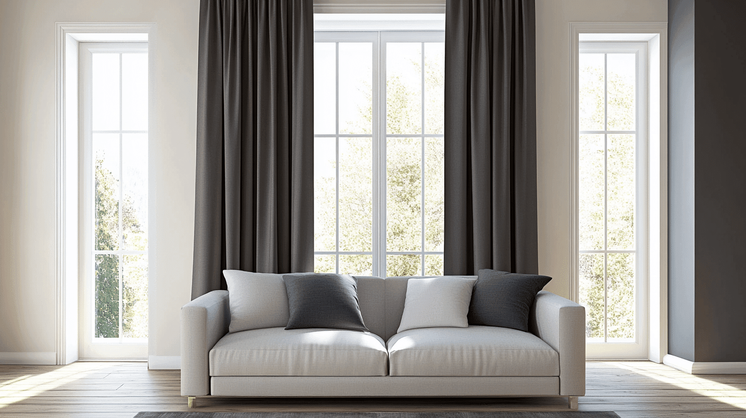
A Living Room
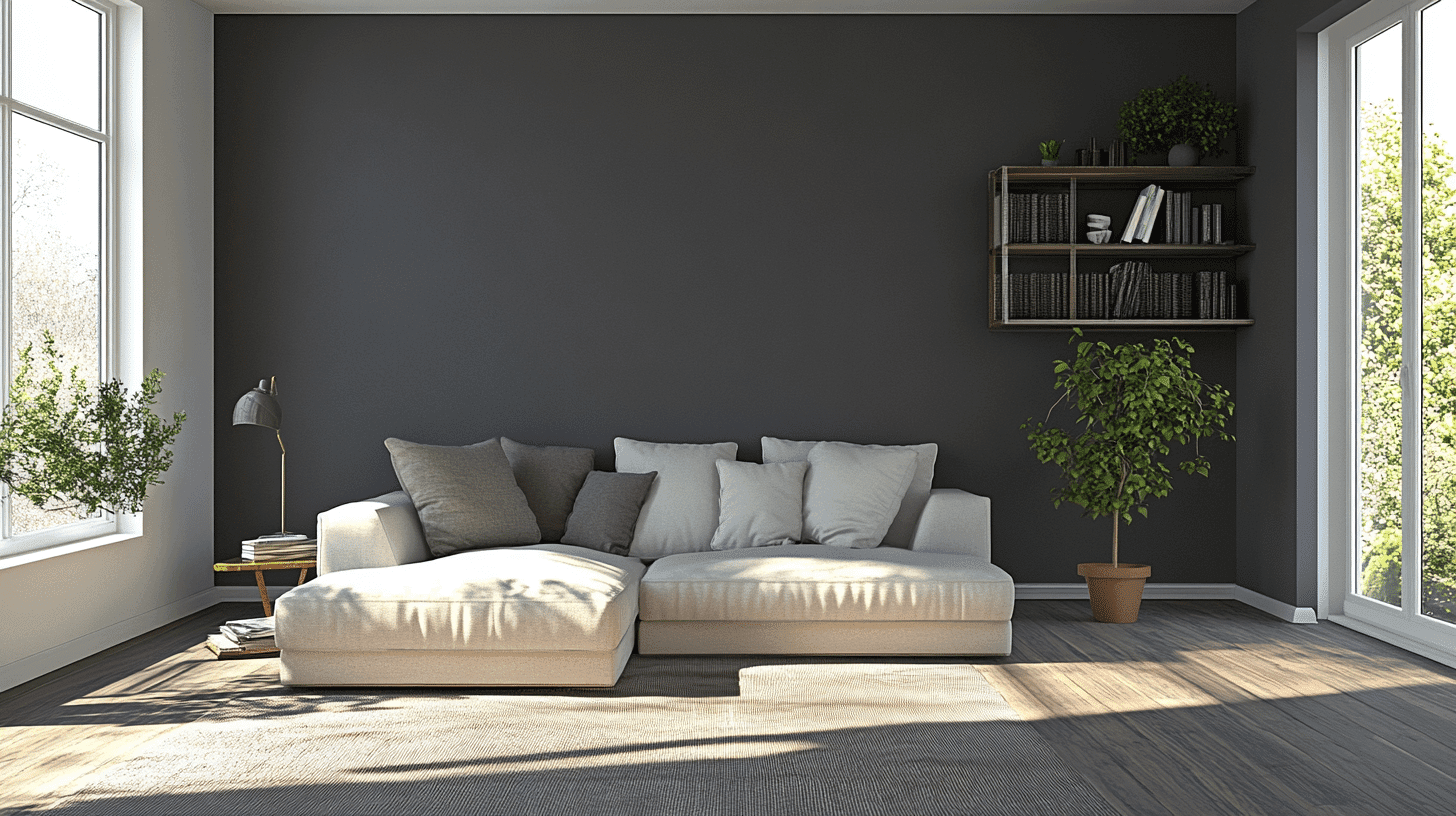
- Creates a dramatic backdrop for artwork and collectibles
- Adds refined depth to larger spaces
- Grounds open floor plans with visual weight
- It pairs beautifully with natural light and warm lighting
The Bedroom
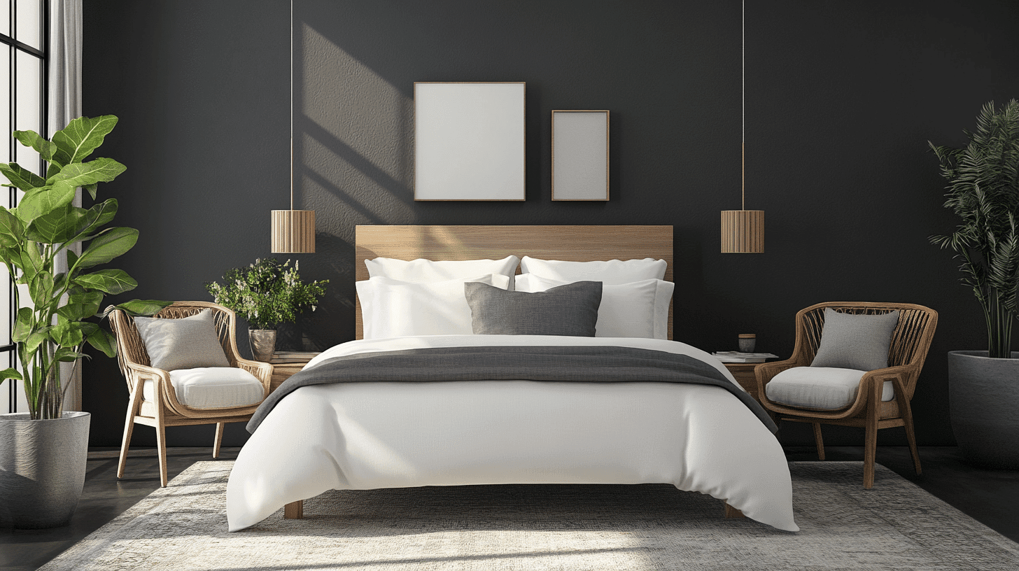
- Establishes a cozy, cocoon-like retreat
- Enhances relaxation and sleep quality
- Creates lavish contrast with light bedding
- Converts ordinary spaces into luxurious sanctuaries
A Home Office
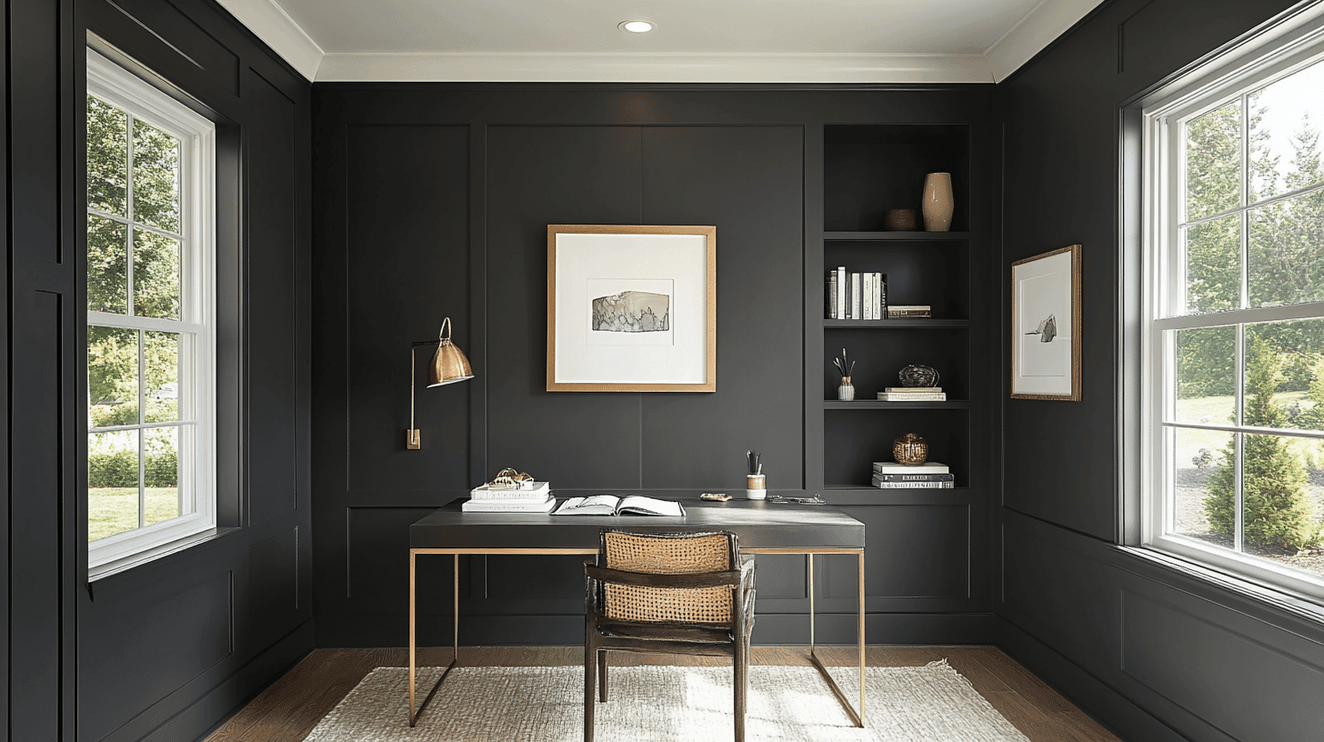
- Improves focus and concentration
- Creates a cultured professional backdrop for video calls
- Reduces eye strain compared to brighter colors
- Pairs well with wood furniture and brass accents
Practical Tips for Painting with Iron Mountain
1. Preparing Your Space
Iron Mountain requires thorough preparation to achieve its rich depth. Start by cleaning walls with a degreaser to remove oils and dirt.
Repair imperfections with spackle and sand smooth. Apply a dark gray primer to ensure color accuracy and reduce the needed topcoats.
Test the color in different lighting conditions, as this deep charcoal can appear more blue in natural light and richer in artificial lighting.
2. Application Techniques
For best results with Iron Mountain, invest in premium painting tools—a high-quality microfiber roller with a 3/8-inch nap for smooth walls and an angled synthetic brush for precise cutting-in.
Apply the box method rather than the W-pattern to avoid streaking with this dark color. Work in small sections and maintain a wet edge.
Two thin coats will provide better coverage and finish than one thick application.
3. Maintenance and Durability
Iron Mountain’s deep tone provides excellent durability and hides minor imperfections well. To preserve the finish, clean with gentle soap and water and a soft cloth.
Consider a washable formula for high-traffic areas. Though generally fade-resistant, it protects from direct sunlight in south-facing rooms.
Touch up scuffs immediately with leftover paint stored in an airtight container. With proper care, expect 7-10 years of beautiful wear.
4. Accent Considerations
Iron Mountain creates dramatic impact, so balance with lighter elements to prevent spaces from feeling too dark.
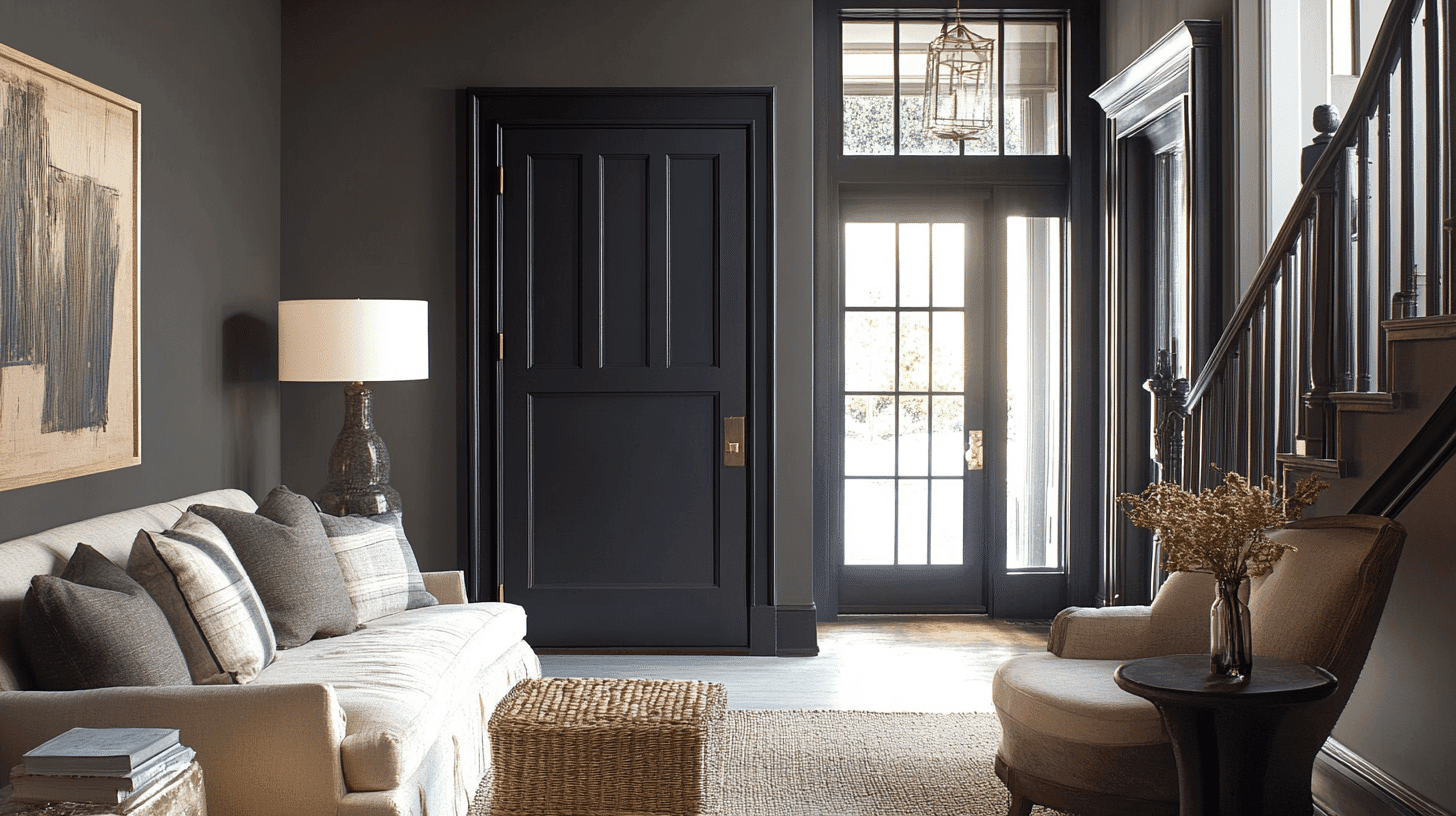
Pair with crisp white trim for a striking contrast. Consider using it as an accent wall in smaller spaces or north-facing rooms with limited natural light.
Complement with warm metals like brass or gold for refined classiness. Enhance with strategic lighting to highlight the color’s rich complexity.
Color Combinations and Inspiration
Iron Mountain creates dramatic and refined spaces that feel both cozy and lavish. This deep charcoal works in many different rooms and with many design styles.
Room Inspirations with Iron Mountain
Iron Mountain delivers dramatic impact in various settings throughout the home. In contemporary living rooms, it creates a refined backdrop when paired with light gray upholstery and blonde wood furniture.
Many designers have adopted it for dining rooms, where its depth enhances intimacy while establishing a luxurious atmosphere for gatherings.
The 2025 design trends emphasize bold contrasts and statement neutrals, positioning Iron Mountain as perfectly on-trend.
It pairs beautifully with this year’s popular sage greens and warm ivory accents. In-home offices, interior experts combine it with walnut desks and brass lighting for a distinguished, focused workspace.
The color changes primary bedrooms into luxurious retreats when matched with crisp white linens and touches of muted gold.
Color Pairing Suggestions for Iron Mountain
Iron Mountain’s deep charcoal-gray tones with subtle earthy undertones make it a refined choice for various color combinations:
For a Classic Look, Pair It With:

- Crisp white trim (Benjamin Moore Chantilly Lace) for sharp contrast
- Soft sage green (Sherwin Williams Evergreen Fog) for an organic balance
- Warm taupe (Benjamin Moore Pale Oak) for graceful transitions
- Burnished brass or copper accents for warmth and dimension
As an Accent Wall, Iron Mountain Creates Impact Against:
- Light gray walls for a refined tonal gradient
- Warm ivory surroundings for a balanced contrast that isn’t harsh
- Deep blue companion walls for a moody, dramatic beauty.
- Creamy white for a timeless, constructive statement
Iron Mountain’s versatility allows it to excel in contemporary and traditional settings. Its depth makes it perfect for creating focal points in minimalist spaces.
At the same time, its earthy undertones help it complement natural materials like wood, stone, and leather, making it ideal for transitional or industrial-inspired interiors.
Decor Tips with Benjamin Moore Iron Mountain
- Use Iron Mountain on a focal wall behind your bed for a dramatic, cozy primary bedroom.
- Paint built-in bookshelves with Iron Mountain to make colorful book spines and decorative objects pop.
- Apply to kitchen island cabinetry paired with white perimeter cabinets for a grounded, designer look.
- Create striking contrast by painting the interior doors of Iron Mountain against light walls.
- Use on exterior shutters, front doors, or garage doors for refined curb appeal.
- Paint a fireplace surround or built-in entertainment center to create an anchoring focal point.
- Apply to lower cabinets with light uppers for a balanced, modern kitchen.
- Use as ceiling color in a dining room with a crystal chandelier for unexpected drama.
- Paint stair risers or stair railings for constructive interest in transitional spaces.
- Try on a bathroom vanity with brass hardware and marble countertops for a luxe contrast.
Summing It Up
Benjamin Moore Iron Mountain (2134-30) is a true winner for home design. This deep charcoal gray works in many places – from accent walls to furniture. It plays well with whites, woods, and metals, making your home look put together without trying too hard.
What makes Iron Mountain special is how it changes with light. In bright rooms, it looks rich and warm. In darker spaces, it feels cozy and classy.
Whether you’re painting a whole room or just a door, this color adds character without being flashy. Unlike trendy colors that quickly look dated, it stays in style year after year.
For anyone wanting a bold and practical color, Iron Mountain delivers. It’s the perfect mix of modern and timeless—a color that makes your home feel like home.
Not just a paint color, but your home’s best-kept secret weapon!

Alex Guerrero, a graduate with a Fine Arts degree from the Rhode Island School of Design, has been a visionary in the world of color and design for over 15 years. His professional journey began in the heart of the fashion industry in Milan, where he developed an acute sense for color harmonies and trends. Alex joined our team in 2018, offering fresh and innovative perspectives on color utilization in various spaces. Renowned for his ability to blend contemporary trends with timeless elegance. Outside of work, Alex is an accomplished painter and a volunteer art therapist, his artistic talents further enriching his professional insights.