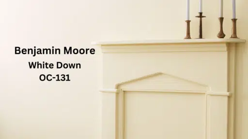

When I first encountered Benjamin Moore White Down OC-131, I was immediately drawn to its timeless quality.
Created as part of Benjamin Moore’s Historical Collection, this color draws inspiration from America’s colonial and federal period palettes—an era when cream walls provided warmth without the abundance of electricity.
What delights me about White Down is its refined balance. A 76.69 LRV brightens my spaces while offering more depth than stark whites.
Its subtle yellow undertones create an inviting atmosphere throughout changing daylight.
Have you struggled to find a versatile neutral? White Down has changed my home by blending with contemporary and traditional elements. Whether paired with cool marble or warm wood, it adapts beautifully.
What spaces are you looking to modify? Let me share how this historical-inspired cream has upgraded my home to refined comfort.
Understanding Paint Color Basics
Color Terminology
| Property | Value |
|---|---|
| LRV (Light Reflectance Value) | 76.69 |
| Color Category | Considered a light color (LRV > 70) |
| Comparison | Pure white: ~90 LRV, Black: ~0 LRV |
| RGB Value | Red: 235 Green: 230 Blue: 215 |
| Hex Code | #EBE6D7 |
Undertones:
- White Down has subtle greige (gray-beige) undertones
- It’s a warm off-white with very soft taupe undertones
- Not a stark or pure white, but a urbane neutral
Psychology of Off-White/Neutral Colors
- Off-whites like White Down Create a sense of spaciousness and calm
- Greige tones: Offer refinement and versatility
- Warm neutrals: Evoke comfort, subtle refinement, and timelessness
- Benefits: Less stark than pure white, reduces eye strain, and creates a soft backdrop for other design elements
Why Choose this color?
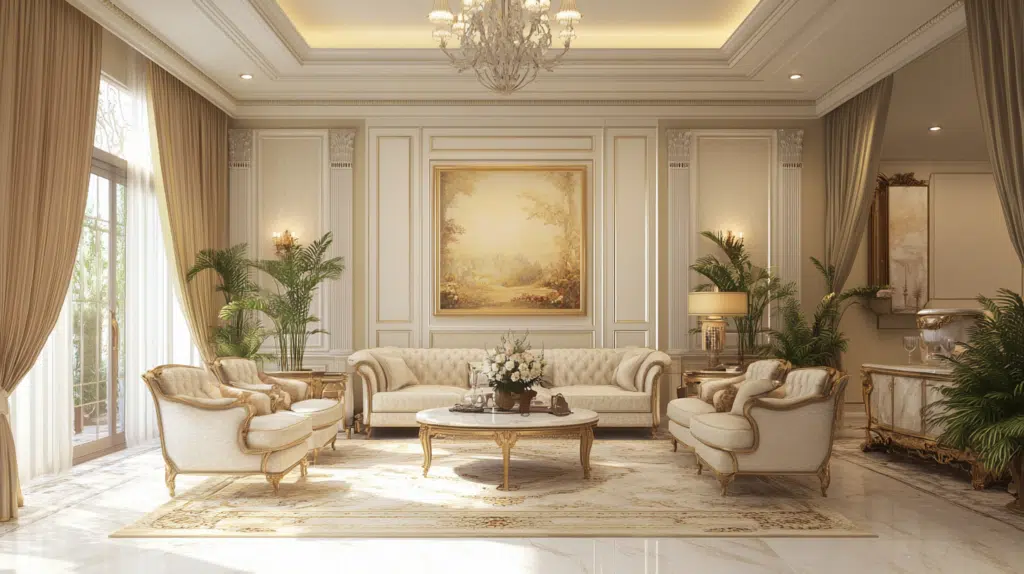
Benjamin Moore White Down’s versatility shines in varying lighting conditions. It maintains its refined warmth in north-facing rooms while avoiding washout in sun-drenched spaces. Its timeless cream quality provides a refined neutral backdrop that complements traditional and contemporary design elements without overwhelming the space.
Key features
Benjamin Moore White Down offers exceptional adaptability with fixed elements like countertops and flooring, creating cohesive transitions between spaces. It provides enough warmth to feel welcoming while maintaining a refined, timeless quality that won’t quickly date your interior design choices.
Durability
Benjamin Moore White Down, particularly in premium finishes like Aura or Regal Select, offers outstanding durability with excellent scuff resistance in high-traffic areas. Its subtle depth and warm undertones help conceal minor marks and imperfections better than stark whites while maintaining its refined appearance. This paint resists fading and maintains color consistency even with regular cleaning when properly applied.
Texture patterns
Benjamin Moore White Down creates a subtle, velvety texture that adds dimension to walls without overwhelming the space. Its cream undertones produce gentle shadow play that softens harsh lighting and adds visual interest to textured surfaces. When applied to different finishes, it can enhance structural details while maintaining a consistent, worldly-wise appearance throughout connected rooms.
Why it works
Benjamin Moore’s White Down works because it perfectly balances warmth and neutrality, providing enough color to feel inviting without overwhelming a space. Its yellow undertones complement warm wood elements and cool stone features, while its high LRV (76.69) ensures rooms feel bright yet grounded. This versatile cream adapts beautifully to changing light conditions, maintaining its refined character throughout the day.
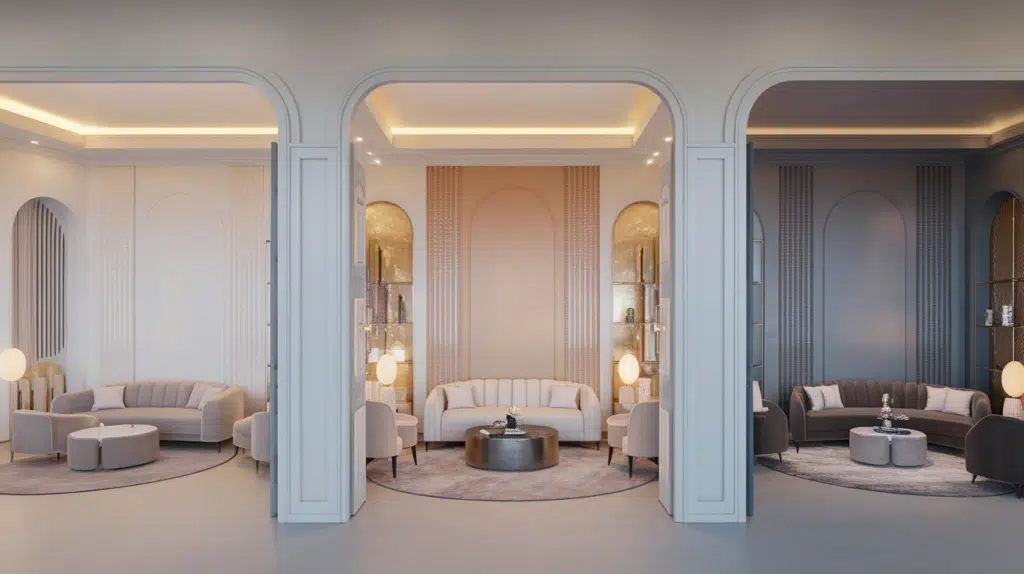
Room-by-Room Color Recommendations with White Down
Living Spaces and Open Floor Plans
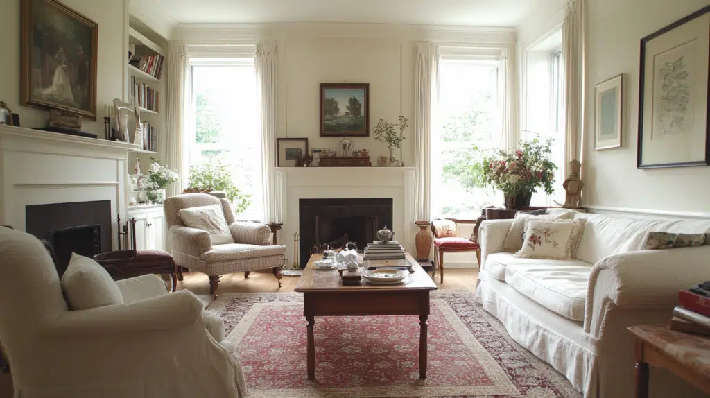
- White Down (OC-131) works exceptionally well in open floor plans due to its versatile greige undertones that create a cohesive flow between connected spaces.
- The 76.69 LRV of White Down provides enough light reflection to make spaces feel open while offering a warmth that pure whites lack.
- For dimension, pair White Down walls with slightly darker trim in complementary neutrals like Revere Pewter HC-172 or lighter trim in White Dove OC-17.
Bedrooms and Relaxation Areas
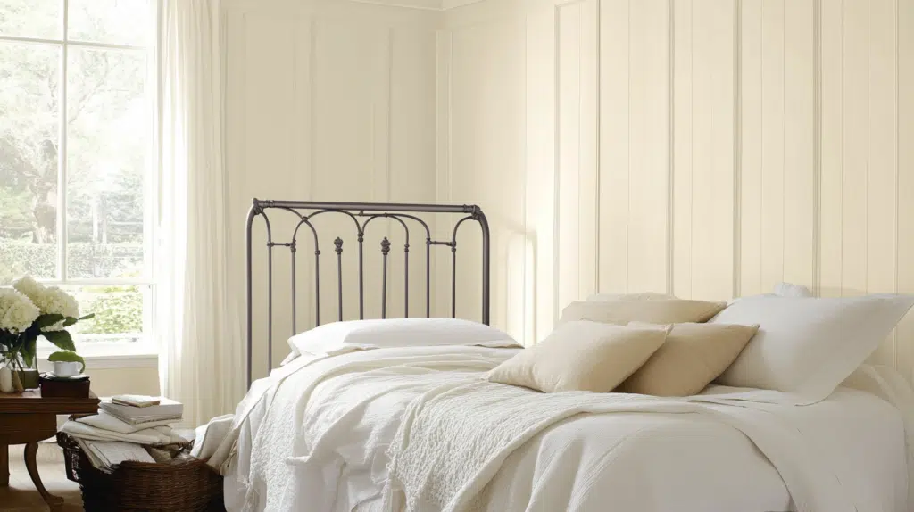
- White Down creates a soft, enveloping atmosphere in bedrooms without feeling too stark or clinical.
- The warm undertones in White Down promote relaxation while maintaining enough brightness to keep the space open and airy.
- Consider White Down for bedroom ceilings to soften overhead light and create a more restful environment than a pure white ceiling.s
Kitchens and High-Traffic Zones
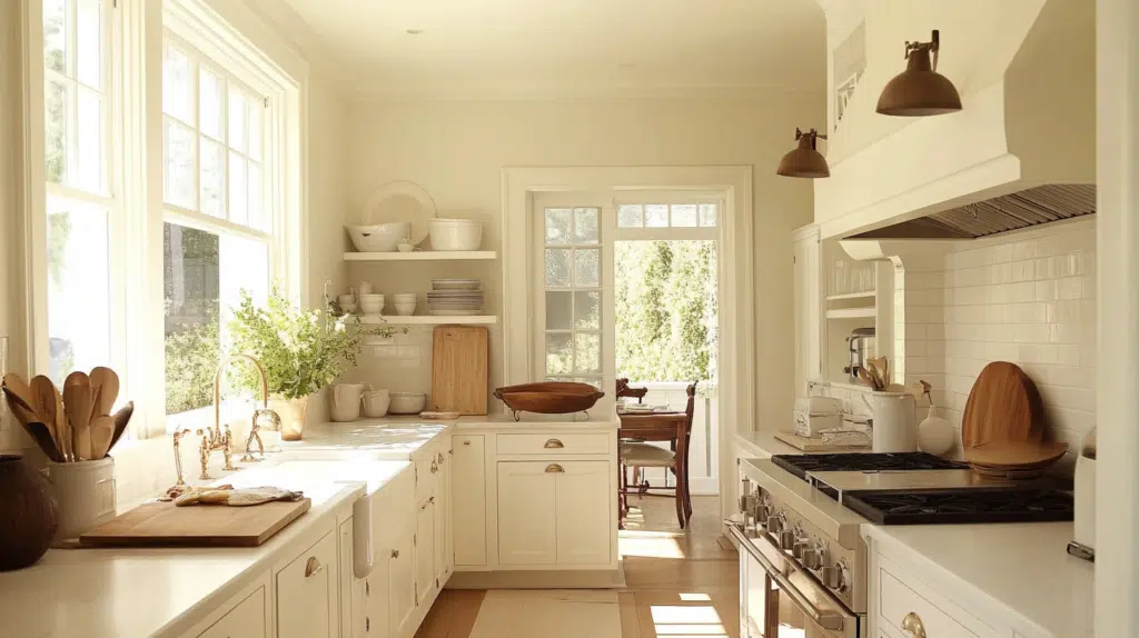
- White Down in eggshell or satin finish offers practicality in high-traffic areas while its subtle depth masks minor scuffs better than brighter whites.
- The neutral warmth of White Down complements both cool stone countertops and warm wood cabinetry without leaning too yellow.
- White Down works beautifully with stainless steel appliances and various cabinet colors, making it adaptable to kitchen updates and changes.
Bathrooms and spa-like retreats
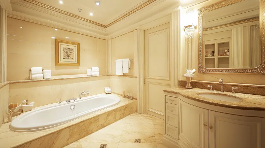
Benjamin Moore White Down creates a serene, spa-like atmosphere in bathrooms. Its warm cream undertones soften the clinical feel of fixtures while brightening small spaces. This versatile shade pairs beautifully with cool marble and warm natural elements, creating a timeless, refreshing retreat.
Color Pairings and Combinations for White Down (OC-131)
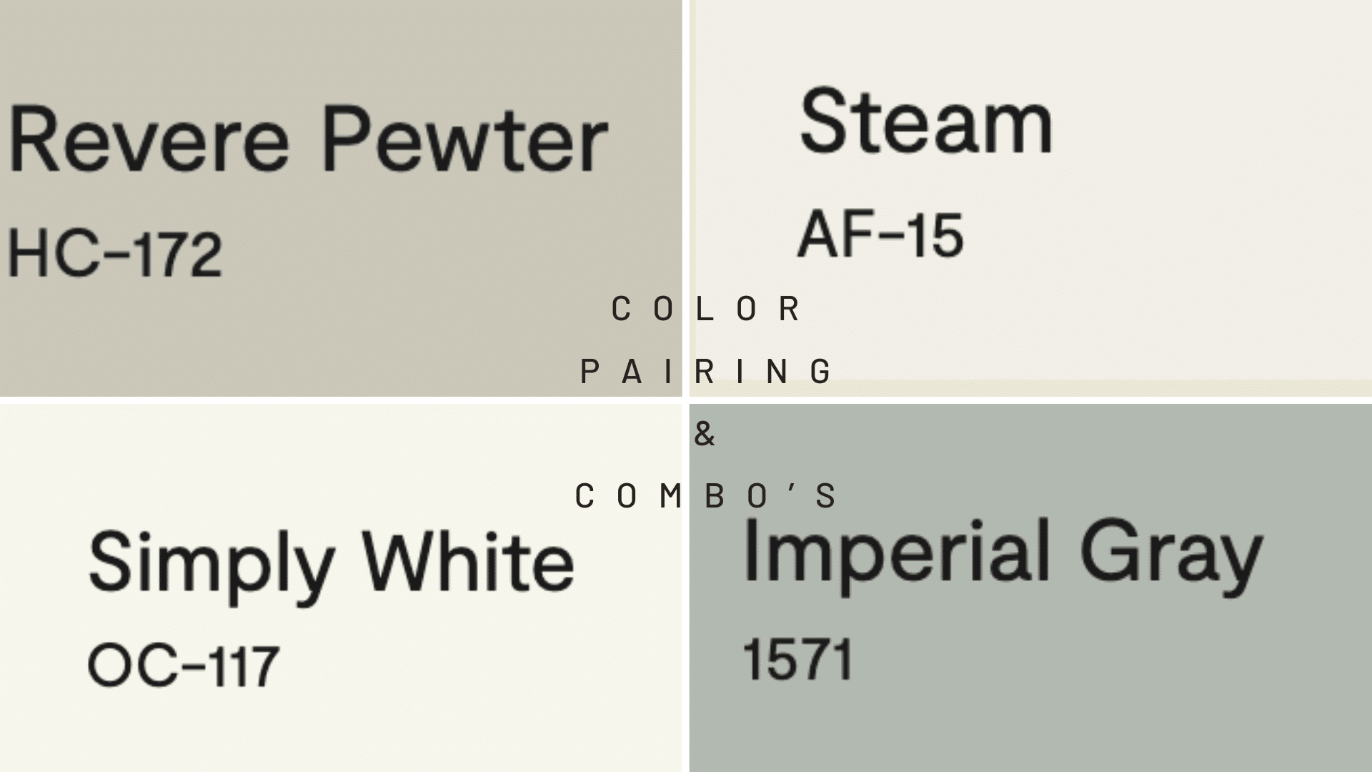
White Down is a beautiful off-white with subtle warm undertones. Its high Light Reflectance Value (LRV) of 76.69 makes it a versatile neutral that can brighten spaces while providing more warmth than a stark white. Let me help you with color pairings and combinations for this shade.
Complementary Trim Colors
- Simply White (OC-117) – A slightly brighter white that creates a subtle, refined contrast
- Revere Pewter(HC-172)– A soft white with warm undertones that pair seamlessly
- Steam(AF-15) – A classic soft white for a harmonious look
- Imperial Grey(1571)– A crisp white that provides more definition
Creating Cohesive Color Schemes
Monochromatic Scheme:
- White Down for main walls
- Simply White for trim
- Steam (AF-15) for ceilings
- Revere Pewter (HC-172) for accent pieces or adjoining rooms
Warm Color Scheme:
- White Down for main living areas
- Pashmina (AF-100) for dining room
- Alexandria Beige (HC-77) for hallways
- Soft Chamois (OC-13) for bedrooms
Cool Color Scheme:
- White Down for main walls
- Wickham Gray (HC-171) for bathrooms
- Gray Owl (OC-52) for bedrooms
- Imperial Gray (1571) for home office
Coordinating with Furniture and Decor
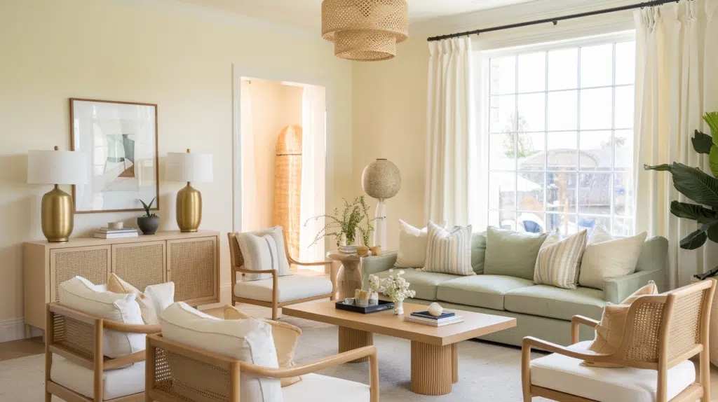
Wood Tones
White Down works beautifully with medium to light wood tones like oak, maple, and birch. White-washed or pickled woods create a serene, coastal feel when paired with this versatile cream. For a more dramatic look, walnut provides rich contrast while maintaining a warm atmosphere.
Metals
Brushed nickel, chrome, and brass hardware complement White Down’s warm undertones. Antique bronze fixtures add depth and character against the soft cream backdrop. The neutral base allows for successfully mixing metallic finishes throughout a space.
Decor
Natural elements like jute, rattan, and houseplants enhance White Down’s warmth and create an inviting atmosphere. Ceramic pieces in earth tones complement the cream backdrop while adding subtle dimension. Woven baskets, organic shapes, and light-filtering linen window treatments complete the refined yet comfortable aesthetic.
Similar Paint Colors: Perfect Alternative to White Down (OC-131)
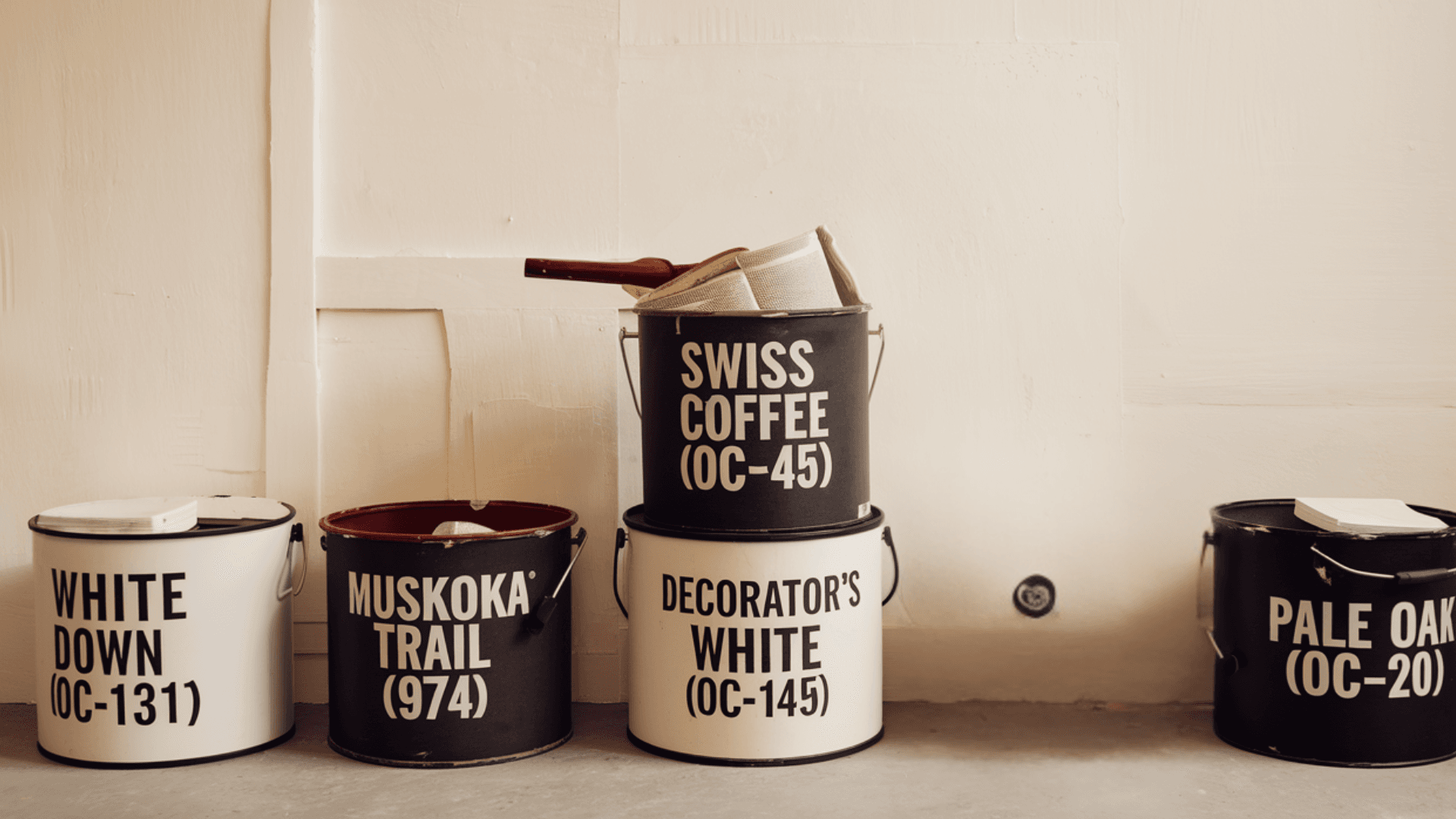
White Down (OC-131) vs. Muskoka Trail 974
White Down (OC-131)
- Warm off-white with subtle yellow/beige undertones
- A high LRV of 76.69 gives an excellent light reflection
- Creates a soft, welcoming atmosphere without feeling stark
Muskoka Trail 974
- It is slightly deeper than White Down with more pronounced beige undertones.
- Lower LRV creates a touch more depth while maintaining a light appearance
- Warmer feeling that can create a cozier ambiance in north-facing rooms
Final Thoughts
I’ve found White Down (OC-131) a versatile foundation for countless design possibilities in my home. This refined off-white offers the perfect balance—bright enough to maximize light in every room yet warm enough to create inviting atmospheres that stark whites cannot achieve.
Suppose you pair it with complementary trim colors, design cohesive whole-home color schemes, create strategic accent walls, or coordinate with my existing furniture. In that case, White Down adapts beautifully to my vision. Its subtle warm undertones work harmoniously with various design elements while maintaining consistent performance throughout changing daylight conditions.
I’ve learned that finding my perfect paint color means observing how it behaves specifically in my space with my unique lighting and furnishings. With White Down as my canvas, I’ve created timeless, personal spaces that feel just right.
Not all whites are created equal—but White Down has upgraded my home to a new level of refined comfort.

Alex Guerrero, a graduate with a Fine Arts degree from the Rhode Island School of Design, has been a visionary in the world of color and design for over 15 years. His professional journey began in the heart of the fashion industry in Milan, where he developed an acute sense for color harmonies and trends. Alex joined our team in 2018, offering fresh and innovative perspectives on color utilization in various spaces. Renowned for his ability to blend contemporary trends with timeless elegance. Outside of work, Alex is an accomplished painter and a volunteer art therapist, his artistic talents further enriching his professional insights.