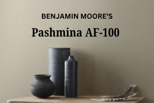

Like the soft hug of luxurious cashmere, Benjamin Moore’s Pashmina AF-100 wraps your space in refined comfort.
This refined greige transcends ordinary neutrals, carrying subtle green undertones that bring depth and character to your walls.
Pashmina creates a sanctuary of balance—a grounded, inviting atmosphere that adapts beautifully to changing light throughout the day.
Its remarkable versatility allows it to shift between warm and cool, creating spaces that feel simultaneously refined and welcoming without ever losing its stylish, adaptable character.
It’s the perfect backdrop for both modern farmhouse designs and sleek contemporary spaces seeking depth without heaviness.
Understanding Benjamin Moore’s Pashmina
Color Terminology
| PROPERTY | VALUE |
|---|---|
| LRV (Light Reflectance Value) | 44.2 |
| Color Category | Considered a medium-depth neutral (LRV between 40-50) |
| Comparison | Pure white: ~90 LRV, Black: ~0 LRV |
| RGB Value | Red: 188, Green: 179, Blue: 162 |
| Hex Code | #BCB3A2 |
Undertones
- Pashmina has a complex blend of gray, beige, and subtle green undertones
- It’s a balanced neutral with remarkable versatility between warm and cool influences
- Not a flat or one-dimensional color, but a refined, complex neutral with noticeable depth
Psychology of Balanced Neutral Colors
Balanced neutrals like Pashmina create a sense of stability and timeless elegance.
- Chameleon-like qualities: Offers adaptability across different lighting conditions
- Balanced neutrals: Evoke sophistication, harmony, and refined comfort
- Benefits: More interesting than plain beige or gray, adds substantial presence to spaces, creates a versatile backdrop for both colorful furniture and natural elements
Pashmina provides the perfect balance for those seeking a significant neutral that isn’t too overwhelming or underwhelming.
Its complex undertones make it particularly versatile in spaces with varied exposure, where it helps maintain depth while contributing a sense of refined balance.
Why Choose this Color?
The perfect equilibrium of Pashmina evokes a sense of refined comfort and refinement that promotes harmony in any environment.
This enduring color carries complex undertones that shift subtly with changing light, ensuring your space feels both current and timelessly stylish.
Key Features
Benjamin Moore Pashmina offers exceptional versatility across different lighting conditions. It maintains its subtle green undertones in north-facing spaces while creating a warm, welcoming atmosphere in rooms with southern or western exposure.
Its timeless neutral quality provides a refined backdrop that complements both colorful elements and natural textures without appearing either too warm or too cool.
Adaptability
Benjamin Moore Pashmina demonstrates remarkable adaptability with existing elements like white trim and natural wood fixtures, creating harmonious blends between spaces.
It provides enough depth to feel substantial and grounding while maintaining a refined, enduring quality that won’t quickly date your interior design choices.
This versatile neutral works equally well as an all-over color for creating cohesive, atmospheric environments or as a complementary element to more saturated accent walls.
Durability
Benjamin Moore Pashmina, particularly in premium finishes like Aura or Regal Select, delivers outstanding durability with excellent coverage in both new and repainted areas.
Its balanced tone and subtle undertones maintain a refined appearance throughout your home while providing a forgiving surface for everyday living.
This paint resists staining and maintains color consistency even with regular cleaning when properly applied.
Texture Patterns
Benjamin Moore Pashmina creates a soft, velvety texture that adds subtle dimension to walls and constructive features.
Its complex undertones produce a stunning light play that enhances moldings and adds visual interest to even simple walls.
When applied to different finishes, it can stylishly highlight constructive details while maintaining a consistent, refined appearance throughout connected spaces.
Room-by-Room Color Recommendations with Pashmina
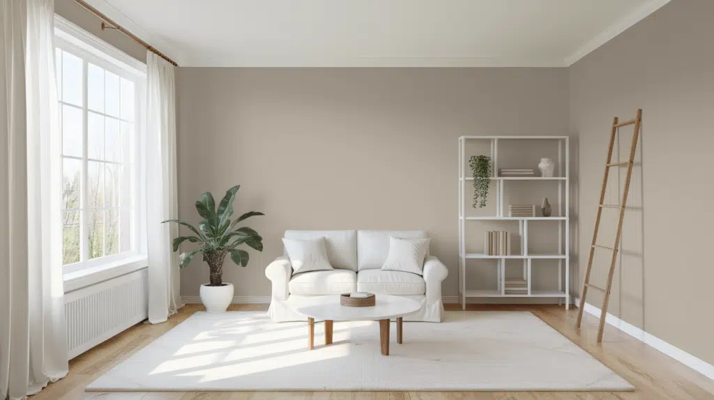
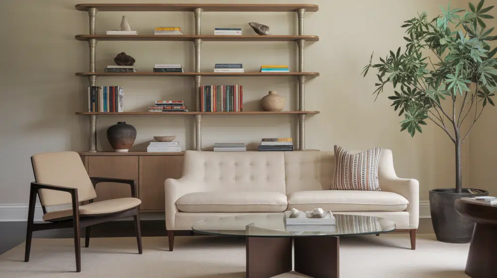
Living Spaces and Open Floor Plans
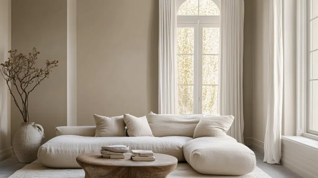
- Pashmina works exceptionally well as an all-over color in open floor plans, creating a cohesive space while maintaining a refined, timeless palette.
- The 44.2 LRV of Pashmina provides a substantial, grounding feel that makes spaces appear more refined without feeling heavy.
- Use Pashmina to unify different areas in larger spaces while allowing colorful furnishings and artwork to stand out against its tranquil backdrop.
Bedrooms and Relaxation Areas
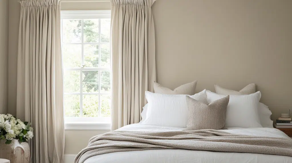
- Pashmina creates a soothing, stylish atmosphere in bedrooms that promotes relaxation.
- The subtle green undertones in Pashmina evoke a sense of nature while creating a refined backdrop for colorful bedding and furniture of any style.
- Consider Pashmina for all walls to create a serene sanctuary that feels both spacious and intimate without sacrificing depth.
Kitchens
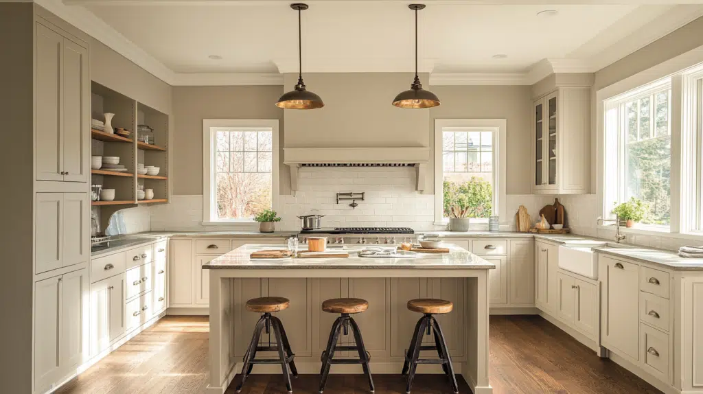
- Pashmina in satin or semi-gloss finish on cabinets creates a refined, timeless element that pairs beautifully with white islands or accent pieces.
- The balanced depth of Pashmina enhances both light countertop materials and mixed metal fixtures, making it adaptable to various kitchen styles, from traditional to contemporary.
- Pashmina walls paired with white cabinets create appealing harmony that adds warmth to the kitchen while maintaining a refined, cohesive feel.
Bathrooms and Spa-like Retreats
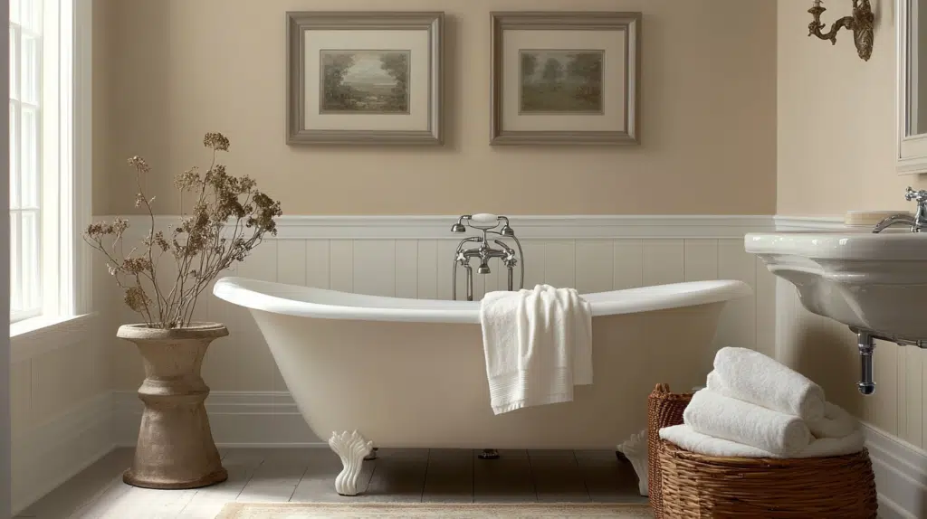
- Benjamin Moore Pashmina creates a balanced, refined atmosphere in bathrooms. Its subtle undertones establish a sense of calm while complementing various fixtures.
- This versatile shade pairs beautifully with both warm and cool metals, marble, and natural wood, creating a timeless, refined retreat that feels both stylish and inviting.
- Use Pashmina on all walls in smaller bathrooms to create a sense of refinement without sacrificing openness.
Pashmina Color Combinations
Pashmina is a balanced, refined neutral with subtle green undertones. Its medium Light Reflectance Value (LRV) of 44.2 makes it a substantial, grounding foundation that adds refinement and versatility to spaces while maintaining a perfect balance between warm and cool.
Let me help you with color pairings and combinations for this shade.
Complementary Trim Colors
- White Dove (BM OC-17) – A soft white that creates a refined distinction with Pashmina
- Simply White (BM OC-117) – A crisp white that provides a clean contrast to Pashmina’s depth
- Cloud White (BM OC-130) – A versatile soft white that complements Pashmina’s balanced quality
- Swiss Coffee (BM OC-45) – A warm white that harmonizes with Pashmina’s subtle warmth
Coordinating Wall Colors
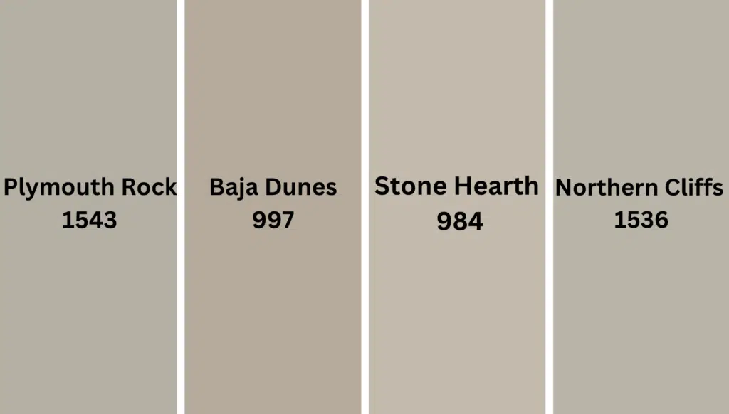
- Stone Hearth (BM 984) – A slightly warmer, deeper tone that creates continuity with Pashmina
- Plymouth Rock (BM 1543) – A cooler neutral that adds depth while complementing Pashmina
- Baja Dunes (BM 997) – A lighter neutral that echoes Pashmina’s balanced qualities
- Northern Cliffs (BM 1536) – A grayer neutral that creates serene harmony with Pashmina
Accent Colors
- Hale Navy (BM HC-154) – A deep navy that creates a dramatic contrast with Pashmina’s neutrality
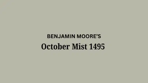
- October Mist (BM 1495) – A muted sage green that enhances Pashmina’s subtle green undertones
- Kingsport Gray (BM HC-86) – A medium-deep gray that grounds Pashmina in a compatible palette
- Caliente (BM AF-290) – A vibrant red that provides a striking contrast to Pashmina’s neutrality
Coordinating with Furniture and Decor
Wood Tones
Pashmina pairs beautifully with a wide range of wood tones, offering different refined effects. Medium oak, walnut, and maple create a harmonious balance against Pashmina’s versatile backdrop.
Light wood tones like ash or birch provide complementary brightness that enhances Pashmina’s depth.
For a more contrasting look, espresso or ebony woods create striking depth that highlights Pashmina’s nuanced quality and creates a refined modern statement.
Natural, unstained wood creates organic, balanced harmony that enhances Pashmina’s subtle complexity.
Metals
Both warm metals (brass, gold) and cool metals (nickel, chrome) enhance Pashmina’s versatile undertones and create a balanced, refined look.
Matte black fixtures create a modern contrast that emphasizes Pashmina’s refined character. While Pashmina works beautifully with all metals, bronze and aged brass accents create a stylish tension between traditional and contemporary elements—opt for brushed or satin finishes for a more refined pairing.
Mixed metal finishes work exceptionally well, as Pashmina’s balanced nature helps unify diverse metallic elements while maintaining cohesion.
Decor
Natural fibers like linen, cotton, and wool in earthy tones create textural interest against Pashmina walls while providing necessary depth.
Colorful accents in navy, sage, or terracotta offer a striking contrast against the balanced backdrop.
Glass, ceramic, and stone elements add weight and prevent Pashmina from feeling too flat in spaces with changing light.
Introducing natural elements with varied textures—like rattan, jute, or wool—reinforces the organic balance inherent in this versatile neutral while adding tactile interest.
Similar Paint Colors: Perfect Alternative to Pashmina
Pashmina vs. Stone Hearth
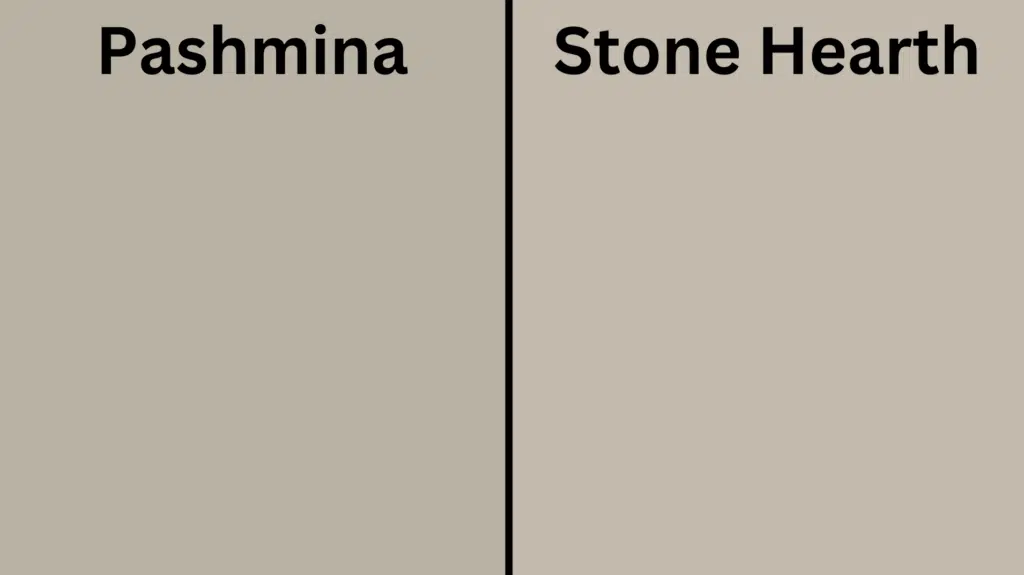
Pashmina (Benjamin Moore AF-100)
- A balanced neutral with subtle green undertones
- Medium LRV (Light Reflectance Value) that creates refined, adaptable spaces
- Works well in transitional, contemporary, or farmhouse interiors
- Best for spaces where you want a versatile, refined neutrality
Stone Hearth (Benjamin Moore 984)
- A versatile neutral with warmer undertones
- Medium LRV (around 41) that creates a balanced, adaptable backdrop
- It contains slightly warmer undertones that create a more welcoming atmosphere
- Popular for creating neutral, inviting environments that work with many design styles
A Few Key Differences
- Pashmina has more subtle green undertones, while Stone Hearth has more pronounced warm undertones.
- Pashmina appears slightly more balanced in most lighting conditions
- Pashmina creates more versatile neutrality, while Stone Hearth is more consistently warm
- They serve similar roles in design – both as refined neutrals with slightly different character and undertones
Final Thoughts
Pashmina surpasses trends, embodying the perfect balance between depth and versatility that makes it a yearly favorite among designers and homeowners seeking refined, refined spaces.
Its remarkable complexity allows it to adapt effortlessly to changing styles and seasonal accents, ensuring longevity in your design choices.
If shifting between warm and cool in changing light or creating a canvas for contrasting elements, Pashmina delivers a timeless quality that both lifts and grounds a space.
In choosing this exceptional shade, you’re not simply selecting a color—you’re embracing a design philosophy that values balance, refinement, and enduring elegance in the spaces we call home.

Alex Guerrero, a graduate with a Fine Arts degree from the Rhode Island School of Design, has been a visionary in the world of color and design for over 15 years. His professional journey began in the heart of the fashion industry in Milan, where he developed an acute sense for color harmonies and trends. Alex joined our team in 2018, offering fresh and innovative perspectives on color utilization in various spaces. Renowned for his ability to blend contemporary trends with timeless elegance. Outside of work, Alex is an accomplished painter and a volunteer art therapist, his artistic talents further enriching his professional insights.