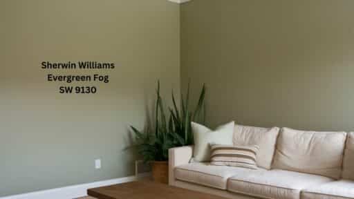
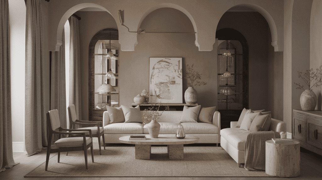
I’ve used Mega Greige SW 7031 throughout my home, and it’s truly the perfect balance of refinement and warmth.
I love how it alters my spaces with its complex personality that shifts throughout the day. Have you noticed how it reveals warm brown undertones in the morning light and then showcases cooler gray sides as evening approaches?
Unlike those trendy neutrals that felt dated so quickly in my previous home, Mega Greige offers timeless versatility that works with both my contemporary furniture and cherished traditional pieces.
Its medium depth creates just the right amount of visual interest without overwhelming my space.
I made a design statement without taking risks. It coordinates effortlessly with my white trim for clean contrast and deeper accents for dramatic depth.
With its balanced undertones, it helped me create a home that feels both grounded and refined. What do you think? Are you ready to see what we can create together?
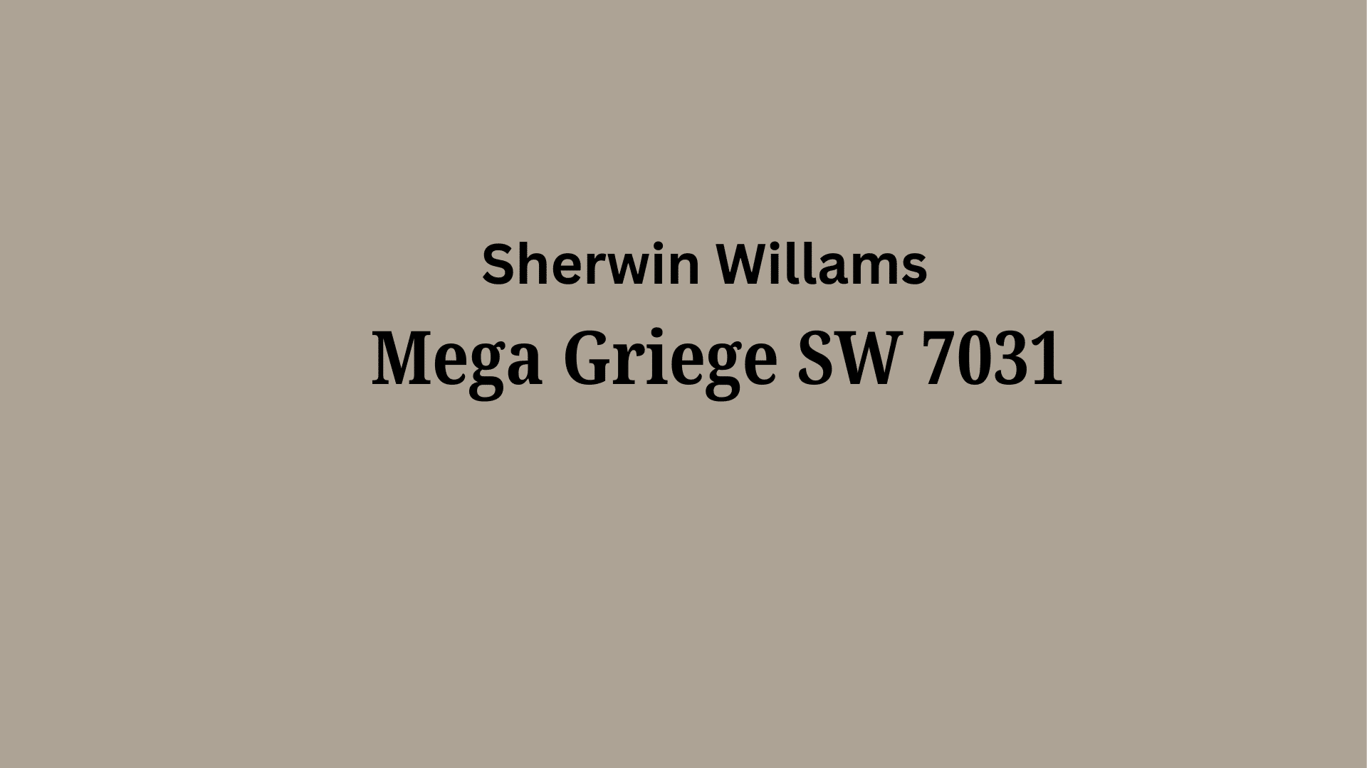
Mega Griege (SW 7031): Understanding Paint Color Basics
Color Terminology
| PROPERTY | VALUE |
|---|---|
| LRV (Light Reflectance Value) | 37 |
| Color Category | Considered a medium-depth neutral color |
| RGB Value | Red: 173, Green: 162, Blue: 149 |
| Hex Code | #ADA295 |
Undertones:
- Mega Greige is a warm, medium-dark neutral with distinct brown and gray undertones
- It has subtle purple undertones that emerge in certain lighting conditions
- While especially warm, it maintains a balanced character that allows it to coordinate with many palettes
- The greige quality creates a cultured, earthy presence that feels inviting rather than stark
- Its complex undertone mixture allows it to shift slightly depending on lighting and neighboring colors
- It’s versatile and pairs well with both cooler grays and warmer earth tones
Psychology of Mega Greige
It creates mental equilibrium and stability by blending warm and cool tones, establishing a balanced foundation that reduces mental dissonance in a space.
Through its complex undertone mixture, it conveys understated refinement, projecting quiet confidence rather than dominance and suggesting maturity and thoughtfulness.
It enhances spatial perception by softening transitions between different design elements, allowing other colors to maintain their identity while creating a flow.
It provides emotional versatility, adapting to both energetic and calming environments, creating a psychological buffer that can feel both welcoming and composed.
It encourages adaptability and flexibility in thinking, as its chameleon-like quality mirrors the subtle nature of complex thought processes.
Why Choose Mega Greige SW 7031?
Versatility
- Mega Greige alters subtly across different lighting conditions, appearing more gray in cool northern light while revealing its warmer brown undertones in warm southern or artificial lighting.
- Its balanced warm-cool profile creates a urbane neutral that transitions between traditional and contemporary design styles.
Key Features
- Mega Greige functions as a unifying transitional color, bridging disparate design elements and creating flow between spaces.
- It provides a timeless, grounded backdrop that feels current without chasing trends, offering longevity that trend-focused neutrals cannot match.
Durability
- Sherwin-Williams Mega Greige in premium finishes like Duration or Emerald offers excellent hide and durability with minimal maintenance needs.
- Its mid-tone depth effectively masks everyday wear and, when applied with quality preparation, maintains its complex character even in busy areas.
Texture Patterns
- Mega Greige enhances textural elements by capturing subtle light variations, adding cultured dimension to walls without overwhelming them.
- Its complex undertone mixture creates nuanced depth that enriches textured surfaces like grasscloth or Venetian plaster, creating layered, inviting environments.
Why It Works
- Mega Greige succeeds by masterfully balancing warmth with neutrality, providing an adaptable color that feels both welcoming and urbane.
- Its medium depth complements both light furnishings and darker structural elements, while its balanced LRV creates spaces that feel both open and intimate.
Room-by-Room Color Recommendations for Mega Greige
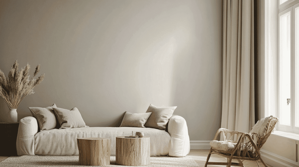
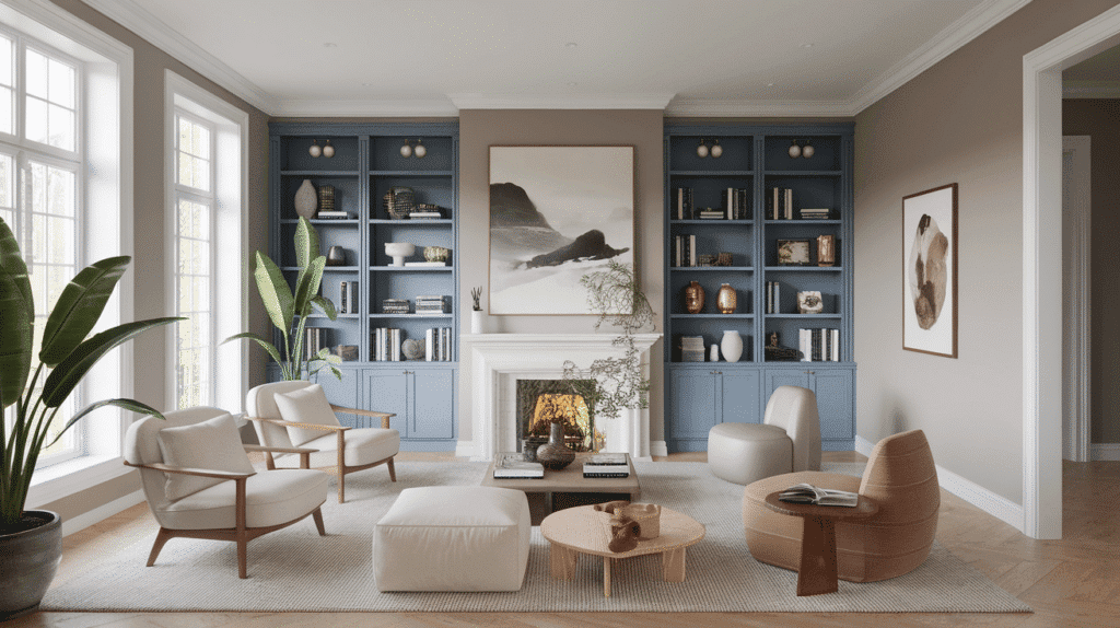
In Living Spaces and Open Floor Plans
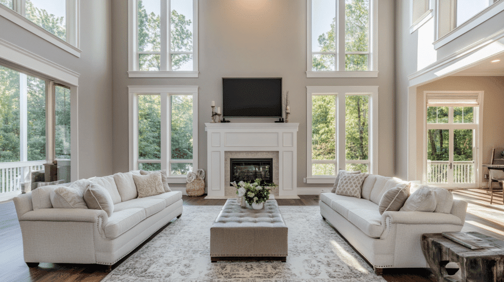
- Mega Greige creates refined cohesion in open floor plans with its balanced depth that maintains consistency across varying light exposures.
- Mega Greige’s mid-tone LRV provides graceful transitions between spaces, softly defining functional zones while maintaining visual flow.
- For refined harmony, pair Mega Greige walls with Pure White SW 7005 trim or create subtle dimension with Agreeable Gray SW 7029 for adjacent areas.
In Bedrooms and Relaxation Areas
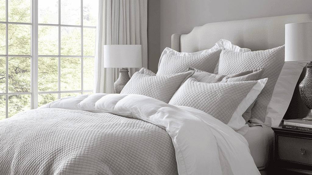
- Mega Greige establishes a nurturing retreat in bedrooms with its comforting warmth that promotes relaxation and gentle tranquility.
- The complex undertones create a layered environment while maintaining enough neutrality to support seasonal textile changes and personal accents.
- Consider Mega Greige for all walls with Accessible Beige SW 7036 on the ceiling to create an enveloping, cohesive space that feels both grounded and uplifting.
In Kitchen
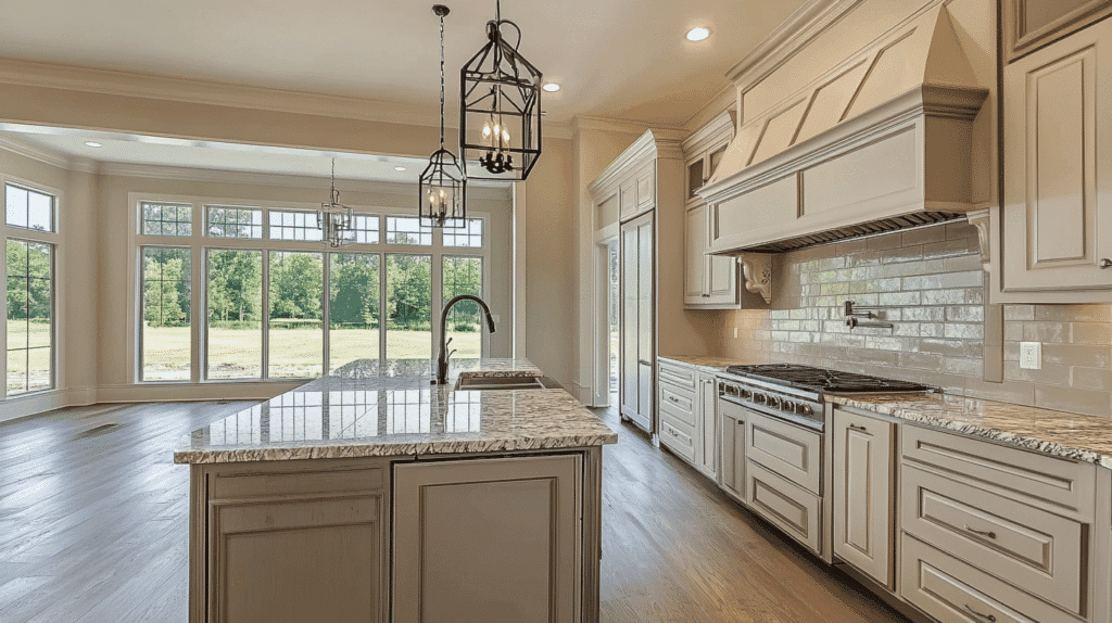
- Mega Greige in satin finish offers cultivated coordination on perimeter cabinets or walls, while its balanced tone bridges disparate elements in busy kitchen designs.
- The versatile depth complements cool quartz and warm wood surfaces, providing a unifying foundation for mixed-material palettes.
- Mega Greige creates an inviting backdrop for both light and dark countertops, adding dimensional warmth and visual harmony to kitchen designs.
In Bathrooms and Spa-Like Retreats
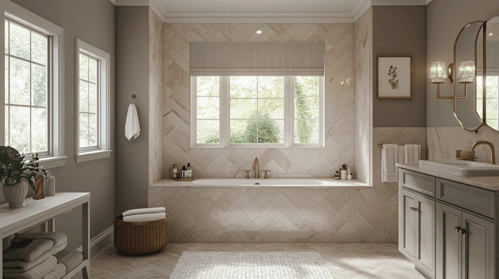
- Mega Greige establishes a calming, spa-like atmosphere in bathrooms. Its balanced nature creates visual warmth while providing a sleek contrast with crisp fixtures.
- This adaptable neutral beautifully showcases natural stone, brushed metals, and wood accents, creating a cohesive, organic aesthetic.
- Consider using it on walls or as a vanity color to create a serene foundation that enhances the entire space without competing with decorative elements.
Color Pairings and Combinations for Mega Greige
Mega Greige alters transitional spaces like hallways and entryways into cohesive design statements, creating seamless flow and refined continuity between rooms.
When used on built-ins or interior doors, Mega Greige creates subtle moments of definition that establish visual rhythm while maintaining harmony throughout the home.
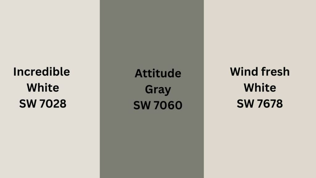
Complementary Trim Colors
- Incredible White SW 7028 – A soft, warm white with subtle greige undertones that create gentle coordination with Mega Greige’s complex depth.
- Windfresh White SW 7628 – A crisp white with cool undertones that provides fresh contrast while maintaining a refined balance.
- Attitude Gray SW 7060 – A deeper, more saturated gray with similar undertones that creates dimensional layering when paired with Mega Greige.
Creating Cohesive Color Schemes with Mega Greige
1. Monochromatic Scheme
- Mega Greige SW 7031 for main walls
- Dovetail SW 7018 for accent walls or cabinetry
- Agreeable Gray SW 7029 for connecting spaces
- Repose Gray SW 7015 for ceilings or lighter contrast
2. Cool Color Scheme
- Mega Greige SW 7031 for main living areas
- Attitude Gray SW 7060 for structural features
- Naval SW 6244 for built-ins or furniture
- Aleutian SW 6241 for dining room
3. Warm-Cool Balance Scheme
- Mega Greige SW 7031 for main walls
- Copper Mountain SW 6356 for accent furniture
- Incredible White SW 7028 for trim and millwork
- Persimmon SW 6339 for accessories or small spaces
4. Natural Elements Scheme
- Mega Greige SW 7031 for interior focal points
- Wind fresh White SW 7628 for trim and millwork
- Accessible Beige SW 7036 for main living spaces
- Kilim Beige SW 6106 for connecting spaces
Coordinating with Furniture and Decor
Wood Tones
- Mega Greige harmoniously balances medium woods like oak, maple, and hickory, enhancing their natural warmth.
- For a more dramatic approach, dark mahogany or espresso wood provides a striking contrast against this balanced neutral.
- Light, weathered, or cerused woods create a relaxed, organic pairing that emphasizes the greige’s refined undertones.
Metals
- Brushed brass and champagne gold complement Mega Greige’s warmth, creating refined coordination without overwhelming contrast.
- Oil-rubbed bronze and antique pewter blend seamlessly for a subtle, cultured palette.
- Mixed metal approaches work exceptionally well, as Mega Greige’s versatile undertones bridge both warm and cool metal finishes.
Decor
- Textural elements like linen, raw cotton, and natural jute in varied neutrals enhance Mega Greige’s depth while maintaining its balanced character.
- Ceramic, alabaster, and matte surfaces add dimensional interest without competing with the complex undertones.
- Layered textiles with subtle patterns, botanical elements with soft silhouettes, and natural stone accessories with tonal variations reinforce the nuanced, adaptable quality this color establishes.
Similar Paint Colors: Perfect Alternatives to Mega Greige
Mega Greige is a refined, warm gray with complex brown and subtle purple undertones. Its balanced Light Reflectance Value creates versatile, harmonious spaces while providing more nuance and depth than simpler neutrals.
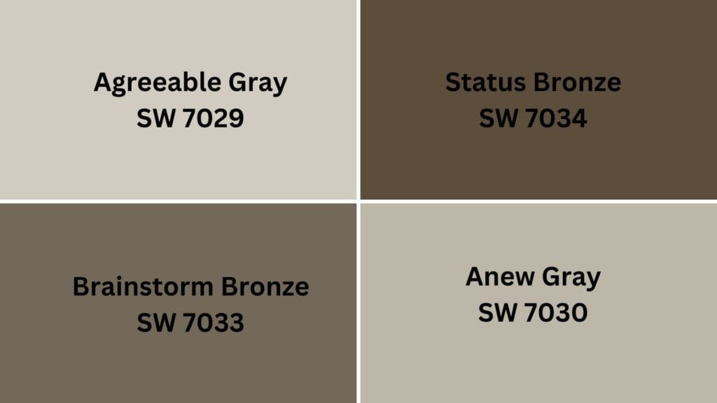
Agreeable Gray SW 7029 is a lighter, softer greige with cooler undertones. It offers Mega Greige’s versatility, with increased brightness and airiness for more open, luminous environments.
Anew Gray SW 7030 is a slightly warmer greige with a more pronounced taupe influence. It maintains Mega Greige’s balanced character but with additional earthiness and cozy appeal.
Status Bronze SW 7034 – A deeper, more saturated greige with stronger brown undertones that captures Mega Greige’s complexity while introducing a more substantial, grounding presence.
Brainstorm Bronze SW 7033 – A rich, dimensional greige with prominent taupe-brown notes that shifts Mega Greige’s undertones toward warmer territory for a more enveloping, cocoon-like atmosphere.
Summing It Up
After living with Mega Greige for several years, I’m still impressed by its staying power. While trends come and go, this versatile neutral continues to serve as the perfect foundation throughout my home. I’ve paired it with everything from bright whites to deep charcoals, and it never disappoints.
What I appreciate most is how it adapts to different lighting conditions without losing its character. Morning sunlight brings out its warmer undertones, while evening light reveals its refined gray base.
If you’re hesitating between countless paint swatches, stop overthinking it. Grab a sample of Mega Greige SW 7031 today and see how it alters your space.
Trust me—you’ll wonder why you waited so long to locate this perfect balance of warmth and versatility. Ready to make your home feel instantly more refined?

Alex Guerrero, a graduate with a Fine Arts degree from the Rhode Island School of Design, has been a visionary in the world of color and design for over 15 years. His professional journey began in the heart of the fashion industry in Milan, where he developed an acute sense for color harmonies and trends. Alex joined our team in 2018, offering fresh and innovative perspectives on color utilization in various spaces. Renowned for his ability to blend contemporary trends with timeless elegance. Outside of work, Alex is an accomplished painter and a volunteer art therapist, his artistic talents further enriching his professional insights.