
Choosing the perfect off-white paint color transformed my home in ways I never imagined. After months of testing countless swatches, I discovered five exceptional shades above the rest.
Benjamin Moore’s Swiss Coffee (OC-45) and White Dove (OC-17) captured my heart with their timeless grace, while Sherwin Williams’ Alabaster (SW 7008) and Dover White (SW 6385) brought a warmth that makes every room feel like home.
Behr’s Ultra Pure White (1850) delivers perfectly for spaces needing a crisp, contemporary feel. These five remarkable off-whites offer the perfect balance of warmth, versatility, and style for any home.
Join me as I share my travels with these exceptional colors and learn why they’ve earned their place as the best off-white paint colors available today.
Which are the Best Off-White Paint Colors I Recommend?
1. Benjamin Moore – Swiss Coffee
2. Benjamin Moore – White Dove
3. Sherwin Williams – Alabaster
4. Sherwin Williams – Dover White
5. Behr – Ultra Pure White
Why I Love These Off-White Colors for My Place?
In this section, I’ll explain why I recommend each of these shades for different spaces in my home, what makes them unique, and how they bring out the best in my interior design.
1. Benjamin Moore – Swiss Coffee (OC-45)
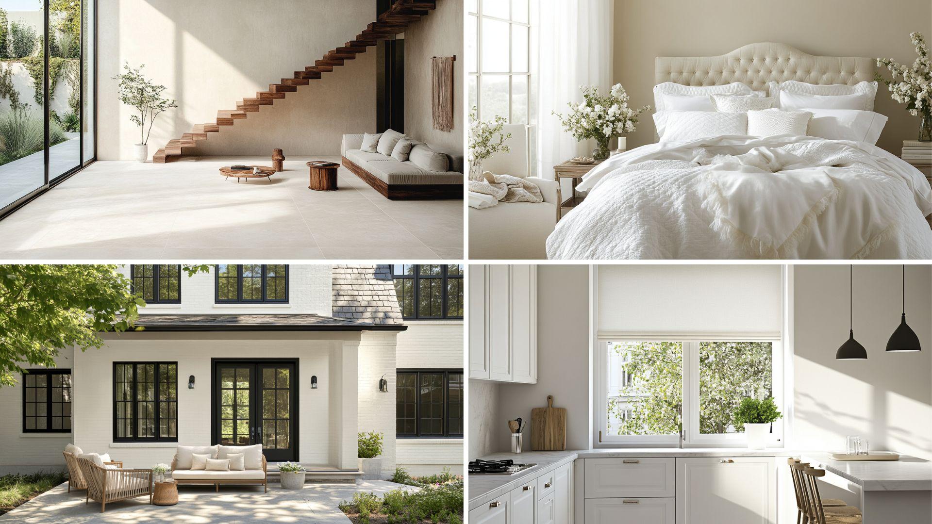
A soft and warm off-white with subtle cream undertones, this color is perfect for creating a cozy, inviting atmosphere in any room.
Timeless Warmth
- Swiss Coffee creates an inviting, cozy atmosphere in any space.
- This versatile neutral shifts throughout the day, appearing more cream in warm light and a cleaner off-white in cooler settings.
Ideal for Any Space
- Kitchens become welcoming gathering places that feel both clean and comfortably lived in.
- Living rooms transform into elegant yet approachable spaces that complement both modern and traditional furnishings.
- Bedrooms develop a gentle, soothing quality that promotes rest while maintaining a fresh appearance.
Versatile Companion
- Dark wood furniture creates a dramatic, rich contrast against this warm backdrop.
- Colorful accent pieces pop without competing, allowing decorative elements to shine.
- Brass and gold fixtures gain a subtle enhancement from the cream undertones, creating a harmonious relationship.
Emotional Benefits
- Cultivates a sense of comfort and stability in transitional spaces.
- Creates an impression of timeless grace without feeling stark or clinical.
- Inspires a connection to home traditions while accommodating contemporary design elements.
| Attribute | Value |
|---|---|
| RGB Value | (238, 234, 220) |
| HEX Code | #EEEADC |
| LRV (Light Reflectance Value) | 83.93 |
What These Values Mean?
The RGB values show how Swiss Coffee gets its special character:
- The slightly higher red and green values contribute to its warm, creamy appearance.
- The high LRV gives it excellent reflective qualities while maintaining softness.
Digital Uses
Swiss Coffee provides an excellent neutral backdrop for home decor, culinary, and lifestyle websites. It offers warmth and sophistication while ensuring excellent readability and a welcoming digital presence.
2. Benjamin Moore – White Dove
It is a timeless and elegant off-white with a hint of gray. It offers a refined look that complements both modern and traditional spaces.
Refined Grace
- White Dove creates a soft, refined appearance with remarkable depth.
- This versatile neutral maintains its balanced character throughout the day, appearing warm without yellowing and clean without feeling stark.
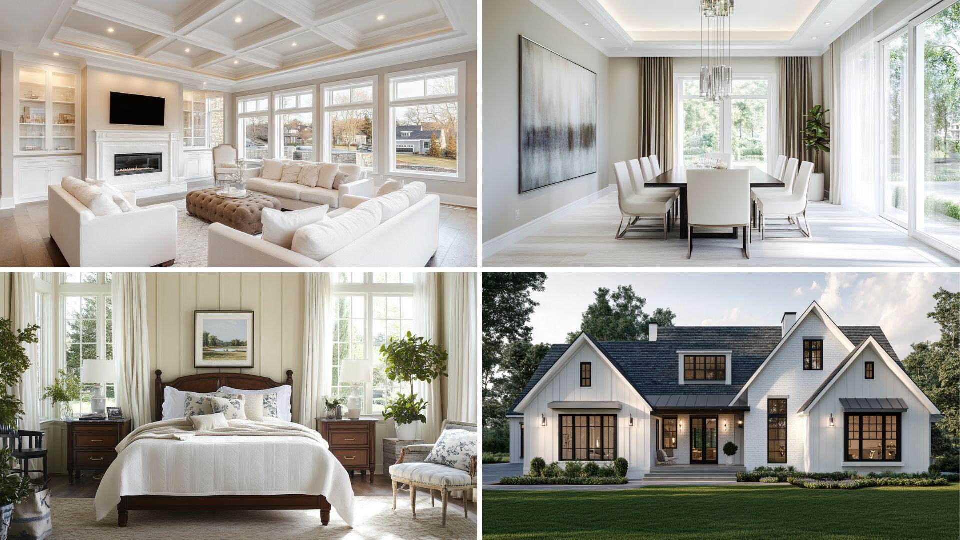
Ideal for Any Space
- Dining rooms transform into refined entertaining areas that feel both formal and welcoming.
- Home offices become focused, productive environments that reduce visual distraction while avoiding sterility.
- Hallways and transitional spaces gain a cohesive, brightening effect that connects rooms seamlessly.
Versatile Companion
- Both cool and warm accent colors appear true against this perfectly balanced backdrop.
- Marble and stone surfaces complement its subtle undertones, creating harmonious material transitions.
- Stainless steel and matte black hardware create a striking definition against its soft canvas.
Emotional Benefits
- Establishes a sense of calm clarity that supports mental focus and emotional balance.
- Creates an impression of thoughtful simplicity that reduces visual noise in busy households.
- Inspires a connection to classic design principles while remaining thoroughly contemporary.
| Attribute | Value |
|---|---|
| RGB Value | (238, 236, 225) |
| HEX Code | #EEECE1 |
| LRV (Light Reflectance Value) | 85.38 |
What These Values Mean?
The RGB values reveal White Dove’s balanced character:
- The nearly equal red and green values with slightly lower blue create its subtle warmth.
- The high LRV offers excellent light reflection while maintaining a soft, non-glaring quality.
Digital Uses
White Dove provides an ideal backdrop for photography portfolios, architectural websites, and minimalist design platforms.
It offers sophistication and neutrality while ensuring excellent contrast for both dark and colored content elements.
3. Sherwin Williams – Alabaster
A subtle, creamy off-white with a touch of warmth, it adds a bit of richness without overpowering the space. It is ideal for both interiors and exteriors.
Serene Warmth
- Alabaster creates a gentle, welcoming atmosphere in any room.
- This versatile neutral maintains a consistent character throughout the day, offering a subtle warmth that never feels yellow or stark.
Ideal for Any Space
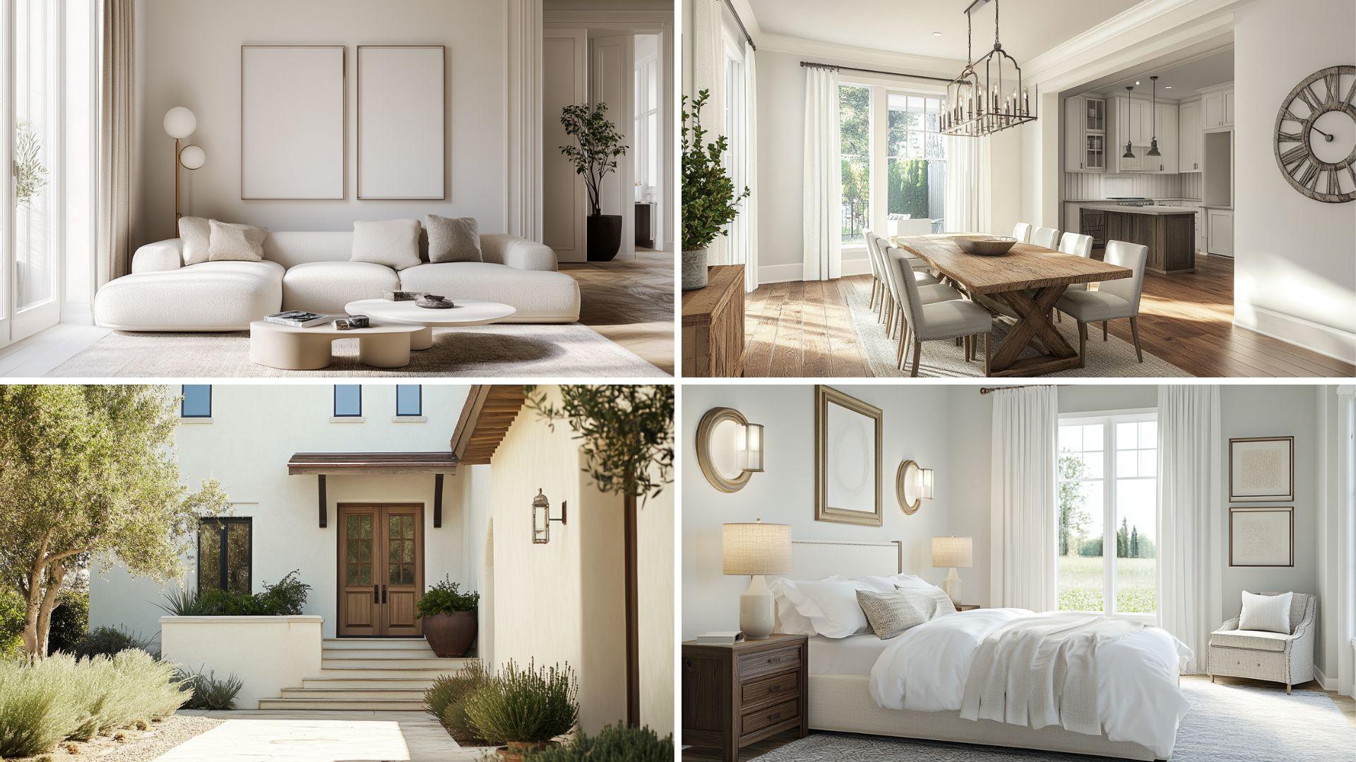
- Living rooms become inviting sanctuaries that balance sophistication with approachable comfort.
- Kitchens change into bright, clean environments that feel fresh yet comfortably lived in.
- Entire home interiors gain a cohesive, flowing quality when used as a unifying neutral throughout connected spaces.
Versatile Companion
- Natural textiles like linen and cotton appear rich and textured against its subtle backdrop.
- Both cool blues and warm terracottas complement its balanced undertones without clashing.
- Oil-rubbed bronze and antique brass hardware create a graceful definition against its soft surface.
Emotional Benefits
- It fosters a sense of gentle serenity that supports daily relaxation in busy households.
- Creates an impression of timeless simplicity that reduces visual complexity without feeling plain.
- Inspires a connection to natural elements while maintaining a refined, curated aesthetic.
| Attribute | Value |
|---|---|
| RGB Value | (237, 234, 224) |
| HEX Code | #EDEAE0 |
| LRV (Light Reflectance Value) | 82.14 |
What These Values Mean?
The RGB values reveal Alabaster’s balanced character:
- The slightly higher red value contributes to its subtle warmth without becoming cream.
- The high LRV provides excellent light reflection while maintaining a soft, non-clinical appearance.
Digital Uses
Alabaster provides an excellent foundation for home design websites, wedding photography portfolios, and wellness platforms. It lends a warm sophistication while ensuring excellent readability and a welcoming digital presence.
4. Sherwin Williams – Dover White
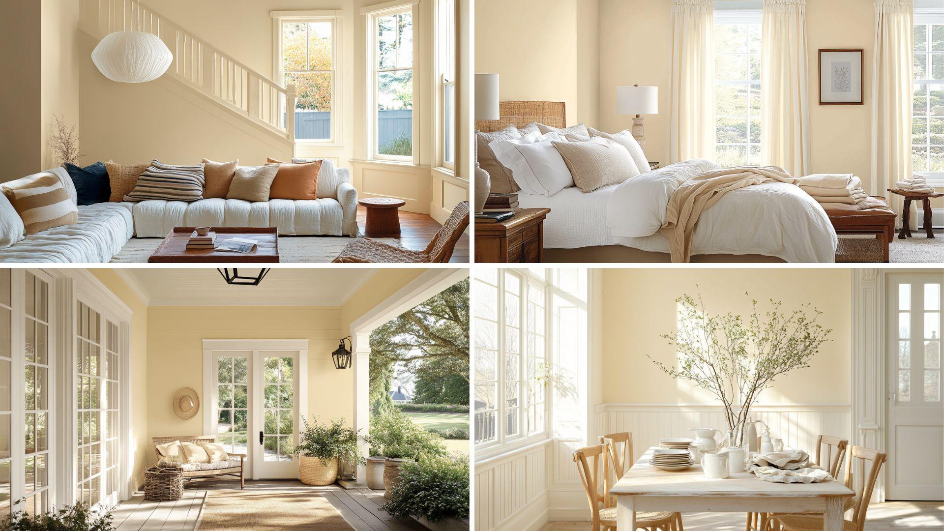
A subtle, creamy off-white with a touch of warmth, it adds a bit of richness without overpowering the space. It is ideal for both interiors and exteriors.
Rich Creaminess
- Dover White creates a soft, inviting atmosphere with noticeable depth.
- This versatile neutral takes on a richer quality in darker spaces while maintaining its creamy character in well-lit areas.
Ideal for Any Space
- Dining areas become cozy, intimate gathering spots that encourage conversation and connection.
- Bedrooms transform into warm retreats that feel nurturing and comfortable throughout the seasons.
- Exterior applications create a timeless, classic appearance that complements traditional and transitional architecture.
Versatile Companion
- Navy blues and forest greens create a stunning, classic contrast against its warm backdrop.
- Wood tones in medium to dark finishes harmonize beautifully with its creamy undertones.
- Wrought iron and black fixtures stand out with striking definition against its soft surface.
Emotional Benefits
- Cultivates a sense of nostalgic comfort that connects to traditional home values.
- Creates an impression of established grace without feeling pretentious or formal.
- Inspires a connection to heritage design elements while accommodating contemporary living.
| Attribute | Value |
|---|---|
| RGB Value | (239, 233, 218) |
| HEX Code | #EFE9DA |
| LRV (Light Reflectance Value) | 81.3 |
What These Values Mean?
The RGB values reveal Dover White’s warm character:
- The higher red and green values with slightly lower blue create its distinctive creamy quality.
- The high LRV offers excellent light reflection while maintaining a soft, enveloping warmth.
Digital Uses
Dover White provides an excellent backdrop for vintage-inspired brands, culinary blogs, and traditional home decor websites. It offers warmth and accessibility while ensuring good contrast between text and photography.
5. Behr – Ultra Pure White
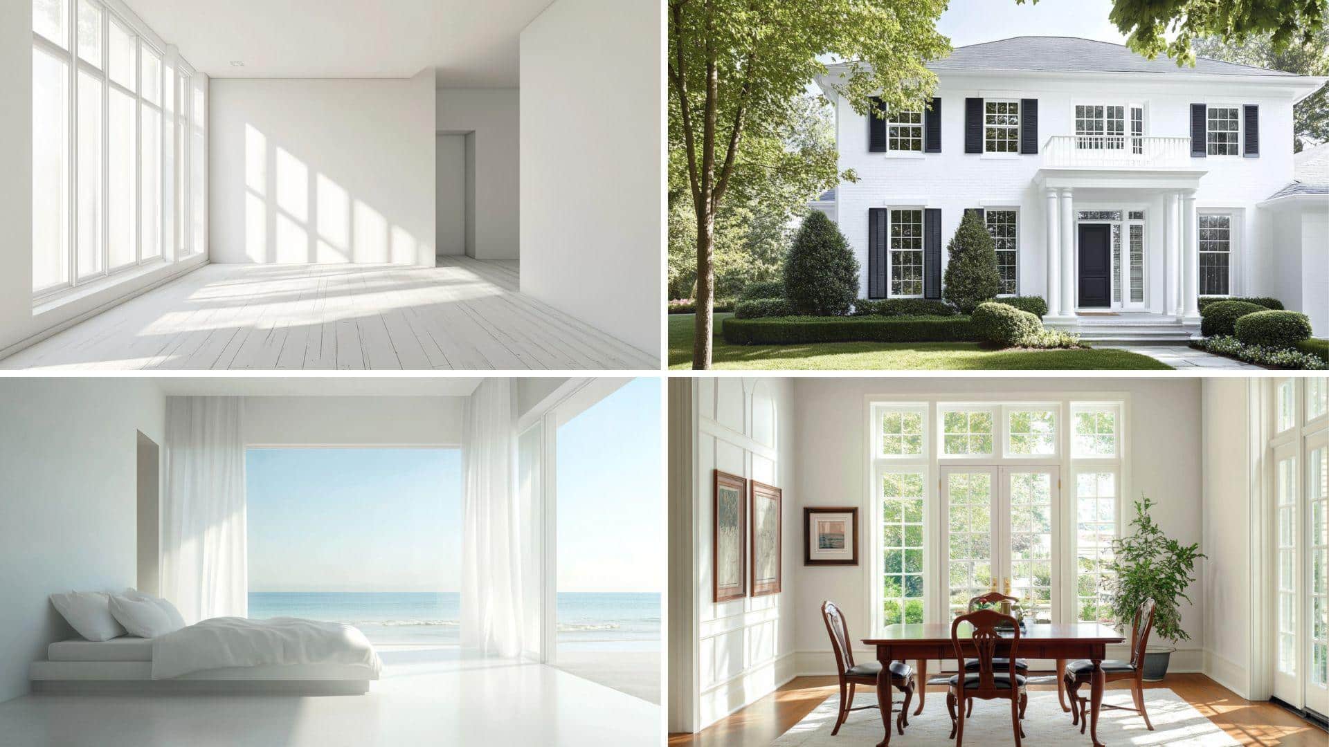
This versatile shade, a crisp, clean, off-white with a touch of cool undertones, works well in contemporary spaces. It offers a bright, fresh feeling.
Crisp Clarity
- Ultra Pure White is a clean, bright white with cool undertones that create a fresh, contemporary appearance with remarkable clarity.
- This versatile neutral maintains its crisp character throughout the day, appearing consistently bright without taking on unwanted color casts.
Ideal for Any Space
- Modern kitchens become sleek, pristine environments that feel clean and professionally designed.
- Art spaces transform into gallery-like settings where colorful pieces stand out with maximum impact.
- Small rooms gain a sense of expanded space and airiness that helps overcome limited square footage.
Versatile Companion
- Vibrant accent colors appear true and saturated against its neutral backdrop.
- Contemporary materials like glass, concrete, and metal create striking architectural statements.
- Black fixtures and hardware establish a dramatic, high-contrast definition that creates visual interest.
Emotional Benefits
- Establishes a sense of clean simplicity that reduces visual complexity in busy environments.
- Creates an impression of fresh beginnings that supports mental clarity and focus.
- Inspires a connection to minimalist design principles while providing maximum decorating flexibility.
| Attribute | Value |
|---|---|
| RGB Value | (255, 255, 255) |
| HEX Code | #FFFFFF |
| LRV (Light Reflectance Value) | 94.0 |
What These Values Mean?
The RGB values reveal Ultra Pure White’s true white character:
The maximum values across all channels create its distinctively bright, clean appearance.
The extremely high LRV provides maximum light reflection, brightening spaces significantly.
Digital Uses
Ultra Pure White provides an ideal foundation for modern e-commerce platforms, technology websites, and contemporary design portfolios.
It offers a clean canvas that allows content to take center stage while creating a sense of professional precision.
Colors that Go Well with these Off-Whites
Here is a table with dark colors that would pair well with the off-white shades provided:
| Dark Color | Description |
|---|---|
| Charcoal Gray | A deep, rich gray that complements off-white shades, adding sophistication and balance. |
| Navy Blue | It is a classic, bold choice that pairs beautifully with soft off-whites, creating a timeless contrast. |
| Black | A sharp, modern contrast against off-white, perfect for a clean, sleek look. |
| Deep Forest Green | A dark green adds a natural, earthy vibe when paired with warm off-whites, creating a serene atmosphere. |
| Burgundy | A rich, deep red provides warmth and grace against off-white tones, making a bold statement. |
These dark colors create a striking contrast with off-whites and can be used in various design elements, such as accent walls, furniture, or decor items.
Conclusion
My exploration of off-white paint colors has been truly eye-opening. These five exceptional shades—Benjamin Moore’s Swiss Coffee and White Dove, Sherwin Williams’ Alabaster and Dover White, and Behr’s Ultra Pure White—have completely transformed my living spaces.
Each offers its unique character while maintaining the timeless versatility that makes off-whites so beloved.
Whether you’re seeking warmth, sophistication, or contemporary freshness, these colors deliver beautifully in any light and complement any style.
I’ve found that the perfect off-white isn’t just a background color—it’s a foundation that elevates everything in the room if you’re feeling overwhelmed by endless paint options.
I can confidently recommend these five outstanding choices as the best off-white paint colors for your home. They will stand the test of time and bring lasting beauty to your home.

Alex Guerrero, a graduate with a Fine Arts degree from the Rhode Island School of Design, has been a visionary in the world of color and design for over 15 years. His professional journey began in the heart of the fashion industry in Milan, where he developed an acute sense for color harmonies and trends. Alex joined our team in 2018, offering fresh and innovative perspectives on color utilization in various spaces. Renowned for his ability to blend contemporary trends with timeless elegance. Outside of work, Alex is an accomplished painter and a volunteer art therapist, his artistic talents further enriching his professional insights.