

Are you looking for the perfect paint color that works in any room? Oyster Bay Sherwin Williams (SW 6206) might be just what you need.
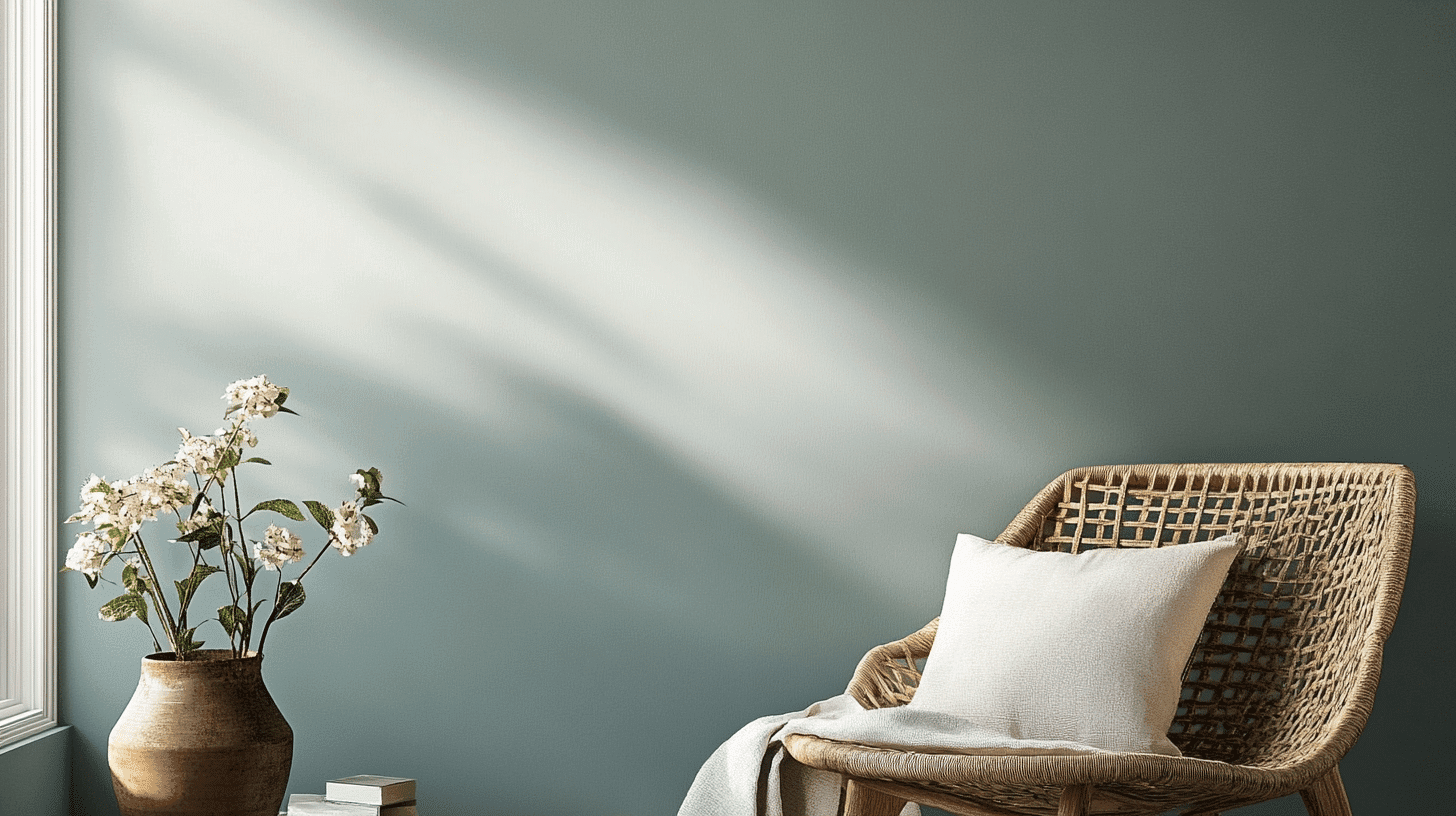
This beautiful green-gray color brings a calm, natural feeling to your home without being boring.
With its medium brightness level (LRV of 44), Oyster Bay isn’t too dark or too light – it’s just right for creating a peaceful space that still has personality.
In this blog, we’ll find why Oyster Bay is so popular, how it works in different rooms, what colors go well with it, and even some similar options if you want something a little different.
Get ready to learn why this versatile paint color might be the perfect choice for your next project.
Understanding Paint Color Basics
Color Terminology
| Property | Value |
|---|---|
| LRV | 44 |
| RGB | 174 / 179 / 169 |
| Hex Code | #AEB3A9 |
Undertones:
- Oyster Bay has green-gray undertones
- It’s a soft coastal color with a touch of warmth
- Not a plain gray, but a natural, earthy neutral
Psychology of Oyster Bay’s Color
- Green-gray tones like Oyster Bay Create a feeling of calm and connection to nature
- Coastal colors: Bring a relaxed, soothing vibe to any room
- Natural neutrals: Make spaces feel peaceful, balanced, and welcoming
- Benefits: Easier on the eyes than bright colors, hides dirt well and makes a great backdrop for both light and dark furniture
Why Choose Oyster Bay Sherwin Williams (SW 6206)?
Oyster Bay’s versatility works well in many lighting situations. It keeps its calming green-gray look in bright rooms while warming up darker spaces.
Its natural color makes a perfect backdrop that fits both modern and cozy home styles without taking over the room.
1. Key Features
Oyster Bay offers great flexibility with things you can’t easily change, like countertops and floors. With its medium LRV of 44, it’s not too dark or too light, creating a smooth flow between rooms.
It gives enough color to feel welcoming while staying timeless, so your walls won’t look outdated next year.
2. Durability
Oyster Bay in quality finishes like Duration or Emerald hides scuffs and marks better than lighter colors, perfect for busy hallways and family rooms.
Its depth helps cover small wall flaws while keeping its soothing look. When applied correctly, this paint keeps its color even with regular cleaning.
3. Texture Patterns
Oyster Bay creates a soft, natural texture that adds gentle depth to your walls. Its green-gray tones create nice shadows that soften harsh light and make textured walls look more interesting.
When used on different surfaces, it highlights special details while keeping rooms feeling connected.
Room-by-Room Color Recommendations
1. Living Spaces and Open Floor Plans
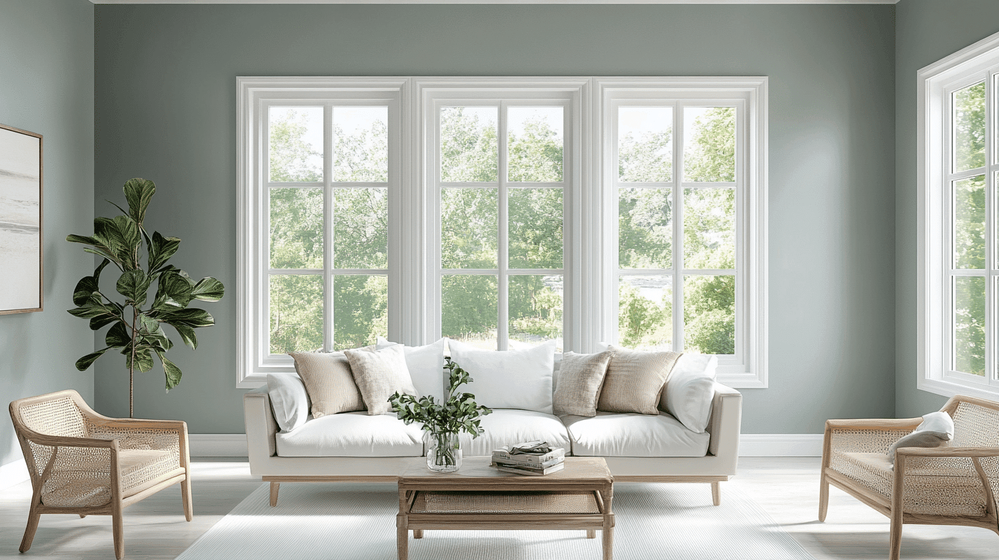
- Oyster Bay (SW 6206) creates a soothing backdrop in living areas, with its green-gray tones providing a natural connection between indoor and outdoor spaces.
- The medium LRV of 44 offers enough depth to feel cozy without darkening open floor plans, striking a perfect balance between airy and grounded.
- Pair Oyster Bay walls with crisp white trim like Pure White (SW 7005) to create subtle contrast and definition in connected spaces.
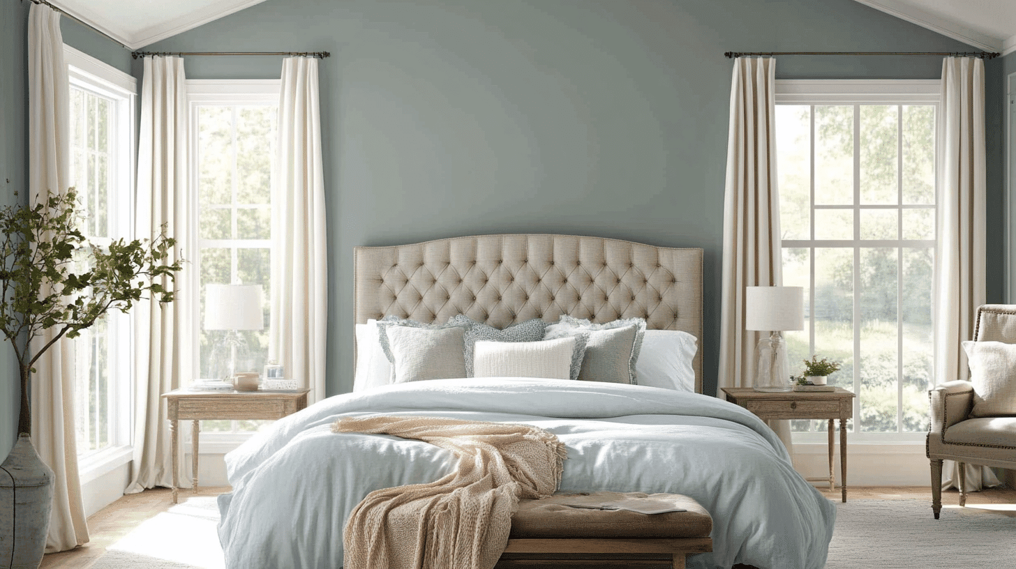
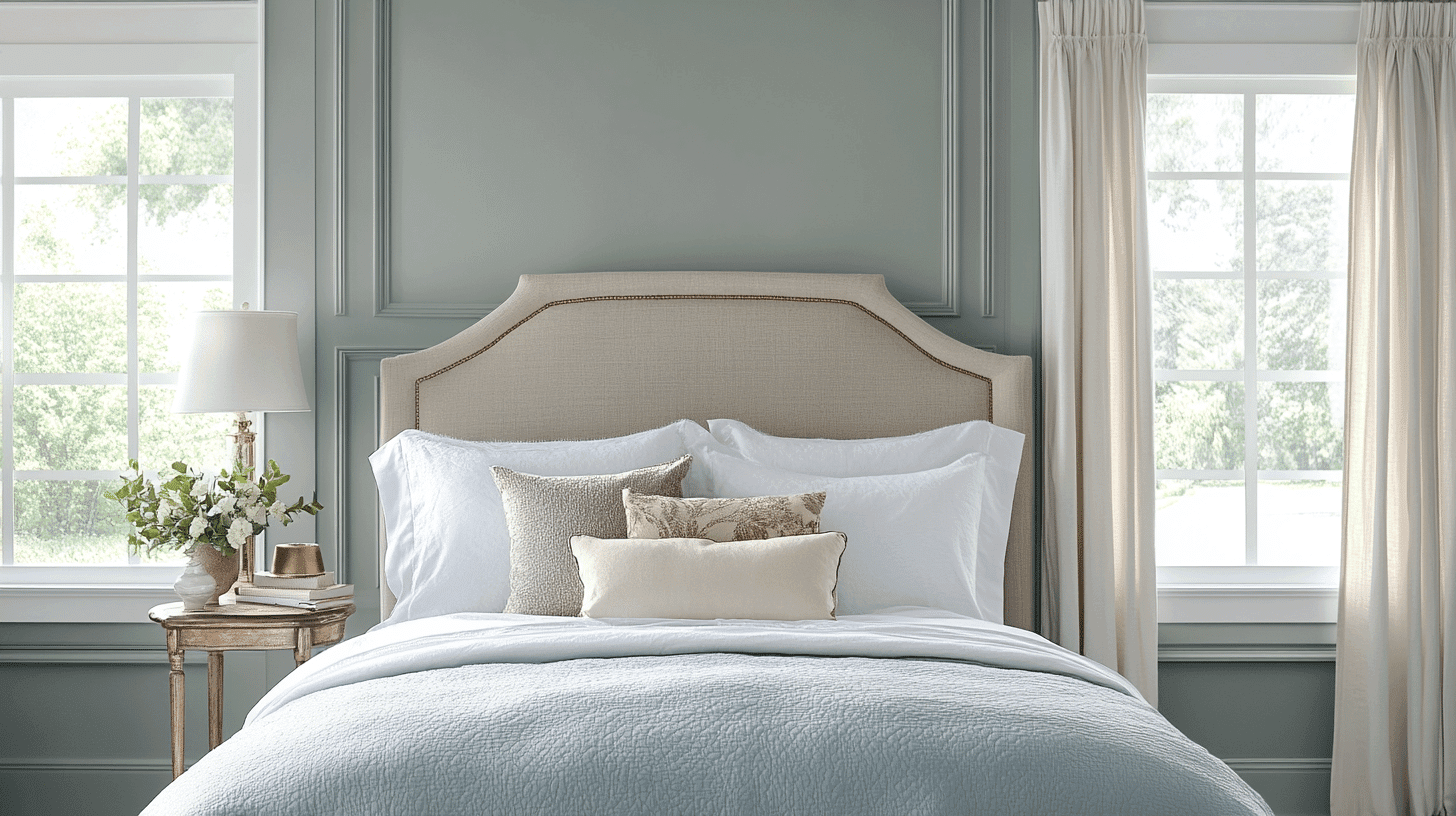
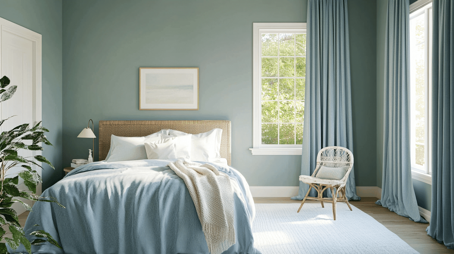
2. Bedrooms and Relaxation Areas
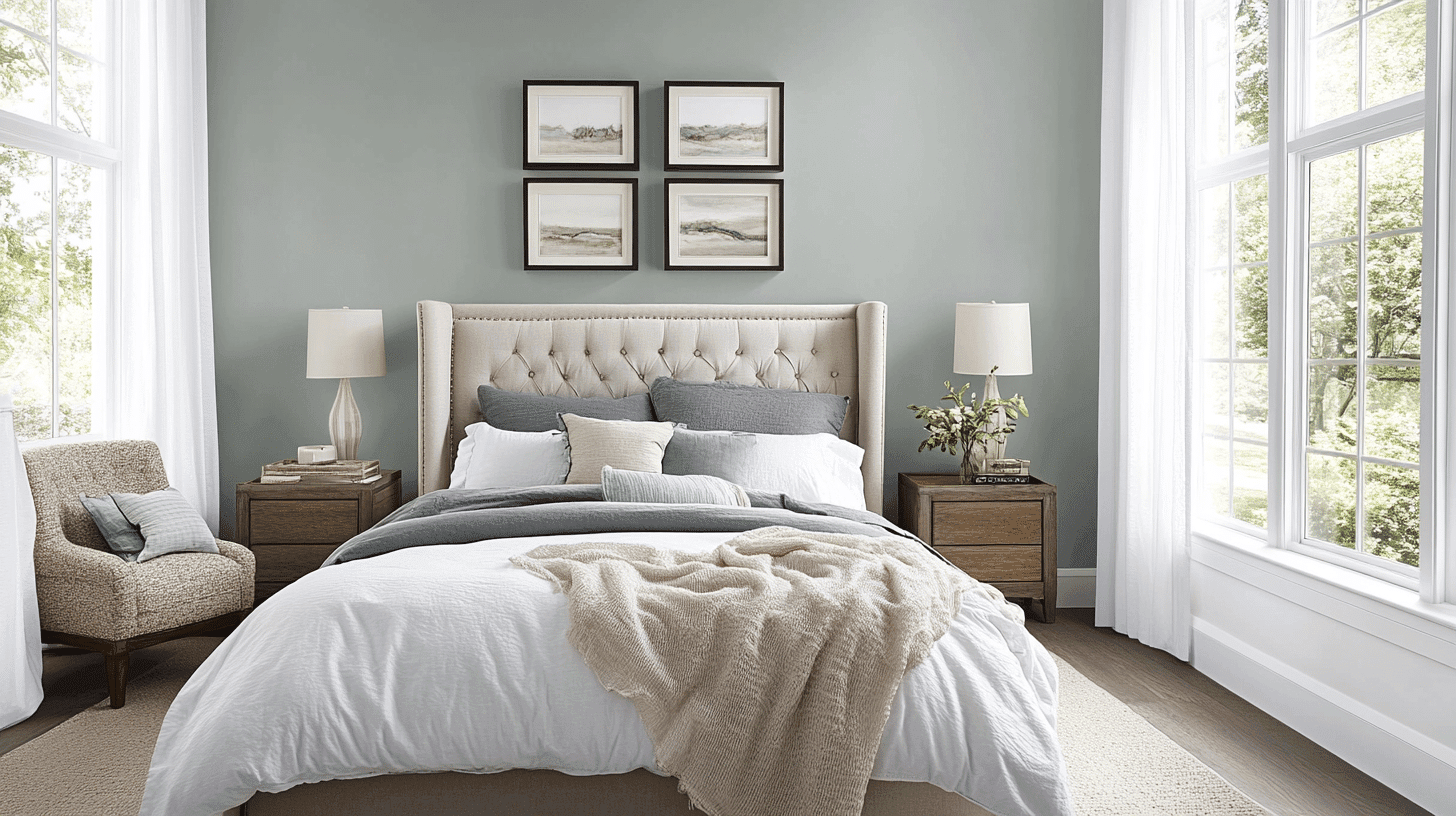
- Oyster Bay fosters a tranquil, restful environment in bedrooms with its nature-inspired undertones that promote relaxation and sleep.
- The soft green-gray color creates a gentle cocoon effect that feels calming without being too dark or heavy in sleeping spaces.
- Consider using Oyster Bay on all walls in a bedroom for an enveloping effect or as an accent wall behind the bed to create a peaceful focal point.
3. Kitchens and High-Traffic Zones
- Oyster Bay in a satin or semi-gloss finish stands up well to cleaning in busy areas while its mid-tone depth hides smudges and marks better than lighter colors.
- This versatile neutral works beautifully with both white cabinetry for a coastal feel and dark wood tones for a more traditional kitchen style.
- The green undertones in Oyster Bay complement many countertop materials, from warm butcher block to cool marble, making it adaptable to various kitchen designs.
Color Pairings and Combinations for Oyster Bay (SW 6206)
Oyster Bay is a beautiful green-gray with natural, earthy undertones. Its medium Light Reflectance Value (LRV) of 44 makes it a versatile neutral that adds depth to spaces while maintaining a soft, soothing quality.
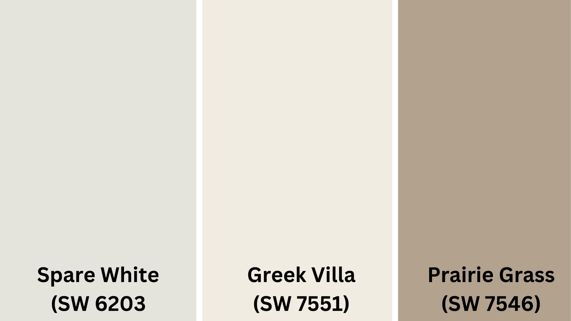
Complementary Trim Colors
- Spare White (SW 6203) – A soft, warm white that creates a gentle, melodic contrast with Oyster Bay’s green-gray tones
- Greek Villa (SW 7551) – A creamy off-white that improves the warmth in Oyster Bay for a cozy, welcoming look
- Prairie Grass (SW 7546) – A deeper neutral with similar undertones that provides subtle definition while maintaining color cohesion
Creating Cohesive Color Schemes with Oyster Bay
Monochromatic Scheme
- Oyster Bay (SW 6206) for main walls
- Spare White (SW 6203) for trim
- Ceiling Bright White (SW 7007) for ceilings
- Sea Salt (SW 6204) for accent pieces or adjoining rooms
Warm Color Scheme
- Oyster Bay (SW 6206) for main living areas
- Accessible Beige (SW 7036) for the dining room
- Balanced Beige (SW 7037) for hallways
- Agreeable Gray (SW 7029) for bedrooms
Cool Color Scheme
- Oyster Bay (SW 6206) for main walls
- Silver Strand (SW 7057) for bathrooms
- Rainwashed (SW 6211) for bedrooms
- Pewter Green (SW 6208) for home office
Coordinating with Furniture and Decor
1. Wood Tones
Oyster Bay pairs beautifully with medium walnut and cherry wood for refined contrast. Lighter woods like ash and blonde oak improve its coastal, airy feel.
Dark espresso finishes create a dramatic definition against this subtle gray-green.
2. Metals
Brushed nickel and chrome hardware offer contemporary complements to Oyster Bay’s calm nature.
Aged brass and bronze fixtures bring warmth while improving the color’s vintage coastal appeal. Matte black accents create a striking definition that grounds the soft green-gray.
3. Decor
Natural textures like seagrass and linen reinforce Oyster Bay’s connection to coastal design. Blue-green and teal accents highlight its undertones, while soft corals create a balanced palette.
White ceramics and glass elements amplify natural light, allowing the color to shift beautifully throughout the day.
Similar Paint Colors: Perfect Alternatives to Oyster Bay (SW 6206)
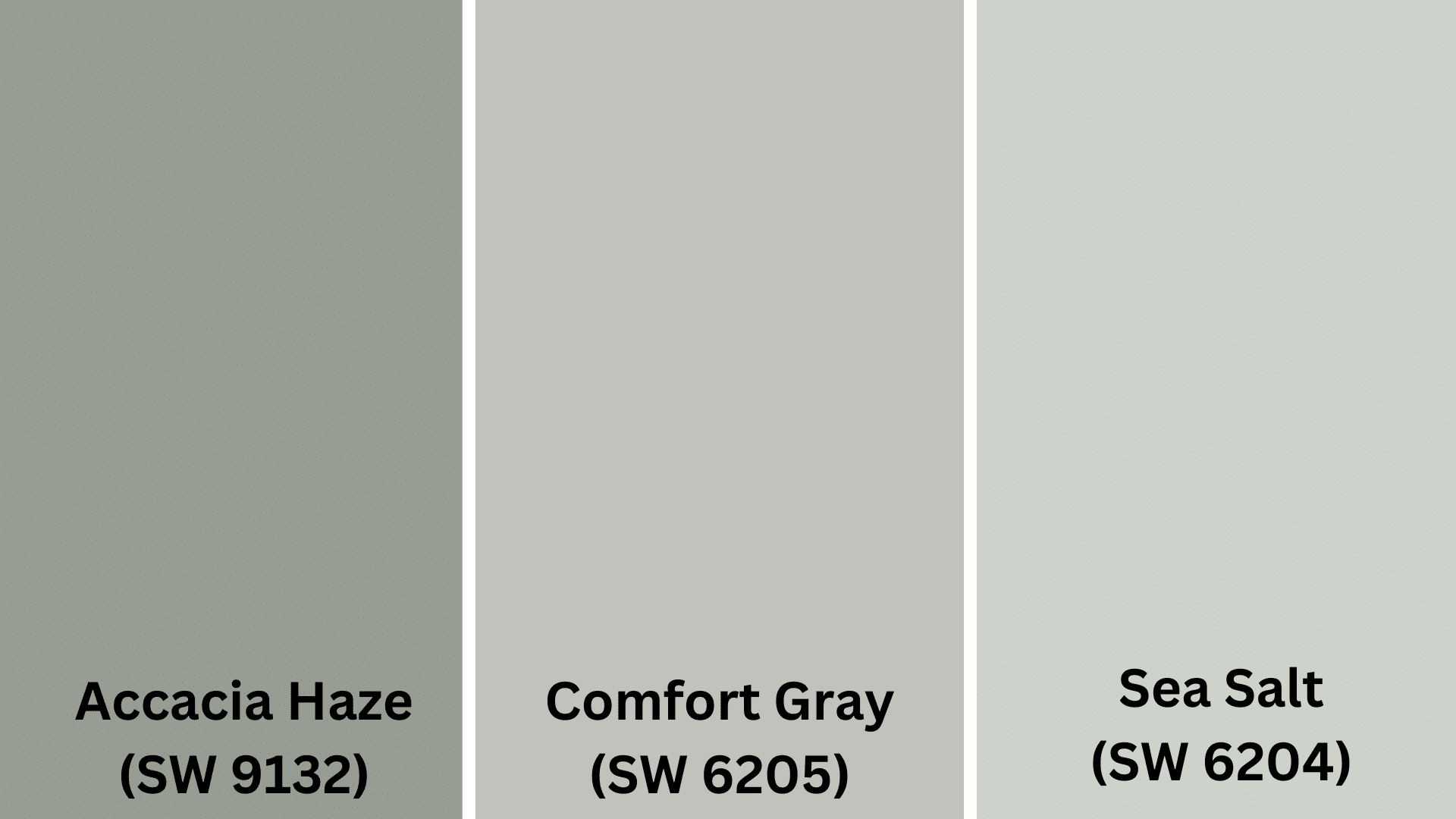
1. Comfort Gray (SW 6205)
- It is slightly deeper than Oyster Bay, with stronger sage undertones for a more defined green-gray presence.
- Creates a cozy, grounded atmosphere ideal for living rooms and bedrooms where intimate warmth is desired.
- It pairs exceptionally well with cream fabrics, natural wood, and terracotta accents.
2. Sea Salt (SW 6204)
- Lighter and more airy than Oyster Bay, with light blue-green undertones that evoke coastal tranquility.
- It reflects more light, making it perfect for smaller spaces, bathrooms, and areas with limited natural light.
- It creates a spa-like serenity when paired with white trim, light linens, and natural stone elements.
3. Acacia Haze (SW 9132)
- Features refined lavender-gray undertones that give it a more contemporary feel than Oyster Bay.
- Adapts beautifully to changing light, appearing more purple in cool lighting and more taupe in warm settings.
- Works pleasantly with cool metals, greige furnishings, and deep navy or plum accents.
Final Thoughts
Oyster Bay Sherwin Williams (SW 6206) proves that you don’t need bright colors to make a big impact in your home.
This soothing green-gray creates spaces that feel connected to nature and brings a sense of calm to any room.
It works beautifully with all kinds of wood, metal finishes, and decorations, making it easy to use throughout the house.
If you’re painting a busy kitchen, peaceful bedroom, or open living area, Oyster Bay adapts to different lighting and complements your furniture without fighting for attention. It’s a color that won’t go out of style and looks fresh year after year.
Ready to change your home with this versatile neutral? Grab a sample of Oyster Bay today and watch how this magical color changes throughout the day in your own space!

Alex Guerrero, a graduate with a Fine Arts degree from the Rhode Island School of Design, has been a visionary in the world of color and design for over 15 years. His professional journey began in the heart of the fashion industry in Milan, where he developed an acute sense for color harmonies and trends. Alex joined our team in 2018, offering fresh and innovative perspectives on color utilization in various spaces. Renowned for his ability to blend contemporary trends with timeless elegance. Outside of work, Alex is an accomplished painter and a volunteer art therapist, his artistic talents further enriching his professional insights.