
Have you ever stared at a wall wondering which white paint to pick? With so many shades out there, finding the right one can be tough.
Extra White (SW 7006) by Sherwin Williams might be just what you need.
This clean, bright white has cool undertones that make rooms feel fresh and open. It works great in all kinds of light – from sunny rooms to darker spaces.
If you’re painting a kitchen, bedroom, or living room, Extra White can fit right in.
In this review, we’ll share everything you need to know about Extra White, from how it looks in different rooms to what colors complement it.
Let’s find out if this popular white is the right choice for your home.
Understanding Paint Color Basics
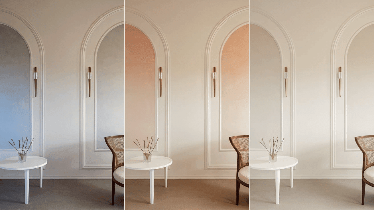
Extra White has very subtle, cool undertones that give it a crisp, clean look. In the morning, it appears bright and fresh with a slight blue hint.
During midday, it shows its truest white color with minimal undertones. By evening, it can take on a softer, slightly gray appearance in lamplight.
The color changes with seasons, too – looking sharper in summer sunlight and slightly cooler in winter light.
When choosing Extra White, remember that north-facing rooms will bring out its cool tones, while south-facing rooms warm it up slightly.
This makes it a flexible white that works in most spaces without looking too stark or too creamy.
Color Terminology
| ATTRIBUTE | VALUE |
|---|---|
| Color Code on Sherwin Williams | SW 7006 |
| LRV | 86 |
| Hex Code | #EEEFEA |
| RGB Value | 238, 239, 234 |
What These Colors Mean?
- Color Code on Website (SW 7006): A unique identifier used by Sherwin Williams to distinguish Extra White from other shades.
- LRV (86): Light Reflectance Value indicates how much light the color reflects. At 86, Extra White is highly reflective, making spaces feel bright and open.
- Hex Code (#EEEFEA): A six-digit color representation used in digital design and web applications.
- RGB Value (238, 239, 234): The combination of red, green, and blue light that creates the exact shade of Extra White.
Psychology on White Colors
White colors like Extra White can change how a room feels and how you feel in it.
- White creates a feeling of space and makes rooms look bigger and more open.
- It gives a clean, fresh feeling that helps people feel calm and peaceful.
- White works well in rooms where you want to feel awake and clear-headed.
- It changes a lot with light – looking bright in sunlight and softer in lamp light.
White is often used in places where people want to feel clean and organized, like kitchens and bathrooms.
Why Choose This Color?
Extra White by Sherwin Williams works well in all types of light, making it useful throughout your home. This clean, bright white fits both modern and old-fashioned home styles.
It pairs nicely with any flooring type, from dark hardwood to light tile, and looks great next to granite, marble, or laminate countertops.
The color adds a fresh, clean feel to any room without being too stark or cold. Extra White is a safe choice that won’t clash with your existing furniture or decor, making it perfect for both small rooms and large open spaces.
1. Key Features
Extra White shows up differently on walls versus trim or ceilings, giving you options for how to use it. In bright rooms, it looks crisp and clean, while in darker spaces, it takes on a softer, cozier feel.
This color looks different from morning to night – brighter and more blue-toned in daylight and warmer and softer under lamps at night.
This makes rooms feel different throughout the day.
2. Durability & Maintenance
Extra White is known for staying clean-looking longer than darker colors that show marks and dirt more easily. Here are tips to make your paint last longer:
- Clean walls with a soft cloth and mild soap when needed
- Touch up small marks right away before they get worse
- Use a primer before painting for better sticking power
- Keep paint cans stored in a cool, dry place for touch-ups
- Avoid scrubbing too hard, which can make shiny spots
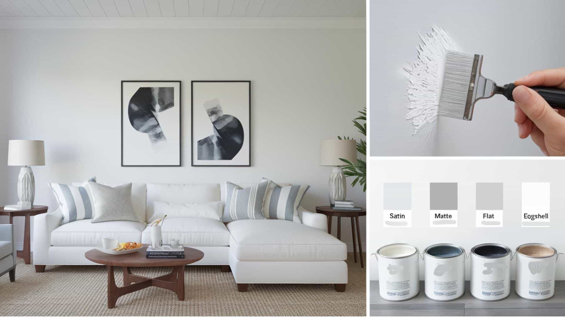
3. Texture & Finish Recommendations
The right finish makes a big difference in how Extra White looks in your home. Here are the best finish options:
- Flat/Matte: Good for ceilings and low-traffic areas
- Eggshell: Works well in living rooms and bedrooms
- Satin: Perfect for kitchens and bathrooms
- Semi-gloss: Best for trim, doors, and cabinets
- High-gloss: For special accent areas and furniture
Room-By-Room Recommendations
Living Spaces & Open Floor Plans
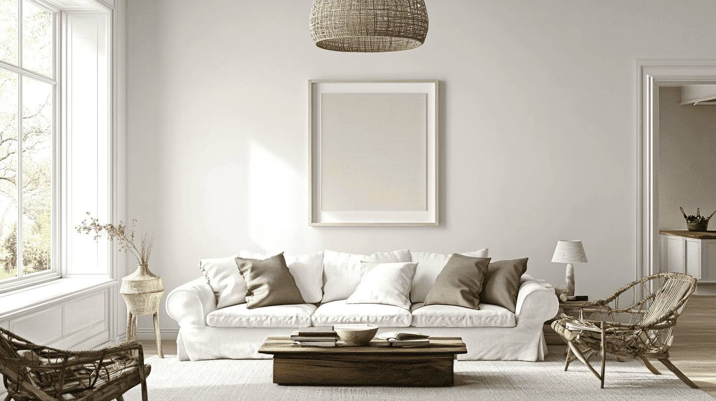
Extra White makes big rooms feel clean and bright. It reflects light well, which helps rooms feel bigger and more open.
Additional Tips:
- Paint baseboards and crown molding in Extra White semi-gloss for a clean look
- Try pairing it with gray or navy blue accent walls for a nice contrast
Bedrooms & Relaxation Areas
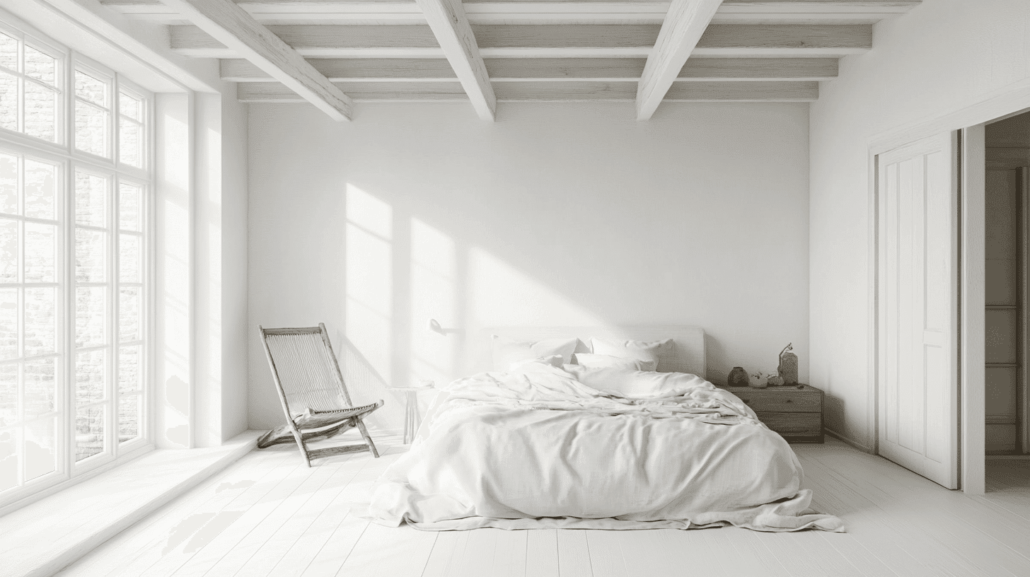
Extra White creates a calm feeling that helps with sleep and rest. It works as a blank canvas that lets your bedding and furniture stand out.
Additional Tips:
- Paint your ceiling the same Extra White color to make the room feel taller
- Use soft, warm lighting to make the white feel cozy at night
Kitchens & High-Traffic Areas
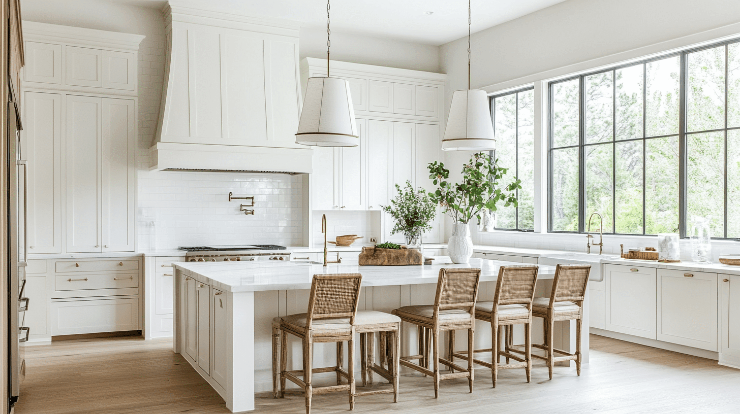
Extra White in a satin or semi-gloss finish can handle splashes and wipe clean easily. It makes kitchens look clean and works well with most cabinet colors and countertops.
Additional Tips:
- Choose a semi-gloss finish for areas that need frequent cleaning
- Extra White looks great with both light and dark cabinet colors
Bathrooms & Spa-like Retreats
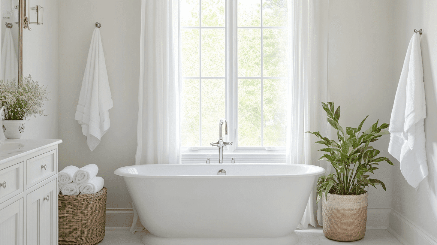
Extra White looks clean in bathrooms and brightens up small spaces. It works well with the bright lights found in bathrooms without looking too harsh.
Additional Tips:
- Pair with white tiles for a clean, matching look
- Use Extra White on the ceiling, too, for a simple, bright feeling
Color Pairings & Combinations
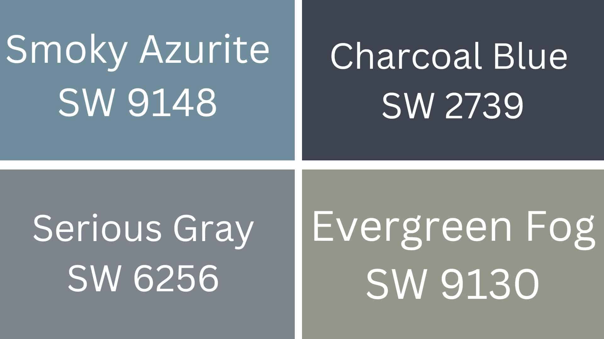
1. Smoky Azurite (SW 9148)
Smoky Azurite is a deep blue with gray hints. When used together on walls or trim, it makes Extra White look clean and fresh.
2. Charcoal Blue (SW 2739)
Charcoal Blue is a darker blue-gray color. When paired with Extra White, it creates a calm feeling that works well in bedrooms and offices.
3. Serious Gray (SW 6256)
Serious Gray is a medium gray with warm tones. It looks great next to Extra White on cabinets or as an accent wall in living rooms.
4. Evergreen Fog (SW 9130)
Evergreen Fog is a soft, misty green-gray color. It pairs nicely with Extra White to make rooms feel peaceful and natural, like in kitchens or bathrooms.
Creating Cohesive Color Schemes
Extra White by Sherwin Williams works great in many color plans. It can be the main color or help other colors look better. Let’s look at some ways to use it with different colors.
1. Monochromatic Scheme
A monochromatic scheme uses different shades of the same color. Extra White can be the base for a clean, bright look.
- Mix Extra White with light gray for a soft look
- Use white on walls and darker whites for trim
- Add texture with white furnishings of different materials
- Include mirrors to bounce light and make the space feel bigger
2. Warm Color Scheme
Warm colors feel cozy and welcoming. Extra White works well with warm colors to keep the space bright.
- Pair Extra White with soft yellow for a sunny feel
- Add tan or beige for a calm, relaxed look
- Use wood tones to bring warmth to white walls
- Try small pops of red or orange with mostly white walls
3. Cool Color Scheme
Cool colors feel calm and peaceful. Extra White helps cool colors look crisp and clean.
- Match Extra White with light blue for a beach-like feel
- Add gray-blue colors for a modern look
- Use green plants against white walls for a fresh feel
- Try navy blue accents with white for a classic combo
Coordinating with Furniture & Decor
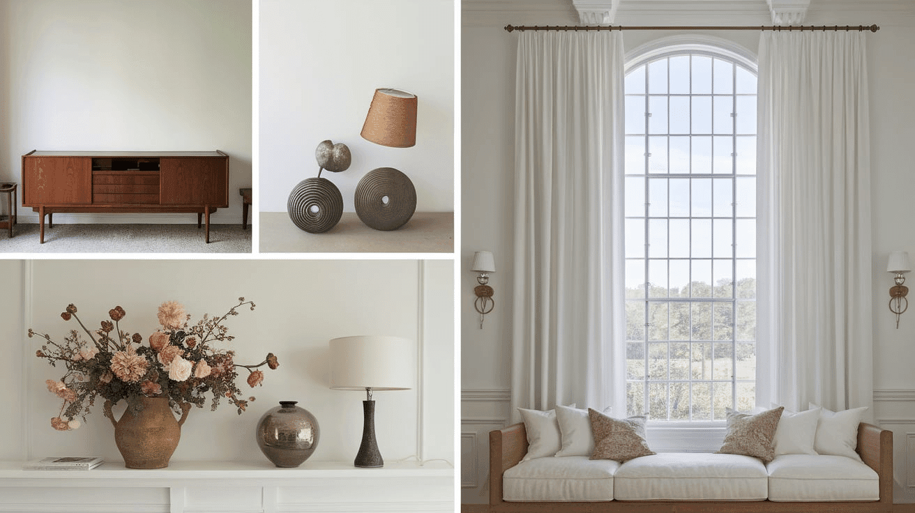
1. Wood Tones
Extra White looks great with dark wood like walnut or cherry. It also works well with light woods like oak or pine to create a clean, bright room.
2. Metals
Silver and chrome look crisp next to Extra White walls. Gold and brass add warmth and stand out nicely against this pure white shade.
3. Decor
Blue and green items pop against Extra White walls. Simple items in black or gray also look good and keep the room feeling calm and clean.
Similar Colors & Alternatives
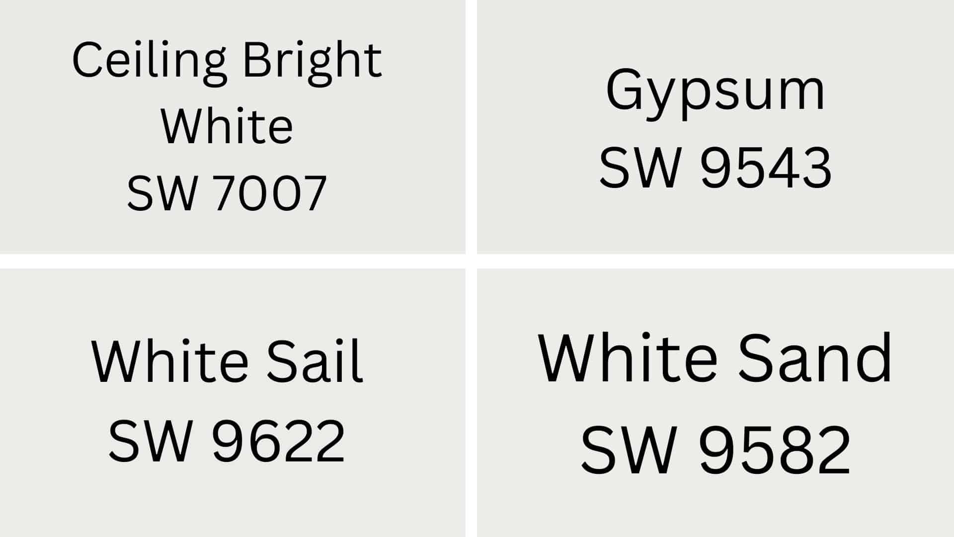
1. Ceiling Bright White (SW 7007)
Ceiling Bright White has a tiny hint of blue compared to Extra White. It works great on ceilings where you want a clean, bright look without any yellow tones.
2. Gypsum (SW 9543)
Gypsum is a bit softer than Extra White with very light gray undertones. It looks nice in rooms that get lots of sunlight without being too stark or harsh.
3. White Sail (SW 9622)
White Sail has slight cream undertones, making it warmer than Extra White. It’s good for rooms that need to feel cozy but still look clean and fresh.
4. White Sand (SW 9582)
White Sand adds a touch of tan to white, making spaces feel warm and welcoming. It pairs well with wooden furniture and natural materials throughout your home.
Final Thoughts
Extra White by Sherwin Williams is a clean, bright color that works in almost any room. It changes with the light, looking cooler in the morning and softer at night.
This white pairs well with both dark and light woods, all kinds of metals, and many accent colors. It’s easy to clean and keeps your home looking fresh.
Whether you’re painting a whole house or just one room, Extra White is a safe bet that won’t clash with your stuff. It makes small rooms feel bigger and helps your furniture stand out.
With so many uses and such a clean look, it’s no wonder this color is so popular.
Want the perfect white for your home? Try Extra White Paint from Sherwin Williams today!
For more color reviews, check out our website for more.

Alex Guerrero, a graduate with a Fine Arts degree from the Rhode Island School of Design, has been a visionary in the world of color and design for over 15 years. His professional journey began in the heart of the fashion industry in Milan, where he developed an acute sense for color harmonies and trends. Alex joined our team in 2018, offering fresh and innovative perspectives on color utilization in various spaces. Renowned for his ability to blend contemporary trends with timeless elegance. Outside of work, Alex is an accomplished painter and a volunteer art therapist, his artistic talents further enriching his professional insights.