Tired of choosing between cold grays and overly warm beiges? What if you could have the best of both?
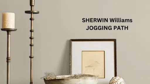
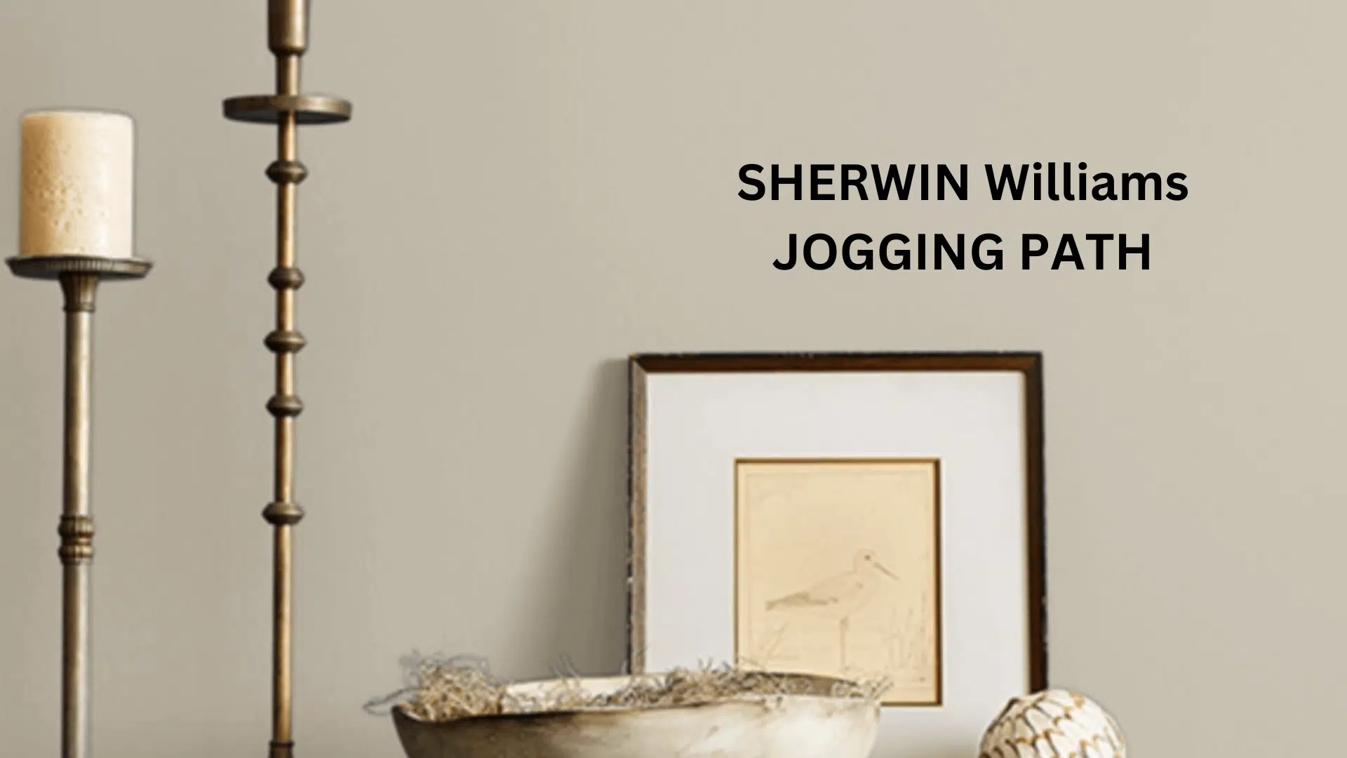
Sherwin-Williams’ Jogging Path (SW 7638) is the perfect middle ground, a refined beige that blends warmth and subtle coolness to create calm, balanced spaces that feel inviting and timeless.
In this guide, you’ll discover what sets Jogging Path apart from ordinary neutrals. From how it reacts to light to where it works best in your home, we’ll dig its versatility, emotional impact, and pairings with trim, furniture, and accent colors.
Whether you’re refreshing a cozy bedroom, designing a modern kitchen, or creating flow in an open-concept space, this soft, grounded hue might just be the effortless solution you’ve been looking for.
Let’s uncover why Jogging Path is more than a color it’s a feeling.
Understanding Sherwin Williams’ Jogging Path (SW 7638)
Color Terminology
| Property | Value |
|---|---|
| Color Name | Jogging Path |
| SW Number | SW 7638 |
| Location Number | 247-C2 |
| Hex Code | #C0B9A9 |
| RGB Value | R: 192 / G: 185 / B: 169 |
| LRV | 49 |
| Color Family | Greige (gray + beige blend) |
LRV tells you how much light a color reflects (0 = darkest, 100 = brightest), while RGB shows the mix of red, green, and blue light that creates the color.
Undertones:
- Jogging Path has balanced, warm undertones
- It’s a versatile greige with slight warmth that leans toward taupe
- Not a flat or one-dimensional neutral, but a refined, complex color with noticeable depth
Psychology of Greige Colors
Medium greiges like Jogging Path offer more than a neutral backdrop they create a sense of calm, balance, and approachability in everyday living.
Its warm taupe undertones bring a welcoming softness, making spaces feel grounded without being dark or heavy. Whether you’re unwinding in a cozy reading nook or moving through an open floor plan, Jogging Path offers visual harmony that connects your home.
Unlike stark grays or dated beiges, it adds quiet sophistication, supporting bold furniture, natural textures, or layered decor without clashing. And thanks to its versatility, it stays consistent across lighting conditions, bringing comfort and cohesion to any room.
Why Choose this Color?
The balanced depth of Jogging Path evokes a sense of groundedness and refinement that promotes comfort in any environment.
This enduring color carries complex undertones that shift subtly with changing light, ensuring your space feels both current and timelessly elegant.
Key Features
Sherwin Williams Jogging Path offers exceptional versatility across different lighting conditions. It maintains its balanced, warm undertones in dim spaces while creating a sophisticated, harmonious atmosphere in rooms with varied natural light.
Its timeless neutral quality provides a refined backdrop that complements both colorful elements and natural textures without appearing overly cool or flat.
Adaptability
Sherwin Williams Jogging Path demonstrates remarkable adaptability with existing elements like light-colored furniture and natural wood fixtures, creating beautiful harmony between spaces.
It provides enough depth to feel substantial and grounding while maintaining a refined, enduring quality that won’t quickly date your interior design choices.
This versatile greige works equally well as an all-over color for creating cohesive, atmospheric environments or as a complementary element to more saturated accent walls.
Durability
Sherwin Williams Jogging Path, particularly in premium finishes like Duration or Emerald, delivers outstanding durability with excellent coverage in both new and repainted areas.
Its medium tone and balanced warm undertones maintain a refined appearance throughout your home while providing a forgiving surface for everyday living.
This paint maintains color consistency even with regular cleaning when properly applied.
Texture Patterns
Sherwin Williams Jogging Path creates a soft, velvety texture that adds subtle dimension to walls and architectural features.
Its complex undertones produce a beautiful light play that enhances moldings and adds visual interest to even simple walls.
When applied to different finishes, it can elegantly highlight architectural details while maintaining a consistent, refined appearance throughout connected spaces.
Why It Works
Sherwin Williams’ Jogging Path works because it perfectly balances warmth and sophistication, providing enough character to create an atmosphere without feeling too trendy or overwhelming.
Its balanced undertones complement light woods, natural materials, and colorful elements, while its medium LRV (37) ensures rooms feel grounded and elegant.
This versatile greige adapts beautifully to changing decor styles, maintaining its distinguished character throughout the seasons.
Room-by-Room Color Recommendations with Jogging Path
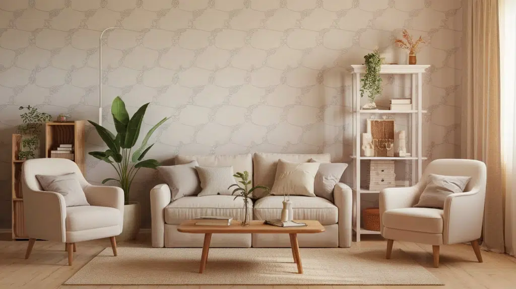
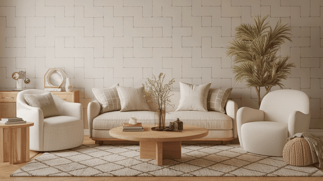
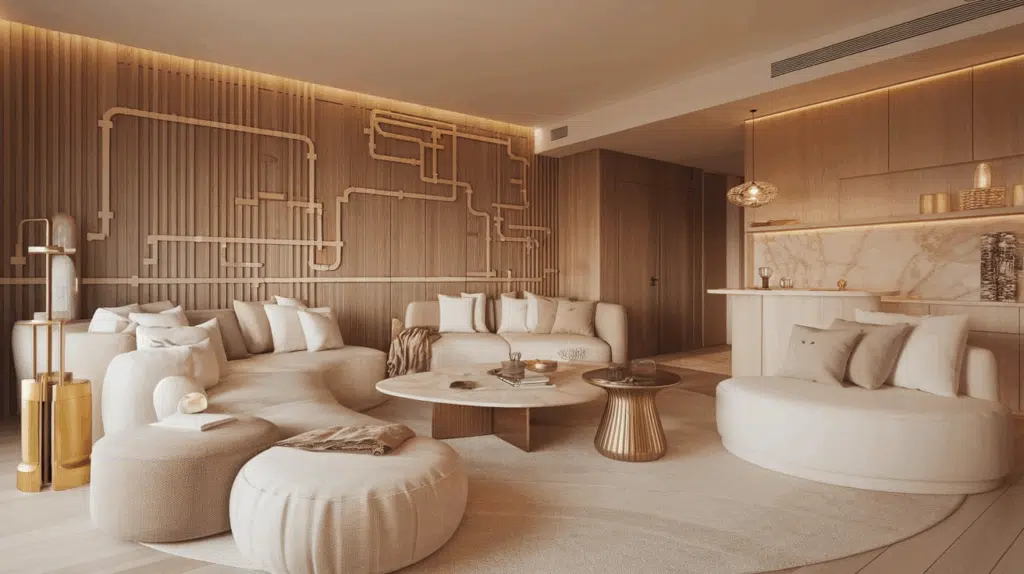
Living Spaces and Open Floor Plans
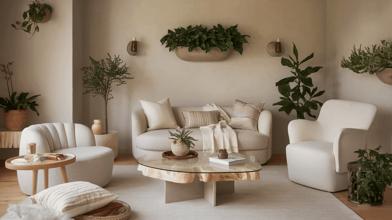
- Jogging Path works exceptionally well as an all-over color in open floor plans, creating a cohesive, harmonious space while maintaining a refined, contemporary palette.
- The 37 LRV of Jogging Path provides a substantial, grounding feel that makes spaces appear more sophisticated and refined without feeling heavy.
- Use Jogging Path to unify different areas in larger spaces while allowing colorful furnishings and artwork to stand out against its balanced backdrop.
Bedrooms and Relaxation Areas
- Jogging Path creates a soothing, cozy atmosphere in bedrooms that promotes relaxation and rest.
- The balanced warm undertones in Jogging Path evoke a sense of comfort while creating a refined backdrop for bedding and furniture of any style.
- Consider Jogging Path for all walls to create a serene sanctuary that feels both intimate and sophisticated without sacrificing warmth.
Kitchens
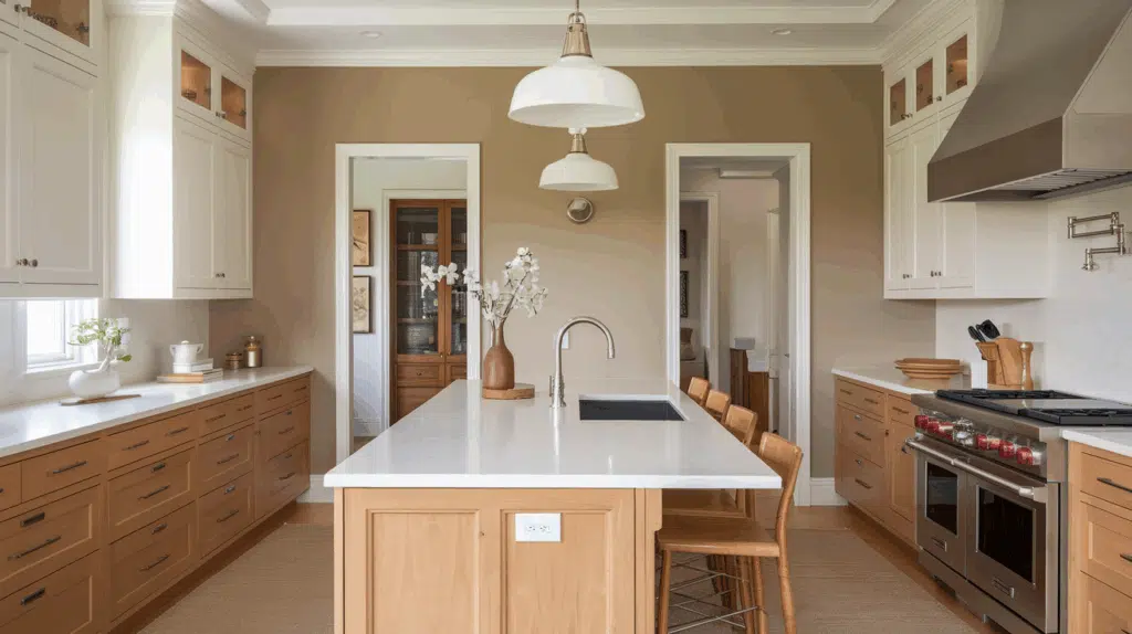
- Jogging Path in eggshell or satin finish on walls creates a sophisticated, timeless element that pairs beautifully with white cabinets or natural wood tones.
- The balanced depth of Jogging Path enhances both light countertop materials and stainless steel fixtures, making it adaptable to various kitchen styles from contemporary to farmhouse.
- Jogging Path walls paired with white upper cabinets create appealing contrast that grounds the kitchen while maintaining a refined, cohesive feel.
Bathrooms and Spa-like Retreats

- Sherwin Williams Jogging Path creates a sophisticated, refined atmosphere in bathrooms. Its balanced, warm undertones establish a sense of comfort while complementing various fixtures.
- This versatile shade pairs beautifully with both chrome and brass fixtures, marble, and natural wood, creating a timeless, refined retreat that feels both elegant and inviting.
- Use Jogging Path on all walls in medium-sized bathrooms to create a sense of coziness without sacrificing sophistication.
Jogging Path Color Combinations: Choose Based on Your Design
Sherwin Williams’ Jogging Path (SW 7638) is a beautifully balanced greige with warm undertones. With a Light Reflectance Value (LRV) of 37, it offers a grounding, sophisticated base without feeling too dark. But its full potential shines when paired with the right supporting colors.
Here’s how to choose the best color combinations with Jogging Path based on your specific design goals
1. Best Trim Colors with Jogging Path
Define the space with trim that suits your style:
Extra White (SW 7006) – Use for modern contrast. Ideal if you’re going for crisp, clean edges in a contemporary or minimalist room.
Pure White (SW 7005) – Best for balanced brightness. Works in transitional homes where you want subtle definition without starkness.
Alabaster (SW 7008) – Choose when you want a soft, cozy atmosphere. Pairs well in bedrooms, family spaces, or farmhouse-style interiors.
Greek Villa (SW 7551) – Great for traditional elegance. Use in spaces with warmer decor and natural textures for a seamless flow.
2. Coordinating Wall Colors: For Cohesion or Brightening
Use these when pairing Jogging Path with other walls or adjacent rooms:
Accessible Beige (SW 7036) – Use to brighten darker rooms or make smaller spaces feel more open without losing warmth.
Agreeable Gray (SW 7029) – Ideal for a subtle, cool-neutral transition. Works well in open floor plans or homes with modern furnishings.
Sea Salt (SW 6204) – Choose this for a calm, coastal feel. Perfect in bathrooms, laundry rooms, or bedrooms with natural light.
Krypton (SW 6247) – Use when you want a gentle contrast with a cooler undertone. Great for accent walls or serene, airy rooms.
3. Accent Wall Colors: To Add Depth or Drama
Looking to highlight a wall or feature? These choices create impact:
Naval (SW 6244) – Use for classic drama. Best in formal dining rooms, moody offices, or behind a statement bed or fireplace.
Rosemary (SW 6187) – Perfect for a natural, earthy vibe. Try it in reading nooks, kitchens with wood tones, or cottage-inspired interiors.
Iron Ore (SW 7069) – Best for bold contrast. Use in sleek, modern rooms or to highlight built-ins, fireplaces, or statement shelves.
Urbane Bronze (SW 7048) – Use for rich, masculine warmth. Ideal for studies, dens, or leather-accented rooms with a grounded, luxe feel.
Pro Tips for Choosing Combinations:
1. Want to brighten a dim space? Pair Jogging Path with Accessible Beige or Alabaster trim to keep things light yet cohesive.
2. Going for a modern edge? Choose Extra White trim and bold accents like Iron Ore or Naval for sharp contrast.
3. Love natural, calming interiors? Opt for Rosemary or Sea Salt, which echo earth and sea tones while complementing Jogging Path’s warmth.
Coordinating with Furniture and Decor
Wood Tones
Jogging Path pairs beautifully with a wide range of wood tones, offering different aesthetic effects. Light oak, maple, and birch create harmonious warmth against Jogging Path’s balanced backdrop.
Medium wood tones like cherry provide a complementary richness that enhances Jogging Path’s warm undertones.
For a more dramatic look, dark espresso or ebony woods create a refined contrast that highlights Jogging Path’s nuanced character.
Natural, unstained wood creates organic, clean harmony that highlights Jogging Path’s connection to nature.
Care Tip: When using dark woods, ensure adequate lighting (natural or layered artificial) to prevent the room from feeling overly moody or closed in. A mix of ambient and accent lighting helps maintain warmth and clarity.
Metals
Brushed nickel, stainless steel, and pewter hardware complement Jogging Path’s balanced undertones and create a fresh, contemporary look.
Matte black fixtures create a sophisticated contrast that emphasizes Jogging Path’s warmth. While Jogging Path works beautifully with cool metals, brass, and gold accents create a harmonious warmth that enhances its underlying tones—opt for brushed or antique finishes for a more refined pairing.
Bronze and copper finishes provide an elegant, timeless combination that complements Jogging Path’s distinguished character with enhanced warmth.
Care Tip: To avoid visual clutter, limit metal finishes to one or two tones per space. Repeating a finish (e.g., matte black cabinet pulls and lighting) reinforces design cohesion alongside Jogging Path’s subtle backdrop.
Decor
Natural fibers like linen, cotton, and wool in neutral tones create textural interest against Jogging Path walls while enhancing its organic quality.
Colorful accents in muted tones, such as dusty blues, sage greens, and terracotta, offer a beautiful contrast against the balanced backdrop.
Glass, ceramic, and stone elements add refined texture and prevent the Jogging Path from feeling too flat in spaces with varied lighting.
Introducing natural elements with varied textures—like rattan, jute, or wool—reinforces the organic balance inherent in this versatile greige while adding tactile interest.
Care Tip: In rooms with limited light, choose lighter or reflective decor (e.g., glass, mirrors, pale textiles) to bounce light and prevent the space from feeling heavy.
Jogging Path vs. Accessible Beige vs. Agreeable Gray
Choosing the right warm neutral can completely transform the feeling of your space. Here’s how Jogging Path, Accessible Beige, and Agreeable Gray stack up—so you can pick the perfect tone for your needs.
Quick Links to Explore Each Color:
Side-by-Side Comparison Chart
| Paint Color | LRV | Undertones | Visual Tone | Best For |
|---|---|---|---|---|
| Jogging Path (SW 7638) | 37 | Warm taupe-gray | Mid-tone, grounded | Creating cozy, elegant, or transitional spaces with warmth and depth |
| Accessible Beige (SW 7036) | 58 | Beige with gray (greige) | Lighter and softer | Brightening rooms while keeping a warm, welcoming feel |
| Agreeable Gray (SW 7029) | 60 | Balanced gray-beige | Light, neutral and versatile | Modern, open-concept spaces where you want flexibility across styles |
Jogging Path has the deepest tone, creating more visual weight and warmth—ideal for grounding larger or open areas.
Accessible Beige is lighter and brighter, great for spaces that lack natural light but still need warmth.
Agreeable Gray is cooler and more adaptable, perfect for contemporary designs where you want neutrality with just a touch of warmth.
Final Thoughts
Jogging Path (SW 7638) transcends fleeting trends, striking a graceful balance between warmth and sophistication. It’s a favorite among designers and homeowners alike for its ability to create grounded, refined spaces that feel timeless yet current.
Its nuanced character adapts beautifully to evolving styles and seasonal updates, making it a reliable foundation for long-term design. Whether basking in natural morning light or serving as a quiet anchor for bold accents, Jogging Path consistently elevates the atmosphere with understated elegance.
In choosing this exceptional shade, you’re not just picking a paint color you’re embracing an approach to design that values balance, subtlety, and enduring beauty in the spaces we live in every day.
What do you think of Jogging Path? Share your thoughts below!

Alex Guerrero, a graduate with a Fine Arts degree from the Rhode Island School of Design, has been a visionary in the world of color and design for over 15 years. His professional journey began in the heart of the fashion industry in Milan, where he developed an acute sense for color harmonies and trends. Alex joined our team in 2018, offering fresh and innovative perspectives on color utilization in various spaces. Renowned for his ability to blend contemporary trends with timeless elegance. Outside of work, Alex is an accomplished painter and a volunteer art therapist, his artistic talents further enriching his professional insights.