

Want a white paint that warms your home without going too yellow?
I have used Westhighland White in countless homes, and it never disappoints!
This soft, creamy off-white brings a gentle warmth to any room without feeling too yellow. I love how it alters dark hallways into welcoming spaces that feel open and bright.
When I painted my dining room with Westhighland White, the space instantly felt more inviting. It’s perfect for north-facing rooms that need some warmth but also works beautifully in sunny spaces without looking washed out.
I’ve noticed it pairs wonderfully with both cool and warm colors.
If you’re looking to create a cozy bedroom or a fresh kitchen, this versatile shade adapts to your style. From traditional to modern homes, Westhighland White creates the perfect backdrop for your furniture and décor.
When selecting trim colors to complement Westhighland White, it's essential to consider Sherwin-Williams' best white trim options to achieve a harmonious look.
Paint Color Basics of Westhighland Whites
Get to know SW Westhighland White through its key specs, undertones, and color psychology. This breakdown covers everything you need to understand this popular white paint choice.
Color Terminology
| PROPERTY | VALUE |
|---|---|
| LRV (Light Reflectance Value) | 86 |
| Color Category | Considered a light color (LRV above 50) |
| Comparison | Pure white: ~90 LRV, Black: ~0 LRV |
| RGB Value | Red: 243, Green: 238, Blue: 227 |
| Hex Code | #F3EEE3 |
Undertones of SW Westhighland White
- Westhighland White is a crisp, clean white with delicate, cool undertones of blue and gray.
- It has a bright, airy quality that creates a fresh, open feeling without appearing harsh or sterile.
- The subtle coolness is well-balanced, preventing it from feeling too clinical while avoiding any cream or yellow influence.
- Westhighland White provides an agile, contemporary foundation that enhances natural light and creates a sense of spaciousness.
- It’s highly versatile and complements both warm wood tones and cooler accent colors, making it an exceptionally adaptable neutral.
Psychology of Neutral Colors
It boosts focus with a crisp, clean backdrop. Light bounces freely here.
It speaks of modern refinement. Cool undertones create simplicity without starkness.
It defines space clearly. Colorful elements pop against its pure canvas.
It brings emotional calm. Order and serenity flow throughout any setting.
It energizes through light. Spaces feel open; communication flows more easily.
Why Choose Westhighland White?
Versatility
Westhighland White adapts beautifully across lighting conditions, appearing as a bright, clean white in daylight while showing subtle cool undertones in artificial lighting.
Its balanced coolness creates a versatile neutral that works seamlessly with modern, transitional, and classic design elements.
Key Features
Westhighland White functions as a powerful space enhancer, visually expanding rooms and providing a crisp background that showcases artwork and furnishings.
It delivers a fresh, airy backdrop that feels contemporary yet timeless, avoiding the stark coldness of bluish whites or the heaviness of creamy neutrals.
Durability
Sherwin-Williams Westhighland White in premium formulations like Emerald or Duration offers superior coverage and washability with minimal maintenance.
Its reflective properties effectively brighten spaces and maintain a pristine appearance even in high-traffic areas when applied correctly.
Texture Patterns
Westhighland White creates modern refinement through its ability to capture and amplify light, adding brightness to walls while maintaining visual clarity.
Its cool, clean undertones produce crisp dimensional effects that define structural details and create bright, energizing environments.
Westhighland White Room Guide
Learn how to use Westhighland White in every room of your home. These tips show you which spaces work best and what colors to pair with them.
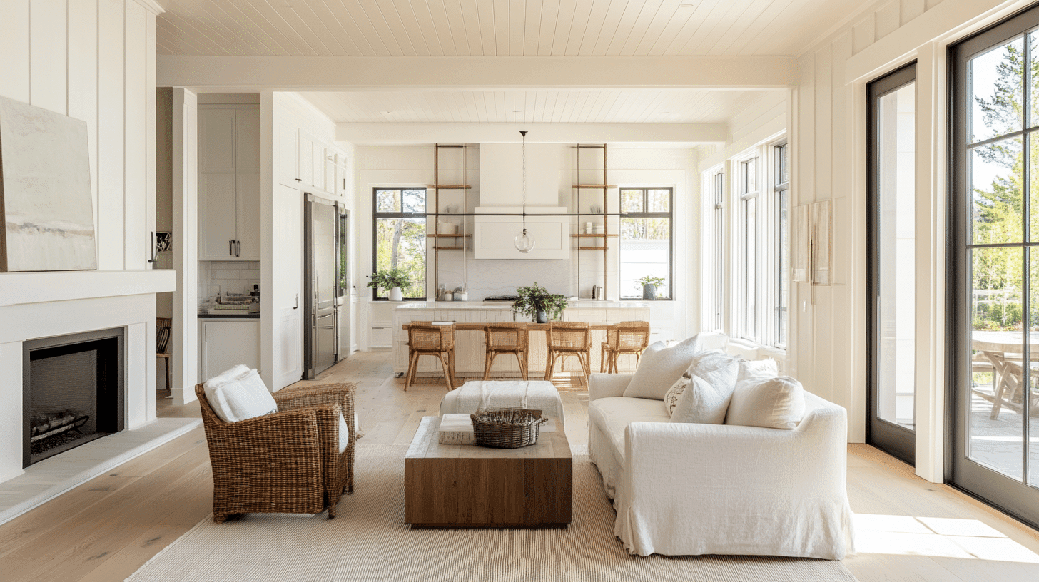
In Living Spaces and Open Floor Plans
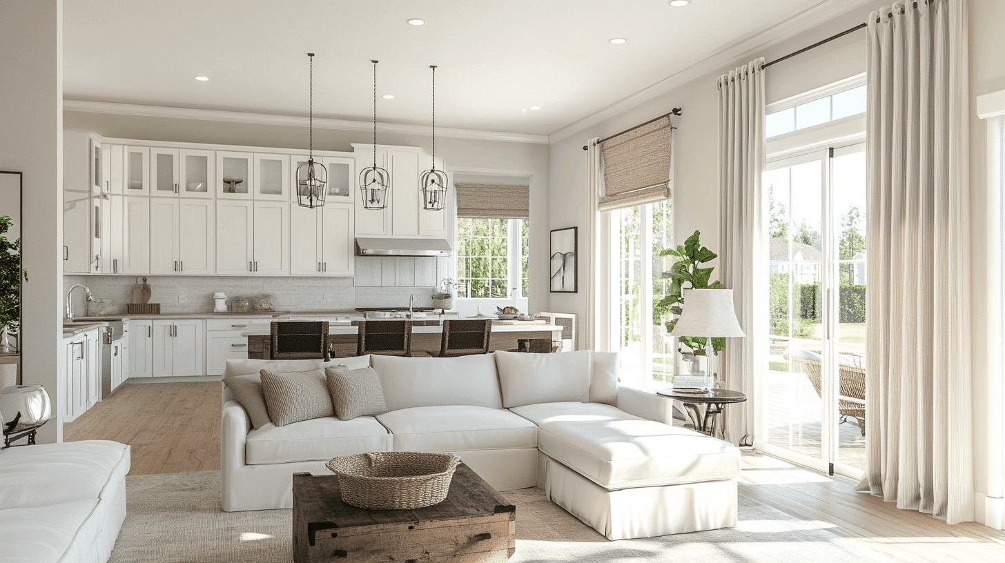
- Westhighland White creates cohesive clarity in open concepts, as its reflective quality maximizes brightness across different lighting zones.
- Westhighland White’s high LRV enhances spaciousness when used throughout while allowing furniture and decorative elements to stand out distinctly.
- For refined contrast, pair Westhighland White walls with Pure White SW 7005 trim or create subtle layering with Site White SW 7070 for adjacent spaces.
In Bedrooms and Relaxation Areas
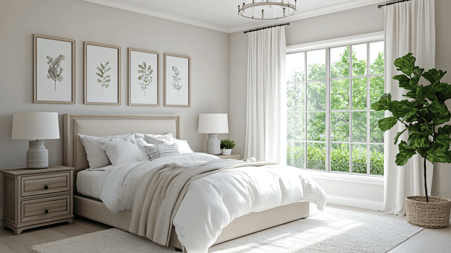
- Westhighland White establishes a clean, refreshing retreat in bedrooms. Its cool crispness promotes clarity and restful simplicity.
- The subtle blue-gray undertones create a calming environment while providing enough neutrality to support various accent colors and textures.
- Consider Westhighland White for all walls, complemented by layered textiles in varying tones to create a tranquil sanctuary that feels both contemporary and inviting.
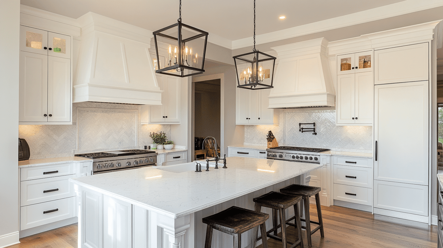
In Kitchen
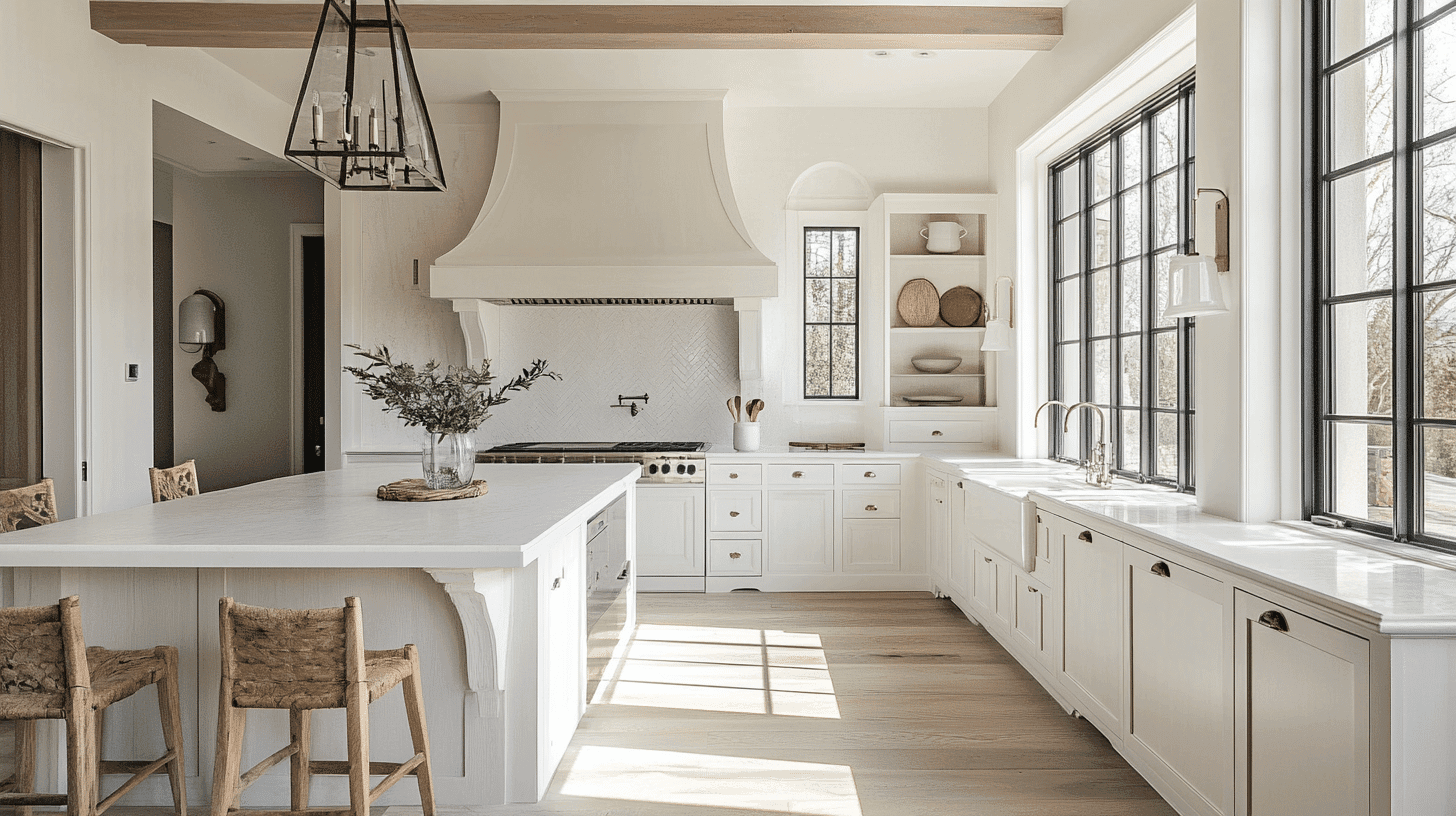
- Westhighland White in a semi-gloss finish offers modern intricacy on cabinets or walls. Its bright tone maximizes light and creates a clean, fresh appearance.
- The versatile coolness complements both warm woods and cool stone surfaces, providing a flexible foundation for diverse material palettes.
- Westhighland White creates a pristine backdrop for colorful accessories or statement hardware, adding refined brightness without appearing yellow or cream-tinted.
In Bathrooms and Spa-Like Retreats
- Westhighland White establishes invigorating, spa-like freshness in bathrooms. Its brightness enhances visual spaciousness while providing a clean backdrop for fixtures.
- This crisp neutral beautifully highlights chrome, matte black, or brushed fixtures, creating a coordinated, intentional aesthetic.
- Consider using it on all surfaces for a bright, expansive feel, or pair it with bold accent tile to create a balanced focal point that promotes the entire space.
Combinations for Westhighland White (SW 7566)
Westhighland White recasts transition spaces like entryways and hallways into warm, inviting areas, creating a soft, cozy atmosphere in often confined spaces.
When used on wainscoting or interior door frames, Westhighland White establishes a subtle warmth that creates a welcoming flow and enhances natural light throughout the home with its creamy undertones.
Complementary Accent Colors
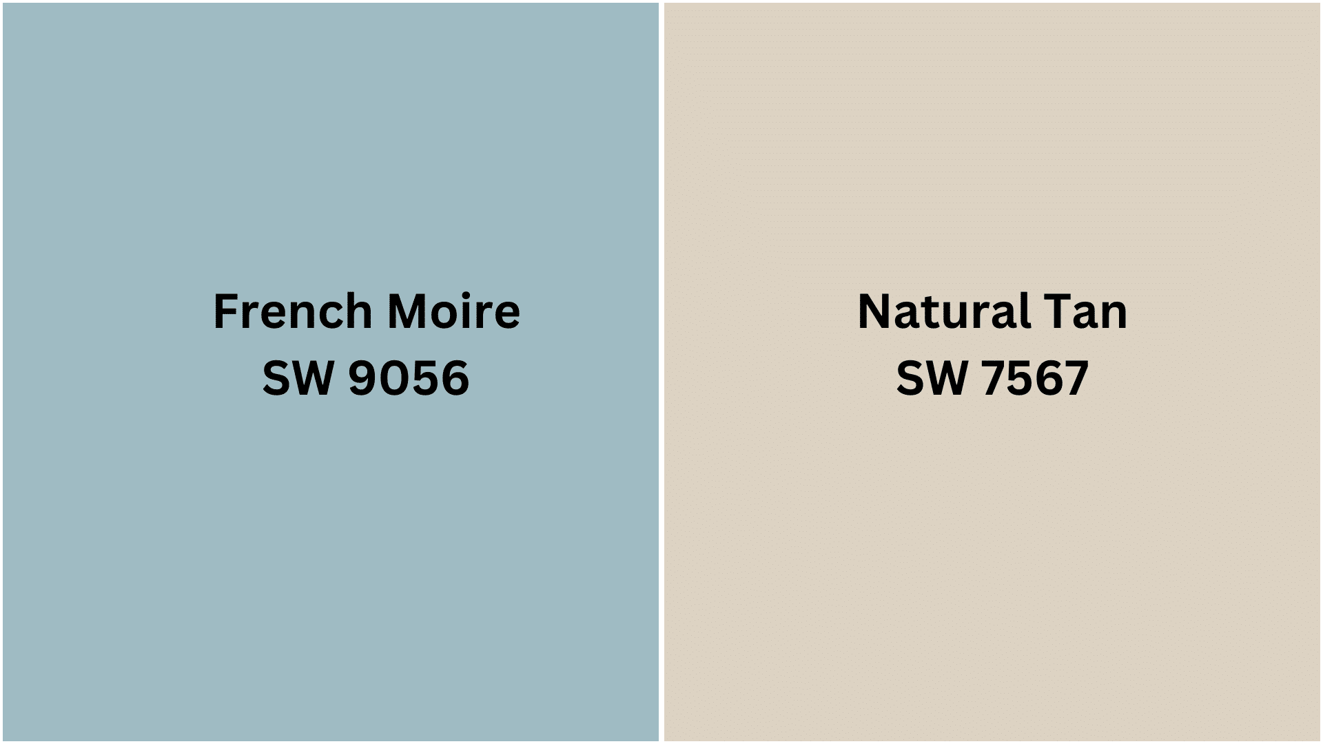
Natural Tan SW 7567 – A versatile, warm neutral that seamlessly extends Westhighland White’s creamy undertones while adding depth and dimension to your space.
French Moire SW 9056 – A refined blue-green that provides smart contrast against Westhighland White’s warm canvas, creating a balanced and refreshing color story.
Creating Cohesive Color Schemes with Westhighland White (SW 7566)
1. Monochromatic Scheme
- Westhighland White for main walls and trim
- Creamy (SW 7012) for ceilings and connecting spaces
- Ivory Lace (SW 7013) for structural details
- Nacre (SW 6154) for subtle contrast and depth
2. Cool Color Scheme
- Westhighland White for main walls and millwork
- Rainwashed (SW 6211) for living areas and bedrooms
- Quietude (SW 6212) for accent walls
- Silver Strand (SW 7057) for subtle color in bathrooms
3. Warm-Cool Balance Scheme
- Westhighland White for primary spaces and trim
- Natural Tan (SW 7567) for living and dining areas
- Loggia (SW 7506) for accent walls
- Smoky Salmon (SW 6331) for small spaces or accessories
4. Natural Elements Scheme
- Westhighland White for main walls and built-ins
- Extra White (SW 7006) for trim and ceilings
- French Moire (SW 9056) for connecting spaces
- Greens (SW 6748) for focal points or furniture
Coordinating with Furniture and Decor
Wood Tones
Westhighland White creates a warm, inviting backdrop for medium woods likecherry, oak, and pecan, enhancing their natural warmth and character.
For a more contrasting approach, darker woods like ebony or wenge provide dramatic definition against this soft, creamy neutral. Light maple or birch creates a contemporary, light-filled pairing that emphasizes the subtle warmth of both elements.
Metals
Warm brass and copper blend exceptionally well with Westhighland White’s creamy undertones, creating a cohesive, inviting palette. Matte black hardware provides a striking definition against Westhighland White’s soft warmth, offering structural interest that grounds the space.
Bronze and aged metals create a timeless, traditional feeling that complements Westhighland White’s classic quality while adding character.
Decor
Textural elements like wool, bouclé, and sisal in varying warm tones add depth and coziness while enhancing Westhighland White’s inviting quality.
Terracotta, earthenware, and natural stone introduce organic color moments that pair beautifully with the neutral backdrop. Landscape art with soft horizons, trailing vines with organic silhouettes, and honey-toned wood accessories enhance the warm, welcoming atmosphere this color establishes.
Perfect Alternative to Westhighland White (SW 7566)
Westhighland White is a soft, creamy off-white with warm undertones. Its balanced Light Reflectance Value creates welcoming, luminous spaces while providing gentle warmth and subtle depth compared to brighter whites.
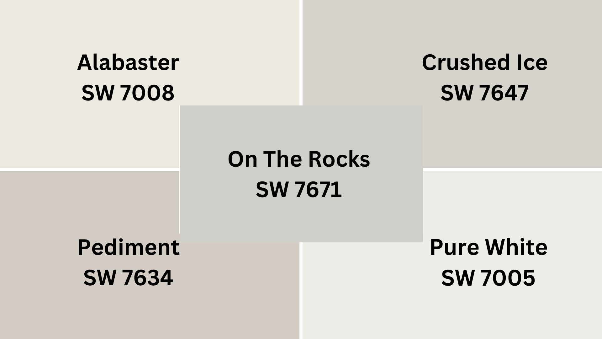
SW 7005 Pure White – A cleaner, brighter white that maintains Westhighland White’s versatility but with a less yellow undertone, creating a more contemporary, crisp aesthetic while still avoiding a stark appearance.
SW 7008 Alabaster is a refined off-white with delicate warmth that echoes Westhighland White’s creamy quality but with slightly more neutral undertones. It is perfect for creating serene, timeless spaces.
SW 7634 Pediment – A refined greige-influenced white that shifts Westhighland White’s undertones toward a more complex territory, adding subtle depth and a touch of refinement for more layered interiors.
SW 7647 Crushed Ice – A versatile cool white with subtle gray undertones that offers a refreshing alternative to Westhighland White for spaces where a cooler, more contemporary presence is desired.
SW 7671 On the Rocks – A balanced white with subtle gray-beige undertones that captures Westhighland White’s softness while introducing a more modern, neutral quality that works beautifully in various lighting conditions.
Final Thoughts
After using Westhighland White (SW 7566) throughout my home, I can truly say it’s one of the most versatile colors I’ve ever worked with. I love how it brightens my spaces without feeling cold or stark.
The soft, creamy undertones create a welcoming atmosphere that my family and friends always compliment.
I’ve found it works in every room, from my sunny kitchen to my north-facing bedroom. It pairs beautifully with both my modern furniture and antique pieces.
Ready to remake your home with this perfect neutral? Please pick up a sample of Westhighland White today and test it on your walls in different lighting.
I guarantee you’ll fall in love with how it adapts throughout the day. Don’t wait to experience the difference this beautiful shade can make in your home!

Alex Guerrero, a graduate with a Fine Arts degree from the Rhode Island School of Design, has been a visionary in the world of color and design for over 15 years. His professional journey began in the heart of the fashion industry in Milan, where he developed an acute sense for color harmonies and trends. Alex joined our team in 2018, offering fresh and innovative perspectives on color utilization in various spaces. Renowned for his ability to blend contemporary trends with timeless elegance. Outside of work, Alex is an accomplished painter and a volunteer art therapist, his artistic talents further enriching his professional insights.


This is such a beautiful review of Westhighland White. The article was very helpful and a beautiful review of a very pretty color! 🙂
I agree, Tina. Thank you, Alex Guerrero for such a thorough review on Westhighland white.