Have you ever wanted a color that feels both calming and interesting? That’s what I found with Cromarty! This amazing green-gray paint changes throughout the day as light moves across your walls. In the morning, it might look more green, while evening light brings out its gray side.
I love how Cromarty creates peaceful rooms without being boring. It’s not too dark or too light—just perfect for living rooms, bedrooms, or kitchens. Pair it with whites for a clean look or with darker blues for something more dramatic.
Unlike plain grays that feel cold, Cromarty connects to nature with its subtle green undertones. Want to make your space feel special? Try Cromarty and watch how it alters your home!
Understanding Paint Color Basics
Color Terminology
| PROPERTY | VALUE |
|---|---|
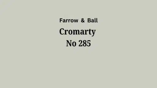
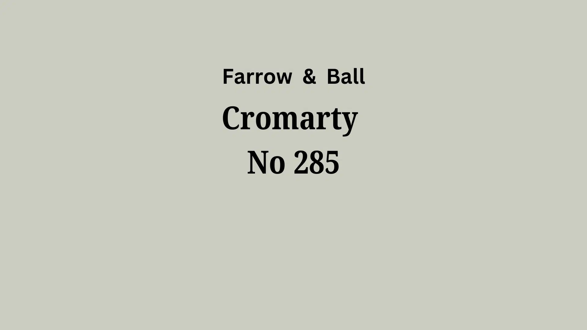
| Brand Color No | 285 |
| Color Category | Considered a light color (LRV above 50) |
| Comparison | Pure white: ~90 LRV, Black: ~0 LRV |
| RGB Value | Red: 207, Green: 206, Blue: 192 |
| Hex Code | #CFCEC0 |
Undertones:
- Farrow & Ball Cromarty is a refined, muted green-gray with subtle blue undertones that shift beautifully in changing light.
- It possesses a calm, contemplative quality that creates a serene atmosphere without feeling cold or detached.
- The delicate balance of green and gray notes gives it depth and complexity, avoiding any muddy or overly sage-like tendencies.s
- Cromarty offers a refined, nuanced backdrop that enhances structural details while providing a gentle connection to natural elements.
- It’s remarkably versatile, effortlessly pairing with crisp whites and deeper tones, making it an exceptionally adaptable neutral for contemporary and traditional spaces alike.
Psychology of New Neutrals
It enhances contemplation with its nuanced green-gray depth. Light changes its character throughout the day.
It conveys understated intricacy. The balance of natural undertones creates complexity without dominating it.
It softens spatial boundaries. Constructive elements gain subtle definitions against their muted presence.
It promotes emotional grounding. The color’s connection to natural elements brings a sense of stability and calm.
It harmonizes transitions. The versatile green-gray hue bridges indoor and outdoor spaces, creating cohesive environments.
Why Choose Farrow & Ball Cromarty, No. 285?
Versatility
Cromarty adapts masterfully through changing light conditions, revealing its complex green-gray character in natural daylight while shifting to a more muted, refined neutral in the evening light.
Its balanced undertones create a versatile foundation that complements both traditional woodwork and contemporary furnishings, making it equally at home in period properties and modern spaces.
Key Features
Cromarty functions as a nuanced space tool, creating a sense of calm and refinement that allows structural elements to shine.
It delivers a soothing, contemplative backdrop that feels both current and timeless. It avoids the flatness of standard grays or the heaviness of traditional greens. Its subtle depth adds dimension to walls without overwhelming other design elements.
Durability
Farrow & Ball Cromarty’s Modern Emulsion or Estate Emulsion Formulations offer excellent coverage with a depth of pigmentation that creates a rich, velvety finish.
Its carefully calibrated tone maintains its character in varying light conditions and ages gracefully, developing a subtle patina rather than appearing worn in busy areas.
Texture Patterns
Cromarty creates refined grace through its ability to capture and gently diffuse light, adding subtle dimensionality to walls.
Its complex undertones produce delicate shadow effects that enhance structural details and create tranquil, grounding environments.
The color reads as neutral but with enough personality to create visual interest and depth on larger wall surfaces.
Room-by-Room Color Recommendations for Farrow & Ball Cromarty (No. 285)
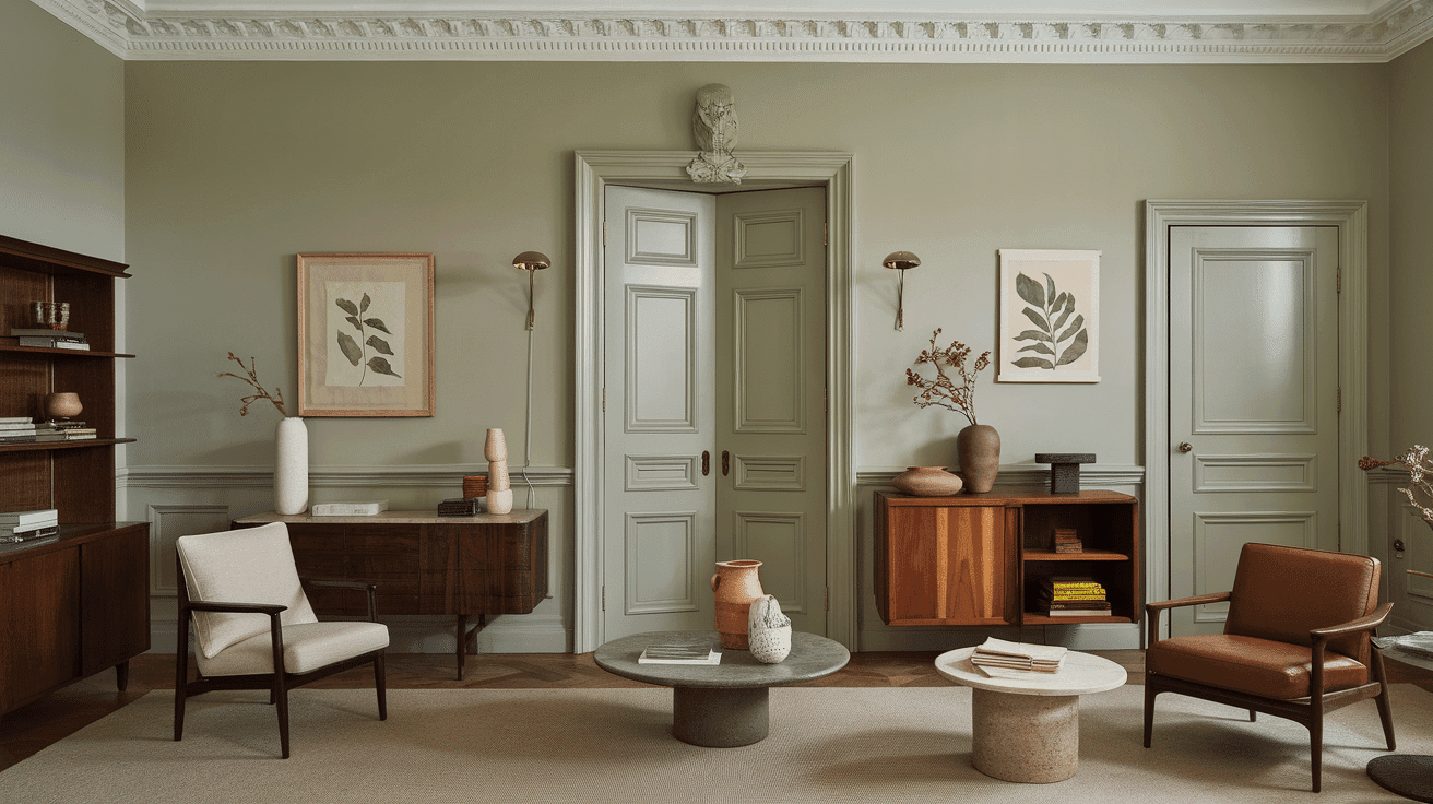
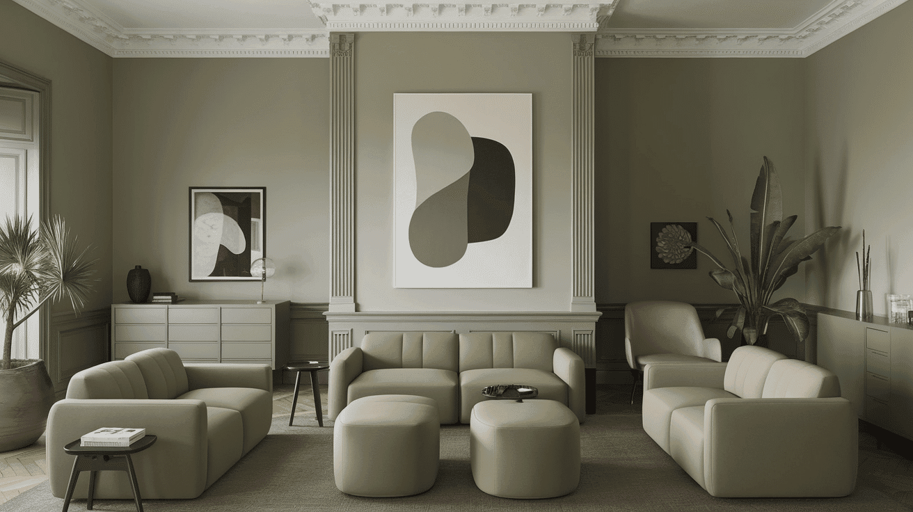
In Living Spaces and Open Floor Plans
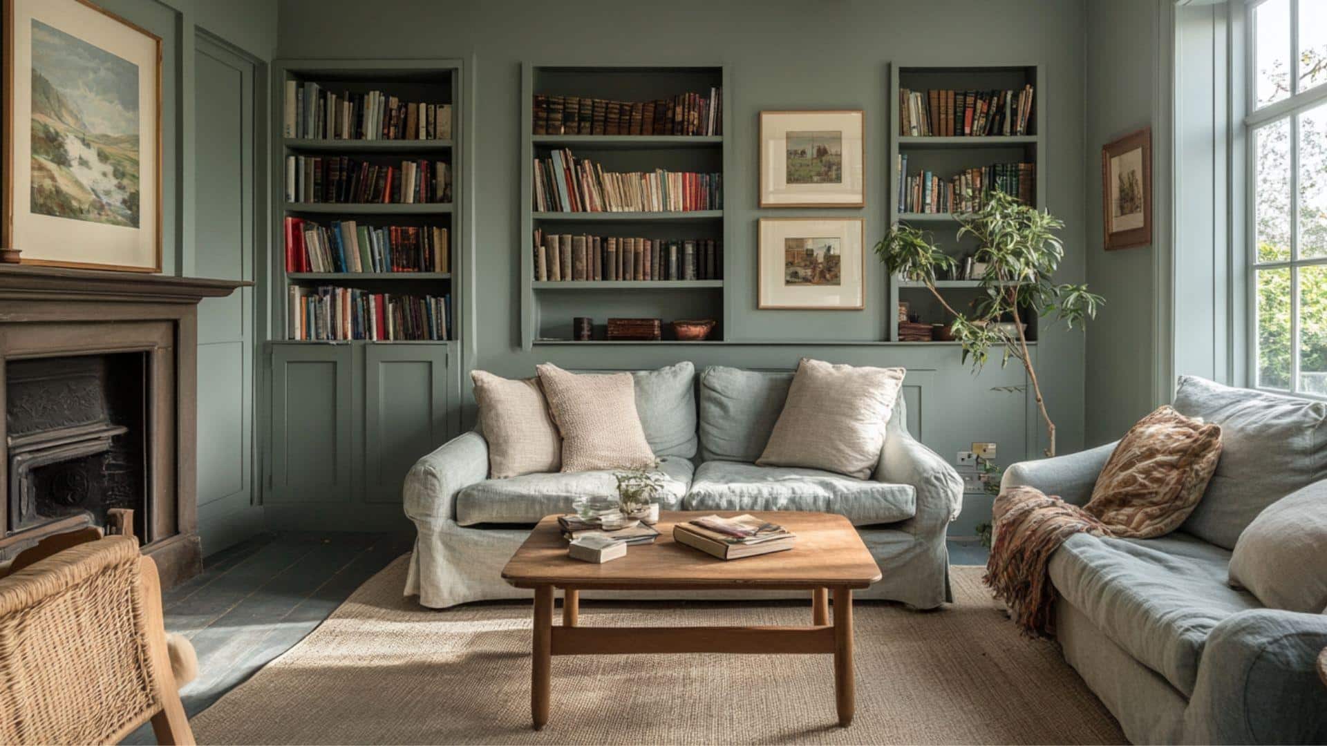
- Cromarty creates cultivated harmony in open floor plans with its nuanced green-gray depth that shifts subtly as light changes throughout the day.
- Cromarty’s balanced mid-tone provides a gentle definition when used comprehensively, unifying spaces while maintaining visual interest across varying perspectives.
- For structural emphasis, pair Cromarty walls with Farrow & Ball All White No. 2005 trim or create layered dimension with Pigeon No. 25 for adjacent spaces that require subtle transition.
In Bedrooms and Relaxation Areas
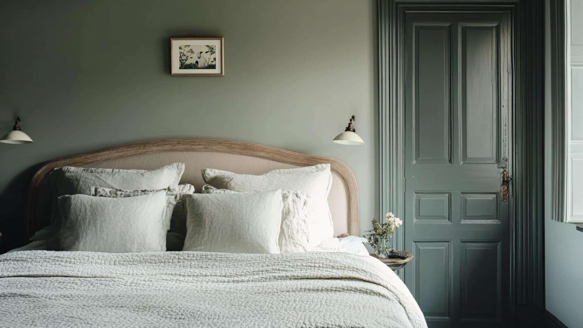
- Cromarty establishes a serene retreat in bedrooms with its muted complexity that promotes tranquility and contemplative calm.
- The balanced undertones create a refined environment that responds beautifully to both natural and artificial light, supporting restful sleep and morning clarity.
- Consider Cromarty for all walls. This creates an enveloping sanctuary that feels both grounded and ethereal, particularly effective with natural linens and textural elements.
In Kitchen
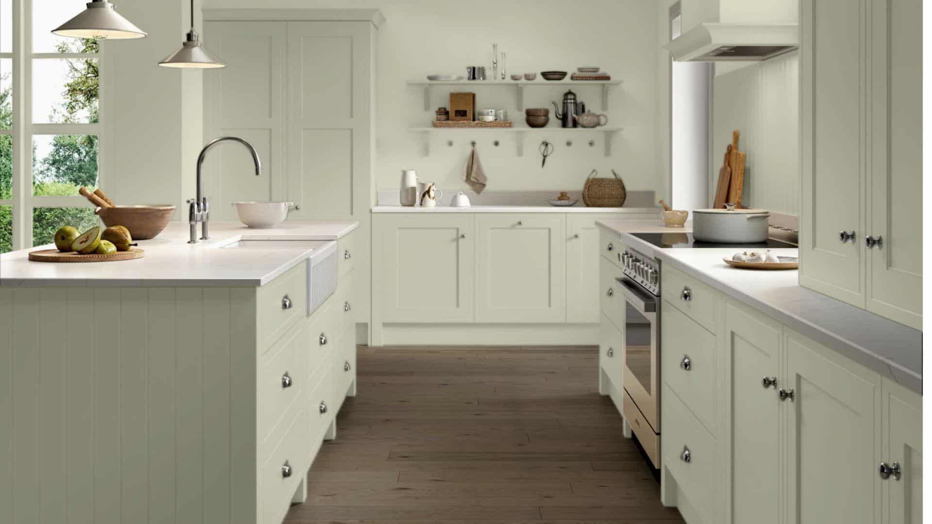
- Cromarty in Modern Eggshell finish offers a refined presence on kitchen cabinetry. Its complex tone adds depth without overwhelming the space.
- The versatile green-gray complements both cool marble and warm wooden countertops, providing an adaptable foundation for various material palettes.
- Cromarty creates a refined backdrop for brass hardware and natural accessories, adding subtle character and timeless elegance to kitchen designs.
In Bathrooms and Spa-Like Retreats
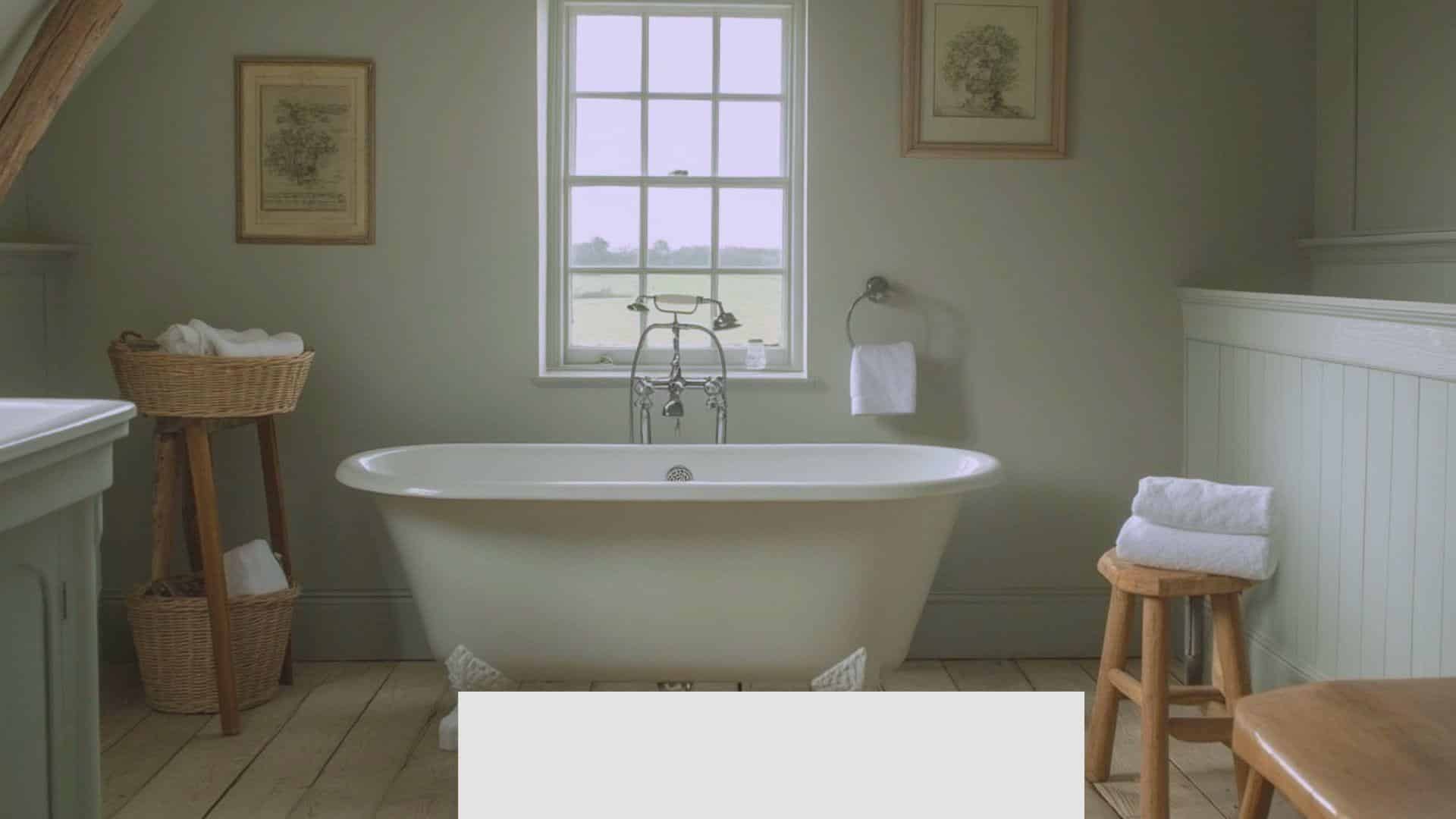
- Cromarty establishes a restorative, nature-inspired atmosphere in bathrooms. Its subtle complexity creates visual interest while maintaining a calm environment.
- This urbane neutral beautifully enhances natural stone, linen textiles, and wooden accessories, creating a cohesive, organic aesthetic.
- Consider using it on all walls to create an immersive, cohesive retreat that feels both grounding and uplifting throughout the day’s changing light.
Color Pairings and Combinations for Farrow & Ball Cromarty No. 285
Cromarty alters connecting spaces like landings and corridors into thoughtful design statements, adding urbane depth to areas that serve as visual transitions.
When used on cabinetry or interior window frames, Cromarty creates subtle moments of interest that draw attention to structural details and establish a refined sense of continuity throughout the home.
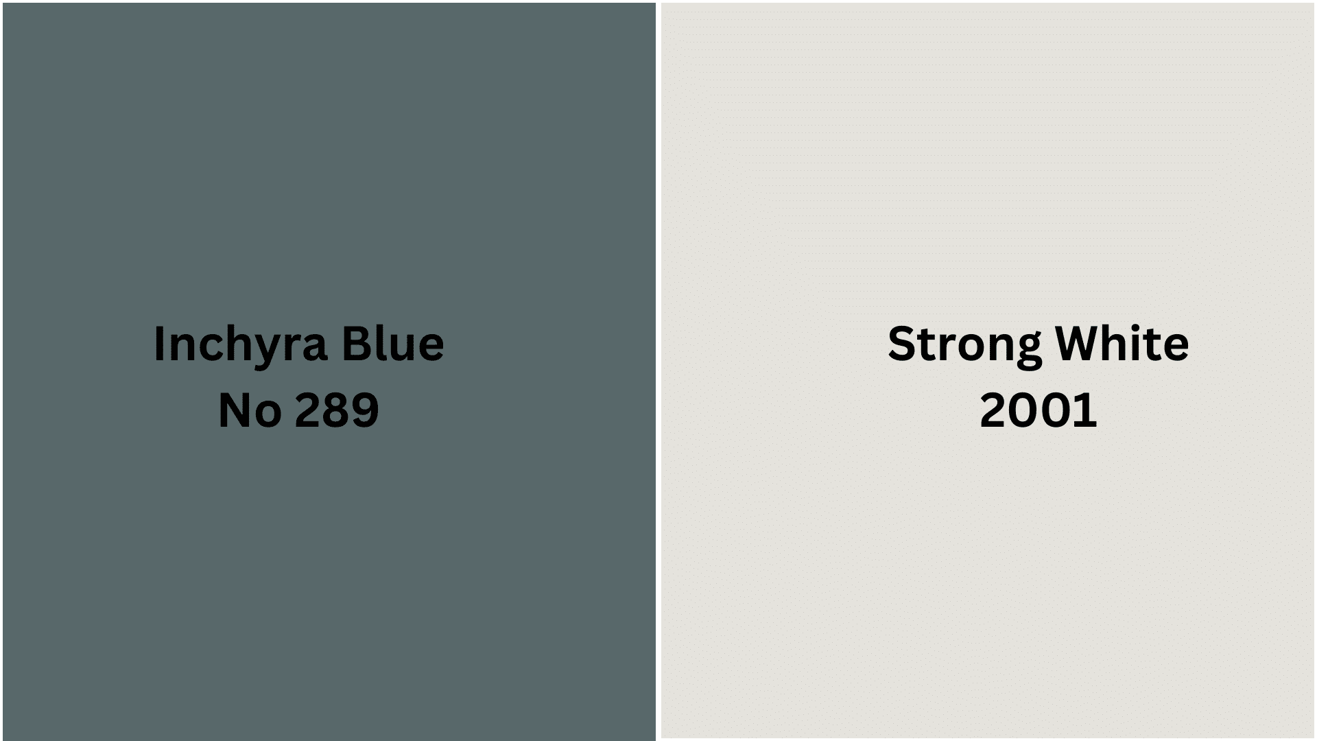
Complementary Trim Colors
No. 2001 Strong White – A cultured off-white with gray undertones that creates subtle harmony with Cromarty while providing a smart definition to woodwork.
No. 289 Inchyra Blue – A mysterious blue-green that shares Cromarty’s depth while introducing rich contrast for dramatic structural emphasis.
Creating Cohesive Color Schemes with Cromarty No. 285
1. Monochromatic Scheme
- Cromarty (No. 285) for feature walls or kitchen cabinetry
- Pigeon (No. 25) for connecting spaces and hallways
- Light Blue (No. 22) for main walls in living areas
- Skylight (No. 205) for ceilings or lighter contrast areas
2. Cool Color Scheme
- Cromarty (No. 285) for structural elements
- Inchyra Blue (No. 289) for statement pieces or built-ins
- Oval Room Blue (No. 85) for dining rooms or studies
- Card Room Green (No. 79) for secondary spaces
3. Warm-Cool Balance Scheme
- Cromarty (No. 285) for main walls
- London Clay (No. 244) for accent furniture or feature areas
- Strong White (No. 2001) for trim and woodwork
- India Yellow (No. 66) for accessories or small focal points
4. Natural Elements Scheme
- Cromarty (No. 285) for principal rooms or exterior accents
- All White (No. 2005) for trims and ceilings
- Purbeck Stone (No. 275) for connecting spaces
- De Nimes (No. 299) for grounding elements and secondary spaces
Coordinating with Furniture and Decor
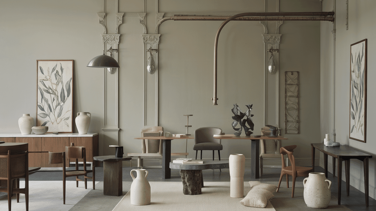
Wood Tones
Cromarty creates a cultivated harmony with honey-toned woods like oak and maple, enhancing their natural warmth.
For a more refined approach, rich mahogany or cherry provides striking depth against this nuanced green-gray neutral.
Pale ash or bleached woods create an airy, Scandinavian-inspired palette that highlights Cromarty’s subtle complexity.
Metals
Antique brass and aged copper complement Cromarty’s depth, creating a timeless, organic connection. Pewter and brushed nickel hardware integrate flawlessly for a refined, coordinated aesthetic.
Polished brass and bronze introduce warmth that balances Cromarty’s cool undertones while adding subtle luminosity.
Decor
Natural linens, raw silk, and heathered wool in neutral tones enhance Cromarty’s organic quality while adding textural interest.
Ceramic, limestone, and matte porcelain surfaces reinforce the color’s connection to natural elements. Botanical prints with subtle coloration, sculptural ceramics with organic forms, and handcrafted wooden accessories amplify the contemplative, nature-inspired atmosphere this color establishes.
Similar Paint Colors: Perfect Alternative to Farrow & Ball Cromarty
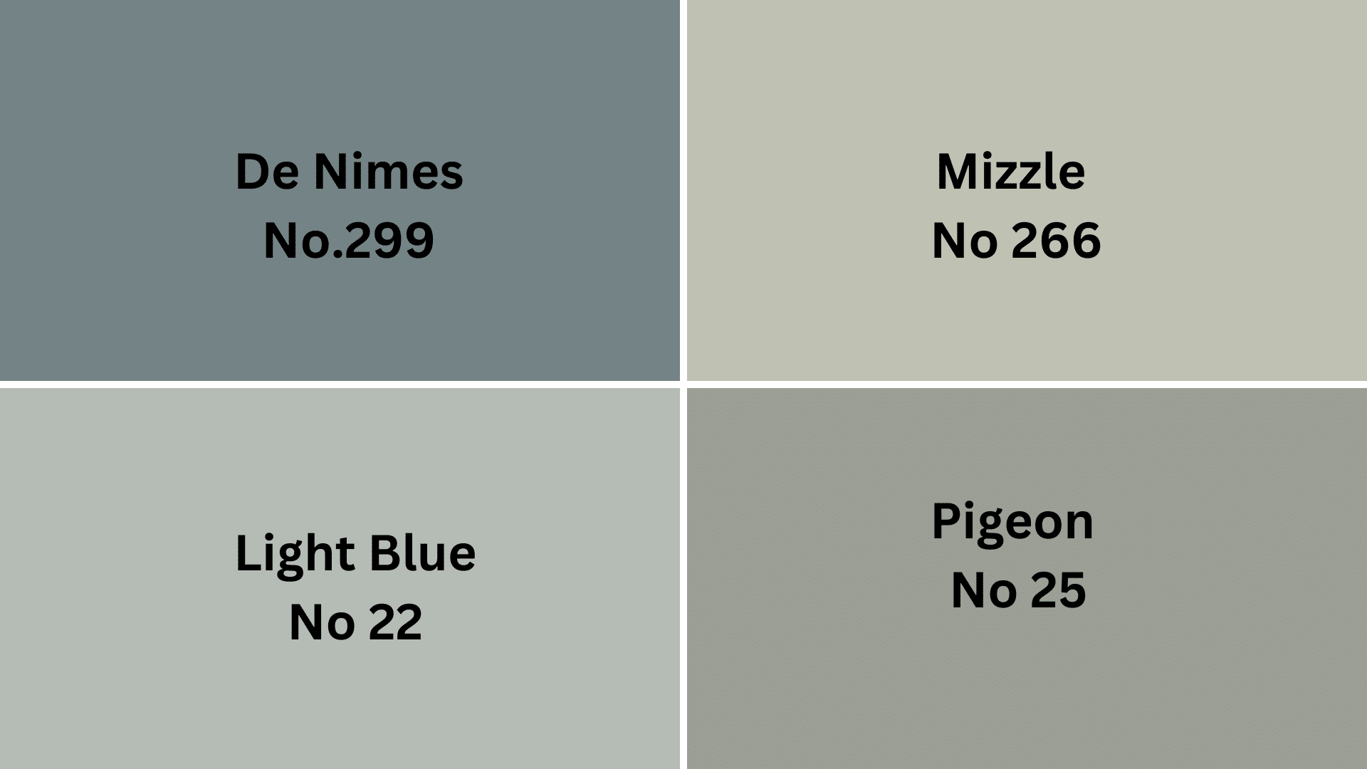
Cromarty is an urbane green-gray with subtle blue undertones that shift beautifully in changing light. Its balanced mid-tone creates serene, contemplative spaces while providing more complexity and depth than standard gray neutrals.
Farrow & Ball Pigeon No. 25 – A warmer green-gray with more pronounced olive undertones that offers Cromarty’s refinement with increased warmth and organic character for nature-inspired environments.
Farrow & Ball Light Blue No. 22 – A delicate blue-gray that maintains Cromarty’s subtle complexity but in a lighter, airier tone with greater luminosity and spaciousness.
Farrow & Ball Mizzle No. 266 – A soft, hazy green-gray with increased yellow influence that captures Cromarty’s atmospheric quality while introducing a gentler, more muted character.
Farrow & Ball De Nimes No. 299 – A rich blue-gray with historical depth that shifts Cromarty’s green undertones toward cooler, more structural territory for a more structured, defined presence.
Final Thoughts
After living with Cromarty in my home, I’m still amazed by how it creates such a peaceful feeling! This special green-gray has become my go-to color when I want a room to feel both stylish and relaxing.
What I really love is how Cromarty works with everything – whether you have modern furniture or antiques, this color fits right in. It’s like having a chameleon on your walls that always looks good!
Ready to convert your space? Grab a sample pot of Cromarty No. 285 today! Paint a small section on different walls and watch how it changes throughout the day. I bet you’ll fall in love with its subtle magic, too!
What room will you try Cromarty in first? Your calm, lovely home is just one paint project away!

Alex Guerrero, a graduate with a Fine Arts degree from the Rhode Island School of Design, has been a visionary in the world of color and design for over 15 years. His professional journey began in the heart of the fashion industry in Milan, where he developed an acute sense for color harmonies and trends. Alex joined our team in 2018, offering fresh and innovative perspectives on color utilization in various spaces. Renowned for his ability to blend contemporary trends with timeless elegance. Outside of work, Alex is an accomplished painter and a volunteer art therapist, his artistic talents further enriching his professional insights.