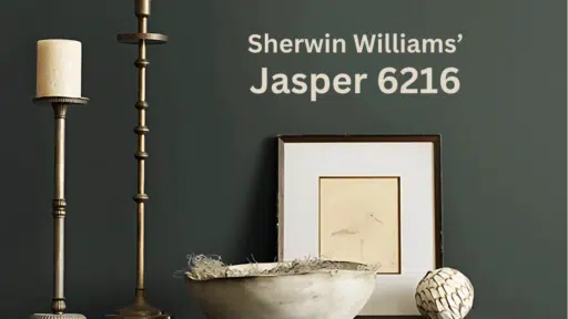
Like the soft feathers of its namesake bird, Sherwin Williams’ Heron Plume (SW 6070) drapes your space in serene grace.
This bright white transcends ordinary neutrals, carrying just a whisper of leans cool in artificial light, but may look slightly warmer in southern sunlight. undertones that soften their presence on your walls.
Its subtle depth invites natural light to play across surfaces, changing throughout the day without ever losing its gentle, composed character.
More than just another white, Heron Plume is an experience—one that brings the peaceful grace of nature’s most graceful waterfowl into your everyday environment. It’s the perfect backdrop for minimalist modern designs and traditional spaces seeking quiet culture.
This blog provides a wide guide to Sherwin-Williams’ Heron Plume (SW 6070), discussing its color features, design applications, and room tips. It emphasizes the paint’s violet undertones, reflectance, and tips for matching colors and furniture to create bright, sleek spaces.
Understanding Sherwin Williams’ Heron Plume (SW 6070)
Color Terminology
| PROPERTY | VALUE |
|---|---|
| LRV (Light Reflectance Value) | 75 |
| Color Category | Considered a bright white color (LRV between 75-85) |
| Comparison | Pure white: ~90 LRV, Black: ~0 LRV |
| RGB Value | 229 / 225 / 216 |
| Hex Code | #E5E1D8 |
Undertones
- Heron Plume has subtle violet undertones
- It’s a bright white with slightly cool influence
- Not a flat or one-dimensional white, but a refined, complex neutral with noticeable gentleness
Psychology of Bright White Colors
Bright whites like Heron Plume create a sense of openness and contemporary serenity.
- Luminous tones: Offer expansiveness of spaces.
- Violet-tinted whites: Evoke calm, tranquility, and modern culture
- Benefits: More nuanced than stark whites, adds substantial presence to spaces, creates a bright backdrop for both colorful furniture and natural elements
Heron Plume provides the perfect balance for those seeking a considerable white that isn’t too clinical or overwhelming.
Its subtle violet undertones make it particularly versatile in spaces with eastern or northern exposure, where it helps maintain brightness while contributing a sense of refined warmth.
Why Choose Heron Plume of Sherwin-Williams?
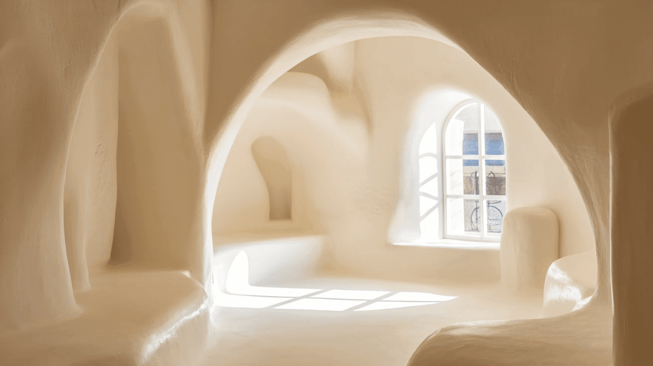
The balanced brightness of Heron Plume evokes a sense of serenity and refinement that promotes tranquility in any environment.
This enduring color carries complex undertones that shift subtly with changing light, ensuring your space feels both current and timelessly peaceful.
Key Features
Sherwin Williams Heron Plume offers exceptional brightness and versatility across different lighting conditions. It maintains its subtle violet undertones in dim spaces while creating a bright, expansive atmosphere in rooms with varied natural light.
Its timeless neutral quality provides a refined backdrop that complements both colorful elements and natural textures without appearing overly stark or flat.
Adaptability
Sherwin Williams Heron Plume demonstrates remarkable adaptability with existing elements like dark-colored furniture and natural wood fixtures, creating striking contrasts between spaces.
It provides enough brightness to feel substantial and uplifting while maintaining a refined, enduring quality that won’t quickly date your interior design choices.
This versatile white works equally well as an all-over color for creating open, atmospheric environments or as a complementary element to more saturated accent walls.
Durability
Sherwin Williams Heron Plume, particularly in premium finishes like Duration or Emerald, delivers outstanding durability with excellent coverage in both new and repainted areas.
Its bright tone and subtle violet undertones maintain a refined appearance throughout your home while providing a forgiving surface for everyday living.
This paint resists yellowing and maintains color consistency even with regular cleaning when properly applied.
Texture Patterns
Sherwin Williams Heron Plume creates a soft, velvety texture that adds subtle dimension to walls and architectural features.
Its complex undertones produce a beautiful light play that enhances moldings and adds visual interest to even simple walls.
When applied to different finishes, it can elegantly highlight architectural details while maintaining a consistent, refined appearance throughout connected spaces.
Room-by-Room Color Recommendations with Heron Plume
Let’s analyze how this versatile white changes different spaces in your home, from cozy bedrooms to busy kitchens.
Living Spaces and Open Floor Plans
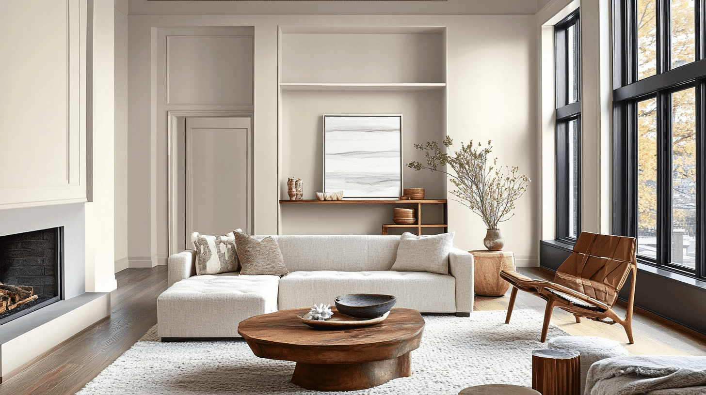
- Heron Plume works exceptionally well as an all-over color in open floor plans, creating a bright, cohesive space while maintaining a refined, contemporary palette.
- The 83.04 LRV of Heron Plume provides a substantial, brightening feel that makes spaces appear more open and refined without feeling clinical.
- Use Heron Plume to unify different areas in larger spaces while allowing colorful furnishings and artwork to stand out against its tranquil backdrop.
Bedrooms and Relaxation Areas
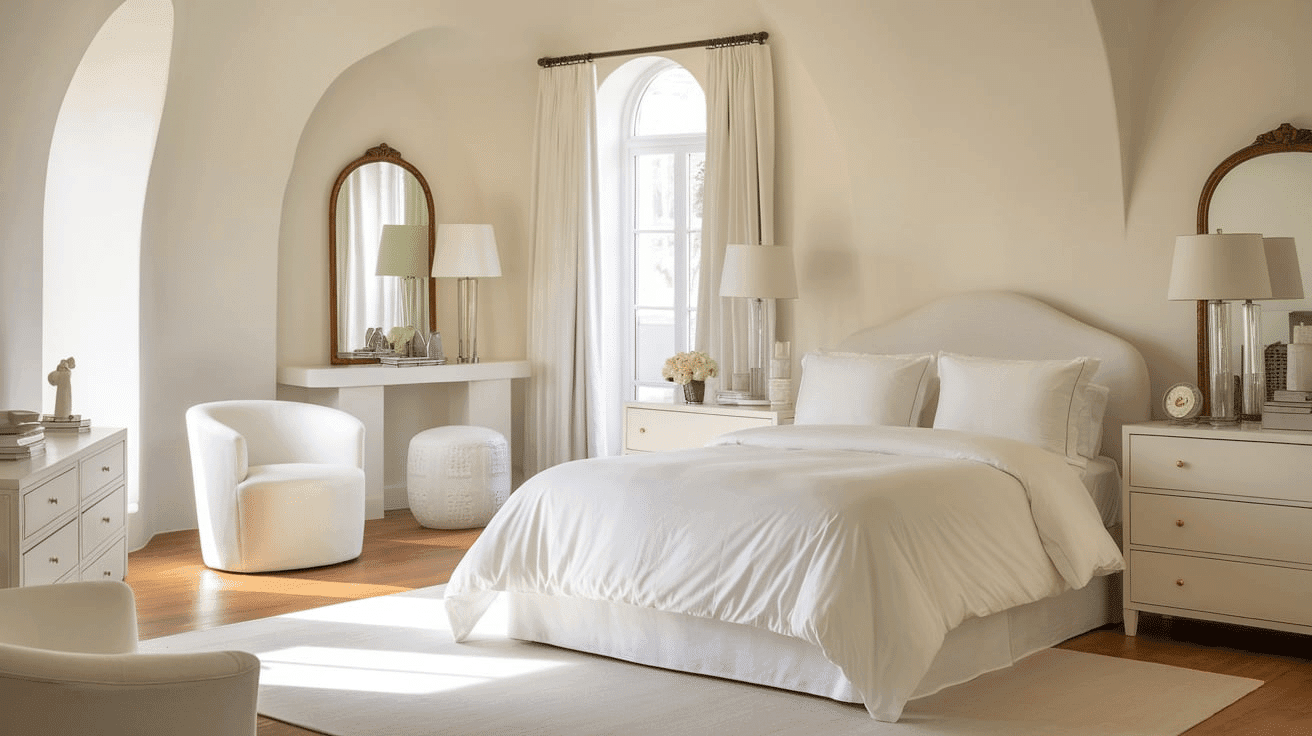
- Heron Plume creates a soothing, airy atmosphere in bedrooms that promotes relaxation and rest.
- The subtle violet undertones in Heron Plume evoke a sense of tranquility while creating a refined backdrop for colorful bedding and furniture of any style.
- Consider Heron Plume for all walls to create a serene sanctuary that feels both spacious and intimate without sacrificing brightness.
Kitchens
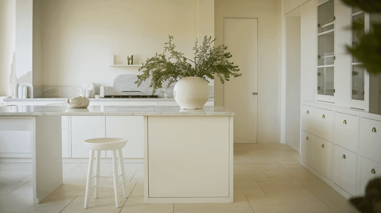
- Heron Plume in satin or semi-gloss finish on cabinets creates a bright, timeless element that contrasts beautifully with dark-colored islands or accent pieces.
- The bright depth of Heron Plume enhances both dark countertop materials and brass fixtures, making it adaptable to various kitchen styles from contemporary to farmhouse.
- Heron Plume upper and lower cabinets paired with a subtle accent wall create appealing contrast that brightens the kitchen while maintaining a refined, cohesive feel.
Bathrooms and Spa-like Retreats
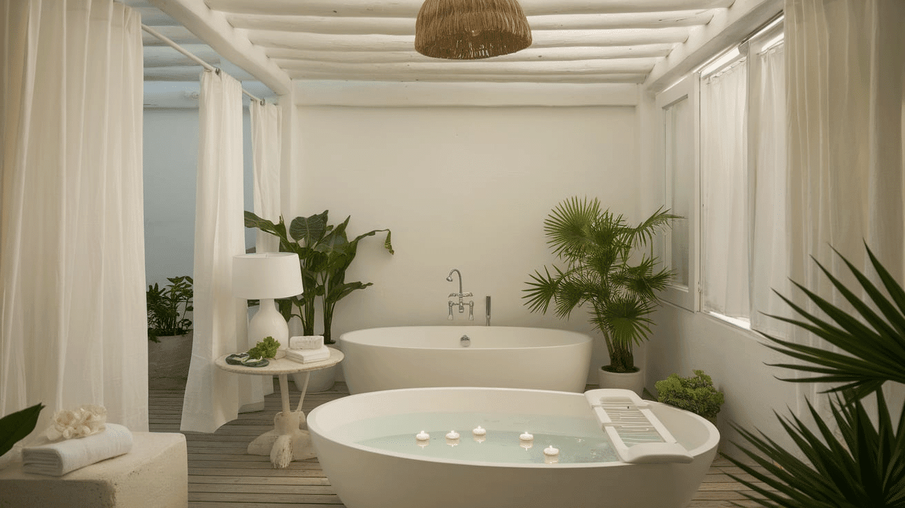
- Sherwin Williams Heron Plume creates a bright, refined atmosphere in bathrooms. Its subtle violet undertones establish a sense of serenity while complementing chrome fixtures.
- This versatile shade pairs beautifully with both chrome and brass fixtures, marble, and natural wood, creating a timeless, refined retreat that feels both elegant and inviting.
- Use Heron Plume on all walls in smaller bathrooms to create a sense of spaciousness without sacrificing character.
Heron Plume Color Combinations
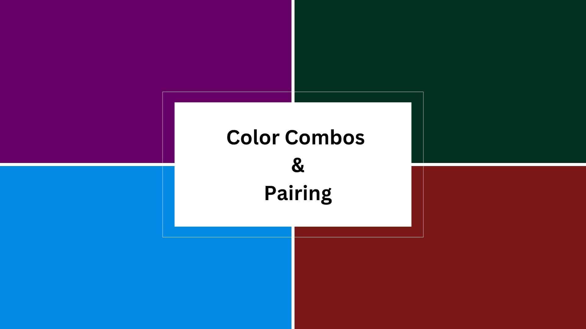
Heron Plume is a bright, refined white with subtle violet undertones. Its high Light Reflectance Value (LRV) of 83.04 makes it a substantial, brightening foundation that adds openness and versatility to spaces while maintaining a refined coolness.
Let me help you with color pairings and combinations for this shade.
Complementary Trim Colors
- Extra White (SW 7006) – A bright, clean white that creates subtle distinction with Heron Plume
- Pure White (SW 7005) – A soft white that balances Heron Plume’s brightness with subtle warmth
- Alabaster (SW 7008) – A versatile off-white that softens Heron Plume’s bright quality
- Greek Villa (SW 7551) – A warm white that contrasts with Heron Plume’s cool undertones
Coordinating Wall Colors
- Repose Gray (SW 7015) – A light warm gray that adds depth while complementing Heron Plume
- Agreeable Gray (SW 7029) – A versatile greige that creates a balanced, cohesive palette
- Sea Salt (SW 6204) – A light blue-green that echoes Heron Plume’s cool qualities in a colorful tone
- Rainwashed (SW 6211) – A soft blue-green that creates a serene contrast with Heron Plume
Accent Colors
- Naval (SW 6244) – A deep navy that creates a dramatic contrast with Heron Plume’s brightness
- Rosemary (SW 6187) – A muted sage green that provides a natural complement to Heron Plume’s coolness
- Serious Gray (SW 6256) – A medium blue-gray that intensifies the culture in a compatible palette
- Urbane Bronze (SW 7048) – A deep brown-gray that grounds Heron Plume’s airy quality
Coordinating with Furniture and Decor
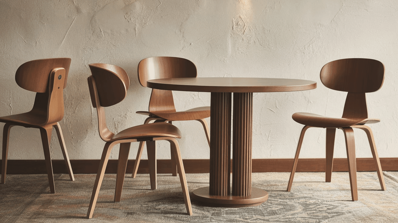
Wood Tones
Heron Plume pairs beautifully with a wide range of wood tones, offering different aesthetic effects. Dark walnut, mahogany, and ebony create a striking contrast against Heron Plume’s bright backdrop.
Medium wood tones like oak provide complementary warmth that balances Heron Plume’s cool undertones.
For a more cohesive look, gray-washed or white-washed woods extend Heron Plume’s refined quality and create a harmonious, coastal aesthetic.
Natural, unstained wood creates an organic, clean contrast that highlights Heron Plume’s depth and richness.
Metals
Chrome, stainless steel, and polished nickel hardware enhance Heron Plume’s cool undertones and create a fresh, contemporary look.
Matte black fixtures create dramatic contrast that emphasizes Heron Plume’s brightness. While Heron Plume works beautifully with cool metals, brass, and gold accents create a vibrant tension between warm and cool elements—opt for polished or satin finishes for a more refined pairing.
Bronze and copper finishes provide an elegant, timeless combination that complements Heron Plume’s distinguished character with warmth.
Decor
Natural fibers like linen, cotton, and wool in rich, saturated tones create textural interest against Heron Plume walls while providing necessary depth.
Colorful accents in jewel tones like emerald, sapphire, and amethyst offer a striking contrast against the bright backdrop.
Glass, ceramic, and stone elements add weight and prevent Heron Plume from feeling too ethereal in spaces with abundant natural light. Introducing natural elements with varied textures—like rattan, jute, or wool—reinforces the organic balance inherent in this versatile white while adding tactile interest.
Heron Plume vs. Snowbound: Coordinating Whites
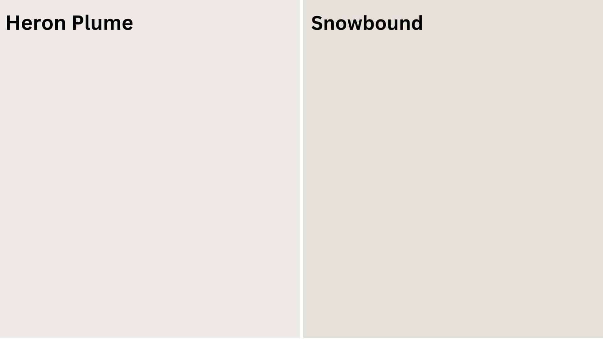
Heron Plume vs. Snowbound
Heron Plume (Sherwin Williams SW 6070)
- A bright white with subtle violet undertones
- High LRV (Light Reflectance Value) that creates bright, serene spaces
- Works well in contemporary, transitional, or minimalist interiors
- Best for spaces where you want a substantial, refined brightness
Snowbound (Sherwin Williams SW 7004)
- A versatile off-white with slight gray undertones
- Medium-high LRV (around 83) that creates a balanced, adaptable backdrop
- Contains cool undertones that create a more contemporary atmosphere
- Popular for creating neutral, calming environments that work with many design styles
Key Differences:
- Heron Plume has more noticeable violet undertones, while Snowbound has gray undertones
- Heron Plume appears slightly brighter in most lighting conditions
- Heron Plume creates more serenity and openness while Snowbound is more versatile and grounded
- They serve similar roles in design – both as bright neutrals with slightly different character and undertones
Final Thoughts
Heron Plume (SW 6070) transcends trends, embodying the perfect balance between brightness and complexity that makes it a perennial favorite among designers and homeowners seeking serene, refined spaces.
Its subtle complexity allows it to adapt effortlessly to changing styles and seasonal accents, ensuring longevity in your design choices.
Whether brightening your walls in morning light or creating a canvas for contrasting elements, Heron Plume delivers a timeless quality that both elevates and softens a space.
In choosing this exceptional shade, you’re not simply selecting a color—you’re embracing a design philosophy that values serenity, refinement, and enduring beauty in the spaces we call home.
Ready to change your space with Heron Plume’s serene sophistication? Share your favorite room idea in the comments below and let’s start planning your perfect color story.

Alex Guerrero, a graduate with a Fine Arts degree from the Rhode Island School of Design, has been a visionary in the world of color and design for over 15 years. His professional journey began in the heart of the fashion industry in Milan, where he developed an acute sense for color harmonies and trends. Alex joined our team in 2018, offering fresh and innovative perspectives on color utilization in various spaces. Renowned for his ability to blend contemporary trends with timeless elegance. Outside of work, Alex is an accomplished painter and a volunteer art therapist, his artistic talents further enriching his professional insights.