White paint sounds easy until you try to choose the right one. A simple color can shift depending on the light, furniture, and room style. Picking the wrong white can make a room feel dull, yellow, or cold.
This guide gives you the 23 best white paint colors from Benjamin Moore and Sherwin-Williams. We have included the exact color codes and Light Reflectance Values (LRVs) to help you make smarter, not harder, color choices.
LRV tells you how much light a paint color reflects. It can change the way a white paint feels in your room. A higher LRV makes a space feel brighter, while a lower LRV adds a softer look.
By the end of this guide, you will know which whites are warm, which ones are cooler, and how each paint color may react in your home. Let’s help you find the right white paint without second-guessing yourself.
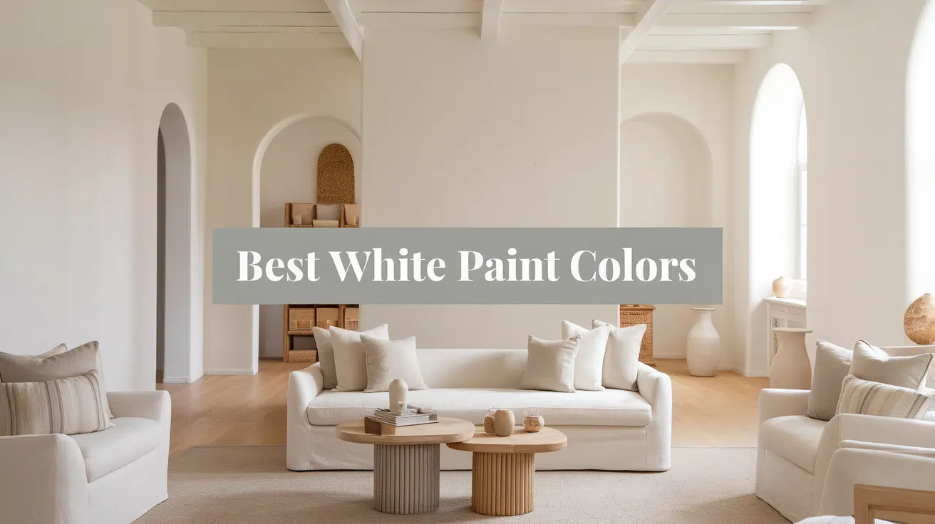
Best White Paint Colors
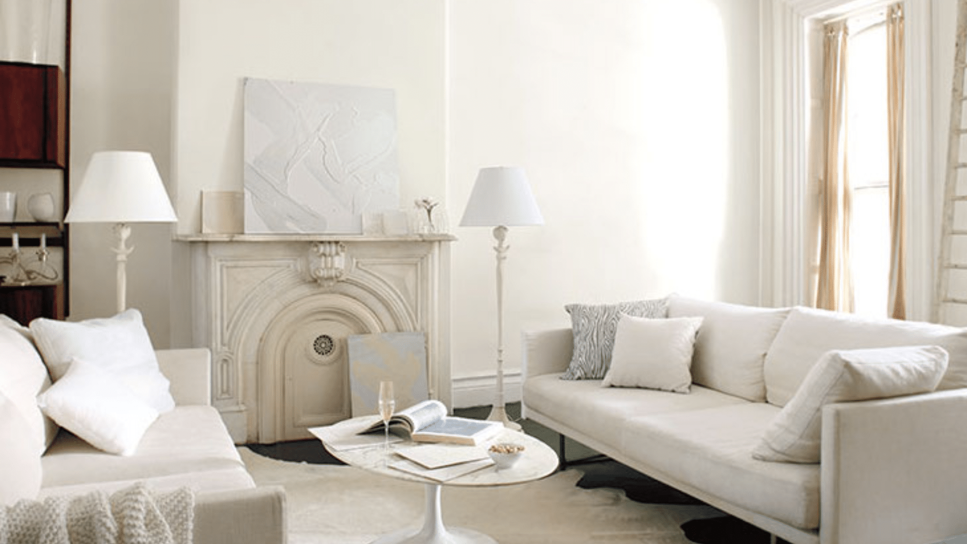
Choosing the right white paint can significantly impact the overall ambiance of a room. Some whites are bright and crisp, while others are soft and cozy.
Here are 23 top choices from Benjamin Moore and Sherwin-Williams to help you find the perfect match for your space.
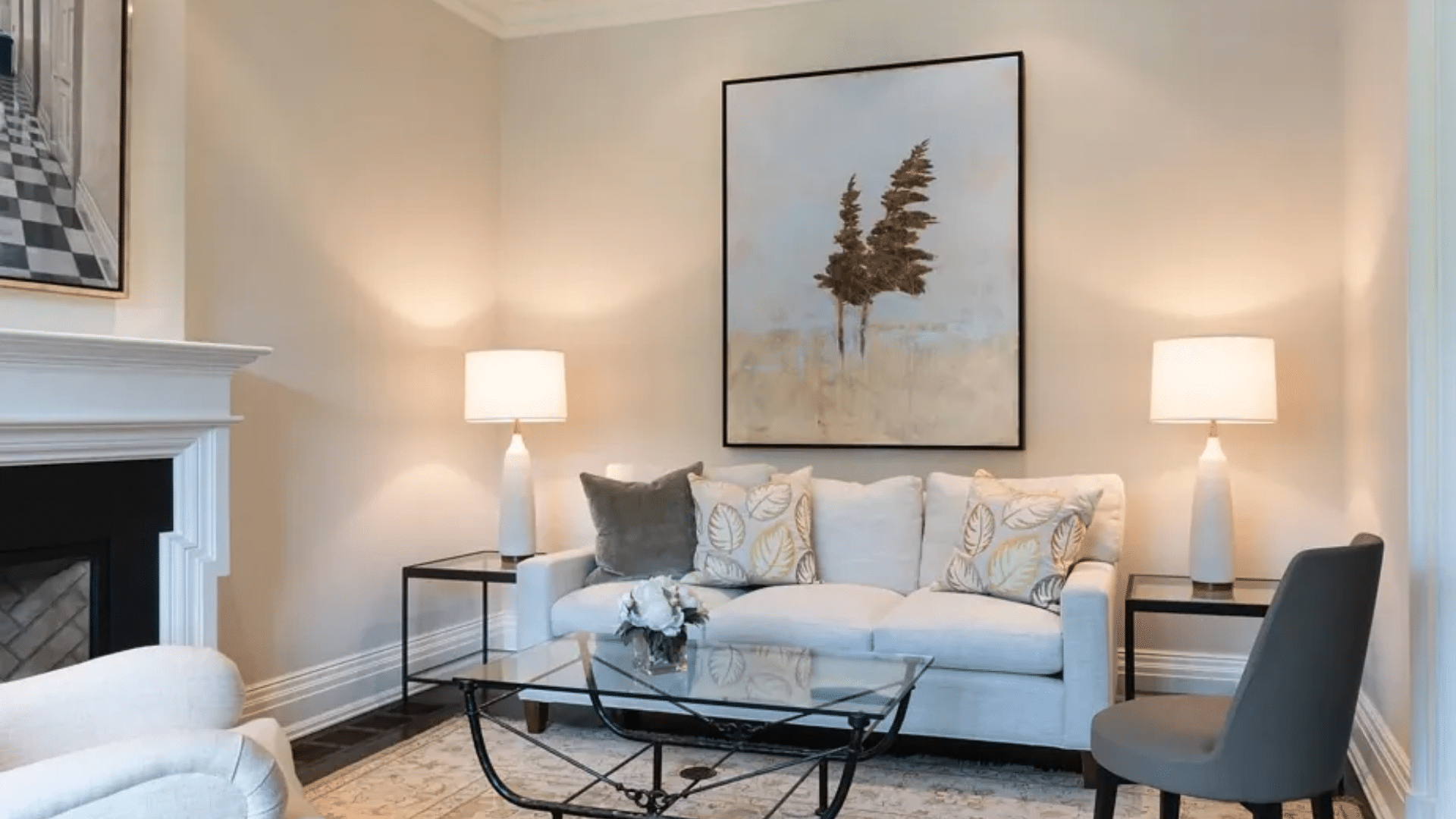
1. Chantilly Lace (OC-65)
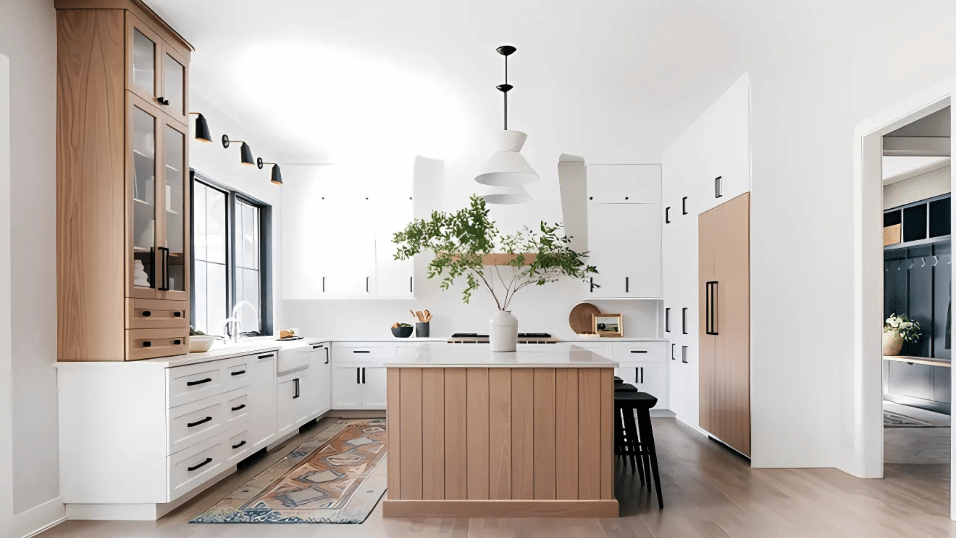
Chantilly Lace by Benjamin Moore is one of the cleanest, purest whites available. It has no strong undertones, so it feels fresh and clear in almost any setting. Its crisp look makes it a favorite for people who want a sharp, bright finish.
The LRV of 90.04 indicates the amount of light it reflects, making it an ideal option for smaller rooms that require a brighter ambiance. In spaces with abundant natural light, Chantilly Lace can make walls appear open and bright without feeling too stark.
This color is perfect for modern kitchens, bright hallways, or living rooms that evoke a clean, open feel. Its simple look fits many styles without competing with furniture or décor.
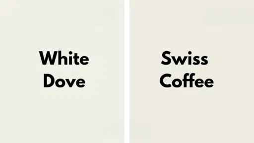
2. White Dove (OC-17)
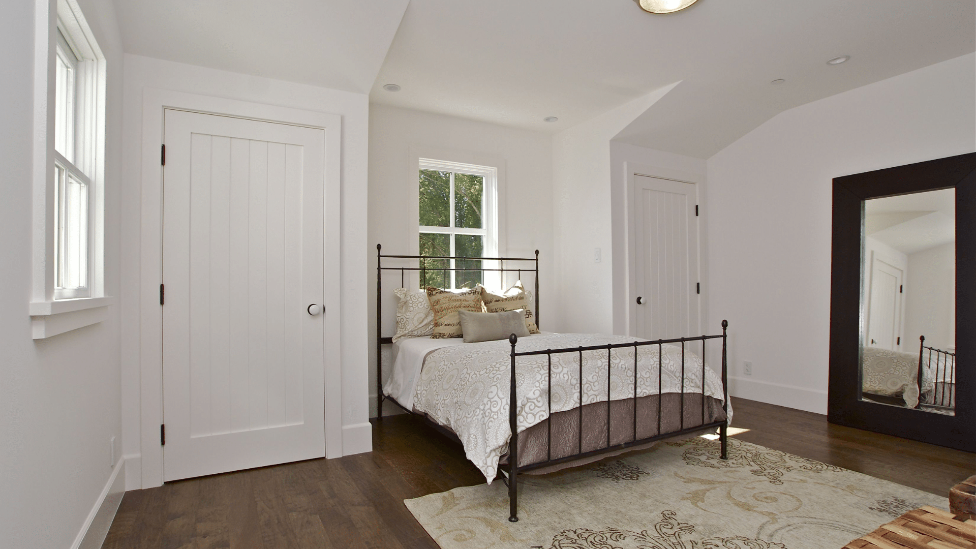
White Dove by Benjamin Moore is a soft, warm white that feels easy on the eyes. It does not have strong yellow tones, which helps it stay neutral and pleasant without looking too cold or too warm.
With an LRV of 83.16, White Dove reflects a substantial amount of light while maintaining a cozy, welcoming ambiance. It’s a good choice if you want white walls that don’t feel too stark or clinical, especially in rooms with mixed lighting.
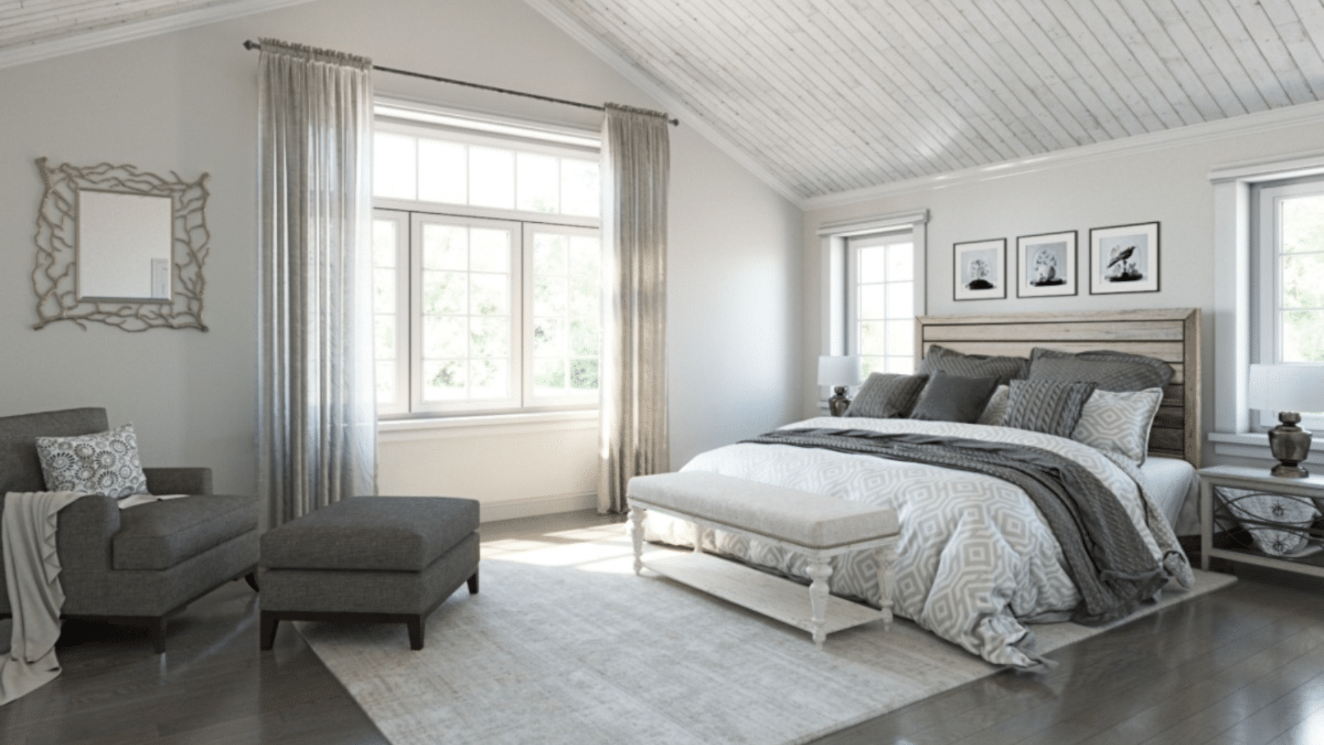
This color works well in bedrooms, living rooms, and open spaces where you want a soft, inviting backdrop. It’s a classic choice for traditional, farmhouse, and transitional interiors.
3. Simply White (OC-117)
Simply White by Benjamin Moore brings a bright and cheerful energy to any room. It has a slight warmth underneath that keeps it from feeling too cold, but it still looks very fresh and clean on the walls.
With an LRV of 89.52, it bounces a lot of light around the room, making spaces feel larger and more open. It’s a great pick for darker rooms that need a little extra lift without feeling heavy.
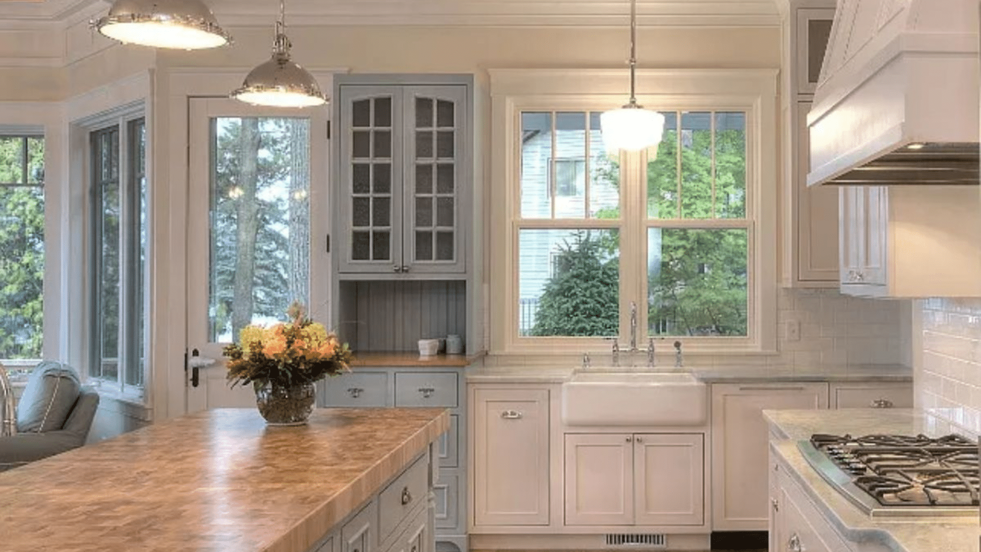
Simply White shines in kitchens, bathrooms, and laundry rooms where you want a crisp but welcoming white. It pairs beautifully with both cool and warm accent colors.
4. Cloud White (OC-130)
Cloud White by Benjamin Moore offers a soft and cozy white that creates a calming atmosphere in busy homes. It has a warm undertone that adds a gentle, lived-in feel without making spaces look yellow or heavy.
The LRV of 85.05 indicates that it reflects a significant amount of light while maintaining a soft, cozy feel. It’s perfect for creating comfortable, relaxing rooms where you want a little more warmth from your walls.
This color is ideal for family rooms, bedrooms, and dining rooms where comfort and relaxation are a priority. It works beautifully with wood accents, soft textiles, and layered neutral décor.
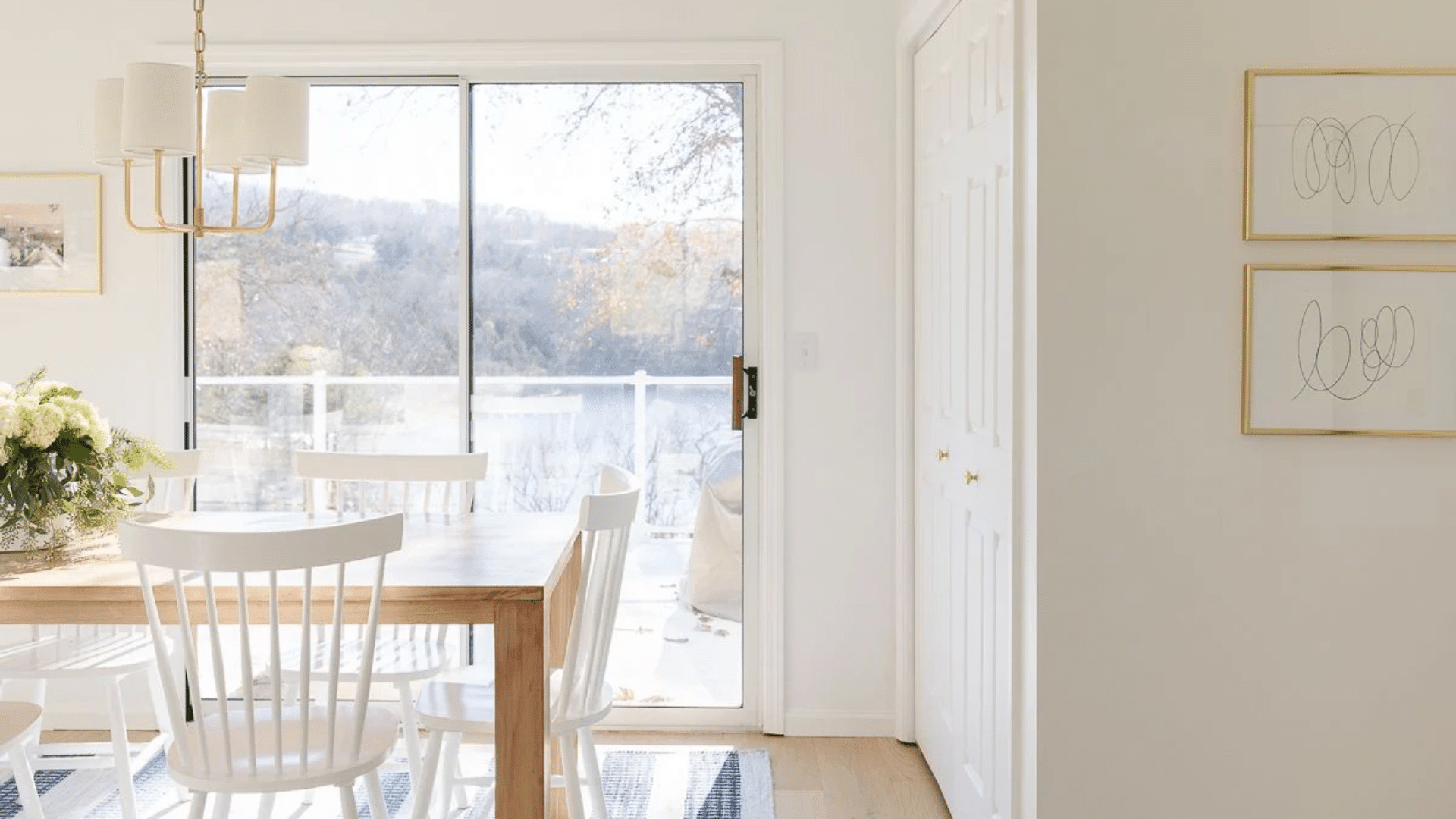
5. Decorator’s White (CC-20)
Decorator’s White by Benjamin Moore is a cool white with a slight gray touch. It feels crisp without being too cold, making it a popular choice for fresh and airy spaces. Its subtle undertone helps balance strong sunlight or bold room colors.
With an LRV of 82.68, Decorator’s White reflects a good amount of light without looking too stark. It is perfect for creating a bright yet slightly softened background that doesn’t feel harsh.
This color suits modern kitchens, bathrooms, and offices well, offering a clean yet gentle feel. It pairs nicely with cooler-toned woods, grays, and even navy accents.
6. Super White (OC-152)
Super White by Benjamin Moore is one of the brightest whites you can find. It has a sharp, clear appearance that brings a modern, sleek finish to any space. There are no strong undertones, which keeps it feeling fresh and clean.
The LRV of 87.36 indicates that it reflects a significant amount of light, making small or dark rooms appear larger and brighter. It works great if you want your walls to feel open, sharp, and simple.
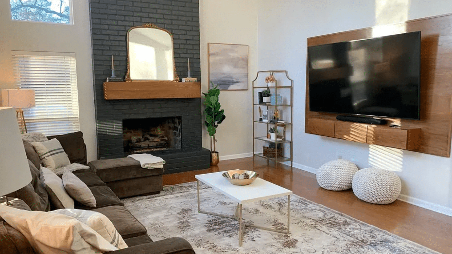
Super White is an excellent choice for minimalist spaces, modern kitchens, and contemporary living rooms. It works especially well with high-contrast decor, such as black, charcoal, or deep blue.
7. Ballet White (OC-9)
Ballet White by Benjamin Moore is a soft, warm white with beige influences. It feels comfortable and lived-in, perfect for creating cozy, welcoming spaces. This gentle color adds a hint of warmth without feeling heavy or overly creamy.
Its LRV of 71.97 indicates that it is a slightly deeper white, offering a soft backdrop that feels peaceful and muted. It does not overpower a space but still keeps the room feeling light.
Ballet White is a beautiful choice for family rooms, hallways, and bedrooms that require a soft, calming backdrop. It pairs well with natural woods, light grays, and muted blues.
8. Steam (AF-15)
Steam by Benjamin Moore is a warm, soft white that brings a feeling of quiet to a room. It has a gentle warmth that helps make spaces feel calm, inviting, and lived-in without overwhelming other colors.
The LRV of 84.2 ensures that Steam reflects enough light to keep rooms feeling open while still offering a warm, cozy glow. It’s a nice balance between fresh and relaxed.
This color works well in bedrooms, bathrooms, or reading nooks where you want a soft, restful atmosphere. It pairs nicely with neutral textiles, muted decor, and natural textures.
9. Seapearl (OC-19)
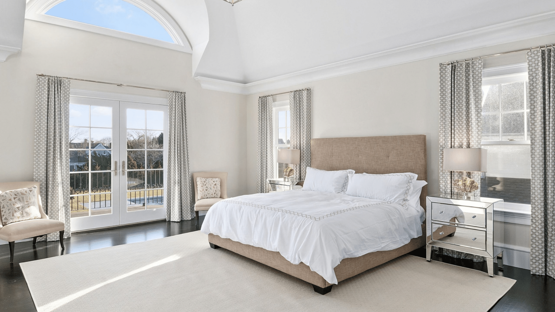
Seapearl by Benjamin Moore is a soft, off-white shade that leans neutral, making it easy to incorporate into many spaces. It features a subtle, creamy-gray undertone that lends rooms a calm and grounded feel.
The LRV of 76.43 helps it reflect a moderate amount of light without feeling too bright. It maintains a cozy, soft appearance while still opening up the space.
Seapearl fits beautifully in living rooms, dining rooms, and entryways, providing a neutral yet welcoming backdrop. It pairs well with soft blues, gentle greens, and warm wood tones.
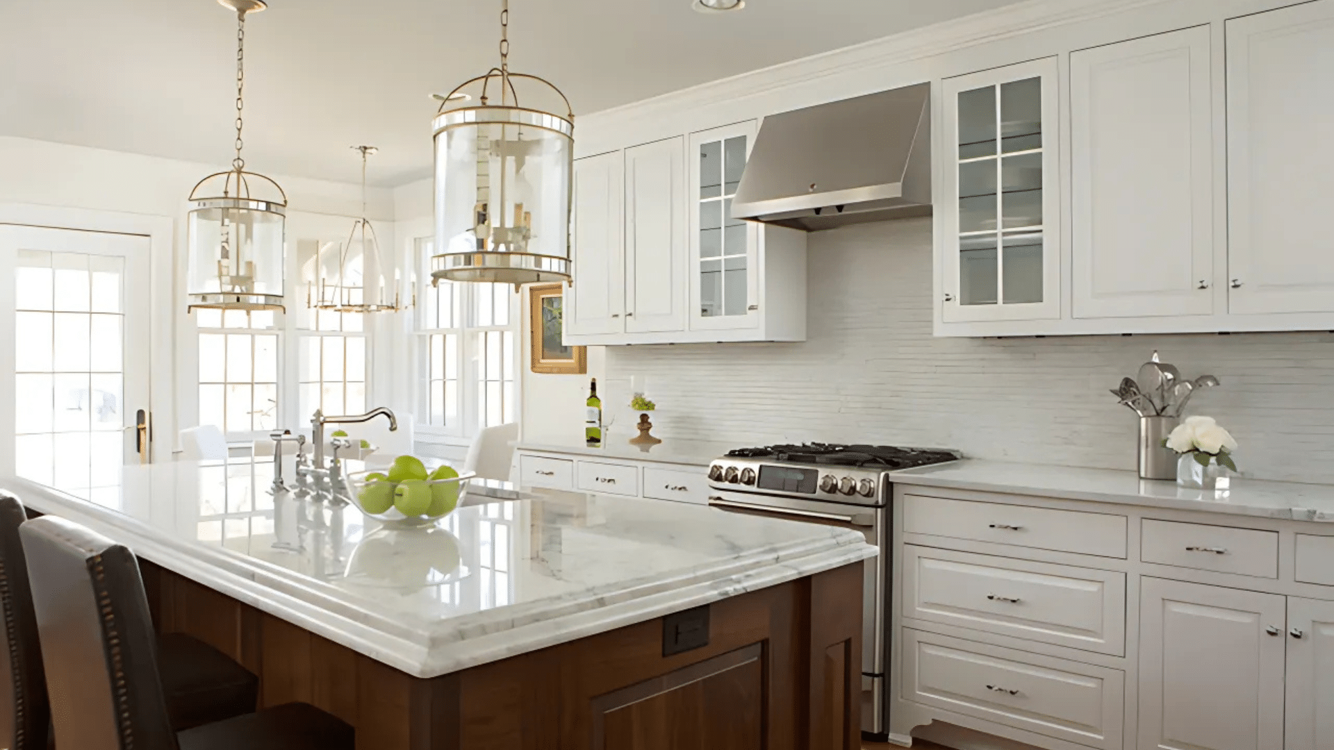
10. Oxford White (CC-30)
Oxford White by Benjamin Moore is a fresh, crisp neutral white that feels clean without being stark. It has a soft and airy quality that makes it a suitable choice for a variety of spaces. This white feels effortless on the walls.
With an LRV of 86.69, Oxford White reflects a lot of light, helping to open up small rooms and brighten darker spaces. It remains neutral in most lighting conditions, maintaining a steady and relaxed appearance.
This color works well in living rooms, kitchens, and hallways where you want a fresh, neat background. It also pairs beautifully with light woods and cool-toned accent pieces.
11. Atrium White (OC-145)
Atrium White by Benjamin Moore is a warm white with a soft, almost invisible pink undertone. It creates a gentle warmth in a room without feeling too colorful or heavy. This makes it a friendly and soft choice for welcoming spaces.
The LRV of 85.08 enables Atrium White to reflect sufficient light, keeping rooms feeling bright while adding a hint of warmth that lends softness. It works well when you want a white that feels personal and cozy.
Atrium White is ideal for bedrooms, nurseries, and spaces where you want a subtle warmth that still looks clean. It pairs nicely with muted colors, natural woods, and soft fabrics.
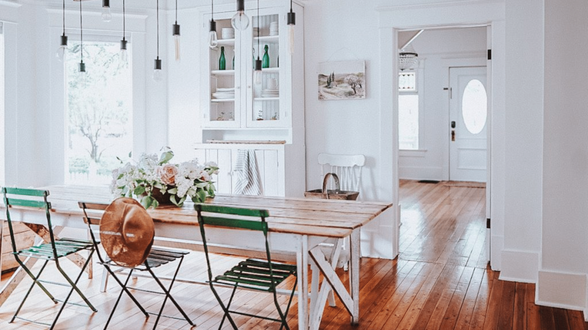
12. Swiss Coffee (OC-45)
Swiss Coffee by Benjamin Moore is a cozy, creamy white that brings warmth without feeling too yellow. It is popular for creating inviting, relaxed spaces where pure white might feel too cold.
With an LRV of 81.91, Swiss Coffee reflects a good amount of light while still offering a soft, grounded feel. It helps create a comfortable atmosphere in larger or open areas.
Swiss Coffee works well in living rooms, dining rooms, and family spaces where you want warmth and softness. It pairs nicely with warm neutrals, soft greens, and natural textures.
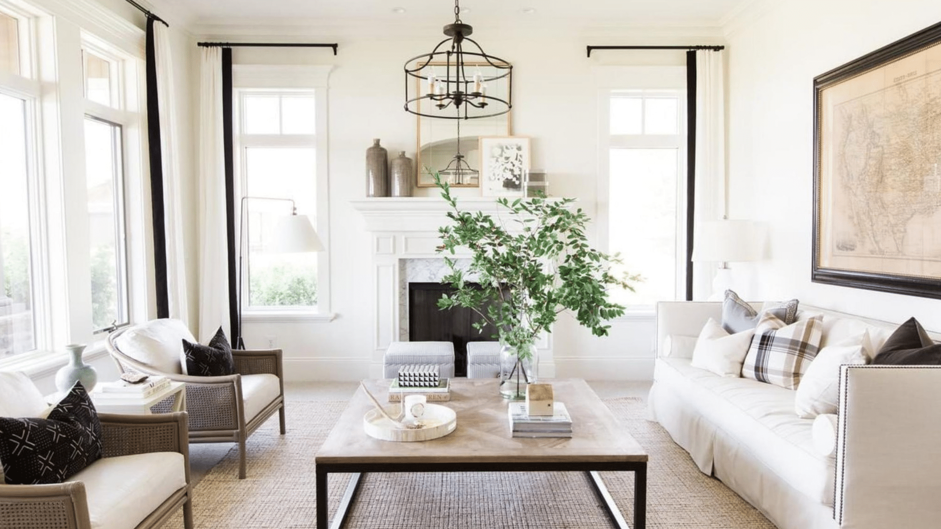
13. Alabaster (SW 7008)
Alabaster by Sherwin-Williams is a soft, warm white that evokes a natural and welcoming ambiance. It does not lean too yellow, which keeps it feeling fresh without being sharp. This color has become a favorite among homeowners seeking a cozy yet clean look.
The LRV of 82 means Alabaster reflects enough light to prevent rooms from feeling heavy, yet it still offers a soft, settled feel. It adapts well to different lighting conditions.
Alabaster is an excellent choice for living rooms, kitchens, and open-plan spaces that require a warm, gentle backdrop. It pairs beautifully with wood accents, soft beiges, and muted greens.
14. Pure White (SW 7005)
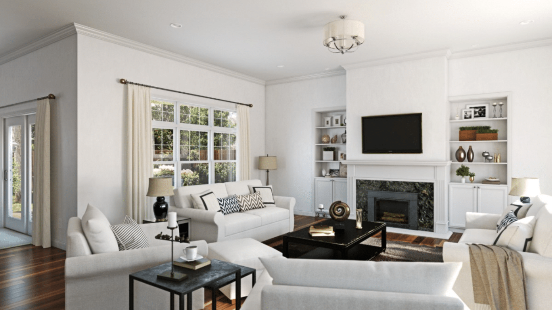
Pure White by Sherwin-Williams is a neutral, balanced shade of white that suits nearly any style. It has a very slight warmth, but it reads clean and bright without looking cold. It’s a dependable choice when you want something simple and flexible.
With an LRV of 84, Pure White bounces plenty of light around, keeping rooms feeling fresh and open. It’s strong enough to stand alone or blend quietly with bolder design elements.
Pure White is ideal for kitchens, bathrooms, and trim work, where a simple yet fresh look is desired. It pairs well with both warm and cool colors, depending on the desired look.
15. Extra White (SW 7006)
Extra White by Sherwin-Williams is a bright, cool white that gives rooms a fresh, crisp feeling. It leans slightly cool without feeling harsh, making it a strong option for modern spaces.
The LRV of 86 indicates that Extra White reflects a significant amount of light, which can help make small spaces feel larger and more open. It holds its clean look even under artificial lighting.
Extra White shines in kitchens, bathrooms, and minimalistic spaces where a clean, crisp look is the goal. It pairs especially well with bold colors, deep charcoals, and sharp black accents.
16. Snowbound (SW 7004)
Snowbound by Sherwin-Williams is a cool white with just a hint of soft gray underneath. It feels light and fresh without leaning too stark, making it an easy pick for many modern spaces. The slight gray gives it a softer, more relaxed feel.
With an LRV of 83, Snowbound reflects a lot of light but keeps a bit of depth. It works well in rooms that get a mix of natural and artificial light throughout the day.
Snowbound is great for living rooms, bedrooms, and even exteriors where you want a crisp white that doesn’t feel too harsh. It pairs beautifully with soft blues, muted grays, and clean neutrals.
17. Greek Villa (SW 7551)
Greek Villa by Sherwin-Williams is a warm, creamy white that feels cozy and soft. It has a natural warmth without heavy yellow tones, which makes it feel welcoming without being too rich.
The LRV of 84 indicates that the Greek Villa effectively reflects a good amount of light, keeping spaces feeling bright yet soft. It’s a strong option for those who want a warm background that feels settled and natural.
The Greek Villa is perfect for family rooms, kitchens, and cozy bedrooms that evoke a gentle, lived-in feel. It pairs well with warm woods, neutral fabrics, and earthy color accents.
18. Dover White (SW 6385)
Dover White by Sherwin-Williams is a traditional, soft, warm white that has been a classic choice for years. It carries a noticeable creamy tone that adds richness without feeling too strong or heavy.
With an LRV of 83, Dover White maintains an open feel while imparting a cozy, settled appearance to rooms. It works well in traditional homes where a little extra warmth is welcome.
Dover White complements dining rooms, formal living spaces, and vintage-inspired interiors perfectly. It pairs nicely with darker wood furniture, soft greens, and warm metallic finishes like bronze or brass.
19. White Heron (SW 7627)

White Heron by Sherwin-Williams is a subtle cool white with light gray-blue undertones. It brings a soft and calming vibe to any space without feeling too icy or cold. The gentle coolness makes it feel peaceful and quiet.
Its LRV of 76 means White Heron reflects a moderate amount of light, making it suitable for spaces where a relaxed, low-glare finish is desired. It works especially well in north-facing rooms that need a softer touch.
The White Heron is a suitable choice for bedrooms, bathrooms, and serene office spaces. It pairs well with soft pastels, cool grays, and light natural woods.
20. Shell White (SW 8917)
Shell White by Sherwin-Williams is a light, creamy white with soft undertones that bring a gentle warmth to a room. It has a calming effect that prevents the space from feeling too bright or sharp. The soft base tone helps create a welcoming and easy-going atmosphere.
With an LRV of 83, Shell White reflects a lot of light while still offering a hint of creamy softness. It’s ideal for spaces that require brightness without feeling cold or bland.
Shell White is a lovely choice for bedrooms, living rooms, and cozy corners where you want a touch of warmth without a heavy color palette. It pairs beautifully with soft pastels, warm neutrals, and natural wood finishes.
21. Antique White (SW 6119)
Antique White by Sherwin-Williams is a deeper creamy white that brings a rich, classic feel to a room. It has a warm, inviting quality, making it a good choice for spaces that desire a soft, lived-in ambiance. This white feels comfortable and timeless.
The LRV of 72 indicates that Antique White reflects less light than brighter whites, creating a soft, cozy effect. It’s a strong pick for larger rooms where you want a warm background.
Antique White is a wonderful fit for traditional dining rooms, bedrooms, and entryways. It matches well with darker wood tones, vintage decor, and earth-toned fabrics.
22. Eider White (SW 7014)

Eider White by Sherwin-Williams is a cool, gray-leaning white that works well in clean, modern designs. It carries a soft gray undertone that makes it feel fresh and balanced without being too cold. The hint of gray adds interest without darkening the room too much.
With an LRV of 73, Eider White reflects a fair amount of light, keeping spaces open while offering a more grounded look. It is a great option for spaces that need something between white and a very light gray.
Eider White looks great in modern kitchens, offices, and bedrooms where a crisp but soft color is needed. It pairs well with cool blues, charcoals, and modern minimalist decor.
23. City Loft (SW 7631)
City Loft by Sherwin-Williams is a gentle greige-white that feels calm and bright at the same time. It offers a balanced mix of gray and beige, which keeps rooms feeling fresh but not too stark. The color feels soft, subtle, and welcoming.
The LRV of 70 means City Loft reflects light softly, helping rooms feel airy without being too reflective. It’s great for spaces where you want a soft neutral that doesn’t dominate the room.
City Loft fits nicely in living rooms, bedrooms, and open-plan areas where you want a light but grounded color. It pairs beautifully with soft beiges, muted greens, and warm wood accents.
How to Pick the Right White for Your Room?
Undertones are key when picking white paint. Warm whites feel cozy with hints of cream or yellow. Cool whites feel fresh with soft traces of blue or gray.
Lighting changes how white looks during the day. North-facing rooms tend to make whites appear cooler, while south-facing rooms tend to add more warmth and brightness.
Always test samples before you decide. Paint large boards and move them around your room. Sampling helps you see how the color shifts with the light.
Sampling Tips for White Paints
Sampling white paint the right way can save you from picking a color that feels wrong once it’s on your walls. White paints shift significantly depending on the light, time of day, and nearby surfaces. A little extra testing now can help you make a choice you’ll feel good about later.
- Use large sample boards: Paint large foam boards or poster boards with two coats. Move them around the room instead of painting straight on the wall to better judge the color.
- Test during different times of the day: morning, afternoon, and evening light can all affect how white appears. Check your samples in natural light, indoor lighting, and mixed lighting to see the full range.
- Compare multiple whites side by side: Testing a few similar whites next to each other will help you spot undertones and brightness differences more easily. It also helps you find the one that feels best in your room.
Taking your time to test white paints properly will give you the clearest view of how they’ll actually look. Sampling first helps avoid surprises and allows you to choose a color you’ll love every day.
Conclusion
Choosing a white paint color is not as simple as grabbing the first can you see. Undertones, lighting, and LRV all play significant roles in determining how a white shade will appear once it is on your walls.
In this guide, we shared 23 top white paint colors from Benjamin Moore and Sherwin-Williams. Each color has its own code, LRV, and mood. Some are bright and crisp, while others offer a softer, warmer look.
Always take the time to sample your top choices. The color of paint can change depending on the lighting, time of day, and surrounding environment. What looks perfect on a paint chip or online can feel very different once it’s in your real room.
Trust what you see with your own eyes in your space. By checking LRV, noticing undertones, and testing samples first, you will feel more confident about your final choice. The right white paint will make your space feel just the way you want it to.

Alex Guerrero, a graduate with a Fine Arts degree from the Rhode Island School of Design, has been a visionary in the world of color and design for over 15 years. His professional journey began in the heart of the fashion industry in Milan, where he developed an acute sense for color harmonies and trends. Alex joined our team in 2018, offering fresh and innovative perspectives on color utilization in various spaces. Renowned for his ability to blend contemporary trends with timeless elegance. Outside of work, Alex is an accomplished painter and a volunteer art therapist, his artistic talents further enriching his professional insights.