
Searching for the perfect neutral that balances warmth and versatility?
Sherwin-Williams White Sand (SW 9582) offers a soft, warm neutral foundation that creates serene, light-filled spaces with a welcoming touch.
This creamy beige shade boasts an LRV of 84, reflecting enough light to brighten rooms while maintaining depth and character.
Its subtle sandy undertones make it exceptionally adaptable across diverse design styles, from cozy cottages to contemporary apartments.
No matter your style, coastal, farmhouse, or transitional, White Sand offers a clean, cozy backdrop that suits bold and understated designs alike.
Explore this neutral’s versatility, perfect pairings, and how it transforms living spaces into havens of comfort.
Understanding Sherwin-Williams White Sand (SW 9582)
Sherwin-Williams White Sand is a soft, warm neutral that creates serene, light-filled spaces with a welcoming touch.
It’s an ideal choice for those looking for a versatile and timeless color.
Color Terminology
Here are the key technical details for White Sand:
| PROPERTY | VALUE |
|---|---|
| LRV | 84 |
| RGB | 237 / 236 / 231 |
| Hex Value | #EDECE7 |
With an LRV of 84, White Sand reflects light beautifully, brightening up spaces while still maintaining warmth and depth.
The RGB and Hex values can also help match this color for digital or custom designs.
Undertones:
White Sand has soft beige and ivory undertones, giving it a smooth, warm feel without leaning too yellow or cool.
This makes it highly versatile and perfect for rooms where you want a neutral yet inviting atmosphere.
- Beige Undertones: Create a warm, welcoming vibe.
- Soft, Creamy Hues: Add depth without being overpowering.
Psychology of White Sand
Colors influence how we feel in a room, even neutrals like White Sand.
Here’s how it affects the atmosphere:
- Warm Neutrals: Promotes a peaceful and cozy ambiance.
- Brightens Spaces: Its high LRV makes rooms feel larger and more open.
- Timeless Grace: It’s a classic color that will never go out of style.
- Benefits: It offers versatility, brightening spaces while maintaining warmth.
White Sand strikes the perfect balance between serenity and worldliness, making any space feel effortlessly inviting.
Why Choose Sherwin-Williams White Sand (SW 9582)?
Sherwin-Williams White Sand (SW 9582) is a warm, creamy neutral that adds subtle style and comfort to any space.
Its soothing undertones and timeless appeal make it a dependable favorite for both classic and contemporary interiors.
1. Versatility
White Sand thrives in all types of homes, from cozy cottages to sleek urban apartments.
It adjusts beautifully to different lighting throughout the day, looking soft and bright in the morning and warm and welcoming by evening.
It suits nearly any room, including bedrooms, dining areas, hallways, and even home offices.
Its gentle beige foundation complements both minimalist designs and eclectic styles.
2. Key Features
This neutral shade has an LRV of 84, which means it reflects a good amount of light, perfect for opening up smaller rooms or enhancing natural brightness.
Its sandy-beige undertones pair well with whites, wood accents, and bolder colors alike.
Whether your style leans toward coastal, farmhouse, or transitional, White Sand offers a clean yet cozy canvas.
3. Durability
Used with Sherwin-Williams’ high-quality paint formulas, White Sand offers durability that withstands everyday wear and tear.
It’s ideal for family homes, withstanding fingerprints, scuffs, and minor marks better than stark whites or darker shades.
Its forgiving tone keeps rooms looking fresh with less frequent touch-ups.
4. Texture Patterns
White Sand enhances the beauty of texture, whether it’s smooth drywall, shiplap, or brick.
Its warm neutrality brings out the richness in layered textiles, natural woods, and patterned accents without overpowering them.
The color creates a seamless flow from room to room, making spaces feel cohesive and airy.
Room Color Recommendations with White Sand (SW 9582)
Sherwin-Williams White Sand (SW 9582) is a warm, creamy neutral that adapts easily to any space in your home.
With its soft beige undertones and comforting warmth, it shifts subtly in different lighting, always maintaining a peaceful and graceful charm.
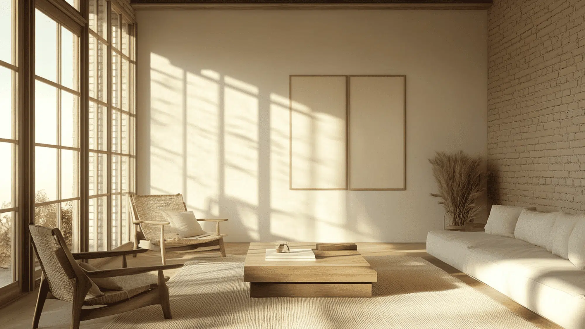
1. Living Rooms and Gathering Spaces
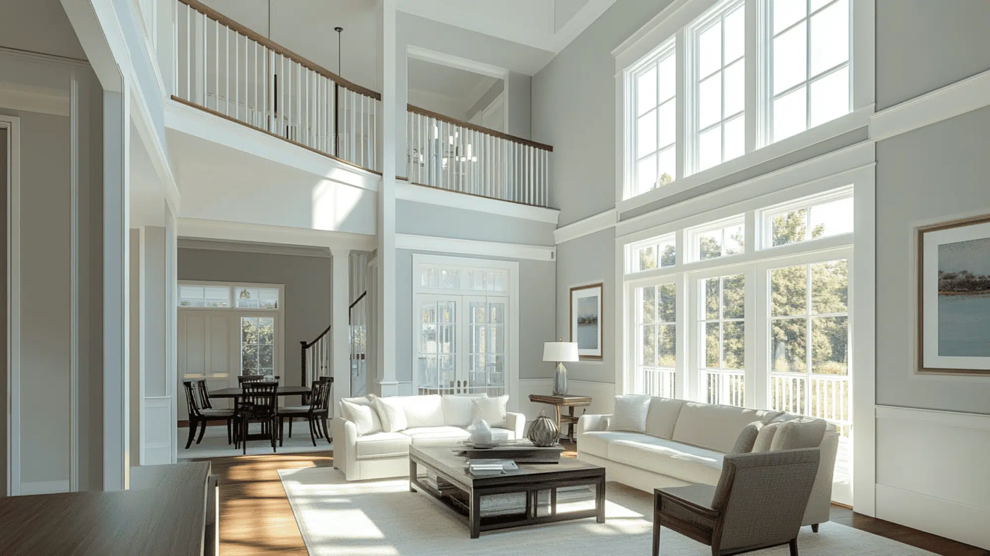
- Creates a cozy, welcoming backdrop for social areas
- Enhances open layouts without overwhelming the room
- Complements wood tones, colorful furniture, and layered textiles
- Use with Accessible Beige (SW 7036) or Balanced Beige (SW 7037) to define zones while maintaining flow
2. Bedrooms and Sleeping Areas
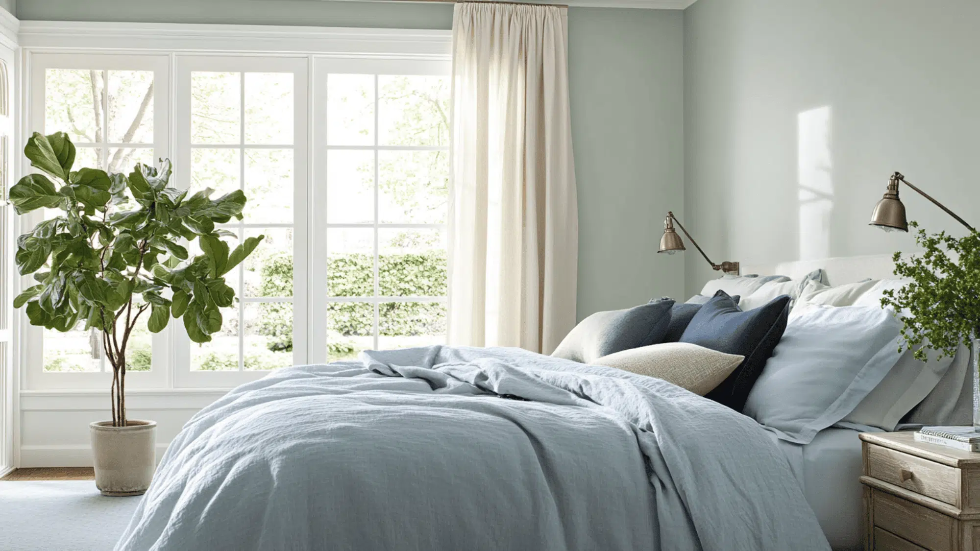
- Promotes calm, relaxation, and restful sleep
- Pairs well with warm bedding tones like blush, green, or terracotta
- Works beautifully with deep accent walls or layered neutrals
- Try Aesthetic White (SW 7035) on trim or ceiling for a subtle contrast
3. Kitchens and Cooking Spaces
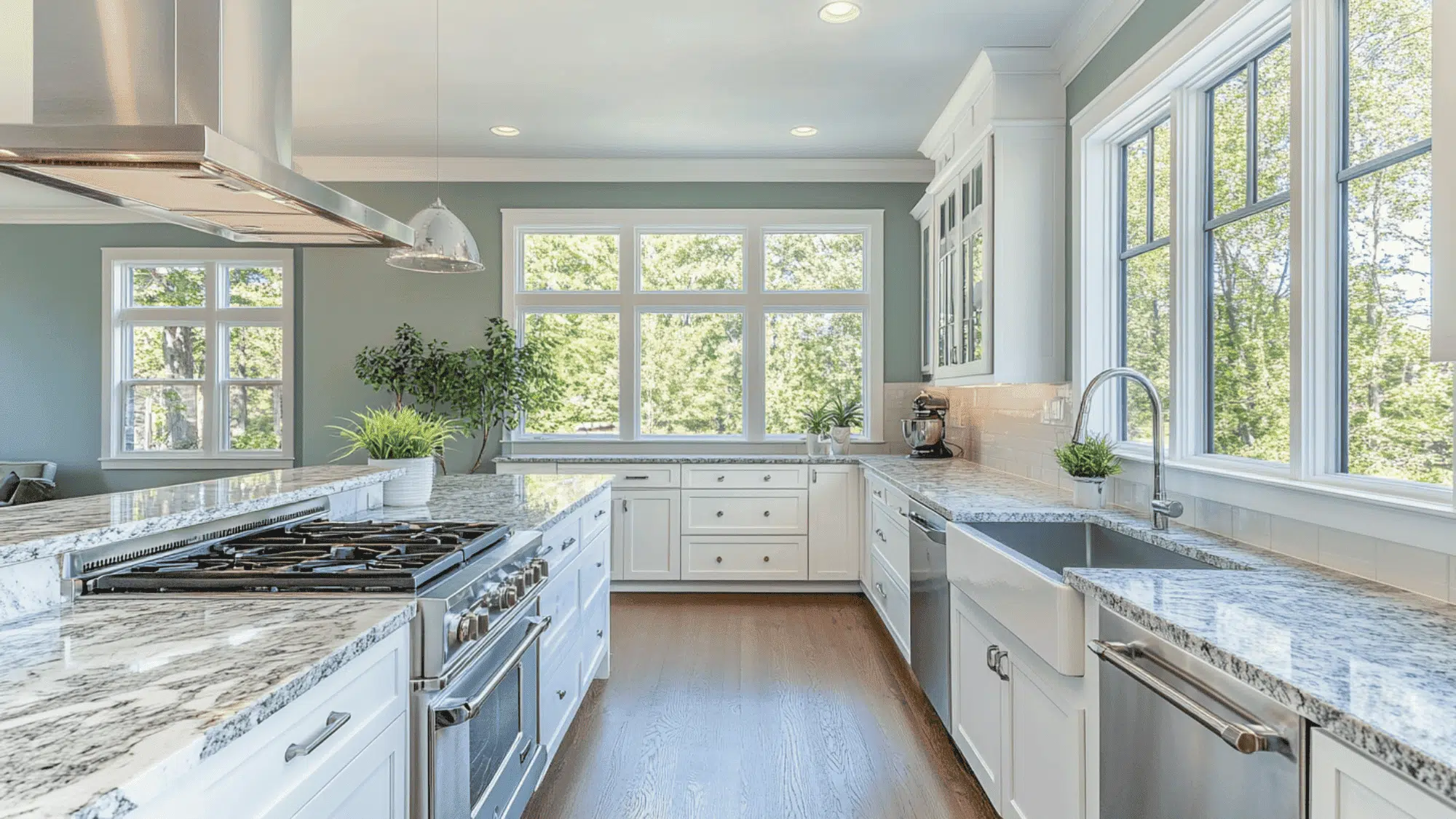
- Brightens the space while masking everyday smudges
- Pairs effortlessly with wood cabinets, quartz, or white tile
- Offers a warm, clean look without appearing stark
- Looks great with brass hardware and earthy accessories
4. Bathrooms and Personal Retreats
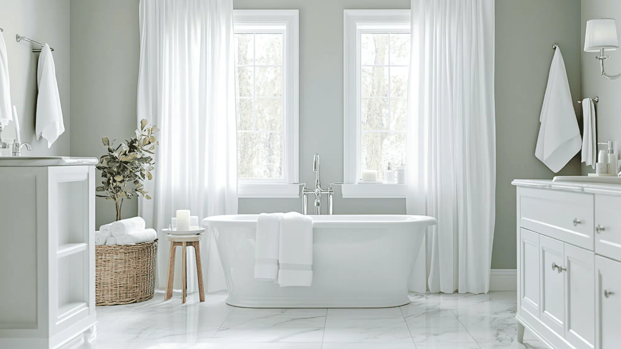
- Delivers a spa-like, serene feel to the space
- Makes small bathrooms appear larger and more open
- Enhances white trim, soft towels, and warm metals
- Feels inviting and luxurious without being too formal
Color Pairings for Sherwin-Williams White Sand (SW 9582)
White Sand is a warm, creamy neutral with a Light Reflectance Value (LRV) of 84. It is bright enough to open up spaces while still providing a soft, grounded feel.
Its sandy-beige undertones pair well with a variety of accent and trim shades.
Here are three beautiful combinations to consider.
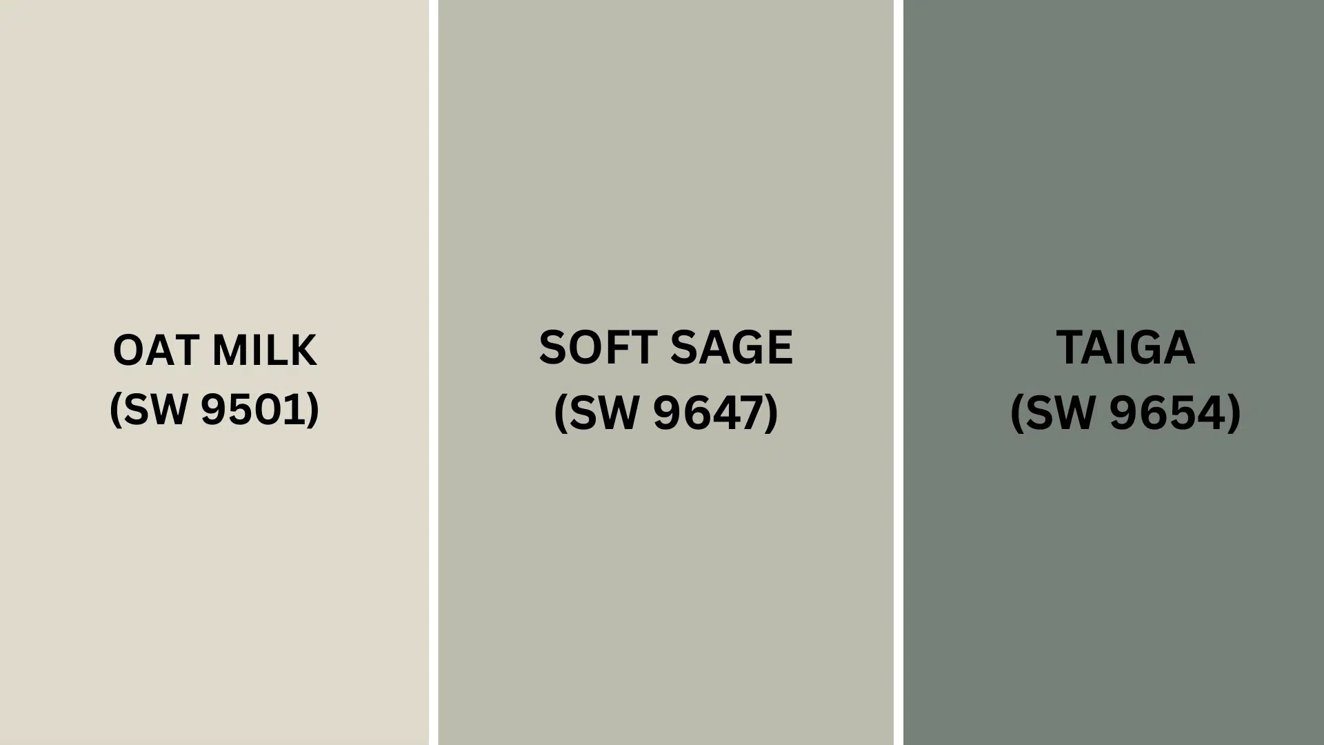
Complementary Trim Colors
- Oat Milk (SW 9501)– A light, off-white with creamy warmth that blends effortlessly with White Sand for a tone-on-tone look. Ideal for trim or ceilings in rooms where you want an airy, cohesive palette with a soft finish.
- Soft Sage (SW 9647) – A muted, calming green that brings out White Sand’s natural warmth. Use it on cabinetry, accent walls, or decor to introduce subtle color while maintaining a peaceful vibe.
- Taiga (SW 9654)– A deep, forest-inspired green that adds contrast and worldliness to White Sand. This pairing is excellent for built-ins, feature walls, or even bold front doors that create a grounded, nature-inspired aesthetic.
With its warm, sandy undertones and versatile nature, White Sand creates a foundation for design that’s both inviting and adaptable to your unique style vision.
Creating Cohesive Color Schemes
Sherwin-Williams White Sand (SW 9582) works pleasantly with many other colors to create a pulled-together look throughout your home.
Here are three different color schemes that use White Sand as the main color.
1. Monochromatic Scheme
- White Sand (SW 9582) for main walls
- Pure White (SW 7005) for trim
- Extra White (SW 7006) for ceilings
- Accessible Beige (SW 7036) for accent pieces or adjoining rooms
2. Warm Color Scheme
- White Sand (SW 9582) for the main living areas
- Loggia (SW 7506) for the dining room
- Oyster White (SW 7637) for hallways
- Kilim Beige (SW 6106) for bedrooms
3. Cool Color Scheme
- White Sand (SW 9582) for main walls
- Soft Sage (SW 9647) for bathrooms
- Sea Salt (SW 6204) for bedrooms
- Rainwashed (SW 6211) for home office
Coordinating with Furniture and Decor
Sherwin-Williams White Sand (SW 9582) creates a versatile backdrop that complements a wide range of furniture styles and decorative elements.
Its warm, sandy undertones make it particularly adaptable across different design aesthetics.
1. Wood Tones
White Sand’s warm beige qualities make it exceptionally compatible with various wood finishes throughout your home.
Dark woods like walnut and ebony create a striking contrast against White Sand walls, highlighting Interior details and furniture craftsmanship.
Medium woods such as oak and teak complement White Sand’s warmth for a cohesive, natural aesthetic that feels grounded and inviting.
Light woods, including pine and ash, enhance the airy quality of White Sand.
This makes it perfect for coastal or Scandinavian-inspired spaces where brightness is desired, but pure white feels too stark.
2. Metals
Antique brass and copper fixtures introduce rich warmth that enhances White Sand’s creamy undertones, creating a stylish yet comfortable atmosphere.
Matte black hardware provides contemporary contrast that anchors the space while maintaining worldliness.
Brushed nickel and chrome accents provide a cool counterpoint to White Sand’s warmth, creating balance in modern or transitional spaces where both warmth and crispness are needed.
3. Decor
Textural elements like woven baskets, sisal rugs, and natural linen upholstery emphasize White Sand’s organic qualities and create visual interest without competing with its subtle charm.
Sage green, terracotta, and navy blue accents draw out different facets of White Sand’s complex undertones.
These colors allow you to shift the room’s feel from earthy to refined with simple accessory changes.
Living elements such as leafy plants, dried grasses, and driftwood complement White Sand’s natural inspiration.
They introduce vitality and dimension to this versatile neutral foundation.
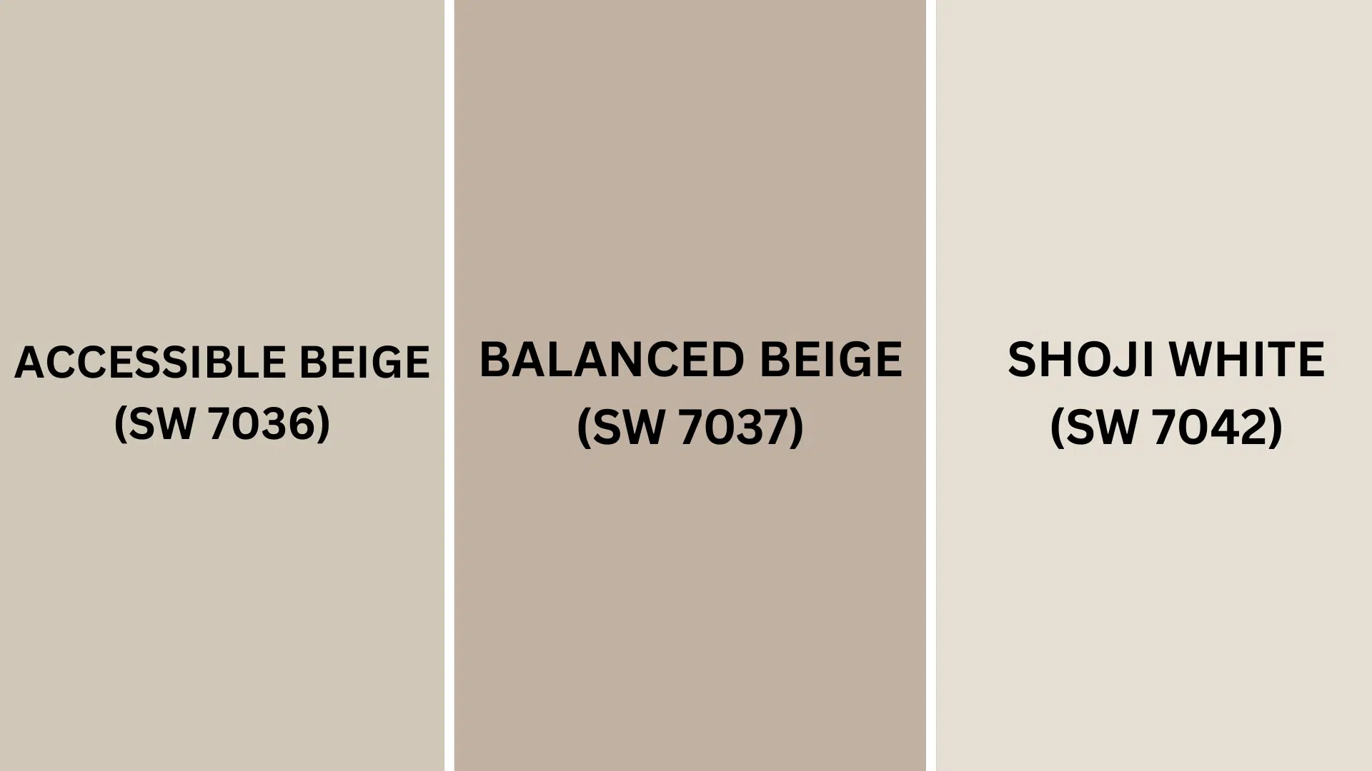
Similar Paint Colors: Perfect Alternatives to White Sand (SW 9582)
These colors work beautifully in various rooms, creating balanced, inviting spaces that maintain the warm neutral appeal of White Sand while offering subtle variations.
1. Accessible Beige (SW 7036)
- Slightly warmer beige with stronger taupe undertones
- Similar LRV (58) maintains good light reflection while offering a cozier feel
- Creates a versatile neutral foundation that works especially well in traditional and transitional spaces
2. Balanced Beige (SW 7037)
- Deeper beige with noticeable warm undertones
- Lower LRV (46) makes it more saturated and dramatic on walls
- Creates a rich, grounded look that feels more substantial and less ethereal
3. Shoji White (SW 7042)
- Lighter greige with soft yellow undertones
- Higher LRV (74) creates brighter, more luminous feeling spaces
- Creates a fresher, airier atmosphere that feels relaxed while maintaining warmth
Each alternative offers its own unique character while staying within the same warm neutral family.
This allows you to find the perfect shade that responds to your specific lighting conditions and complements your existing decor.
Summing It Up
Sherwin-Williams White Sand (SW 9582) stands as a testament to the enduring power of refined neutrals.
This warm beige tone creates inviting environments in your home.
Its ability to change spaces is unmatched.
Whether paired with crisp whites, earthy greens, or rich wood tones.
White Sand provides a foundation that adapts to your unique vision while maintaining its timeless grace.
If you’re interested in more informational color review content, feel free to click here and explore other blogs you might enjoy.

Alex Guerrero, a graduate with a Fine Arts degree from the Rhode Island School of Design, has been a visionary in the world of color and design for over 15 years. His professional journey began in the heart of the fashion industry in Milan, where he developed an acute sense for color harmonies and trends. Alex joined our team in 2018, offering fresh and innovative perspectives on color utilization in various spaces. Renowned for his ability to blend contemporary trends with timeless elegance. Outside of work, Alex is an accomplished painter and a volunteer art therapist, his artistic talents further enriching his professional insights.