

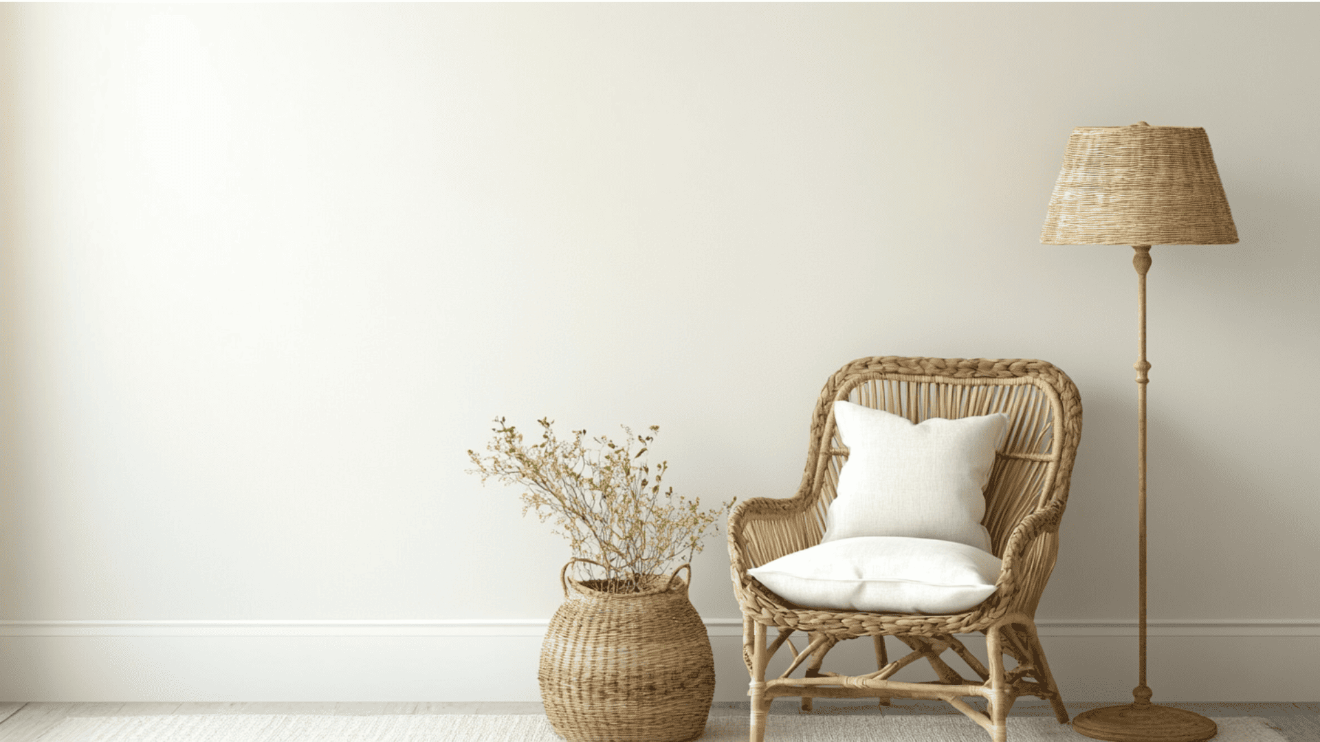
There’s something almost magical about walking into a room painted in Farrow & Ball’s Setting Plaster (No. 231).
Neither distinctly pink nor terracotta, this enigmatic shade has sparked a quiet revolution in home design.
While bold colors come and go, this refined neutral has endured because it performs a remarkable feat: it makes every room feel instantly more classy yet deeply comfortable.
Unlike countless failed “perfect neutrals,” Setting Plaster genuinely changes spaces across lighting conditions, from sun-drenched living rooms to shadowy hallways.
Suppose you’ve struggled to find that elusive wall color that feels timeless without being boring, refined without being precious.
In that case, this pink-clay chameleon might just end your search for the perfect paint.
Understanding Setting Plaster by Farrow & Ball
A timeless, versatile neutral that brings warmth and refinement to any space while adapting beautifully to changing light conditions.
Color Terminology
Setting Plaster is a refined neutral with historical roots, named after the color of freshly applied plaster as it dries.
Here’s the table showing the color specifications for Setting Plaster by Farrow & Ball:
| PROPERTY | VALUE |
|---|---|
| Brand Color No. | 231 |
| RGB | 223 / 194 / 175 |
| Hex Code | #DFC2AF |
This table provides the key technical information you need to reference or match this color in your design projects accurately.
Undertones
The unique charm of Setting Plaster lies in its subtle complexity, with undertones that shift beautifully throughout the day.
- Setting Plaster has warm pink undertones.
- It’s a muted, dusty pink that can appear peachy in certain lights
- Not a bright or saturated pink, but a soft, neutral color with earthiness
Psychology of Pink-Neutral Colors
These sophisticated neutrals have gained popularity for their versatility and the serene atmosphere they create in contemporary interiors.
- Setting Plaster creates a warm, welcoming atmosphere that changes any space into a cozy retreat.
- Pink-terracotta tones add subtle depth and timeless grace that complements both modern and traditional decor.
- Muted pinks feel nurturing and comforting without appearing overly feminine, making them suitable for all rooms.
- Benefits: Creates a flattering glow that enhances natural skin tones and provides genteel warmth to interiors.
Why Choose Farrow and Ball Setting Plaster (No. 231)?
Setting Plaster shows amazing flexibility in all kinds of lighting throughout your home.
It glows warmly in sunny rooms while making darker spaces feel cozy and welcoming.
Its soft pink-clay color creates a perfect backdrop for both old and new furniture without taking over.
1. Key Features
Setting Plaster works great with things you already have, like stone counters and neutral fabrics.
It gives enough color to be special while staying classic, so your rooms won’t look dated.
2. Durability
Setting Plaster in Estate Emulsion or Modern Eggshell stands up well to daily life in busy areas.
Its medium tone hides small marks better than lighter colors while keeping its luxury look.
This paint doesn’t fade easily and keeps its color even with regular cleaning when put on right.
3. Texture Patterns
Setting Plaster makes walls look rich and velvety while keeping rooms balanced and flowing.
Its warm tones create nice shadows that make natural light look better on all wall surfaces.
Used in different finishes, it shows off details while keeping connected rooms looking unified.
4. Why It Works
Setting Plaster works by balancing warmth and style, with just enough color for character.
Its pink-clay tones look great with light woods and gray accents, making rooms feel welcoming.
This versatile color shifts beautifully as daylight changes, looking good all day long.
Room-by-Room Color Recommendations with Setting Plaster
Learn how this versatile neutral can modify different spaces in your home.
Find styling suggestions and practical applications to maximize Setting Plaster’s beauty.
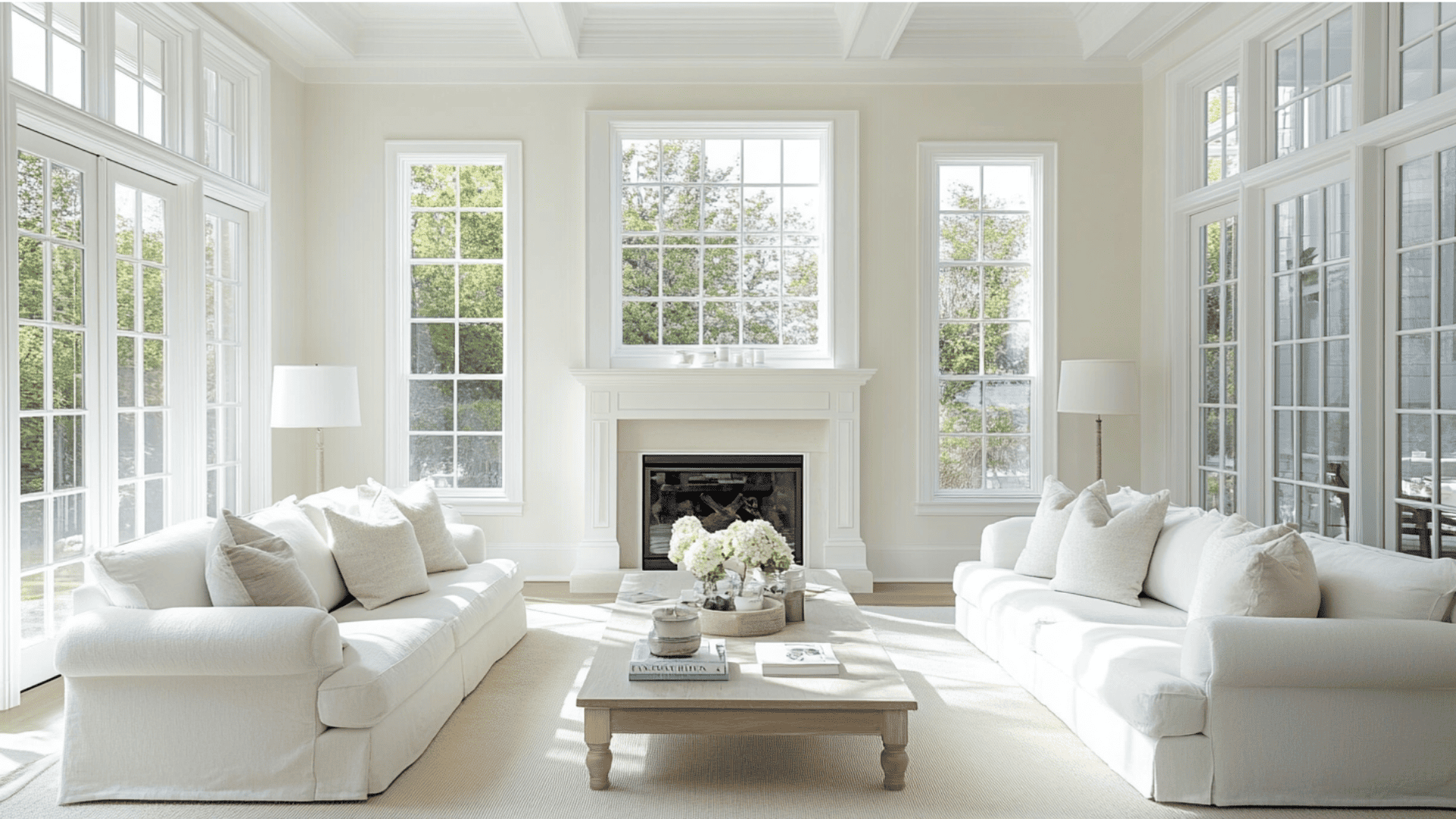
1. Living Spaces and Open Floor Plans
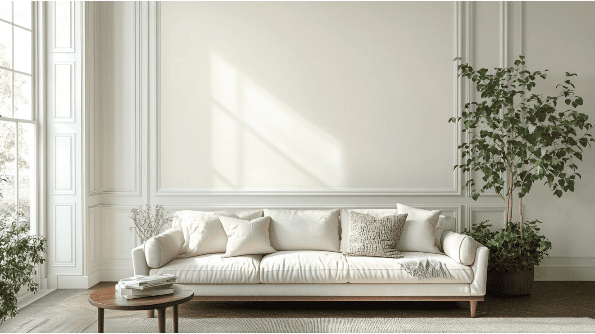
- Setting Plaster creates a warm backdrop that feels both luxury and welcoming. It shines in living rooms with varying light exposure.
- Pair with cool chrome details and dark walnut furniture to balance the warm tones and create a worldly, layered living space.
- Use this versatile pink in connecting rooms for cohesion while changing textiles to give each area its unique personality.
2. Bedrooms and Relaxation Areas
- Apply Setting Plaster to all walls for a nurturing effect that promotes comfort and stability in primary bedrooms.
- To enhance the space’s airy feel, balance this color’s warmth with crisp linen bedding and natural fiber rugs.
- Consider Setting Plaster for a headboard wall or built-in wardrobes in guest rooms for impact without overwhelming occasional visitors.
3. Kitchens and High-Traffic Zones
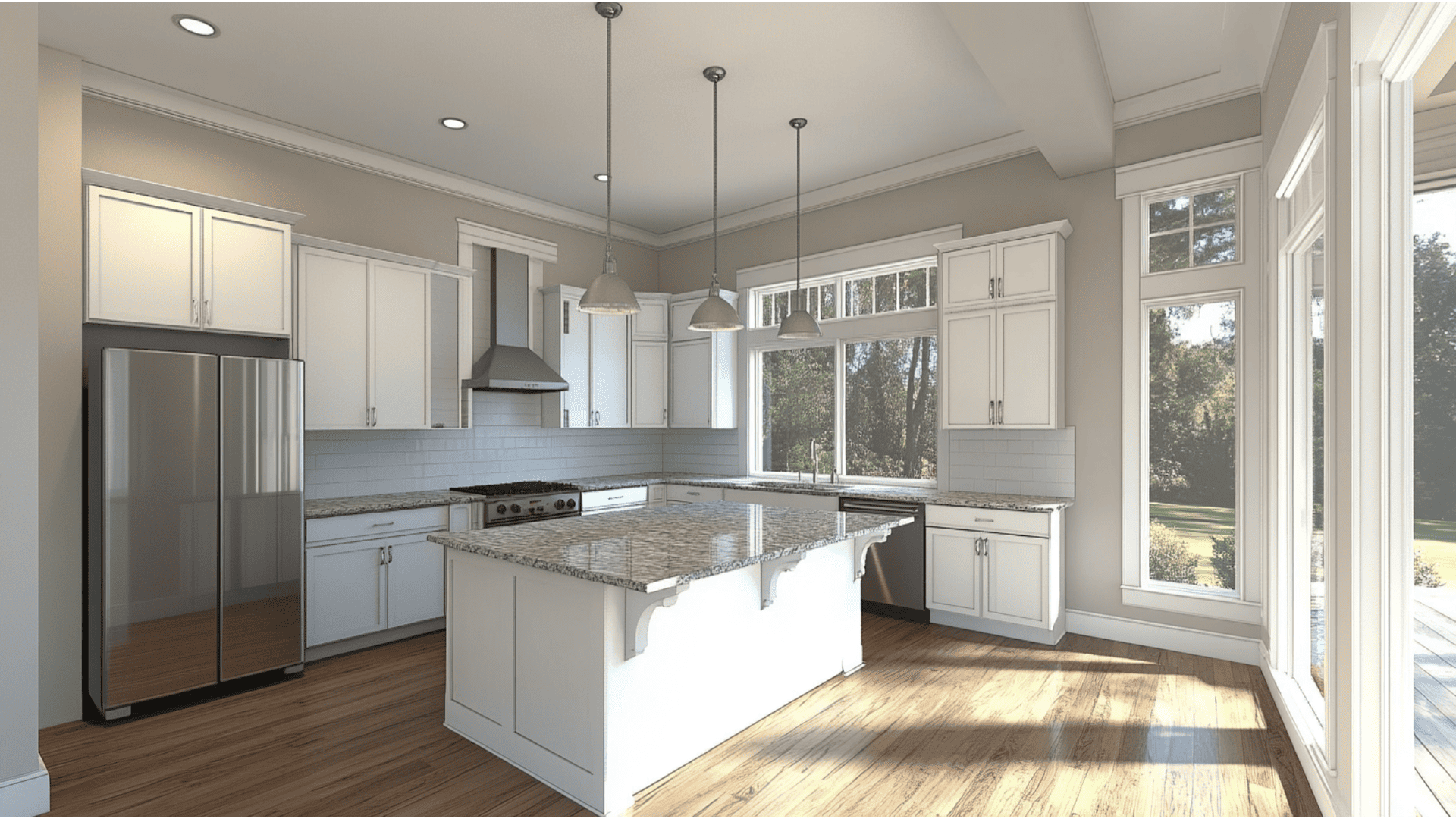
- Use Setting Plaster on kitchen walls paired with dark countertops for a timeless look that disguises everyday dust and splashes.
- This color works beautifully in kitchens with limited natural light, preventing the space from feeling cold or clinical.
- Complement Setting Plaster kitchen elements with dark metals like matte black or bronze for hardware and lighting fixtures.
4. Bathrooms and Spa-like Retreats
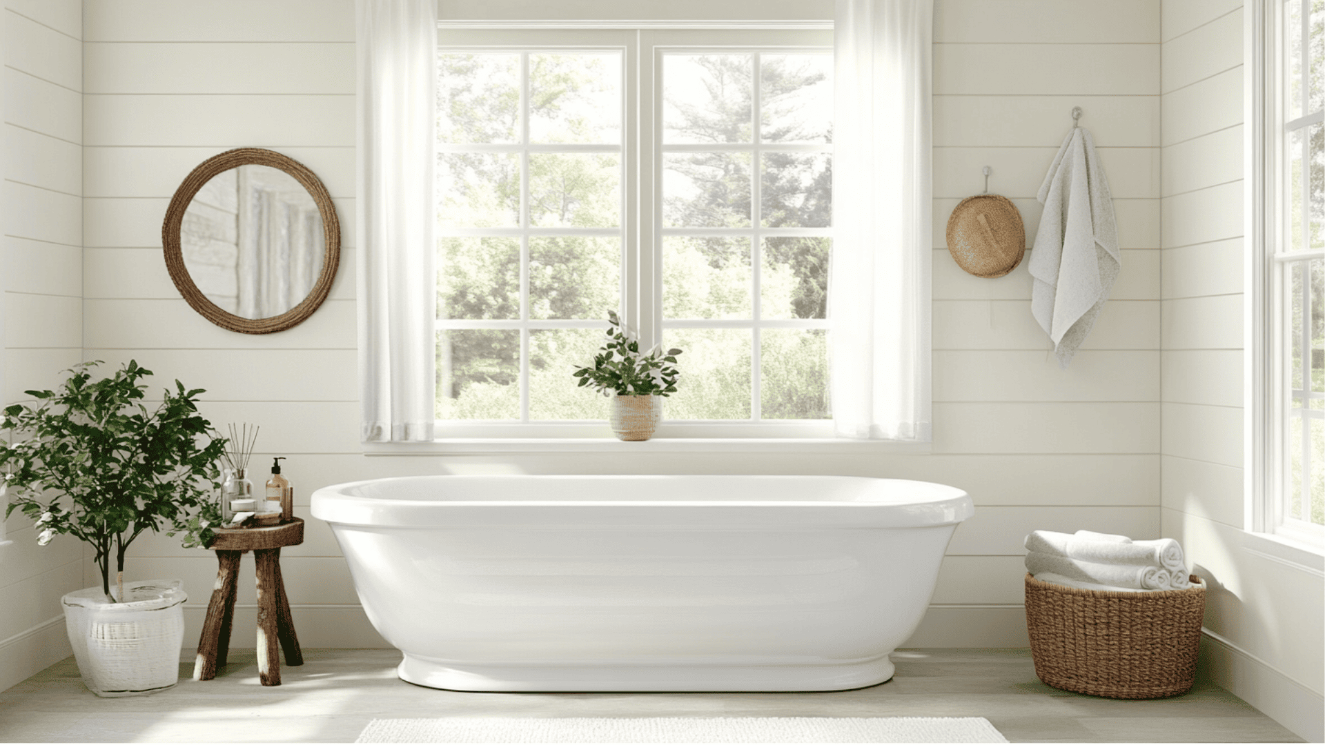
- Setting Plaster alters bathrooms into luxurious retreats when paired with marble fixtures and dark wood accents.
- Apply to walls while keeping vanities darker for a striking contrast in smaller bathrooms and powder rooms.
- The terracotta undertones in Setting Plaster echo Mediterranean spas, reinforcing the relaxing feeling that makes bathrooms feel special.
Color Pairings and Combinations
Setting Plaster is a warm, earthy pink with subtle terracotta undertones.
Its medium depth makes it incredibly versatile, adding warmth to spaces while maintaining a refined, timeless quality.
Here are some excellent color pairings for this shade.
Complementary Trim Colors
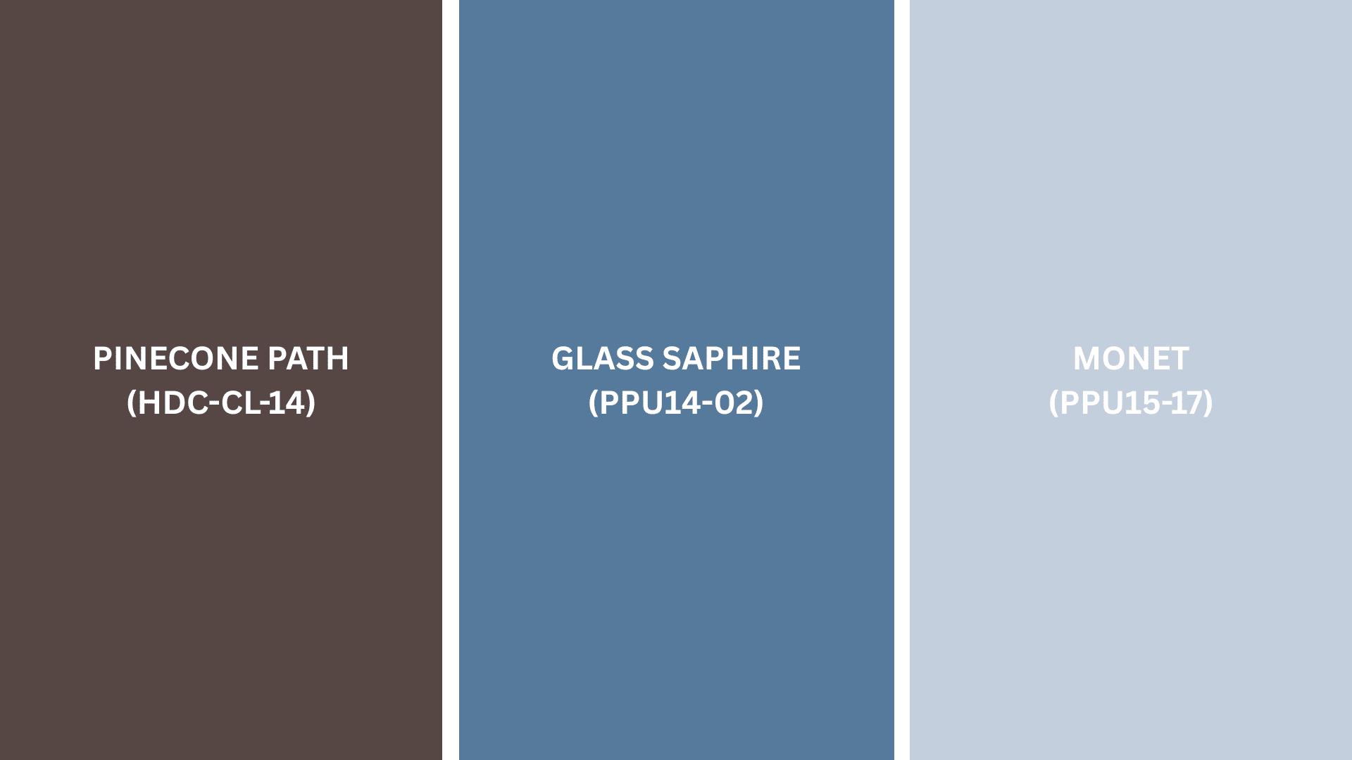
- Elephants Breath (No. 229) – A versatile warm gray that creates a graceful, subtle contrast with Setting Plaster
- Charleston Gray (No. 243) – A deeper, more dramatic, earthy tone that provides fine depth
- London Clay (No. 244) – A rich terracotta brown that enhances Setting Plaster’s warmth for a cohesive look
Creating Cohesive Color Schemes
These professionally curated color palettes are designed to create cohesive and visually appealing interior spaces with Setting Plaster as your foundation.
Choose a scheme that matches your preferred aesthetic and lighting conditions.
| SCHEME | MAIN WALLS / AREAS | TRIM / CEILINGS | OTHER ROOMS / ACCENTS |
|---|---|---|---|
| Monochromatic | Setting Plaster (231) | Pink Ground (202), Dimity (2008) | London Clay (244), Dead Salmon (28) |
| Warm | Setting Plaster (231) | Tallow (203), Joa’s White (226) | Oxford Stone (264), Charleston Gray (243), Cinder Rose (246) |
| Cool | Setting Plaster (231) | Elephants Breath (229), Skimming Stone (241) | Mole’s Breath (276), Purbeck Stone (275), Lamp Room Gray (88) |
NOTE: All colors are from the Farrow & Ball collection. Paint colors may appear different depending on lighting conditions, so it is recommended that you test samples in your space before making final decisions.
Coordinating with Furniture and Decor
Setting Plaster’s versatile nature allows it to complement a wide range of materials and styles.
Learn how to pair this refined neutral with different elements for a cohesive, designer-worthy look.
1. Wood Tones
Setting Plaster pairs exceptionally well with espresso, walnut, and ebony wood tones.
The pink-terracotta undertones create a refined contrast with dark woods, highlighting their rich character.
For a lighter, more relaxed look, whitewashed or pale oak provides a breezy Mediterranean feel against the warmth of this versatile color.
2. Metals
Cool metals like chrome, silver, and blackened steel hardware bring out the subtle earthy notes in Setting Plaster while adding contemporary contrast and refinement.
Antiqued bronze fixtures create rhythmic coordination and a more traditional feel.
The pink-terracotta base allows for interesting combinations of metallic finishes that add luxury to a space.
3. Decor
Natural textures like sisal, jute, and linen in slate or charcoal shades ground Setting Plaster’s warmth and create a balanced, worldly atmosphere.
Ceramic pieces in cool blue or sage green tones add refreshing contrast against the warm backdrop.
Black and white photography, glass accents, and geometric patterns enhance this heritage color’s contemporary feel, maintaining timeless grace in spaces.
Similar & Great Alternatives to Farrow & Ball Setting Plaster
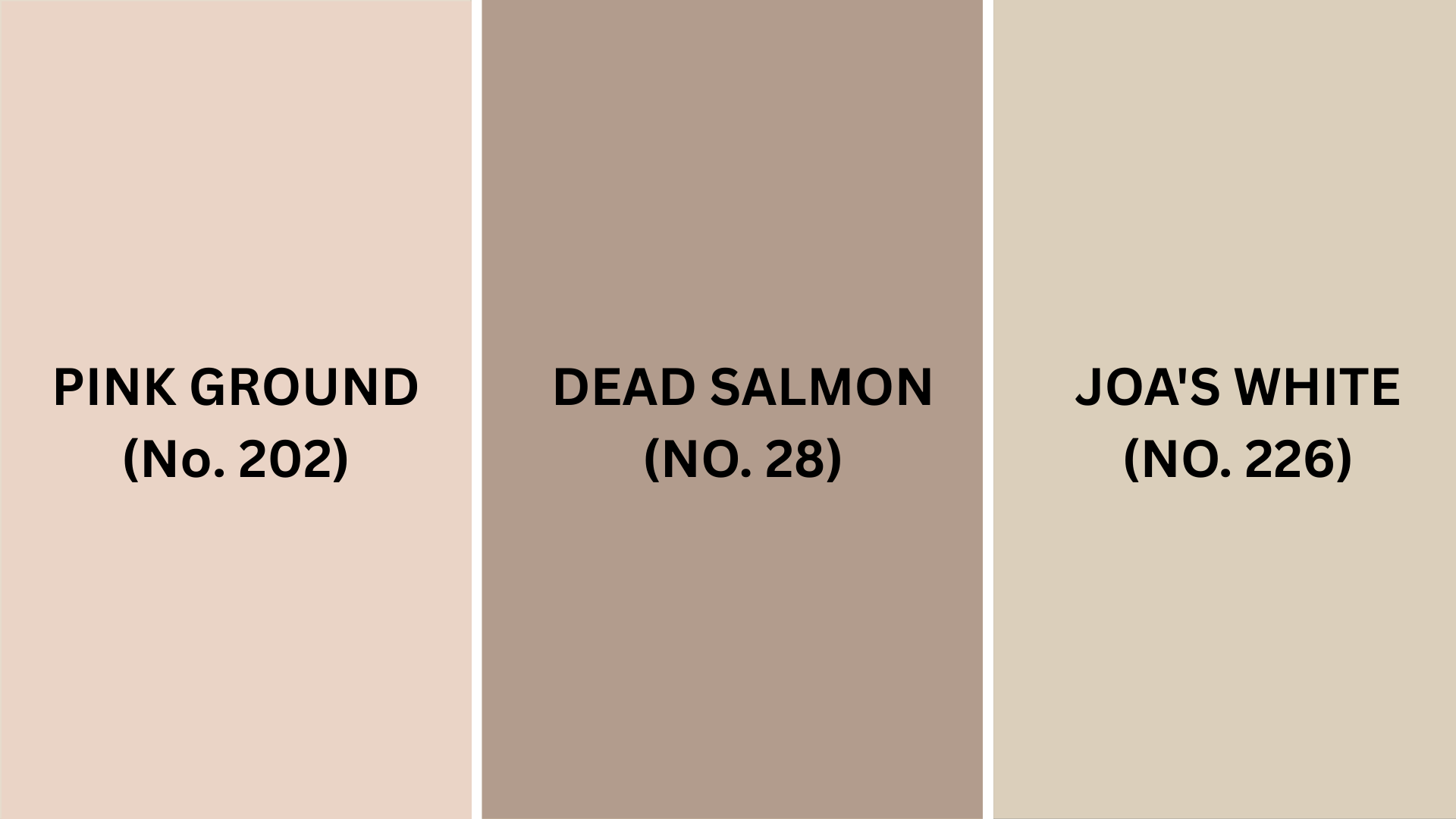
For those seeking the essence of Setting Plaster with subtle variations, these alternatives offer similar qualities.
Each Farrow & Ball color brings its own unique characteristics while maintaining the warmth and intricacy you love
1. Pink Ground (No. 202)
- A slightly lighter, softer option that shares the same warm quality and refined character
- Works beautifully in similar light conditions while offering a slightly fresher, more versatile feeling
- Pairs with the same complementary colors while providing a touch more brightness
2. Dead Salmon (No. 28)
- Features a similar pink-terracotta balance but with slightly deeper, richer qualities
- Creates the same welcoming atmosphere with a touch more gravitas for sleek spaces
- Offers equal versatility with furniture and decor while feeling subtly more traditional
3. Joa’s White (No. 226)
- Embraces the warm undertones of Setting Plaster while minimizing the pink influence
- Delivers the same understated refinement and works beautifully with identical accent colors
- Provides a comparable warmth and refinement while leaning more into neutral, versatile territory
Final Words
Setting Plaster by Farrow & Ball is a timeless pink-terracotta shade that blends classiness with warmth, perfect for modern homes.
Its adaptable tone shifts beautifully with light, suiting any room, from cozy living areas to spa-like bathrooms.
This versatile color pairs effortlessly with dark woods for contrast or cool metals for a sleek, contemporary look.
More than stylish, it’s durable in high-traffic areas, resists fading, and easily hides scuffs.
Setting Plaster enhances decor without overpowering it, making it a functional yet beautiful backdrop.
Explore more tasteful color reviews to find the perfect shade for your space.

Alex Guerrero, a graduate with a Fine Arts degree from the Rhode Island School of Design, has been a visionary in the world of color and design for over 15 years. His professional journey began in the heart of the fashion industry in Milan, where he developed an acute sense for color harmonies and trends. Alex joined our team in 2018, offering fresh and innovative perspectives on color utilization in various spaces. Renowned for his ability to blend contemporary trends with timeless elegance. Outside of work, Alex is an accomplished painter and a volunteer art therapist, his artistic talents further enriching his professional insights.