
Are you looking for the perfect white paint that feels warm and welcoming?
Sherwin-Williams Fleur de Sel might be your new best friend!
This soft white creates calm spaces in almost any home. It brightens rooms without feeling too stark.
This color has gentle greige undertones that add warmth to your walls.
It changes slightly as daylight shifts throughout the day.
This versatile color works in kitchens, living rooms, and bedrooms.
It pairs well with many furniture styles and accent colors.
The soft white hue makes decorating easier.
You’ll notice how it makes everything in your room look better.
It flows nicely from one room to another. It lets your beautiful furniture be the star.
Understanding Sherwin-Williams’ Fleur de Sel
This is a beautiful, soft white paint color by Sherwin-Williams.
It converts plain walls into calm, welcoming spaces that work in almost any home.
You can find this color as SW 7666.
Color Terminology
Here’s a clear and simple breakdown of the color information you provided.
This table helps you understand the Light Reflectance Value (LRV), RGB, and HEX code at a glance.
| PROPERTY | VALUE |
|---|---|
| LRV | 72 |
| RGB | 220 / 221 / 216 |
| HEX | #DCDDD8 |
These values suggest the color is a soft, very light neutral, ideal for bright, airy spaces.
It works well in minimalist or modern interiors that need a clean but warm background.
Undertones:
- It has soft griege undertones that give it warmth
- It changes slightly as the light shifts through the day
- Not a stark white, but a cozy, gentle white that feels lived-in
Psychology of Neutral Colors
The colors on our walls affect how we feel at home, especially versatile ones like this.
- Gentle whites: Create open, peaceful spaces
- Warm neutral colors: Make decorating much easier
- Flexible wall colors: Look different but always good as daylight changes
- Benefits: Hides small wall flaws, goes with everything, looks put-together
People love this color because it feels both timeless and modern.
It’s like the perfect white t-shirt for your walls – it just works!
Why Choose Sherwin-Williams Fleur de Sel (SW 7666)?
Sherwin-Williams Fleur de Sel is a soft, creamy white paint that makes any room feel fresh and welcoming.
It’s really easy to use because it complements pretty much any furniture or style in your home.
1. Versatility
This color shifts in lovely ways as the day goes on.
Morning sunlight brings out its warm, cozy side, while evening light shows off its crisp, clean look.
You can use it anywhere – living rooms, bedrooms, kitchens, or bathrooms.
It looks great in country-style homes, beach houses, or modern apartments, making it super easy to work with.
2. Key Features
This finds that sweet spot between warm and cool whites.
With its high LRV of 72, it brightens up spaces without feeling too stark or blinding.
People have loved this color for years because it doesn’t feel too trendy or dated.
Once you paint your walls, you’ll notice how it improves everything else in your room.
3. Durability
When used in Sherwin-Williams’ Duration or SuperPaint formulas, it is really well-suited to everyday life.
This soft white hides small marks and fingerprints better than pure whites, which is perfect for homes with kids or pets.
The quality ingredients keep the beautiful color looking fresh even after years of cleaning, so your walls look good for a long time.
4. Texture Patterns
This color creates a smooth, peaceful look that instantly makes rooms feel put-together.
Its subtle greige undertones add just enough interest without being too busy.
It makes baseboards and door frames pop with a clean, finished look.
It flows nicely from one room to another, creating a connected feel while letting your furniture and decorations be the main attraction.
Room Color Recommendations: Sherwin-Williams Fleur de Sel
This is a soft, creamy white paint that makes any room feel fresh and cozy.
It changes a bit throughout the day, showing warmer tones when the sun is bright and cooler tones in the evening.
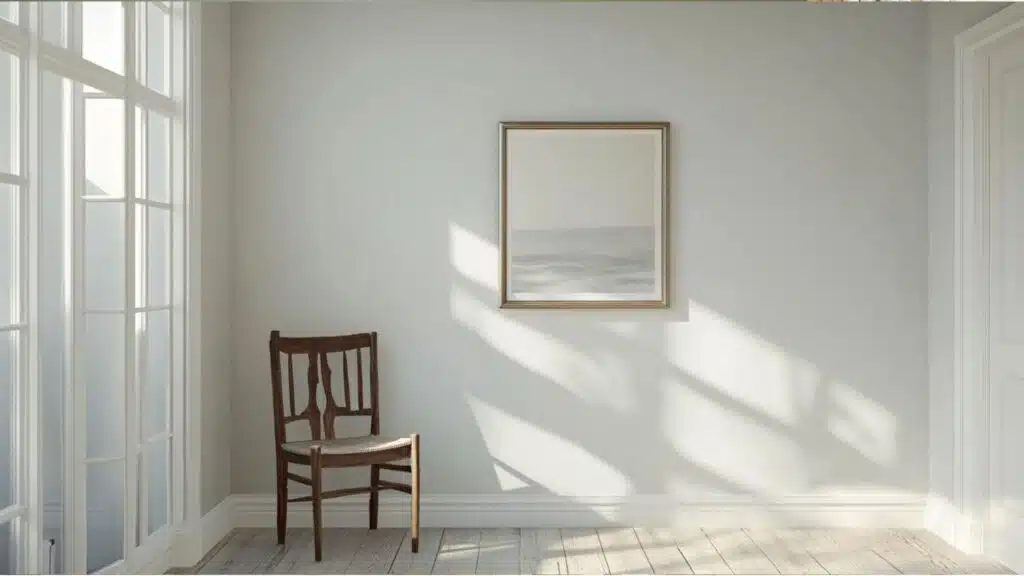
1. Living Spaces and Family Rooms
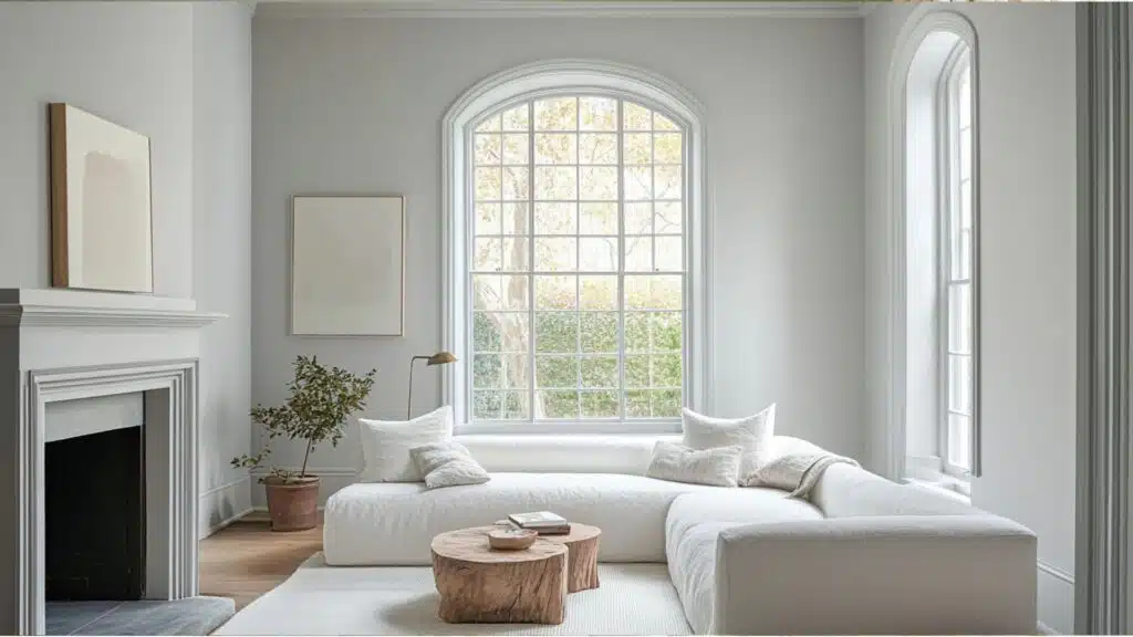
It works great in living rooms where families spend most of their time.
It creates a clean canvas that makes the room feel open and inviting.
- This gentle white lets your colorful furniture and decorations really stand out and shine.
- It goes with both old-fashioned and modern styles, so you won’t need to repaint when you get new furniture.
- Try it with dark floors and some blue or green pillows for a look that feels both fresh and homey.
Your friends will notice how put-together your living room looks.
The soft white creates a peaceful feeling that helps everyone relax.
2. Kitchens and Dining Areas
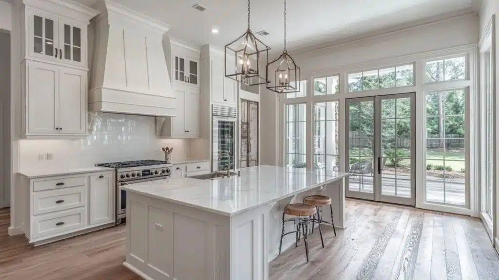
Kitchens painted with this color feel clean without being too stark or hospital-like.
It’s perfect for the heart of your home.
- The creamy white makes kitchens feel bigger and brighter without being too harsh on the eyes.
- It looks amazing with white, gray, or wood cabinets, making it super easy to work with.
- In dining rooms, this soft color creates a nice background for good meals and better conversations.
Food looks more appetizing against this gentle backdrop.
Your kitchen will feel welcoming to guests without being too bold or distracting.
3. Bedrooms and Relaxation Spaces
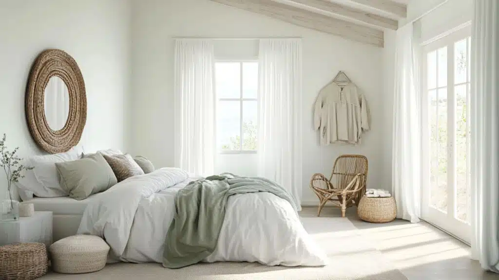
Bedrooms need colors that help you unwind and rest well.
It creates a peaceful feeling that’s perfect for sleeping.
- It turns bedrooms into calm spaces that help your mind settle down at night.
- This soft white works with any color bedding from deep blues to soft greens or cozy beiges.
- It makes small bedrooms feel more open while still keeping that snug feeling that helps you sleep.
You’ll notice how much easier it is to relax in a room painted this color.
It’s like giving your bedroom a soft hug that welcomes you home every night.
Color Pairings and Combinations for Fleur de Sel (SW 7666)
This is a friendly, soft white that works in pretty much any room of your house.
Its high LRV of 72 creates bright, airy spaces that feel both fresh and cozy.
Here are some perfect partner colors for this super versatile shade.
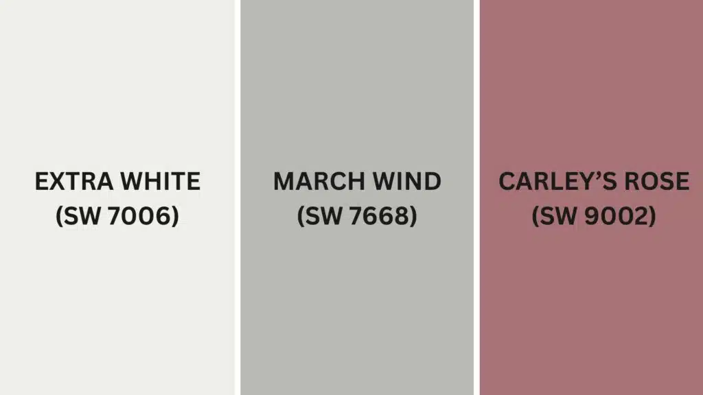
Complementary Trim Colors
Picking the right colors to go with this color can really change how your home feels.
These specific colors create beautiful combinations with this soft, warm white.
1. Extra White (SW 7006)
A crisp, clean white that creates a subtle contrast with this color.
It makes doorways and windows pop without feeling too stark or harsh.
Your trim will look fresh and defined while still keeping the room feeling warm and welcoming.
2. March Wind (SW 7668)
A gentle, slightly deeper greige that adds just the right amount of contrast.
It works great as an accent wall or on kitchen cabinets when the color is on the walls.
This combo creates a layered, designer look that feels calm and put together.
3. Carley’s Rose (SW 9002)
A soft, dusty pink that adds warmth and personality when used with it.
It makes a lovely accent color in bedrooms or dining rooms.
This combo feels both modern and timeless, giving your space a touch of color without being too bold.
Creating Cohesive Color Schemes
Sherwin-Williams Fleur de Sel works great with many other colors to make your whole house feel connected.
This soft, warm white is a perfect starting point for lots of different decorating styles.
Here are three different color schemes that use it as the main color.
| SCHEME | MAIN WALLS / AREAS | TRIM / ACCENT / CEILINGS | OTHER ROOMS / ACCENTS |
|---|---|---|---|
| Monochromatic | Fleur de Sel (SW 7666) | Extra White (SW 7006) | Alabaster (SW 7008), Snowbound (SW 7004) |
| Warm | Fleur de Sel (SW 7666) | March Wind (SW 7668) | Accessible Beige (SW 7036), Balanced Beige (SW 7037) |
| Cool | Fleur de Sel (SW 7666) | Carley’s Rose (SW 9002) |
NOTE: All colors shown are Sherwin-Williams paints. Colors will look different depending on your lighting, so always test samples on your walls before buying full gallons.
Coordinating with Furniture and Decor
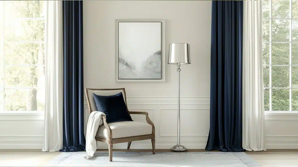
This is a soft white color that makes your furniture and decorations look amazing.
Its warm white tone creates a gentle backdrop that lets your favorite things stand out without fighting for attention.
1. Wood Tones
Dark woods like walnut, mahogany, and espresso create a stunning contrast against these light walls.
The mix feels cozy and classy at the same time.
Medium woods like cherry and oak blend perfectly with this paint, making rooms feel balanced and natural.
Light woods such as maple or pine add a bright, fresh feeling when paired with this versatile white shade.
2. Metals
Silver and chrome fixtures look sleek and modern, adding a touch of shine.
Brass and gold hardware bring warmth that works beautifully with the soft undertones in the paint.
Black metal pieces stand out nicely on the white walls, creating clean lines that add style to any room.
3. Decor
Rich colors like navy blue, emerald green, and deep red pop beautifully against these walls.
They create eye-catching spots of color without being too much.
Soft colors like light blue, pale pink, or mint green blend smoothly with this white, creating a peaceful, dreamy feeling.
Textured pillows, patterned rugs, and natural items like wooden bowls add interest to rooms painted in this easy-going, forgiving color.
Alternative Paints Similar to Sherwin-Williams Fleur de Sel
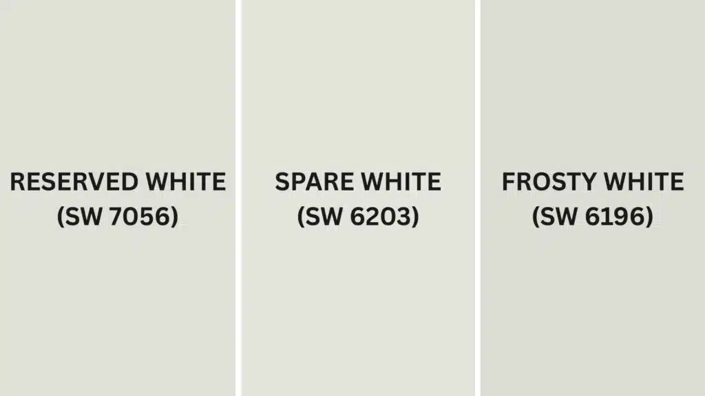
If you love the color but want to explore other options, check out these similar colors.
Each has the same soft quality but brings something a little different to your walls.
1. Reserved White (SW 7056)
Reserved White has a cooler look than the color and fewer warm undertones.
It gives rooms a fresh, clean feeling.
- Creates spaces that feel more modern and crisp without being too cold.
- Works perfectly in rooms with lots of natural light to create a bright atmosphere.
- Pairs beautifully with blue, green, or gray accents for a put-together look.
This color is great when you want a slightly more modern feel.
It still has some warmth but leans more toward a true white than Fleur de Sel does.
2. Spare White (SW 6203)
Spare White gives you a slightly softer version with gentle undertones.
It feels airy and light on your walls.
- Makes rooms feel open and peaceful without the starkness of bright white.
- Shows subtle depth that adds interest to simple walls and trim.
- Changes throughout the day, looking slightly different as the light shifts.
Your home will have a light, breezy feeling with this color.
It’s perfect for creating calm spaces where you can really relax.
3. Frosty White (SW 6196)
Frosty White offers a cleaner alternative with very subtle cool undertones.
It feels bright and refreshing in any room.
- Brightens up darker spaces while keeping a soft, not harsh quality.
- Has just enough gray to make it interesting without being too colorful.
- Works wonderfully with both warm and cool accent colors throughout your home.
This color creates spaces that feel open and clean.
It’s like Fleur de Sel’s slightly crisper cousin that keeps things feeling fresh.
Final Words
Sherwin-Williams Fleur de Sel alters homes with its peaceful versatility.
This refined white creates spaces that feel simultaneously fresh and cozy, complementing dark woods, colorful furniture, and various accent colors.
Unlike stark whites, it gracefully conceals minor wall imperfections.
Perfect for bedrooms or entire homes, it establishes a timeless aesthetic, like the ideal white t-shirt for your walls.
Morning light highlights its warmth, while evening illumination reveals its crisp character.
Under its influence, small spaces appear more expansive and luminous, wrapping your home in a light, airy atmosphere that’s both inviting and refined.
Have you tried this paint color in your home yet?
Share your experience in the comments below!
If you’re interested in more informational color review content, feel free to click here and explore other blogs that you might like.

Alex Guerrero, a graduate with a Fine Arts degree from the Rhode Island School of Design, has been a visionary in the world of color and design for over 15 years. His professional journey began in the heart of the fashion industry in Milan, where he developed an acute sense for color harmonies and trends. Alex joined our team in 2018, offering fresh and innovative perspectives on color utilization in various spaces. Renowned for his ability to blend contemporary trends with timeless elegance. Outside of work, Alex is an accomplished painter and a volunteer art therapist, his artistic talents further enriching his professional insights.