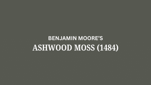
Do you know that happy feeling you get when you see the ocean?
Santorini Blue by Benjamin Moore can bring that feeling to your home!
This pretty blue-gray color makes rooms feel calm and cozy.
Santorini Blue enhances rooms with a subtle shade.
You can use it in kitchens, bedrooms, bathrooms, and living rooms.
Want to see how this pretty blue might look in your home?
Let’s check out Santorini Blue together!
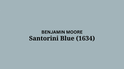
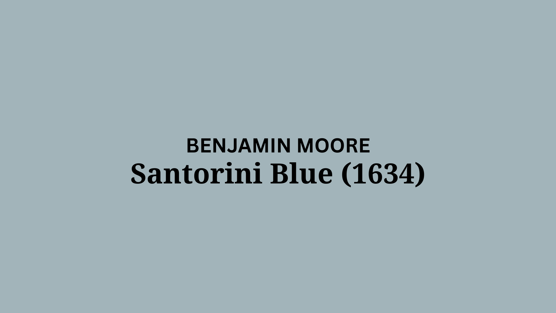
Understanding Benjamin Moore’s Santorini Blue
This soft blue paint makes your home feel like the beach.
It helps rooms feel calm and open.
Color Terminology
Here are the simple facts about this color.
These numbers help you match this paint to other things in your home.
| PROPERTY | VALUE |
|---|---|
| LRV | 44.67 |
| RGB | 162, 180, 186 |
| Hex Value | #A2B4BA |
You can use these numbers when you want to match this color online or when buying home items.
Undertones:
There’s something very calming about blue, even more so when it has a bit of gray mixed in.
This shade reminds me of the sea, and it’s perfect for adding color without taking over the room.
- Soft blue with gray mixed in
- Beach-like color that feels natural
- Not a bright blue, but a soft, pretty blue-gray. This blue plays nice with others.
It brings a calm feeling, gentle charm, and a grounded look to any room.
The color is a quiet hello from the ocean, with just the right amount of style.
Psychology of Blue Colors
When you paint your walls this color, it makes the room feel calm.
This paint can change how a room feels.
Blue like this:
- Makes rooms feel open and big
- Ocean colors: Make rooms feel relaxed
- Soft blues: Make spaces feel just right
This blue stays nice for a long time.
It won’t go out of style and makes a good background for your things.
Why Choose Benjamin Moore Santorini Blue (1634)?
Santorini Blue is a generous blue-gray that looks like the beach while still looking nice.
It’s good when you want something natural that also looks pretty.
1. Versatility
It looks different as the sun moves through the day.
In morning light, it looks more blue.
At night, it looks more gray.
This color works well in bedrooms, bathrooms, and even kitchens.
This blue-gray fits with beach style, new style, or a mix of old and new.
2. Key Features
This blue-gray goes well with most furniture.
It’s not too light or too dark.
It makes a room feel nice but open.
Unlike colors that look old fast, this blue will look good for many years.
3. Durability
When used with good paint, it hides marks and spots.
This is good for busy homes with kids or pets.
The medium blue hides small marks while still looking good.
Simple cleaning keeps walls looking nice for years.
4. Texture and Light Interaction
This paint has a smooth, rich look that adds depth to your walls.
It changes a bit with the sun during the day, making soft shadows.
This color flows well from room to room.
It lets art and plants stand out.
Room Color Recommendations: Benjamin Moore Santorini Blue
This pretty blue-gray works well in any room of your home.
It changes a bit as the day goes on, but stays calm in any light.
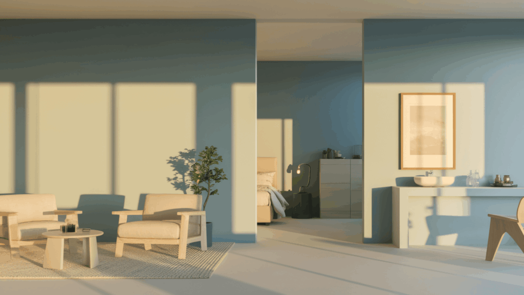
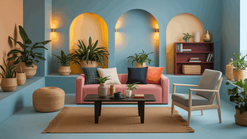
1. Living Spaces and Open Floor Plans
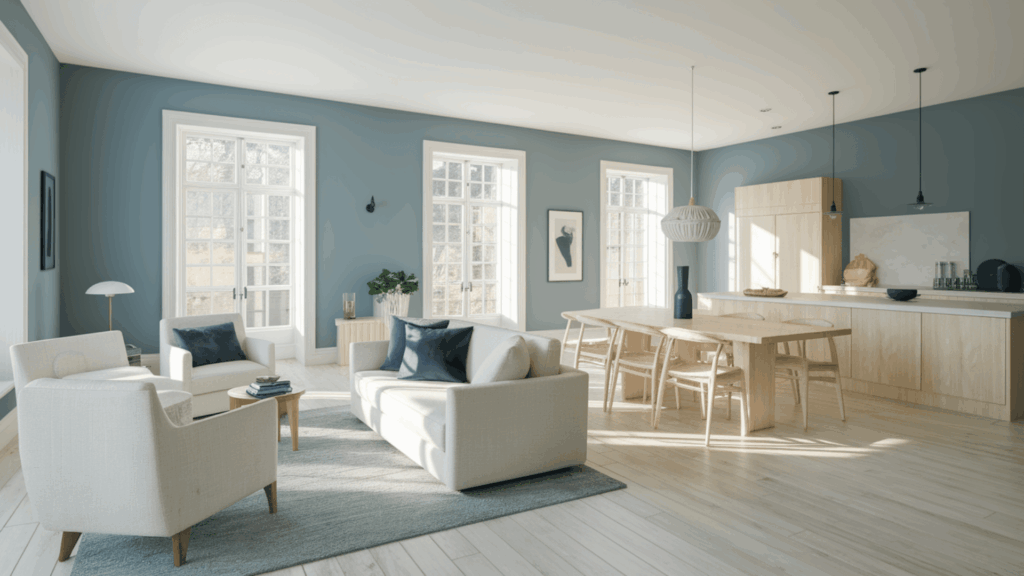
- Creates an open, spacious living room that highlights your furniture instead of hiding it.
- The soft blue color evokes calmness, especially the sunlight streaming through the windows during the day.
- For homes with no walls between rooms, use this color all over to help rooms feel like they go together, or add darker blues for a bit of change.
2. Bedrooms and Relaxation Areas
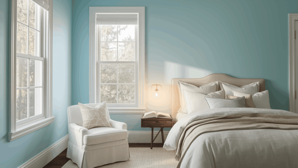
- Helps the bedroom feel calm and quiet, making it a great place to rest, read, or get ready for sleep.
- It looks bright and fresh in the morning, but turns soft and cozy when the lights are low or at night.
- Good for painting all the walls to feel like the beach, or you can use white trim to add a bit of pop and clean lines.
3. Bathrooms and Spa-like Spaces
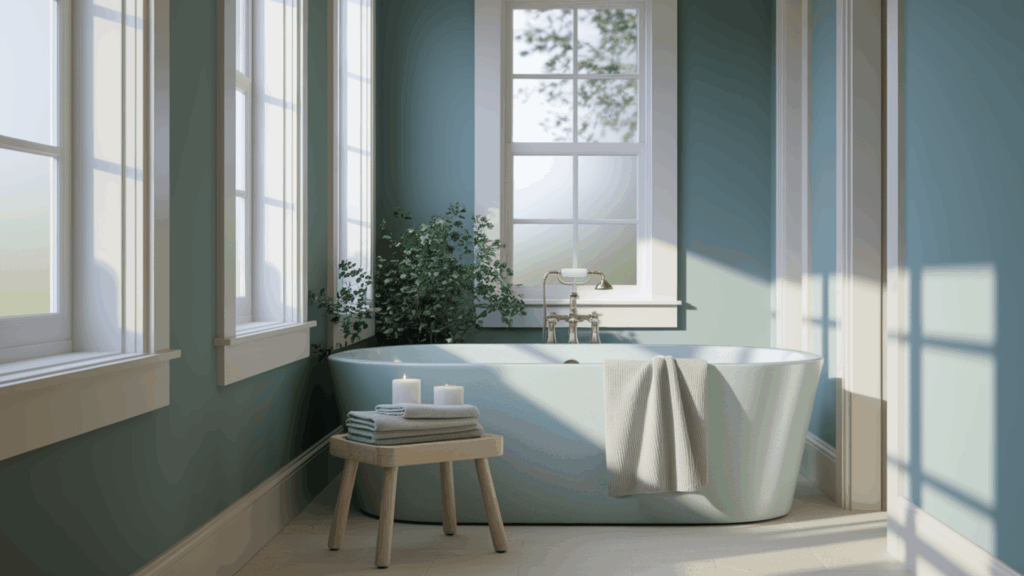
- It turns the bathroom into a calm space, like a fancy hotel, without feeling too cold or too hot.
- The light blue-gray tone goes really well with wood, stone, or light tile, keeping the space clean and neat.
- Add gold taps and green plants to give the room color and warmth, while still keeping it fresh and nice to use.
Color Pairings and Combinations for BM Santorini Blue
Santorini Blue is a soft blue-gray that looks pretty.
It makes rooms feel calm and happy.
Here are the colors that look good with it.
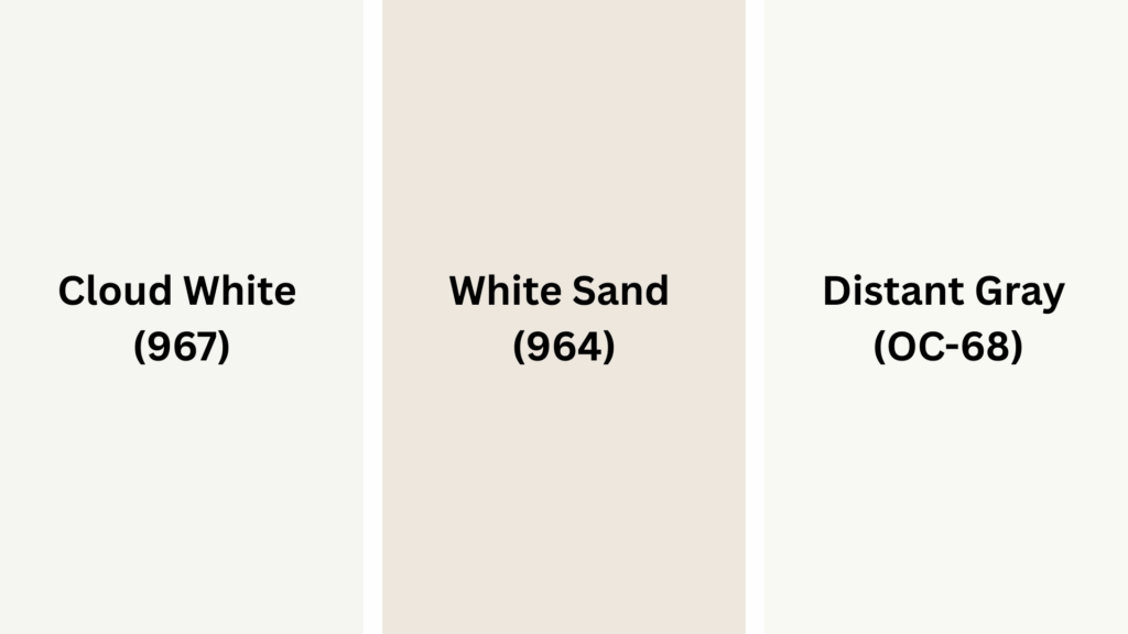
Complementary Trim Colors
The right trim color can make this blue look even better on your walls.
These colors work really well with Santorini Blue:
- Cloud White (967): A clean, soft white that makes Santorini Blue pop.
- White Sand (964): A warm, merged with Santorini Blue to look attractive.
- Distant Gray (OC-68): A light gray that looks pretty next to Santorini Blue.
Try small spots of each color to see which one looks best in your home’s light.
Creating Cohesive Color Schemes
This blue-gray looks good with many colors to make your home look like one.
Here are three sets of colors for Santorini Blue:
| SCHEME | MAIN WALLS | TRIM / ACCENT | OTHER ROOMS |
|---|---|---|---|
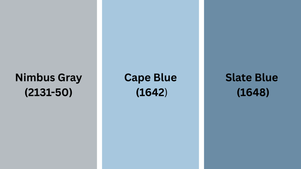
| Coastal | Santorini Blue | Cloud White (967) | Nimbus Gray (2131-50) |
| Contemporary | Santorini Blue | White Sand (964) | Wolf Gray (2127-40) |
| Transitional | Santorini Blue | Distant Gray (OC-68) | Cape Blue (1642) |
NOTE: Colors look different in different lights.
Always try painting on your walls before buying a lot.
Coordinating with Furniture and Decor
Santorini Blue works with almost all furniture and home items.
Its soft blue-gray makes a good background for your favorite stuff.
1. Wood Colors
Santorini Blue looks great with all kinds of wood.
Dark woods like brown-black wood look rich and nice against these blue-gray walls.
Medium woods like red-brown wood add a nice feel while keeping it looking natural.
Light woods like blonde wood make a fresh, clean feel with this soft blue.
2. Metals
Gold and brass look nice and pretty, and work well with the gray hints in Santorini Blue.
Black metal makes clean, new-looking lines that pop on these blue-gray walls.
Silver adds a cool look, creating a mix that feels both fresh and stylish.
3. Decor
Pink-orange, cream, and navy blue fabrics look great with Santorini Blue.
Natural items like rope, baskets, clay pots, and stone enhance rooms with a blue-gray texture.
Plants of all types look great against this background, making rooms feel more alive.
Similar Paint Colors: Excellent Alternatives to Santorini Blue
All these colors work well in many rooms.
They make spaces feel natural and homey.
Here’s a deeper look at each one:
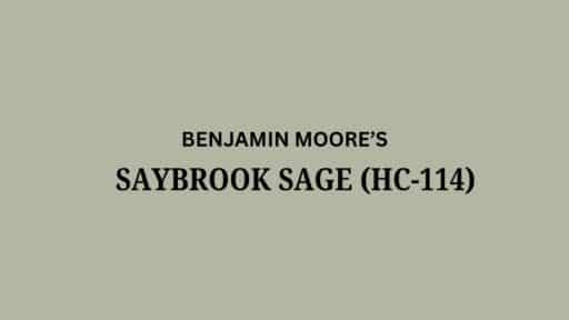
1. Nimbus Gray (2131-50)
This color is a bit more gray with less blue in it.
It has more gray but still feels generous.
It is slightly darker than Santorini Blue, giving rooms more depth.
It works well in dining rooms and home offices.
It looks good with white trim and light wood floors.
Try this if you want a gray that still hints at blue but is more neutral.
2. Cape Blue (1642)
Brighter blue that feels fresh and clean.
Has a beach feel but with more color to it.
The blue is clearer and less gray than Santorini Blue.
Makes rooms feel open and airy.
Good for rooms with lots of natural light to show its pretty color.
Try this if you like Santorini Blue but want something a bit more cheerful.
3. Slate Blue (1648)
A deeper blue-gray that feels rich and inviting.
Makes a more snug, comfortable feel.
Has more color depth than Santorini Blue.
Good for one wall or rooms where you want a restful feel.
Works well in bedrooms and reading nooks.
Pairs nicely with light gray or cream trim.
Looks good with brass or gold light fixtures.
Try this if you like Santorini Blue but want something a bit bolder.
Final Thoughts
Santorini Blue is a pretty blue-gray that works in any home.
Its gray hints make rooms feel calm, like the beach.
From living rooms to bedrooms, this blue-gray looks good with all kinds of wood, metals, and other colors.
Try it with Cloud White trim for a clean look or with plants and baskets for a nice feel.
Ready to make your home feel fresh and happy?
This beach-like blue might be just what you need!
Have you put this paint on your walls?
We’d love to hear what you think in the comments!

Alex Guerrero, a graduate with a Fine Arts degree from the Rhode Island School of Design, has been a visionary in the world of color and design for over 15 years. His professional journey began in the heart of the fashion industry in Milan, where he developed an acute sense for color harmonies and trends. Alex joined our team in 2018, offering fresh and innovative perspectives on color utilization in various spaces. Renowned for his ability to blend contemporary trends with timeless elegance. Outside of work, Alex is an accomplished painter and a volunteer art therapist, his artistic talents further enriching his professional insights.