Finding the perfect serene color for your home can change every space with timeless peace.
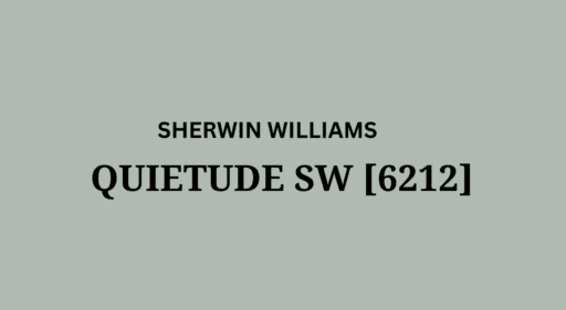
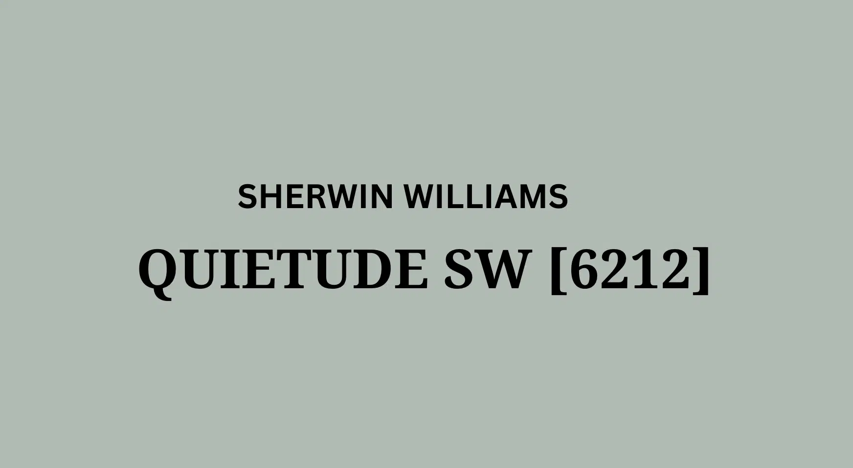
Sherwin-Williams Quietude (SW 6212) stands as an exceptional choice for homeowners seeking a calming backdrop.
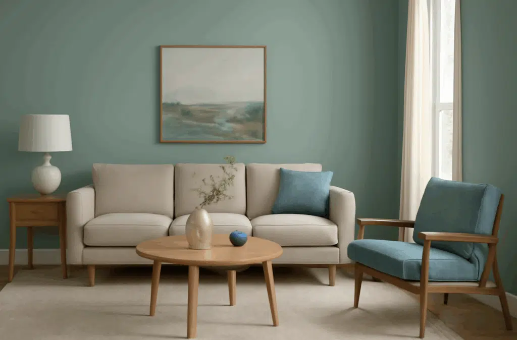
This gentle blue-green infuses subtle serenity into any room, especially when complemented by natural light.
Quietude creates a peaceful atmosphere that makes even smaller spaces feel more open and inviting.
Its delicate balance prevents the coldness that some blue tones can produce, offering a soothing presence.
Whether coating entire rooms or highlighting architectural details, Quietude enhances surrounding colors beautifully.
Throughout this blog, we’ll explore how this refined color can elevate your home’s aesthetic.
This versatile hue works beautifully in bedrooms, bathrooms, and living spaces where relaxation matters.
Understanding Sherwin-Williams’ Quietude
Before exploring Quietude’s qualities, let’s understand the elements that make each paint color unique.
Quietude offers a balance between blue and green, creating a versatile color that adapts to lighting conditions.
Its subtle depth makes it excellent for creating cohesive interiors that feel contemporary and timeless.
With its medium light reflectance, Quietude brightens spaces while maintaining depth that white paints lack.
This gentle blue-green creates an ideal backdrop for both vibrant accents and natural elements.
Quietude allows other design features to shine without competing for attention in your space.
The color shifts throughout the day, sometimes appearing more blue and sometimes leaning toward green.
This chameleon-like quality ensures your space remains interesting as lighting conditions change throughout seasons.
Quietude creates peaceful transitions between rooms while providing distinct character in each space.
This versatile hue balances between making a statement and providing a calming foundation in homes.
Color Terminology
| ATTRIBUTE | DETAILS |
|---|---|
| Light Reflectance Value (LRV) | 48 – A medium-toned color that balances light and medium tones. |
| Tone Classification | Falls between light and medium, offering visual balance. |
| RGB Values | Balanced blue and green with minimal red content. |
| Hex Code | #ADBBB2 – Reflects blue-green tones with a gray undertone. |
| Mood & Effect | Calming and cool with gentle brightness; ideal for tranquil spaces. |
Undertones
Quietude has blue-green undertones with a hint of gray adding complexity.
It’s a soft coastal color that avoids being too vibrant or overwhelming.
This color balances blue, green, and gray, making it incredibly versatile.
Its gentle coolness creates a refreshing atmosphere without feeling cold or sterile.
Quietude complements both warm woods and cool metal accents beautifully.
Psychology of Blue-Green Colors
Blue-green colors like Quietude create calm and peaceful relaxation throughout spaces.
Cool tones offer refinement and adaptability in various lighting conditions.
Gentle blue-green hues evoke harmony, balance, and elegance in any room.
Benefits include stress reduction, visual depth, and a soothing backdrop.
These colors lower blood pressure and create feelings of calm and serenity.
Why Choose Sherwin-Williams’ Quietude?
Sherwin-Williams Quietude’s versatility shines in varying lighting conditions throughout the day.
It maintains gentle coolness in south-facing rooms while avoiding darkness in north-facing spaces.
Its adaptable quality provides a refined backdrop that complements both traditional and modern elements.
This paint color shifts with changing light, creating dynamic yet cohesive spaces throughout homes.
Quietude creates harmonious transitions between rooms while providing enough unique character.
This blue-green creates spaces that feel intentionally designed without being overwhelming or trendy.
The color works in coastal, farmhouse, traditional, and contemporary designs with equal elegance.
It provides personality while allowing architectural details to remain the focal point.
Quietude balances between making a color statement and providing a neutral backdrop.
Its timeless quality ensures your space won’t quickly feel dated as design trends evolve.
Key Features
Sherwin-Williams Quietude offers adaptability with fixed elements like wood furnishings and stone.
It creates seamless transitions while maintaining its distinct blue-green character throughout homes.
This versatile color provides coolness while maintaining a refined, timeless quality.
It won’t date your interior design choices like more trendy colors often do.
This blue-green works with warm woods and cool metals, allowing design flexibility.
Durability
Sherwin-Williams Quietude in premium finishes like Duration offers outstanding durability in spaces.
Its medium-toned depth helps hide imperfections while maintaining its refined appearance for years.
When properly applied, this paint resists fading and maintains color consistency with cleaning.
Its timeless profile ensures lasting appeal despite changing trends, making it a smart investment.
The color depth handles wear without showing marks easily in busy households.
Texture Patterns
Sherwin-Williams Quietude creates a subtle texture that adds dimension without overwhelming spaces.
Its blue-green undertones produce gentle light play that softens harsh lighting beautifully.
When applied to different finishes, it enhances architectural details while maintaining consistency.
Quietude highlights textural elements like beadboard or wainscoting details throughout homes.
The color adds depth to textured surfaces while maintaining its soothing character.
Room-by-Room Color Recommendations with Quietude
1. Living Spaces and Open Floor Plans
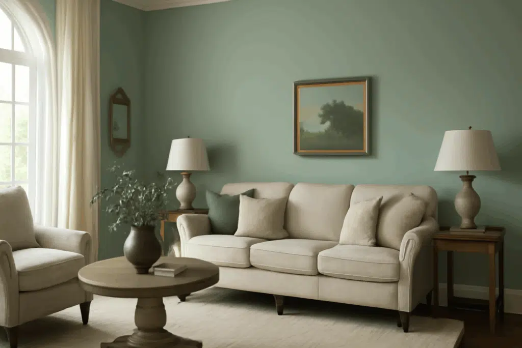
Quietude works well in open floor plans due to its versatile blue-green undertones.
It creates a cohesive flow between connected spaces while maintaining distinct character.
The medium LRV provides balanced light reflection, making spaces feel open yet cozy.
Pair Quietude walls with white trim or complementary gray-blue accent walls.
Quietude helps define zones while maintaining visual flow throughout connected living areas.
2. Bedrooms and Relaxation Areas
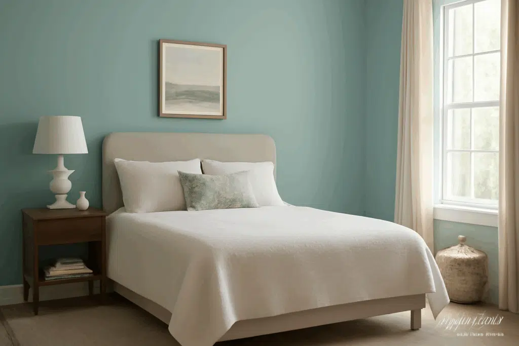
Quietude creates a soothing atmosphere in bedrooms without feeling cold or impersonal.
The blue-green undertones promote relaxation while maintaining depth to feel cozy.
Consider Quietude for walls while using softer neutral accents for balance.
This color reduces stress and promotes better sleep through its calming effects.
Quietude works in master suites and guest rooms where relaxation matters most.
3. Kitchens
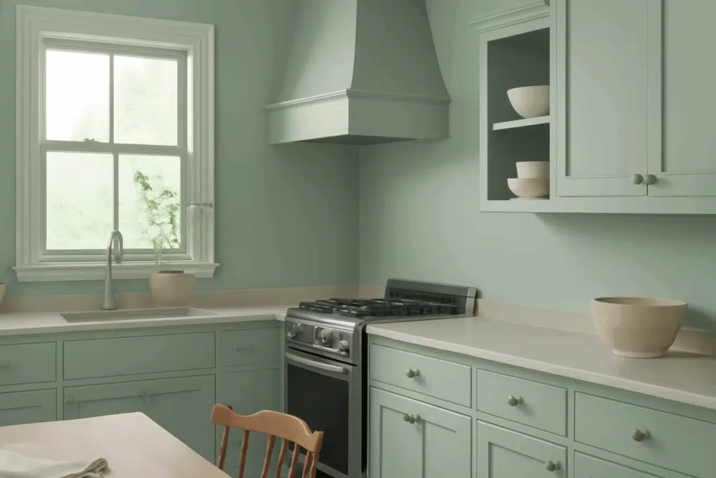
Quietude in eggshell finish offers practicality in kitchens while enhancing cleanliness.
The blue-green tones complement white marble countertops and warm wood cabinetry.
Quietude works with brass, nickel, or black hardware, making it adaptable.
This color creates a refreshing kitchen environment that feels clean and inviting.
It pairs well with subway tile, shaker cabinets, and natural stone elements.
Bathrooms and Spa-like Retreats
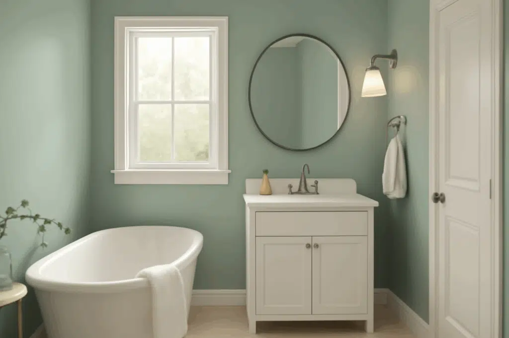
Sherwin-Williams Quietude creates a spa-like atmosphere in bathrooms that promotes relaxation.
Its blue-green undertones enhance fixtures while adding sophistication to spaces.
This shade pairs beautifully with white porcelain, natural stone, and nickel elements.
For smaller bathrooms, consider using Quietude throughout to maximize stability.
The color’s water-like quality makes it particularly appropriate in bathroom environments.
Color Pairings and Combinations for Quietude
Quietude is a refined blue-green that captures the essence of quiet design.
This shade blends the calmness of blue with the freshness of green.
Its subtle depth creates cohesive, flowing interiors that feel intentionally designed.
Quietude provides character while allowing other design elements to shine brightly.
It has become a designer favorite for creating peaceful yet interesting spaces.
The color works in coastal, traditional, and contemporary designs with equal success.
Quietude provides a backdrop for both neutral and vibrant accent colors.
Its balanced undertones allow room-to-room transition without visual disruption.
This hue creates spaces that feel curated without being trend-focused.
Quietude’s timeless quality ensures your design choices remain relevant for years.
Complementary Trim Colors
Pure White (SW 7005) – A clean white that highlights Quietude’s blue-green depth.
Tricorn Black (SW 6258) – A soft black creating elegant contrast with Quietude.
Agreeable Gray (SW 7029) – A versatile gray providing subtle definition between spaces.
Sea Salt (SW 6204) – A lighter blue-green complementing Quietude for a layered effect.
Alabaster (SW 7008) – A warm white softening Quietude’s coolness for balance.
Coordinating with Furniture and Decor
Recommended Wood Pairings
- Light Woods: Maple and ash create a Scandinavian aesthetic with Quietude’s blue-green tones.
- Medium Woods: Oak and cherry add warmth to balance Quietude’s cool nature.
- Dark Woods: Walnut and espresso add dramatic contrast, highlighting Quietude’s character.
- Weathered Woods: Reclaimed finishes enhance the coastal quality of Quietude perfectly.
- White-washed woods: Create a breezy aesthetic that amplifies Quietude’s refreshing qualities.
Metal Finishes
- Brushed Nickel: Provides a modern complement to Quietude’s refined blue-green character.
- Antique Brass: Warm brass fixtures add warmth to balance Quietude’s coolness.
- Matte Black: Offers a bold statement against Quietude’s softer blue-green backdrop.
- Chrome: Adds reflective contrast highlighting Quietude’s refined blue-green depth.
- Pewter: Creates a subtle accent echoing Quietude’s gray undertones harmoniously.
Similar Paint Colors: Perfect Alternatives to Quietude
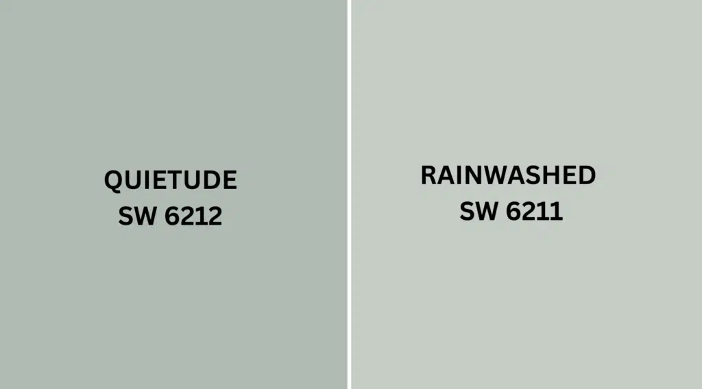
Color Comparison: Quietude vs. Rainwashed (Sherwin-Williams)
Quietude
Balanced blue-green with subtle gray undertones for sophistication and depth.
Medium Light Reflectance Value of 48 offers a nuanced interpretation of blue-green.
Balances between blue and green, creating versatility for various design styles.
Ideal for spaces seeking peace with moderate depth and soothing character.
It provides distinctive color presence while remaining calm and understated.
Rainwashed
Lighter blue-green with more pronounced green undertones, appearing fresher and brighter.
Higher LRV of 59 evokes a lighter, more airy appearance in spaces.
It provides a softer, more pastel-like quality while maintaining blue-green characteristics.
Rainwashed creates less drama while offering more brightness in darker spaces.
This lighter alternative maintains stability while providing more reflective properties overall.
Color Undertones
Quietude: More balanced, with blue-green undertones adding sophistication to spaces.
Rainwashed: Lighter, with green undertones creating fresher, more airy ambiance.
Both colors contain gray influences, but Quietude offers more depth overall.
Quietude leans slightly more blue while Rainwashed leans toward green comparatively.
These undertone differences affect how each color pairs with woods and accents.
Lighting Impact
- Quietude: Adapts to lighting, appearing more blue or green depending on exposure.
- Rainwashed: Maintains a consistent lighter appearance across different lighting conditions.
- North-facing rooms: Quietude appears gray-blue while Rainwashed maintains green quality.
- South-facing rooms: Quietude’s depth shines while Rainwashed can appear almost mint-like.
- Artificial lighting: Both maintain character, with Quietude offering more depth.
Final Words
Imagine a color that captures the peacefulness of a misty coastal morning – that’s Quietude.
This blue-green paint color shifts throughout the day with changing light conditions.
Sometimes it appears more blue and serene, other times more green and refreshing.
This chameleon-like quality makes it versatile for enhancing nearly any space.
Designers love Quietude because it creates spaces that feel peaceful and thoughtful.
It reminds people of spa retreats where every element contributes to calm.
This color works in bedrooms, bathrooms, living rooms, and exterior accent areas.
It balances color and neutrality, creating spaces that feel timeless yet interesting.
Quietude complements both traditional and contemporary design elements with versatility.

Alex Guerrero, a graduate with a Fine Arts degree from the Rhode Island School of Design, has been a visionary in the world of color and design for over 15 years. His professional journey began in the heart of the fashion industry in Milan, where he developed an acute sense for color harmonies and trends. Alex joined our team in 2018, offering fresh and innovative perspectives on color utilization in various spaces. Renowned for his ability to blend contemporary trends with timeless elegance. Outside of work, Alex is an accomplished painter and a volunteer art therapist, his artistic talents further enriching his professional insights.