
If you’re considering painting a room and want a color that feels strong, classic, and just bold enough, I recommend looking at Gentleman’s Gray by Benjamin Moore.
I’ve used this deep blue in my own home, and I’ve seen it completely change a space.
It has hints of green and black, so it shifts depending on the light and time of day. That’s part of what makes it so interesting.
In this blog, I’ll walk you through everything I’ve learned about this color, what it really looks like, where it works best, how lighting affects it, what colors go well with it, and more.
By the end, you’ll have a good sense of whether Gentleman’s Gray is the right pick for your space. It might be the standout color you’ve been looking for
What Color Is Gentleman’s Gray Benjamin Moore?
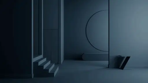
Gentleman’s Gray (2062-20) is a deep blue with touches of green and black. Some see it as navy, while others see it as dark teal; it all depends on the light.
The color shifts slightly throughout the day, which makes it feel interesting and rich. It’s bold but not harsh, with a calm, cozy vibe that still feels stylish.
It works well in rooms where you want a relaxed feel with a bit of depth. The tone adds warmth in the evening and a cool edge in brighter light.
You might notice more blue or green depending on your lighting and decor. If you want a color that feels calm, smart, and just a little bold, Gentleman’s Gray is worth a look.
Why Do People Love This Color?
People like Gentleman’s Gray because it’s bold but still calm. It creates a space that feels peaceful without being too bright or cluttered.
It works great in bedrooms, living rooms, or reading spots, anywhere you want to relax.
The color fits many styles, from modern to rustic, and looks good on walls, cabinets, doors, or furniture.
It also shifts in different light, sometimes looking navy, teal, or even black. That little change keeps it interesting.
Additionally, it pairs well with white, beige, wood, gold, and soft pastels, making it easy to match with your decor.
How It Looks in Different Lighting
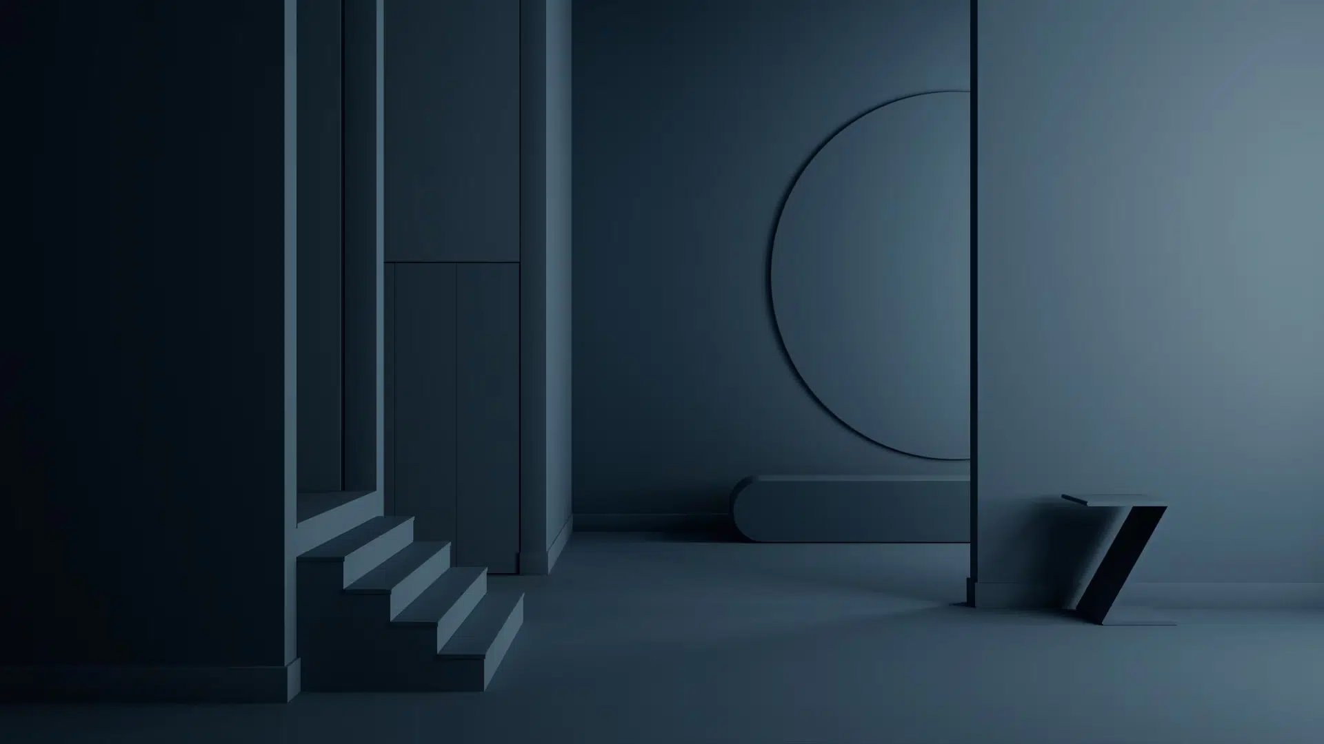
This deep color changes based on the light in your space. It can look blue, teal, or nearly black depending on the time of day and the kind of lighting you have.
Natural light
In a room with lots of sunlight, Gentleman’s Gray shows more of its blue side. The green tones fade into the background, and the color feels clean and fresh.
It brings out a navy-like richness that makes the room feel bold but not heavy.
If your room has big windows or faces the sun, this color can feel bright and full of energy during the day.
It pairs beautifully with white trim and natural wood, helping to keep the space balanced.
Artificial light
Under indoor lighting, especially with warm or yellow-toned bulbs, the green tones become more pronounced.
This makes the color look more like a dark teal or even a soft forest green in some rooms.
The lighting can change the mood from modern and crisp to cozy and rich. If you use cooler white bulbs, the blue will stand out more.
It’s a flexible color that adjusts to your lighting choices, so consider the kind of atmosphere you want to create in the room.
Low-light spaces
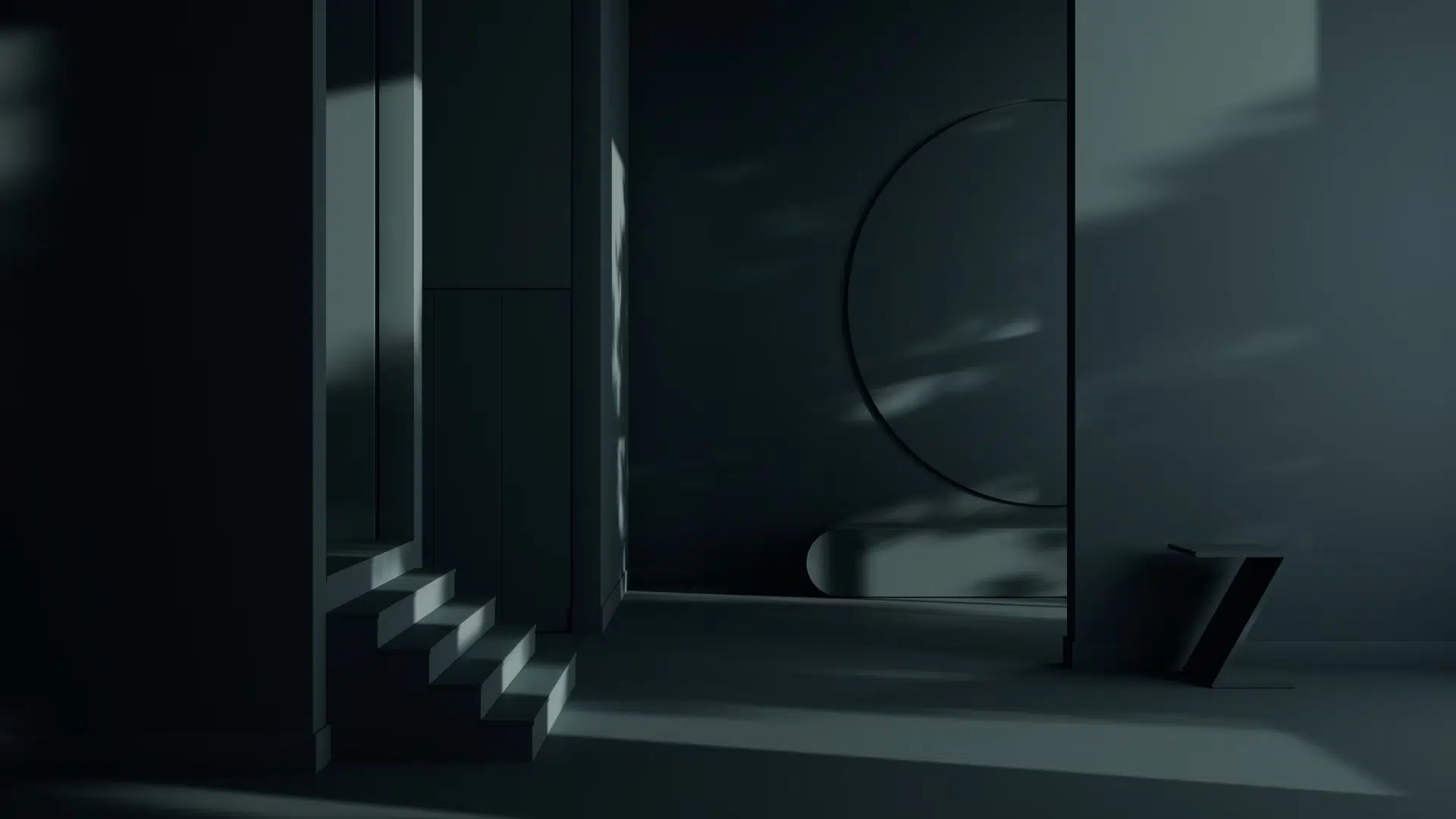
In rooms without many windows or in corners that don’t get much light, Gentleman’s Gray can look almost black.
It creates a dramatic and moody feeling, which some people love for bedrooms, dens, or powder rooms.
But it can also feel too dark if the space has no natural light or is painted wall-to-wall without contrast.
To keep it from feeling too heavy, you can add white trim, mirrors, or lighter-colored furniture.
Where to Use Gentleman’s Gray?
This rich and moody color can work in almost any room. Whether you’re looking for cozy, calm, or bold, Gentleman’s Gray has a perfect spot in your home.
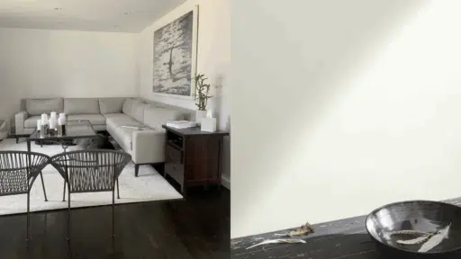
1. Living rooms
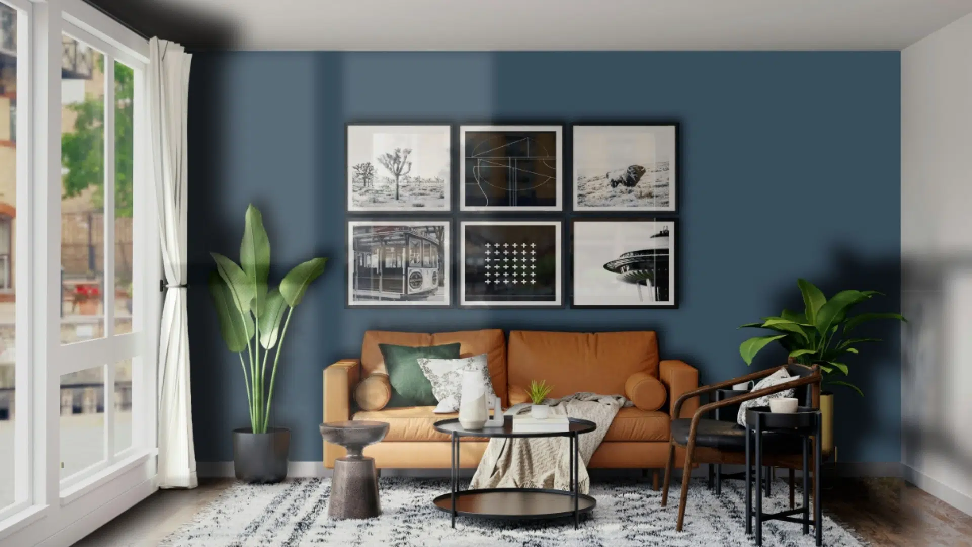
If you want your living room to feel bold and stylish, this color is a great choice. It looks great behind a TV or fireplace.
Add white trim or light-colored furniture to keep the space balanced and cohesive. Pair it with a soft rug and neutral curtains for a cozy feel.
You can also mix in gold or brass lighting to add a touch of shine. Wall art in warm tones looks amazing against this color as well.
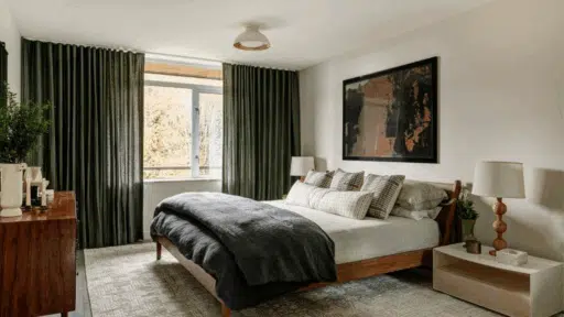
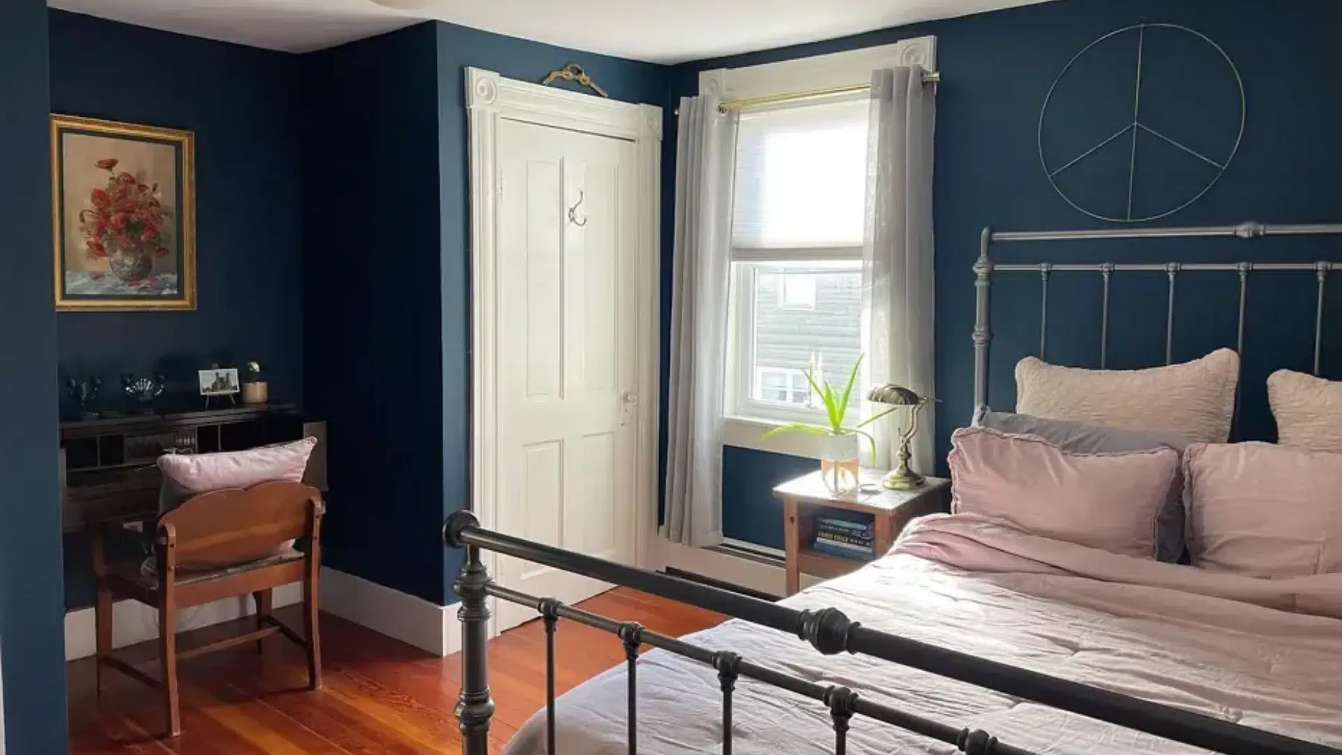
2. Bedrooms
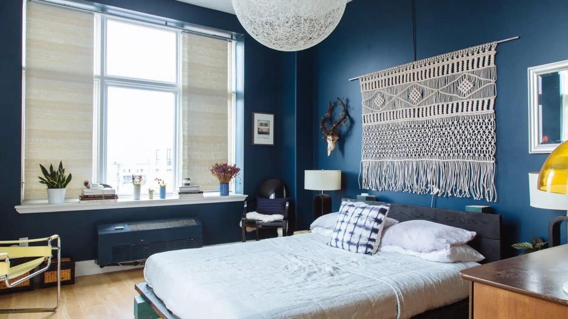
Gentleman’s Gray can create a peaceful and quiet atmosphere in a bedroom. Use it on one wall for an accent or on all the walls for a moody look.
Soft bedding in white or beige helps lighten things up. Add texture with linen or velvet pillows to make the room feel warm and inviting.
A wooden headboard or side table brings in a natural balance. Use warm lamps for a relaxing glow at night.
3. Bathrooms
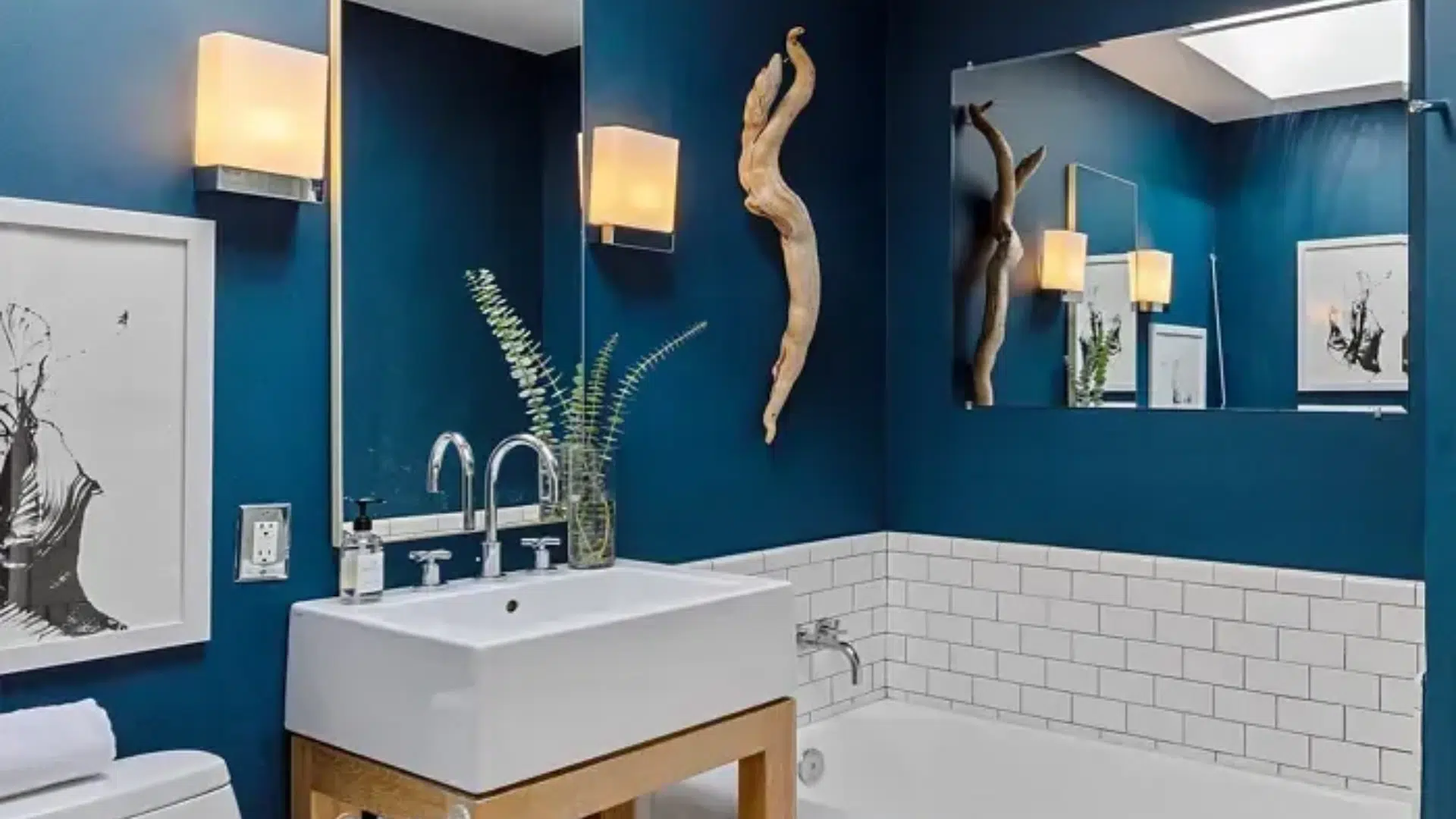
This color looks great in a bathroom with gold or brass fixtures. Add a white vanity or mirror frame, and the dark wall color really pops.
It creates a spa-like feeling when used with soft towels and a clean design. You can add floating shelves in wood for storage and style.
Patterned floor tiles or a light-colored shower curtain also pair well with this shade. Even a small powder room can feel high-end with this rich color.
4. Home office
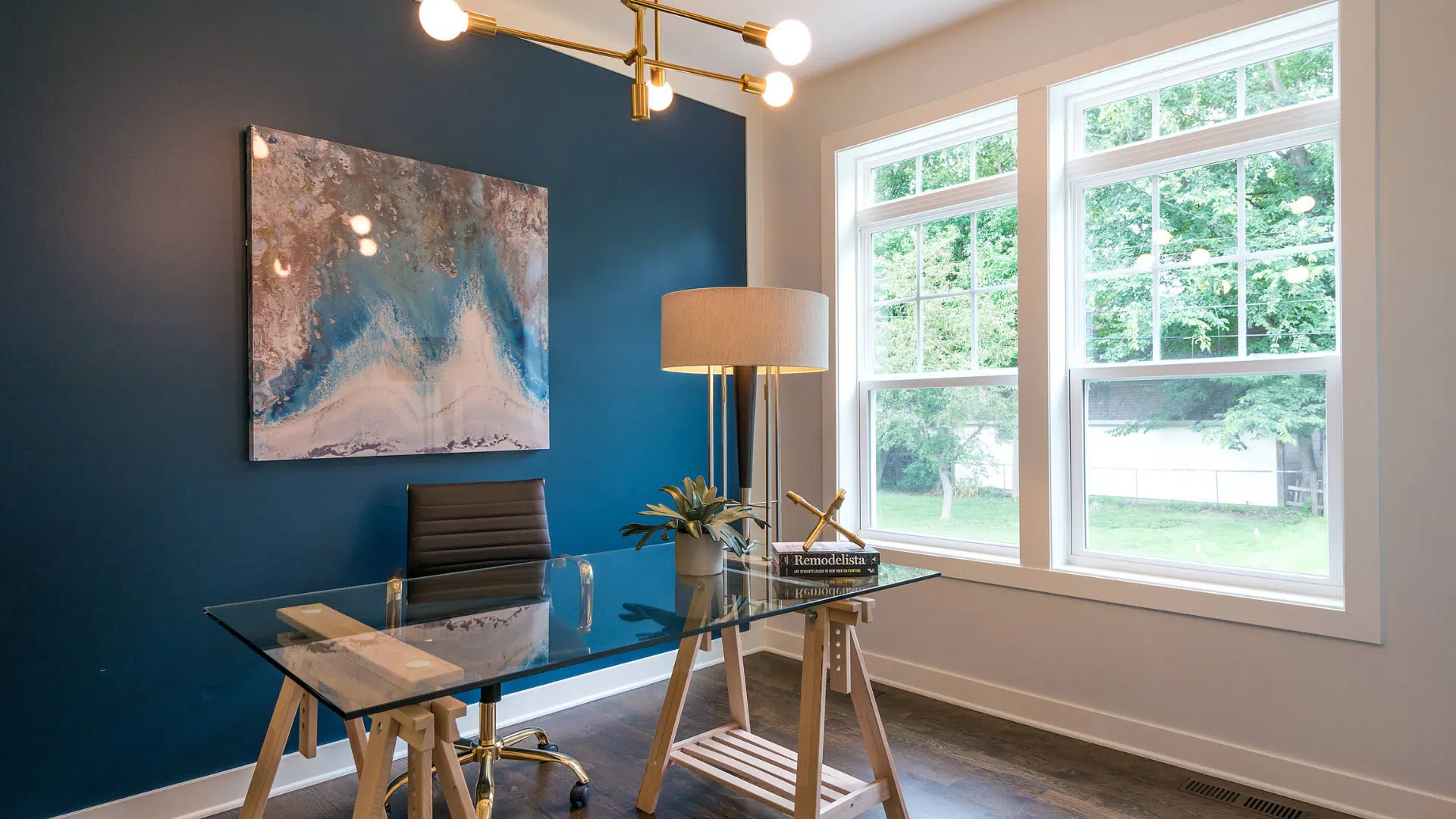
Want your office to feel calm and focused? This deep blue-green color makes a space feel smart and serious.
Pair it with wood furniture for a classic look. Add floating shelves or a bookshelf in white or natural wood.
Use a desk lamp with a gold base for a little polish. Gentleman’s Gray creates a quiet atmosphere that helps you focus on your work.
5. Cabinets or doors
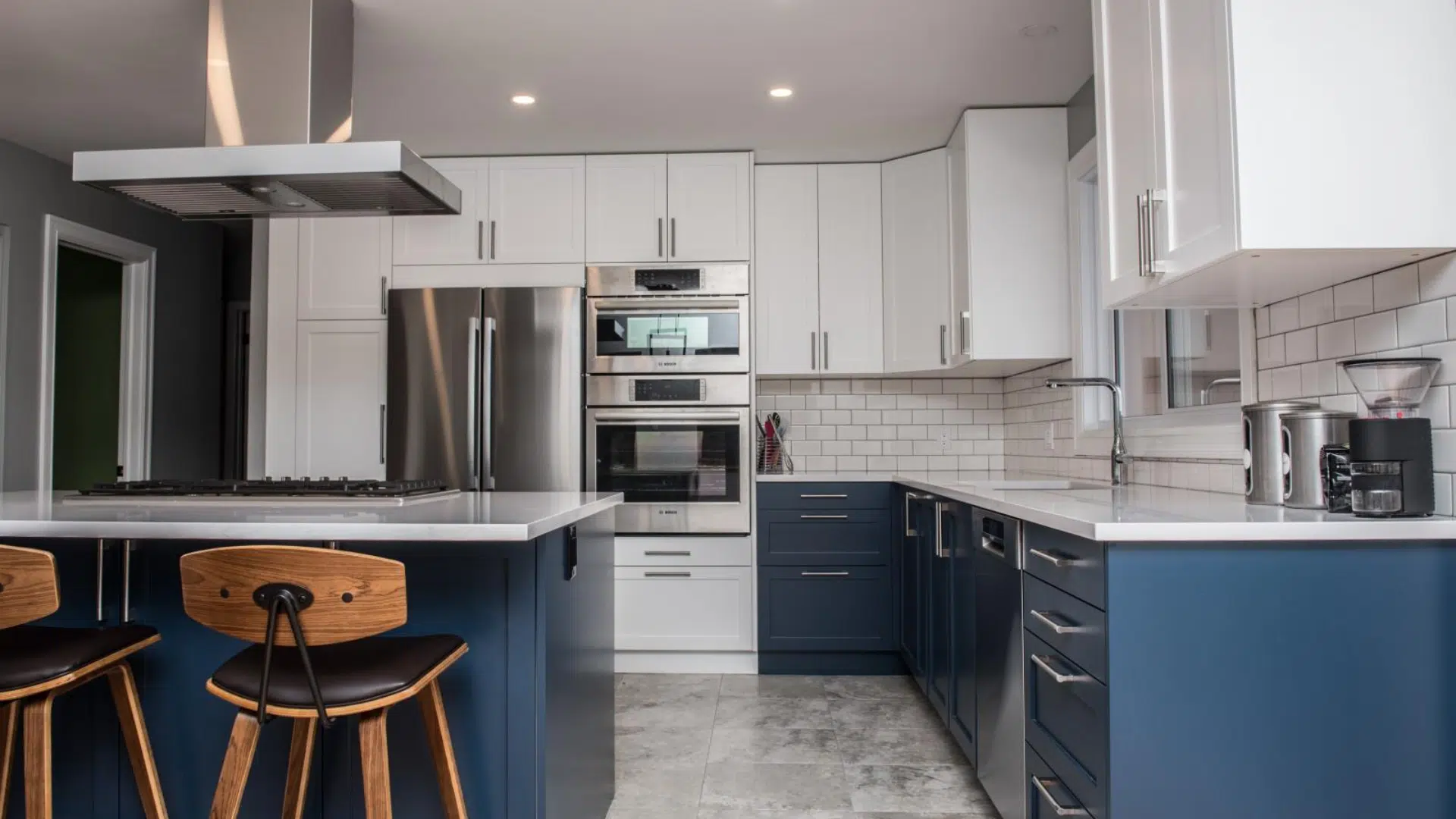
If painting a whole room feels like too much, try it on your kitchen cabinets or a door. It adds just enough style without being too bold.
Use it on lower cabinets while keeping the upper ones white for a trendy look. A painted front door in this color gives your home a unique and welcoming vibe.
Pair it with silver or gold handles to finish the look with elegance.
What colors go well with Gentleman’s Gray
This rich color pairs well with many other shades. Whether you’re going for soft and calm or bold and fun, there’s a perfect color match.
- Whites: Soft whites like Benjamin Moore White Dove or Simply White brighten up the space and help the dark blue walls pop. They make the room feel fresh and balanced.
- Light grays and taupes: These gentle shades add a soft background without stealing attention. They let the deep color shine while keeping the look smooth and relaxed.
- Gold and brass: Warm metallics like gold or brass add sparkle and warmth. They look especially nice in bathrooms and kitchens where the contrast feels clean and stylish.
- Wood tones: Natural wood, especially light types like oak or maple, brings out the cozy side of Gentleman’s Gray. The warmth of the wood keeps the room from feeling too dark.
- Pops of color: If you want something playful. Try accents like mustard yellow, coral, or blush pink. Use them in pillows, art, or rugs for just the right amount of color without going overboard.
Tips Before You Paint
Before you grab a brush, take a few smart steps to make your painting project easier and more successful. These simple tips can help you get the best results with Gentleman’s Gray.
- Test first: Always paint a sample on your wall before committing. The color can change depending on your lighting, furniture, and even the direction your windows face.
- Use primer: If you’re covering a light or bright color, apply a primer first. It helps the dark paint stick better and keeps the color looking even and rich.
- Use good tools: High-quality brushes and rollers give smoother results. Cheap tools can leave streaks or fuzz behind, and you might end up using more paint.
- Paint in daylight: Natural light helps you see the true color and spot missed areas more easily. Try to paint during the day when your room is brightest.
Conclusion
If you want a paint color that looks rich, smart, and stylish, I think you’ll love Gentleman’s Gray.
It works in many places and pairs well with a variety of other colors.
If you’re working on a full room, an accent wall, or just a piece of furniture, this color yields a bold and beautiful result.
You don’t have to be a pro to use a deep color like this.
With the right lighting and some lighter decor, you can make any space feel balanced. Additionally, it’s enjoyable to observe how the color changes throughout the day.
If you’re unsure where to start, begin with a small space, such as a cabinet or a single wall. See how it feels, then go from there. You might end up loving it as much as I do.
Have fun with your project and let your home show off your style. And if you do use Gentleman’s Gray, I’d love to hear how it turns out.

Alex Guerrero, a graduate with a Fine Arts degree from the Rhode Island School of Design, has been a visionary in the world of color and design for over 15 years. His professional journey began in the heart of the fashion industry in Milan, where he developed an acute sense for color harmonies and trends. Alex joined our team in 2018, offering fresh and innovative perspectives on color utilization in various spaces. Renowned for his ability to blend contemporary trends with timeless elegance. Outside of work, Alex is an accomplished painter and a volunteer art therapist, his artistic talents further enriching his professional insights.