
Thinking about giving your home a fresh new look? The right paint color can totally change how a room feels, taking it from plain and boring to bright and full of life.
I’ve put together a list of the most popular interior paint colors that both designers and homeowners love.
There’s something here for every taste and mood – from soft whites and calming grays to rich blues and bold, cozy tones.
If you’re painting one wall or redoing your entire home, this guide will help you choose colors that you’ll enjoy looking at every day.
Picking paint can be stressful when there are so many choices at the store. That’s why I’ve done the work for you, narrowing it down to timeless, stylish, and easy-to-live-with colors.
By the time you finish reading, you’ll feel more confident about which shades could work best in your space.
Let’s get started and find the one that fits your home just right!
How to Choose the Right Interior Paint Color?
Picking the right paint color isn’t just about choosing what looks nice on a small paint chip. It’s about how the color feels in your space and how it fits with everything else in your home.
Light changes everything. Depending on the amount of sunlight, a color that looks perfect in one room might look totally different in another.
North-facing rooms feel cooler, while south-facing ones get warmer, brighter light.
Also, think about what you already own, like your floors, furniture, and cabinets, and make sure the paint complements them.
Try a few samples on your walls and check them at different times of day.
Some colors look better in the morning than at night. Most importantly, trust your gut. You’re the one who will see it every day, so choose what makes you happy.
Popular Interior Paint Colors
I’ve seen how the right paint color can turn any room from ordinary to extraordinary. These shades have stood the test of time, yet they still feel fresh and current.
1. Benjamin Moore’s White Dove (OC-17)
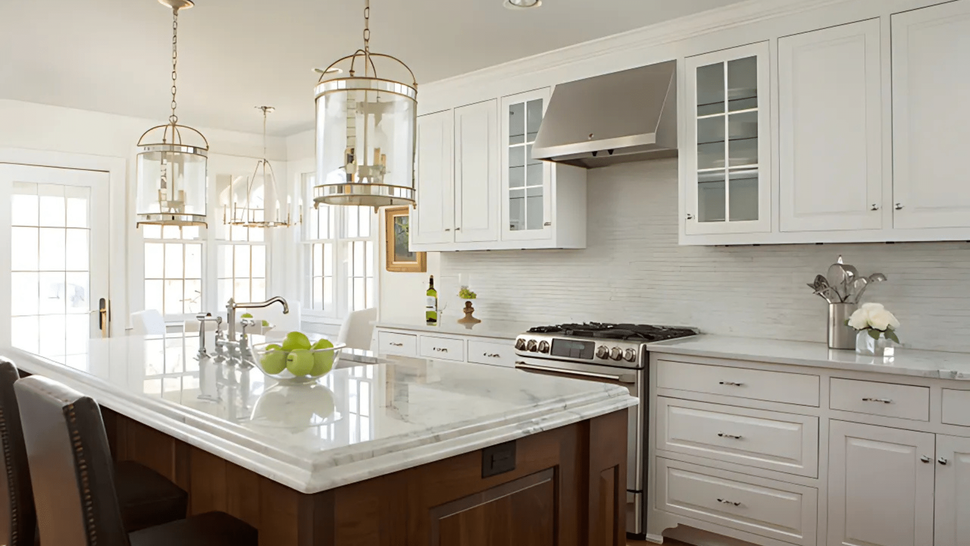
White Dove (LRV-83.16) is a soft, warm white that gives rooms a cozy, clean look without being too bright or cold.
It works especially well in bedrooms and living rooms where you want a calm, welcoming feel.
The creamy tone makes it great for spaces that don’t get much sunlight. It helps brighten the room without looking harsh.
This color also pairs nicely with natural wood and soft accent colors, giving your space a peaceful and timeless look.
2. Sherwin-Williams Alabaster (SW-7008)
Alabaster (LRV-82) is a soft off-white with just a touch of warmth that helps any room feel relaxed and inviting.
It looks great in spaces like dining rooms or entryways, especially when you want something light that isn’t plain white.
The soft finish gives walls a smooth glow and makes art or furniture stand out more. It works well with almost any color scheme.
That makes it one of the most loved shades for many home styles.
3. Behr Swiss Coffee (12)
Swiss Coffee (LRV-84) is a creamy white that feels warm and soft without being too yellow.
It’s a great choice for kitchens and breakfast areas where it helps light bounce around and makes the space feel open.
The gentle tone works nicely with wood cabinets or floors. It also makes a small space look bigger and more comfortable.
If you want a white that feels lived-in and cozy, this one’s a favorite for a reason.
4. Farrow and Ball Pointing (2003)
Pointing (LRV-73) is an off-white color with light yellow hints that make it feel warm and gentle.
It was named after the color used between bricks, so it has a classic, old-world feel.
Use it in living rooms or offices where you want the light to feel soft but still bright.
It has more depth than a flat white, but it still keeps the space looking clean. This makes it a great pick if you want something subtle but not boring.
5. Valspar Bistro White (7006-4)
Bistro White (LRV-84.792) is a modern white with a hint of gray, giving it a calm and cool feeling.
It’s perfect for bathrooms and kitchens where you want something that looks clean and sharp but not too bright.
It works well with silver fixtures, tile, or sleek counters. The soft gray tone adds depth without making the room look dark.
It’s a simple, fresh color that feels both classy and easygoing.
6. Benjamin Moore Revere Pewter (HC-172)
Revere Pewter (LRV-55.05) is a balanced mix of gray and beige, also known as “greige.”
It changes slightly depending on the lighting, which makes it feel alive and flexible in any room.
It’s especially useful in living rooms and hallways because it helps connect different spaces without feeling too bold.
The color’s soft warmth makes it feel homey, while the gray tones keep it calm and modern. It’s one of those shades that always feels just right.
7. Sherwin-Williams Agreeable Gray (SW-7029)
Agreeable Gray (LRV-60) is a soft beige that blends perfectly into almost any space.
It works well in bright rooms and even in low-light areas, which makes it ideal for open floor plans or whole-house color schemes.
The balance between warm and cool tones helps it go with nearly everything, from bold colors to soft pastels.
It doesn’t feel too dark or too light, and it creates a peaceful, clean backdrop. That’s why so many people consider it their go-to neutral.
8. Behr Silver Drop (790C-2)
Silver Drop (LRV-70) is a light gray with a hint of warmth that keeps it from feeling too cold or stark.
It’s a great pick for bedrooms, offices, or any place where you want a soft, peaceful setting.
This color works well with wood tones, black and white, or even brighter colors.
The lightness helps make the space feel open, but the slight warmth adds comfort. It’s an easy shade to live with every day.
9. Valspar Gravity (4005-1B)
Gravity (LRV-56.262) is a cool medium-gray with soft blue undertones that give it a calm, clean look.
It adds more color than a light gray but isn’t too dark or heavy. It’s a great choice for living rooms or dining spaces where you want something modern but not too bold.
When paired with white trim or light wood, it really stands out in the best way.
It brings depth and balance without feeling cold.
10. Farrow and Ball Cornforth White (No.228)
Cornforth White (LRV-77) is a soft, warm gray that reads more like a neutral than a white.
Despite the name, it has enough gray in it to give walls a smooth, calming feel.
It’s perfect for living rooms or studies where you want the space to feel stylish and quiet.
The color changes just a bit in different lighting, which keeps it interesting but not flashy.
It adds a touch of beauty without being too bold or dark.
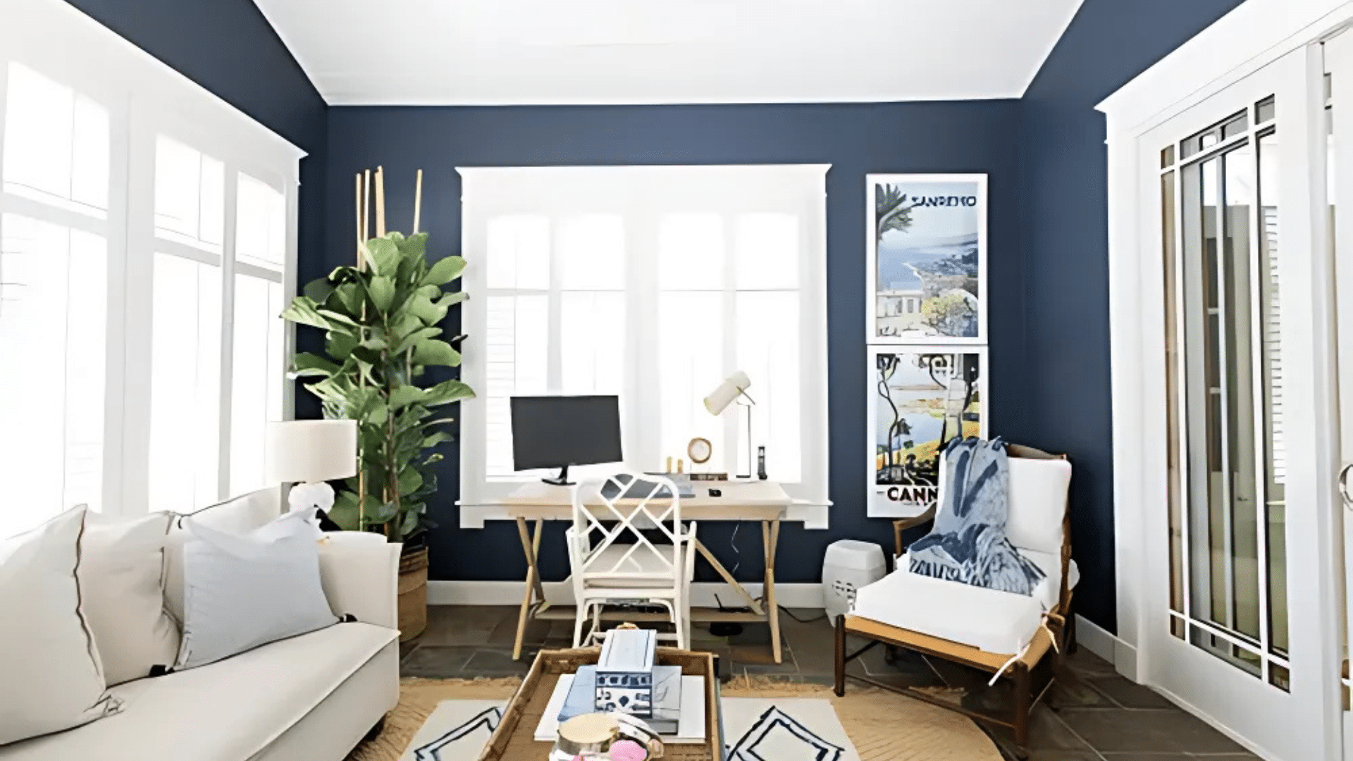
11. Sherwin-Williams Naval (SW-6244)
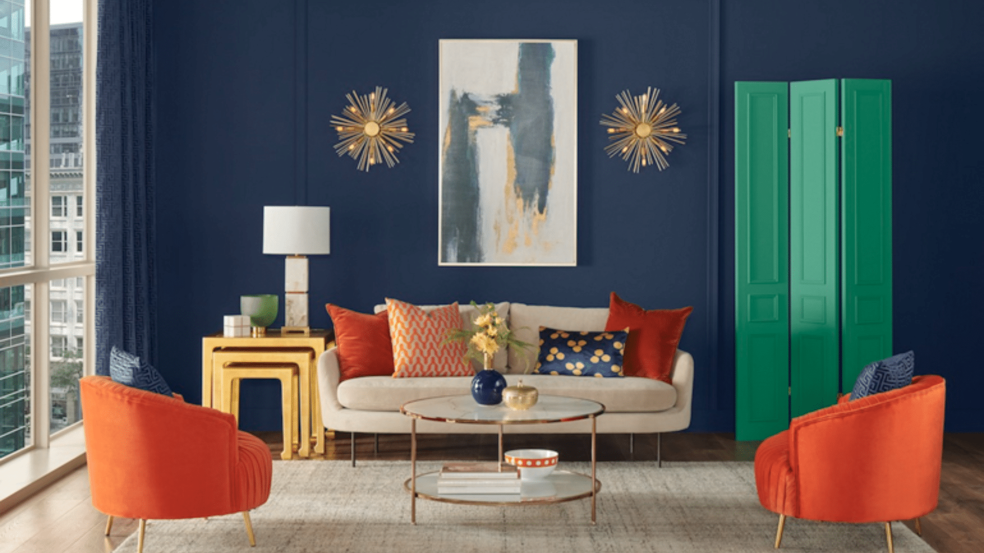
Naval (LRV-4) is a rich, deep navy blue that brings bold style to any room.
It’s strong and classic, which makes it great for accent walls, dining rooms, or studies where you want a cozy, dramatic feel.
The color pairs beautifully with white trim or brass hardware, helping everything stand out stylishly.
Even though it’s dark, it doesn’t feel heavy when used in the right space. It adds a touch of style that never goes out of style.
12. Benjamin Moore’s Hale Navy (HC-154)
Hale Navy (LRV-8.36) is a timeless dark blue that works well with both traditional and modern styles.
It has just the right mix of cool and warm tones, so it blends with many other colors.
Use it on built-ins, kitchen islands, or accent walls to give a grounded, stylish look.
It’s deep enough to stand out, but not so dark that it overwhelms a room. Hale Navy makes any space feel more polished and put together.
13. Behr Black Bamboo (N380-7)
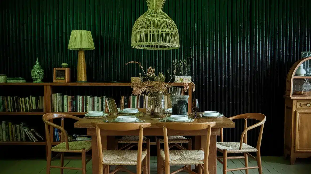
Black Bamboo (LRV-11) is a bold, deep green-black that feels cozy and rich.
It adds a lot of character to rooms like dining areas, libraries, or offices. The subtle green tone gives it more personality than a plain black, so it looks special without being too loud.
Pair it with wood or gold accents for a warm, stylish look.
It’s a great way to bring drama into a space while still keeping it calm.
14. Farrow and Ball Railings (31)
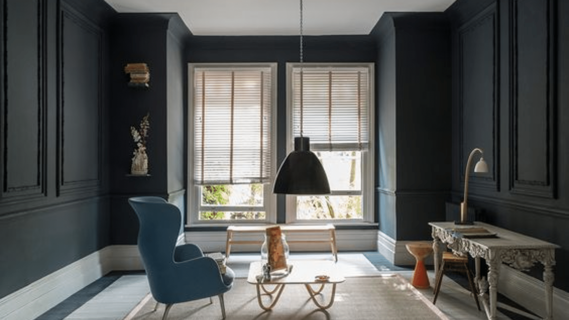
Railings (LRV-6) is a deep, inky color that blends black with just a touch of blue.
It creates a moody, dramatic look, perfect for doors, cabinets, or accent walls.
In some lighting, it looks almost black, while in others, the blue comes through. That change makes it really fun to work with.
It adds depth and richness that can make even a simple room feel special and high-end.
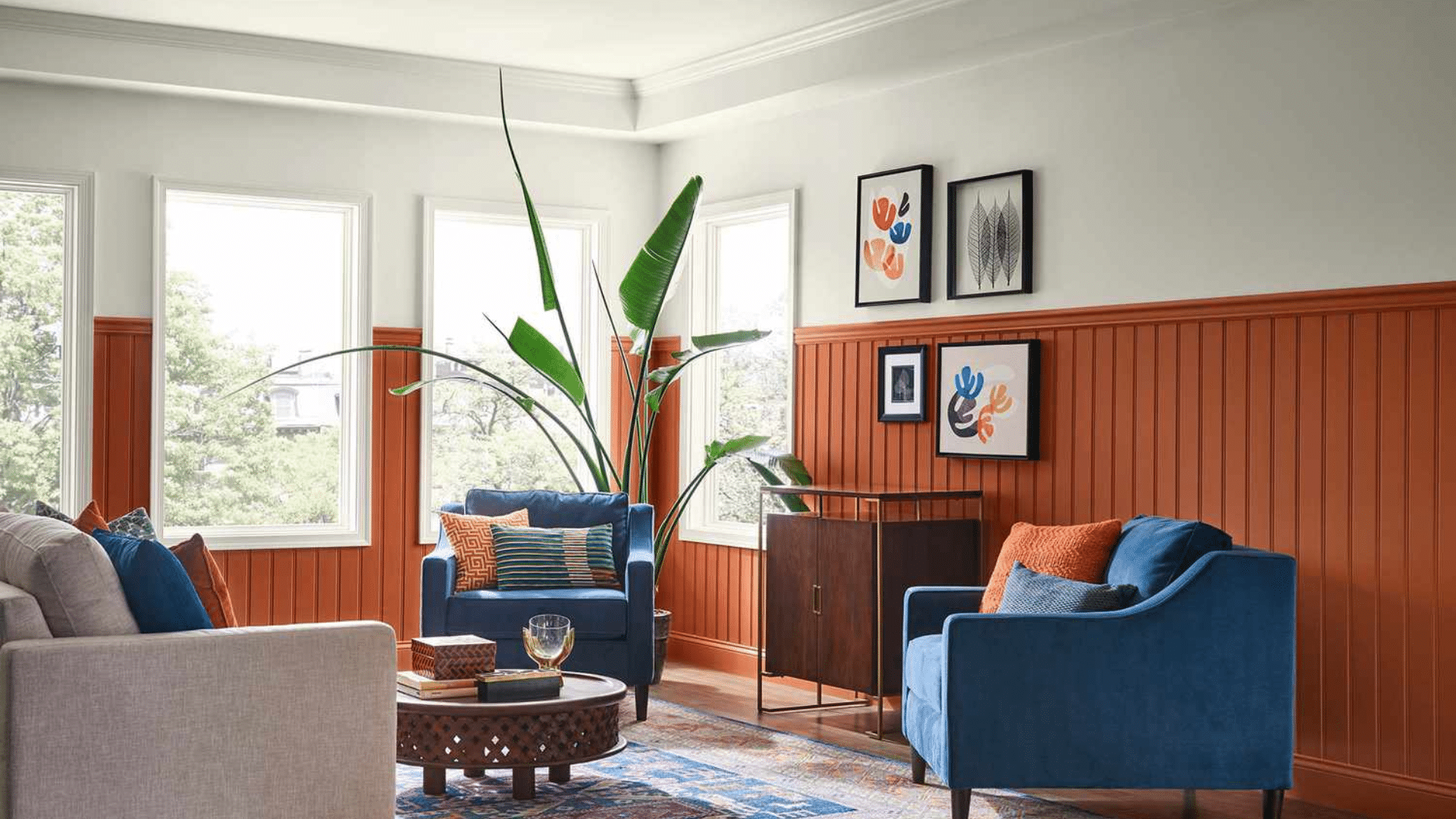
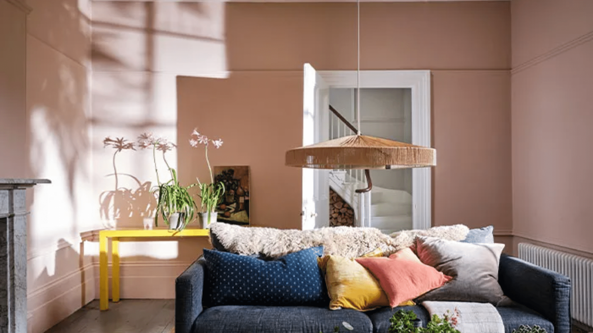
15. Valspar Fired Earth (6011-1)
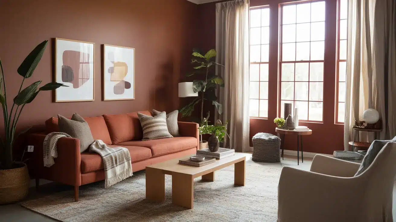
Fired Earth (LRV-3.65) is a warm terracotta that brings a natural, earthy feeling into your home.
It’s a mix of red and brown tones that feels cozy and inviting. This color works well in rooms with a lot of light because it gives the space a soft glow.
It’s great for living rooms, dining rooms, or anywhere you want to feel grounded and warm.
The color feels classic and comforting, not trendy or loud.
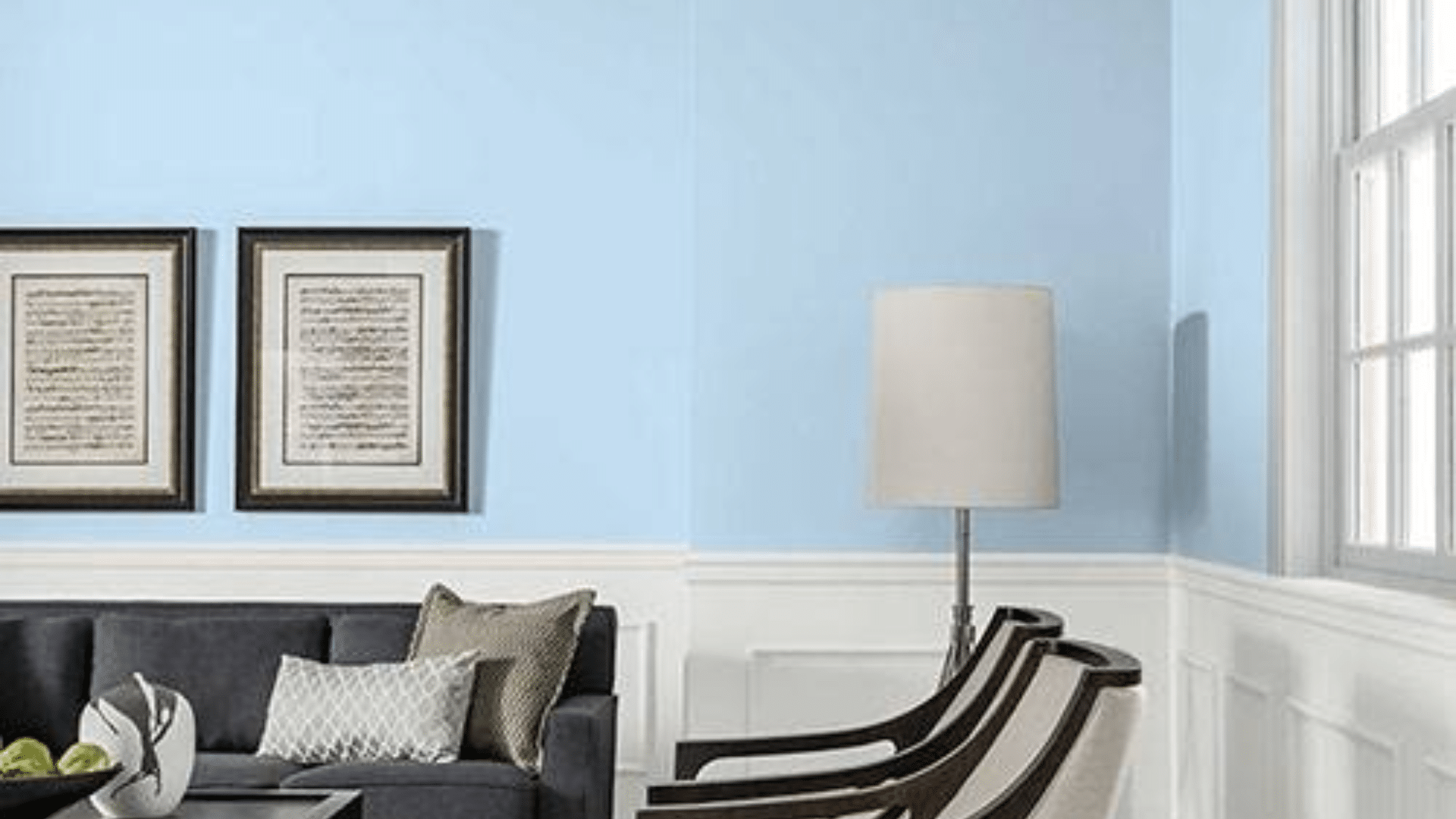
16. Benjamin Moore Palladian Blue (HC-144)
Palladian Blue (LRV-60.4) is a soft mix of blue and green with just a touch of gray to keep it feeling calm.
It’s perfect for bedrooms or bathrooms where you want a relaxing, peaceful space.
The gentle tones create a fresh look without being too bright or bold. It reflects light nicely and works well in both sunny and shaded rooms.
This color feels light and airy, but still has enough depth to be interesting.
17. Sherwin-Williams Sea Salt (SW-6204)
Sea Salt (LRV-63) is a pale blue-green that changes with the light, sometimes looking more blue and other times more green.
It’s known for creating a spa-like feeling, which makes it great for bathrooms and bedrooms.
The color is soft enough to be used on all four walls, but it still has personality. It pairs well with whites, grays, and natural wood.
It’s one of those shades that feels peaceful and never gets old.
18. Behr Rainforest (M440-7)
Rainforest (LRV-10) is a deep, bold green that brings a strong natural feeling into a room.
It’s great for accent walls, built-ins, or even a whole room if you want something dramatic.
This color works really well with gold or brass fixtures and wooden furniture. When used in a space with good light, it adds richness without feeling too dark.
If you love nature-inspired tones, Rainforest creates that connection in a strong, stylish way.
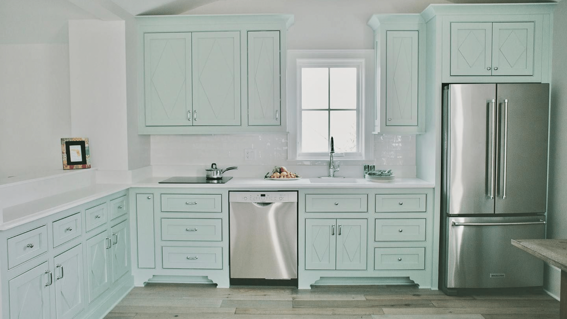
19. Valspar Spring Reflection (6003-3A)
Spring Hill (LRV-71.751) is a light, minty green that brings a soft, cheerful feeling into your home.
It has a little gray in it, which keeps it from looking too bright or too young.
It works especially well in bathrooms, laundry rooms, or sunny spots where you want a clean, fresh vibe.
This color adds energy but still feels calm. It’s a simple way to brighten a room without overwhelming it.
20. Farrow and Ball Green Blue (84)
Green Blue (LRV-49) is a soft mid-tone that shifts between green and blue, depending on the light.
It has a vintage, peaceful quality that works beautifully in bedrooms, living rooms, or even hallways.
The color is calming but still interesting, which makes it feel special. It pairs well with both dark wood and white trim.
If you want a soft color that has personality, this one is a strong choice.
21. Sherwin-Williams Cavern Clay (SW-7701)
Cavern Clay (LRV-20) is a warm terracotta shade that brings comfort and earthiness into a room.
It’s bold without being too bright and works really well in living rooms or dining areas.
This color looks especially good in north-facing rooms that need a bit of warmth. It pairs nicely with natural textures like wood, leather, or woven fabrics.
Cavern Clay creates a cozy, lived-in feel that makes any space more inviting.
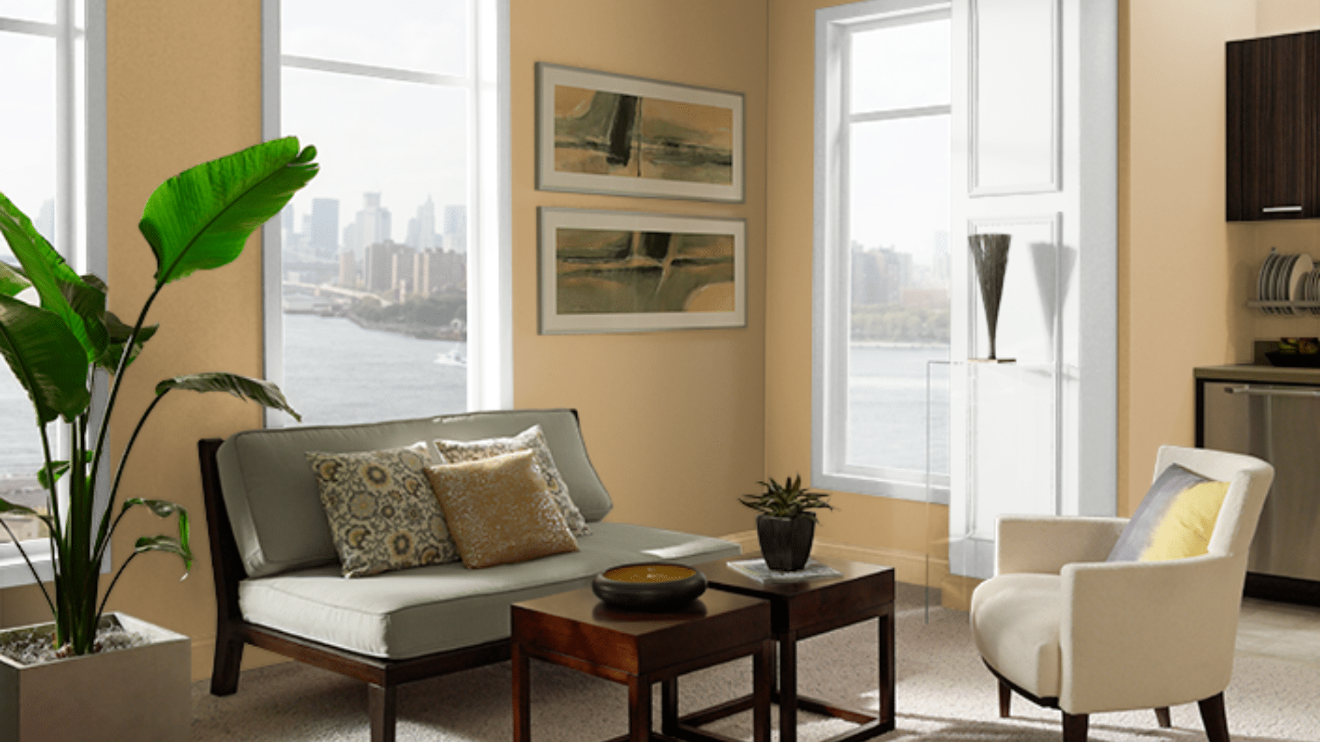
22. Benjamin Moore’s Lenox Tan (HC-44)
Lenox Tan (LRV-43.14) is a classic warm tan with a soft golden tone that makes rooms feel welcoming.
It’s deep enough to add warmth, but still light enough to keep things open.
Use it in hallways or living rooms to tie spaces together with one smooth color.
It complements many styles and works with both dark and light furniture. If you want a timeless, easy-to-live-with color, Lenox Tan is a solid choice.
23. Behr Spiced Mustard (S300-5)
Spiced Mustard (LRV-33) is a rich golden yellow with just enough brown to keep it from feeling too bright.
It adds energy and personality to a space, especially in dining rooms, kitchens, or creative areas.
The warm undertone makes it great for rooms that need a little extra light and coziness.
It works well with wood, whites, and even deeper colors like navy or charcoal. It’s a bold but friendly color that feels warm and fun.
24. Valspar Autumn Fog (4007-1B)
Autumn Fog (LRV-45.931) is a muted sage green with just a hint of gray, giving it a soft and calming feel. b v
It’s perfect for bedrooms, living rooms, or spaces where you want a relaxing background color. This tone adds a gentle sense of color without being too strong or loud.
It pairs well with neutral decor and natural elements like plants or wood accents.
Autumn Fog feels timeless, grounded, and easy to decorate around.
25. Farrow and Ball Setting Plaster (No.2003)
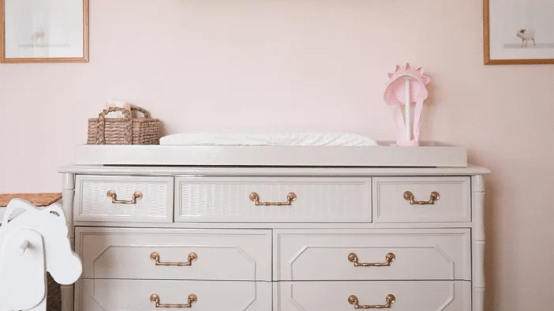
Setting Plaster (LRV-87) is a warm, dusty pink with soft earthy tones that feel cozy and stylish.
It’s great for living rooms or bedrooms where you want a soft, comfortable glow. The pink isn’t too bright or sweet, it has a bit of a grown-up, natural vibe.
It works beautifully with white, gold, or wood finishes.
This color adds warmth in a gentle, stylish way and gives rooms a welcoming, flattering look.
26. Benjamin Moore Opal Essence (680)
Opal Essence (LRV-75.42) is a soft lavender with just enough gray to keep it from feeling too bright or sugary.
It creates a calm, peaceful feel that works well in bedrooms, sitting rooms, or even nurseries. The soft color adds personality without being overwhelming.
It pairs nicely with light woods, whites, and silver accents.
If you want a dreamy color that still feels grown-up, Opal Essence is a beautiful option.
27. Sherwin-Williams Intimate White (SW-6322)
Intimate White (LRV-77) is a warm, light pink with a touch of beige that gives it a soft, glowing effect.
It adds warmth and comfort without looking too pink or too plain.
It’s a great choice for bedrooms and powder rooms where you want a gentle, flattering look.
This color works well with warm whites, creams, and soft metallics. It feels calming, romantic, and just a little bit playful.
28. Behr Lilac Mist (PPU16-06)
Lilac Mist (LRV-78) is a gentle purple with cool gray undertones that make it soft and easy to live with.
It’s perfect for bedrooms or quiet spaces where you want a peaceful, calming feel.
The color is delicate but not too sweet, which makes it feel more mature and relaxed. It pairs nicely with whites, grays, and silver touches.
If you want a subtle hint of color, Lilac Mist adds beauty without too much boldness.
29. Valspar Clear Blue Sky (4007- 9A)
Clear Blue Sky (LRV-67.67) is a light, airy blue that brings a fresh and open feeling into a room.
It’s great for bedrooms, bathrooms, or any small space you want to feel larger. The soft blue tone is not too cold, and the slight gray base keeps it feeling calm and balanced.
It works well with natural light and pairs beautifully with white trim or beachy, wood accents.
Sky Breeze makes any room feel bright and peaceful.
30. Farrow and Ball Pink Ground (No.202)
Pink Ground (LRV-72) is a soft, dusty pink with warm undertones that give it a cozy, natural look.
It’s a great choice for bedrooms, living rooms, or nurseries where you want a calming but stylish vibe.
The color doesn’t feel too sweet because of its soft, earthy base. It works well with warm whites, creams, or even soft grays.
This shade feels gentle, flattering, and timeless.
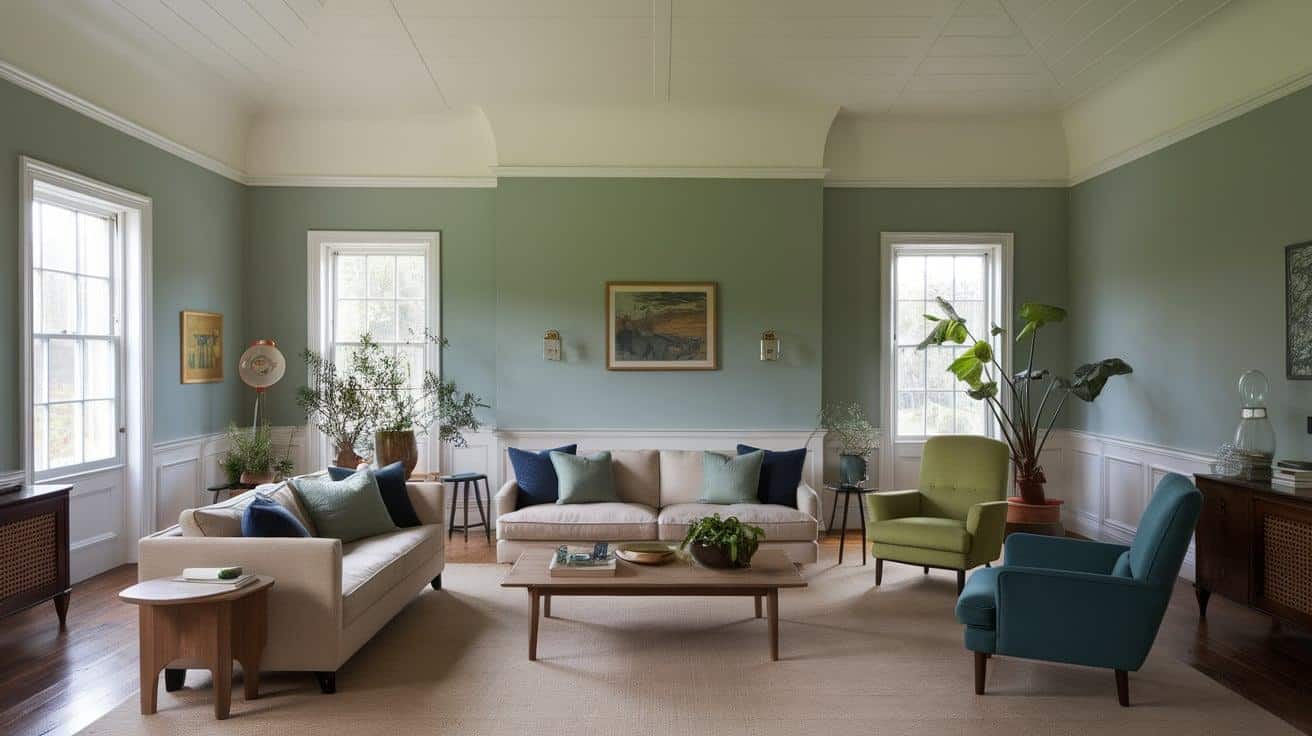
31. Benjamin Moore October Mist (1495)
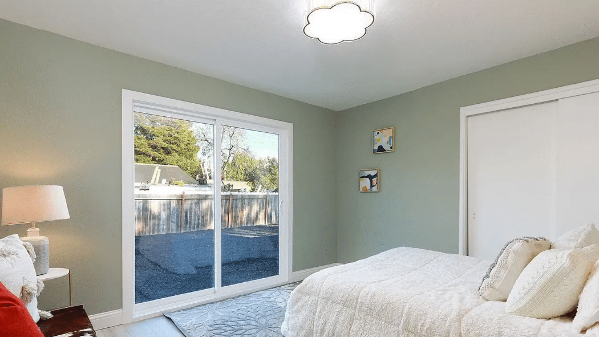
October Mist (LRV-46.54) is a soft sage green with a touch of gray that gives it a calm, earthy feel.
It’s perfect for bedrooms, living rooms, or anywhere you want a peaceful, natural vibe. The gray keeps it grounded, so it doesn’t feel too bright or minty.
It pairs well with wood tones, creams, and other soft, natural colors.
If you’re looking for a gentle green that still feels modern, October Mist is a great pick.
32. Sherwin-Williams Evergreen Fog (SW-9130)
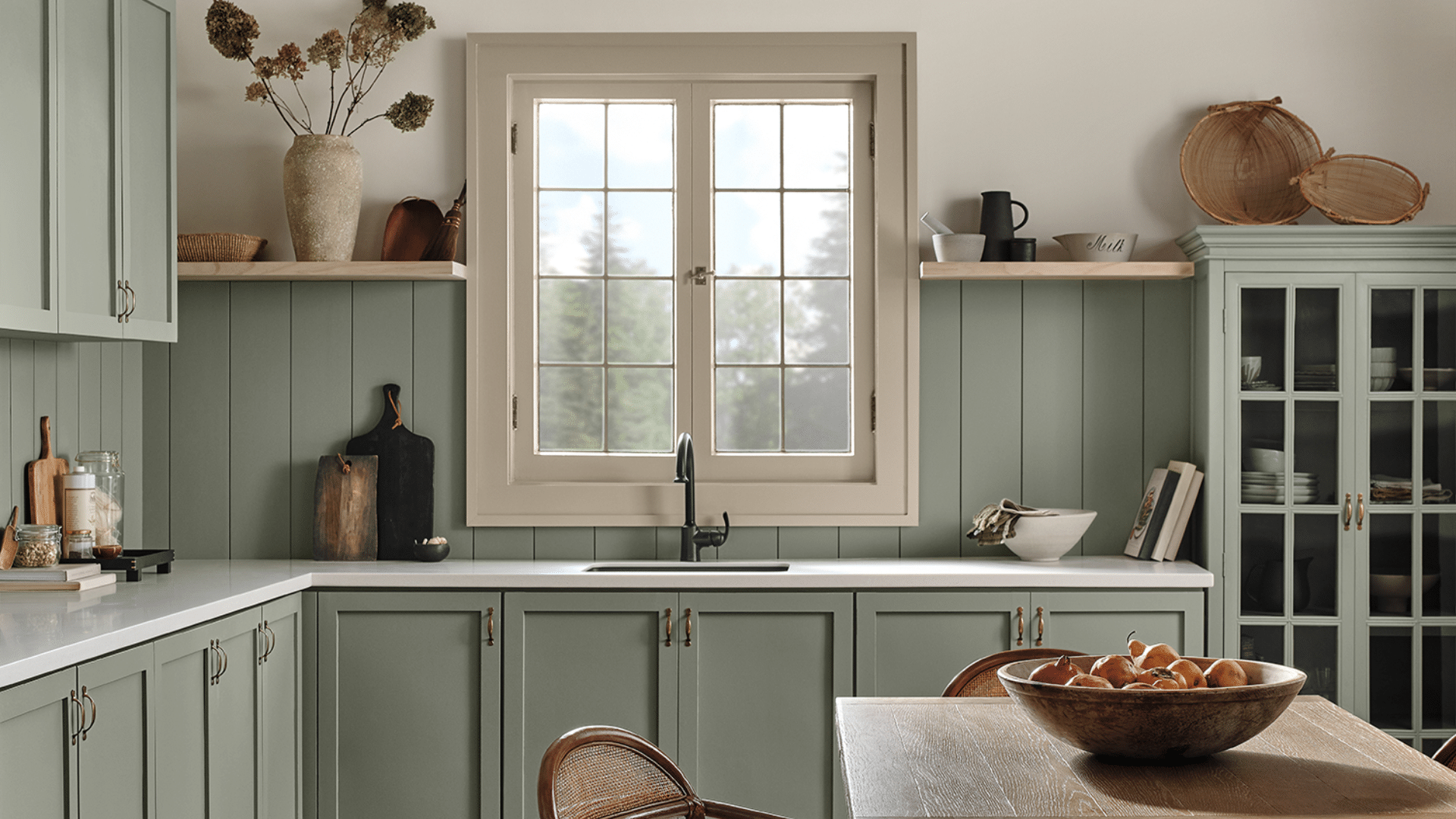
Evergreen Fog (LRV-30) is a muted green with a little gray mixed in, making it feel quiet and refined.
It’s a great color for living spaces, bedrooms, or offices where you want to feel calm and focused.
The tone is soft enough to act like a neutral but still adds a touch of color. It pairs well with natural textures and warm metals.
Evergreen Fog feels grounded, relaxing, and very easy to live with.
33. Behr Blank Canvas (DC-003)
Blank Canvas (LRV-84) is a warm, creamy white that feels soft, fresh, and easy to live with. It’s not too bright or stark, which makes it perfect for creating calm, inviting spaces.
This shade works beautifully on walls in living rooms, bedrooms, and even kitchens, anywhere you want a clean look that still feels cozy.
It pairs well with both bold and neutral accents, giving you lots of room to play with furniture and decor.
Blank Canvas brings warmth and light into a room without overwhelming it. If you’re looking for a classic, easygoing white that goes with everything, this is a great choice.
34. Farrow and Ball Hague Blue (No.30)
Hague Blue (LRV-7) is a deep, moody blue with a slight green tone that makes it feel classic and rich.
It adds depth and character to rooms like dining areas, libraries, or entryways.
The color changes with the light, sometimes feeling darker and other times showing more blue or green.
It pairs beautifully with white trim, brass accents, and dark wood. Hague Blue is timeless, bold, and full of personality.
35. Valspar Mountain River (4005-6C)
Mountain River (LRV-8.958) is a deep teal that blends blue and green for a dramatic, rich color.
It’s a great choice for accent walls, built-ins, or even a full room if you want a bold, cozy vibe.
The natural feel makes it perfect for both modern and traditional spaces. It works well with gold finishes, white trim, and warm wood tones.
Mountain River feels bold yet calming, great for making a room stand out while still feeling grounded.
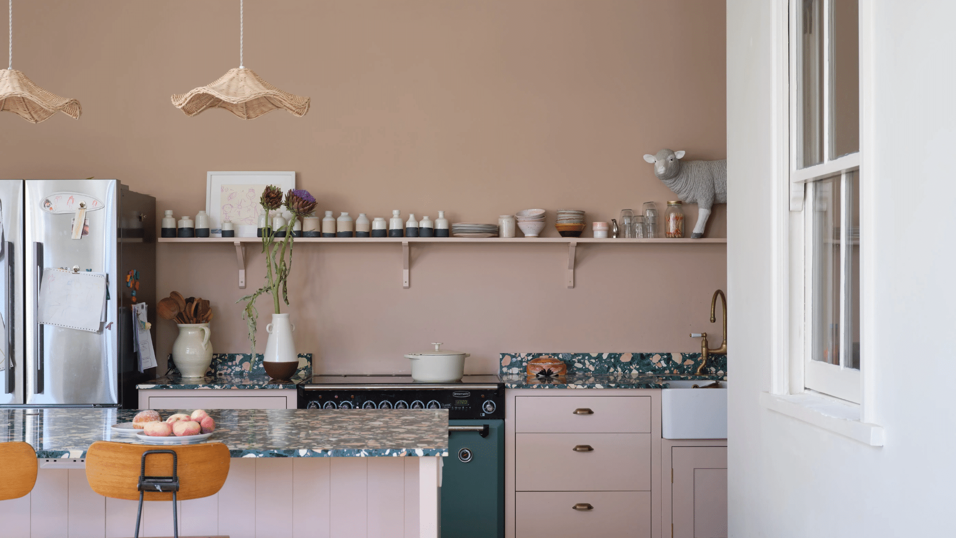
Tips for Using These Colors in Different Rooms
Now that you’ve seen the best paint colors, the next step is knowing where to use them. Every room in your home has its own purpose and mood, so choosing the right color for each space can really make a difference.
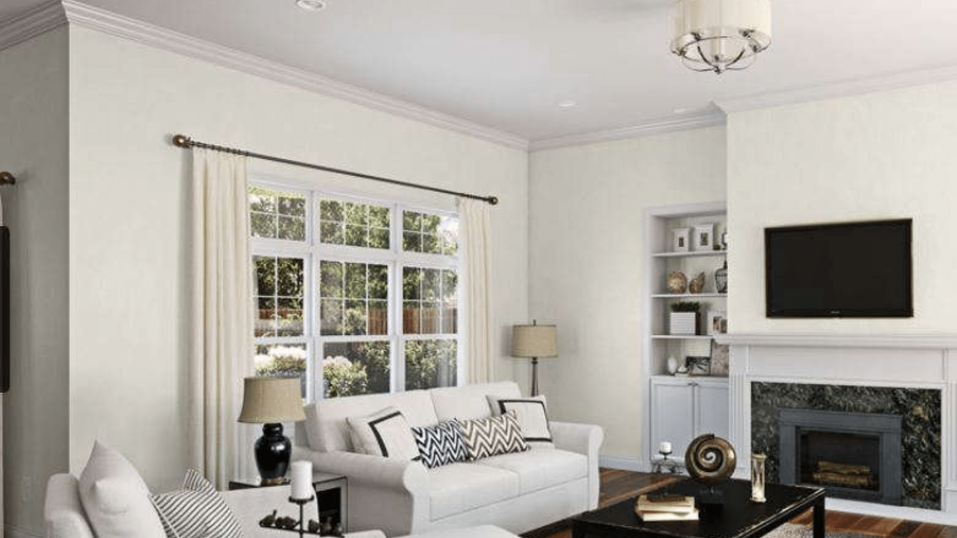
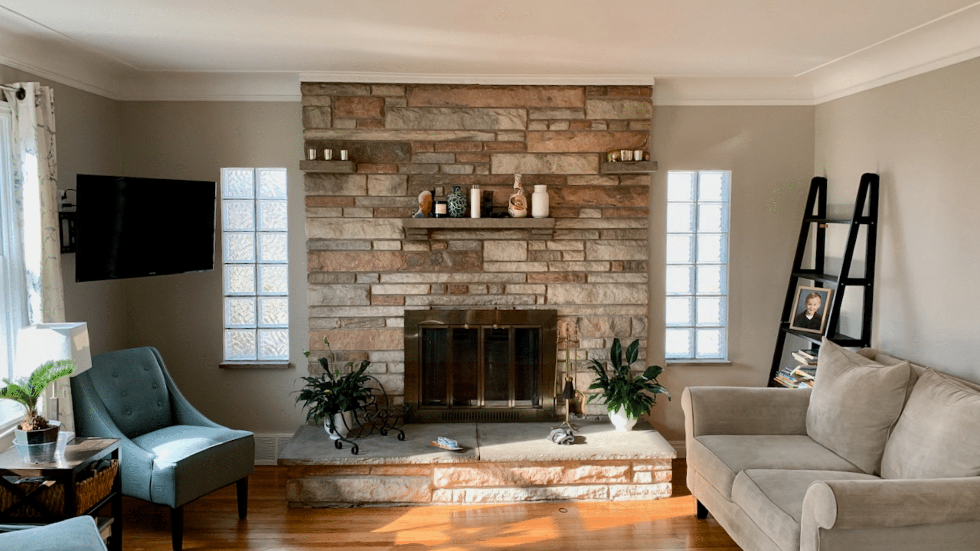
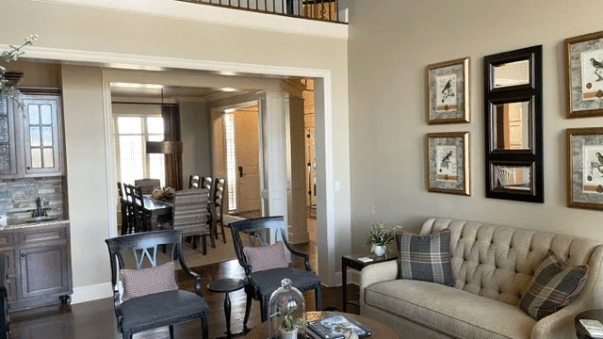
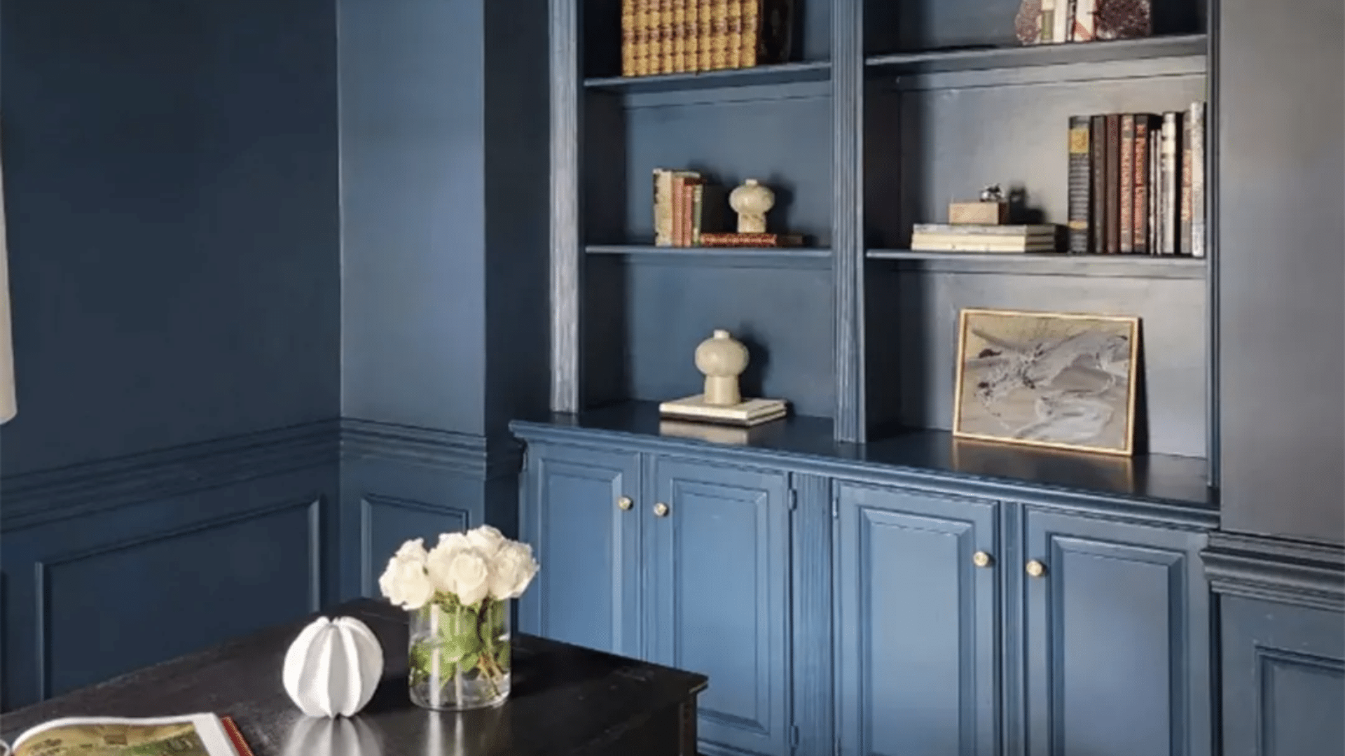
- Living Room: Go for warm neutrals, soft earth tones, or deep accents on a feature wall. These shades make the space feel cozy and welcoming, perfect for gathering and relaxing.
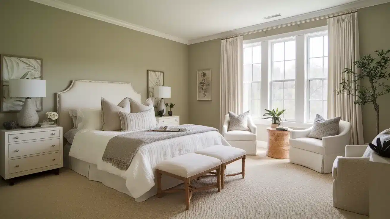
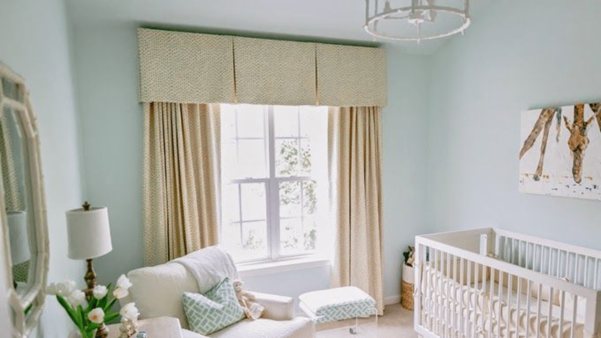
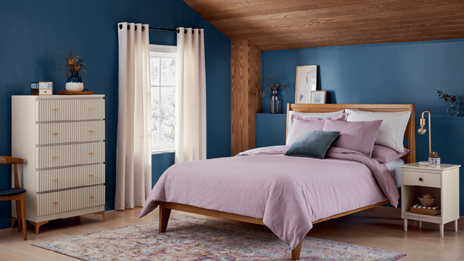
- Bedroom: Choose calming, muted tones like soft blues, sage greens, or dusty pinks. These create a peaceful atmosphere that’s ideal for winding down and sleeping well.
- Kitchen: Stick with crisp whites, soft creams, or muted greens and blues. Lighter shades keep the space feeling fresh and clean, while subtle color on cabinets or islands adds character.
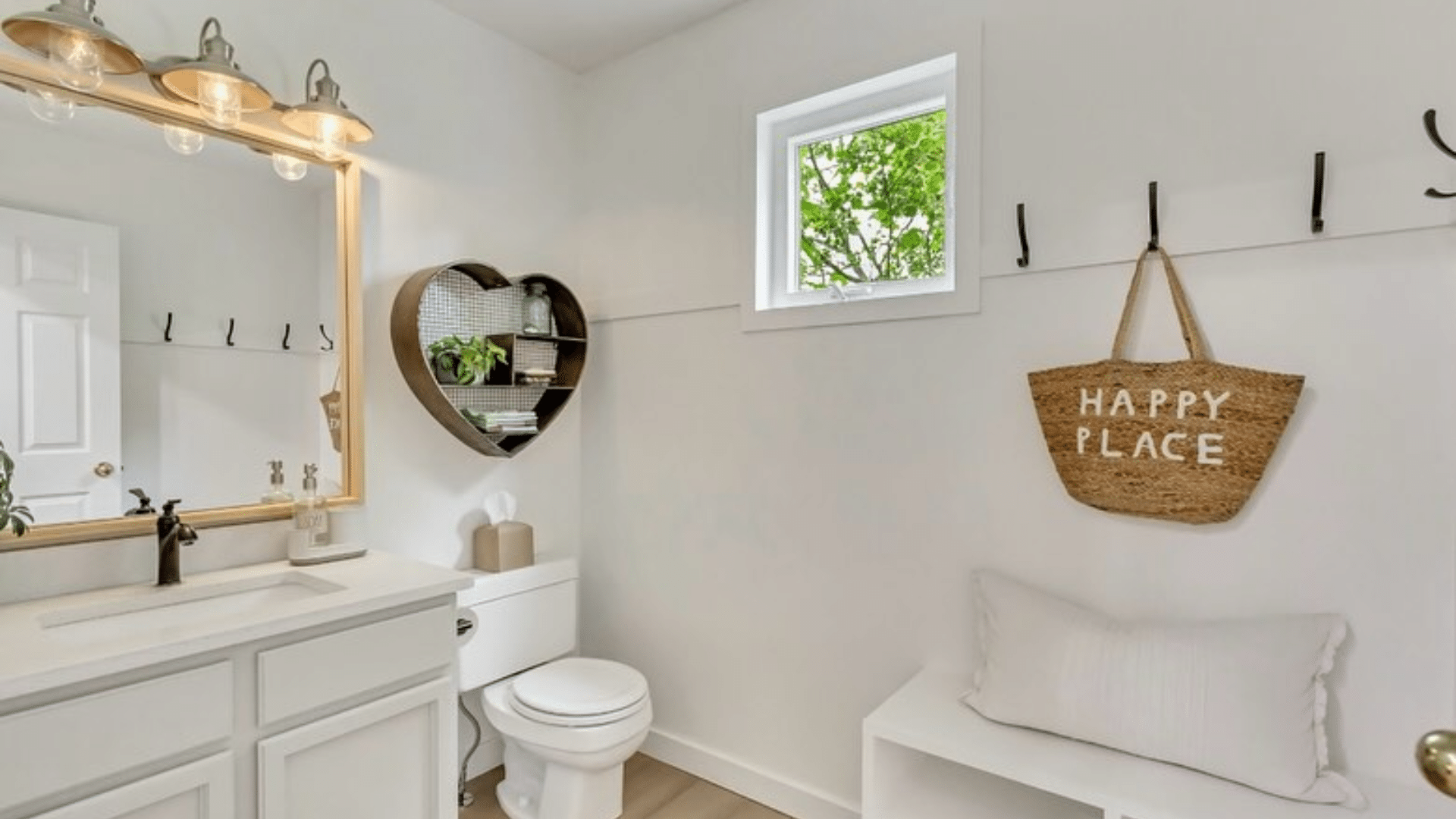
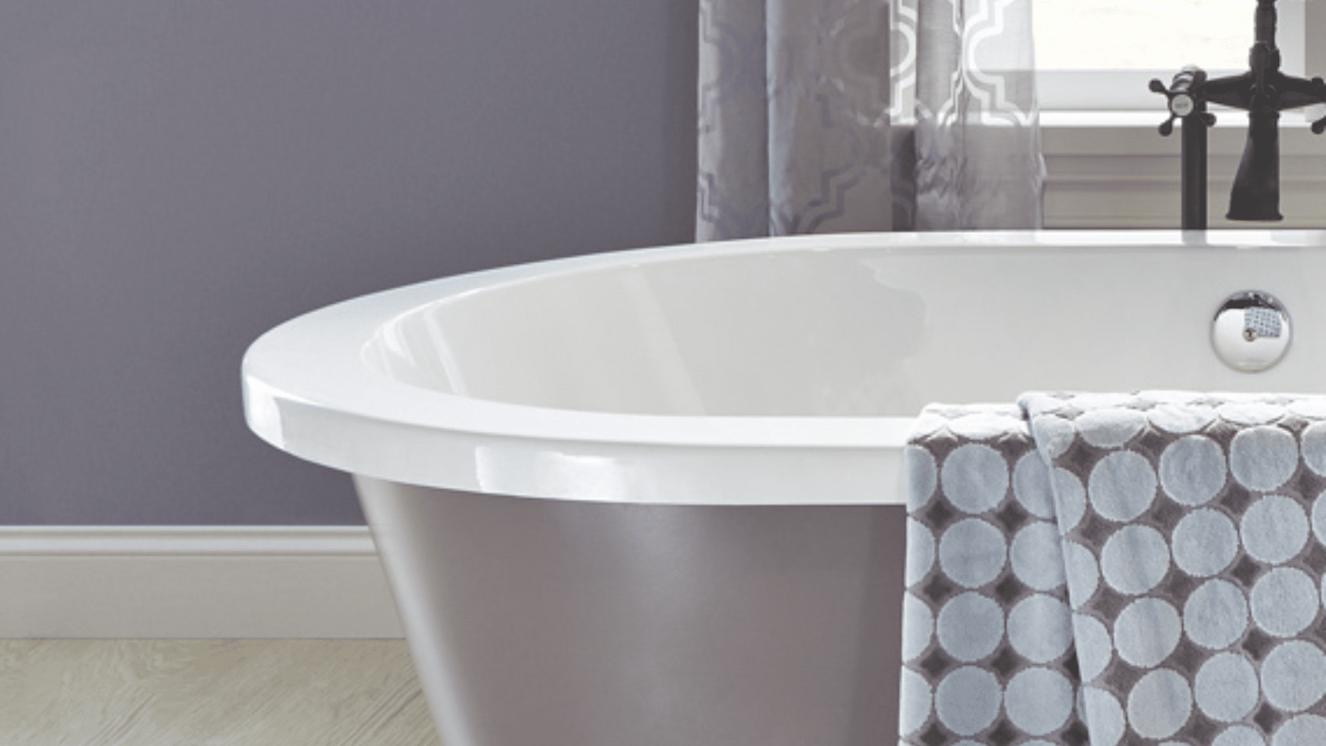
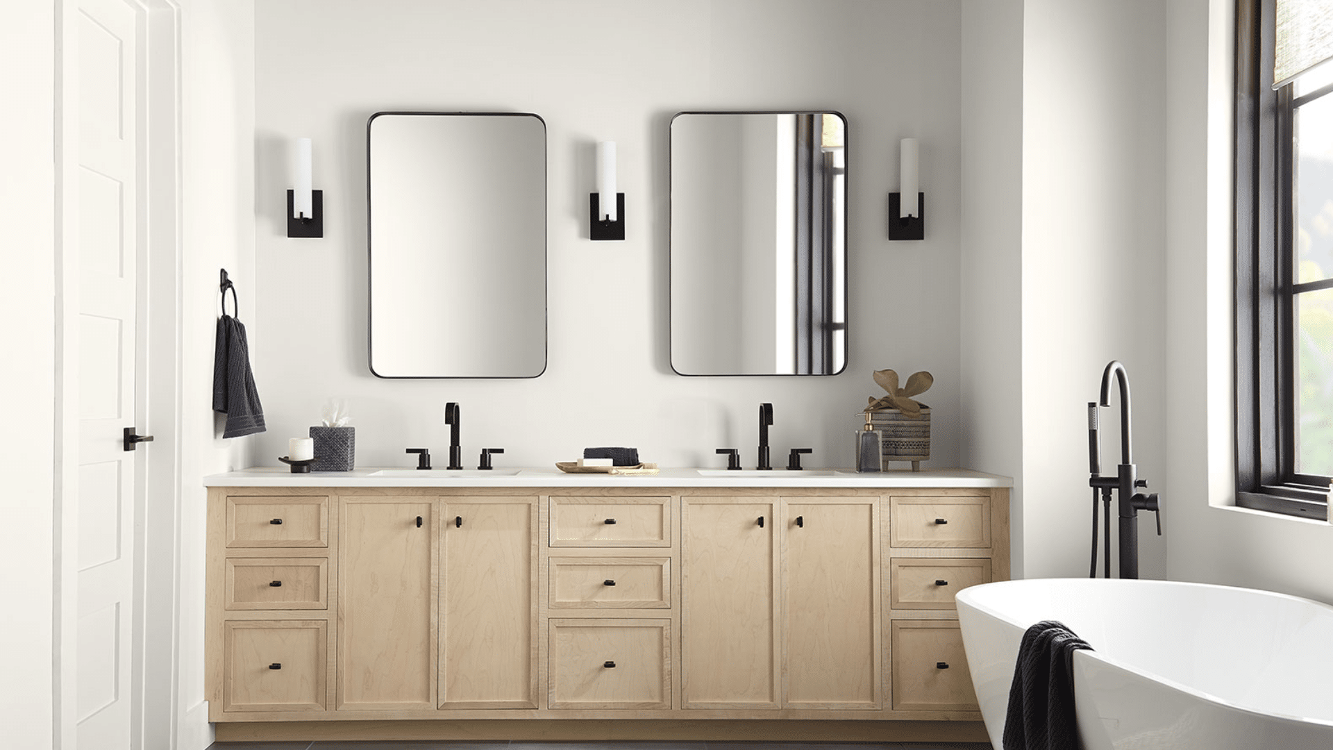
- Bathroom: Use cool tones like breezy blues or gentle grays to create a spa-like feel. For a bolder look, try warm clay or terracotta to add personality in small doses.
Conclusion
Finding the right paint color can turn a house into a home that truly feels like yours.
The colors we looked at offer something for everyone, from soft, calming shades to bold colors that make a big statement. If you like clean neutrals or richer tones, there’s a color that can help show off your personal style.
Remember, picking the best color isn’t just about what’s trending right now. It’s about choosing something that feels right for you and makes your space feel comfortable and welcoming.
Always test a few samples before deciding, because colors can look very different depending on the light in your home.
The most important thing is to trust your gut. If a color makes you smile every time you walk into the room, then it’s the right one for you.
I hope this guide gave you some new ideas and helped make the choice a little easier.
Did any of these colors stand out to you? Share your thoughts and favorites in the comments, we’d love to hear what you think!

Alex Guerrero, a graduate with a Fine Arts degree from the Rhode Island School of Design, has been a visionary in the world of color and design for over 15 years. His professional journey began in the heart of the fashion industry in Milan, where he developed an acute sense for color harmonies and trends. Alex joined our team in 2018, offering fresh and innovative perspectives on color utilization in various spaces. Renowned for his ability to blend contemporary trends with timeless elegance. Outside of work, Alex is an accomplished painter and a volunteer art therapist, his artistic talents further enriching his professional insights.