
Urbane Bronze by Sherwin-Williams (SW 7048) is a bold, grounded paint color with an LRV of 8.
It blends rich brown with soft gray, creating a deep, calming tone that feels both strong and natural.
I’ve seen more homeowners using it on exteriors lately, thanks to its growing popularity.
It adds warmth and depth to siding, doors, and trim without feeling too harsh or overpowering.
In this article, I’ll walk you through how Urbane Bronze looks on different outdoor surfaces, how it compares to similar shades like Natural Linen and Accessible Beige, and which colors pair well with it.
I’ll also share real-life examples to help you decide if Urbane Bronze is the right fit for your home’s exterior.
What Is Urbane Bronze by Sherwin-Williams?

Urbane Bronze stands out for giving homes a rich, complete look.
It’s dark enough to feel bold but soft enough to stay welcoming. I like how it adds depth without feeling too intense.
On full siding, it creates a sleek, modern base. On trim or doors, it gives a strong contrast, working well on both large and small details.
I’ve seen it look great on craftsman homes, ranch houses, and modern cabins.
Its warm, dark tone feels current yet grounded in nature. It also helps other materials shine, wood looks richer, and stone or brick appears more textured.
Another plus: it hides dust and dirt better than lighter colors, which makes it a wise choice for homes in dry or dusty areas. Urbane Bronze is both stylish and practical.
Why Use Urbane Bronze on Exteriors?
Urbane Bronze enhances flat surfaces and draws attention to architectural lines and textures.
It subtly highlights trim, edges, and shadows, staying bold without feeling too dark.
I’ve found it pairs beautifully with natural materials like wood, stone, and metal. These elements balance its richness and help it blend into the outdoor surroundings.
You can use Urbane Bronze on complete siding for a dramatic effect or on features like doors, shutters, and trim to add interest without going too dark.
It’s also a wise, durable choice for exteriors. The color holds up well in both sun and rain, resisting fading over time.
Plus, it does a better job of hiding dust and dirt compared to lighter paints.
For a look that’s bold, natural, and low-maintenance, Urbane Bronze delivers.
Styling Urbane Bronze in Different Exterior
Seeing Urbane Bronze in real settings can help you picture it in your own home. Below are a few popular styles where this color works beautifully.
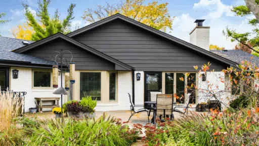
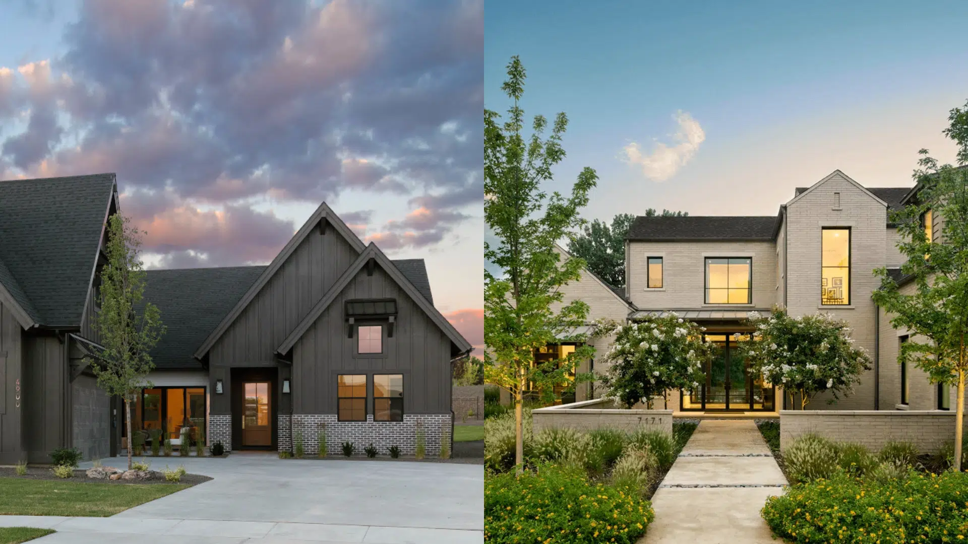
1. Modern Farmhouse
This home features Urbane Bronze throughout its siding, giving the structure a rich and defined surface.
The dark tone brings a contemporary element to the classic farmhouse silhouette.
Bright white trim outlines the roofline, windows, and corners, adding sharp contrast and keeping the overall design clear and refined.
Black window frames further enhance the visual outline, tying all elements together. The result is strong, simple, and up-to-date without losing its inviting charm.
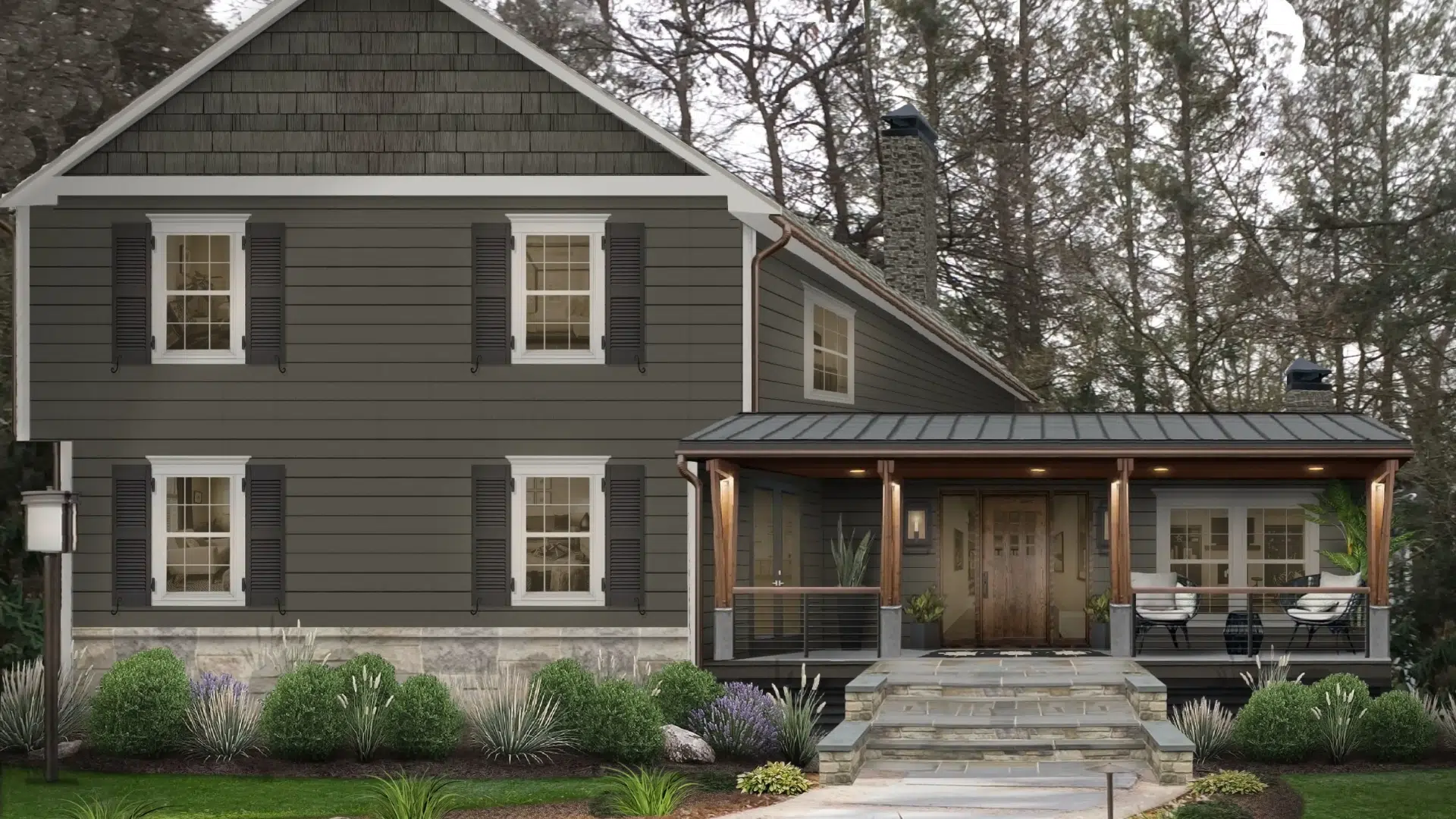
2. Craftsman Home
Natural stone forms the foundation, offering both texture and visual strength.
Above it, Urbane Bronze siding provides a smooth transition, creating contrast without feeling abrupt.
Soft white trim adds lightness around windows and eaves, balancing the deeper tone. This pairing keeps the home grounded while still feeling open and classic.
Together, the materials and colors create a warm, layered look that fits well in green or wooded settings, as well as established neighborhoods.
3. Contemporary Home
This design features sharp rooflines and uncluttered shapes. Vertical siding in Urbane Bronze reinforces the structure’s clarity and brings out its clean design.
Wood accents add variation and warmth, breaking up the darker surface and connecting the home with outdoor surroundings.
The final effect is one of focus and confidence. The layout stays simple, while the color adds visual structure and a clear sense of design direction.
Best Trim Colors to Match Urbane Bronze
Choosing the right trim color can make or break your exterior look. It helps frame your home and highlight architectural details. Below are some of the most trusted Sherwin-Williams trim colors.
- Pure White (SW 7005): This is a clean, neutral white that creates a modern edge when paired with Urbane Bronze. It works well if you want your trim to pop but still feel crisp and classic.
- Greek Villa (SW 7551): A soft, creamy white that brings warmth to the overall look. It’s an excellent choice for homes with wood or stone accents that lean towards warm tones.
- Shoji White (SW 7042): An off-white with subtle beige undertones. This trim color offers a smooth, low-contrast look that feels quiet and balanced.
- Tricorn Black (SW 6258): Deep black that adds strong Contrast and drama. It’s perfect for doors, window frames, or shutters if you want a bolder design.
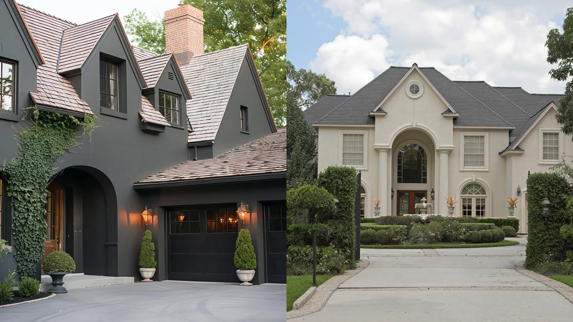
Comparison: Urban Bronze vs. Other Colors
When choosing the right exterior color, it’s helpful to compare shades that offer a similar tone but deliver different effects.
Urbane Bronze vs. Natural Linen
Natural Linen by Sherwin-Williams is a soft, light beige. It has warm undertones that make it feel inviting and smooth.
This color creates a creamy look that works well across complete exteriors. It’s a popular choice for siding on traditional or farmhouse-style homes.
Natural Linen doesn’t overpower. It brings brightness to a home’s exterior but still feels soft and easy on the eyes.
Now let’s look at how these two colors compare. One is dark and earthy. The other is light and airy. Both are beautiful in their own way.
| Feature | Urbane Bronze | Natural Linen |
|---|---|---|
| Shade | Deep gray-brown | Light beige |
| Feel | Bold, modern, earthy | Soft, warm, classic |
| Use | Accent, trim, whole body | Siding, main exterior |
| Pairs Well With | Wood, black, greige | Brown, white, charcoal |
Choose Urbane Bronze if your home features sharp lines or bold architectural elements. It makes the architecture stand out. It’s also a good fit if you have natural elements like wood or stone.
Choose Natural Linen if your home receives a lot of sunlight. The lighter shade reflects light, keeping the exterior feeling open. It’s also great if you prefer a traditional or farmhouse style.
Both are strong options; it just depends on the mood you want.
Urbane Bronze vs. Accessible Beige
Accessible Beige by Sherwin-Williams is a light taupe-gray with warm undertones. It feels soft, neutral, and easy to coordinate with other colors.
It isn’t as warm as classic beige or as cool as a true gray. This in-between quality makes it adaptable for various architectural styles.
The tone is understated but still brings visual interest. It’s a solid pick if you prefer a lighter color that still shows character.
Now let’s compare it to Urbane Bronze. While both fall into the category of warm neutrals, they perform very differently on exterior surfaces.
| Feature | Urbane Bronze | Accessible Beige |
|---|---|---|
| Shade | Dark gray-brown | Light taupe-gray |
| Visual Tone | Deep, grounded | Soft, balanced |
| Common Use | Accent or full siding | Entire exterior or trim |
| Best Matches | Wood, stone | Brick, white, navy |
Choose Urbane Bronze if you’re aiming for a strong, modern appearance. It draws the eye and adds visual weight to the overall design. It’s especially effective for highlighting trim or creating contrast.
Opt for Accessible Beige if you’re after a softer, more adaptable tone. It’s light enough for wide coverage while still offering definition. This option is well-suited for areas with varied home colors.
Both shades add warmth to a home’s exterior, but they leave different impressions: one delivers a bold impact, the other offers a lighter, more neutral presence.
Popular Color Pairings for Exteriors
Urbane Bronze pairs best with natural textures. These materials bring out their warmth and soften their boldness.
- Wood tones: Stained cedar, redwood, or natural pine give warmth and texture. These tones highlight the earthy side of Urbane Bronze.
- Stone or brick: Red brick creates contrast. Gray or white stone keeps things cool and balanced. All of them help the color feel grounded and architectural.
- Metal roofing: Matte black or oil-rubbed bronze adds sharp definition. These metals make Urbane Bronze look more modern and clean.
Tips for Using Urbane Bronze Outside
When applying Urban Bronze to siding, trim, or accent features, these tips will ensure the color looks cohesive and enhances the overall appearance of your home exterior.
- Test before committing: Always sample the color on your actual exterior. Natural light can affect how it appears throughout the day.
- Choose the right finish: For siding, go with a matte or satin finish. These offer a smooth appearance with minimal reflection.
- Stick to a focused palette: Pair Urbane Bronze with neutral or natural materials. Avoid mixing it with too many contrasting colors to maintain a cohesive look.
- Use lighting thoughtfully: Warm outdoor lighting helps emphasize the richness of the shade after sunset and brings out the texture of surrounding materials.
Conclusion
Urbane Bronze is one of my favorite picks for a color that feels strong, inviting, and grounded.
It works well across various exterior styles, from urban homes to country retreats, making it a reliable choice in diverse settings.
I like how it enhances natural textures, highlights architectural details, and keeps a balanced look over time.
If you prefer something softer, Natural Linen or Accessible Beige offer lighter warmth with the same flexibility.
Before making a decision, I always recommend testing samples in various lighting conditions and locations. What looks rich in the morning might feel cooler by afternoon.
Going for a bold accent or a complete exterior update? Urbane Bronze offers a stylish, durable finish that holds up beautifully, adding lasting character to your home.

With a Master’s in Architecture from the University of California, Berkeley, Alexander Martin has dedicated the last 18 years to enhancing outdoor living through thoughtful and robust structure design. His career kicked off in urban planning, giving him a unique perspective on integrating structures into diverse environments. In 2019, Alexander brought his expertise to our website, offering insights into creating versatile outdoor spaces. Since then, he has been the lead advisor for our outdoor design projects and is known for his ability to merge functionality with environmental consciousness. Alexander enjoys rock climbing outside of work and participates in community development projects, activities that reflect his passion for the outdoors and sustainable design.