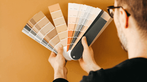
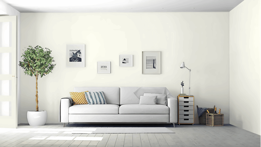
Do you know that happy feeling you get when you walk into a cozy coffee shop?
Benjamin Moore Mascarpone can bring that same warmth to your home.
This creamy white color makes any room feel bright and welcoming with its gentle cream shade.
You can use Mascarpone in kitchens, bedrooms, bathrooms, and living rooms for a soft, comfortable look.
The versatile color complements various furniture styles and decorating choices.
Want to see how this lovely cream white might transform your space?
Let’s explore what makes Mascarpone such a popular choice for homeowners looking for warmth and grace.
Understanding Benjamin Moore’s Mascarpone
This creamy paint makes your home feel like a big hug.
It helps rooms feel friendly and bright.
Color Terminology
Here are the simple facts about this color.
These numbers help you match this paint to other things in your home.
| PROPERTY | VALUE |
|---|---|
| LRV | 89 |
| RGB | 248, 247, 232 |
| Hex Value | #F8F7E8 |
You can use these numbers when you want to match this color online or when buying home items.
Undertones:
Cream white is nice, especially with the right richness.
This shade evokes fresh butter, perfect for beauty without heaviness.
- Gentle cream with yellow mixed in
- Butter-like color that feels natural
- Not a bright white, but a pretty cream-white
This white plays nice with others.
It brings a happy feeling, gentle charm, and a friendly look to any room.
The color is a quiet hello from a sunny morning, with just the right amount of style.
Psychology of Cream Colors
When you paint your walls this color, it makes the room feel happy.
This paint can change how a room feels.
Cream white like this:
- Makes rooms feel friendly and big
- Rich colors: Make rooms feel nice
- Gentle creams: Make spaces feel just right
This cream stays nice for a long time.
It won’t go out of style and makes a good background for your things.
Why Choose Benjamin Moore Mascarpone (AF-20)?
Mascarpone is a lovely, cream-white cheese that looks like butter while still looking clean.
It’s good when you want something natural that also looks pretty.
1. Versatility
This creamy white color shifts beautifully as sunlight moves through your home during the day.
Morning light makes it feel warm and cozy, while evening brings out deeper, calming tones.
The versatile shade works perfectly with country, classic, or mixed decorating styles without overpowering your space.
2. Key Features
This shade fits with most furniture, if light, dark, new, or old, making room setup simple and easy.
It feels balanced, not too bright or dark, keeping rooms from feeling small while still adding warmth and comfort.
The color won’t go out of style quickly, so it’s a smart pick for long-term use in any home.
It creates a soft, open feel that’s friendly, not flashy, and works well in both busy and quiet homes.
3. Durability
With good paint, this color hides small marks or smudges, keeping your walls looking neat even with daily use.
It’s a strong option for homes with kids or pets, where walls take more wear and need simple care.
Light cleaning with a soft cloth can keep walls fresh without needing deep scrubbing or repainting every few months.
4. Texture and Light Interaction
This paint has a smooth finish that catches sunlight softly, adding gentle depth without feeling too shiny or flat.
As daylight shifts, the walls show slight shadow effects, adding quiet beauty without pulling focus from room features.
It allows art, plants, or decor to stand out clearly, working as a gentle background instead of stealing attention.
Room Color Recommendations: Benjamin Moore Mascarpone
This pretty cream-white works well in any room of your home.
It changes a bit as the day goes on, but stays lovely in any light.
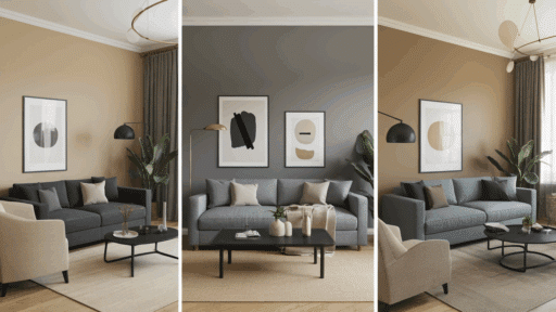
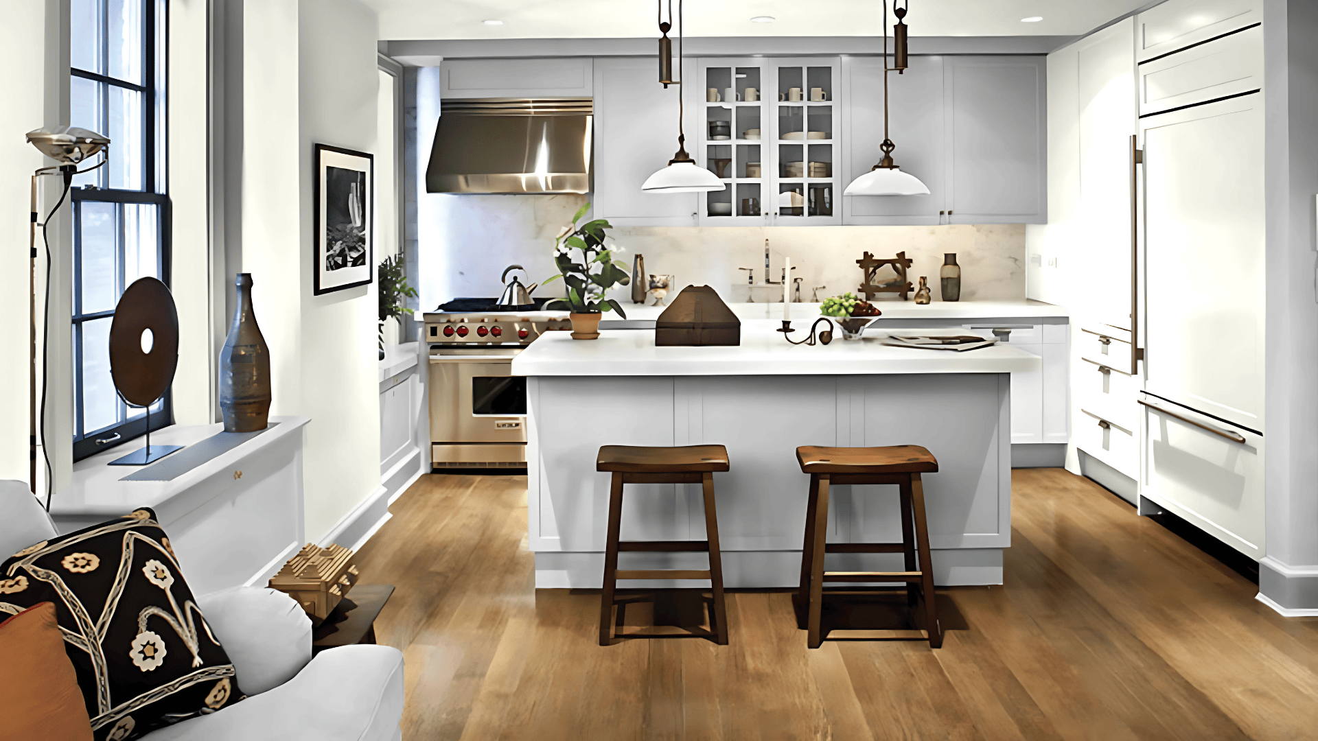
1. Living Spaces and Open Floor Plans
- Creates a friendly, big living room that shows your furniture instead of hiding it.
- The gentle cream color brings richness, especially with sunlight coming through the windows during the day.
- For homes with no walls between rooms, use this color all over to help rooms feel like they go together, or add darker creams for a bit of change.
2. Bedrooms and Relaxation Areas
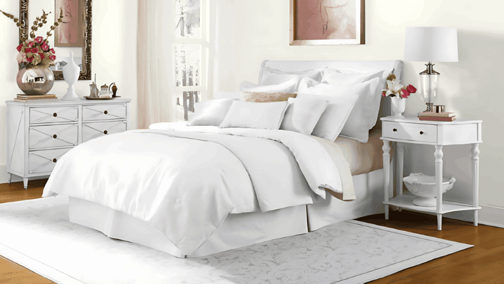
- Helps the bedroom feel calm and quiet, making it a great place to rest, read, or get ready for sleep.
- It looks bright and fresh in the morning, but turns gentle and rich when the lights are low or at night.
- Good for painting all the walls to feel like a peaceful retreat, or you can use white trim to add a bit of pop and clean lines.
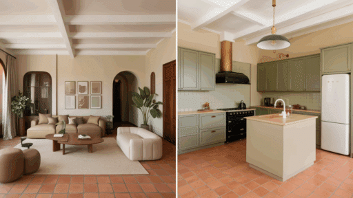
3. Bathrooms and Spa-like Spaces
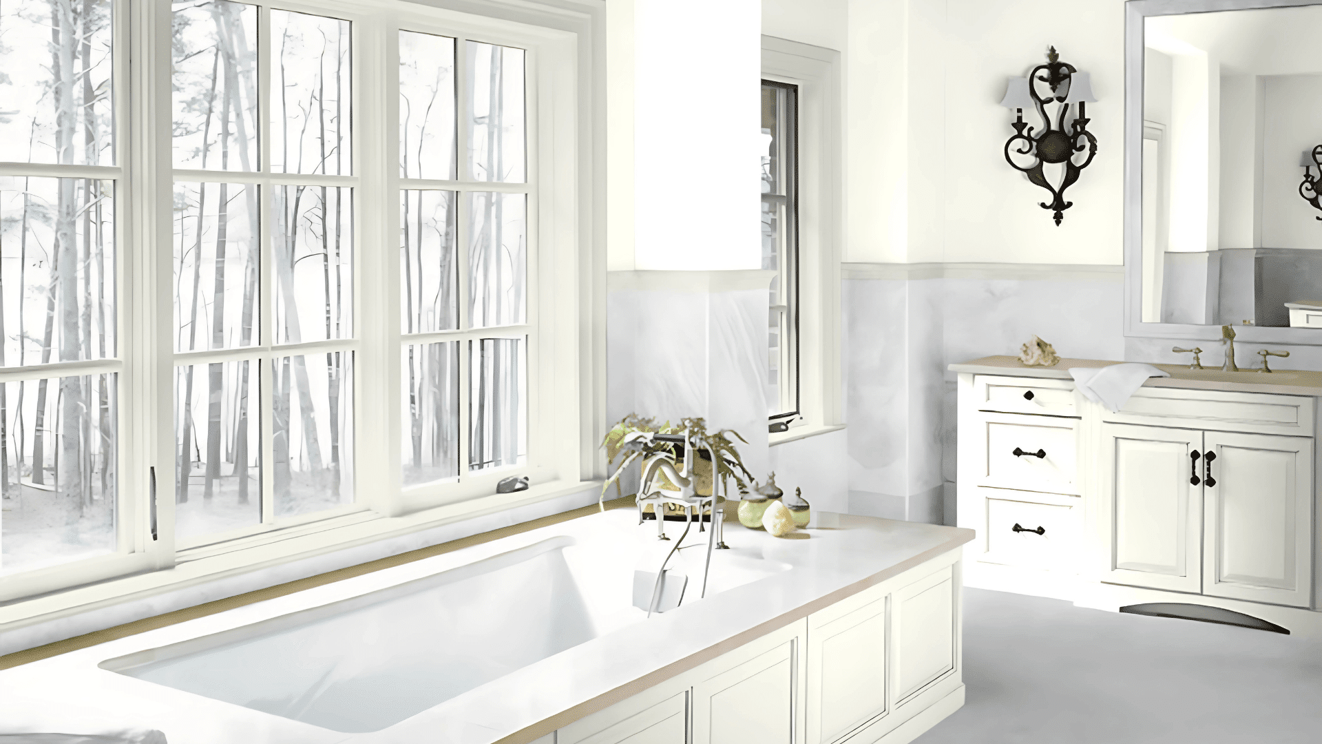
- It turns the bathroom into a calm space, like a nice spa, without feeling too yellow or too plain.
- The light cream tone goes really well with wood, stone, or light tile, keeping the space clean and neat.
- Add gold taps and green plants to give the room color and beauty, while still keeping it fresh and nice to use.
Color Pairings and Combinations for BM Mascarpone
Mascarpone is a gentle, cream-white cheese that looks pretty.
It makes rooms feel happy and bright.
Here are the colors that look good with it.
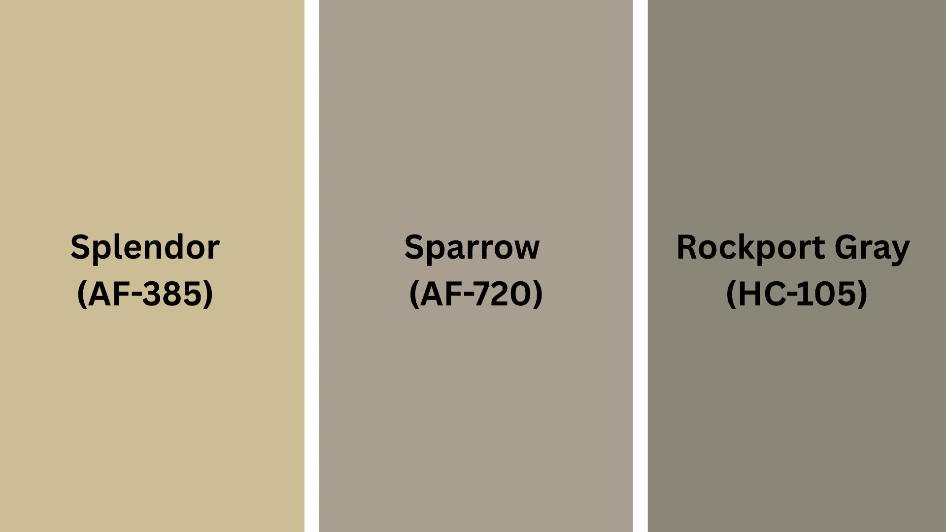
Complementary Trim Colors
The right trim color can make this cream look even better on your walls.
These colors work really well with Mascarpone:
- Splendor (AF-385): A clean, bright white that makes Mascarpone pop.
- Sparrow (AF-720): A rich white that blends with Mascarpone to look nice.
- Rockport Gray (HC-105): A light gray that looks pretty next to Mascarpone.
Try small spots of each color to see which one looks best in your home’s light.
Creating Cohesive Color Schemes
This cream-white looks good with many colors to make your home look like one.
Here are three sets of colors for Mascarpone:
| SCHEME | MAIN WALLS | TRIM / ACCENT | OTHER ROOMS |
|---|---|---|---|
| Monochromatic | Mascarpone (AF-20) | Ivory White (925) | Linen White (912) |
| Warm | Mascarpone (AF-20) | Hawthorne Yellow (HC-4) | Sedona Clay (2174-30) |
| Cool | Mascarpone (AF-20) | Stonington Gray (HC-170) | Wedgewood Gray (HC-146) |
NOTE: Colors look different in different lights. Always try painting on your walls before buying a lot.
Coordinating with Furniture and Decor
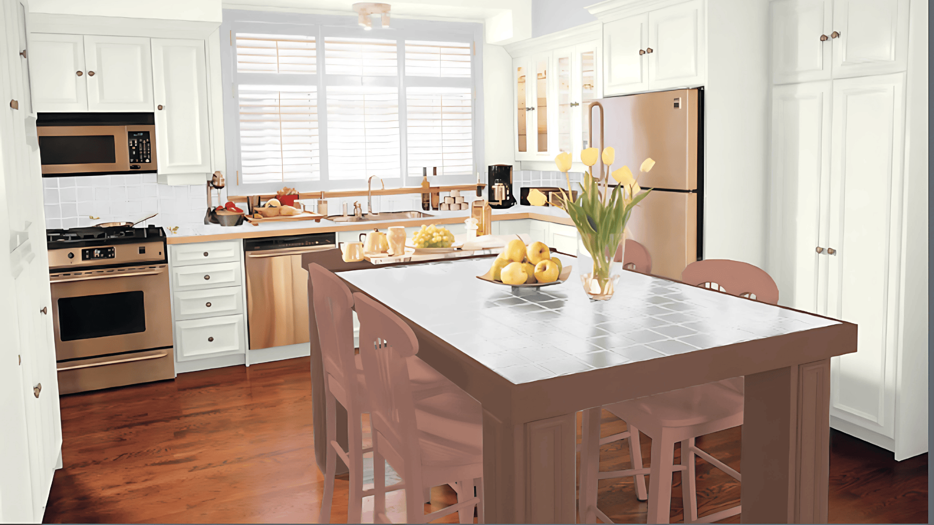
Mascarpone works with almost all furniture and home items.
Its gentle cream makes a good background for your favorite stuff.
1. Wood Colors
Mascarpone looks great with all kinds of wood.
Dark woods like brown-black wood look rich and nice against these cream walls.
Medium woods like red-brown wood add a natural feel while keeping it looking fresh.
Light woods like blonde wood make a bright, clean feel with this creamy white.
2. Metals
Gold and brass look nice and pretty, and work well with the cream hints in Mascarpone.
Black metal makes clean, new-looking lines that pop on these cream walls.
Silver adds a cool look, creating a mix that feels both fresh and stylish.
3. Decor
Pink, blue, and green fabrics look great with Mascarpone.
Natural items like rope, baskets, clay pots, and stone work well with cream walls.
Plants of all types look great against this background, making rooms feel more alive.
Similar Paint Colors: Excellent Alternatives to Mascarpone
All these colors work well in many rooms.
They make spaces feel natural and homey.
Here’s a deeper look at each one:
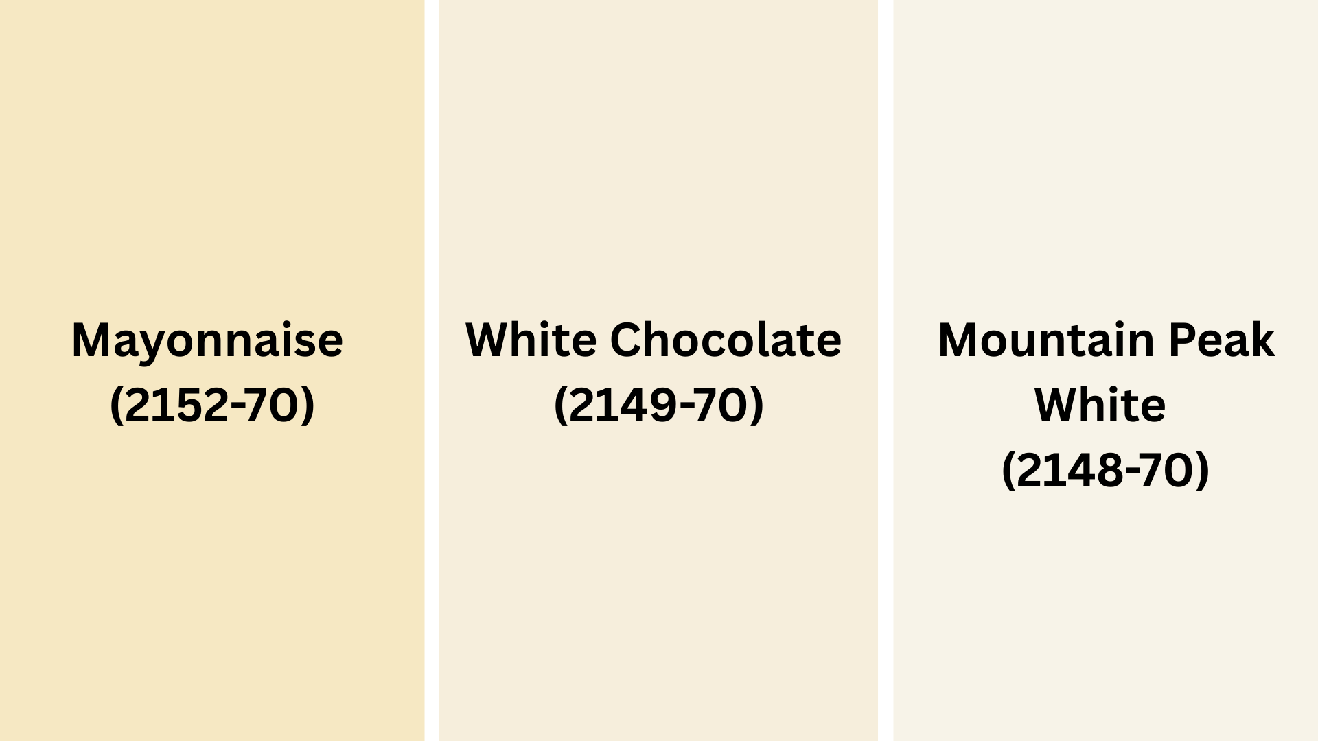
1. Mayonnaise (2152-70)
This color is a bit more yellow with more cream in it.
It has more yellow, but still feels nice.
It is slightly richer than Mascarpone, giving the rooms more depth.
It works well in dining rooms and kitchens.
It looks good with white trim and dark wood floors.
Try this if you want a cream that is richer but still feels clean.
2. White Chocolate (2149-70)
Lighter cream that feels sweet and clean.
Has a friendly feel but with more lightness to it.
The cream is gentler and less yellow than Mascarpone.
Makes rooms feel open and airy.
Good for rooms with lots of natural light to show its pretty color.
Try this if you like Mascarpone but want something a bit lighter.
3. Mountain Peak White (2148-70)
A cleaner cream-white that feels fresh and nice.
Makes a more crisp, neat feel.
Has less yellow depth than Mascarpone.
Good for one wall or rooms where you want a clean feel.
Works well in bathrooms and kitchens.
Pairs nicely with light gray or cream trim.
Looks good with brass or gold light fixtures.
Try this if you like Mascarpone but want something a bit cleaner.
Final Thoughts
Benjamin Moore Mascarpone brings a warm, creamy feeling to any room in your house.
This soft cream-white color works beautifully with Cloud White trim for a fresh, clean appearance.
You can also pair it with natural wood furniture and green plants for a cozy, welcoming feel.
The gentle shade makes spaces feel brighter and more inviting without being overwhelming.
Many homeowners appreciate how this buttery cream color creates a calm backdrop for their daily lives.
If you want paint that feels both classic and comfortable, Mascarpone could be perfect for your next room makeover.
Share your thoughts in the comments below.
Take a stroll through our other paint picks, you might find your next favorite shade!

Alex Guerrero, a graduate with a Fine Arts degree from the Rhode Island School of Design, has been a visionary in the world of color and design for over 15 years. His professional journey began in the heart of the fashion industry in Milan, where he developed an acute sense for color harmonies and trends. Alex joined our team in 2018, offering fresh and innovative perspectives on color utilization in various spaces. Renowned for his ability to blend contemporary trends with timeless elegance. Outside of work, Alex is an accomplished painter and a volunteer art therapist, his artistic talents further enriching his professional insights.