Sherwin-Williams Rainstorm creates a striking first impression with its deep blue-green blend that feels both calming and bold.
This color has gained popularity in recent years as homeowners seek colors that evoke a natural outdoor feel inside their homes.
With an LRV of 5, Rainstorm offers a rich, moody presence that complements both modern and traditional spaces.
The color performs beautifully in rooms where you want to create a cozy feeling without making the space feel too dark.
The paint shows stronger blue tones overall, with green undertones that become more visible under warm lighting.
Many people choose this shade because it works as both a primary wall color and an accent wall option.
Let’s explore why this blue stands out from the others and why it is considered a famous blue!
Understanding Rainstorm’s Basics
Paint colors change throughout the day, depending on the lighting and room direction.
Rainstorm’s blue tones read cool, while its green undertones fall on the warm side of the color wheel.
- During morning hours, natural light brings out the green undertones more clearly.
- Afternoon light shows the most accurate blue color.
- Evening light makes the color appear deeper and more mysterious.
- Warm lights bring out more of its green tones, while cool lights emphasize the blue.
- North-facing rooms make this color appear cooler and more blue.
- South-facing rooms bring out warmer green undertones.
The color looks different on each wall of the same room, depending on how light hits it.
Understanding these changes helps you pick the right finish and lighting for your space.
Color Terminology
Digital color data for Sherwin-Williams Rainstorm as per the official website specifications.
| Attribute | Value |
|---|---|
| Company Code | SW 6230 |
| LRV (Light Reflectance Value) | 5 |
| Color Category | Dark |
| RGB Code | 36, 70, 83 |
| Hex Code | #244653 |
What Do These Numbers Mean?
Here’s what this table means, explained in simple bullet points:
- Company Code: SW 6230 helps identify Rainstorm in Sherwin-Williams’ color catalog for accurate matching and ordering.
- LRV (Light Reflectance Value): 5 means Rainstorm reflects very little light, making it a deep, dramatic shade ideal for bold accents or cozy spaces.
- Color Category: Dark indicates that this hue falls within the darker range, making it suitable for rich, moody aesthetics and statement walls.
- RGB Code: (36, 70, 83) tells us the mix of red, green, and blue used to create the digital version of this color.
- Hex Code: #244653 is the hex code of the color, useful for designers working on digital or branding projects.
Understanding these technical specifications helps ensure accurate color matching and consistency across different paint applications and digital displays.
Psychology of Dark Blue Colors
Dark blue colors, such as Rainstorm, evoke feelings of calm and trust in most people.
Research shows that these colors help reduce stress levels.
- Blue colors help people feel more focused and productive
- Dark blues create cozy, protected feelings in bedrooms
- Blue-green blends connect people to nature and water
- Deep blues work well in spaces meant for relaxation
- These colors help create peaceful environments for sleep and rest
These psychological effects make Rainstorm perfect for bedrooms, home offices, and reading areas where you want to feel calm and focused.
Why Choose This Color?
Rainstorm offers good versatility and fits into several different color palettes.
The color serves as both a statement wall and a full-room color.
You can pair it with many different accent colors and furniture styles.
The deep tone conceals minor wall imperfections more effectively than lighter colors, saving time and money on wall preparation before painting.
The LRV of 5 provides enough depth to create interest without being too dark for most rooms.
Many homeowners choose this color because it feels timeless rather than trendy.
You won’t need to repaint in a few years when styles change.
The color works well with both warm and cool accent colors, giving you flexibility in decorating choices.
1. Key Features
Rainstorm is a blend of blue and green tones with stronger blue characteristics.
The color maintains its character in different lighting conditions without dramatic shifts.
This paint provides consistent coverage and color depth. This paint works well for both interior and exterior applications.
The color hides fingerprints and smudges better than lighter paint colors.
Despite having warm green tones, the paint color still reads as cool overall.
The depth helps create visual interest without needing complex patterns or textures on walls.
These special features make Rainstorm a practical choice for busy households that want both beauty and function.
2. Durability & Maintenance
Regular cleaning is essential in maintaining the appearance and longevity of paint.
Dark colors like Rainstorm need specific care to keep looking fresh.
- Use a soft cloth or sponge with mild soapy water to gently wipe away dust, dirt, and fingerprints.
- Avoid abrasive materials or harsh cleaning agents that can damage the paint finish.
- Save leftover paint from your initial project for touch-ups, ensuring the color and finish match perfectly.
- Minimize direct sunlight exposure using curtains or blinds to prevent fading.
- Apply paint touch-ups using a small brush and feather the edges into the surrounding areas.
Using these steps helps in the longevity of the paint in your home.
3. Texture & Finish Recommendations
Different room types need different paint finishes to perform well and look their best.
Consider how much wear each room gets when choosing finishes.
- Eggshell finish works best in living rooms and bedrooms for easy cleaning
- Satin finish handles high-traffic hallways and family rooms well
- Semi-gloss finish works great in kitchens and bathrooms for moisture resistance
- Flat finish creates the richest color depth, but is only used in low-traffic areas
Higher-traffic areas benefit from washable paint finishes that resist scuffing and marking.
Choose your finish based on the room’s intended use rather than just your appearance preferences.
Room-by-Room Recommendations
Each room in your home has different lighting conditions and usage patterns.
Understanding how Rainstorm works in specific spaces helps you make the best decorating choices.
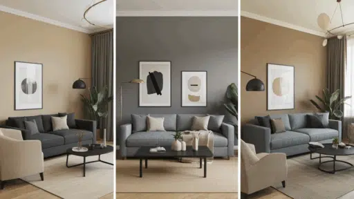
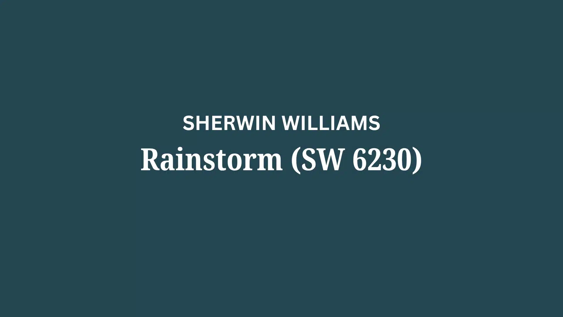
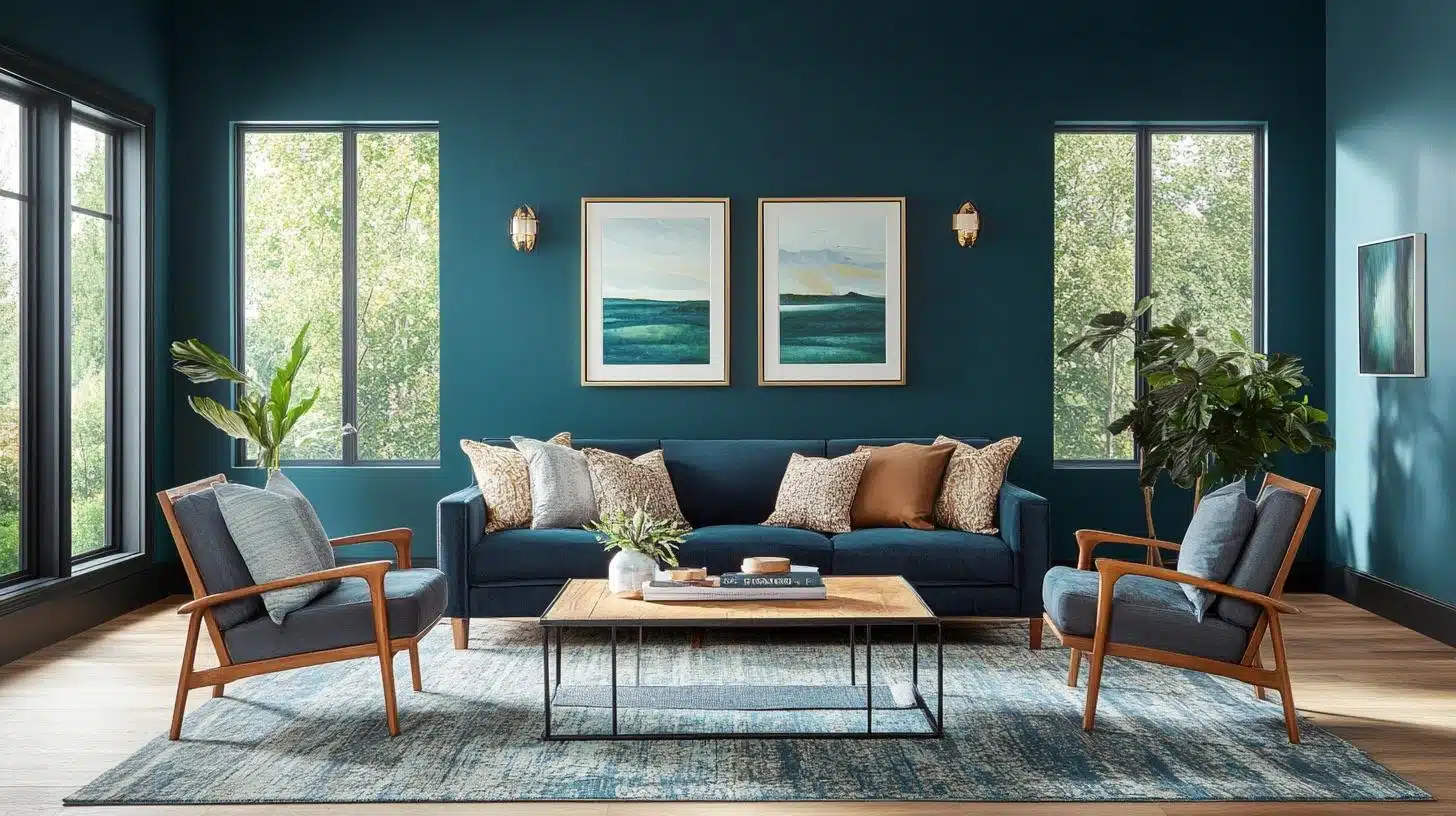
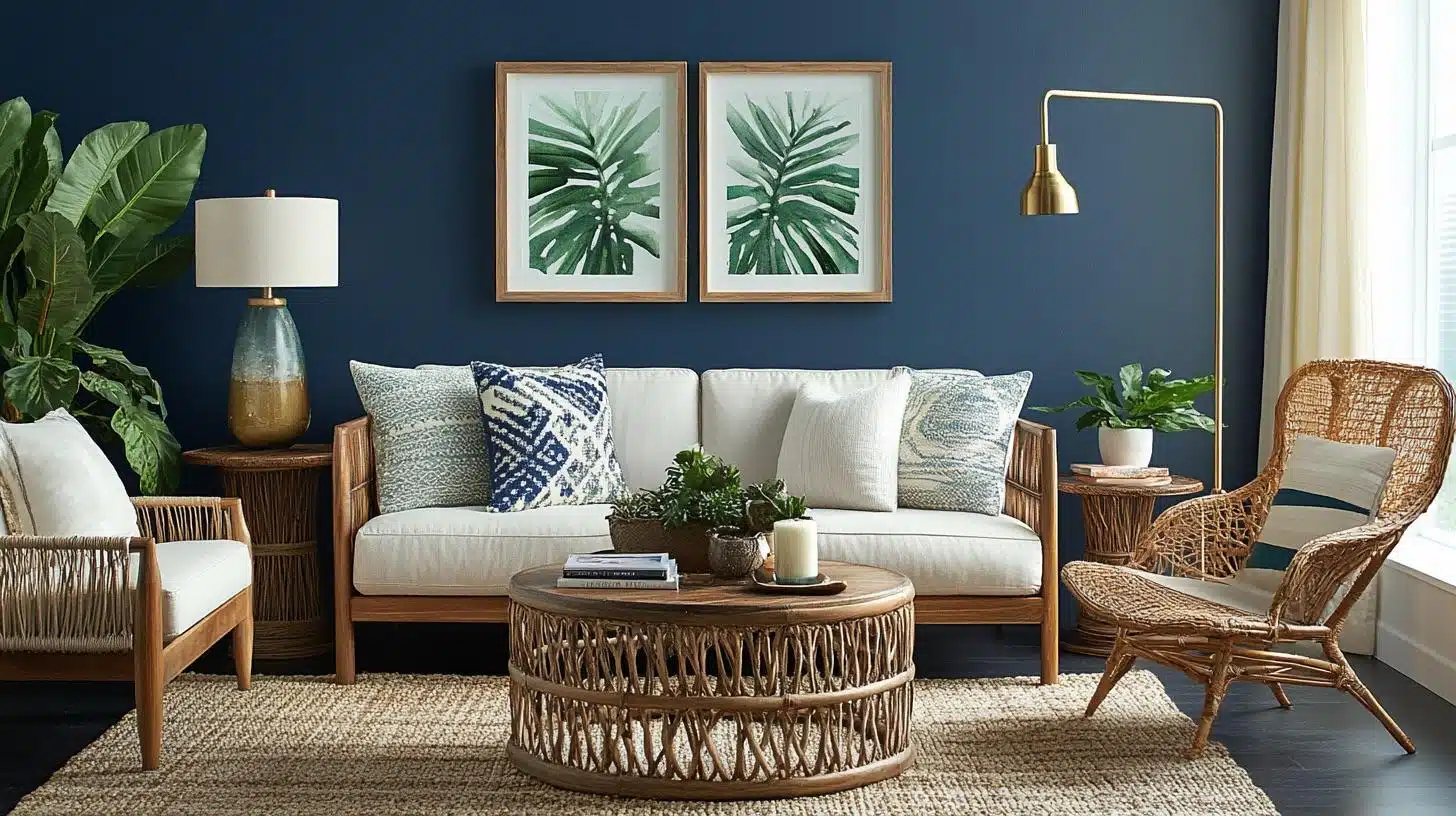
Living Spaces & Open Floor Plans
Dark blue creates a sense of style and completeness, converting spaces into welcoming and luxurious retreats.
Rainstorm works well as an accent wall behind a sofa or fireplace.
The color pairs beautifully with white trim and neutral furniture pieces.
Additional Tips:
- Use plenty of table lamps and floor lamps to balance the dark color
- Add light-colored throw pillows and blankets to create contrast
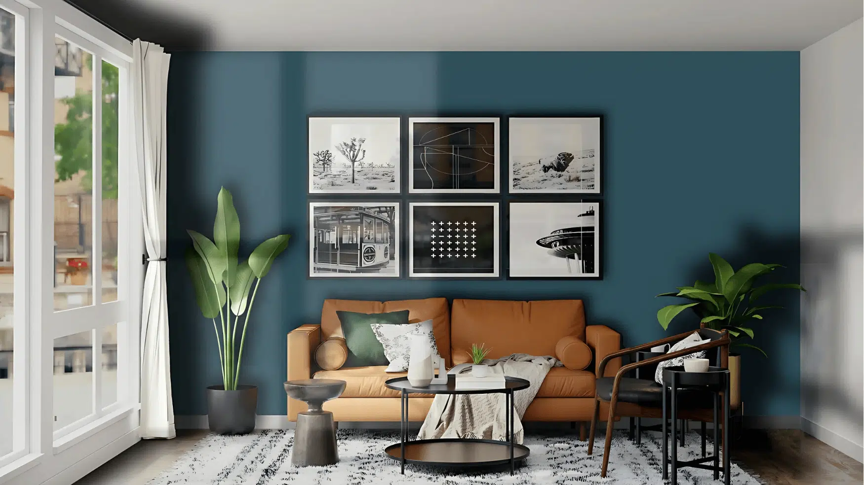
Bedrooms & Relaxation Areas
Deep blue’s dark undertones bring a calming presence that encourages relaxation.
Dark blue paint creates a serene bedroom environment, perfect for those seeking a calm space.
This color helps create the cozy atmosphere that many people desire in their bedrooms.
Additional Tips:
- Pair with white or cream bedding to keep the room from feeling too dark
- Use warm-toned lighting to bring out the green undertones for a softer look
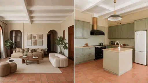
Kitchens & High-Traffic Areas
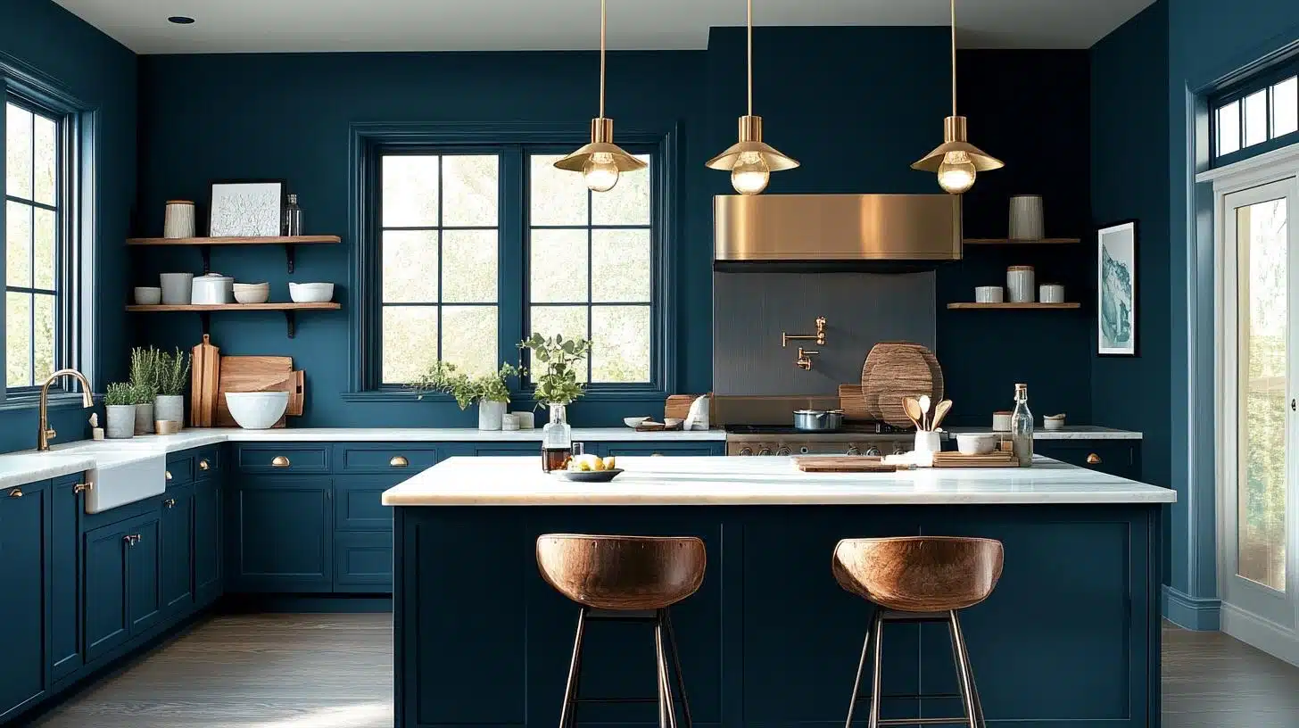
In kitchens, dark blue creates a harmonious balance with stainless steel appliances and sleek finishes.
Rainstorm works well on kitchen islands or as an accent wall behind open shelving.
The color hides cooking stains and everyday wear better than lighter colors.
Additional Tips:
- Use semi-gloss or satin finish for easy cleaning and moisture resistance
- Balance with light-colored countertops and backsplashes
Bathrooms & Spa-like Retreats
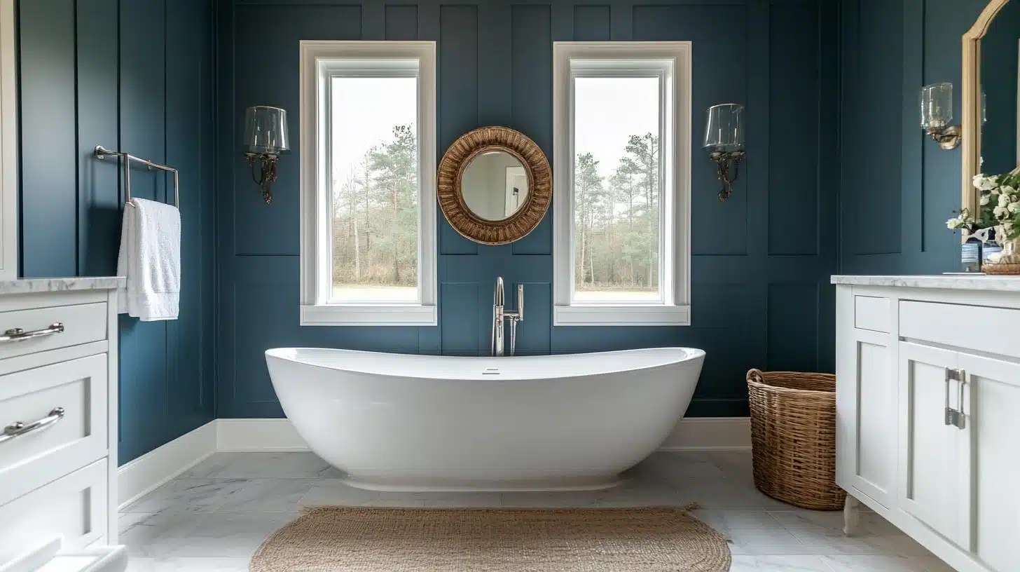
Dark blue enhances the style of bathroom spaces and pairs well with soft lighting and luxurious textures.
Frosted Emerald has a minty and refreshing look that pairs perfectly with Rainstorm in bathrooms.
The color creates a spa-like feeling that many homeowners want.
Additional Tips:
- Use good ventilation to prevent moisture problems with dark colors
- Add light-colored towels and accessories to brighten the space
Color Pairings & Combinations
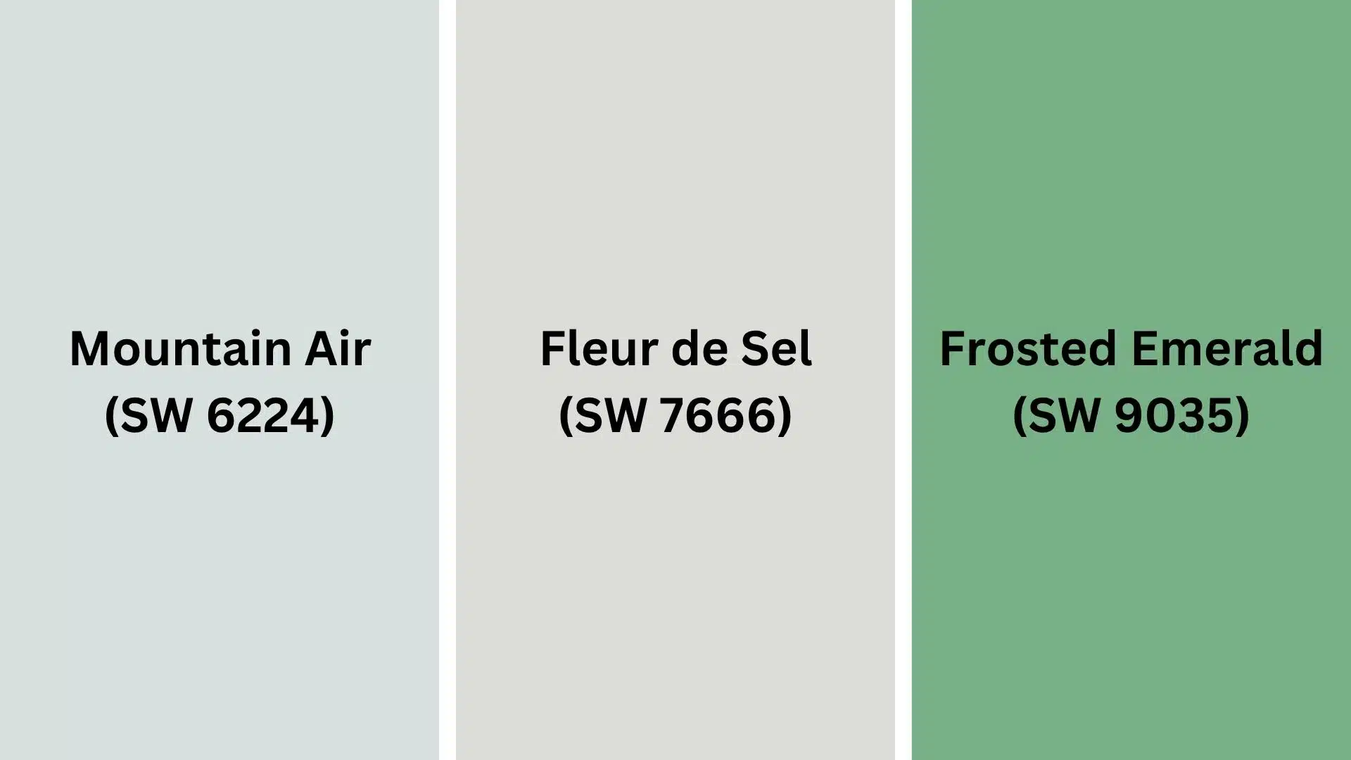
Several paint colors coordinate well with Sherwin-Williams Rainstorm to create beautiful color schemes.
- Mountain Air (SW 6224): A soft, airy blue that provides a calming contrast to the intensity of Rainstorm. This bright paint color blends green and blue for a calm, pleasing vibe.
- Fleur de Sel (SW 7666): A neutral white that can balance the deep hues of Rainstorm and make it stand out. This cool off-white has hints of green undertones.
- Frosted Emerald (SW 9035): This mid-toned, saturated green appears brilliant and beautiful, with a refreshing, minty hue.
These coordinating colors help create balanced and pleasing color schemes that work well in any home setting.
Creating Cohesive Color Schemes
Building successful color schemes with Rainstorm requires understanding how different colors work together.
You can create monochromatic schemes using different shades of blue and green.
Complementary schemes pair Rainstorm with warm oranges and corals for dramatic contrast.
| SCHEME | MAIN WALLS / AREAS | TRIM / ACCENT / CEILINGS | OTHER ROOMS / ACCENTS |
|---|---|---|---|
| Mono | Rainstorm (SW 6230) | Snowbound (SW 7004) | Distance (SW 6243) |
| Warm | Rainstorm (SW 6230) | Alabaster (SW 7008) | Cavern Clay (SW 7701) |
| Cool | Rainstorm (SW 6230) | Extra White (SW 7006) | Sea Salt (SW 6204) |
Analogous schemes use colors next to blue-green on the color wheel for harmony.
Triadic schemes add a third color for more visual interest.
The key is balancing the intensity of the Rainstorm with lighter or brighter accent colors.
Coordinating with Furniture & Decor
The right furniture and decorative pieces can make Rainstorm look even better in your space.
Consider how different materials and colors interact with this deep blue-green shade.
1. Wood Tones
Natural wood finishes complement Rainstorm’s connection to nature and outdoor feelings.
Lighter woods, such as pine and oak, create a nice contrast against the dark wall color.
- Light oak and pine woods create a bright contrast
- Walnut and cherry woods add rich warmth
- Painted white furniture keeps rooms from feeling too dark
- Natural bamboo and rattan add texture and interest
- Avoid very dark woods that might make rooms feel heavy
Light and medium wood tones work better with this color than very dark woods.
The contrast helps both the wood and paint color look their best.
2. Metals
Metal finishes can either warm up or cool down, depending on your choice.
Brass and gold metals bring out the green undertones and add warmth.
- Brass and gold hardware bring out green undertones
- Silver and chrome emphasize the blue tones
- Black metal creates a dramatic contrast
- Copper adds warm orange tones for balance
- Matte black fixtures create modern looks
Choose metals based on whether you want to emphasize the blue or green aspects of the color.
3. Decor
Decorative accessories help tie together your color scheme and add personality to rooms painted in Rainstorm.
Light colors create the most pleasing contrast.
- White and cream accessories brighten dark walls
- Coral and peach colors create complementary contrast
- Natural textures like jute and linen add softness
- Metallic accents reflect light around the room
- Plants add life and connect to the color’s natural feeling
Keep most accessories lighter than the wall color to maintain good visual balance in your rooms.
Similar Colors & Alternatives
If Rainstorm doesn’t feel quite right for your space, these similar colors might work better for your needs.
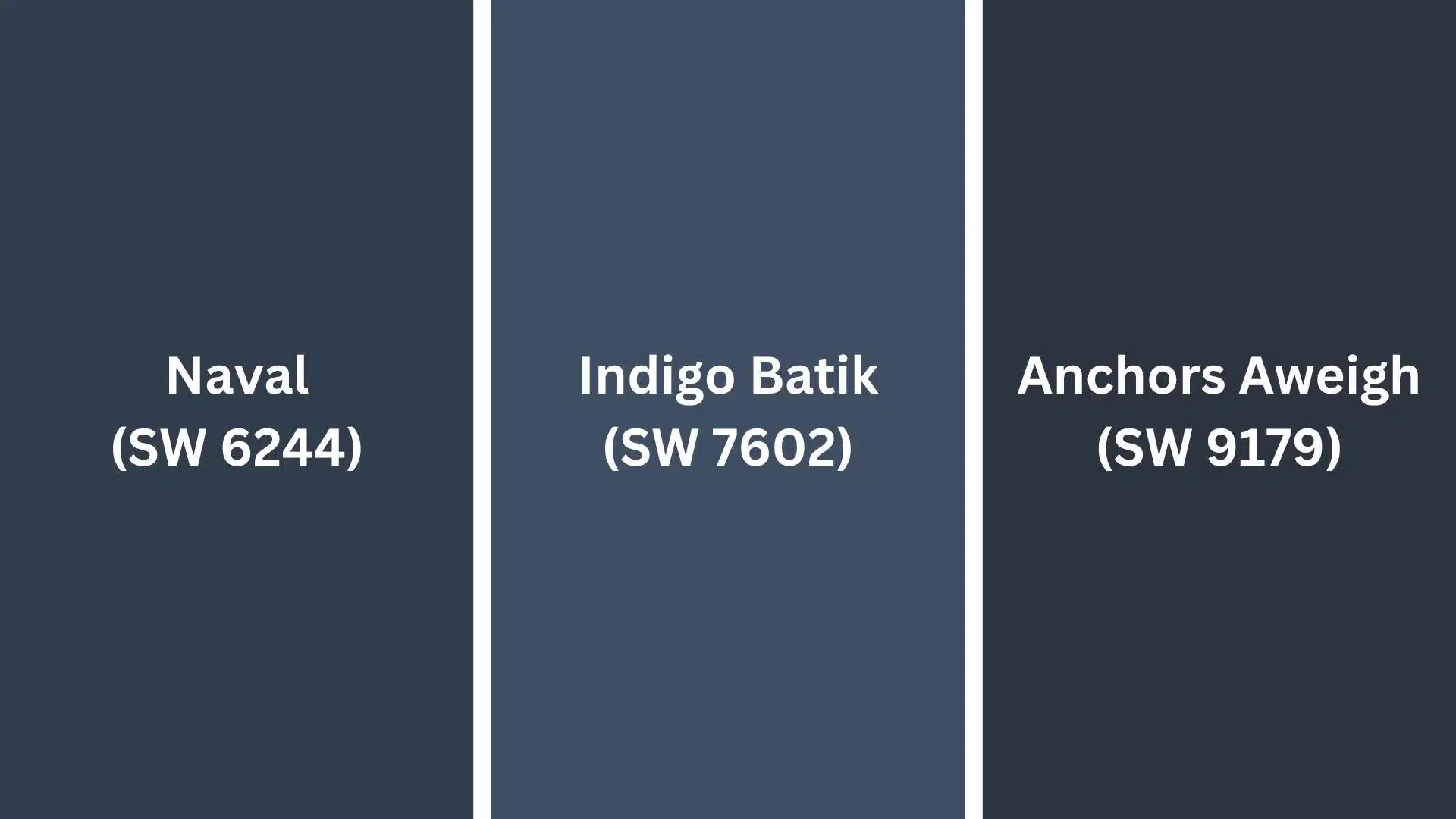
- Naval (SW 6244): A deeper, more traditional navy blue without green undertones. This color works well in formal spaces and pairs with classic decor styles.
- Indigo Batik (SW 7602): A rich blue-purple with more dramatic undertones. This option works well when you want something bolder than Rainstorm.
- Anchors Aweigh (SW 9179): A slightly lighter blue-green that offers similar character with more brightness. Good choice for smaller rooms or north-facing spaces.
Each of these alternatives offers different benefits depending on your specific room conditions and personal style preferences.
Final Thoughts
Rainstorm demonstrates how blue and green tones can work together to create a versatile paint color that suits various decorating styles.
The color performs well in various lighting conditions while maintaining its character throughout the day.
Understanding how to pair this color with appropriate finishes, furniture, and accessories makes the difference between a good paint job and a great one.
With its balanced blue-green character, Rainstorm offers consistent results that many homeowners have loved for years.
The color works exceptionally well when you want to create calm, relaxing spaces that still feel interesting and current.
Whether you use it on all walls or as an accent, proper planning and coordination help this color look its absolute best in any room of your home.
If you’re interested in more color review content, feel free to click here and explore other blogs you might enjoy.
Frequently Asked Questions (FAQs)
Here are some commonly asked questions about this color.
Does Rainstorm Have Green Undertones?
Yes, Rainstorm has subtle green undertones that can appear in warmer lighting, adding depth and richness to the overall blue base.
Can Rainstorm Be Used for Exteriors?
Absolutely. Its bold, moody character makes it a striking choice for front doors, siding, shutters, or exterior accents against stone or brick.
What Finish Is Best for Rainstorm on Walls?
A satin or eggshell finish works well for interior walls, offering a smooth look with light reflectivity that enhances the richness of the colors.

Alex Guerrero, a graduate with a Fine Arts degree from the Rhode Island School of Design, has been a visionary in the world of color and design for over 15 years. His professional journey began in the heart of the fashion industry in Milan, where he developed an acute sense for color harmonies and trends. Alex joined our team in 2018, offering fresh and innovative perspectives on color utilization in various spaces. Renowned for his ability to blend contemporary trends with timeless elegance. Outside of work, Alex is an accomplished painter and a volunteer art therapist, his artistic talents further enriching his professional insights.