
Sherwin-Williams Natural Linen (SW 9109) is a soft, warm beige that works well in almost any room. It has just a hint of pink and peach, which makes it feel cozy without being too colorful.
If you’re looking for a neutral paint that isn’t plain or dull, this one’s a great choice.
But even the best wall color needs the right colors around it to really stand out. That’s where coordinating colors come in. The trim, furniture, or nearby walls can either bring the space together or make it feel off.
In this blog, I’ll recommend the best colors to pair with Natural Linen and provide helpful tips on where and how to use them.
If you want a calm and relaxing vibe or something bold and modern, these color ideas can help you get the look you like.
Understanding Natural Linen (SW 9109)

Sherwin-Williams Natural Linen (SW 9109) is a warm beige paint color with soft pink undertones that give it a cozy, welcoming feel.
It has a Light Reflectance Value (LRV) of 66, which means it reflects a good amount of light and helps rooms feel open and bright without being too washed out.
This makes it a great choice for both small and large spaces.
Natural Linen is a linen option if you want something neutral but warmer than plain white or cool gray. It adds just enough color to make a room feel soft and comfortable without drawing too much attention.
You can use it in just about any area of your home: living rooms, bedrooms, kitchens, bathrooms, and even on the exterior. It pairs beautifully with wood tones, soft whites, and earthy colors.
Natural Linen also works well with popular styles like farmhouse, coastal, traditional, and even flexible spaces, making it one of the most adaptable neutrals available.
Top Complementary Colors for Natural Linen
1. Sherwin-Williams Sea Salt (SW 6204)

Sea Salt is a soft green-gray color that feels fresh and peaceful. It’s a great match for Natural Linen because it balances out the warm undertones with a cool touch.
This combo works perfectly in bathrooms, bedrooms, or any space where you want a calm and relaxing feel. Sea Salt also complements coastal, farmhouse, or light wood décor.
If you’re going for a clean but cozy look, pairing Sea Salt with Natural Linen is a practical and simple way to get there.
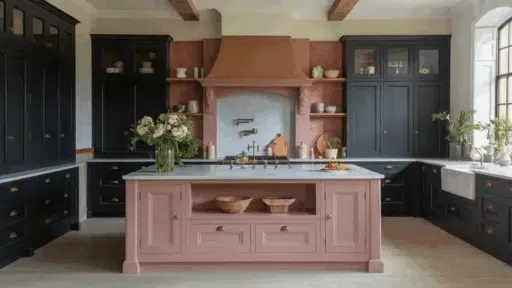
2. Sherwin-Williams Urbane Bronze (SW 7048)

Urbane Bronze is a deep brown-gray shade that brings bold contrast and a grounded feel. It pairs beautifully with the soft warmth of Natural Linen, creating a rich, cozy atmosphere.
This color is great for accent walls, built-ins, or kitchen cabinets. It adds depth to a room without going too dark. It also works well with wood tones and brass accents.
Together, Urbane Bronze and Natural Linen make a space feel balanced, stylish, and full of personality.
3. Sherwin-Williams Pure White (SW 7005)

Pure White is a clean, neutral white that brightens up any space. When used with Natural Linen, it highlights the warmth of the beige walls while keeping everything looking fresh and tidy.
This combo is perfect for trim, ceilings, doors, or even furniture. It creates a soft contrast that feels classic and calm.
If you want a timeless look that feels light and open, Pure White is one of the most dependable and trusted pairings to go with Natural Linen.
4. Sherwin-Williams Naval (SW 6244)

Naval is a deep navy blue that adds bold contrast to Natural Linen’s soft beige tone.
This color creates a rich, dramatic tone while remaining polished and calm. It works especially well on accent walls, built-ins, or statement furniture pieces.
You can pair it with gold, leather, or warm wood for a refined, high-end look. The mix of navy and warm beige feels cozy and up-to-date.
Use Naval if you want a standout color that still pairs well with natural tones.
5. Sherwin-Williams Dried Thyme (SW 6186)

Dried Thyme is a soft olive green with a grounded, earthy tone. When paired with Natural Linen, it creates a warm, natural look that feels relaxed and inviting.
This combo looks great in living rooms, kitchens, or entryways with wood or rattan accents. It also works well in farmhouse or rustic-style spaces.
Dried Thyme adds just enough color without being too strong. If you like rooms that feel calm and in touch with nature, this is a practical and attractive pairing to try.
6. Sherwin-Williams Accessible Beige (SW 7036)

Accessible Beige is a beige neutral that’s just a little deeper than Natural Linen. These two colors work beautifully together if you want a soft, layered look that’s simple and relaxed.
Use Accessible Beige in nearby rooms or on furniture for a smooth flow throughout your home. It’s perfect for open floor plans or connecting spaces where you want everything to feel consistent but not all the same.
If you love neutral palettes that don’t feel cold, this is a strong combo.
7. Sherwin-Williams Gris Morado (SW 9156)

Gris Morado is a muted purple-gray that adds a soft touch of color and charm. It works well with Natural Linen because the warm beige helps balance the cool gray-purple, creating a nice balance.
This combo looks great in bedrooms, reading nooks, or even a small accent wall. It’s a simple way to add personality without going too bold.
If you want a cozy space that feels a little different from the usual neutrals, Gris Morado brings just the right amount of appeal.
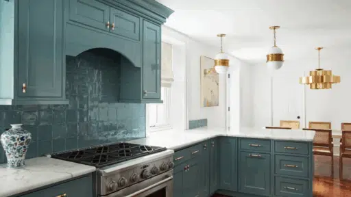
8. Sherwin-Williams Austere Gray (SW 6184)

Austere Gray is a cool green-gray that adds a quiet, calming tone to any space.
When paired with Natural Linen, it creates a peaceful, spa-like effect that’s perfect for bedrooms or bathrooms. This soft contrast helps the room feel both clean and warm.
It’s a good option if you want your walls to have some color without standing out too much.
Austere Gray works really well with white trim, natural wood, and light fabrics. It’s a dependable choice for a relaxing, clean look.
9. Sherwin-Williams Alabaster (SW 7008)

Alabaster is a creamy white that blends softly with Natural Linen for a warm, easy look.
Alabaster is a great option for trim, ceilings, or cabinets if you want everything to flow together without a sharp contrast. It adds light to a room but still feels comfortable.
It pairs well with other warm tones, making it a solid pick for welcoming, homey spaces.
If you like a soft and natural look that feels clean without being bright white, this combination is practical and consistent.
10. Sherwin-Williams Studio Clay (SW 9172)

Studio Clay is a warm taupe with earthy undertones that pair perfectly with Natural Linen’s soft beige tone. It adds depth and richness to your walls without making the space feel too dark.
Use it for feature walls, hallway accents, or furniture to give your space a cozy, grounded feel. This color combo works great in rooms with natural wood, leather, or warm metal finishes.
If you want something warm and welcoming with a little more depth, Studio Clay is a great match.
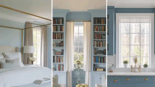
11. Sherwin-Williams Moody Blue (SW 6221)

Moody Blue is a cool blue-gray that brings a calm, vintage charm to your space. When you pair it with Natural Linen, the contrast is soft and soothing.
It works well in bedrooms, bathrooms, or any spot where you want a peaceful, relaxing tone. This pairing looks especially nice with white trim and soft fabrics.
Moody Blue adds color without being too bold, making it a great choice if you want something a little different but still easy to enjoy.
Styling Tips with Natural Linen
Here are some easy styling tips I use to create a space that feels just right with Natural Linen shades. These simple ideas can help you make the most of its soft, versatile look.
Pairing with Textures and Materials
- Pair with Soft, Natural Textures: Use warm wood tones, brass hardware, and light fabrics like cotton or linen to create a cozy, welcoming vibe.
- Add Earthy Materials: Rattan, wicker, and leather bring out the color’s natural warmth and help the space feel grounded and relaxed.
- Use in Cozy Spaces: In living rooms or bedrooms, natural elements like these enhance the soft, inviting feel of Natural Linen.
Lighting Considerations
- Changes with Light Levels: In low-light rooms, Natural Linen looks like a warm beige. In bright spaces, its soft peach or pink undertones become more visible.
- Works with Any Lighting: This shade looks great under both warm and cool bulbs, making it a flexible, easy-to-live-with color in any room.
Creating Different Moods
- For a Light and Airy Feel: Pair it with soft greens, light blues, or crisp whites to create a calm, open atmosphere.
- For a Warm and Cozy Look: Use richer tones like taupe, bronze, or navy blue to make the space feel more intimate.
- For a Modern, Balanced Style: Mix in mid-tone grays and other earthy shades for a more up-to-date and grounded look.
- Versatile for Any Style: Natural Linen works well with relaxed, bold, or neutral interiors, making it easy to match your personal taste.
Conclusion
Sherwin-Williams Natural Linen is a warm, soft neutral that works well in just about any room.
Its light beige tone with a hint of peach makes it easy to pair with other colors and styles.
If you like cool tones, bold accents, or earthy neutrals, there’s a complementary color that perfectly complements them. From calm greens and soft blues to deep navy or warm taupe, the options are flexible and stylish.
Natural Linen also looks great with wood, metal, and cozy textures, making it simple to decorate around. It changes a little in different lighting, but that adds to its charm.
If you’re looking for a neutral paint color that isn’t plain or boring, this one is a great choice. Try out a few pairings and see how it brings warmth and balance to your space.

Alex Guerrero, a graduate with a Fine Arts degree from the Rhode Island School of Design, has been a visionary in the world of color and design for over 15 years. His professional journey began in the heart of the fashion industry in Milan, where he developed an acute sense for color harmonies and trends. Alex joined our team in 2018, offering fresh and innovative perspectives on color utilization in various spaces. Renowned for his ability to blend contemporary trends with timeless elegance. Outside of work, Alex is an accomplished painter and a volunteer art therapist, his artistic talents further enriching his professional insights.