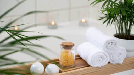
Creating a peaceful bedroom starts with the right paint color. Color influences how a space feels the moment you enter it, affecting mood, relaxation, and even sleep quality.
Calm bedroom paint colors work by reducing visual noise, softening contrast, and reflecting light in a gentle way.
Instead of bold or highly saturated tones, these shades rely on muted undertones, warm neutrals, and softened hues inspired by nature.
Whether you prefer airy whites, muted greens, or cozy greige tones, choosing a calming color helps the bedroom feel grounded, balanced, and intentionally designed for rest rather than stimulation.
How Paint Color Affects Bedroom Atmosphere
Paint color directly shapes how a bedroom feels emotionally and physically.
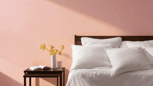
Warm tones (soft beige, warm white, gentle taupe) create comfort and coziness, making large or cool rooms feel more inviting.
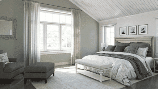
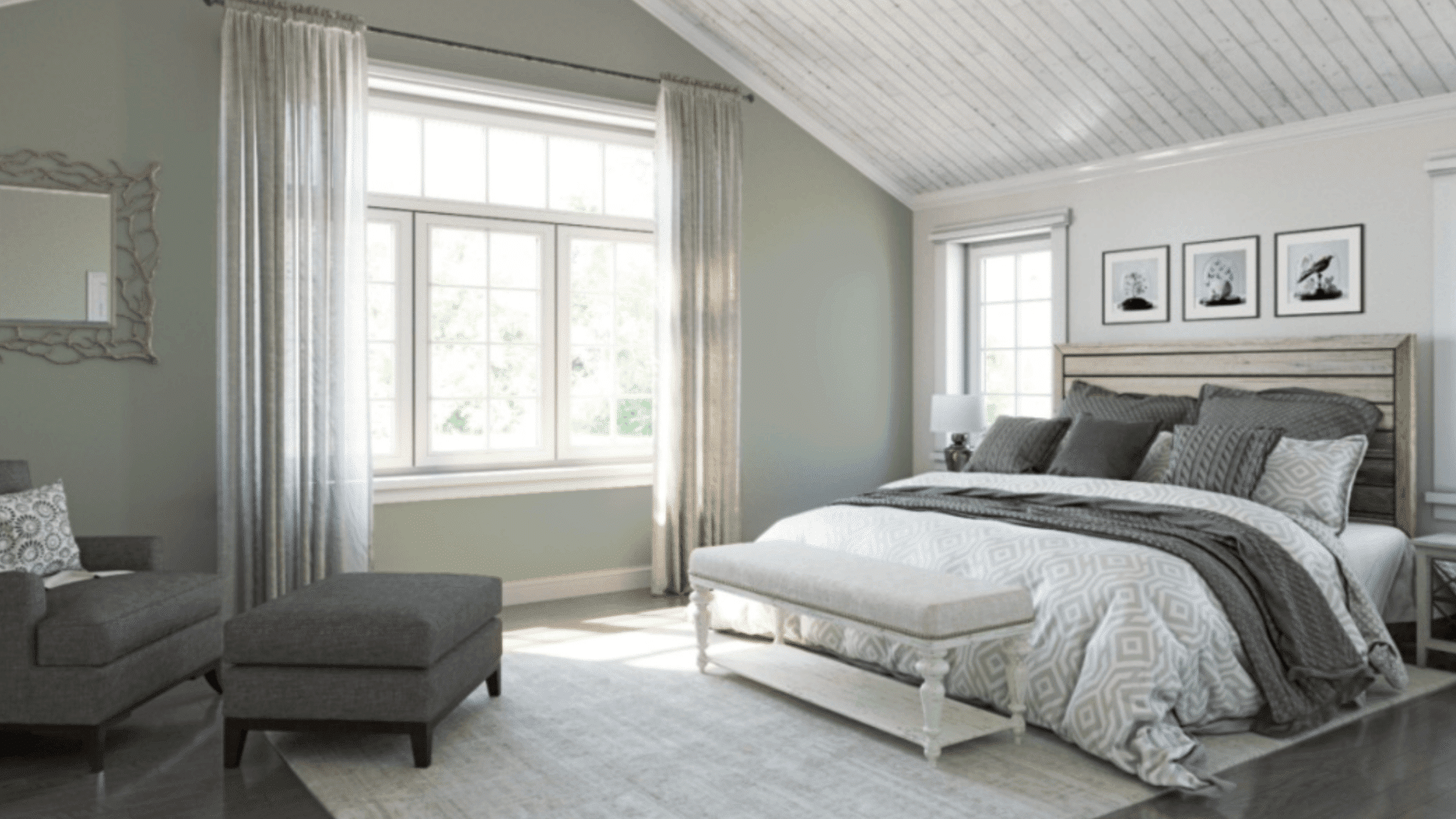
Cool tones (muted blues, greens, blue-grays) promote calm and mental rest, which supports sleep.
Muted colors are more calming than saturated ones because they reduce visual stimulation. Bright or highly pigmented shades keep the brain alert, while softened tones help the space feel quieter and more balanced.
Lighting also changes how paint behaves. Natural light reveals undertones clearly, while artificial light (warm or cool bulbs) can shift colors warmer or grayer. Always test paint in the room’s actual lighting before committing.
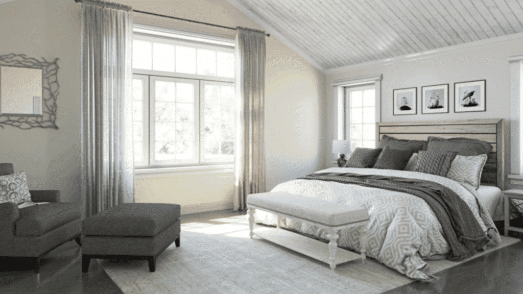
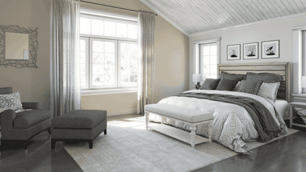
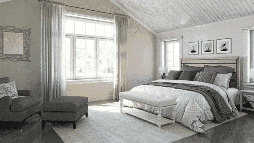
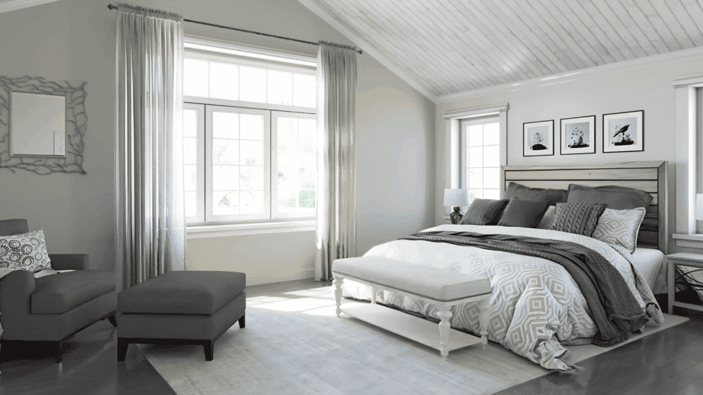
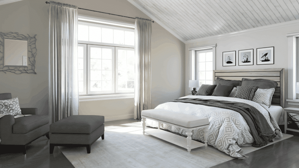
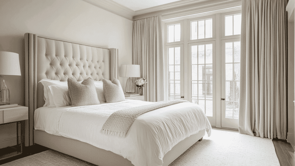
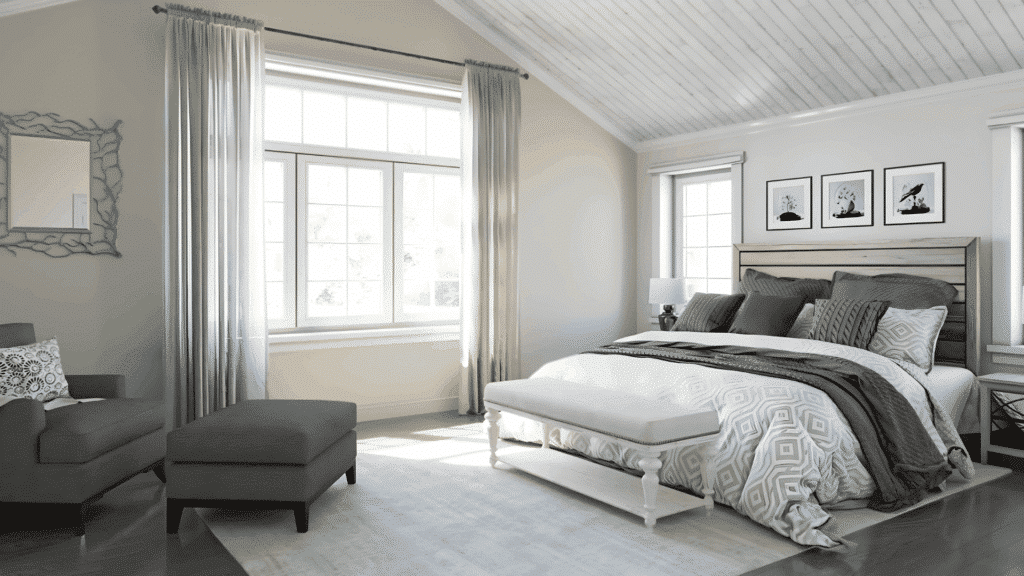
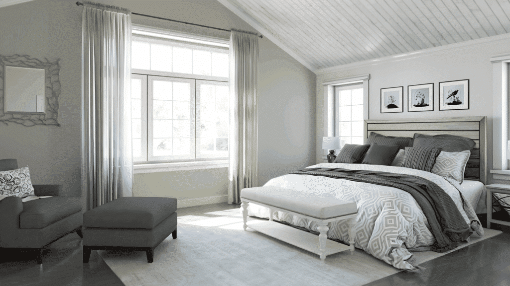
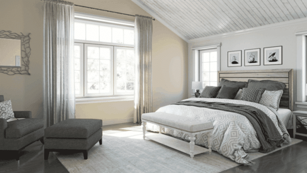
Peaceful & Calm Bedroom Paint Color Ideas
Soft, muted paint colors help bedrooms feel quieter and more restorative. These shades are drawn from trusted collections by Sherwin-Williams, Benjamin Moore, and HGTV Home, chosen for their calming undertones and proven performance in real bedrooms.
1. Sherwin-Williams Alabaster (SW 7008)
Alabaster is a warm, soft white that removes harsh contrast and creates a gentle backdrop for rest. It reflects light without feeling stark, making bedrooms feel open yet cozy. This color works especially well in rooms with limited natural light.
Palette: Alabaster + light oak wood + soft linen + warm brass
2. Benjamin Moore White Dove (OC-17)
White Dove balances warmth and neutrality, avoiding the clinical feel of pure white. It creates a calm envelope that pairs easily with layered bedding and subtle textures. Ideal for bedrooms aiming for a timeless, serene look.
Palette: White Dove + greige textiles + pale wood + cream accents
3. Sherwin-Williams Accessible Beige (SW 7036)
Accessible Beige is a soft greige that adds warmth without heaviness. It grounds the bedroom while staying visually light, making it suitable for both modern and traditional spaces. This color supports relaxation without feeling flat.
Palette: Accessible Beige + ivory + matte black accents + warm wood
4. Benjamin Moore Edgecomb Gray (HC-173)
Edgecomb Gray is a light greige with subtle warmth that adapts well to changing light. It creates a peaceful, cocoon-like feeling without darkening the room. Works well for bedrooms with both cool and warm furnishings.
Palette: Edgecomb Gray + soft white + natural linen + light maple
5. Sherwin-Williams Agreeable Gray (SW 7029)
Agreeable Gray is calm, neutral, and highly adaptable. It avoids strong undertones, which keeps bedrooms feeling balanced and uncluttered. This shade is ideal for anyone seeking a safe, soothing color that pairs with almost anything.
Palette: Agreeable Gray + crisp white + muted blue + brushed nickel
6. Benjamin Moore Classic Gray (OC-23)
Classic Gray is a barely-there neutral that reads soft and airy. It brightens bedrooms while maintaining warmth, making it ideal for small or low-light spaces. The result is calm without feeling cold or sterile.
Palette: Classic Gray + white bedding + pale wood + soft taupe
7. Sherwin-Williams Sea Salt (SW 6204)
Sea Salt is a muted blue-green that instantly feels restful. Its gray undertone keeps it subtle rather than colorful, helping bedrooms feel fresh but calm. Works especially well in coastal or light-filled spaces.
Palette: Sea Salt + white trim + driftwood tones + soft blue accents
8. Benjamin Moore Palladian Blue (HC-144)
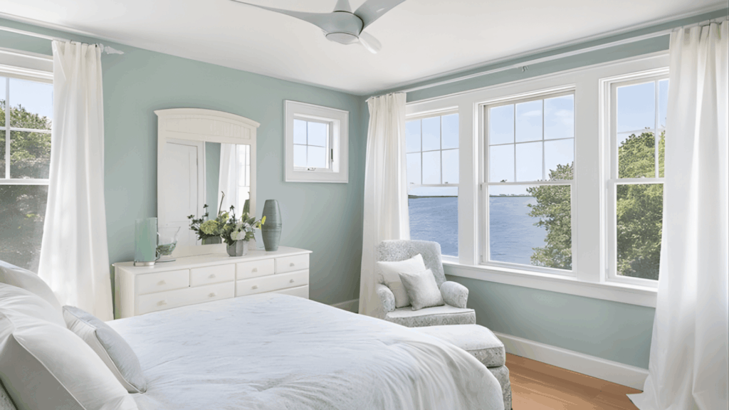
Palladian Blue blends soft blue and green with a gray base. It feels light and tranquil without overwhelming the space. This shade supports relaxation while still adding gentle color to neutral bedrooms.
Palette: Palladian Blue + cream + weathered wood + brushed brass
9. Sherwin-Williams Rainwashed (SW 6211)
Rainwashed has a quiet, spa-like quality that promotes relaxation. Its subtle blue-green tone feels clean and calming, especially in bedrooms designed for minimalism and simplicity. It pairs well with natural materials.
Palette: Rainwashed + soft white + bamboo + pale gray textiles
10. Benjamin Moore Healing Aloe (1562)
Healing Aloe is a soft, airy green with gray undertones. It feels fresh without being vibrant, helping bedrooms feel balanced and calm. This color works beautifully in spaces meant to feel restorative and uncluttered.
Palette: Healing Aloe + ivory + light wood + woven textures
11. Sherwin-Williams Silver Strand (SW 7057)
Silver Strand blends gray, blue, and green into a subtle, cool-neutral shade. It creates a quiet atmosphere without feeling cold. Ideal for bedrooms with modern or minimalist design.
Palette: Silver Strand + white + charcoal accents + cool wood
12. Benjamin Moore Gray Owl (OC-52)
Gray Owl is a light gray with soft green undertones that prevent it from feeling flat. It adapts well to daylight and artificial light, keeping bedrooms calm at all hours.
Palette: Gray Owl + crisp white + pale oak + soft green accents
13. Sherwin-Williams Repose Gray (SW 7015)
Repose Gray offers a gentle balance between warm and cool. It feels soothing and understated, helping bedrooms stay visually calm. This shade works well for layered, neutral interiors.
Palette: Repose Gray + off-white + muted blush + natural wood
14. Benjamin Moore Balboa Mist (OC-27)
Balboa Mist is a light greige that feels soft and polished. It adds warmth while maintaining a relaxed tone. This color works well in bedrooms with classic or transitional styling.
Palette: Balboa Mist + warm white + linen textures + light walnut
15. Sherwin-Williams Drift of Mist (SW 9166)
Drift of Mist is a pale neutral with subtle warmth that keeps bedrooms feeling light and calm. It works well as a backdrop for textured bedding and layered neutrals.
Palette: Drift of Mist + cream + soft gray + natural fibers
16. Benjamin Moore Silver Satin (OC-26)
Silver Satin is a refined off-white with gentle warmth. It brightens bedrooms while remaining soft on the eyes. Ideal for spaces where calm simplicity is the goal.
Palette: Silver Satin + warm white + light gray + satin metals
17. Sherwin-Williams Comfort Gray (SW 6205)
Comfort Gray leans toward a muted blue-green with gray undertones. It feels grounded and soothing, making it a strong choice for bedrooms designed for rest and quiet.
Palette: Comfort Gray + ivory + aged wood + soft blue accents
18. Benjamin Moore Quiet Moments (1563)
Quiet Moments is a soft, spa-inspired blue-green that promotes relaxation. Its gentle tone works well in bedrooms meant to feel peaceful and uncluttered.
Palette: Quiet Moments + white + pale stone + light wood
19. Sherwin-Williams Natural Linen (SW 9109)
Natural Linen is a warm neutral that adds comfort without heaviness. It creates a cozy, calm atmosphere ideal for bedrooms with layered textiles and soft lighting.
Palette: Natural Linen + cream + warm taupe + woven textures
20. Benjamin Moore Pale Oak (OC-20)
Pale Oak is a light greige with warm undertones that feels inviting and soft. It supports a calm bedroom environment without leaning too beige or gray.
Palette: Pale Oak + white + soft blush + light wood
21. Sherwin-Williams Shoji White (SW 7042)
Shoji White is a warm off-white that creates a serene backdrop. It softens contrasts and pairs beautifully with natural materials, helping bedrooms feel calm and cohesive.
Palette: Shoji White + warm beige + oak + linen
22. Benjamin Moore Nimbus Gray (2131-50)
Nimbus Gray is a soft mid-tone gray with subtle depth. It adds calm structure to bedrooms without feeling heavy, especially effective in larger rooms.
Palette: Nimbus Gray + white + charcoal + light wood
23. Sherwin-Williams Oyster Bay (SW 6206)
Oyster Bay is a muted blue-green that feels grounded and relaxing. It works well in bedrooms that aim for a cozy yet fresh atmosphere.
Palette: Oyster Bay + ivory + warm wood + soft gray
24. Benjamin Moore Soft Chamois (OC-13)
Soft Chamois is a warm neutral that feels gentle and inviting. It creates a peaceful base for bedrooms focused on comfort and subtle warmth.
Palette: Soft Chamois + cream + pale wood + muted gold
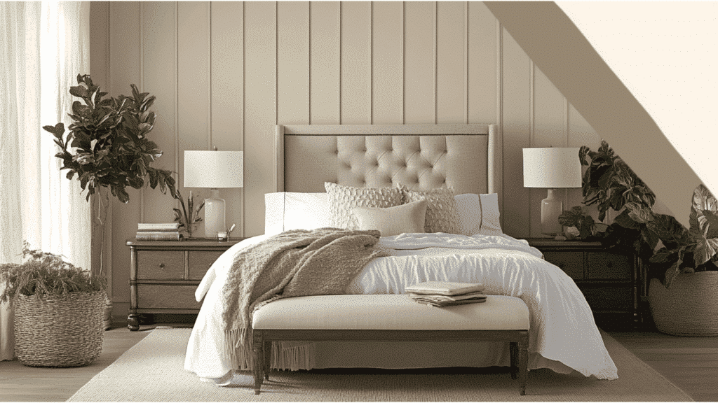
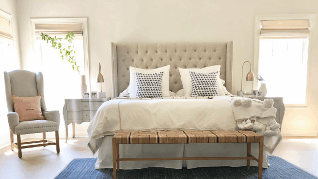
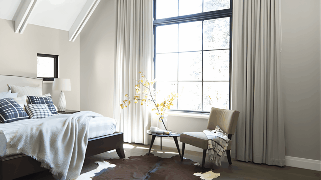
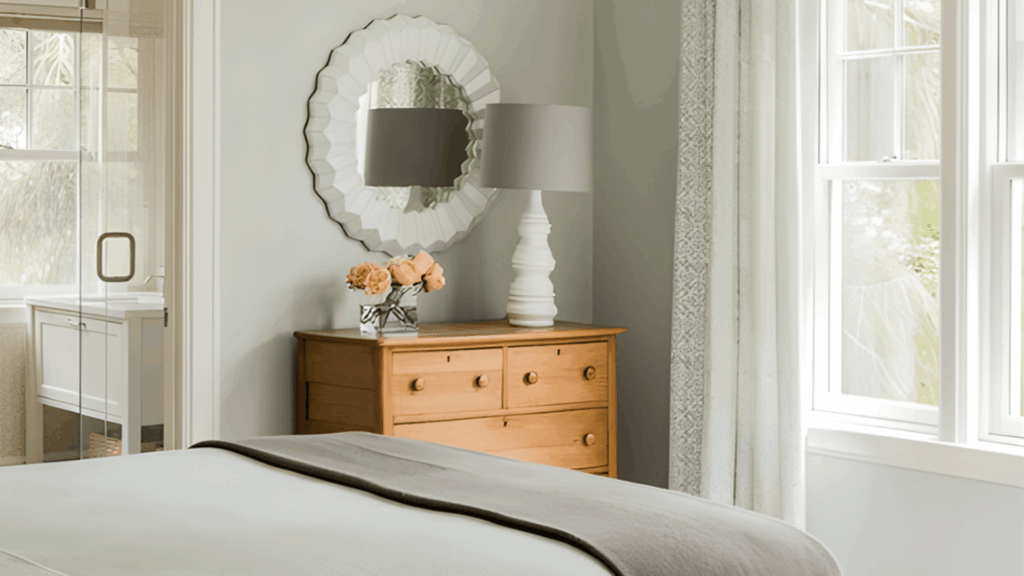
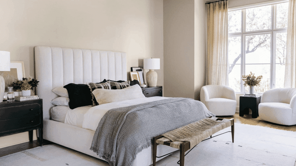
How to Pair Paint Colors With Bedroom Decor
Paint works best when paired with decor that supports calm rather than competing with it.
Neutral wall colors allow bedding, pillows, and throws to add personality while keeping the room restful and easy to update over time.
Monochromatic schemes, using lighter and darker versions of the same color, create visual flow without contrast overload. This approach feels cohesive and soothing, especially in bedrooms.
Texture matters as much as color. Linen, cotton, wool, wood, and soft upholstery add depth without visual noise.
When textures are varied but colors stay restrained, the bedroom feels layered, warm, and intentionally calm.
Conclusion
Peaceful bedroom paint colors are less about trends and more about creating a space that supports rest and comfort every day.
When colors stay soft, balanced, and low in contrast, the room naturally feels quieter and more inviting.
The right shade should work with natural light, complement existing furniture, and maintain a sense of calm from morning to night.
By focusing on proven calming hues and thoughtful palette combinations, your bedroom becomes a place that feels cohesive and soothing rather than visually busy.
A well-chosen paint color sets the foundation for a bedroom that feels consistently calm and restorative.

Alex Guerrero, a graduate with a Fine Arts degree from the Rhode Island School of Design, has been a visionary in the world of color and design for over 15 years. His professional journey began in the heart of the fashion industry in Milan, where he developed an acute sense for color harmonies and trends. Alex joined our team in 2018, offering fresh and innovative perspectives on color utilization in various spaces. Renowned for his ability to blend contemporary trends with timeless elegance. Outside of work, Alex is an accomplished painter and a volunteer art therapist, his artistic talents further enriching his professional insights.